WiP in WiP, post your screenshots!
- Thread starter Arhurt
- Start date
You are using an out of date browser. It may not display this or other websites correctly.
You should upgrade or use an alternative browser.
You should upgrade or use an alternative browser.
If you click on a certain view port, then press Shift + Z, it will full screen that viewport to make it easier to see in screenshots.
If you click on a certain view port, then press Shift + Z, it will full screen that viewport to make it easier to see in screenshots.
http://imgur.com/gallery/ipTiw
Here's a better view.
DigitalEvorian
L1: Registered
- Jul 21, 2016
- 7
- 2

I sort of liked this little train tunnel..
So I take it you're making a payload map?
DigitalEvorian
L1: Registered
- Jul 21, 2016
- 7
- 2
Yes, i'm trying.. it will be my first payload map actually. it's current name is "PL_Greenville"So I take it you're making a payload map?
Yes, i'm trying.. it will be my first payload map actually. it's current name is "PL_Greenville"
Sounds cool, but if you don't mind me asking;
Why is it called Greenville?
DigitalEvorian
L1: Registered
- Jul 21, 2016
- 7
- 2
Sounds cool, but if you don't mind me asking;
Why is it called Greenville?
I don't know really.. i just had it in the back of my head for some time.
I'm sure it'll be cool thoI don't know really.. i just had it in the back of my head for some time.
I think it depends on its usage. because there could be a situation in which it can be hard to identify which team has which entrance to a certain area. The colors there can give a hint. But rarely there realy is a need for this as the surroundings should in most cases already change and that already can identify the specific team. I do agree that in most cases (including this one) the neutral signs are best.Looks great, but I never liked this habit of having the B sign split in half like that.
I sort of liked this little train tunnel..
Make sure you only create displacements on the visible sides of the brushes and sew them together to avoid those black shadows near the edges.
DigitalEvorian
L1: Registered
- Jul 21, 2016
- 7
- 2
Ah alright, thank you~Make sure you only create displacements on the visible sides of the brushes and sew them together to avoid those black shadows near the edges.
DigitalEvorian
L1: Registered
- Jul 21, 2016
- 7
- 2
I think it looks good~
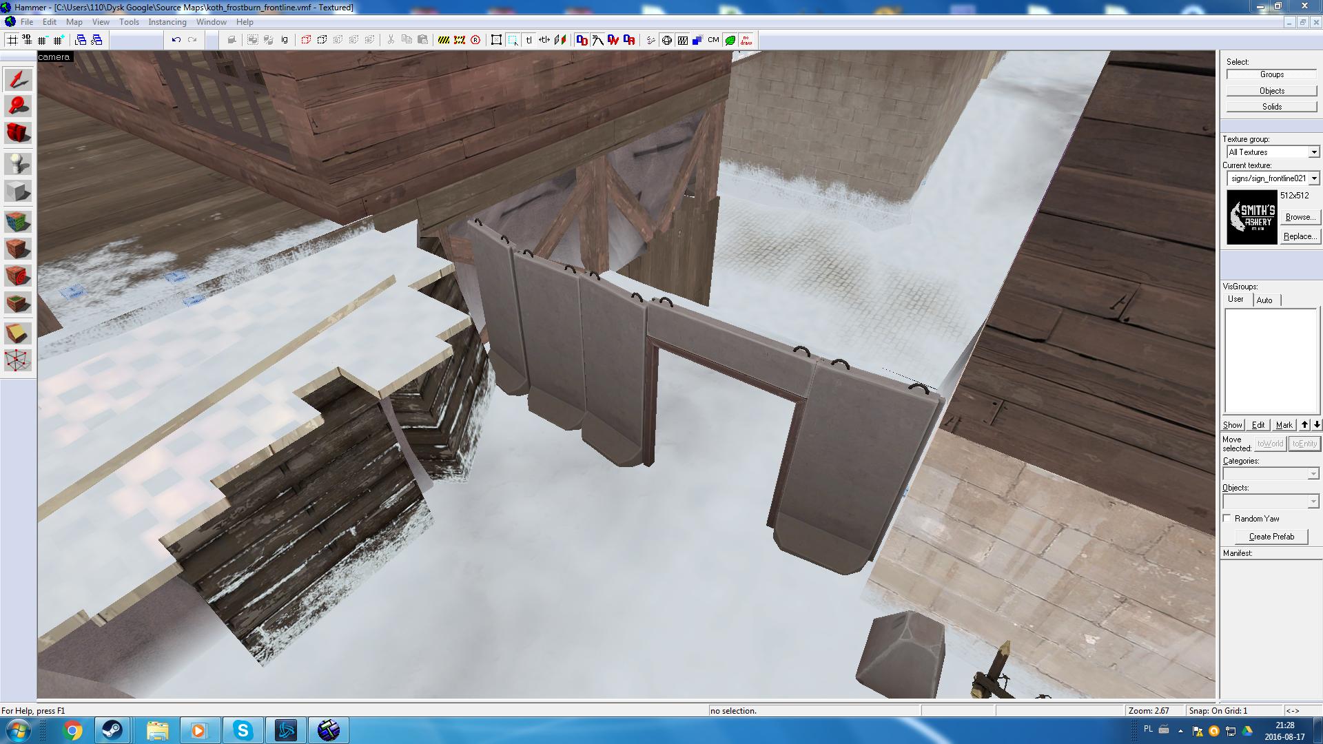
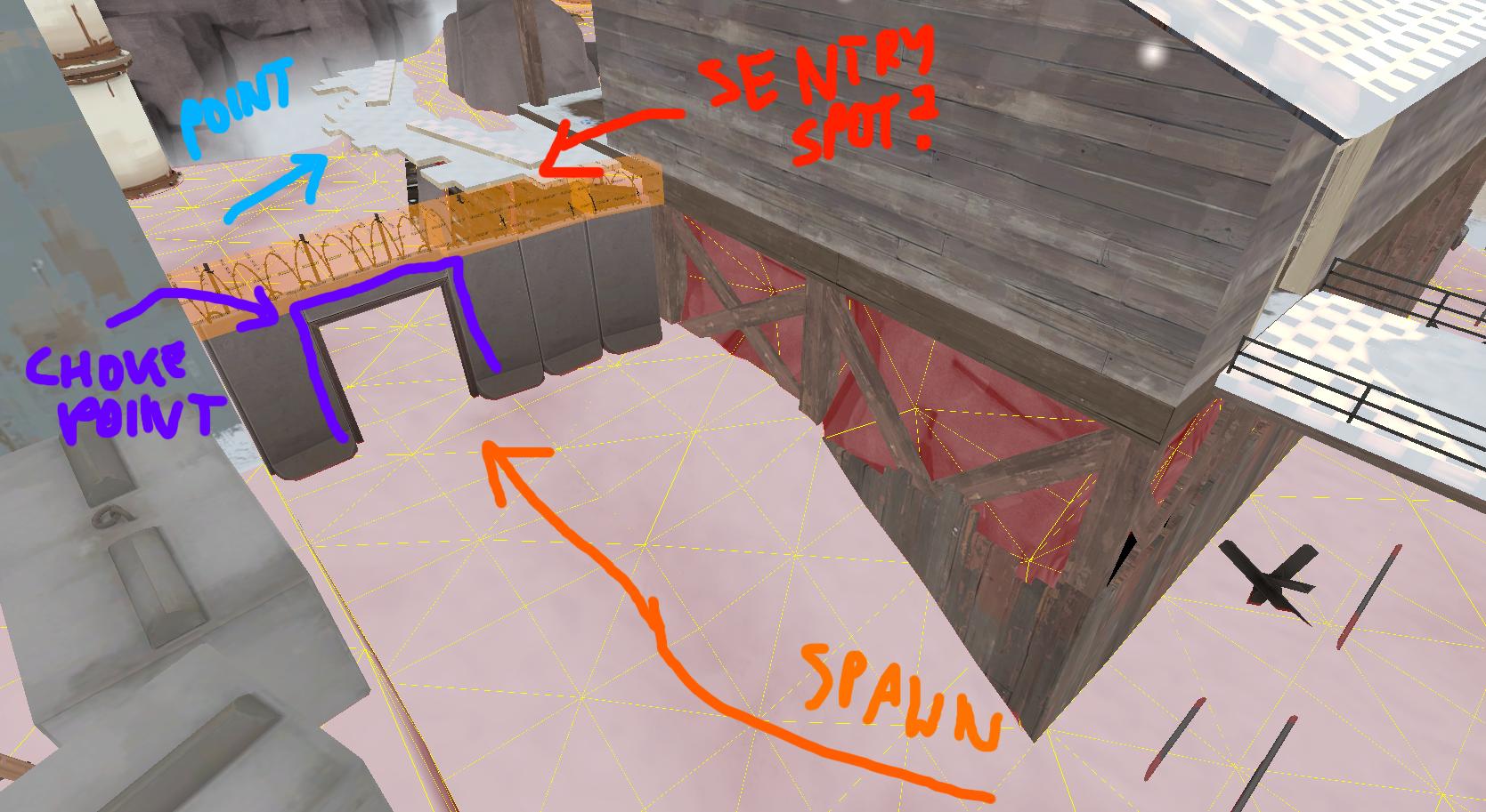
I'm not sure if this concrete fence with a doorway is a good idea
I mean balance-wise:I think it looks good~

I'm afraid this place will get camped by dominating team (this is a KOTH map so the same wall goes to the other teams' side too.
DigitalEvorian
L1: Registered
- Jul 21, 2016
- 7
- 2
Ahh, yeah.. you might want to change it then..I mean balance-wise:

I'm afraid this place will get camped by dominating team (this is a KOTH map so the same wall goes to the other teams' side too.
Bummer... I like having the wall there (makes the map even more Frontline-y), but...
I think I'll leave it in for now. I'll have to update the map later on anyway once new frontline assets arrive.
I think I'll leave it in for now. I'll have to update the map later on anyway once new frontline assets arrive.


