WiP in WiP, post your screenshots!
- Thread starter Arhurt
- Start date
You are using an out of date browser. It may not display this or other websites correctly.
You should upgrade or use an alternative browser.
You should upgrade or use an alternative browser.
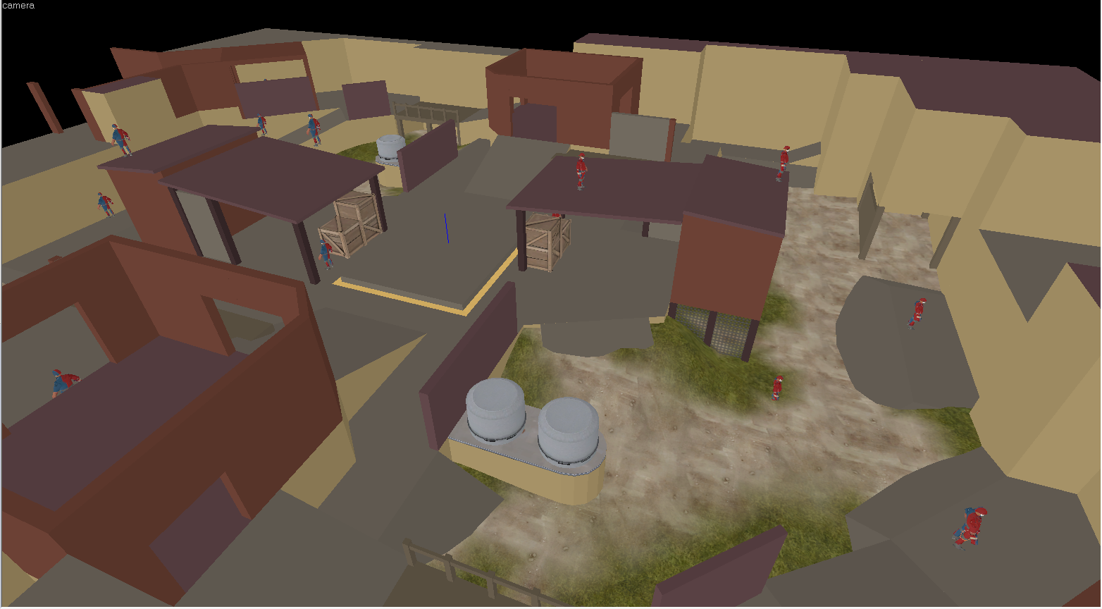
Remaking that mess of a map. I don't even know why.Wait a minute, what happened to ramjam?
Remaking that mess of a map. I don't even know why.
Have you gotten a new set of feedback to work off of, or just tearing apart and building brand new?
Ramjam is my first serious map for TF2 ever, so when I started working on it I had no freaking idea what I was doing. Its geometry is a complete mess, impossible to optimize and its generaly too large. Decided to start it again with the same kind of layout but shrinking it down a lot and making the brushwork better now that I actually know how to do things.Have you gotten a new set of feedback to work off of, or just tearing apart and building brand new?
Ramjam is my first serious map for TF2 ever, so when I started working on it I had no freaking idea what I was doing. Its geometry is a complete mess, impossible to optimize and its generaly too large. Decided to start it again with the same kind of layout but shrinking it down a lot and making the brushwork better now that I actually know how to do things.
second time should be a hell of a lot quicker to push through as well
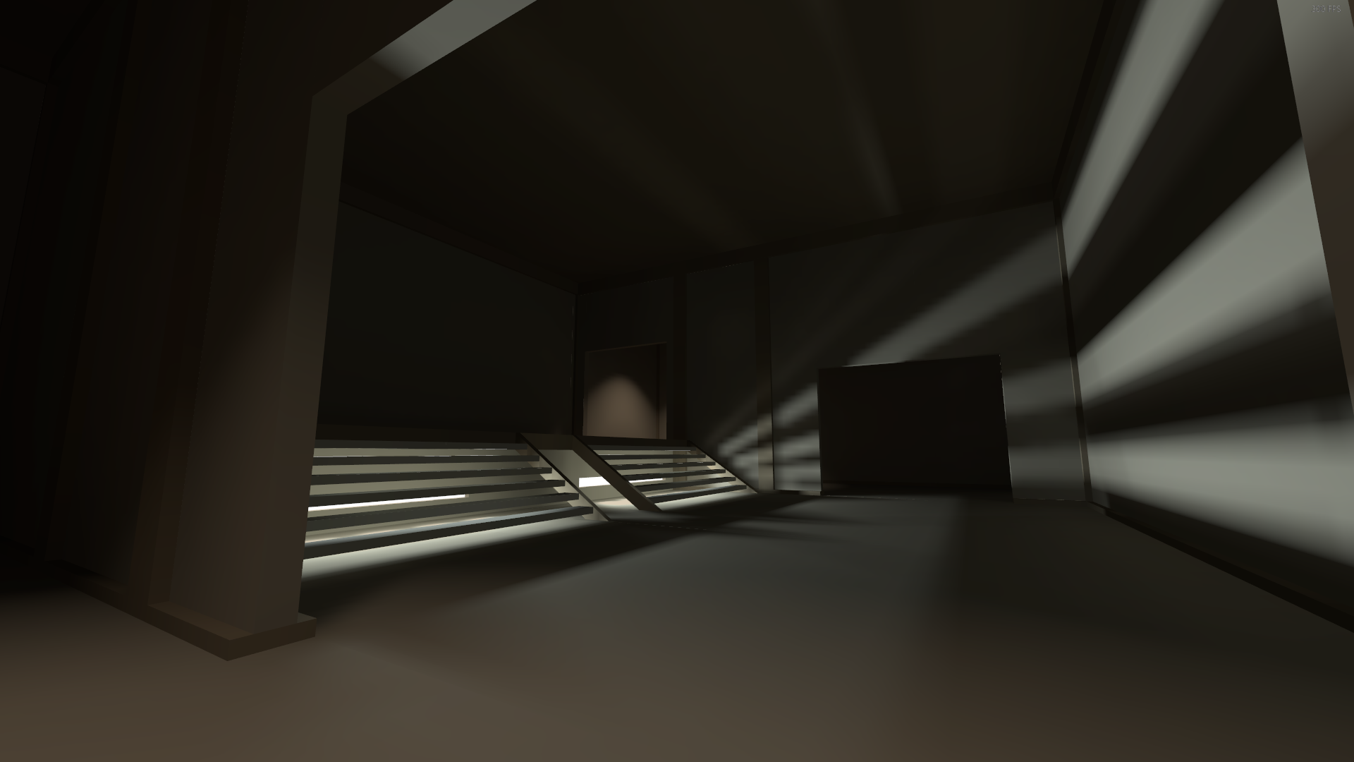
edit: messing about with lighting:
Last edited:
So, another night, more mapping done. Blue spawn outside is missing a bit more life, but is basically done:
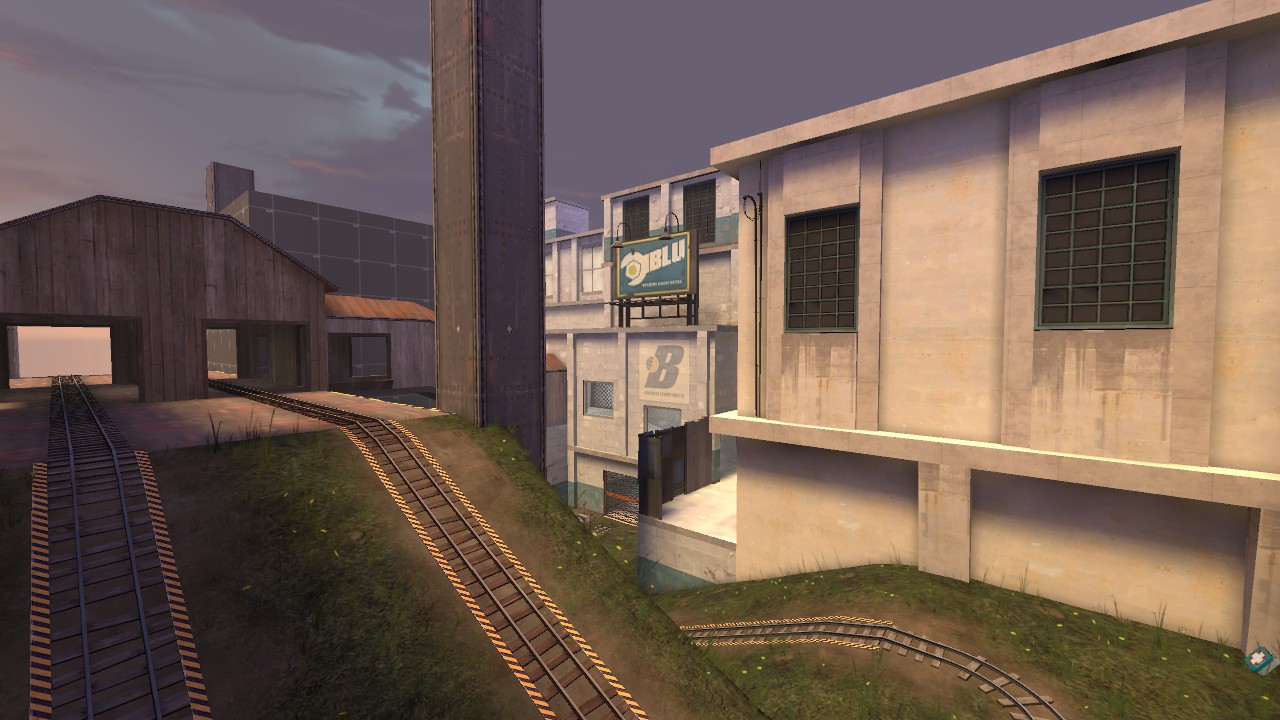
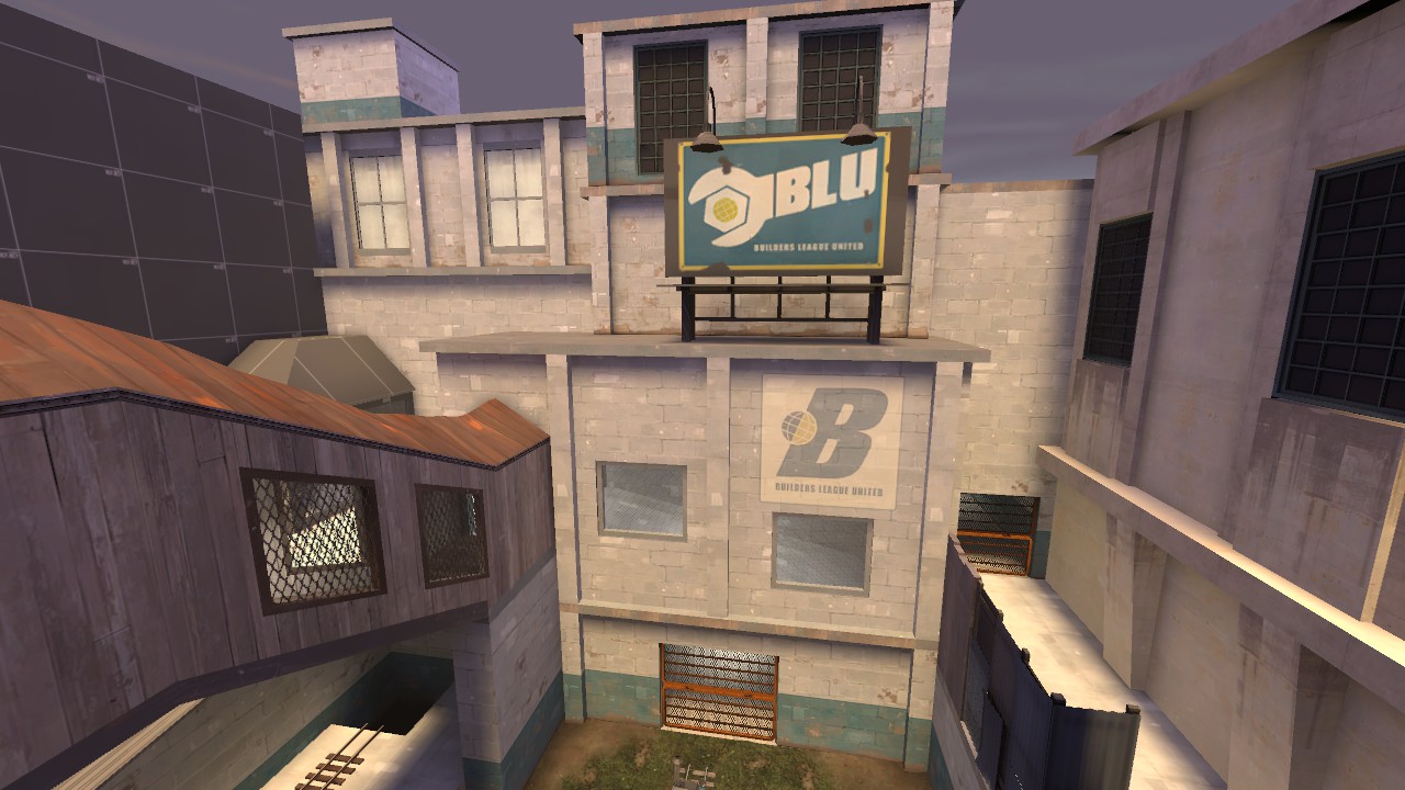
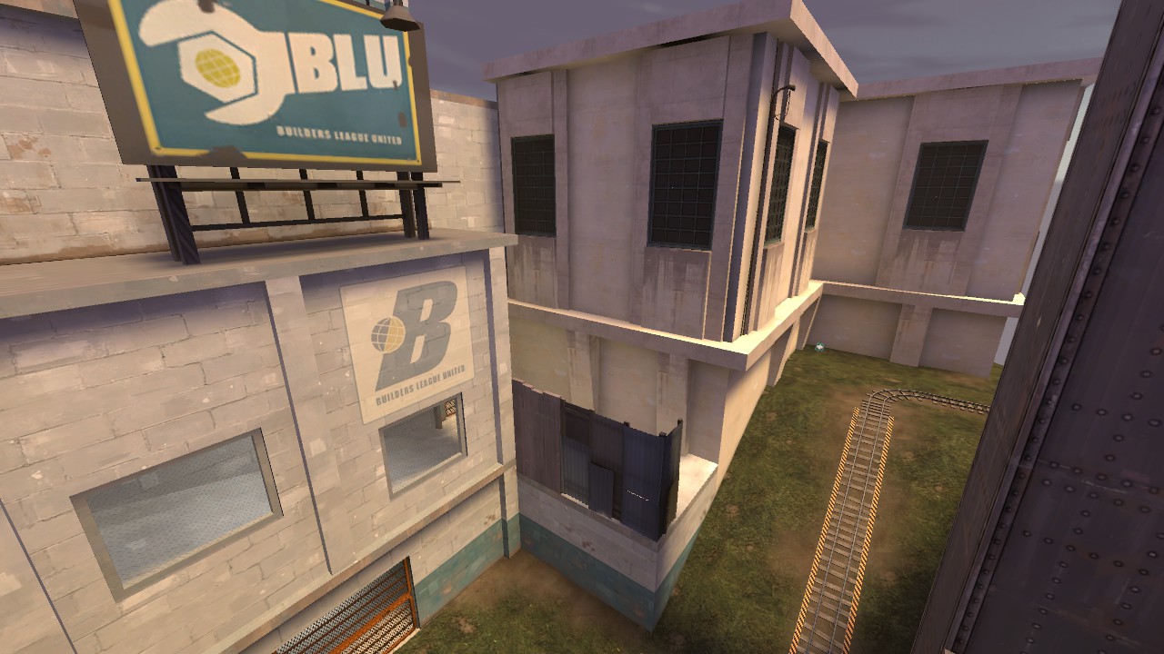
Please note: I already talked with the chat, especially hoplitejoe about how the bridge pillars don't make much sense anymore - I'll think about some changes for them.
I also did some very early work on the red spawn inside.
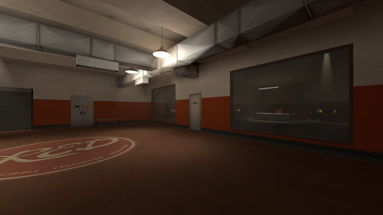
*edit: Oh yeah, and i changed the angled windows on red spawn as well.
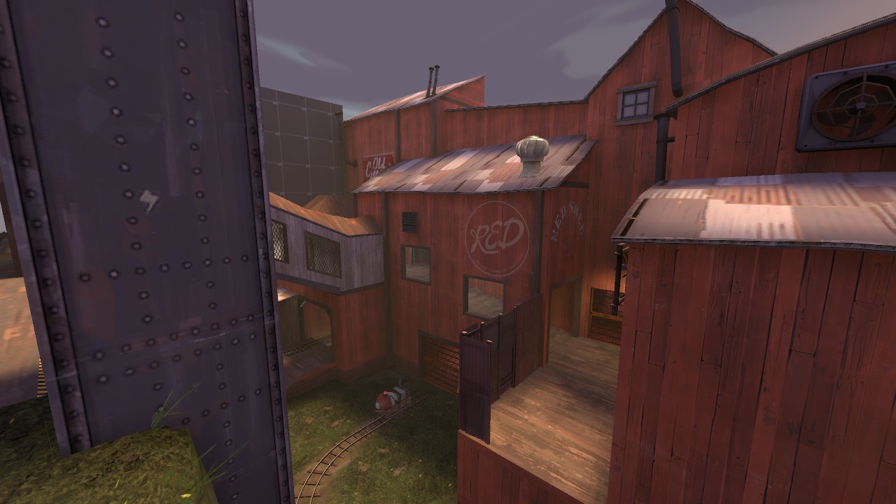
Please note: I already talked with the chat, especially hoplitejoe about how the bridge pillars don't make much sense anymore - I'll think about some changes for them.
I also did some very early work on the red spawn inside.
*edit: Oh yeah, and i changed the angled windows on red spawn as well.
Just makes the floor look like it's covered in a huge puddle to me. A shiny floor would have blurrier reflections than that, hence why every other engine in existence allows phong shading on flat surfaces.From cubemaps to real-time reflections.
You'll have my vote.
Just makes the floor look like it's covered in a huge puddle to me. A shiny floor would have blurrier reflections than that, hence why every other engine in existence allows phong shading on flat surfaces.
It is meant to be a huge puddle, the theme is an underwater base.
If we bother Valve enough they might just implement it at some point. It's already present on models, it shouldn't be that hard to get it working on standard world brushes, right?Just makes the floor look like it's covered in a huge puddle to me. A shiny floor would have blurrier reflections than that, hence why every other engine in existence allows phong shading on flat surfaces.
RIGHT?
It is meant to be a huge puddle, the theme is an underwater base.
But then why is the facility pristine? Anyway nice work Exactol, it reminds me of Natural Selection 2's claustrophobic facilities. Also, put some handrails up on that walkway, that ain't OSHA.
Its not supposed to be a puddle.Maybe they just really polish the floors or something. I might try messing with the reflectivity to make it less like a layer of waterIt is meant to be a huge puddle, the theme is an underwater base.
It sure looks like there are ripples on the "water".
The first image makes use of a water through glass effect that was made for cp_hadal I believe? The light coming in through the water and then through the window is whats leaving shadowed ripples.
Edit: Nevermind, was looking at the wrong picture.
Last edited:


