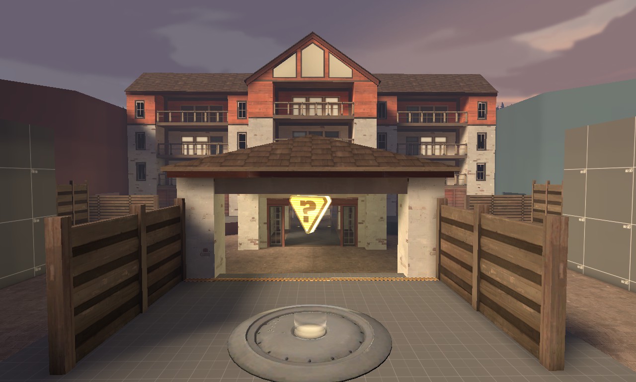
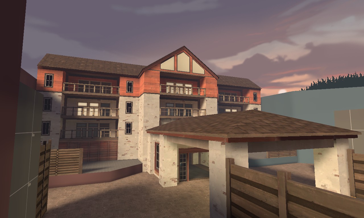
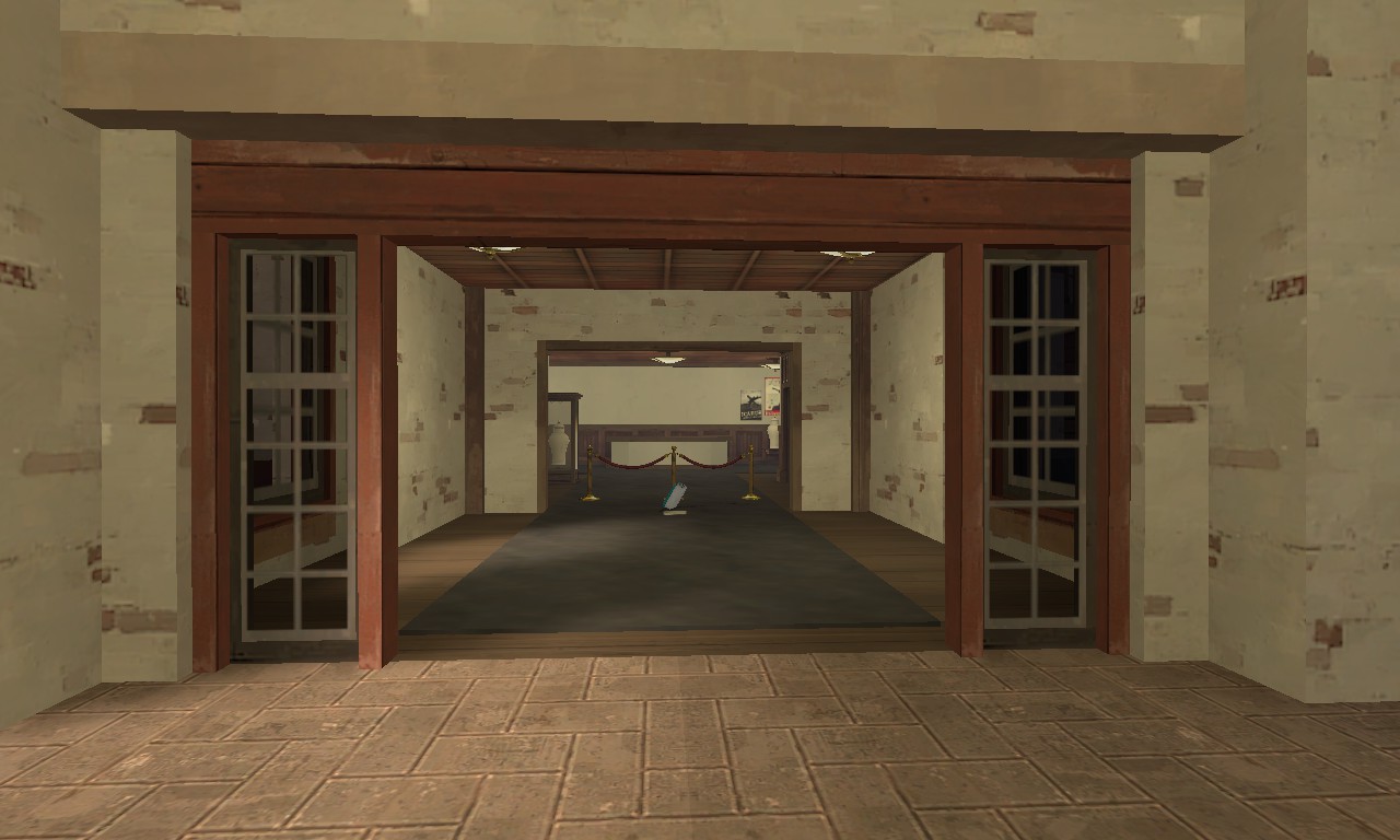
WiP in WiP, post your screenshots!
- Thread starter Arhurt
- Start date
You are using an out of date browser. It may not display this or other websites correctly.
You should upgrade or use an alternative browser.
You should upgrade or use an alternative browser.
The thing about phong shading, as I understand it, is that it's inherently a different lighting model than what Source uses for anything else. Like, there's flat shading, which assigns a light level to every poly; vertex shading, which assigns a light level to every corner and blends between them; and phong shading, which is something totally different and presents its own set of problems. You know how sometimes two connected pipes will just shift abruptly from light to dark? Imagine that same issue on the level of a room's entire floor. So what you'd need to do is offer an extra layer in the shader that adds phong reflections in additive mode (think setting a layer to "Screen" in Photoshop) the same way $envmap adds cubemap ones now. Stiffy360 proved that the closest thing we currently have looks just fine, but it requires having two separate objects that sample their lighting in fundamentally different ways.If we bother Valve enough they might just implement it at some point. It's already present on models, it shouldn't be that hard to get it working on standard world brushes, right?
RIGHT?
So it's a maybe. Valve added phong elements to LightmappedGeneric in CS:GO recently, but with a weird limitation I don't fully understand the reason for. Here's a quote from someone in that thread trying to explain it:
Phong is a real-time intinterpolation of a surface's normal and a light vector (which direction the light is pointing). These two combined create a specular reflection. That being said this is why only the cascadded sun ent works for phong right now. it's a realtime light shadowmap that has readable realtime vectors. Apparently these vectors are exposed to models as well, it would be nice to see point and spotlights effecting brush surfaces, but I doubt it.
seth
aa
- May 31, 2013
- 1,021
- 852
I had to take it a step farther
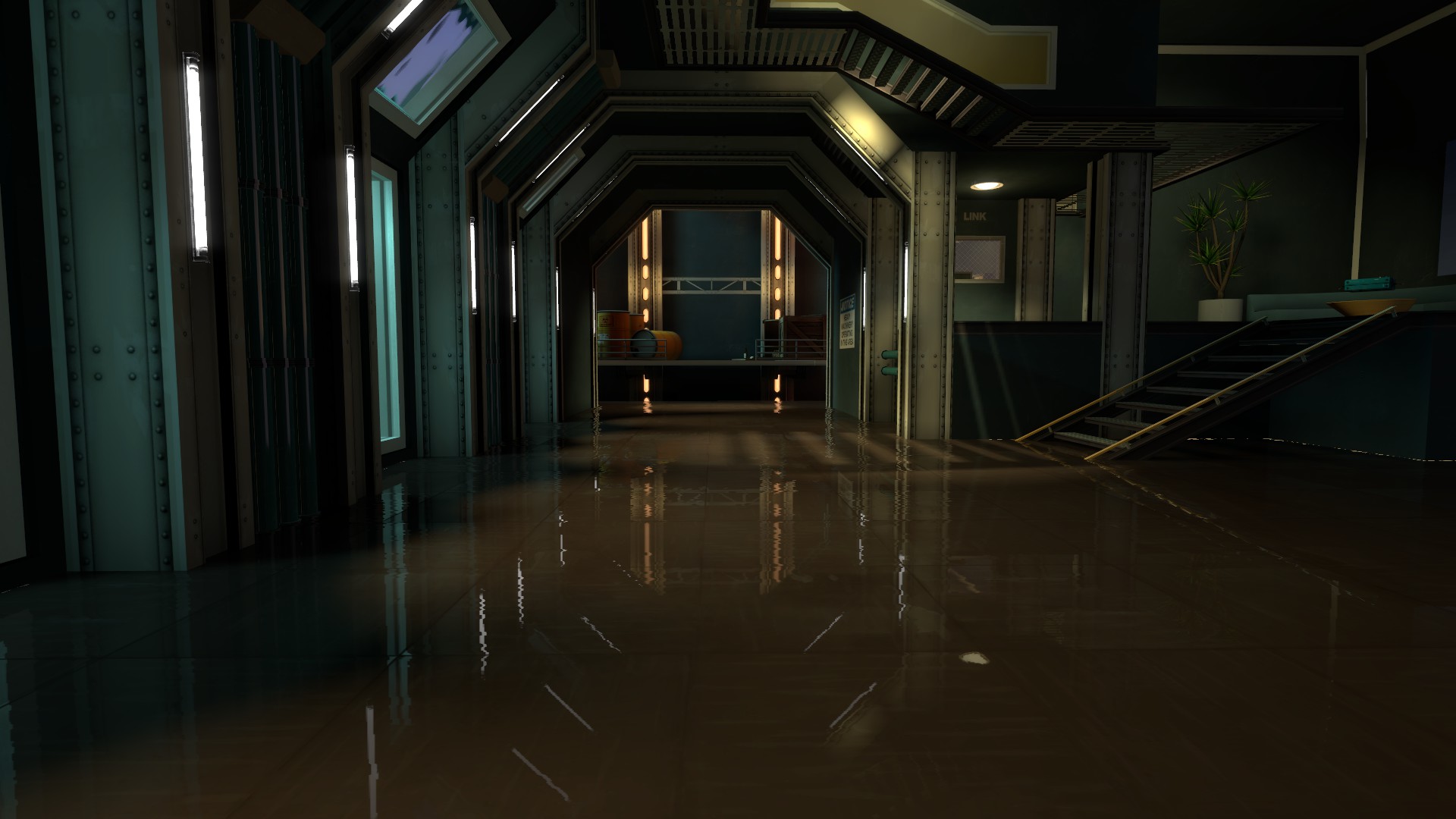
Can you explain how you set this up? I didn't think real-time reflections were possible in TF2's version of Source.
Sadly that's a Source limitation. I tried many times to get the 3D skybox to reflect to no avail. It basically has to do with the fact that the 3D skybox isn't actually there, but instead is magnified from another place on the map.It uses a water shader, because water can reflect all if you have that setting enabled for tf2. Sadly it seems to screw up the 3d skybox so I'm trying to fix that
Unless you do find out a way in which case please make a tutorial on it.
Is the comparison in the first image or is there a second image I'm not seeing? Because I don't see it (the comparison).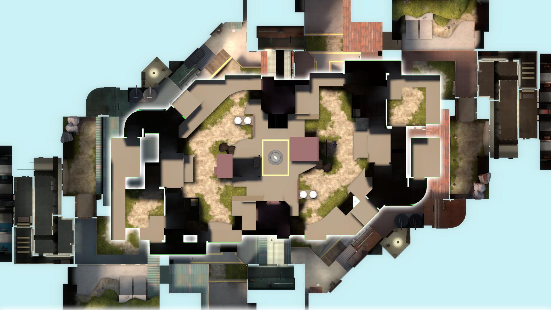
a messy comparison of how much I've cut ramjams size down. Damn the original is huge.
edit: also, its pretty neat to see how well the map kept its proportions even when I made the layout almost completely out of memory.
Is the comparison in the first image or is there a second image I'm not seeing? Because I don't see it (the comparison).
I'm pretty sure it's the inner area with the white glow around it. Took me a minute to see it.
Is the comparison in the first image or is there a second image I'm not seeing? Because I don't see it (the comparison).
Yep, the inner part with the glow around it is basicly the new playable space (missing the spawns tho) compared to the original, which is the background.I'm pretty sure it's the inner area with the white glow around it. Took me a minute to see it.
Dusting off an old map of mine:
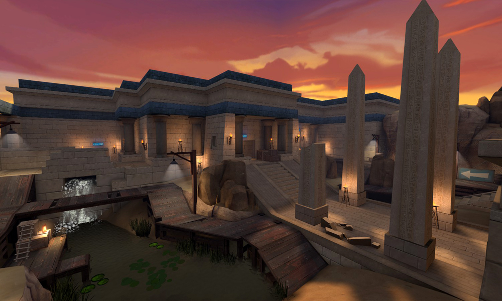
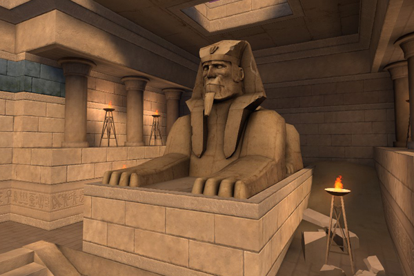
It was going to be an excuse to use the new sphinx I made, but I couldn't fit in it. Ended up making a new, smaller one for the point:
Man I remember playing that on Star_'s server years ago. Are the sphinx and textures the only changes?
Man I remember playing that on Star_'s server years ago. Are the sphinx and textures the only changes?
Nope. Also taking the feedback from way back when to update the map.
It's mirrored now. The point is larger and much less cramped, all the walkways everywhere are wider and easier to navigate, and there's a better flank route (where the crumbled wall used to be is now an entrance to a cave). I'll have an update ready over the weekend, hopefully.
Boy that is a lot smaller. And indeed maybe for the better. The few times I played the map in TF2center lobbies I always felt 2 things about the map. 1: it's not very good looking, and 2: boy is it big for KOTH.Yep, the inner part with the glow around it is basicly the new playable space (missing the spawns tho) compared to the original, which is the background.
I was thinking of detailing it 2fort style this time, with unique architechture styles on for both sides.Boy that is a lot smaller....
I liked the Gorge-style, it just wasn't done very good, and the lighting didn't help with that either.I was thinking of detailing it 2fort style this time, with unique architechture styles on for both sides.
I must say though, I haven't played the map in a veeeery long time, so I probably have to get a look at it again to see what's what, but that's what I remember from my last time playing.
edit downloaded the map again, had a look around. The biggest issue seems to be lighting. The texture work itself is nice, but the lighting in most areas could be improved drastically.
Last edited:
Unless you do find out a way in which case please make a tutorial on it.[/QUOTE]
It wasn't that it wouldn't reflect the 3d skybox, but it completely breaks it. For some reason it makes the skybox appear black, but if you look at it at certain angles it looks fine
It wasn't that it wouldn't reflect the 3d skybox, but it completely breaks it. For some reason it makes the skybox appear black, but if you look at it at certain angles it looks fine
It wasn't that it wouldn't reflect the 3d skybox, but it completely breaks it. For some reason it makes the skybox appear black, but if you look at it at certain angles it looks fine
So if you got the 3D skybox to reflect, how'd ya do that? Cuz I wanna know.
Also, remember that the real-time reflections do not count towards the visibility system Source has, meaning that if an area can't be seen trough the player's eyes when looking at it normally and it stops being rendered it also won't show up in the reflection. Maybe that's the issue?


