Fountain

PL Fountain b3

Idolon

they/them
aa
Feb 7, 2008
2,123
6,137
Fountain - a hybrid payload

Adopted from Tyler, who made versions a1-a8 (a8 was never released).

Television has a scale. It has other properties, but what television has to a dominant degree is a certain scale and the power to enforce it. No one has been able to describe the scale as it is experienced. We know some of its properties, though.
  • Television does not vary. The trivial is raised up to power in it. The powerful is lowered toward the trivial.
  • The power behind it resembles the power of no-action, the powerful passive.
  • It is bewitching.
  • It interferes with growth, conflict, and destruction, and these forces are different in its presence.
  • "Entertainment" is an unsatisfactory word for what it encloses or projects or makes possible.
  • No good has come of it.
 
Last edited:

Idolon

they/them
aa
Feb 7, 2008
2,123
6,137
a9 changes:

Overall:
-more artpass (by tyler)
-various small adjustments to brushwork for neatness / architectural realism

A:
-adjusted stairs on cliff-side route for faster blue rotations and to feel less cramped
-moved health/ammo on cliff-side route into building and adjusted health to medium to allow better hold for blue
-removed stairs and moved handrail on red side of same route to make rotations longer for red
-added small ammo pack to roof to better hint at jump route, adjusted rock to make prop jump usable for 100% speed classes

B:
-changed side building to make roof area usable

C:
-adjusted prop jump route to high ground to be easier / more obvious for red

D:
-no changes (reverted to a7 version from a8 incomplete unreleased version from tyler)
 

Idolon

they/them
aa
Feb 7, 2008
2,123
6,137
some thoughts

upload_2020-7-1_20-34-52.png

upload_2020-7-1_20-36-40.png

upload_2020-7-1_20-37-51.png

upload_2020-7-1_20-38-57.png

upload_2020-7-1_20-42-33.png
 

Idolon

they/them
aa
Feb 7, 2008
2,123
6,137
Test notes:

A is still as chokey as ever. Changes may have helped but it still plays kind of the same. The red holds are pretty fun but blue just has shit options and its not that fun for them. Need changes here beyond health kit adjustments.

B still plays weird, nobody used the roof. Need to make that roof an area that is accessible to everyone. It feels like there are some hold areas on B that are hinted at but, if they even do work, nobody is using them. Need to make these more obvious, probably by making them different entirely. Force blue to use more of the area around B instead of just taking the innermost route.

Speaking of, the innermost route at B needs some consideration - its kind of useful for red at A, but mostly as a shortcut and sniper balcony, and red should probably have a teleporter anyways, so the shortcut isn't that valuable. After A, that shortcut can be used for defense, but it basically never works because you're going against half of blue team on the cart through a 128w doorway - You're going to die without an uber, which you probably don't have, since you just lost A. (Also, if red is going to flank blue on this point, they should be using the sheds! They're much more fun.) For blue, this route is pretty useful, but its not particularly fun? The angles are all awkward. I see multiple approaches to this area, will need to experiment.

Need to watch demos to get opinions on C, D. I already know D will be redesigned to have the pit pushed further forward and be more like Upward, where the challenge is pushing a short distance within an easily held room. (Fountain already kind of plays like this, the cart tends to roll once it gets around the fence.) I may try a different approach by having the cart work its way around the hold before dumping in, but the geometry of that is less simple and to the point... Will need to experiment.
 

Idolon

they/them
aa
Feb 7, 2008
2,123
6,137
a10

The concept of a local or national culture is a paradoxical proposition not only because of the present obvious antithesis between rooted culture and universal civilization but also because all cultures, both ancient and modern, seem to have depended for their intrinsic development on a certain cross-fertilization with other cultures. Regional or national cultures must today, more than ever, be ultimately constituted as locally inflected manifestations of "world culture." It is surely no accident that this paradoxical proposition arises at a time when global modernization continues to undermine, with ever increasing force, all forms of traditional, agrarian-based, autochthonous culture. We have to regard regional culture not as something given and relatively immutable but rather as something which has, at least today, to be self-consciously cultivated. Sustaining any kind of authentic culture in the future will depend ultimately on our capacity to generate vital forms of regional culture while appropriating alien influences at the level of both culture and civilization.

A:
-reverted patio change
-raised blue bridge and adjacent room (by patio) by 64 units. added railing to patio room exit.
-bridged building over to tiny little chimney building thing. makes more sense for detailing, and also nullifies jumping classes a tiny bit (jump route was too awkward to be worth keeping anyways).

B:
-removed inner high ground route. porch is accessed on other side, interior area is just an ammo dead-end. this route isn't super useful for red and kind of shortcuts the blue push to B in a way that feels highly variable, which i want to avoid for consistency in holds. hoping this makes players (blue and red) play more in the shed area behind the B corner.
-added route through pool-side building
-replaced roof area from a9 with proper balcony accessible to all classes via staircase

C:
-no changes

D:
-grounded trash can

Read the rest of this update entry...
 

Idolon

they/them
aa
Feb 7, 2008
2,123
6,137
a10a

Fixed a couple of random glitches and did a small layout update.

C:
-reworked outdoor flank to be more of a gameplay space than a corridor. harder to camp as pyro.
-fixed funny payload cart path
-fixed prop jump that didn't actually work
-added chin

Read the rest of this update entry...
 

Idolon

they/them
aa
Feb 7, 2008
2,123
6,137
In New York's East Harlem there is a housing project with a conspicuous rectangular lawn which became an object of hatred to the project tenants. A social worker frequently at the project was astonished by how often the subject of the lawn came up, usually gratuitously as far as she could see, and how much the tenants despited it and urged that it be done away with. When she asked why, the usual answer was, "What good is it?" or "Who wants it?" Finally one day a tenant more articulate than the others made this pronouncement: "Nobody cared what we wanted when they built this place. They threw our houses down and pushed us here and pushed our friends somewhere else. We don't have a place around here to get a cup of coffee or a newspaper even, or borrow fifty cents. Nobody cared what we needed. But the big men come and look at that grass and say, 'Isn't it wonderful! Now the poor have everything!'"

This tenant was saying what moralists have said for thousands of years: Handsome is as handsome does. All that glitters is not gold.

She was saying more: There is a quality even meaner than outright ugliness or disorder, and this meaner quality is the dishonest mask of pretended order, achieved by ignoring or suppressing the real order that is struggling to exist and to be served.

A:
-opened up shed area to make it less of a pain to push into, and also hopefully making it more obvious as a holding area for red team

B:
-fixed fence that you could shoot through. apparently tyler did this on purpose?
-added door that shuts after B is capped to make The Good Route less good

C:
-moved a fence back a bit
-tweaked deathpit flank door a bit to block a sightline into blue spawn
-developed same cave area a bit
-added windows overlooking point. not sure why

D:
-no changes

Read the rest of this update entry...
 

Idolon

they/them
aa
Feb 7, 2008
2,123
6,137
Thanks to Chin (smig) for suggestions on changing B / C connecting area.

A:
-redesigned opening area because red doesn't actually use it for much of anything and it feels really weird and cramped and i don't like it. after looking at some classic tf2 maps, i think this area needs to be more natural and open to just help the map feel more like a real place rather than a big clusterfuck of sheds

B:
-opened up dead-end diagonal shed to be a better hold area. added medium health
-added funny stairs to water area to give red more mobility, easier to flank into shack area and use more of the area to give blue a hard time
-added wall onto bridge for blue cover
-garage door will not open until B is capped
-reworked side building so red can still enter while in cover but it does not connect to C. upgraded health to medium
-downgraded health in balcony room to small

C:
-disconnected the Good Route from B entirely so Blue is forced to use other routes. connected Good Route back into the main room, added medium health / ammo
-added balcony for high ground exit so blue can use it more easily and so red can prop jump up more easily / obviously

D:
-rework to put fountain in center instead of at the end. minimal changes to the Actual Layout in response to this, mostly because i don't have a ton of ideas

Read the rest of this update entry...
 

Idolon

they/them
aa
Feb 7, 2008
2,123
6,137
a12a

A:
-no changes

B:
-added medium health to shack flank to hopefully encourage blue usage of the area

C:
-various small adjustments for detailing

D:
-no changes

Read the rest of this update entry...
 

Idolon

they/them
aa
Feb 7, 2008
2,123
6,137
a13

-reduced max map time from 10 minutes to 8 minutes

A:
-full rework of blue's approach to the point. the old one didn't have a proper space for players to "duke it out" and the gameplay was stale as a result. the aim here is to open up the flow for both teams to be more fun for everyone without reducing the difficulty too much.
-balcony on top of elevator is gone. i wanted to try and keep it in because it feels like an iconic part of the map, but it just doesn't fit in a design for A that is meant to encourage red to push forward and play more aggressively.

B:
-lowered red side of choke by 64 units (without an overall reduction in height difference for the point) in order to make the main choke slightly easier to push (as well as make red holds require better use of the sheds) and also make the red half of the point easier to defend.
-lowered left sentry nest to make it more connected to point area
-added conveyor belt over choke to try and hamper blue demomen from jumping to red spawn
-made bounds of netting a bit more obvious

C:
-redesigned platform on red side of main room to try and reorient defense towards the middle of the room instead of just the back half
-moved tall machinery thing back 256 units to enlarge front area, added cover to front area to make it more of a gameplay space and offer better route into B
-added ramp up to door exiting brewery to give red a more obvious advantage at that choke

D:
-red fwd spawn becomes a dropdown
-reworked red hold area behind finale for better sentry nest

Read the rest of this update entry...
 

Idolon

they/them
aa
Feb 7, 2008
2,123
6,137
some fountain #thoughts

A got a total redo and people are slowly learning to play it, though I don't think it plays like I hoped. Here's what I had imagined a good forward red defense would look like:

upload_2020-9-3_19-3-6.png


There are two main holding areas, (1) which is closed quarters and doesn't have great control over the open routes, but is necessary to hold to prevent blue from gaining an important high ground, and (2) which covers most of the open area. There are some issues with assuming red players will hold here - in addition to the fact that players may be used to how the old A is meant to be held, these spots are not obvious, they don't always offer great cover or retreat, and maybe most importantly, they have no synergy. Let's take a look at Gorge:
unknown.png


Here we can see a greater number of positions and better retreat options, but maybe most important is that these positions share a lot of common ground in the area they cover. Players on red are choosing different positions based on their class and intended strategy, but they are going to be attacking the same blue players from multiple angles. On Fountain A, this is barely the case, and instead red team is trying to hold two completely different fronts. It's not great, and the area needs to be refocused.


B is probably the most consistent point in the map right now. I'm not sure how much people are having fun, but it seems balanced. In recent testing it has been the only point to net red a win besides D.

One question that has come up is this corner choke. What if there was more area to fight in back here? I don't know. I can't tell how people feel about this. I think the corner might be fine as it is if the rest of the point area becomes better to play in.

upload_2020-9-3_19-20-47.png


I think the significant issue with this point is that red isn't really sure where the "good" hold is once they lose the corner. The team becomes confused and unfocused if there isn't a good engineer nest to galvanize the team, but this doesn't happen by default. Here are the main holds:

upload_2020-9-3_19-23-57.png


(1) is intended to be the default hold, but it doesn't work great. Good engineer holds typically have the engineer built in the back with their teammates up in front, relying on the engineer for resources, and letting the sentry take out enemies that overextend. However, this doesn't exactly work when the area isn't already a good place for the majority of the team to hold from, is it? The covered area for the sentry and the covered area for the player is the same spot. If you try to hold out in front of the (1) sentry spot, you're subject to sightlines and height disadvantage. Not great.
upload_2020-9-3_19-48-51.png


(2) and (3) are more difficult hold positions that end up being much better for red team, as players can actually hold in an area with cover while defending the cart from a distance, and they can fall back to be protected by a sentry. This dynamic could be improved in these areas, but the point is that this dynamic should apply to (1), since this is where the majority of the team will enter the area. (2) and (3) should be riskier hold positions, but not necessary to not get completely rolled.


C is weird because typically payload points are at the end of an open area to help ensure that blue team has cleared the open area of red players before capping. Typically red will also be limited on their entrances to the area because this helps ensure red has a hard time pushing back out once they have lost that ground.

C currently fails because it is just on the wrong side of a choke, and it is possible (if not frequent) that blue cheeses the cap without actually pushing red out of the open area. So, one possible conclusion is to move the point in and increase the difficulty of pushing the cart to the CP:

upload_2020-9-3_18-39-20.png


However, this doesn't solve the issue of being limited on their entrances. There are three routes in and out of this building, both usable by either team. For this to work, the routes out of the building would need to be redesigned such that blue has the advantage once they occupy that ground - and there's not really a good way to do that here. Also, the outdoor area is pretty good for spamming into the building, so blue would likely still be cheesing the cap even in this scenario. So:

upload_2020-9-3_18-35-18.png


What if we move the point even further out? This design would meet both of the typical requirements for a point: At the end of an open area, and red's options into this open area are limited. The hold at the old C point spot would exist, but there would be another layer of holding available to red (which has happened on some tests).

To help balance this out, red would probably spawn at last instead of a forward. This may cause some timing issues with C as it is since blue would be reaching further into the building before encountering red team, but that can be adjusted by delaying the door opening after capping B, much like how Barnblitz B's turntable gives red time to set up. There is also already a decent amount of slack built into the start of C, which is typical of payload maps for pretty much this exact reason.


D plays decently but has sightline issues and lacks things to do for a lot of classes. It is an open area for DM where snipers and soldiers rule. There is an area to the side that can be an interesting area to contest from a gameplay perspective (as evidenced by Wilson continuously planting a blue teleporter in the back area, due to neglect from red team), but it doesn't actually offer a large advantage to attacking last. You're still subject to a lot of the same sightlines and you get no height advantage.

So, for redesigning the point, I want to try and think of the point as MAIN and FLANK, where MAIN is where the cart goes and is a more open area to "duke it out" (where the same sightlines may apply), and FLANK, a secondary area for both teams to contest that offers high ground and cover for both teams that will help with controlling the area. This would be similar to the buildings around Badwater last, or the rooms around Upward last, etc. Some area that is ultimately necessary to control, but not directly connected to the cart path, requiring both teams to split their attention.

upload_2020-9-3_18-54-31.png


You'll have to use your imagination here for what FLANK would look like. Imagine there's an area with good cover that can take out the main sentry nest from out of range.
 

Idolon

they/them
aa
Feb 7, 2008
2,123
6,137
Game shows have come to admit that they refer only to themselves. Very rarely are contestants asked about the old history, the history before demographics became the New History. When this older, more distant world is invoked, it is made obvious that this world is mystifying and too difficult to be comfortable with. One game show host asked a question about the First World War and then described the First World War as "certainly a military event of considerable importance." He was assuring his audience that the First World war was popular in its own day.

a14

A:
-reopened heaven
-narrowed width of first open area overall
-added stair to upper level shed (red side), removed blue access
-rerouted lower shed entirely to be disconnected from upper shed
-removed railing in front of fwd spawn

B:
-bunch of changes near the point that should make it easier to hold. too many to count.
-fixed playerclip issue at fence

C:
-removed red forward spawn. red now spawns at final for defending C.
-added rollback, moved point further outdoors to help ensure blue actually pushes red out
-modified red side room to try and encourage a stronger hold there

D:
-added new side area to function as a "playground" that offers height advantage over last point, useful for both teams
-extended track length
-moved red spawn to corner. its probably too close to the cart path

Read the rest of this update entry...
 

Idolon

they/them
aa
Feb 7, 2008
2,123
6,137
a14 thoughts (tested three times, oct 4, oct 5, oct 6)

A

This playing much better than the first version of the A rework but it doesn't play really how I want it to. Red can actually hold onto the point now, but it is mostly by holding back. Forward holding is risky and only mildly rewarding, and red still can't hold forward in everywhere that I want them to. Plus, red doesn't have great options for falling back if they do try to hold forward, so they tend to get wiped.

upload_2020-10-10_10-34-9.png


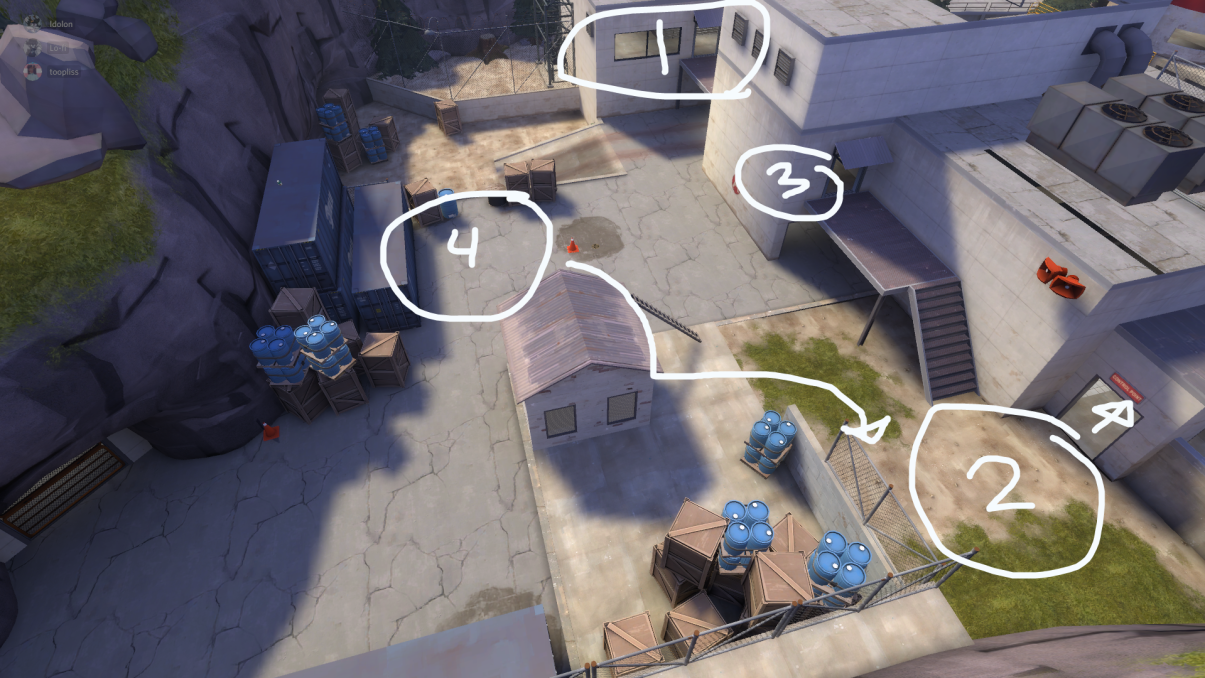
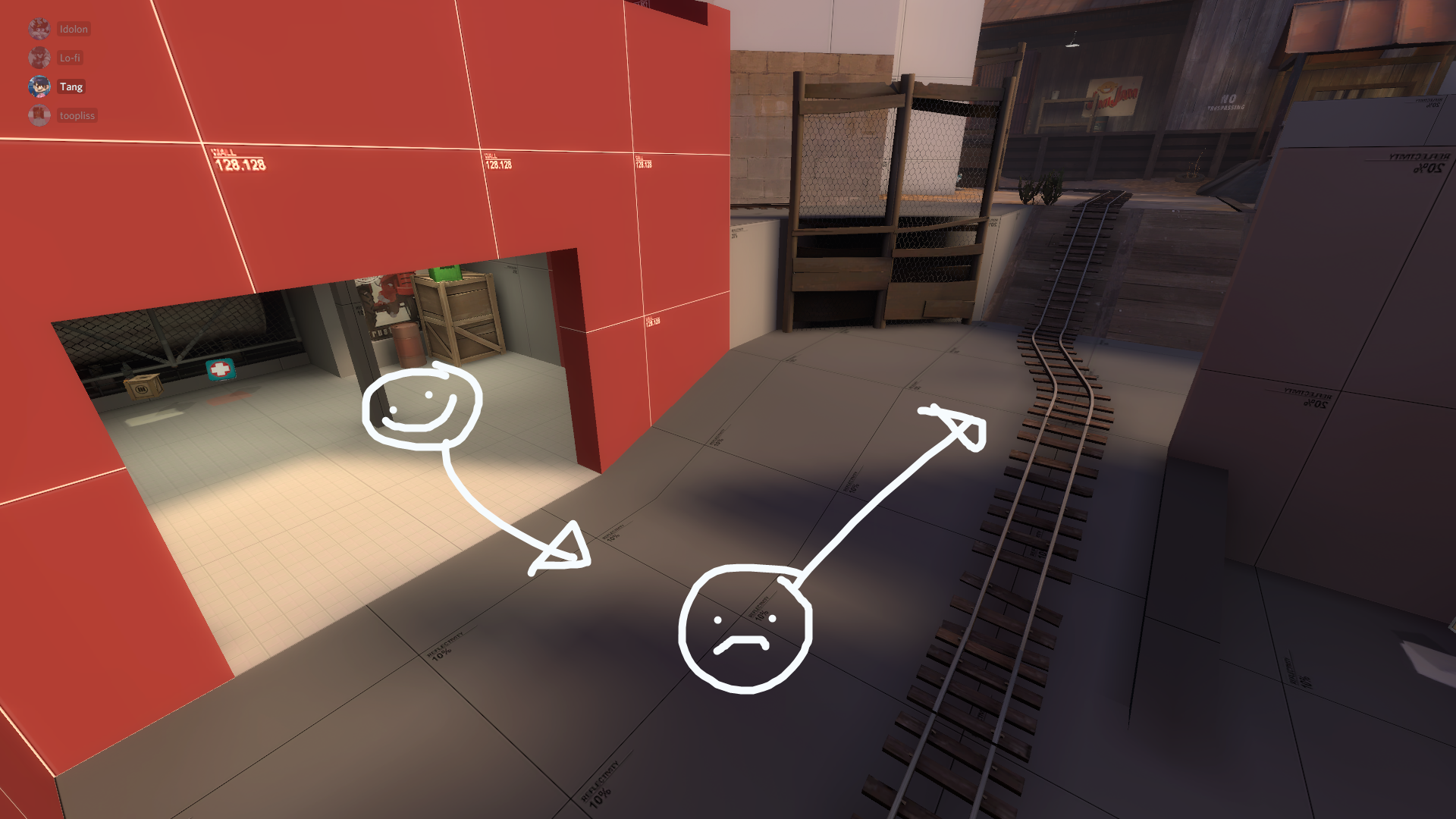
Also, this corner is weird.

upload_2020-10-10_10-35-6.png


B

This point is probably the best part of the map, quite happy with how it plays. No obvious issues at the moment, probably not changing anything significant for a15.

C

Brewery is fun to fight in and seems balanced, but the push out of the brewery onto the point is a bit of a slog. Blue needs a better way to hold forward and push into that area, and I have a couple of thoughts on how to do that.

The first idea is to reroute the high ground flank to free up the window room, then use that window room as a protected high ground for blue team to spam the point from. This seems like the best place to give blue a high ground / forward hold without disrupting the overall format of the map. (This would also help some optimization concerns I've had regarding those windows... though I'm not sure how useful the visibility provided to blue actually was.) My concern with this route is that red can't really use it for anything, and also blue can get access to it fairly quickly in their push, allowing them to start spamming red players before the team has really "earned" the ability to deal out protected spam that far forward.

upload_2020-10-10_9-55-34.png


The second idea is to make the forward hold a more powerful position to push C from. I think this is a better solution long-term, since it would reward blue team for pushing red out of an area. However, the current structure of the map doesn't allow for that very well, as the high ground is an inside corner that skips past most of the payload path rather than providing a more "complimentary" route to the main push. Also, any change here is going to mess with the rollout from blue forward spawn for pushing D.

upload_2020-10-10_10-3-40.png


The ideal here would be somewhere between these two options, where pushing the high ground route takes you to the window room... this could be achieved by mirroring the entire map past the brewery exit choke, but I don't really want to do that. Upsets too many existing spatial relationships in the map, I want to keep the final area behind the brewery so that there is a consistent visual landmark for final all throughout the map.

upload_2020-10-10_10-11-39.png


Perhaps the outdoor area could be reoriented to be more of a straightaway rather than a corner, which would allow more room to provide a high ground at this area. Enjoy this absolutely fucked paintover:

upload_2020-10-10_10-16-3.png


Another option is to just remove the dropdown into D and use that area for a high ground. This may be the least destructive way to improve C, depending on whether or not that change makes sense for D.

D

The geometry at this point is fun but the scaling and balance is off. Red was much more easily able to hold forward at the main choke into the area, for a variety of reasons, but seemingly mostly this:

upload_2020-10-10_10-20-56.png


While the cart path is a proper skirmish area where both teams are pushing and pulling and gaining and losing ground, red can also just skip past most of it straight to the choke. While I intended for this to be a forward hold for red, I did not anticipate just how good it would be. The size of the final area just doesn't lend itself well to red getting gradually flushed out of this area, its a bit all-or-nothing at the moment. This also means the point lends itself to spawn camping, as the final cart push is too close to red spawn. It's roughly upward sized but doesn't really work the same.

My first thought on how to fix this is to move the finale back to where it was previously and reorient spawn again. This would provide more space in front of red spawn so that camping is not necessary. It would also probably make sense for flow, since blue will most be pushing across the pit in this direction (rather than diagonally) once they own the playground area. It will also help balance that forward hold by increasing the walk time and making red players more exposed as they make their way there.

upload_2020-10-10_10-48-30.png


It would also help reinforce the overall structure of the map, with red spawning from the direction of the brewery. Just a nice thematic touch.

upload_2020-10-10_10-50-10.png
 

Idolon

they/them
aa
Feb 7, 2008
2,123
6,137
In the less eschatological conjecture we still live in, we would be better served by honoring past struggles - including those defeated - than sneering at them, because it would prime us for staying on their path. Defeat also has a pedagogical function, including those for the climate movement: without COP15 and the disappointments of early Obama, there might have been no turn towards mass action.

Climate fatalism is for the jaded and the deflated; it is a bourgeois luxury ... Climate fatalism is for those on top; its sole contribution is spoilage. The most religiously Gandhian climate activist, the most starry-eyed renewable energy entrepreneur, the most self-righteous believer in veganism as panacea, the most compromise-prone parliamentarian is infinitely preferable to the white man of the North who says "We're doomed - fall in peace.' Within the range of positions this side of climate denial, none is more despicable.

a15

-made map snowy

A:
-added building over forward hold area to make it more forward holdable
-added a window

B:
-no changes

C:
-moved point even further outdoors, added second rollback
-reworked "inside corner" to be a forward hold for blue

D:
-shortened cart path in fountain room quite a bit. much more like upward now
-removed main secondary route to fountain room
-relocated underground route to be quicker
-cave dropdown route is now a regular route

Read the rest of this update entry...
 

Idolon

they/them
aa
Feb 7, 2008
2,123
6,137
a16

-art pass
-clipping pass
-relocated red forward spawn, cutting roughly 3 seconds of walk time

A:
-added stairwell into main building allowing for rotation between top and bottom levels, making upper level useful as a route for blue, as well as allowing blue to clear the area so red players don't end up behind a blue push
-various adjustments to block some of the cheekier sightlines
-added small cover to point
-added another resupply cabinet to blue spawn

B:
-no changes

C:
-added bridge across middle of room as a high ground both teams can contest, and to make blue access to the far flank more difficult / make it a stronger red forward hold
-added switchback stair for quicker but riskier access to high ground
-adjusted cover at forward hold to better enable sentry nests
-removed far flank route to ease spawncamping on B
-added doors to block roof route access until B is capped
-moved kits near old spawn to a forward position

D:
-added safety advisory

Read the rest of this update entry...