Amazing

KotH Amazing v5borge

YM

LVL100 YM
aa
Dec 5, 2007
7,158
6,079
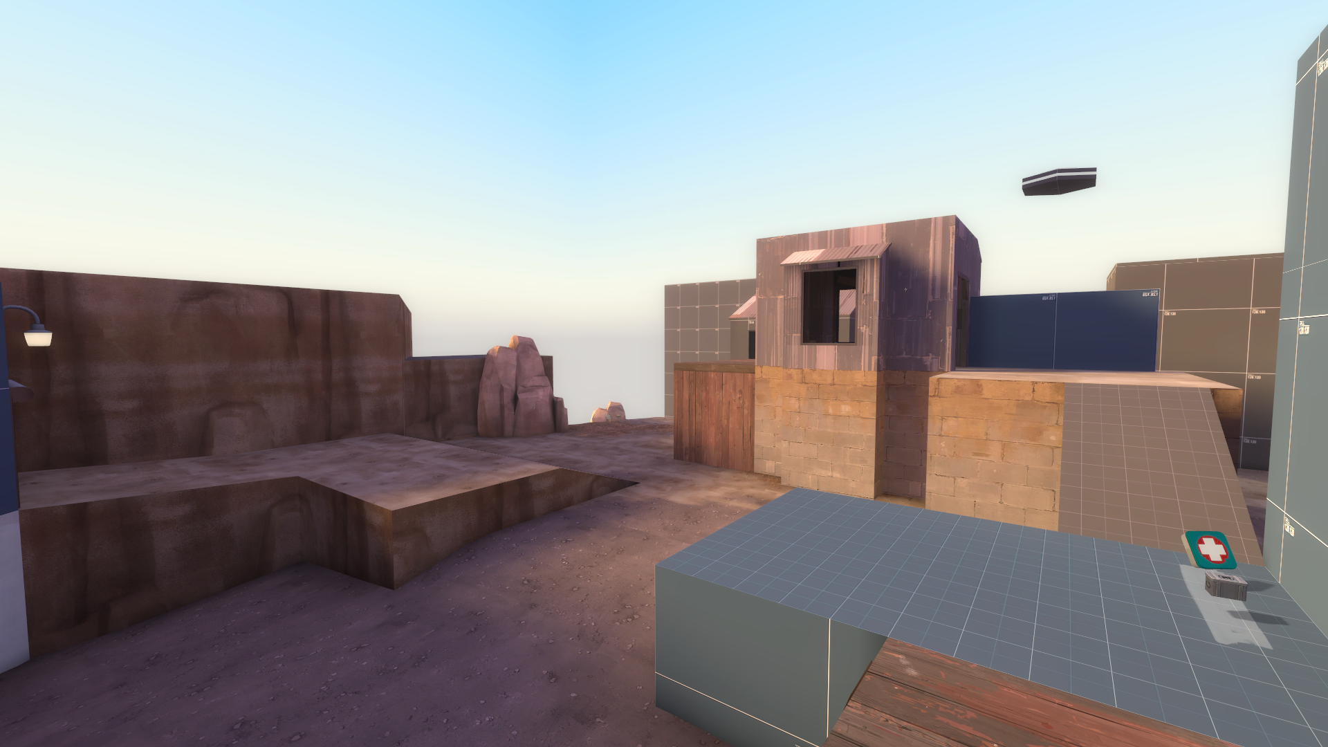
Having played this for the first time the other day my initial feedback is going to try and impres upon you how terrible vis is for this map. You've got massive long sightlines, you can see through thin slivers of doors and windows, every building is way below even mild jumping class jump height and there seems to be some kind of floating platform as a main gameplay feature that can see 100% of the map.

Without serious thought into vis, once you start putting anything more than dev boxes into this map it's going to turn into a treacle tart.

Try and fix this without changing much of the gameplay, but you will, inevitably have to change some areas substantially. You should break it up into at least three distinct vis areas, each of which which cannot possibly see the other two, from anywhere within them. One as mid, one as each team's side. (do 3 that can't see each other at all, or 5 that can partially see only the two either side of themselves)

If you want to keep most buildings short, put a thin row of super tall ones as the division between these areas. Big fences like goldrush/cactus canyon have are visually OK way to do this as well. (even if they're a little boring)

I feel it would be unfair of my to offer any gameplay feedback until I see a map that could at least concievably be optimised. You're not there yet.
 

Another Bad Pun

In the shadows, he saw four eyes lit by fire
aa
Jan 15, 2011
806
1,850
I finished koth_amazing_a8b a while back really, and I've had it tested plenty of times since then, 20 rounds with 49 FB's given with an exact team win ratio of 50:50, but I've never updated the thread until now. And now it's on the front page, 3 months later! muahah

koth_amazing_a8b has lots of stuff, such as:
-reverted a few changes from a7
-this included reverting the point from a7
-reverted some healthpack and ammo placement
-capping while on the UFO is now a feature
-changed the color of a blocked window
-fixed vis badly
-optimized a ton, hints and areaportals galore
-removed arena_doge_72 from map

Here's the DOWNLOAD if you somehow don't have the map already
hl2%202014-07-30%2015-41-24-86.png


I'm pretty sure this will be the final alpha, after all of these years. I really want to start detailing now, but I need to be very careful with it because visibility is very far, which makes detailing and optimization hard, and the latter has its own set of problems. I really don't know how to fix vis without altering the layout completely. Eventually I will be posting detailing screenshots. The goal is to create detailing that looks great from a long distance, because I have lots of those, but I also want to make something that looks nice up close. Even if that might be sparse. But I hope not. In terms of detail density, it might end up resembling Hydro.
I'll discuss the theme later, but it's basically Yukon with a Dustbowl skybox. I think it will work!
 
Last edited:

Another Bad Pun

In the shadows, he saw four eyes lit by fire
aa
Jan 15, 2011
806
1,850
Hello! The map is officially in "beta." Although 7/8 of the map is still dev textures, my reasoning behind b1 is that most of the ground floor is now displacements. Health packs have been changed as well, and I've adjusted a few things which will hopefully make each area feel more unique. I'm really trying to preserve the geometry I have. I've only tested this version once, and the last test will be in the gameday. The betas after this one will definitely be more complete.

koth_amazing_b1 has a few things, such as:
-map now in b1
-for a b1, not too much has changed in terms of detail and gameplay
-whoops
-changed full health-pack on cliff to a medium
-changed med-pack under cp bridge to a small
-created some rough displacements, with blends, to get a feel for the theme
-fixed lots of minor issues, not all related to gameplay
-I created a floating wood beam by accident, don't know how, but I went with it anyways and it kills you when touched
 
Last edited:

Another Bad Pun

In the shadows, he saw four eyes lit by fire
aa
Jan 15, 2011
806
1,850
I went ahead and released a newer version, koth_amazing_v1. Ammo and Health pickups have been either removed or moved somewhere else.
I really want to improve on:
-item placement
-length of the map
-optimization

So the next few versions of the map will focus on that and will have the suffix _v. It's a stage in between alpha and beta, because the map might gravitate back and forth between those two during versions.
This version will be tested in the gameday today.
Also, here's a fence.
fence.png
 
Last edited:

Another Bad Pun

In the shadows, he saw four eyes lit by fire
aa
Jan 15, 2011
806
1,850

Zed

Certified Most Crunk™
aa
Aug 7, 2014
1,241
1,025
A to the B to the V.

These suffix changes sure are kinky.
 

Idolon

they/them
aa
Feb 7, 2008
2,123
6,137
Nobody really uses this route unless their team owns the point. Even then, there's hardly any reason - it's very exposed, and unless you've got enough jumpin', you can't get to the point. It also exposes anyone trying to rotate through here to sniper fire from the point (and even across from the other side).

This route is a good candidate for a "main" route, but the deathpit and height disadvantage contradict that. I usually get killed if I try to use this route - people on the point have a lot of ground to use to attack you with, and it's a long ways to back up before you can get any cover. A smart point defender can also use the building next to it and flank you from behind.

Everywhere in the point area is visible from everywhere else in the point area. Unless you're hanging out by the doorways into the area, you've got virtually no cover to use. Cover and height advantage are pretty much the only things that keep every fight from being a matter of who can output more damage and/or aim a bit better, which makes weaker classes a lot less useful. In addition, it makes it very difficult for anyone to cross the map without being seen by the enemy team, so any fight over the point is just a matter of pushing forward hard enough to drive the enemy team back - no ambushes (unless the enemy team fucks up).

There are a lot of unexpected sightlines. Generally, you'll want to keep sightlines easily knowable. Getting picked off from unexpected places is frustrating. Even if the sightlines are tight/not that useful, it can make players anxious if they think they might get picked off from some unexpected spot. That sort of feeling can lead to players avoiding parts of the map that they really should be taking advantage of, and it's also just not fun at all.

On top of that, VVIS can't ignore those types of sightlines. If you can design your map around having no cheeky sightlines, then your map will run like a cheetah. See Reckoner for an example of this - it's rare that you can stand in one large area and see into another, but the rooms don't feel cramped. If you can see through from one to another, it's generally a limited portion (e.g. the layout takes a 90 degree turn right outside the next doorway).

Note that these sightline principles are part of what guided the so-called Viaduct Formula - all three of the connector routes in Viaduct take tight turns instead of leading straight through. It also just so happens that this sort of shape is generally more fun to play on (see my earlier point about cover).

Try to get away from the bar layout. If you want to push towards the point, you pretty much only ever go forwards, not side to side. There aren't any thick walls - just about every square inch of the layout is usable, and you rarely have to go very far horizontally before you can continue forward again.

This is a lot to take in, and it's probably a disproportionate amount of text for how much it will take to make this map better. I think you need to do a complete overhaul of the map, but you've got a lot of pieces to work with already. The individual gameplay spaces you have are fine, but the arrangement of them isn't doing you any good. If you want specific suggestions on how to make the layout better, feel free to ask, though I think it would be good for you to try and figure it out yourself.