-
This map is featured! Our best maps, all together in one place for your viewing pleasure.
You are using an out of date browser. It may not display this or other websites correctly.
You should upgrade or use an alternative browser.
You should upgrade or use an alternative browser.
- 3d skybox
- some relighting
- optimisation
- retreat routes back to blu spawn
- miscellaneous tweaks
- more deer
Read the rest of this update entry...
- some relighting
- optimisation
- retreat routes back to blu spawn
- miscellaneous tweaks
- more deer
Read the rest of this update entry...
A few detailing things:
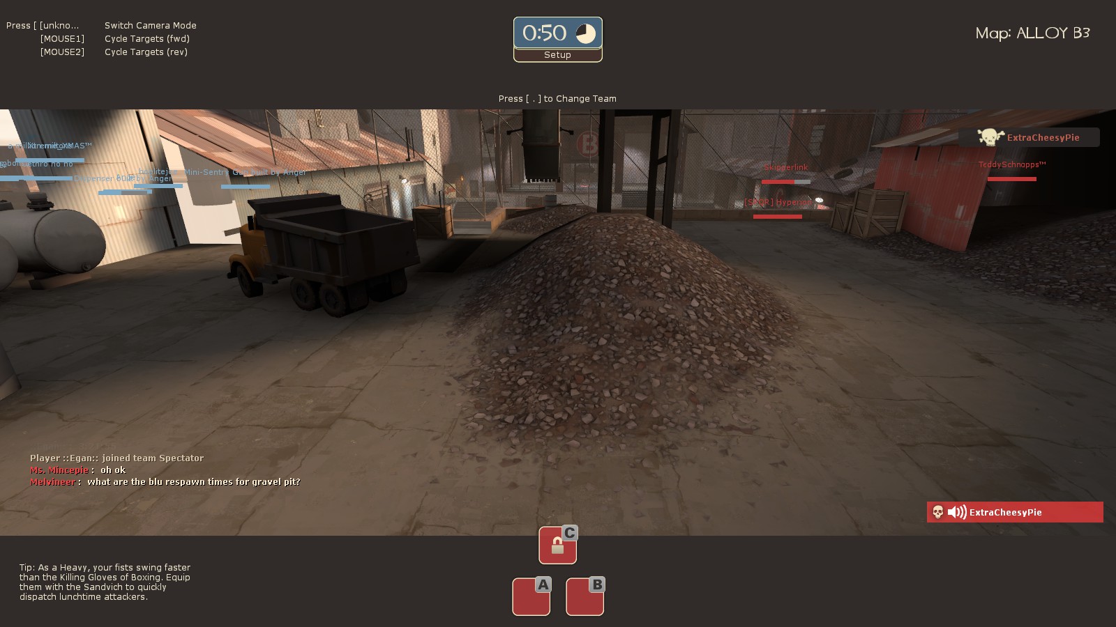
I'm sure you already know that in order to make a pile like this look right, you need to make sure that the alpha is at 100% all the way out to where the displacement goes flat. I'm just letting you know that there are a number of places where it doesn't, yet.
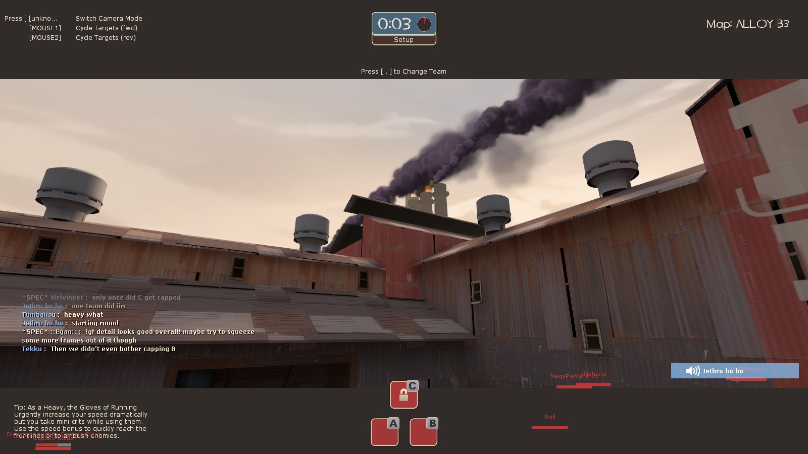
This building seems to be getting cut up by the skybox brush.
Also now that I look closer at it, you might want to fiddle with the roof textures there so you don't have a row of gaps right at the edge like that, especially directly over the row of gaps on the lower roof. And don't forget to wrap all your roof textures around the edges; I'm seeing horizontal meeting vertical.
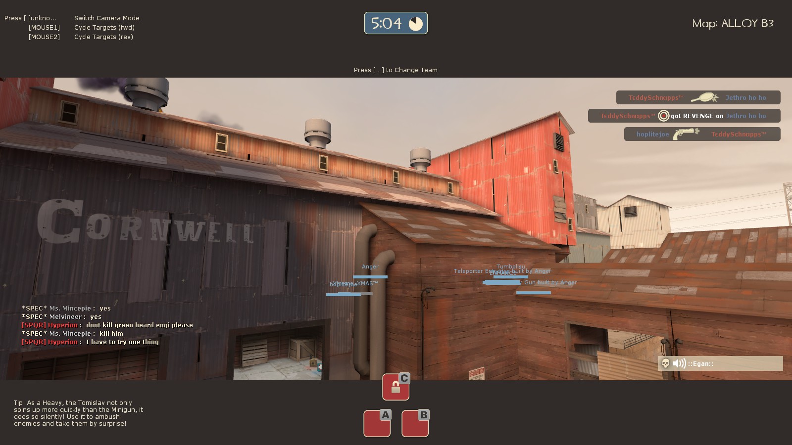
This ... just seemed awkward to me, in a way I can't put into words. Having two separate buildings with the exact same roof pitch so close that they almost join up but don't... I dunno. It's already kind of strange that an iron/steel works has some wooden outbuildings in the first place.

I'm sure you already know that in order to make a pile like this look right, you need to make sure that the alpha is at 100% all the way out to where the displacement goes flat. I'm just letting you know that there are a number of places where it doesn't, yet.

This building seems to be getting cut up by the skybox brush.
Also now that I look closer at it, you might want to fiddle with the roof textures there so you don't have a row of gaps right at the edge like that, especially directly over the row of gaps on the lower roof. And don't forget to wrap all your roof textures around the edges; I'm seeing horizontal meeting vertical.

This ... just seemed awkward to me, in a way I can't put into words. Having two separate buildings with the exact same roof pitch so close that they almost join up but don't... I dunno. It's already kind of strange that an iron/steel works has some wooden outbuildings in the first place.
- Fixed some issues around the map
- Added new route through train tunnel from A to C
Read the rest of this update entry...
- Added new route through train tunnel from A to C
Read the rest of this update entry...
- shortened blu respawn times
- moved respawnroomvisualizers forward
- misc tweaks/fixes
Read the rest of this update entry...
- moved respawnroomvisualizers forward
- misc tweaks/fixes
Read the rest of this update entry...
RELEASE CANDIDATE
- Altered the way C bonuses work, bridges remain the same but the platforms only raise when both points are captured.
- Bugfixes all over
- Polish all over
Read the rest of this update entry...
- Altered the way C bonuses work, bridges remain the same but the platforms only raise when both points are captured.
- Bugfixes all over
- Polish all over
Read the rest of this update entry...
- Added soundscapes
- Added particle effects in molten steel pit
- Fixed some weird textures/geometry
- Made dynamic point logic easier to test/demonstrate (for Fantasmos)
Read the rest of this update entry...
- Added particle effects in molten steel pit
- Fixed some weird textures/geometry
- Made dynamic point logic easier to test/demonstrate (for Fantasmos)
Read the rest of this update entry...
running around and commenting on things that are either kinda major or super nitpicky
If a train ran through here it would scrape the edges of this stuff up really badly
Was this slot in the concrete made specifically for these props to sit in? If someone removed those crates/barrels, the platform wouldn't make sense.
The smokestacks line up really well with the edge of the building, which just looks odd compositionally.
The playable space's lighting is really dim, and is identical to the lighting levels of the OOB areas. | The fence also gets kinda lost, which I think can be fixed with brighter lighting.
The doorways that Red people might be in are really easy to miss at a glance - especially the two to the right, which have interiors that are roughly as bright as the exterior wall. | Spotlight effect on a lightbulb is weird. Also, the doorway in this room kinda disappears into the blackness (I've hidden the bottom part of the wall with my scattergun to exaggerate the effect).
The individual red lights on the surface of these surfaces are easy to see.
Spooky ghost light! Ghost lighting is ok sometimes, but I don't think there's any reason to not have a prop for this one.
This should probably be a spotlight effect. Also, another ghost light.
A lot of your interiors have well lit floors, but the walls and ceiling disappear into blackness. You can get away with a dark ceiling, but walls are also important to see at a glance for understanding the size of the room you're in.
I like that you did the DO NOT BLOCK THIS DOORWAY gag without even using the sign.
You made these different sizes to make clipping easier, didn't you? Shame on you!!!
Red spies could get into the setup area this way.
Alloy is now on the steam workshop! Head on over there and check it out, with a finished trailer by @Fantasma as well!
Yuriy
L1: Registered
- Jan 4, 2016
- 1
- 1
This is a big attempt to creat a gravel pit under the roof. And I think it succeeded.
My first impressions are:
BLU spawn: on screens it's hard to see, but, like in Gravel pit, it's almost impossible to spawn camp. You have a large nice set up area. I like that toward Point B you kind of drop down. (more Gravel Pit references). A positive thing, that you can clim back to the base.
Point A: a very wide open area. A very generous for this type of map. And a cool small area behind the capture point. Is just great for spy and sniper.
Point B: like that it's possible to flank on several levels. And point capture house is big.
Point C: this a strange point, I would say. Not sure how the small platforms can help to cap point, but sure. Let's give it a try.
A-B connector: this is a maze! But, you can do a funny jumps from iron boxes with melting metal. And huge pipes are very organic there.
In general: this is a map, which is bigger on the inside. I didn't expect the distances to be that long (as like on Gravel Pit), and the volume of some rooms positively reminds me of Foundry huge halls. No light issues (though, it might be too bright for rooms, but I will take that as DX lag).
Last edited:
Updated on request of ETF2L
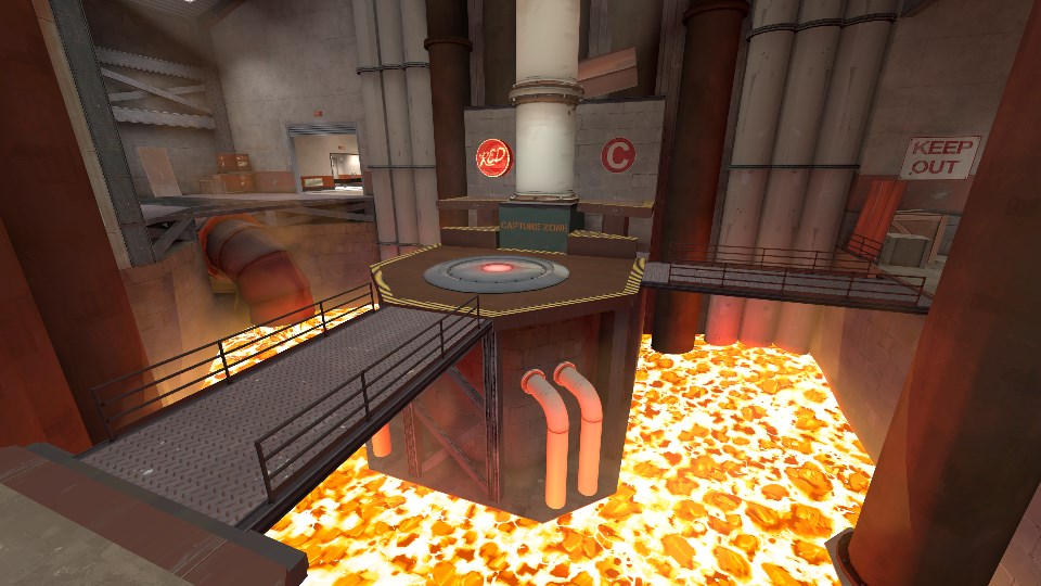
- Fixed capture logic to work with stopwatch games
- Added railings to bridges that raise when both A & B are capped
Read the rest of this update entry...
- Fixed capture logic to work with stopwatch games
- Added railings to bridges that raise when both A & B are capped

Read the rest of this update entry...
- fixed point logic for stopwatch again
- fixed a nonsolid prop you could hide stickies inside
Read the rest of this update entry...
- fixed a nonsolid prop you could hide stickies inside
Read the rest of this update entry...
D0om
L2: Junior Member
- Feb 26, 2016
- 97
- 104
I actually really liked how it played out in competitive setting. However, I think it needs a really experienced team to propely hold both points. Your combo needs to act quick and be really responsive. Sad it won't be played in season 10, imo its much better than gpit. If you wondered, here are some things I noticed:
- the general strat was to hold A and rotate to B when enemy team gets there, because its easier to retake
- the connector under the point is useless, easy to spam into and hard to push out of, not worth going through on any class except maybe spy
- once you lose one point its not worth to hold second at all, just go back to C
- B is unpushable from the front, I mean, really really unpushable. You have to pop once you dropdown and then the walktime to the actual combo position is huge
I think the biggest flaw of the map is that lower level teams have hard time holding it, but its also the biggest plus on top level. Really disappointed I wont see this map during season.
Yea Alloy was never designed with competitive in mind, I'm not sure why ETF2L played it at all.
Attempting to rebalance it for competitive really wouldn't be worth it tho, the most I would do is turn it into a regular GPit map but that wouldn't fix a lot of the flaws.
Alloy will forever remain a pub map.
Attempting to rebalance it for competitive really wouldn't be worth it tho, the most I would do is turn it into a regular GPit map but that wouldn't fix a lot of the flaws.
Alloy will forever remain a pub map.
- Demolished and rebuilt B building
- B point is now much more open, and lower
- New, higher entrace for Blu
- A-B connector now lower due to point being lowered
- C Point changes
- Area behind point now lower, entrance onto point
- Door closes when A and B are capped
- Little room behind point now useful for cover but can't cap from within
- A changes
- Roofs now jumpable, however players will slide off if they land on them
- New, shallower roof added for jumping classes to perch on
- A-C Flank entrance moved, interior made less cluttered by posts
- Lighting changes
- Whole map better lit
- Furnace lights made oranger for team recognition
- Chalkboard in Blu spawn now explains cap sequence, shows progress
- Misc visual changes/fixes
Read the rest of this update entry...
Last edited:
A few comments:
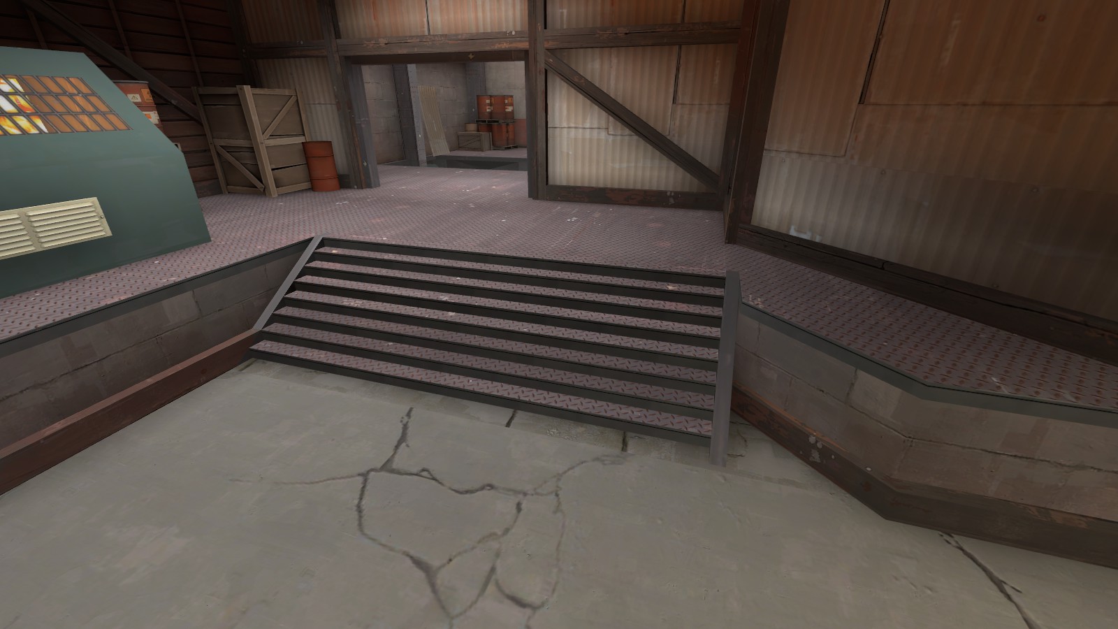
The texture under the stairs is wrong, and there's an alignment seam on the corrugated metal at the right. Also, just as a general comment, most of your staircases still only alternate between two alignments instead of four. This can be fixed fairly easily by going to one of the ones that's not and copying its alignments onto its neighbors with some right clicking, and then repeat until done.
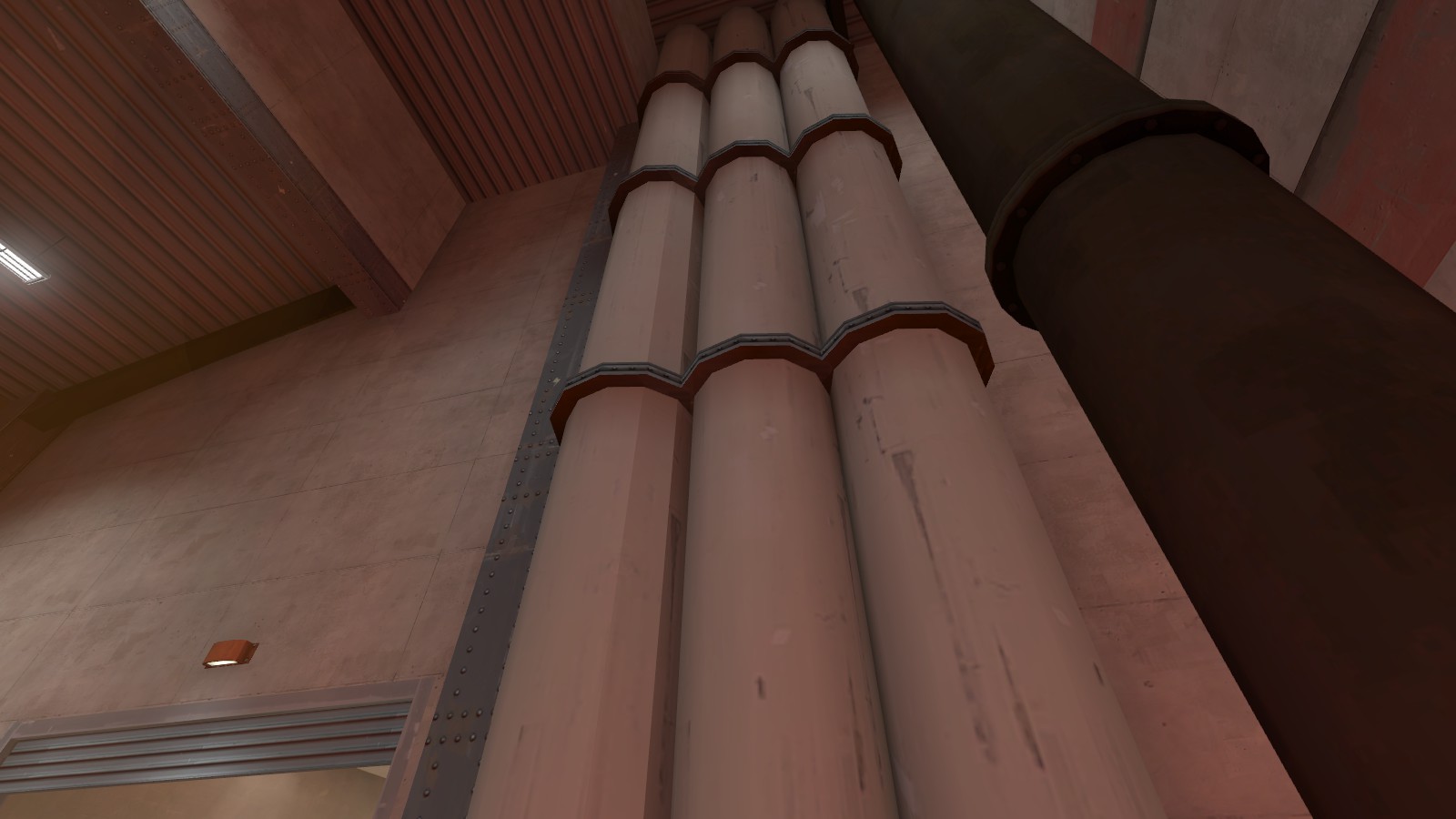
I didn't bring this up before because I had so many other points to make, but these pipes look really cheap. Very low poly and they don't even smooth properly in some places. I realize it's because they're brushwork; at this stage in development you could probably ask somebody to make you some custom models.
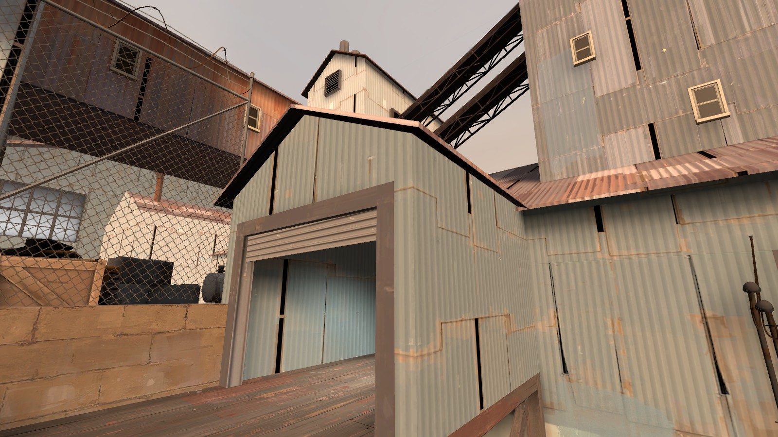
This roof still doesn't cast shadows and it still weirds me out
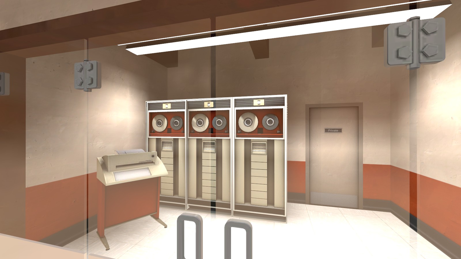
Last version I think I posted a reminder to manually disable self-shadowing on these so they don't end up looking wonky when you compile with -staticproppolys. Looks like you didn't.
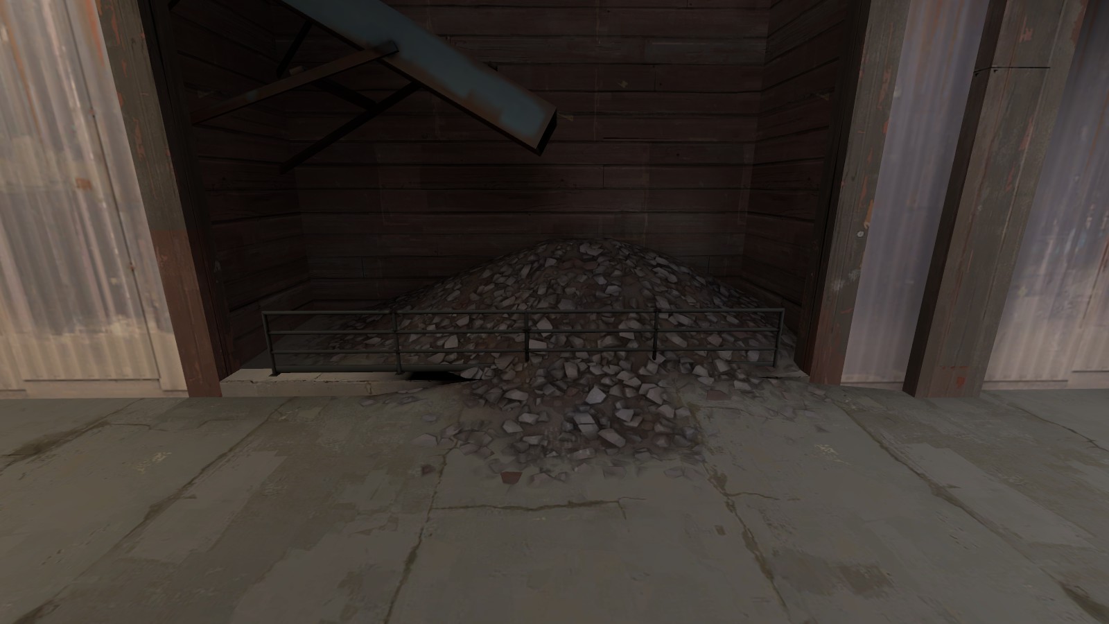
Aaaaand this thing again. You've got the ground rising up here when it's not supposed to (and clipping through the lip) because your Paint Alpha and Paint Geometry don't match up. Also you can see how the lighting is a little screwed up; I don't know if there's an easy fix for that except turning up the resolution of the lightmap.
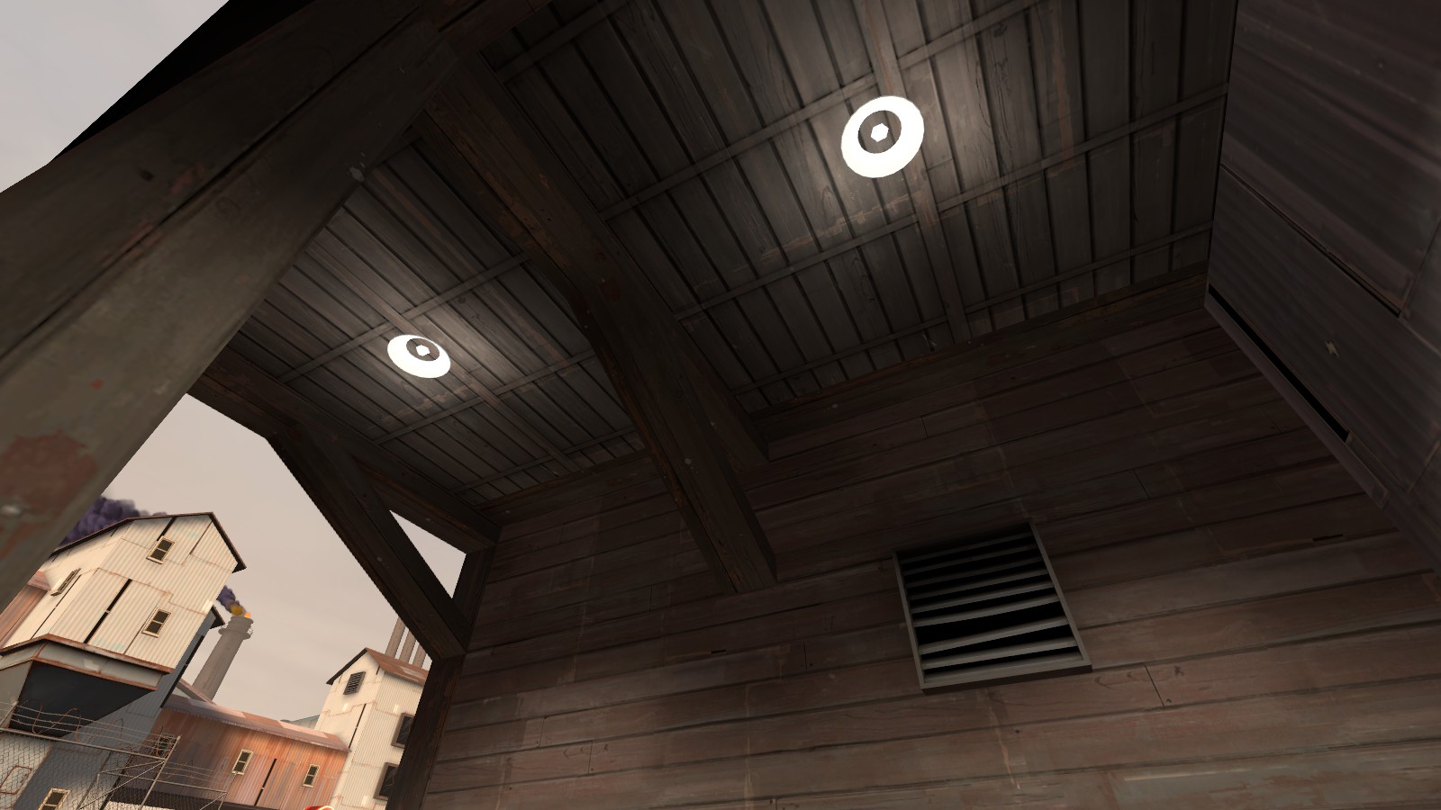
I was just about to call it a day when I shifted my camera and spotted these! 'Nuff said.

The texture under the stairs is wrong, and there's an alignment seam on the corrugated metal at the right. Also, just as a general comment, most of your staircases still only alternate between two alignments instead of four. This can be fixed fairly easily by going to one of the ones that's not and copying its alignments onto its neighbors with some right clicking, and then repeat until done.

I didn't bring this up before because I had so many other points to make, but these pipes look really cheap. Very low poly and they don't even smooth properly in some places. I realize it's because they're brushwork; at this stage in development you could probably ask somebody to make you some custom models.

This roof still doesn't cast shadows and it still weirds me out

Last version I think I posted a reminder to manually disable self-shadowing on these so they don't end up looking wonky when you compile with -staticproppolys. Looks like you didn't.

Aaaaand this thing again. You've got the ground rising up here when it's not supposed to (and clipping through the lip) because your Paint Alpha and Paint Geometry don't match up. Also you can see how the lighting is a little screwed up; I don't know if there's an easy fix for that except turning up the resolution of the lightmap.

I was just about to call it a day when I shifted my camera and spotted these! 'Nuff said.
- Miscellaneous graphical updates
- Lighting changes around C
- Updated to use the new deer props from Sunshine
- Replaced some messy prop areas with clean brushwork (smoother for movement and explosives)
- Blocked off a certain roof again
- Extended B hut to be more usable for attacking scouts
Read the rest of this update entry...
- Lighting changes around C
- Updated to use the new deer props from Sunshine
- Replaced some messy prop areas with clean brushwork (smoother for movement and explosives)
- Blocked off a certain roof again
- Extended B hut to be more usable for attacking scouts
Read the rest of this update entry...


