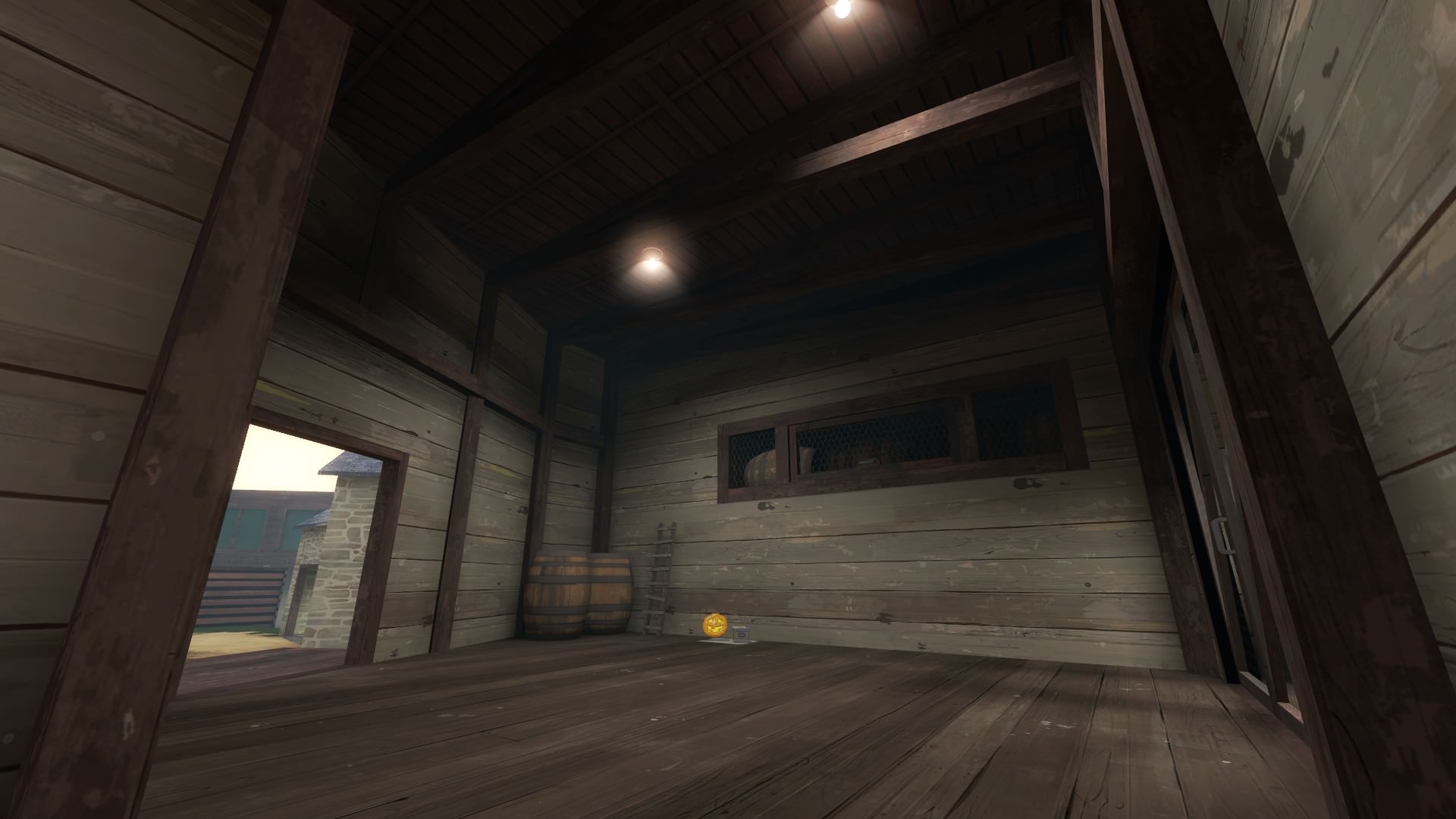
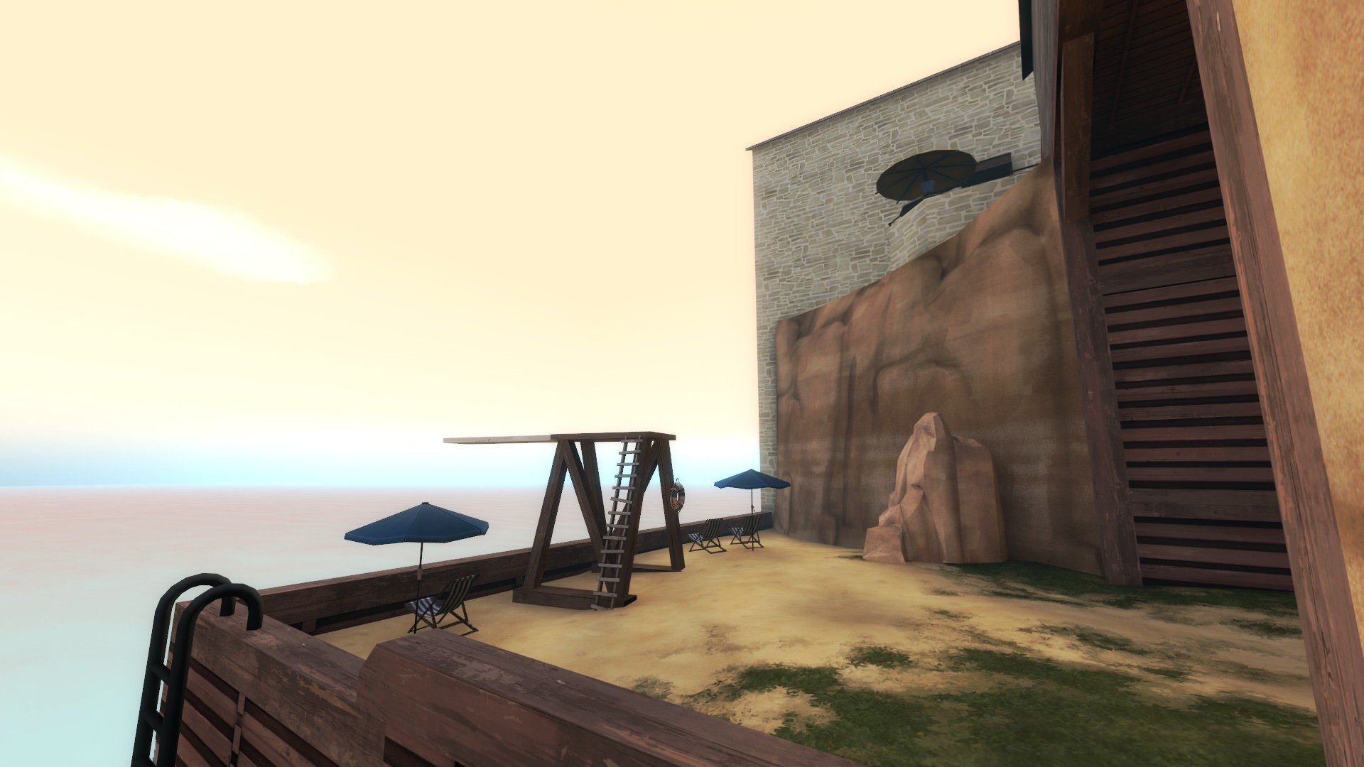
Rather than having hard shadows everywhere like CS:GO (or any modern game because realism) you can still have shadows that look a bit washed out (no hard edges), kinda like the current lightmapped shadows (which are also a bit washed out looking without hard edges and lots of contrast between something in shadows and something in direct lighting), right? But still be way better than the current blocky-ness of lightmapped shadows.Could you rephrase the question? I'm not sure that I follow.
WiP in WiP, post your screenshots!
- Thread starter Arhurt
- Start date
You are using an out of date browser. It may not display this or other websites correctly.
You should upgrade or use an alternative browser.
You should upgrade or use an alternative browser.
Lampenpam
aa
- Mar 23, 2013
- 1,013
- 347
Personally, I don't think tf2 would look very good with sharper shadows everywhere
I agree and thats why I have shadows set to low in tf2 because imo they look much better. Also the high shadows overlap and thats just plain unrealistic and throws me off everytime I see it.
I don't think Source has a way to blur the cascading shadows, no. But apparently Black Mesa does.Rather than having hard shadows everywhere like CS:GO (or any modern game because realism) you can still have shadows that look a bit washed out (no hard edges), kinda like the current lightmapped shadows (which are also a bit washed out looking without hard edges and lots of contrast between something in shadows and something in direct lighting), right? But still be way better than the current blocky-ness of lightmapped shadows.
Lampenpam
aa
- Mar 23, 2013
- 1,013
- 347
But apparently Black Mesa does.
Black mesa doesnt have those though? They are all lightmaps, or are the old hl2 dynamic shadows blurred?
Black Mesa (the paid version) added their own implementation of cascading shadows that don't break in conjunction with flickering lights and have an option in the settings menu to make them blurrier (which apparently impacts performance something awful).
Yup, the soft shadows option. It takes so mich fps away it actually crashes the game on my system.Black Mesa (the paid version) added their own implementation of cascading shadows that don't break in conjunction with flickering lights and have an option in the settings menu to make them blurrier (which apparently impacts performance something awful).
I like the concept but I think the art style is way too off from tf2 (not that any powerhouse skins fit tf2). If you could change the pixel style to more cartoon style with no visible pixels, it will work nice.Jumping on the bandwagon, and working on a weapon skin.
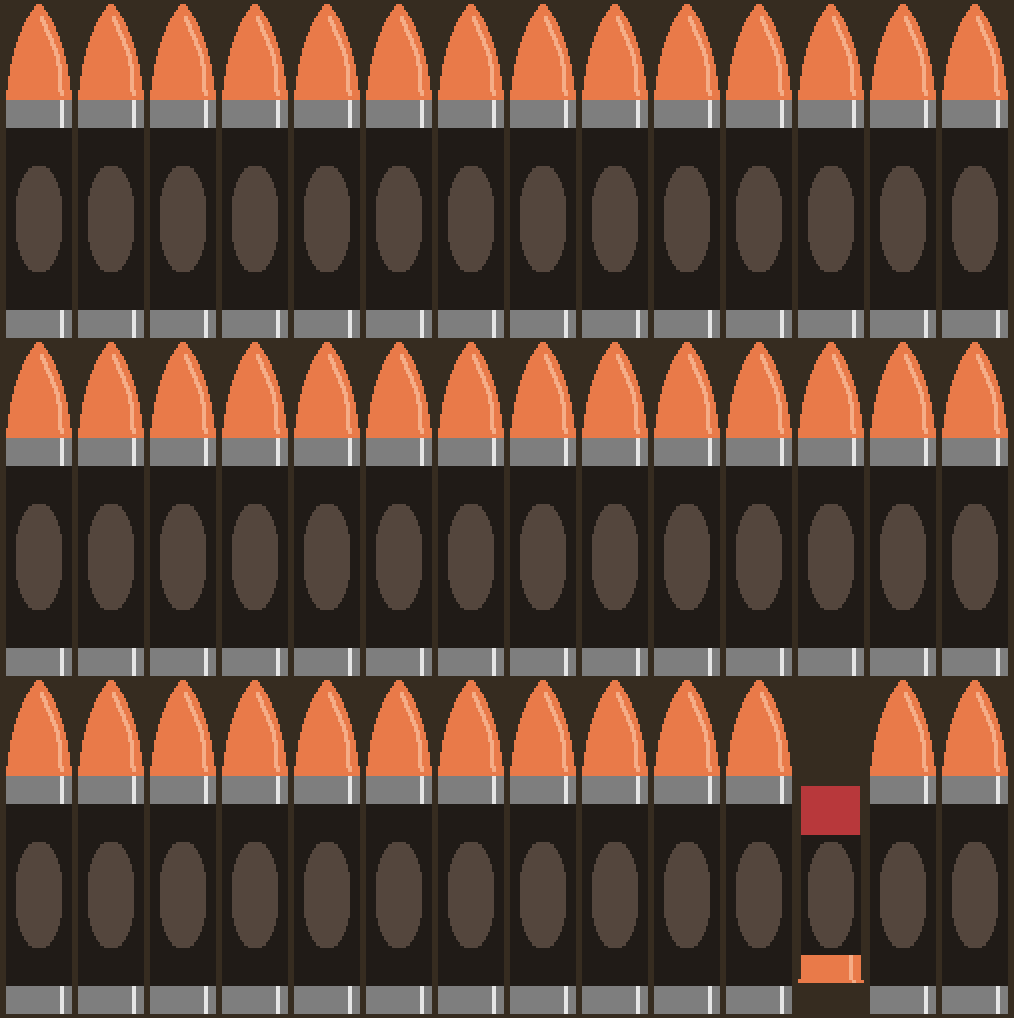
Give me feedback! This is still a WIP and I need to make some changes. Giving me feedback can help me find problems I might have overlooked!
S
saph
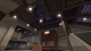
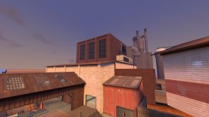
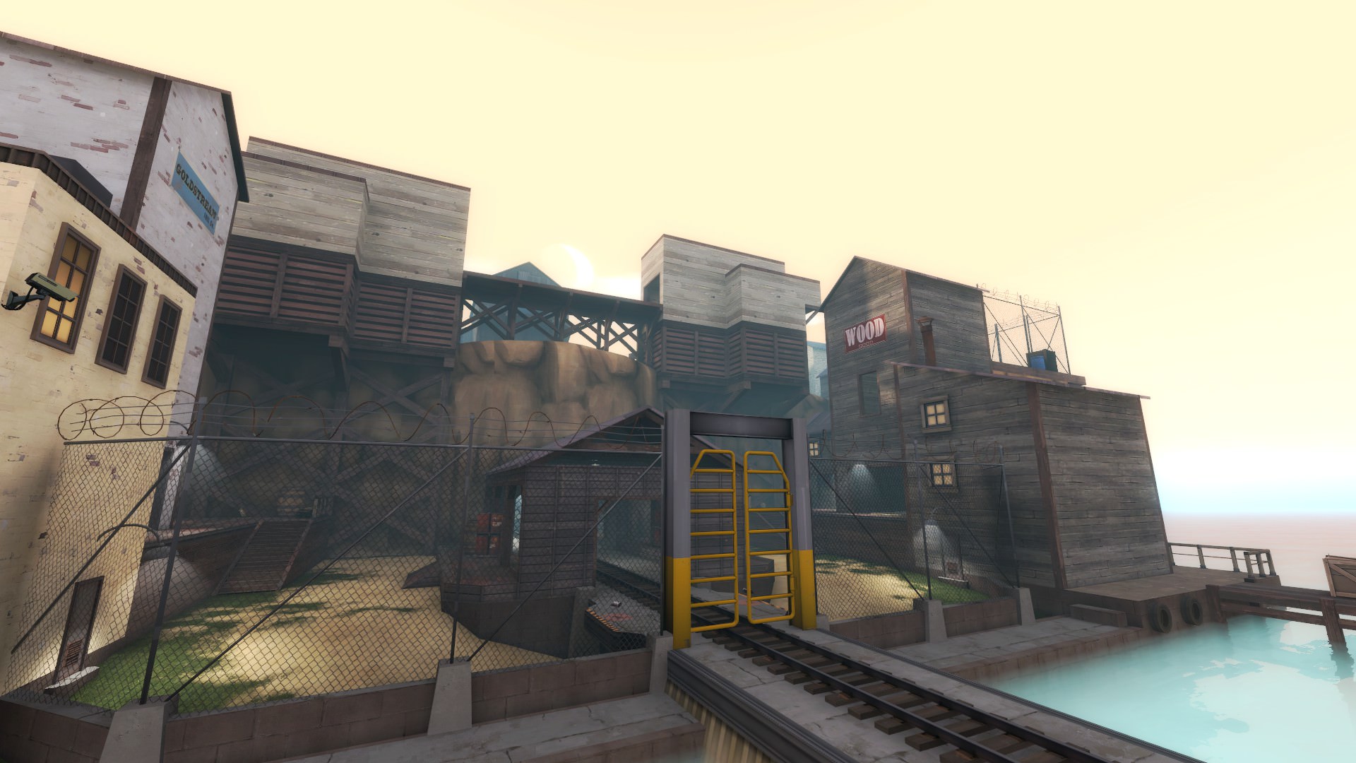
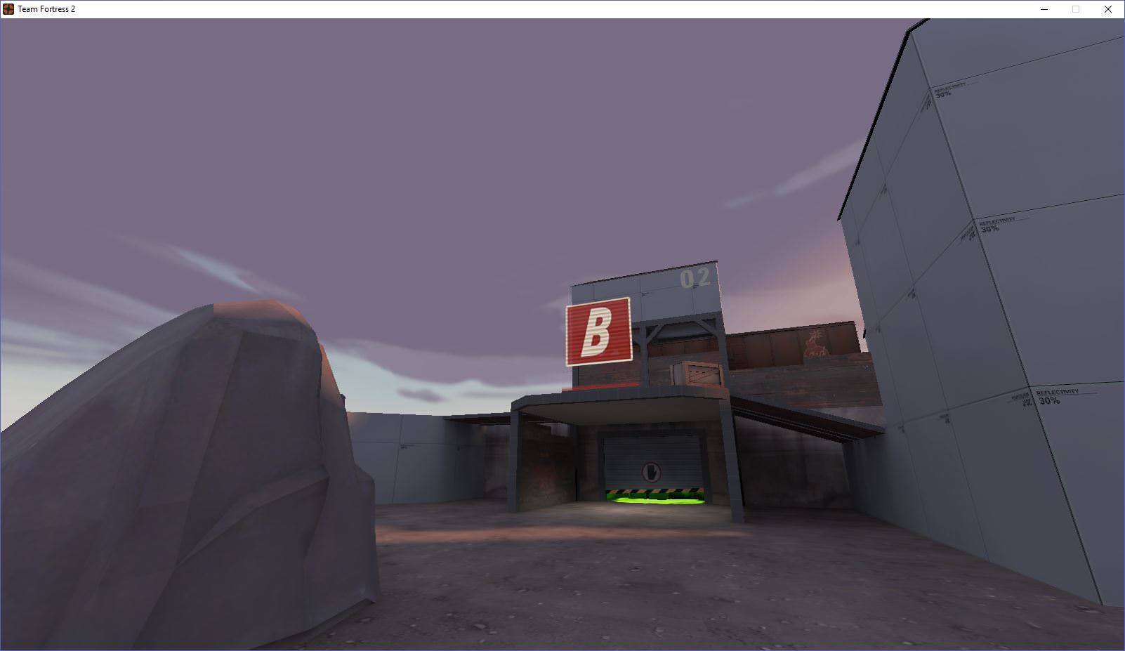
I haven't posted in a while due to trying to grind out the complete overhaul of Conduit. Got bored the other day and decided to try a crack a Steelpit again. Here's a scrapped idea. (The point being flush to the back causes all sorts of issues, but I have some decent brushwork done elsewhere.) Back to square one for B though. I'll post A in a couple of days probably. Maybe I'll have a release in time for my birthday, we'll see.
Berry's Autumn Pack and Void's Nuclear Waste are looking great though.

Berry's Autumn Pack and Void's Nuclear Waste are looking great though.


imo the white does not mix with the brown and green well, I'd try to use some other color for thatMy first "serious" weapon skin:
Bonus bread!

I chose a poop skin for testing the look of it because civic duty has pretty small pattern scale, but its something...
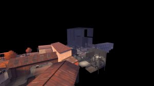
If you create your 3D skybox geometry at a regular scale first along with the rest of your map, put the sky_camera at the map's origin, select the camera along with the geometry, and then shrink it by 1/16, everything should align with the playable map.Do you know the correct way to align the skybox, or are you just guessing?
(Unless you're just asking Jusa if they know how to align a 3D skybox, which... they just demonstrated that they can so I'm not sure why you'd ask.)


