WiP in WiP, post your screenshots!

nitewalker

L2: Junior Member
Aug 5, 2014
64
142
los angeles river inspired koth, really just me experimenting with geometry

1EE2AEF2BABCA59BDBB11BDD4C47A40E7726C041
 
Nov 13, 2015
138
512
B7A1F6829915DDF57DF88B7DE28B2A666F796E4A


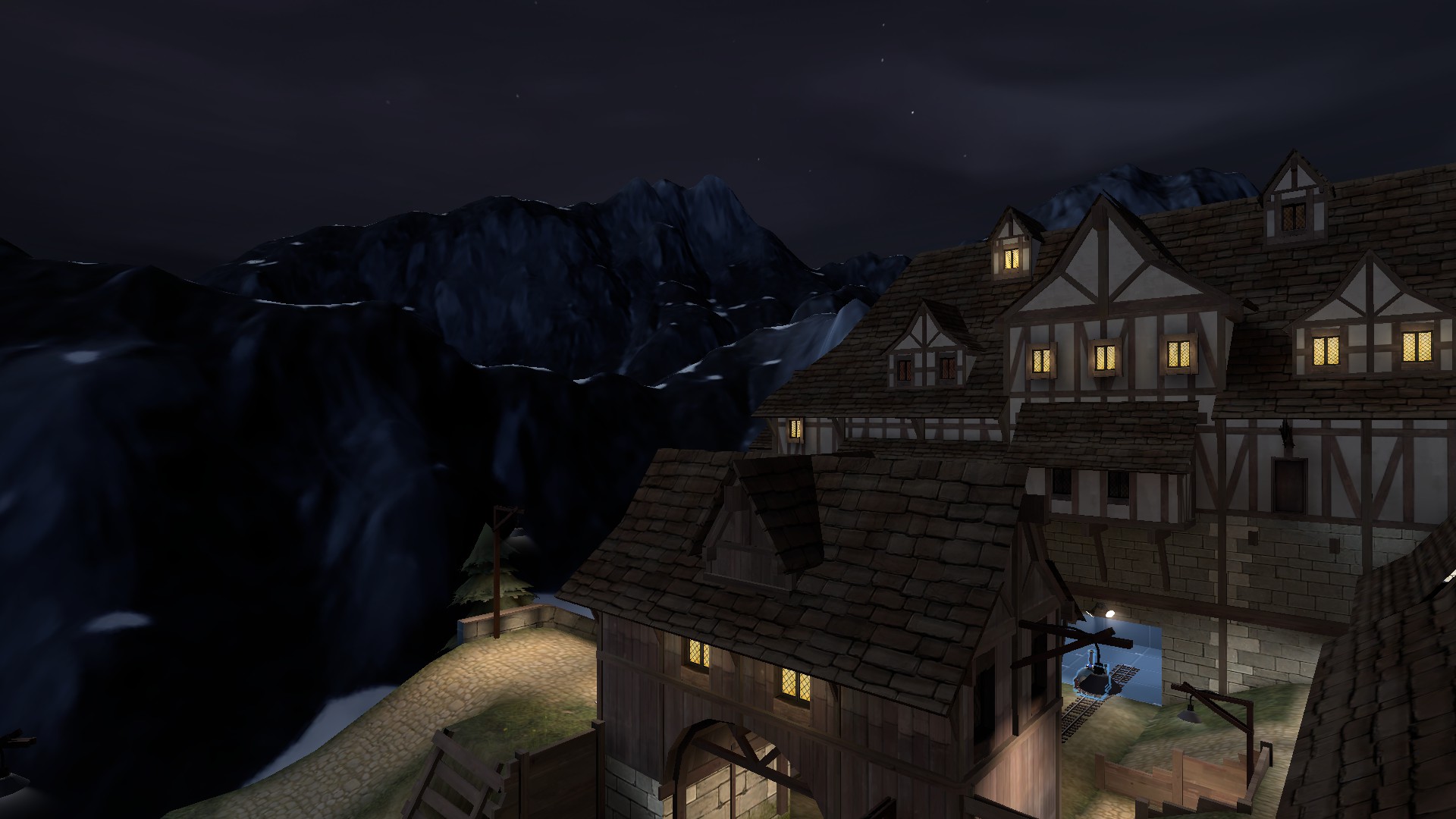
updated the roof color (now a little darker), also been working on the backdrop...at first I was really excited to do something cold and dark, but as the real winter is starting to kick in I'm starting to reconsider turning it into a super happy lala land with rainbows and mushrooms...
(I also switched out the skymap to one of the standard tf2 ones)
 

Uncuepa

aa
Oct 25, 2014
799
1,168
B7A1F6829915DDF57DF88B7DE28B2A666F796E4A


updated the roof color (now a little darker), also been working on the backdrop...at first I was really excited to do something cold and dark, but as the real winter is starting to kick in I'm starting to reconsider turning it into a super happy lala land with rainbows and mushrooms...
(I also switched out the skymap to one of the standard tf2 ones)

Need to scale that mountain down a lot. At least half, but ideally to a quarter of what it currently is
 

nitewalker

L2: Junior Member
Aug 5, 2014
64
142
updated the roof color (now a little darker), also been working on the backdrop...at first I was really excited to do something cold and dark, but as the real winter is starting to kick in I'm starting to reconsider turning it into a super happy lala land with rainbows and mushrooms...
(I also switched out the skymap to one of the standard tf2 ones)

roof color swap is great, definitely meshes better with the tf2 style now, same with the skybox. as for the mountain, its not necessarily the scale that is the issue, just the way its defined. it looks like it would make an excellent mountainous backdrop to a counter strike map, but it doesn't work so well with tf2. take a look at some tf2 maps with mountainous backdrops and see how they do it in keeping with the artstyle, also maybe take a look at this video, it has some great mountainous areas/skyboxes


your mountain does seem sort of overwhelming right now because it is so detailed, large and close to the playing area, as well as having a texture that sort of clashes with the tf2 aesthetic.

looks really good otherwise though, also make sure you get the map tested before you get too far into detailing
 

sooshey

:3c
aa
Jan 7, 2015
514
410
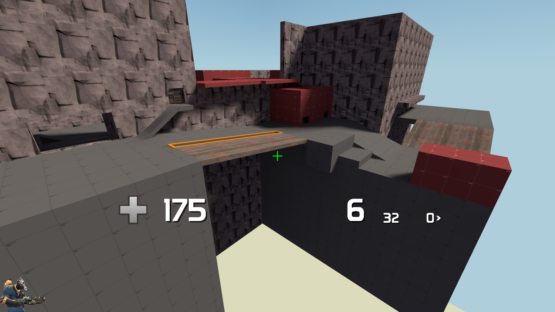
I started working on a pl map that I'm gonna call pl_altitude. The cart travels along/up the face of a cliff and will eventually end up at the top.
Here's what i have so far, but please pardon the darkness in some places lol i forgot to put up lights.
RevvzN0.jpg

agAfbbc.jpg

jqj2JYr.jpg

jHGpTG9.jpg
 

Vel0city

func_fish
aa
Dec 6, 2014
1,947
1,589
I started working on a pl map that I'm gonna call pl_altitude. The cart travels along/up the face of a cliff and will eventually end up at the top.
Here's what i have so far, but please pardon the darkness in some places lol i forgot to put up lights.
RevvzN0.jpg

agAfbbc.jpg

jqj2JYr.jpg

jHGpTG9.jpg
Don't make the cliff too open though (unless it's a high risk-high reward flank like on upward). You'll make the Pyros happy.
 
Nov 13, 2015
138
512
Need to scale that mountain down a lot. At least half, but ideally to a quarter of what it currently is

Yarr, will play some more with the scale, I'll start with increasing the width and depth x4, that will make them feel less tall and appear further away,


roof color swap is great, definitely meshes better with the tf2 style now, same with the skybox. as for the mountain, its not necessarily the scale that is the issue, just the way its defined. it looks like it would make an excellent mountainous backdrop to a counter strike map, but it doesn't work so well with tf2. take a look at some tf2 maps with mountainous backdrops and see how they do it in keeping with the artstyle, also maybe take a look at this video, it has some great mountainous areas/skyboxes

your mountain does seem sort of overwhelming right now because it is so detailed, large and close to the playing area, as well as having a texture that sort of clashes with the tf2 aesthetic.

looks really good otherwise though, also make sure you get the map tested before you get too far into detailing

That's one impressive movie! had a still from that movie as reference...but errr didn't end up anywhere close (which is awesome, because I get to try some more :)) probably need to decrease the resolution and add some visual reference, like trees and perhaps some ruins along the other ridges
 

zahndah

professional letter
aa
Jul 4, 2015
766
647
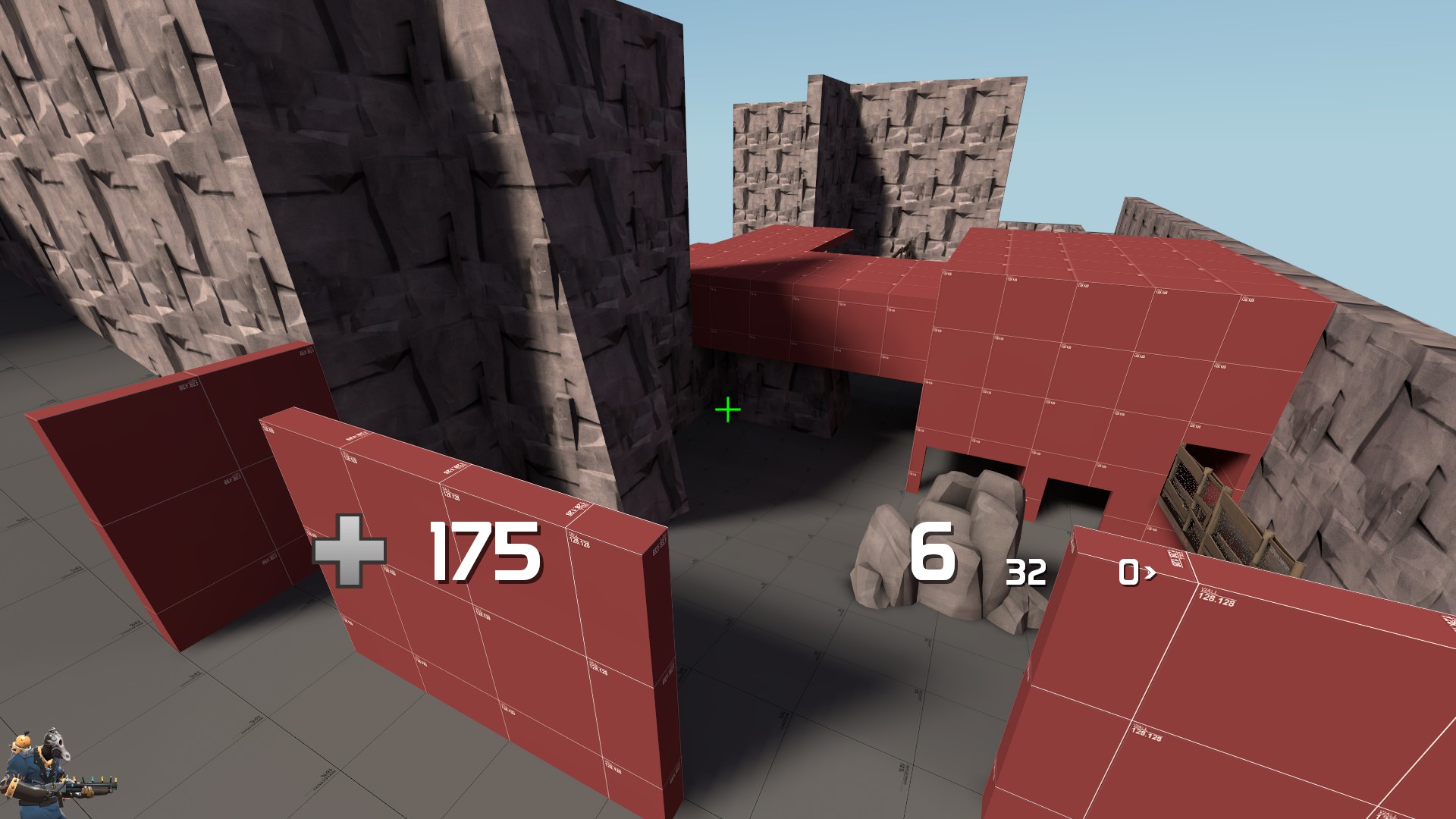
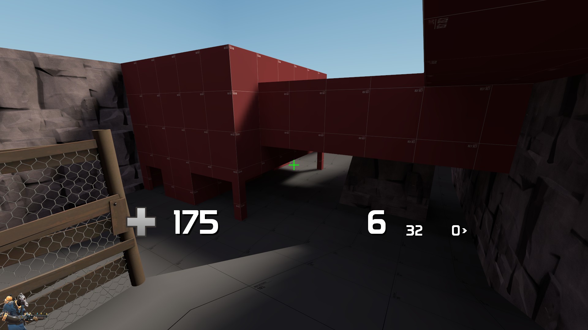
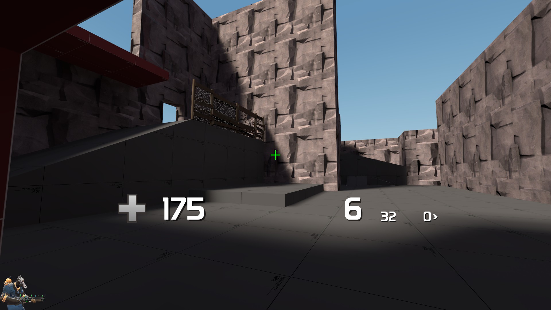
Adding extra high up areas to stop spam from high up areas feels counterproductive...
koth_drudic_a6dev0000.jpg
koth_drudic_a6dev0001.jpg
 

SSX

aa
Feb 2, 2014
392
411
No, cp_foundry_event isn't dead, Fallout 4 has just consumed my life.

More WIP hammer screenshots:

96EmPuG.png

IyP8StD.png

9yQglW2.png

ck29Me6.png
 

TPC

L1: Registered
Nov 7, 2015
33
8
Ever since I have gotten mass feedback on my Shitty first map I started to revamp the entire map
so since scrap day I have only shared one image so this is what the map is in its current state please if you have any comments on how you see the layout is please tell on my forum thread for elpunto the only map I have also I have since gotten rid of the giant mountains of gravel because displacement is a pain in the ass Note map is out click on signature to see A1
2015-11-27_00002.jpg
2015-11-27_00006.jpg
2015-11-27_00004.jpg
2015-11-27_00003.jpg
 
Last edited:

Seba

DR. BIG FUCKER, PHD
aa
Jun 9, 2009
2,364
2,728
That doesn't look very fun to play on, there's two paths to take to the point (which is tiny and dark) both of which are open and flat. Look at how Viaduct and Lakeside work: they have the point in a large area, then a tall structure with battlements, then a yard to access said battlements, then another structure and finally the spawn. Try doing something similar, where the point is overlooked by some good places to attack from but it's difficult for the team owning the point to push into the enemy's yard. I'm no koth mapping pro but I'd say that'll be a better start than what you have up there.
 

TPC

L1: Registered
Nov 7, 2015
33
8
That doesn't look very fun to play on, there's two paths to take to the point (which is tiny and dark) both of which are open and flat. Look at how Viaduct and Lakeside work: they have the point in a large area, then a tall structure with battlements, then a yard to access said battlements, then another structure and finally the spawn. Try doing something similar, where the point is overlooked by some good places to attack from but it's difficult for the team owning the point to push into the enemy's yard. I'm no koth mapping pro but I'd say that'll be a better start than what you have up there.

Its in a1 and its dark because i was to lazy to add lights which is going in a2 but I take the other things into concideration
 

chemelia

yndersn't
aa
May 11, 2014
406
619
First of all, "it's a1" is no excuse to just dismiss all feedback(an exception being detail feedback). Why would you post in wip thread at all if you're just going to deflect what people tell you?

Second of all, if a map has any major area that is too dark to tell team color, it is NOT a playable alpha. Light is very important in level design. Also, "because of laziness" is the absolute worst reason not to do something.
 

Pocket

Half a Lambert is better than one.
aa
Nov 14, 2009
4,705
2,584
Nah, I'd say "Because the voices in my head told me to" is the worst reason. Laziness is a close second though.