Trained moneys?
I wrote it after being up for 24 hours. Been chasing typos all day...
Trained moneys?
I remember it being getting 300 ratings. Congrats for veteran btw.Does being level 7 get you veteran?
I approve.In other news, mudpie you're welcome
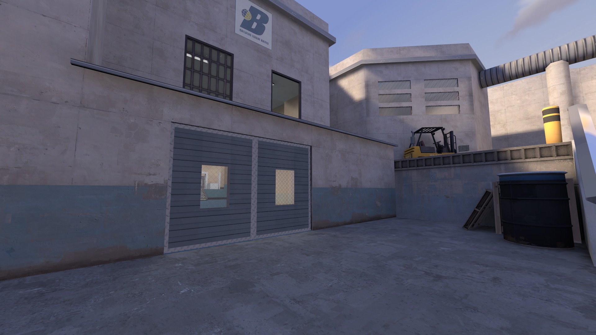
Good to know my name will forever be remembered alongside shitty coffee.
In other news, mudpie you're welcome
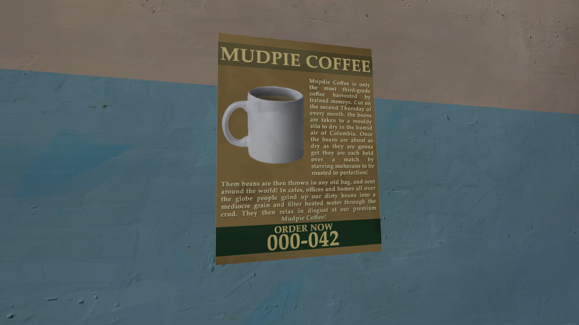
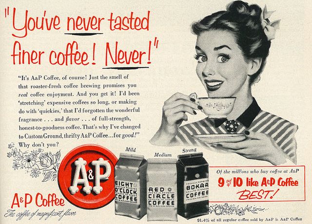
This poster is nice and all but has about twenty times as many words on it as it should.
In which case the question is: why are you doing a stupid thing
That isn't an answer.
In which case the question is: why are you doing a stupid thing
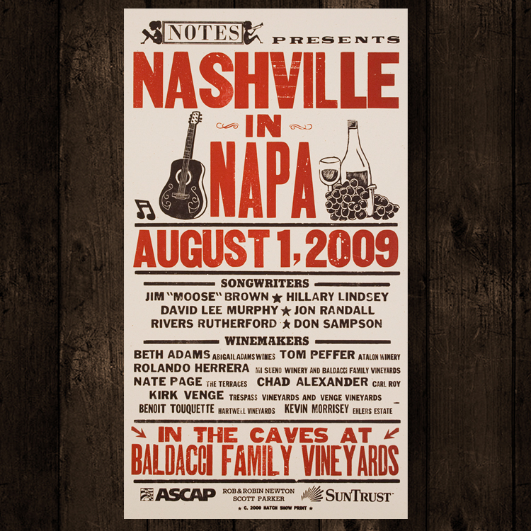
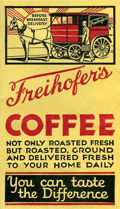
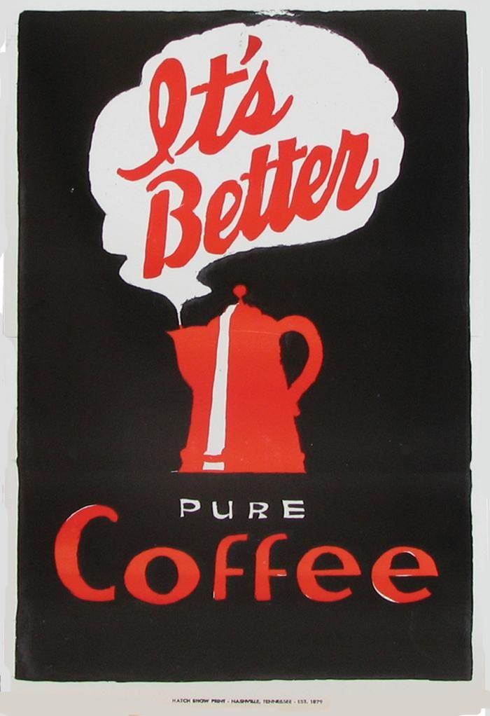
Because people are allowed to have fun with the things they make, and you don't have to call them bad for doing it.It's not about an advertisment technique - Its about why are you doing something that is counter to tf2's artstyle and looks bad? There's nothing stopping you doing that, but I hope you have a better reason than "lol idunno".
It's different in that I would explain to you what's wrong and not say you do stupid things instead.He never said Uncuepa was a bad person, he's critiquing detailing. It's no different than if he'd used a realistic texture and someone said it didn't fit the game's art style.
Has about 20 time's as many words as it should
It's different in that I would explain to you what's wrong and not say you do stupid things instead.
