WiP in WiP, post your screenshots!

Yacan1

D I G I T A L I N F L U E N C E R
aa
Nov 7, 2010
411
793
My love for fallout knows no bounds.
E3A837A8BBC8CDC800A14F62FFDCD79DD2B22E82
 

Uncuepa

aa
Oct 25, 2014
799
1,168
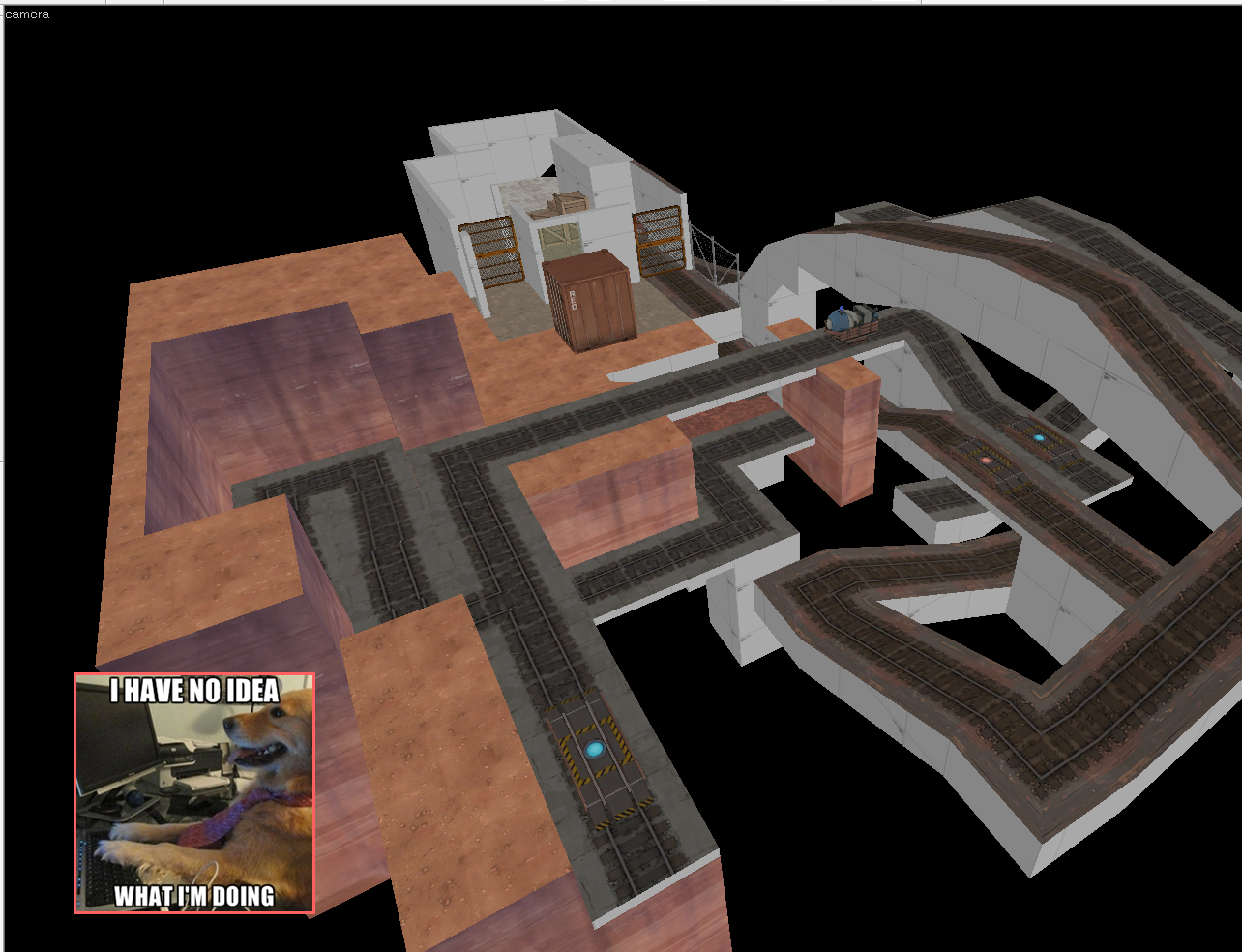
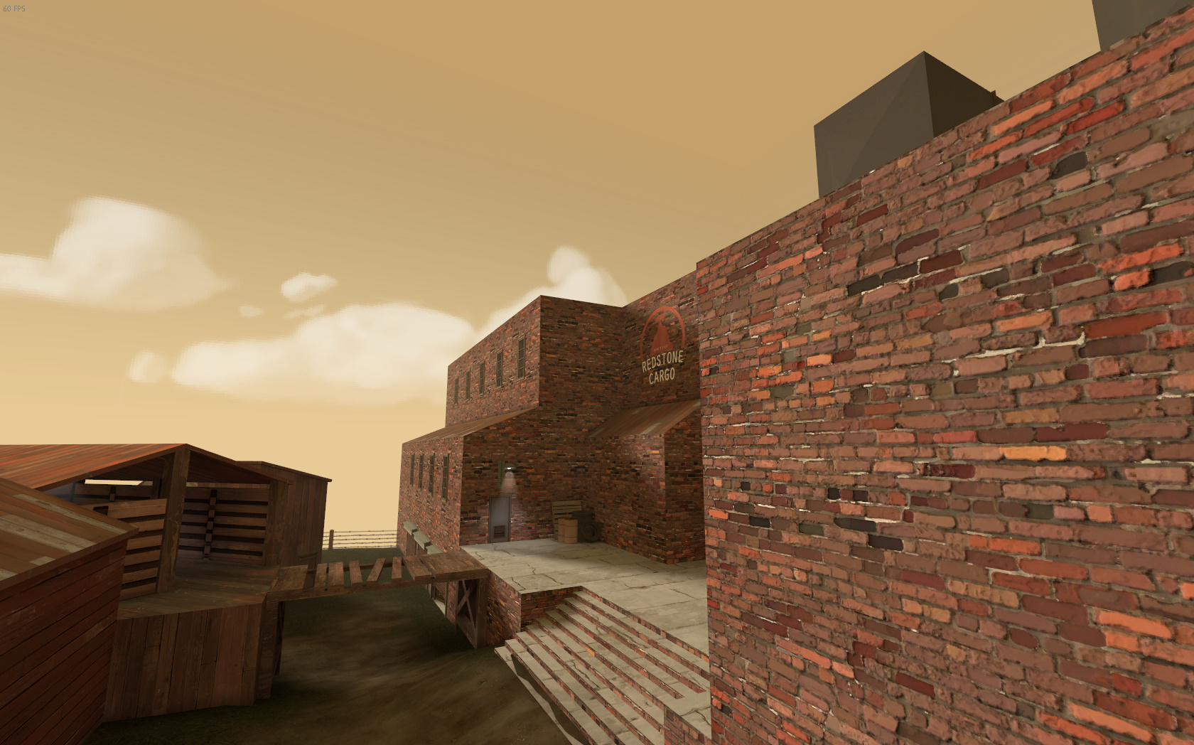
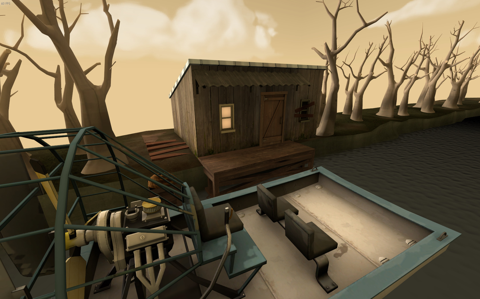
Doing some changes to Sandsnake to make it more defensible and flow better

PmI1dmN.jpg

Changed some fences, rocks, reworked the big container to a small container and a crane.

OfFl8KJ.jpg

Reworked first building to be less sadistic. By that, I mean I removed the deathpit next to pick-ups.

aCh0MT7.jpg

Reworked the lead up to third to loop around for more defense value, and to be less sniper heaven.
 

HQDefault

...what
aa
Aug 6, 2014
1,056
536
I'm remaking my detail contest entry for SFM, now that I know a tad bit more about what I'm doing, along with the feedback from the first attempt.

A30015AB39184BFB719D495C77CFDE8BD2AF1E4E


This is sort of more how I pictured it when I first went into the detail contest.

I'm looking at Black Mesa for architecture ideas.
 

puxorb

L69: Emoticon
aa
Dec 15, 2013
533
802
Look at me! I actually opened hammer today and I might actually have the start of a cool last-point design. Maybe now I can finally make the spytech themed map I always dreamed of.

But what is more likely is that I don't do anything with this and it dies with all my other projects.

c41A9oe.png
 

Moonrat

nothing left
aa
Jul 30, 2014
932
585
Look at me! I actually opened hammer today and I might actually have the start of a cool last-point design. Maybe now I can finally make the spytech themed map I always dreamed of.

But what is more likely is that I don't do anything with this and it dies with all my other projects.

- snip -

If you somehow don't turn that into the best thing ever, I will cut ur mum if you don't release it for the world to make the best map ever.
 

HQDefault

...what
aa
Aug 6, 2014
1,056
536
Nov 2, 2010
356
1,050
Now that Danktown's basically done I decided to throw in a couple of custom posters.

Here's just a random gardening-themed one:

0BA5B85E298CF972CA4689F4CD7D5B27C6A587D2


And this one's a shout-out to the Hampshire Heavies people who tested Danktown and pretended to like it:

E950AA0A45389F38BAADE7CBB2D66B82E8E4D356
 

Pocket

Half a Lambert is better than one.
aa
Nov 14, 2009
4,701
2,583
That's an excellent period font, but it doesn't look very good for an all-caps logo. And typically the name and slogan are written in two different typefaces anyway. Hmm. I'm picturing something somewhere between a serif font like Georgia and something like Britannic, in bold. Nothing springs to mind by name.
 

Zed

Certified Most Crunk™
aa
Aug 7, 2014
1,241
1,025
Well, mostly because you make maps that aren't functional after several versions.
 

Berry

resident homo
aa
Dec 27, 2012
1,056
1,898
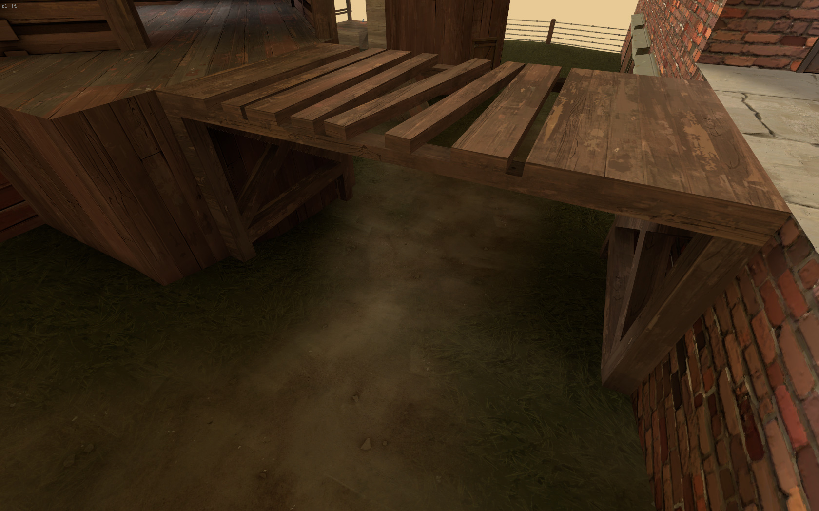
g2PAPv0.jpg

D526r8p.jpg

G2Uxbzq.jpg


Is this why I don't ever get to the detailing stage?

The ideas you have are good in themselves, but what needs work is the execution.

For instance:
  • Planks of wood in the first shot laid on top would never be that thick
  • The planks should also be differing horizontal lengths, slightly going over or under the edge
  • In the second picture, there's way too little brushwork on the building. The roofs should be their own brushes, and you can do loads to make buildings look more interesting than that (I like to have stuff like the trim of that one brick texture on the top, or having a stripe along the building looks nice too)
  • In the last picture, you've sorta just rushed the rock/dirt bit. Extend it out, have some varying heights and lastly don't put anything that's meant to be natural in a row, trees don't just grow in rows like that (unless it's a setting where people would've planted trees in a row for aesthetic).