WiP in WiP, post your screenshots!
- Thread starter Arhurt
- Start date
You are using an out of date browser. It may not display this or other websites correctly.
You should upgrade or use an alternative browser.
You should upgrade or use an alternative browser.
I'm rebuilding a course from Mario Kart. Can you tell which course it is?


Is that Delfino Square or w/e?
edit: I also hope you're gonna release those textures (if they aren't already released somewhere)
Lampenpam
aa
- Mar 23, 2013
- 1,013
- 347
Is that Delfino Square or w/e?
edit: I also hope you're gonna release those textures (if they aren't already released somewhere)
Yeah it's Delfino Square.
And I mostly use the textures from bulletcrops and... well, the guy who made this one death match map, Mario_kart, allowed me to use his textures he made for that map.
Maybe im gonna make a texture for this fruit stands in the first picture. They look so empty
Last edited:
- Mar 11, 2013
- 892
- 1,050
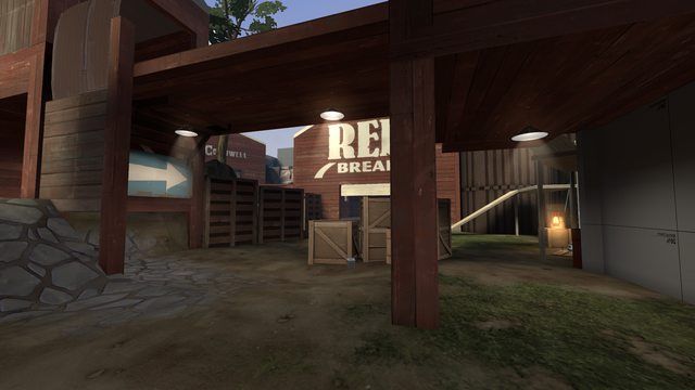
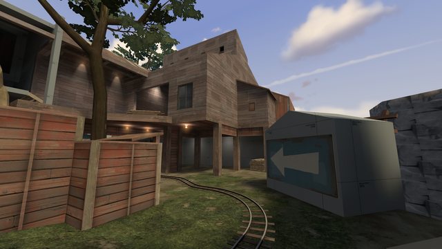
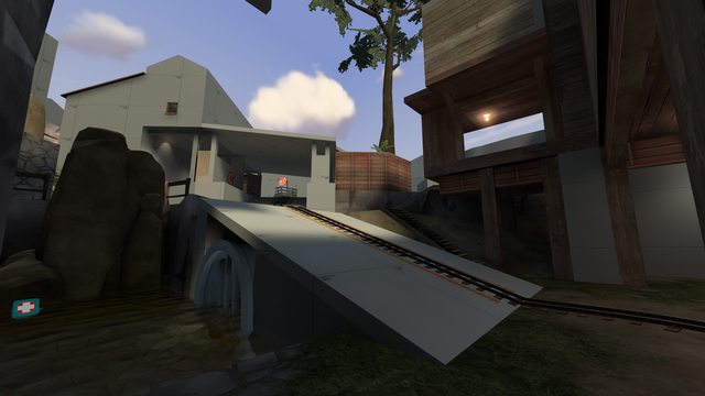
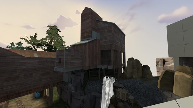
Getting some mid detailing for backwoods done, thoughts so far especially on detail density and just the general look of it?


Not pictured: Alien tubes showing particles the color of the team capturing it, alien capture point particles.


Not pictured: Alien tubes showing particles the color of the team capturing it, alien capture point particles.
Yeah it's Delfino Square.
And I mostly use the textures from bulletcrops and... well, the guy who made this one death match map, Mario_kart, allowed me to use his textures he made for that map.
Maybe im gonna make a texture for this fruit stands in the first picture. They look so empty
Alternatively, The bc pack should have some neat fish pile textures you can use.
Getting some mid detailing for backwoods done, thoughts so far especially on detail density and just the general look of it?
-snipp dogg-
Not pictured: Alien tubes showing particles the color of the team capturing it, alien capture point particles.
Looks okay overall, but I've got a lot of suggestions:
The team colored lanterns look kinda silly. Mids should generally be color-neutral, rather than split down the middle. Also, your wood platform could use more beams - a single wood beam on the bottom of those ramps would be really unstable.
The windows that show black on one side look kinda silly, since the room behind them is definitely well-lit. Try making one that looks like a lit room rather than black. Also think about splitting the windows into multiple parts (ie, two windows side by side rather than one large window).
Those yellow glowy pads should give off some light. Try a dim yellow light and a sprite/env_lightglow. Maybe add some green in the same way to the middle alien tanks. Also, maybe add more alien stuff to the mid in general! Pipes that lead up from the ground below up to the alien tanks could be cool.
Speaking of which, more pipes in general would be cool. It's a rainy climate, there should be some systems in place that divert water around.
Lastly, think about throwing some patch overlays on things. They look nice.


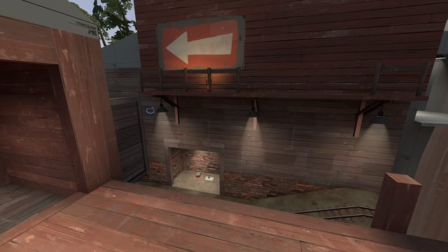
Not that much progress. but at least it has a somewhat completed skyline and 2 barriers done.
(and to note, the skyline will continue to the other side. currently there is a skybox texture in the middle which cuts some of the buildings)
Shanghai
aa
- Jan 8, 2011
- 397
- 393
holy shit I remember that original ramp and point design
Shogun
L6: Sharp Member
- Jan 31, 2014
- 260
- 221
heeheehee!
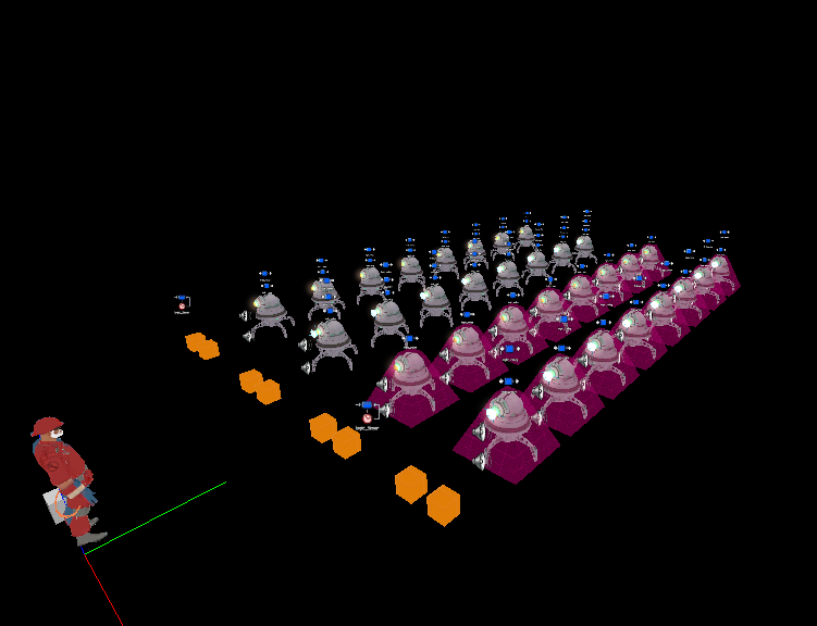
I have no idea what this is but I can already tell it'll be fun.
seth
aa
- May 31, 2013
- 1,021
- 852
Last edited by a moderator:
Shogun
L6: Sharp Member
- Jan 31, 2014
- 260
- 221
Why are you using the cobblestone texture for rock walls? Looks a bit odd imo.


