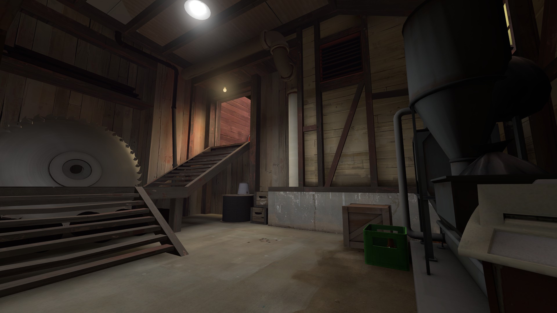
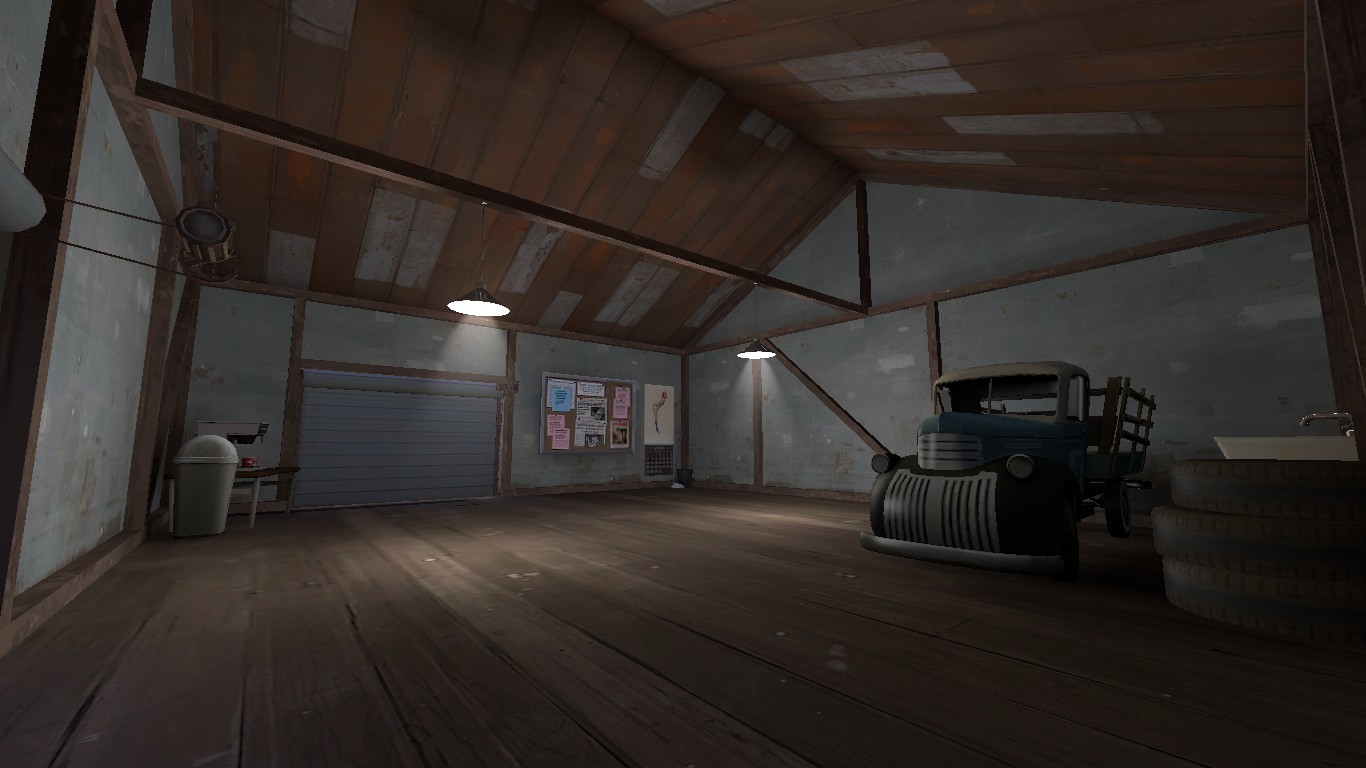
Yeah your light_env is really really orange, you can get across the same desert feel with more neutral lighting I promise. Just make it more white/yellow and more neutral rather than it being so red. Isn't very interesting to look at, and with every structure being brown/orange/red it tends to wash the colors together. Experiment with dissonant lighting, try colors other than orange lighting. Whites, yellows, very bright blues, etc. Create an interesting-to-look-at map by not washing it all one color.
Conversely, consider adding props/brushwork/textures that utilize various colors other than red to vary up your scene. Blue-grey metal structures, blue barrels, metal rooves or structures that are grey-ish, or concrete white structures help vary up the colors a bit. Consider looking at maps such as Badlands or Ravine to see examples of color variation within the desert theme.
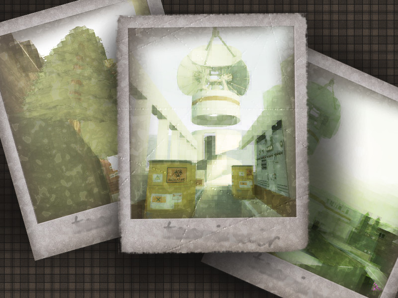
Additionally, within your heavily orange light_env, that yellow light over your control point in the second picture ends up looking a sickly shade of puke green. It's dissonant, but not really in a cohesive or pleasurable way.
