WiP in WiP, post your screenshots!
- Thread starter Arhurt
- Start date
You are using an out of date browser. It may not display this or other websites correctly.
You should upgrade or use an alternative browser.
You should upgrade or use an alternative browser.
Shanghai
aa
- Jan 8, 2011
- 397
- 393
Also thats a fuck of a lot of candles for a place that could just put in electric lights since apparently the tree is a generator.
But the whole joke is the "WARNING: Flammable Materials" sign is next to about 10 candles.
Last edited:


Sneak peek for detail pass #1 of cp_wetland:
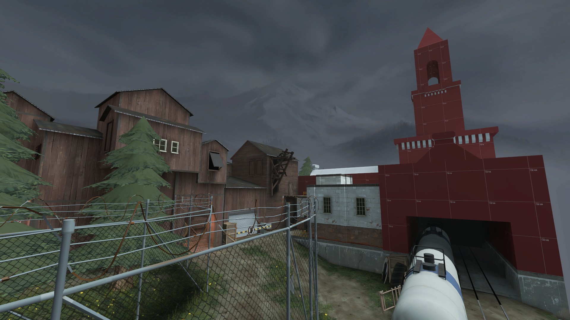
I also have a question: is that big red undetailed trainstation/clocktower in pic 2 too overstated and prominent to be on a flank? I feel like it might attract attention to the area, which is good because it's a woefully underused route, it just also might be too attractive.
I'm thinking of putting a point in the area to maybe give the map more spice: make it into an A > B+C > D map, maybe, I dunno.
Thoughts?
I would wonder how many people notice it at all tbh Deer, will be interesting to see, though most regular testers read this thread I imagine and that spoil the results considerably. I'm not into the idea of a 1-2-1 A/D map but that's only because I like the previous versions and think you'll do well in making ironing out it's problems and making a fun stock A/D map.

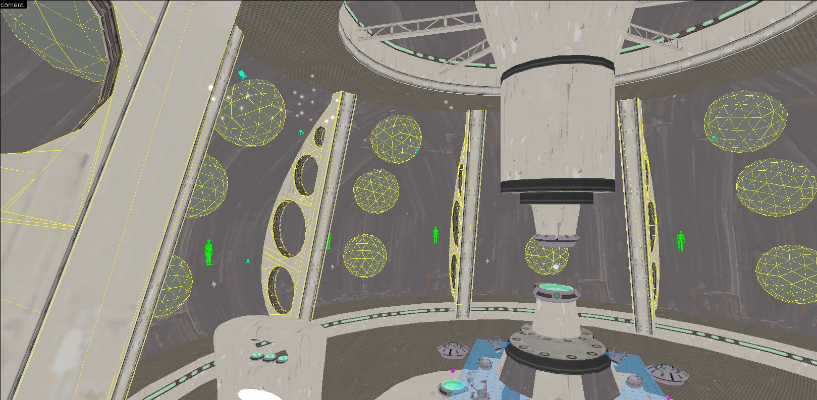
Those lasers to me look a bit weak (they are barely visible at a distance). I would make them go wider which indicates the added power it gains that triggers the explosion.
And maybe even perform some effect similar to doomsday's explosion which i think adds some color correction. This would help to indicate the explosion being closer as now the explosion only happens in the skybox.
Also, kill those below it")
And maybe even perform some effect similar to doomsday's explosion which i think adds some color correction. This would help to indicate the explosion being closer as now the explosion only happens in the skybox.
Also, kill those below it
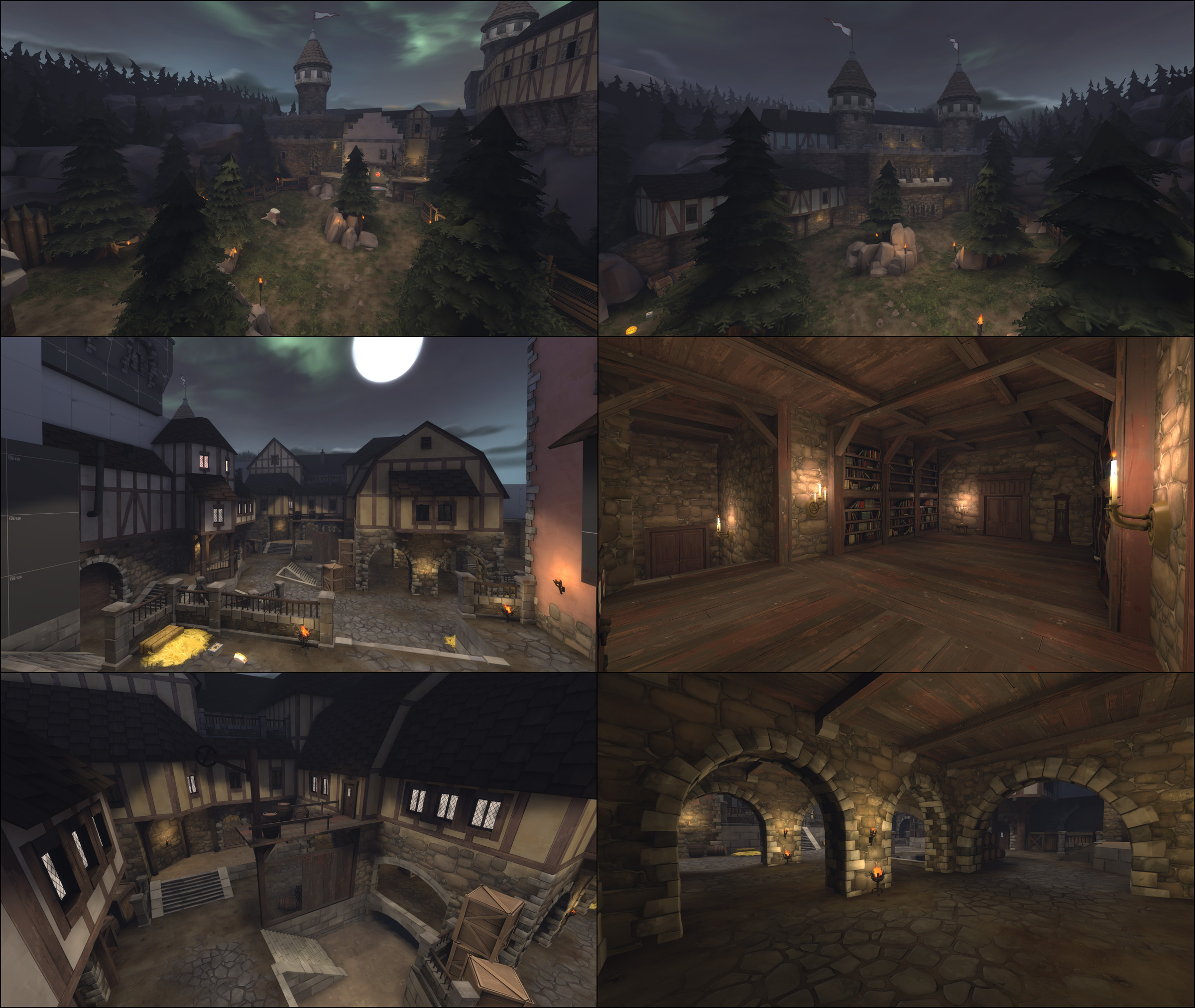
Not every night map has to be a halloween map. Regular (or medieval) night maps are still welcome.
That looks a helluva lot better than your first iteration, if you don't mind me saying.
Yeah, that one.From the original 72hr version? Yeah, I made that one as almost an afterthought in the last bit of time I was working on it.
It's nice, now.
Also, why would such an apparently high-tech thing be located in a dirty, rural -uasi-industrial area?
Thats the definition of TF2 Spytech (read 2fort)