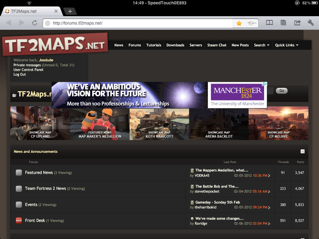
I think it looks sleek now too but that huge gap is pretty silly, seem strange for us to base our layout around what looks good for people with ad's and have it look worse for people who donate to get rid of them. Perhaps you could have the
Also without the random tf2 characters next to the TF2maps header we don't really have an identifiable logo now which feels weird to me
Also now that the feedback section has been taken off the main bar there formally no link to that section of the site IIRC other than the thread about the new feedback plugin bring added and I used the Events menu button quite a lot so it's a bit annoying that's gone but I'm probably used to more than most. I'd put the New posts button into the Welcome back/PM box and bring back the 2 links mentioned above
bit be like an open/close dropdown menu thing so it would be possible to shrink that big gap down.Welcome back, theharribokid
Private messages (Unread 0, Total 71)
User Control Panel
Log Out
Also without the random tf2 characters next to the TF2maps header we don't really have an identifiable logo now which feels weird to me
Also now that the feedback section has been taken off the main bar there formally no link to that section of the site IIRC other than the thread about the new feedback plugin bring added and I used the Events menu button quite a lot so it's a bit annoying that's gone but I'm probably used to more than most. I'd put the New posts button into the Welcome back/PM box and bring back the 2 links mentioned above