Immersion, Dissonance and The Suspension of Disbelief.
Here we will study what makes a map immersive, understanding how players interpret our environments is key to producing more of the stunning environments we currently have available to us. The two main factors are thus; gameplay and narrative. Narrative affects our perspective within the virtual environment, gameplay is a matter of our concentration to the task at hand within said environment.
Let us define the above in regards to narrative. When reading a book one is presented with an environment, factual or otherwise. But what makes it immersive is our ability to relate to the narrative. When we read a book we may choose to accept certain fictional forms such as faster than light travel. This is suspension of disbelief. We allow ourselves to be fooled for entertainment purposes. Because lets face it, real life just isn't that interesting. In the TF2 universe we have our two warring factions RED and BLU, our suspended disbelief allows us to accept that these two 'make believe' factions are at war and possess certain 'spytech' technologies that motivate and provoke the need for conflict. How we react to this universe is our ability to relate to that which is depicted in the narrative (and subsequent game environments). We can appreciate the human tendencies for greed, pride and prejudice and so justify the circumstances of this conflict, immersing ourselves in the interactive narrative of TF2. We become the mercenaries and fight for the resources/objectives presented in the maps.
Secondly, we look at gameplay. Gameplay is the experience of playing a game (funnily enough). When designers produce a game they seek out certain aspects of life that please us and allow us to experience these circumstances in a way that is satisfying (such as defeating an intelligent opponent in competition or solving a puzzle). Additional influences affect our level of immersion, in TF2 this happens through the act of fast paced mortal combat; keen attention is required for prolonged life expectancy and a general high performance. The player becomes his avatar (class) in order to perform tasks and reap the satisfaction that comes with inevitable successes. Immersion in this sense can be achieved without excessive aesthetics, but this is normally defined by the context of the game. Darwinia is a game lacking sophisticated visuals, but we still immerse ourselves in the environment and gameplay because this is the games intended art direction. We accept certain abstract rules to be entertained.
TF2 has its detailed universe and in conforming with the universe we detail it as such. I say this mostly as a result of the presence of orange maps. Orange maps provide an alternative experience to players that can be as rewarding to the senses as what is currently available in the standard game narrative (usually in the form of death match). Of course these maps are out of context to the game universe and largely shunned by the hard core fans. The gameplay of these maps largely mimics other games outside of TF2, providing experiences not otherwise logically plausible within the narrative of TF2, which tends to be the very reason for their existance and success; it becomes a new niche experience.
Lets take a look at how we immerse ourselves in the narrative of our TF2 environments. Why do we believe that this world exists and how do we allow ourselves to be fooled? Well this is because the level designers have produced our environment with just this in mind. Or more precisely, dissonance in mind. Dissonance is the process of something unexpected shocking us. The dictionary puts it as such: “Lack of agreement, consistency, or harmony”. The act of seeing flying pigs or the Combine Citadel in TF2 would be something out of the ordinary and as such it would remove us from our state of suspended disbelief. Thus, there are no flying pigs or Combine Citadels in TF2 and we should also endeavour to avoid including them ourselves.
However, affects can be a lot more subtle. Such as observing farmyard milk pots being stored with industrial grade radioactive barrels and mining crates. Farmyard, industrial and mining equipment being stored together is inconsistent. It creates dissonance and our immersion is broken.
Travis Castillo, author of several books from the “Game Development Essentials” series makes a very nice list of areas of education that a level designer should be familiar with. Stating: “As a level designer, your job is to create worlds. To do this, you must have knowledge of how things work in our world”. Having this level of understanding allows you to produce more consistant environments.
TF2 is largely based off of reality, despite its cartoon visuals and less than realistic combat style. With TF2 environments based off of close to real world scenarios we must more accurately replicate our world to better immerse the players. Particularly in the case of physics, and how we perceive certain structures to exist in the game world we are presented with.
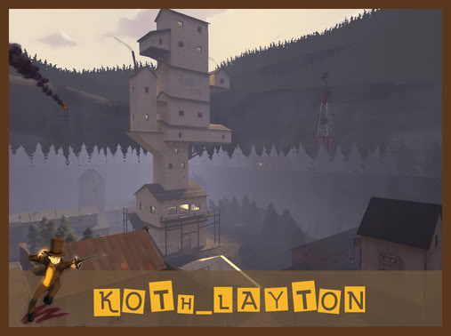
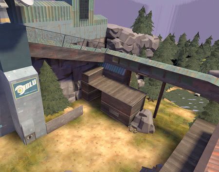
Most of us are aware of what looks “right” when it comes to structures of varying designs. Even though koth_layton was purposefully designed with disproportionate features because it was a homage to another game with different rules (dictated by its own narrative, and the narratives art direction), we can see how the structure does not make sense in the TF2 universe, the structure would clearly topple over from its own weight and high centre of gravity. Having an understanding of physics is one of the key areas in making a map believable and achieving believable building designs. This is important because buildings are a key part of most TF2 environments, making them look proper should be a key priority. This poses a significant art problem for a lot of ammatuer level designers due to the slightly abstract TF2 building designs, but generally the buildings we see conform to the basic laws of physics. In ctf_third_law, seen below, we can see a structure that creates visual dissonance. The 'catwalk' does have some central support in the form of a large upright log, but the single log would not counter the sheering forces involved in a structure of this shape. Further support in the form of trusses would be required to support such a structure. Since these are not present, we question the structures validity and our immersion is broken.
The act of breaking your immersion is of course relative to ones own understanding of the world. The phrase "ignorance is bliss" is something that comes to mind when regarding this. Someone not aware of the forces acting on or within such a structure will obviously be none the wiser to its apparently poor presentation. Not realising that such a structure could not realisticly exist would cause them to overlook such an error of judgement and thus not actually break their suspended disbelief. But, it is up to the level designer to make sure that his environment conforms to certain rules to immerse the geatest number of players possible. Not to hope that most people don't notice such an error.
Dissonance: Enhancing our scenes.
Due to the tight selection of models in TF2, most of which are fairly ambiguous, most of the appropriate detailing comes to maps inadvertently. However, also as a result of the tight selection of props, designers feel the need to mix and match in order to get more variety in their maps. This is bad for your maps narrative for a number of reasons.
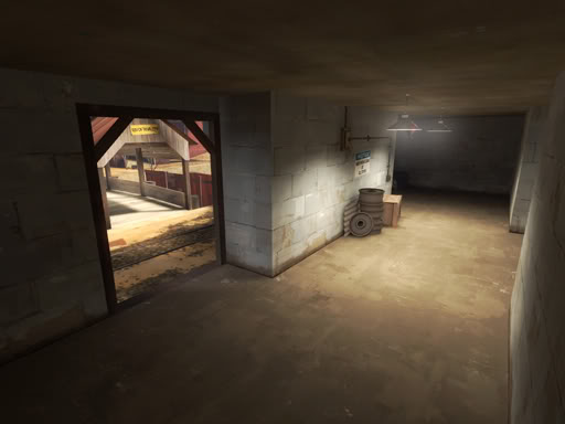
Why are there train wheels here? There is a train track in front of the building. The detail props of a specific nature are therefor justified. Some props are more generic and can be haphazardly placed in and around areas of a map; such as the wooden crates, wooden pallets or rusty barrels. General props that are easily justified by the imagination to be in a variety of potential scenarios. These props are consistent with the majority of environment themes on offer. The props ambiguity allows us to reason their placement in most cases. Other props are not so easy to reason with.
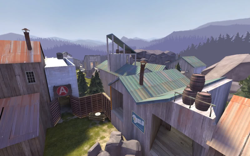
In this image from cp_timber we see a spy-tech fence on the roof of a BLU logging building, fencing off some wooden barrels. The spytech fence does not belong in a non spytech scene and so it looks odd. We start to actively question our surroundings as a result. Additionally, how do we justify how those wooden barrels got up there? Or why they are even stored there. There is no pulley system to manage the barrels to this place, and an object of that nature should be stored away in a 'cool dry place', as to not have it warp or rot from exposure to nature. Basically we should be asking ourselves whether our scenes make sense. Barrels on a roof like this do not make sense, although it is not hard to see where this inspiration came from. Many roofs throughout TF2 maps have tires and wooden planks strewn across them. A lot of smaller items such as these get thrown onto roof tops in a similar manner to fly tipping. Barrels on the other hand, are slightly more difficult to get onto a roof, and as an item it is simply more useful than a used tire; so they tend to stick around in useful places. Rather than get left around in odd places, like on a roof.
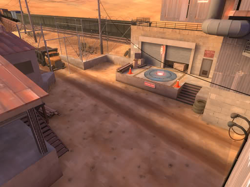
Other more specifically designed props will require more thought. Rocks for example belong outside, this might be seen as common sense however, but it's the start of the thinking process in regards to prop and environment harmony. Trucks can be seen inside and outside. Of course that truck needs a way to get in and out of a building, otherwise how did it get there? Having a truck in a room with only 1 door the size of a human is one way to cause an aesthetic conflict. Also, having a truck outside with no visible hint as to how it got into this courtyard or such will also cause aesthetic conflicts, create dissonance and break immersion.
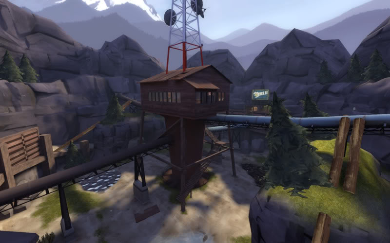
For example, arena_watchtower is based around a watchtower, the environment is completely inappropriate to the chosen theme. There is also little surrounding detail to enhance the theme. As a 'resource' it is an acceptable game goal, owning a watchtower would allow you to observe local topography and enact your martial authority over the surrounding area. The control point is appropriately placed within this resource 'facility'. But the watchtower is placed within a cinder cone or caldera and as a result actually sees little of its surrounding environment. Making the existence of this structure at this location quite redundant. This map would have benefited from an extensive skybox/detail areas, rather than the rather unimaginative high cliff walls that are placed merely for the sake of containing players and obstructing their vision to the lower part of the skybox.
2Fort's red base is largely farm orientated in theme. So detail content should be strictly farm related in order to present the appropriate façade (as dictated by the maps narrative). Chucking numerous props of varying design and purpose at your map will undoubtedly make it “pretty”, that cannot be denied. The items chosen are of a quality that improves overall visual aesthetics in your map. But it does not make your map consistent, your map will be generic and without theme. For instance, throwing the cow model into a mining map would not make much sense to your map's narrative. One should not rely on props to carry your map, your map should carry your props. Without a strict function for your scenario to exist as a TF2 map (farm, mill, hydro-plant, quarry etc.), your map lacks a narrative to immerse a player as to why he is here. Fastlane is a prime example of a map that lacks a narrative; it resides in a desert with some generic buildings of no particular purpose. It is hard to get excited about this map as players are not immersed in the greater TF2 narrative through the maps own narrative, as it has no narrative of its own. Until a recent update by the author, the original map had no visible goal either. Players were not working towards a goal in the environment, they were simply capturing control points. This forms an inconsistency with the TF2 universe/narrative and lacks a number of immersive qualities as a result. The recent Fastlane update did include a rocket base at the final capture points after its purchase by Valve, and the map has additional narrative qualities as a result, thus helping the maps immersive capacity.
Dissonance: Enhancing our buildings.
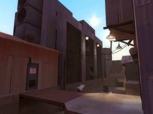
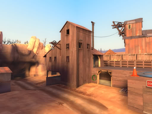
Generally speaking, buildings need a reason to exist otherwise they wouldn't be built, and that reason needs to be believable within the context of the game/map narrative. If a prop is not “junk” that litters our environment (rubble, barrels, crates, tools etc.), it is usually something used to enhance our geometry. Large rocks, fencing, trusses and foliage enhance our cliffs; windows, doors, lights, gutters, junction boxes enhance our buildings. These can be used to emphasise a buildings purpose or function more than generic “junk” can. Junk fills gaps and helps to provide a mood that implies life existed, but other props are much more a part of the environment. In the image below we not only see junk at the top, bottom and background, which implies the presence of life 'at one point', but we also see lights, junction boxes and pipes that give the building itself life and personality. In the image following it, we see power cables that imply the need/use for power (such as for lights), this implies the building does in fact get used, rather than just being a random structure in the desert.
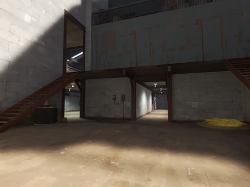
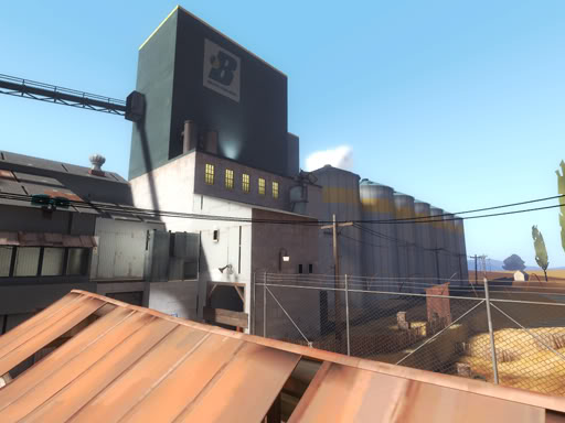
So, when creating a scenario we consider “life”. The presence of life provides us with a narrative. These are not just buildings, the intention is that they are used and abused by their users (RED and BLU). The first port of call is doors and windows. Windows imply an internal structure, and the style of the window often hints as to the use of the building, so the style of the window should compliment the style of the building. Doors tell us people access this structure, also implying an internal structure. Additionally they can justify use of details such as lights or junction boxes. A large gate would justify a collection of crates in the local vicinity, implying a loading bay of sorts, as well as overlay signs or an overlay of wear and tear on the floor. Buildings don't always need a visible access point, we can just as easily reason a door is on the far side where we cannot see it, but if you're stuck detailing a wall you might as well throw a door on it. Gates in particular, take up a lot of space and provide a cue for other visual details.
Given the narrative for TF2 and the varying façades, a lot of equipment is transported to and from, and stored around these areas. In fact the scenarios usually revolve around a 'resource harvesting facility'. The narrative of a map is themed by a local resource (which is harvested by the facility; grain, coal, gravel, gold), and the “junk” is related to the extraction of that resource. Our mind then accepts this narrative and immerses us. I am playing “Goldrush”, it is a gold mining facility, my enemy is gaining additional resources, i must destroy this resource with this explosive device. *plays*
In order to more accurately represent what you are attempting to replicate research is something that will be invalueble. Seeing for yourself, rather than predicting or guessing what is required of you, will give you better results from the start and to anticipate potential design problems.
Summary dissonance:
*Does my prop belong here? Why is it here? Is there a more appropriate alternative?
A huge reinforced blast door encased in a wooden wall does not make much sense (a chain is only as strong as its weakest link).
*Does my environment make sense? Is it logical to TF2?
Having a TF2 map based on your local school, unlike perhaps in Counter Strike, does not make much sense.
Does the theme match my environment?
growing grain in the mountains doesn't make much sense. Unlss you're weird like the Chinese.
Do my structures conform to basic physical rules and laws?
If it looks odd, then you wont be the only one to notice either.
If a scene is present solely for a gameplay mechanic, you need to also consider its environmental purpose for your aesthetics to combine in a complimentary fashion. This is usually the reason why you find odd props in strange places, because people overlook this design problem. If there are no other props available to you that provide you with this interesting gameplay, redesign your area so that you can achieve it by other means, or try and get someone to make you an appropriate model for you if you cannot achieve it by brush work.
I think i have said as much as i can say without losing focus to the topic. There are so many tangents i would like to have gone off on, but i suppose i can respond to reply's in the thread. The possible examples on how to execute a believable scenario are literally endless as well. But at the end of the day it boils down to that list created by Travis Castillo. Having knowledge in these areas allows you to think critically about your scenario and question whether it is appropriate or not. If you don't have the knowledge then you can't effectively reason why it should be, or not be, the way it is. At which point you can only rely on other peoples perspectives, knowledge, and their feedback.
additional feedback:
http://tvtropes.org/pmwiki/pmwiki.php/Main/LampshadeHanging
The importance here is in the visual cue's that justify the environment for us, rather than having us assume that there must be some logical explination that evades us for the otherwise questionable scenario. This is where any potential incompetence lies: Whilst designing our level, we conform to our narrative so that we maintain consistency and thus improve our maps overall immersive qualities. It is our job to make these connections in order to tell the story our map presents to players.
Also see:
[ARTICLE] Stairs and your map
[ARTICLE] Roofs, Skybox Brushes and Your Map
[ARTICLE] Base Facades and Your Map
[GUIDE] Scale and Your Map
[GUIDE] Balance, layout and your A/D map.
Here we will study what makes a map immersive, understanding how players interpret our environments is key to producing more of the stunning environments we currently have available to us. The two main factors are thus; gameplay and narrative. Narrative affects our perspective within the virtual environment, gameplay is a matter of our concentration to the task at hand within said environment.
Let us define the above in regards to narrative. When reading a book one is presented with an environment, factual or otherwise. But what makes it immersive is our ability to relate to the narrative. When we read a book we may choose to accept certain fictional forms such as faster than light travel. This is suspension of disbelief. We allow ourselves to be fooled for entertainment purposes. Because lets face it, real life just isn't that interesting. In the TF2 universe we have our two warring factions RED and BLU, our suspended disbelief allows us to accept that these two 'make believe' factions are at war and possess certain 'spytech' technologies that motivate and provoke the need for conflict. How we react to this universe is our ability to relate to that which is depicted in the narrative (and subsequent game environments). We can appreciate the human tendencies for greed, pride and prejudice and so justify the circumstances of this conflict, immersing ourselves in the interactive narrative of TF2. We become the mercenaries and fight for the resources/objectives presented in the maps.
Secondly, we look at gameplay. Gameplay is the experience of playing a game (funnily enough). When designers produce a game they seek out certain aspects of life that please us and allow us to experience these circumstances in a way that is satisfying (such as defeating an intelligent opponent in competition or solving a puzzle). Additional influences affect our level of immersion, in TF2 this happens through the act of fast paced mortal combat; keen attention is required for prolonged life expectancy and a general high performance. The player becomes his avatar (class) in order to perform tasks and reap the satisfaction that comes with inevitable successes. Immersion in this sense can be achieved without excessive aesthetics, but this is normally defined by the context of the game. Darwinia is a game lacking sophisticated visuals, but we still immerse ourselves in the environment and gameplay because this is the games intended art direction. We accept certain abstract rules to be entertained.
TF2 has its detailed universe and in conforming with the universe we detail it as such. I say this mostly as a result of the presence of orange maps. Orange maps provide an alternative experience to players that can be as rewarding to the senses as what is currently available in the standard game narrative (usually in the form of death match). Of course these maps are out of context to the game universe and largely shunned by the hard core fans. The gameplay of these maps largely mimics other games outside of TF2, providing experiences not otherwise logically plausible within the narrative of TF2, which tends to be the very reason for their existance and success; it becomes a new niche experience.
Lets take a look at how we immerse ourselves in the narrative of our TF2 environments. Why do we believe that this world exists and how do we allow ourselves to be fooled? Well this is because the level designers have produced our environment with just this in mind. Or more precisely, dissonance in mind. Dissonance is the process of something unexpected shocking us. The dictionary puts it as such: “Lack of agreement, consistency, or harmony”. The act of seeing flying pigs or the Combine Citadel in TF2 would be something out of the ordinary and as such it would remove us from our state of suspended disbelief. Thus, there are no flying pigs or Combine Citadels in TF2 and we should also endeavour to avoid including them ourselves.
However, affects can be a lot more subtle. Such as observing farmyard milk pots being stored with industrial grade radioactive barrels and mining crates. Farmyard, industrial and mining equipment being stored together is inconsistent. It creates dissonance and our immersion is broken.
Travis Castillo, author of several books from the “Game Development Essentials” series makes a very nice list of areas of education that a level designer should be familiar with. Stating: “As a level designer, your job is to create worlds. To do this, you must have knowledge of how things work in our world”. Having this level of understanding allows you to produce more consistant environments.
- Astronomy
- Geology
- Biology
- Anthropology
- Sociology
- Psychology.
TF2 is largely based off of reality, despite its cartoon visuals and less than realistic combat style. With TF2 environments based off of close to real world scenarios we must more accurately replicate our world to better immerse the players. Particularly in the case of physics, and how we perceive certain structures to exist in the game world we are presented with.

Most of us are aware of what looks “right” when it comes to structures of varying designs. Even though koth_layton was purposefully designed with disproportionate features because it was a homage to another game with different rules (dictated by its own narrative, and the narratives art direction), we can see how the structure does not make sense in the TF2 universe, the structure would clearly topple over from its own weight and high centre of gravity. Having an understanding of physics is one of the key areas in making a map believable and achieving believable building designs. This is important because buildings are a key part of most TF2 environments, making them look proper should be a key priority. This poses a significant art problem for a lot of ammatuer level designers due to the slightly abstract TF2 building designs, but generally the buildings we see conform to the basic laws of physics. In ctf_third_law, seen below, we can see a structure that creates visual dissonance. The 'catwalk' does have some central support in the form of a large upright log, but the single log would not counter the sheering forces involved in a structure of this shape. Further support in the form of trusses would be required to support such a structure. Since these are not present, we question the structures validity and our immersion is broken.

The act of breaking your immersion is of course relative to ones own understanding of the world. The phrase "ignorance is bliss" is something that comes to mind when regarding this. Someone not aware of the forces acting on or within such a structure will obviously be none the wiser to its apparently poor presentation. Not realising that such a structure could not realisticly exist would cause them to overlook such an error of judgement and thus not actually break their suspended disbelief. But, it is up to the level designer to make sure that his environment conforms to certain rules to immerse the geatest number of players possible. Not to hope that most people don't notice such an error.
Dissonance: Enhancing our scenes.
Due to the tight selection of models in TF2, most of which are fairly ambiguous, most of the appropriate detailing comes to maps inadvertently. However, also as a result of the tight selection of props, designers feel the need to mix and match in order to get more variety in their maps. This is bad for your maps narrative for a number of reasons.

Why are there train wheels here? There is a train track in front of the building. The detail props of a specific nature are therefor justified. Some props are more generic and can be haphazardly placed in and around areas of a map; such as the wooden crates, wooden pallets or rusty barrels. General props that are easily justified by the imagination to be in a variety of potential scenarios. These props are consistent with the majority of environment themes on offer. The props ambiguity allows us to reason their placement in most cases. Other props are not so easy to reason with.

In this image from cp_timber we see a spy-tech fence on the roof of a BLU logging building, fencing off some wooden barrels. The spytech fence does not belong in a non spytech scene and so it looks odd. We start to actively question our surroundings as a result. Additionally, how do we justify how those wooden barrels got up there? Or why they are even stored there. There is no pulley system to manage the barrels to this place, and an object of that nature should be stored away in a 'cool dry place', as to not have it warp or rot from exposure to nature. Basically we should be asking ourselves whether our scenes make sense. Barrels on a roof like this do not make sense, although it is not hard to see where this inspiration came from. Many roofs throughout TF2 maps have tires and wooden planks strewn across them. A lot of smaller items such as these get thrown onto roof tops in a similar manner to fly tipping. Barrels on the other hand, are slightly more difficult to get onto a roof, and as an item it is simply more useful than a used tire; so they tend to stick around in useful places. Rather than get left around in odd places, like on a roof.

Other more specifically designed props will require more thought. Rocks for example belong outside, this might be seen as common sense however, but it's the start of the thinking process in regards to prop and environment harmony. Trucks can be seen inside and outside. Of course that truck needs a way to get in and out of a building, otherwise how did it get there? Having a truck in a room with only 1 door the size of a human is one way to cause an aesthetic conflict. Also, having a truck outside with no visible hint as to how it got into this courtyard or such will also cause aesthetic conflicts, create dissonance and break immersion.

For example, arena_watchtower is based around a watchtower, the environment is completely inappropriate to the chosen theme. There is also little surrounding detail to enhance the theme. As a 'resource' it is an acceptable game goal, owning a watchtower would allow you to observe local topography and enact your martial authority over the surrounding area. The control point is appropriately placed within this resource 'facility'. But the watchtower is placed within a cinder cone or caldera and as a result actually sees little of its surrounding environment. Making the existence of this structure at this location quite redundant. This map would have benefited from an extensive skybox/detail areas, rather than the rather unimaginative high cliff walls that are placed merely for the sake of containing players and obstructing their vision to the lower part of the skybox.
2Fort's red base is largely farm orientated in theme. So detail content should be strictly farm related in order to present the appropriate façade (as dictated by the maps narrative). Chucking numerous props of varying design and purpose at your map will undoubtedly make it “pretty”, that cannot be denied. The items chosen are of a quality that improves overall visual aesthetics in your map. But it does not make your map consistent, your map will be generic and without theme. For instance, throwing the cow model into a mining map would not make much sense to your map's narrative. One should not rely on props to carry your map, your map should carry your props. Without a strict function for your scenario to exist as a TF2 map (farm, mill, hydro-plant, quarry etc.), your map lacks a narrative to immerse a player as to why he is here. Fastlane is a prime example of a map that lacks a narrative; it resides in a desert with some generic buildings of no particular purpose. It is hard to get excited about this map as players are not immersed in the greater TF2 narrative through the maps own narrative, as it has no narrative of its own. Until a recent update by the author, the original map had no visible goal either. Players were not working towards a goal in the environment, they were simply capturing control points. This forms an inconsistency with the TF2 universe/narrative and lacks a number of immersive qualities as a result. The recent Fastlane update did include a rocket base at the final capture points after its purchase by Valve, and the map has additional narrative qualities as a result, thus helping the maps immersive capacity.
Dissonance: Enhancing our buildings.
Generally speaking, buildings need a reason to exist otherwise they wouldn't be built, and that reason needs to be believable within the context of the game/map narrative. If a prop is not “junk” that litters our environment (rubble, barrels, crates, tools etc.), it is usually something used to enhance our geometry. Large rocks, fencing, trusses and foliage enhance our cliffs; windows, doors, lights, gutters, junction boxes enhance our buildings. These can be used to emphasise a buildings purpose or function more than generic “junk” can. Junk fills gaps and helps to provide a mood that implies life existed, but other props are much more a part of the environment. In the image below we not only see junk at the top, bottom and background, which implies the presence of life 'at one point', but we also see lights, junction boxes and pipes that give the building itself life and personality. In the image following it, we see power cables that imply the need/use for power (such as for lights), this implies the building does in fact get used, rather than just being a random structure in the desert.


So, when creating a scenario we consider “life”. The presence of life provides us with a narrative. These are not just buildings, the intention is that they are used and abused by their users (RED and BLU). The first port of call is doors and windows. Windows imply an internal structure, and the style of the window often hints as to the use of the building, so the style of the window should compliment the style of the building. Doors tell us people access this structure, also implying an internal structure. Additionally they can justify use of details such as lights or junction boxes. A large gate would justify a collection of crates in the local vicinity, implying a loading bay of sorts, as well as overlay signs or an overlay of wear and tear on the floor. Buildings don't always need a visible access point, we can just as easily reason a door is on the far side where we cannot see it, but if you're stuck detailing a wall you might as well throw a door on it. Gates in particular, take up a lot of space and provide a cue for other visual details.


Given the narrative for TF2 and the varying façades, a lot of equipment is transported to and from, and stored around these areas. In fact the scenarios usually revolve around a 'resource harvesting facility'. The narrative of a map is themed by a local resource (which is harvested by the facility; grain, coal, gravel, gold), and the “junk” is related to the extraction of that resource. Our mind then accepts this narrative and immerses us. I am playing “Goldrush”, it is a gold mining facility, my enemy is gaining additional resources, i must destroy this resource with this explosive device. *plays*
In order to more accurately represent what you are attempting to replicate research is something that will be invalueble. Seeing for yourself, rather than predicting or guessing what is required of you, will give you better results from the start and to anticipate potential design problems.
Summary dissonance:
*Does my prop belong here? Why is it here? Is there a more appropriate alternative?
A huge reinforced blast door encased in a wooden wall does not make much sense (a chain is only as strong as its weakest link).
*Does my environment make sense? Is it logical to TF2?
Having a TF2 map based on your local school, unlike perhaps in Counter Strike, does not make much sense.
Does the theme match my environment?
growing grain in the mountains doesn't make much sense. Unlss you're weird like the Chinese.
Do my structures conform to basic physical rules and laws?
If it looks odd, then you wont be the only one to notice either.
If a scene is present solely for a gameplay mechanic, you need to also consider its environmental purpose for your aesthetics to combine in a complimentary fashion. This is usually the reason why you find odd props in strange places, because people overlook this design problem. If there are no other props available to you that provide you with this interesting gameplay, redesign your area so that you can achieve it by other means, or try and get someone to make you an appropriate model for you if you cannot achieve it by brush work.
I think i have said as much as i can say without losing focus to the topic. There are so many tangents i would like to have gone off on, but i suppose i can respond to reply's in the thread. The possible examples on how to execute a believable scenario are literally endless as well. But at the end of the day it boils down to that list created by Travis Castillo. Having knowledge in these areas allows you to think critically about your scenario and question whether it is appropriate or not. If you don't have the knowledge then you can't effectively reason why it should be, or not be, the way it is. At which point you can only rely on other peoples perspectives, knowledge, and their feedback.
additional feedback:
http://tvtropes.org/pmwiki/pmwiki.php/Main/LampshadeHanging
Things like this are not a motif of incompetence, but rather they are methods of lampshading, which is one way of taking something that could create dissonance, drawing brief attention to it, and then moving on. Instead of wondering why there are a bunch of people with guns running around a grain shipping facility, we see a sign that draws the quirk into the narrative, laugh at the joke, and keep playing.I'd like to point out that while things do usually make realistic sense, there's also a motif of incompetence in the tf2 theme.
Top secret rooms, with giant windows that let you stare right in, important intelligence sitting on a desk, this job has worked 0 days, etc.
Let's continue our look at watchtower as an example. Instead of opening up the surrounding walls, one could add a pair of binoculars and some kind of chart that says "Eastern rocks clear", "Western rocks clear", etc. If obvious enough to anyone in the watchtower, this could lampshade the issue and avoid breaking immersion almost as effectively.
The importance here is in the visual cue's that justify the environment for us, rather than having us assume that there must be some logical explination that evades us for the otherwise questionable scenario. This is where any potential incompetence lies: Whilst designing our level, we conform to our narrative so that we maintain consistency and thus improve our maps overall immersive qualities. It is our job to make these connections in order to tell the story our map presents to players.
Also see:
[ARTICLE] Stairs and your map
[ARTICLE] Roofs, Skybox Brushes and Your Map
[ARTICLE] Base Facades and Your Map
[GUIDE] Scale and Your Map
[GUIDE] Balance, layout and your A/D map.
Last edited:


