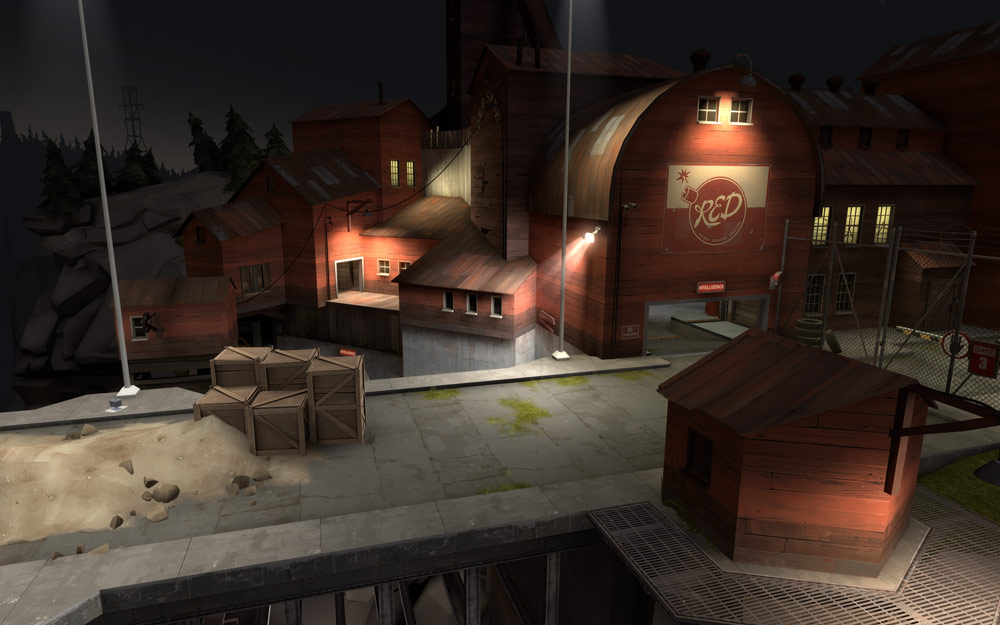
This is an effort to create a more comprehensive article than what the previous roof articles have managed. To start off I'll mention a couple obvious points of interest to flesh out and give context to the articles focus and then hopefully you will learn some more sophisticated methods of applying roofs in your map, notably optimisation techniques.
Now that that's out of the way, lets summarise the contents of this article.
The Basics: Roof Construction
Roof attributes: What should I use?
It's not that hard to create a basic roof shape, they look good aligned to 1:1, 1:2 or 2:3 ratios of height:length. But they're not just restricted to these traditional alignments, some roof angles have been applied at even 1:5 height:length ratios. It all depends on what is required from the structure you are creating. The larger the structure the more abstract alignments you have available given the grid. If the structure is to be accessed by players then it might be preferred to utilise a more basic ratio of 1:2 as it allows for easier alignment of trusses and support beams within the building; it also compliments wall thickness's of 8, 16 and 32 hammer units which are traditional wall attributes for most Source games, including TF2. If the structure is just a detail piece of geometry you can experiment by implementing more greatly warped ratios in your roof angles as you don't have to worry so much about alignment of details within the building.
So in truth there is no right way, simply that 1:1, 1:2 (and 2:3 less so) are easier to work with in Hammer due to the 2x2 Source grid system and TF2 scaling.
The same principle applies for the thickness of a roof and the “lip” on the edges of roofs which extend beyond the structures walls. Length and thickness's are entirely at your artistic discretion, but a thickness of 4 is Valves standard.
What makes a roof look awesome? The inner details
It has to be said that one of the most important features of a roof in TF2 is not actually the roof itself, but the frame work on the inside that enhance the buildings presence. Valve generally stick to a basic grid of 64 Hammer units when it comes to applying structures in their maps, so the 1:2 incline ratio compliments the 2x2 Source grid and the process of including details such as support beams and trusses inside a TF2 structure.
It's also aesthetically attractive to introduce gaps in the roof panels where the sky can shine through. It breaks visual monotony and allows for extra details to be implemented that interact with this visual feature, all furthering the concept of a story/history of the structures life, giving a sense of a wider world beyond the play area and its current presence in the map.
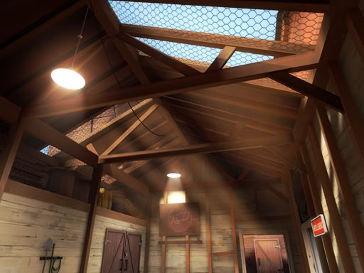
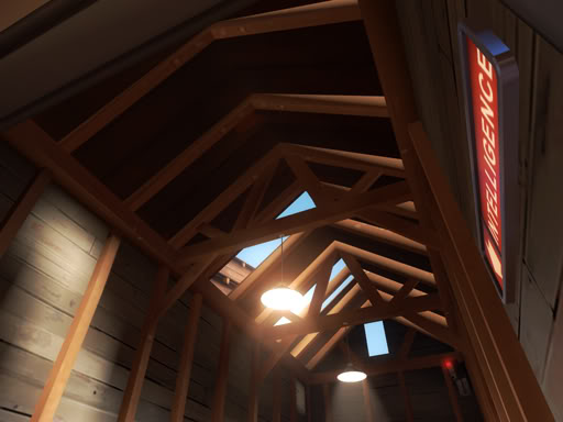
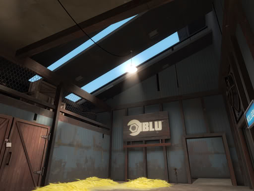
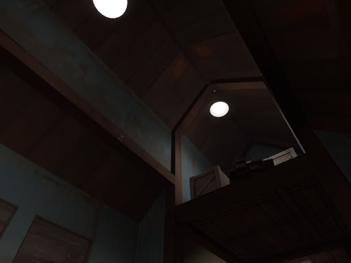
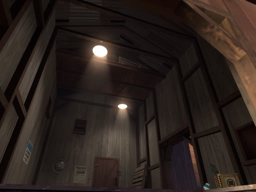
On a final note for inner roof details, in an act of completing detail work within a room, light fixtures are key pieces of detail for the underside of a roof. They hang from the ceiling or walls and have a remarkable impact on the visual attractiveness inside a structure.
What makes a roof look awesome? The outer details
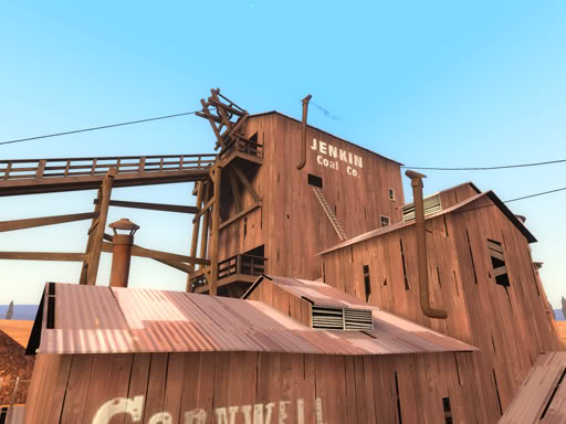
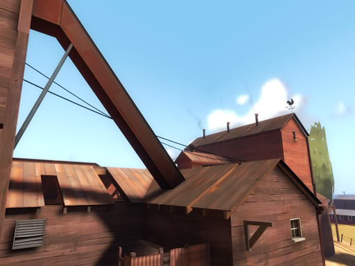
There is more freedom in applying prop based detail work to the outside of your building, anything light in weight that you might classify as “junk” can be scattered onto low rooftops to break visual monotony; including tires, planks of wood or sheets of corrugated iron. Taking roof details even further and in an effort to give a building character, we should add chimneys or ventilation shafts/ducts. There are props and overlays on offer, you can chose which is preferable based on distance to players and level of detail in your area.
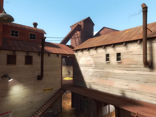
Blu vs Red
BLU is more construction based whilst RED is demolition based. Which means BLU tends to take on more complete and modern building designs including flat roofs; whilst RED opts for more make shift wooden shack structures that utilise corrugated iron sheets for angled roofs (that often have gaps/holes). But either are not strictly limited to these choices and ultimately it comes down to the buildings design concept (materials it is made from and the buildings purpose within the maps narrative). Badlands is an incredibly symmetrical map where BLU does indeed have angled roofing the same as RED, so don't get too caught up with only making BLU have flat roofs and RED angled. But as Badwater shows us BLU buildings will frequently opt for flat roof designs on the more modern concrete looking buildings.
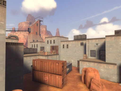
General Optimisation Concerns.
The shape of a room is not a mere box and the underside of roofing is usually visible, this is especially true for RED structures, but a general rule for most TF2 structures. This can be a pain for people who desire to optimise their maps as they'll want to implement func_detail, prop or displacement based roof geometry to simplify visleaf formations, reduce compile times and maximum capacity for detail; but this results in increased vis sight lines as vis sees through these pieces of geometry into areas it shouldn't, increasing total render load for the local vicinity.
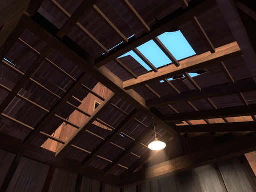
In fact, for the most part we needn't worry about this level of optimisation as the Source Engine and up to date computer systems that run games like TF2 are actually pretty powerful pieces of technology. As long as we moderate the details in the immediate area outside a given accessible structure we can occupy a margin of error in regards to what constitutes too much detail for the average computer to handle in any area; the total rendered content for both the outside area and inside of a structure being carefully balanced.
I.E. If we have a small structure with minimal detail within it, there is no significant reason to allow it to cut vis and extend our compile time, or for us to cordon the inside from the outside for performance reasons. In this case we have the freedom to func_detail or displace our roofs without fear of negative ramifications. But if the structure is large it is sensible to allow it to cut vis for performance benefits, in which case we'll need to carefully watch how we implement our roofs to make sure those performance benefits are maximised.
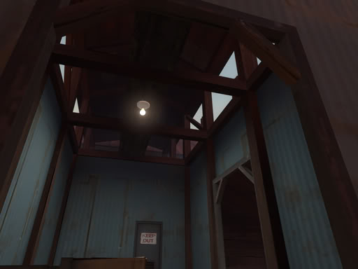
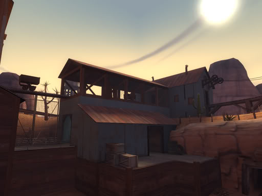
As you can see in this screen shot the roof is open at the top, sacrificing the extra optimisation efficiency for bonus aesthetics. Because the building borders the edge of an arena (stage 1, capture point 2 of pl_goldrush) its potential negative impact on performance is limited as no excessive amount of additional detail is being exposed, allowing for this scenario to work at no significant negative cost on performance. This works because of limited details inside the structure in question, it has been well balanced for this detail/performance compromise.
Displacements vs func_detail's: Optimisation Options
When sealing off the inside from the outside of a structure there are 3-4 common approaches, each achieving different results. Firstly we can func_detail roof panels to prevent excessive cutting of visleafs; this result can also be achieved with displacements, but this obviously adds more triangles to an area that require additional resources for rendering and computing. Both result in cleaner visleaf formation and faster vis times, but may impact negatively on in game performance. We can implement 2 counter measures that will not significantly affect the quality of our roof aesthetics whilst maximising ingame performance.
A) We only func_detail the “lips” of our roof, leaving the “world geometry” (standard brush) of the roof panel to cut vis at a clean angle, separating the areas inside and outside, reducing excessive render loads but still keeping clean vis formations.
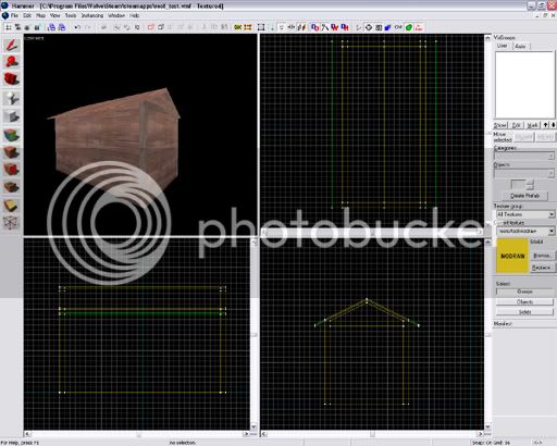
B) We create a second “under” layer to the roof. This is especially helpful when working with displacement roofs were we utilise the displacement feature to purposefully create imperfections in the roof panelling for increased aesthetics. We can include an under layer brush, of wood or metal, aligned to the walls and sealing the inside from the outside. I.E. the displacement sits on top of the brush roof section.
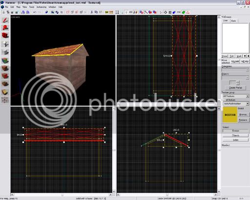
C) We take B's approach, but rest a func_detail on our roof rather than a displacement.
D) We forgo optimisation because it's more efficient to leave the structure as non-world geometry.
Optimising your map with skybox brushes: The messy details
This is where the more innovative mapping techniques come into play.
When creating more sophisticated building designs you'll end up with gaps in geometry you will want to seal for performance reasons, how ever this comes at a price to aesthetics if you're not careful. Skybox brushes cut vis and are intended to seal the map, resulting in cutting into the sides of walls and buildings, taking chunks out of a neighbouring brush faces. Here is a good example:
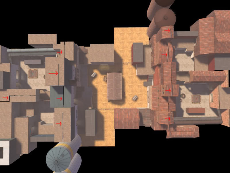
As you can see, the skybox brushes have had a rather destructive affect on our geometry. For the most part one could ignore this affect as it usually occurs outside of the bounds from which the player can see, but this is not always the case; Dustbowl and Goldrush have to deal with this fact in quite a few areas, largely because of their multi-stage nature which sees many fighting areas neighbouring each other and sharing structures on area bounds. But this issue can still be true of any map mode with many areas desired to be separated for performance.
Lets take a closer look at this process, and see the work around options. Here i have set up 3 examples, each intersected vertically through its centre by a skybox brush.
Left to right: World brush, func_detail, displacement.
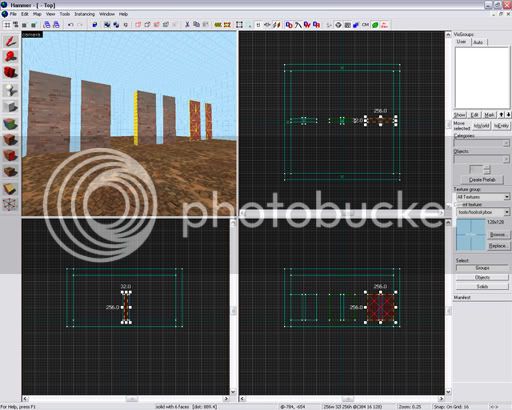
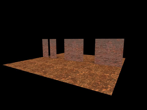
As i have discussed above, the world geometry has been cut by the skybox brush. But the func_detail and displacements have not. It should be noted however that a func_detail which overlaps a skybox brush, but whom's origin resides on one side of the skyboxbrush will only render from the area where its origin resides, preventing it from being rendered on the opposite side of the building despite its volume being present. This can be related to how clever one has been with executing areaportals in the outside area. This can be difficult to do, but have you been resourceful enough to do it you might find you are also culling geometry you do want to render, such as these roof brushes. This can sometimes be avoided by copy/pasting the roof section into the 3dskybox, but this may put additional strains on system resources by rendering it twice (if only at 16th scale). This is more problematic when your map is already at its performance limits. It also has limitations as the 3dskybox is only rendered from skybox brush faces, so world geometry will block LOS to the roof, such as a building's walls preventing the over-hangs from displaying. In which case it's better to utilise displacements (with a single brush) and bending them in half at the peak.
Geometry in action:
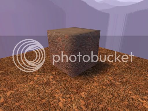
Here we compare a displacement brush with solid world geometry, noting how the world brush's faces get cut but the displacement face remains fully rendered. The effect is true for func_detail as it is with displacements. In order to maintain visleaf cohesion and plug our areas, you will need to occupy a similar volume of geometry to that which has now been rendered invisible to vvis with nodraw or place a skybox brush right through it. Either are acceptable, but skybox brushes emit light which can give you inconsistant shadows or cause light to bleed through at face edges (a common issue for displacements).
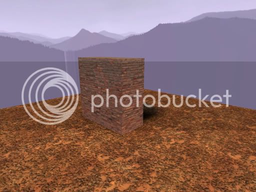
World brush intersected by skybox brush:
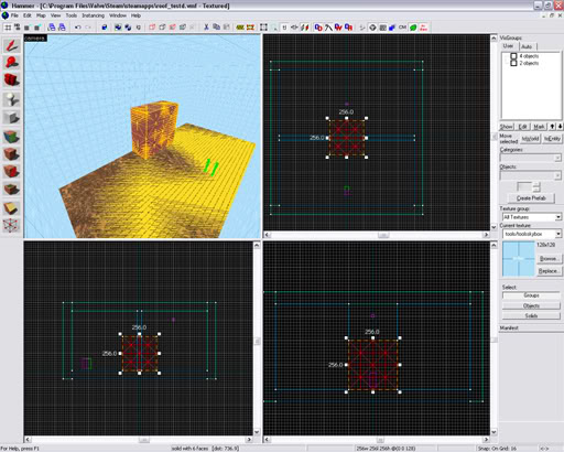
Hammer view demonstrating brush converted into a displacement:
Result:
Lets see this in action:
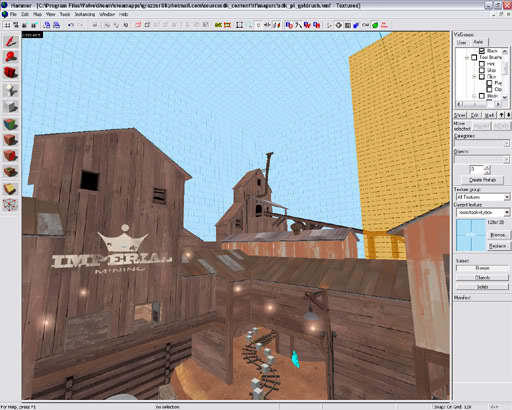
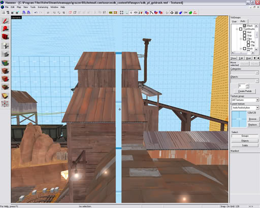
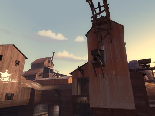
This allows the whole form of a structure that borders 2 areas of a map to be rendered. It is important to note that a face is only rendered from both areas if the face is visible in both. If a brush is cut vertically then there are chances that the far face will not be rendered as desired.
The same thing occuring in dustbowl:
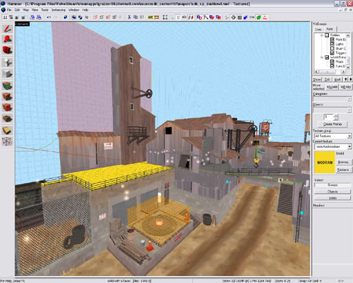
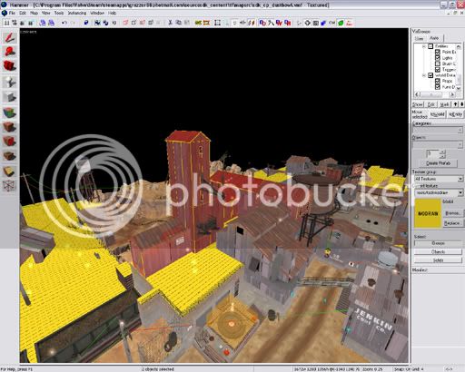
If you wish to research this phenomenon, reference places of interest in provided pre-compile .vmf's can be found in badwater between the first and final area (the tower) and between each stage in dustbowl and goldrush.
It is also important to note that the skybox brush emits light in the direction the environment light dictates. Skybox brushes intersecting large structures can cause light to be cast within areas that should be covered in shadow. Sometimes nodraw brushes occupying the volume of a structure made this way will stop light bleeding through, but other times it is necessery to utilise the "blocklight" texture (reference* as seen in Badwater and goldrush) to prevent this.
Summary points:
Aesthetics:
Now that that's out of the way, lets summarise the contents of this article.
The Basics: Roof Construction
- Attributes: What should I use?
- What makes a roof look awesome? The inner details.
- What makes a roof look awesome? The outer details.
- Blu vs Red.
- General Optimisation Concerns.
- Displacements vs func_detail's.
- Optimising your map with skybox brushes: The messy details.
- Max Z-clipping plane and utilising areaportals.
Roof attributes: What should I use?
It's not that hard to create a basic roof shape, they look good aligned to 1:1, 1:2 or 2:3 ratios of height:length. But they're not just restricted to these traditional alignments, some roof angles have been applied at even 1:5 height:length ratios. It all depends on what is required from the structure you are creating. The larger the structure the more abstract alignments you have available given the grid. If the structure is to be accessed by players then it might be preferred to utilise a more basic ratio of 1:2 as it allows for easier alignment of trusses and support beams within the building; it also compliments wall thickness's of 8, 16 and 32 hammer units which are traditional wall attributes for most Source games, including TF2. If the structure is just a detail piece of geometry you can experiment by implementing more greatly warped ratios in your roof angles as you don't have to worry so much about alignment of details within the building.
So in truth there is no right way, simply that 1:1, 1:2 (and 2:3 less so) are easier to work with in Hammer due to the 2x2 Source grid system and TF2 scaling.
The same principle applies for the thickness of a roof and the “lip” on the edges of roofs which extend beyond the structures walls. Length and thickness's are entirely at your artistic discretion, but a thickness of 4 is Valves standard.
What makes a roof look awesome? The inner details
It has to be said that one of the most important features of a roof in TF2 is not actually the roof itself, but the frame work on the inside that enhance the buildings presence. Valve generally stick to a basic grid of 64 Hammer units when it comes to applying structures in their maps, so the 1:2 incline ratio compliments the 2x2 Source grid and the process of including details such as support beams and trusses inside a TF2 structure.
It's also aesthetically attractive to introduce gaps in the roof panels where the sky can shine through. It breaks visual monotony and allows for extra details to be implemented that interact with this visual feature, all furthering the concept of a story/history of the structures life, giving a sense of a wider world beyond the play area and its current presence in the map.


On a final note for inner roof details, in an act of completing detail work within a room, light fixtures are key pieces of detail for the underside of a roof. They hang from the ceiling or walls and have a remarkable impact on the visual attractiveness inside a structure.
What makes a roof look awesome? The outer details
There is more freedom in applying prop based detail work to the outside of your building, anything light in weight that you might classify as “junk” can be scattered onto low rooftops to break visual monotony; including tires, planks of wood or sheets of corrugated iron. Taking roof details even further and in an effort to give a building character, we should add chimneys or ventilation shafts/ducts. There are props and overlays on offer, you can chose which is preferable based on distance to players and level of detail in your area.


Blu vs Red
BLU is more construction based whilst RED is demolition based. Which means BLU tends to take on more complete and modern building designs including flat roofs; whilst RED opts for more make shift wooden shack structures that utilise corrugated iron sheets for angled roofs (that often have gaps/holes). But either are not strictly limited to these choices and ultimately it comes down to the buildings design concept (materials it is made from and the buildings purpose within the maps narrative). Badlands is an incredibly symmetrical map where BLU does indeed have angled roofing the same as RED, so don't get too caught up with only making BLU have flat roofs and RED angled. But as Badwater shows us BLU buildings will frequently opt for flat roof designs on the more modern concrete looking buildings.

General Optimisation Concerns.
The shape of a room is not a mere box and the underside of roofing is usually visible, this is especially true for RED structures, but a general rule for most TF2 structures. This can be a pain for people who desire to optimise their maps as they'll want to implement func_detail, prop or displacement based roof geometry to simplify visleaf formations, reduce compile times and maximum capacity for detail; but this results in increased vis sight lines as vis sees through these pieces of geometry into areas it shouldn't, increasing total render load for the local vicinity.

In fact, for the most part we needn't worry about this level of optimisation as the Source Engine and up to date computer systems that run games like TF2 are actually pretty powerful pieces of technology. As long as we moderate the details in the immediate area outside a given accessible structure we can occupy a margin of error in regards to what constitutes too much detail for the average computer to handle in any area; the total rendered content for both the outside area and inside of a structure being carefully balanced.
I.E. If we have a small structure with minimal detail within it, there is no significant reason to allow it to cut vis and extend our compile time, or for us to cordon the inside from the outside for performance reasons. In this case we have the freedom to func_detail or displace our roofs without fear of negative ramifications. But if the structure is large it is sensible to allow it to cut vis for performance benefits, in which case we'll need to carefully watch how we implement our roofs to make sure those performance benefits are maximised.


As you can see in this screen shot the roof is open at the top, sacrificing the extra optimisation efficiency for bonus aesthetics. Because the building borders the edge of an arena (stage 1, capture point 2 of pl_goldrush) its potential negative impact on performance is limited as no excessive amount of additional detail is being exposed, allowing for this scenario to work at no significant negative cost on performance. This works because of limited details inside the structure in question, it has been well balanced for this detail/performance compromise.
Displacements vs func_detail's: Optimisation Options
When sealing off the inside from the outside of a structure there are 3-4 common approaches, each achieving different results. Firstly we can func_detail roof panels to prevent excessive cutting of visleafs; this result can also be achieved with displacements, but this obviously adds more triangles to an area that require additional resources for rendering and computing. Both result in cleaner visleaf formation and faster vis times, but may impact negatively on in game performance. We can implement 2 counter measures that will not significantly affect the quality of our roof aesthetics whilst maximising ingame performance.
A) We only func_detail the “lips” of our roof, leaving the “world geometry” (standard brush) of the roof panel to cut vis at a clean angle, separating the areas inside and outside, reducing excessive render loads but still keeping clean vis formations.

B) We create a second “under” layer to the roof. This is especially helpful when working with displacement roofs were we utilise the displacement feature to purposefully create imperfections in the roof panelling for increased aesthetics. We can include an under layer brush, of wood or metal, aligned to the walls and sealing the inside from the outside. I.E. the displacement sits on top of the brush roof section.

C) We take B's approach, but rest a func_detail on our roof rather than a displacement.
D) We forgo optimisation because it's more efficient to leave the structure as non-world geometry.
Optimising your map with skybox brushes: The messy details
This is where the more innovative mapping techniques come into play.
When creating more sophisticated building designs you'll end up with gaps in geometry you will want to seal for performance reasons, how ever this comes at a price to aesthetics if you're not careful. Skybox brushes cut vis and are intended to seal the map, resulting in cutting into the sides of walls and buildings, taking chunks out of a neighbouring brush faces. Here is a good example:

As you can see, the skybox brushes have had a rather destructive affect on our geometry. For the most part one could ignore this affect as it usually occurs outside of the bounds from which the player can see, but this is not always the case; Dustbowl and Goldrush have to deal with this fact in quite a few areas, largely because of their multi-stage nature which sees many fighting areas neighbouring each other and sharing structures on area bounds. But this issue can still be true of any map mode with many areas desired to be separated for performance.
Lets take a closer look at this process, and see the work around options. Here i have set up 3 examples, each intersected vertically through its centre by a skybox brush.
Left to right: World brush, func_detail, displacement.


As i have discussed above, the world geometry has been cut by the skybox brush. But the func_detail and displacements have not. It should be noted however that a func_detail which overlaps a skybox brush, but whom's origin resides on one side of the skyboxbrush will only render from the area where its origin resides, preventing it from being rendered on the opposite side of the building despite its volume being present. This can be related to how clever one has been with executing areaportals in the outside area. This can be difficult to do, but have you been resourceful enough to do it you might find you are also culling geometry you do want to render, such as these roof brushes. This can sometimes be avoided by copy/pasting the roof section into the 3dskybox, but this may put additional strains on system resources by rendering it twice (if only at 16th scale). This is more problematic when your map is already at its performance limits. It also has limitations as the 3dskybox is only rendered from skybox brush faces, so world geometry will block LOS to the roof, such as a building's walls preventing the over-hangs from displaying. In which case it's better to utilise displacements (with a single brush) and bending them in half at the peak.
Geometry in action:
Here we compare a displacement brush with solid world geometry, noting how the world brush's faces get cut but the displacement face remains fully rendered. The effect is true for func_detail as it is with displacements. In order to maintain visleaf cohesion and plug our areas, you will need to occupy a similar volume of geometry to that which has now been rendered invisible to vvis with nodraw or place a skybox brush right through it. Either are acceptable, but skybox brushes emit light which can give you inconsistant shadows or cause light to bleed through at face edges (a common issue for displacements).
World brush intersected by skybox brush:

Hammer view demonstrating brush converted into a displacement:

Result:

Lets see this in action:


This allows the whole form of a structure that borders 2 areas of a map to be rendered. It is important to note that a face is only rendered from both areas if the face is visible in both. If a brush is cut vertically then there are chances that the far face will not be rendered as desired.
The same thing occuring in dustbowl:


If you wish to research this phenomenon, reference places of interest in provided pre-compile .vmf's can be found in badwater between the first and final area (the tower) and between each stage in dustbowl and goldrush.
It is also important to note that the skybox brush emits light in the direction the environment light dictates. Skybox brushes intersecting large structures can cause light to be cast within areas that should be covered in shadow. Sometimes nodraw brushes occupying the volume of a structure made this way will stop light bleeding through, but other times it is necessery to utilise the "blocklight" texture (reference* as seen in Badwater and goldrush) to prevent this.
Summary points:
Aesthetics:
- skybox brushes cut vis and are destructive to world brush faces.
- skybox brushes are not destructive to displacements or func_detail's.
- Roofs on non-accessible buildings should be func_detailed or turned into displacements to simplify visleaf formations and reduce compile times.
- Roofs on small accessible structures that contain minimal detail can can be func_detailed or converted into displacements due to a negligable impact on in game performance.
- Roofs on large structures that are likely to contain significant amounts of detail should have optimisation techniques in place for performance reasons, see: Displacements vs func_detail's: Optimisation Options.
Last edited:


