Theory

CP Theory a18

EArkham

Necromancer
aa
Aug 14, 2009
1,625
2,774
Normally the name is indicitive of a location/theme (dustbowl, badlands, hydro) or related to an important aspect of the map (nucleus, upward, barnblitz), right?

I'm not sure what theory could imply, short of a research facility. Which could be quite cool actually.

How about:

enterprise
manufactorum
industpark
workload

Of course I guess it doesn't matter if the map is purely experimental. It mainly matters if the map starts getting popular as you don't want to change the name at that point.
 

tyler

aa
Sep 11, 2013
5,100
4,621
Of course I guess it doesn't matter if the map is purely experimental. It mainly matters if the map starts getting popular as you don't want to change the name at that point.

Right. I also kind of wanted to stay away from those more generic industrial sounding names. I think I'm probably more concerned with being memorable, and the name is definitely part of that. That's partly why Hella remains somewhat popular, I think: the name. Well, and the black hole and shit. But yeah.

"Thrust" came from thinking up synonyms for "essence," as this was (to me) the essence of good 3CP. Thrust, gist, point, core, essence, etc. I thought it was cool that I could also detail around the name. You bring up Nucleus: that does the same thing, actually. The thrust/nucleus of an argument or statement are the same thing, you know? I really like that kind of name/style synergy. Not sure I can achieve it here, though, now that I have to change it again. But if you have ideas along that line, I'd be happy to hear them.

I'm okay with putting a weird science thing into the back areas of the map to kind of tie it into "theory," and I like the name just for the Weirdness Factor and also the fact that it's a short, simple word. But I'm definitely not against something better. I'll have to decide after tomorrow's gameday, as I'll likely have enough to work on to push a new version (maybe beta!). Bluhh
 

Zed

Certified Most Crunk™
aa
Aug 7, 2014
1,241
1,025
Nucleus is called Nucleus because of the huge-ass reactor smack in the middle of the map.

But yeah, go with the research facility. That sounds cool.
 

Zed

Certified Most Crunk™
aa
Aug 7, 2014
1,241
1,025
Thrust suggests pelvises. I was expecting something schlong-themed.
 

tyler

aa
Sep 11, 2013
5,100
4,621
Thanks to everyone that played this today. I was surprised to see Red push Blu so far back twice, and once after a scramble. I have some ideas to solve that, but I do think a big problem was bad class balance.

I'm also finding lots of little places to cut out of the map to make it smaller in general.

I haven't looked at the feedback in Hammer yet so I don't know what many of the specific ones are at the moment, but if anyone has anything further they'd like to share in a longer format, be my guest. I will probably take a while to create the next version, which will likely be a beta.
 

worMatty

Repacking Evangelist
aa
Jul 22, 2014
1,259
999
If you wanted a name/style synergy between the theory of control point mapping and a swampy construction theme, how about cp_blueprint?

Alternatively:
  • cp_building_code
  • cp_regulations
  • cp_progress
  • cp_renewal
  • cp_hazardous

    Or the mystery option:
  • cp_corsucate
 
Last edited:

worMatty

Repacking Evangelist
aa
Jul 22, 2014
1,259
999
Congratulations! You have won my secret err... contest! Yes! You guessed the map I was thinking of just by my soppy feedback!

Apologies. But hey it's good you recognised which map I was talking about... right?

You have my feedback on Thrust in the map itself, I have no need to bog your thread down with any more :)
 

tyler

aa
Sep 11, 2013
5,100
4,621
a12
- changed map name to cp_theory due to a naming conflict
- trimmed extra space out of the map again. red should have a much easier time getting to A in time to start building, etc
- edited what was red's shortcut before. now it's shorter, and blue can use it to approach B via a drop down into the B area (now there are 2.5 routes into B)
- made the side room by C smaller, so people will want to hold in there less. also moved the health outside
- lowered the fence on C again
- made blue's hallway flank at C more attractive
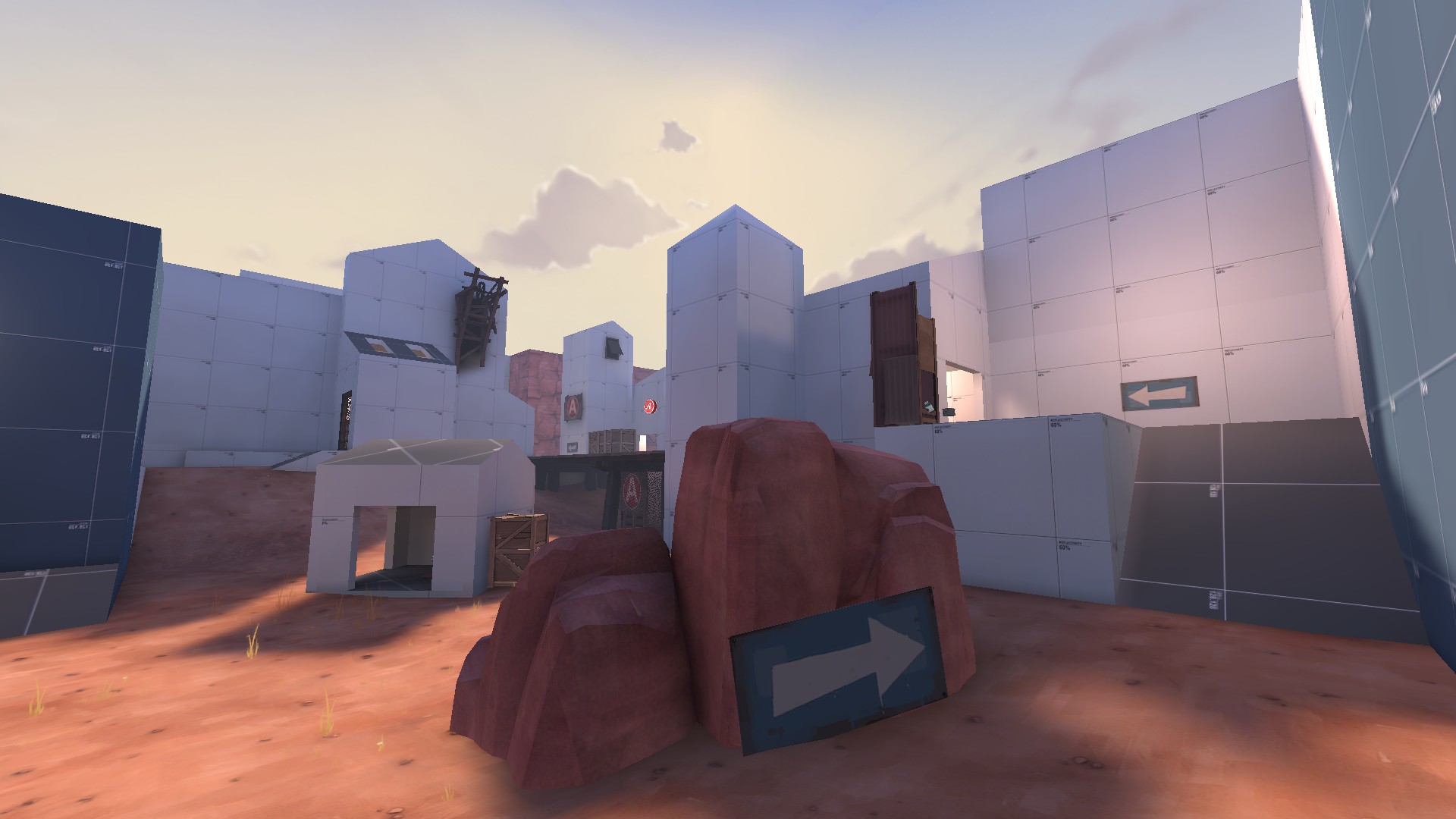
- put a rock and sign near blu spawn to block a gross sightline and direct players to the ramp near spawn more
- added a one-way door that unlocks after A is capped and lets blu get through the area quicker
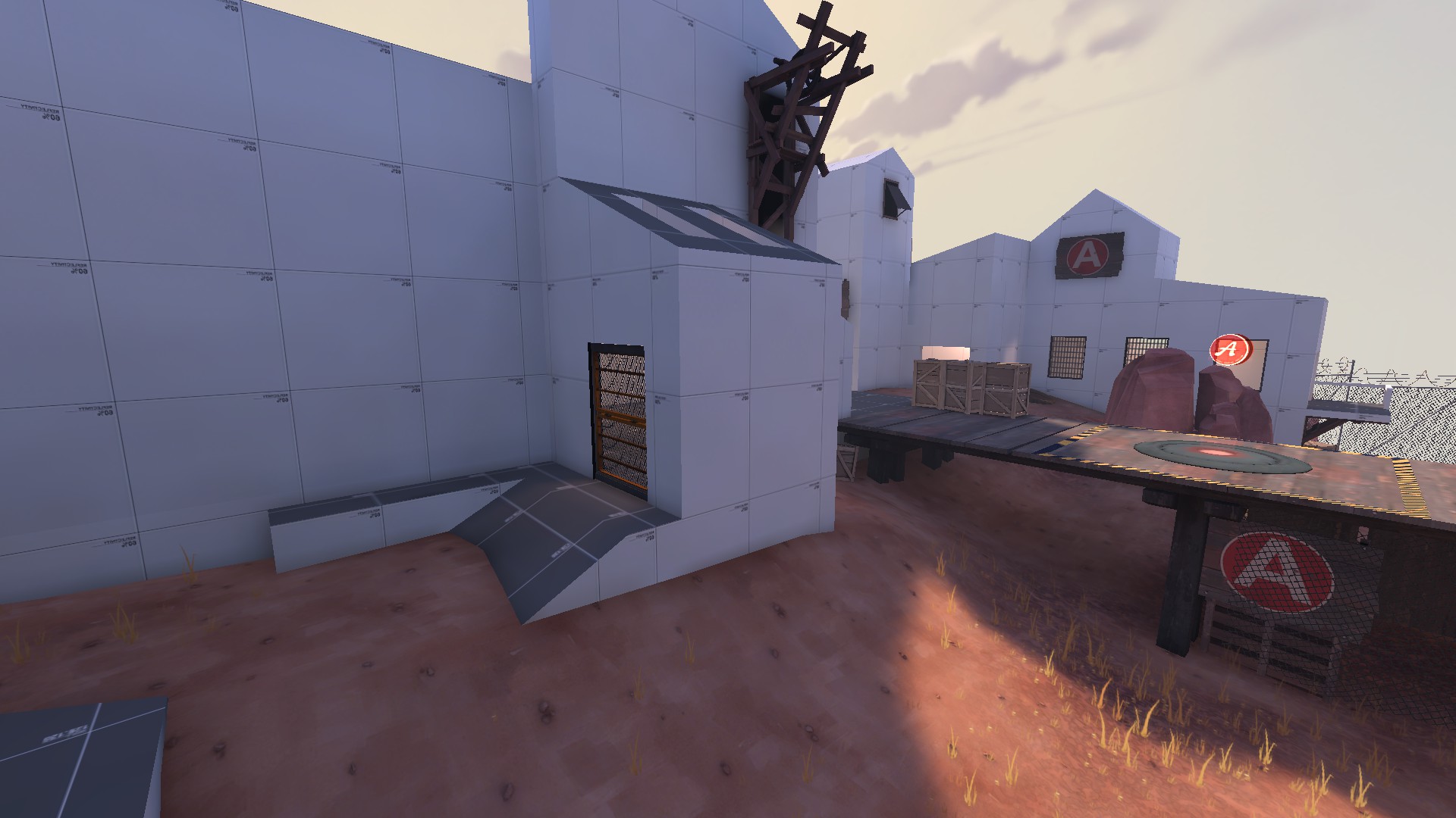
- changed the ramp inside one of the A buildings to a drop down to prevent red from using it to push back
- adjusted some things in the chairman garage
- changed the color of all overlays to be consistent with all of phi's maps
- other minor things (detailing, clipping, blockbullets, etc)

here's some pictures of the changes

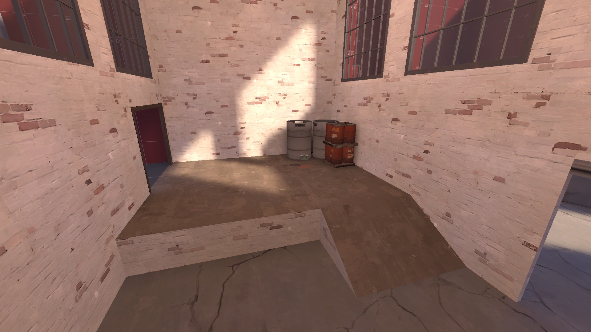
smaller room at C: ramps are now narrower, making splash more dangerous. should help against snipers
2015-06-28_00001.jpg


a rock and sign
2015-06-28_00002.jpg


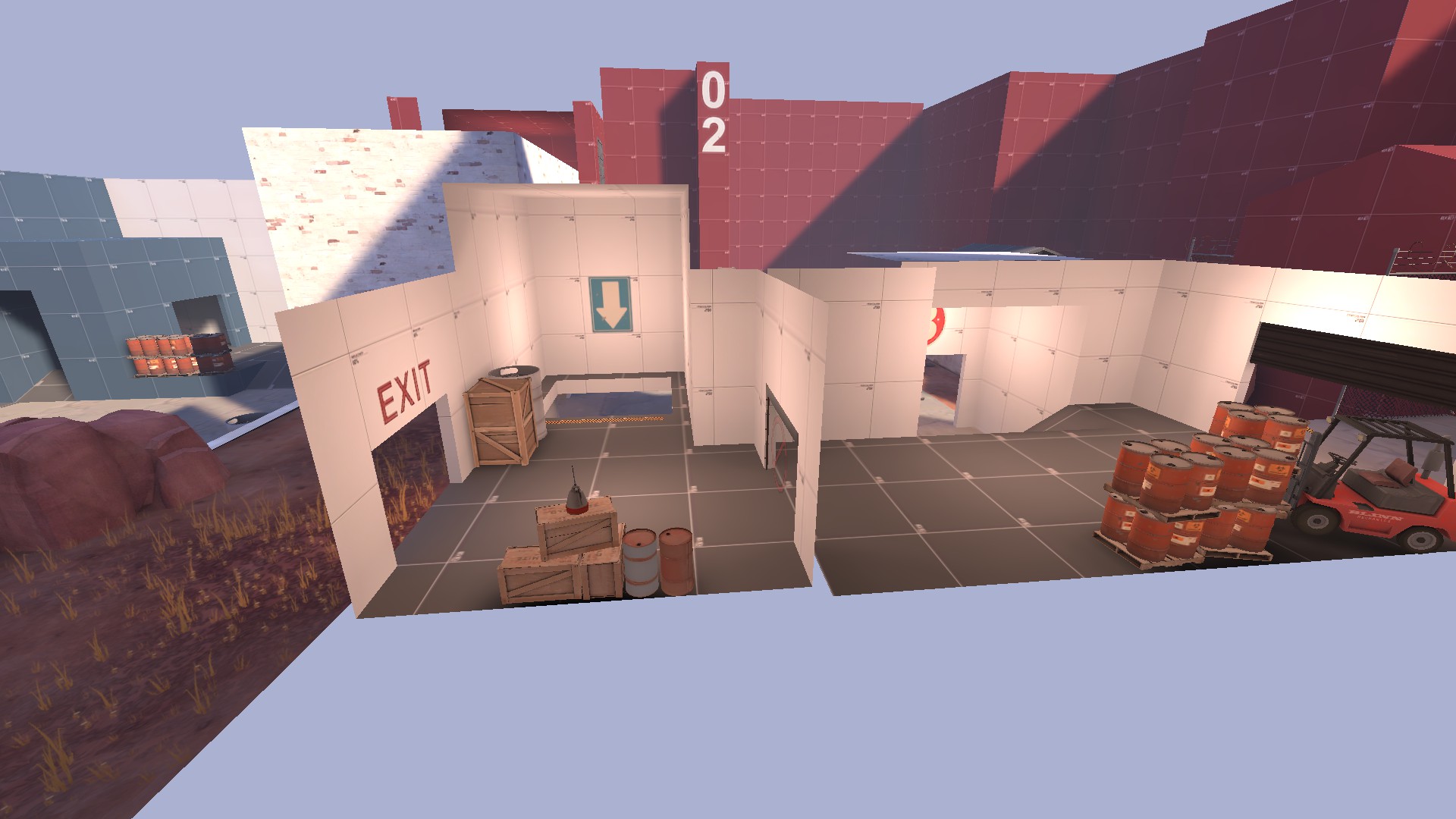
cool new door. activates and gets an arrow sign after A is capped
2015-06-28_00004.jpg


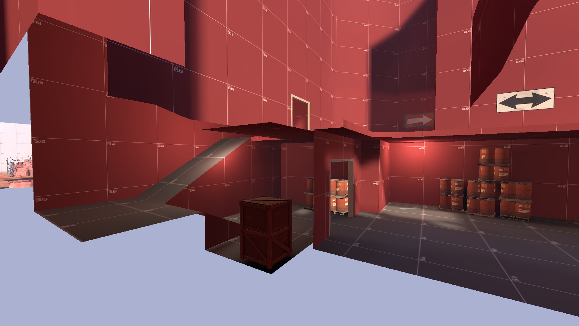
this is now a drop down
2015-06-28_00005.jpg


big changes here
2015-06-28_00006.jpg


this is red's shortcut through to A. the metal door locks after A is capped and neither team can use it.
2015-06-28_00007.jpg


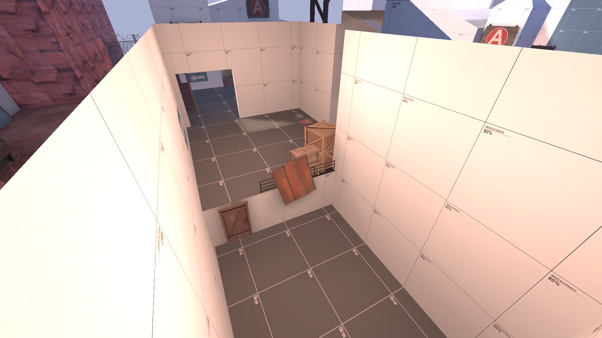
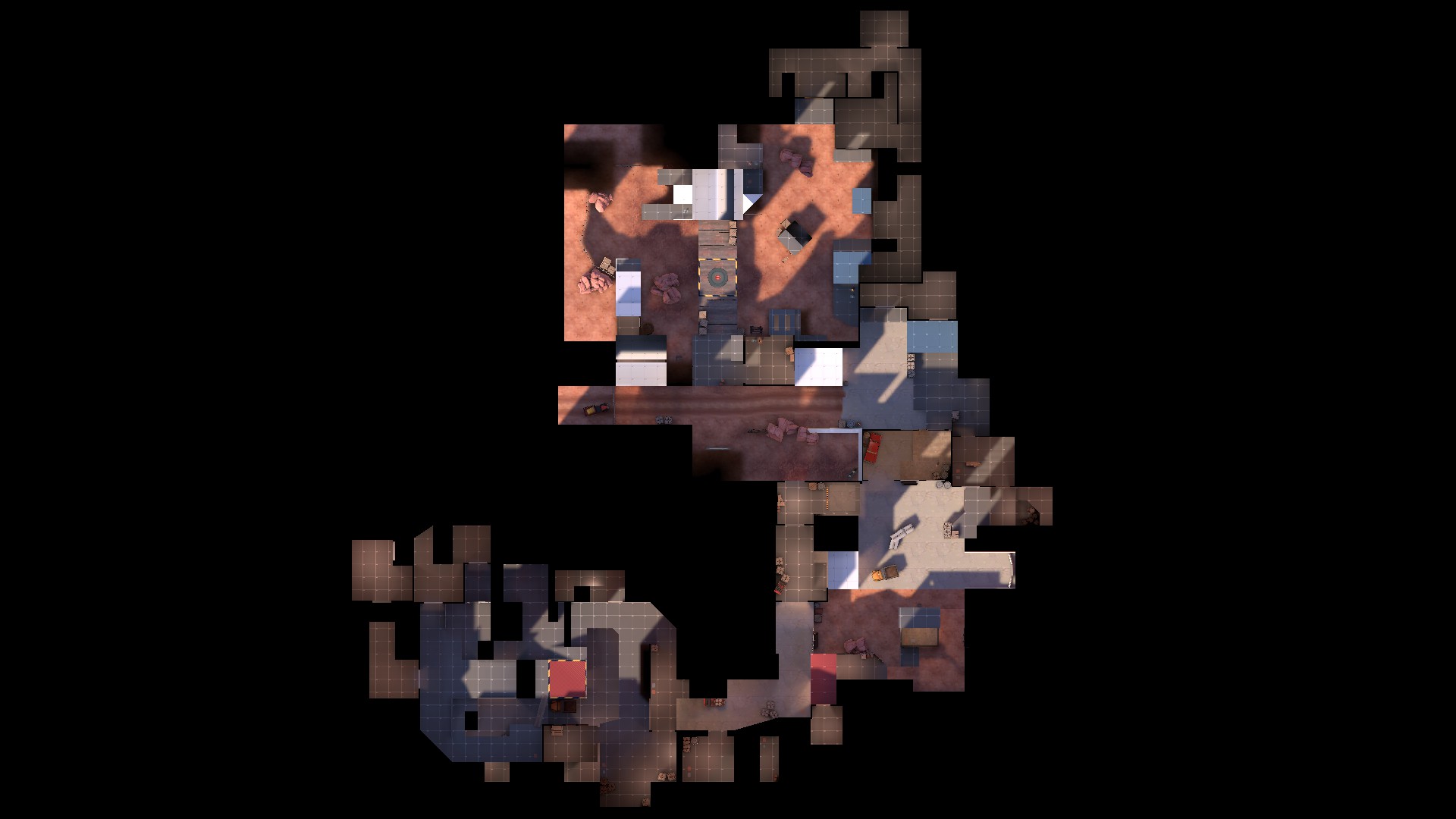
new overhead shot. the level of compression might not be noticeable compared to the old overhead shot (two versions ago), but i've shaved off close to ~1200 units in walking distance since that a10
2015-06-28_00008.jpg


download link is in the OP if anyone wants to run around on it
 
Last edited:

tyler

aa
Sep 11, 2013
5,100
4,621
Seems like each time we play this, half of one team is fucking around and it leads to bad experiences for everyone else.

Anyway please play this in more imps so I can make it better.
 

tyler

aa
Sep 11, 2013
5,100
4,621
OK, I am starting to decide I don't like B, including the A to B connectors. I keep trying to fix them but maybe I need a new approach. Probably have to drop the idea of making this a place cars can drive.
 

tyler

aa
Sep 11, 2013
5,100
4,621
I'm growing to understand that the simplest way to fix this map is to rebuild it from scratch, which is a lot of work. The alternative is dropping it, I guess, but I think fundamentally it's good, so I don't want to. Mostly I'm just going to scale things down and move stuff closer, but I also have to entirely rethink B, and the things I do scale down aren't all necessarily going to scale down by the same amount.

This is a good time to post any in depth feedback about what you think the map should be if you've been playing it. This is the point where the entire map is about to change, in some places more than others.

This is also the time to talk to me about how to make defensive engie nest areas around A, because I evidently have no idea. I am hoping making A smaller will help.

Here's my theory:

Artpass map's 1st, 2nd, and 3rd are about equidistant from each other. The map is structured so that once B is capped, BLU doesn't need to really ever see it again, which helps condense the map significantly. Flaws: The artpass map could really use a shortcut or forward spawn for BLU; they spend far too long walking without engineers. C is really labyrinthine, and it becomes easy to die to random players even before B is capped. Cap times are really fucking long.

Hella went for an approach like Gorge, and I think kind of fails. Both teams get forward spawns depending on who owns A and B. Teams constantly move forward or backward as points are capped, meaning RED engineers end up having to leave their teleporters behind in an A/D map which seems odd (probably since most A/D maps use shortcuts rather than forward spawns). Also, I had to do a weird thing where the RED forward spawn becomes part of the lobby before C in order to fit it in, which isn't ideal to me. Flaws: All that, and the layout sucks. I also tried to make the cap times much faster than the artpass map, and I think in the end I balanced around fast cap times too much.

Putting a RED forward spawn into this map doesn't really do much for me. There's not a great place to put it for several reasons, and most center around B being bad. Normally I'd consider just redoing B and joining the A stuff up somehow, but I feel that if I continue to do that I won't get a good map, hence the rebuild. Similarly, there isn't really a good place or way to cut out a lot of RED's walk time with a shortcut, which I believe to be a much more elegant solution, as it helps defense understand the map faster, which is vital for new players.

The other thing is cap times must be long for a 3cp map to work. It gives RED a chance to respawn and get to the next point to defend it. But the 80s for A on Artpass is obscene, imo. I think A on this map is 22s and people whine about that already. Hella was like 12 or 15 or something, and it was actually much too fast.

What I have now is close, and I think it shows because people like the map, or tell me they do. I like it also, but there are problems. My points are almost equidistant from each other, but not quite, and they're too far apart. I think the cap times are right, but the interaction around the C cap and RED spawn is a bit much; RED should probably be further back. On the way the map is now, that sounds awful, so that's another thing to address in a rebuild. So much of the space on the map just feels wasted.

I don't know. Thoughts? Any other 3cp theory comments?
 

taxicat

L1: Registered
Dec 29, 2012
43
152
Here's my two cents on how 3cp should function:

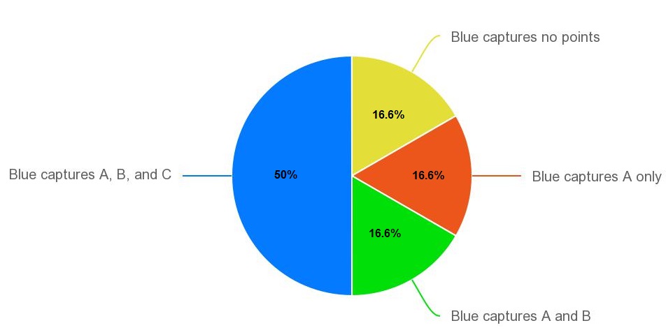
Overall, each team should have a 50% shot at winning; neither team should have a strong advantage. This means that every other possibility of capture points for Blue - no captures, A only, and A and B but not C - should fit within Red's 50% chance of winning. So it fits together like:

yuVeoHG.jpg


So when you do the math this means that, individually, Blue has an 83% chance to cap A, an 80% chance to cap B, and a 75% chance to cap C. So in each of the situations Blue has a big advantage, and the difficultly for them comes in winning those 75-83% coin tosses three times in a row while Red only has to win once. Distances between the points, spawn times, forward spawns, etc don't have to strike a particular balance, but rather need to work together to maintain that advantage for Blue.

I think a problem with the map is that Blue seems to cap A 95% of the time, then B maybe 90% of the time, but then gets hit hard on C with maybe a 50% capture rate. Overall this is close enough to the 50% win rate for each team, but for the wrong reasons.

C in general gives Red a big height advantage over most of the routes to the point, and Blue lacks a solid main path onto it. Defending, it feels like the only reason to bother holding A or B is to give Blue less time to attack C, where you really have a shot at winning.
 

Idolon

they/them
aa
Feb 7, 2008
2,123
6,137
I also have to entirely rethink B

My points are almost equidistant from each other, but not quite, and they're too far apart.

Kill two birds with one stone!

(I would try to be more helpful but I haven't actually played the map)
 

tyler

aa
Sep 11, 2013
5,100
4,621
I'm wondering if it has anything to do with the fact that every time this map gets tested, everyone suddenly gets the burning desire to fuck about instead of actually playing the game.

I'm definitely not thrilled about that, but I do think the map has issues regardless. We've had some good games.
 

tyler

aa
Sep 11, 2013
5,100
4,621
I really like this post, and honestly, I'd never thought to divide things up that way. I'm still not sold on your idea that C needs a main ramp, though; I think it's more like the surrounding geometry needs to be more different. But we'll see.