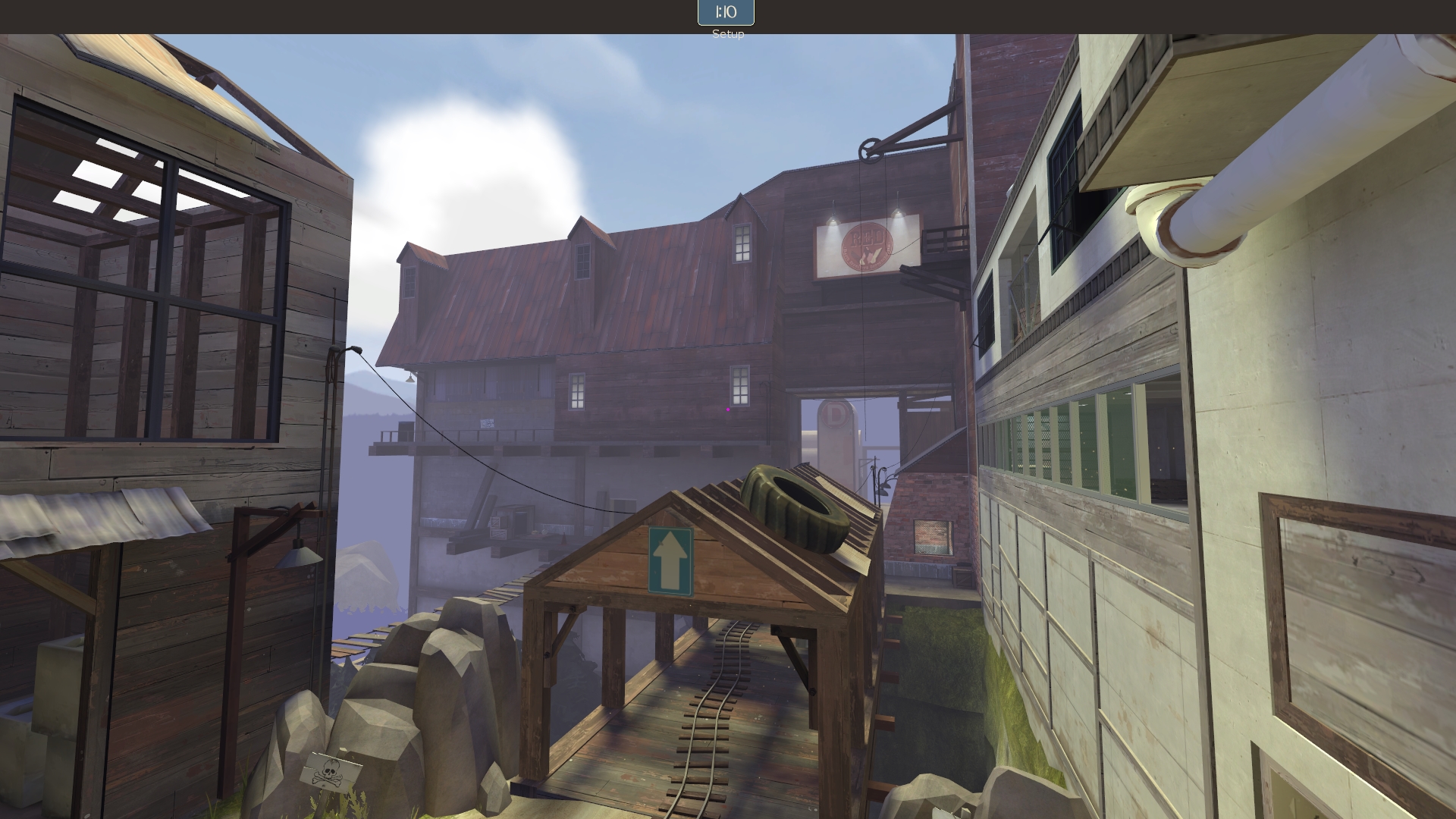
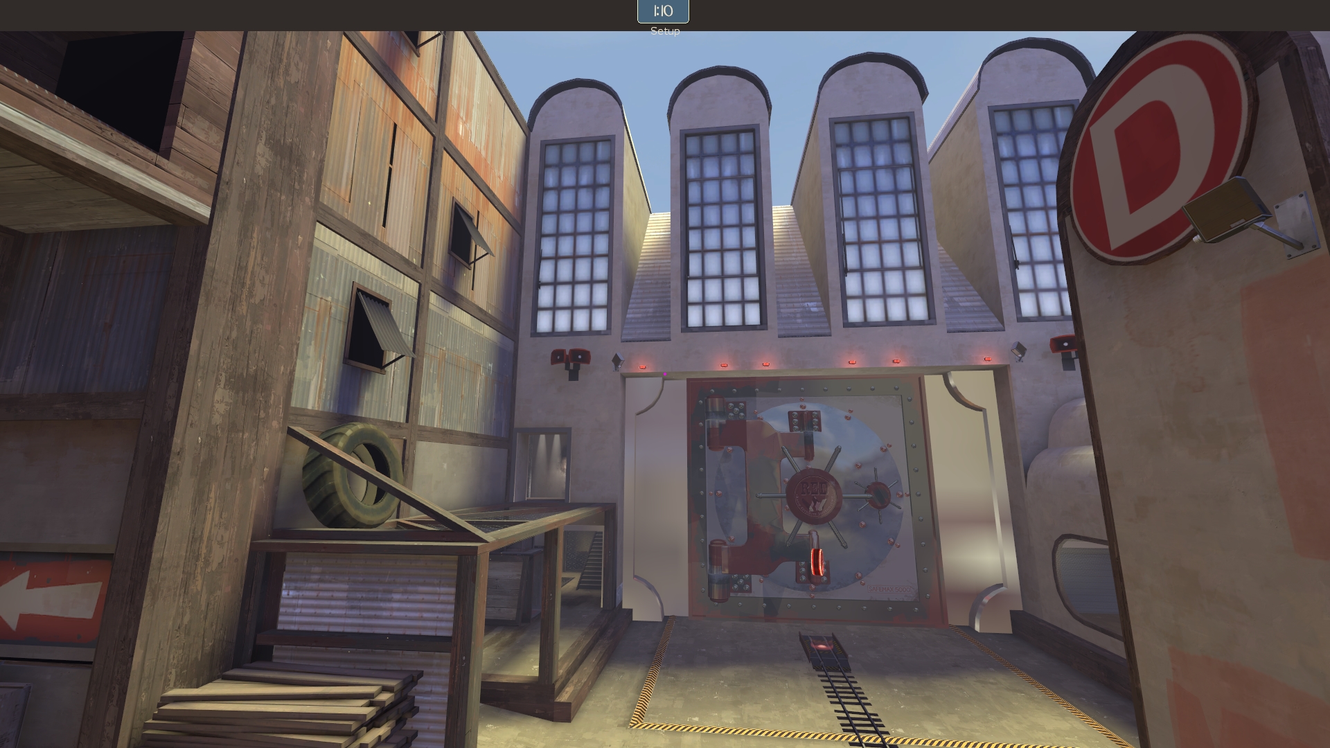
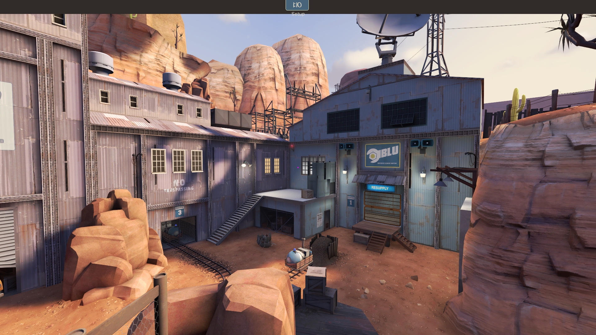
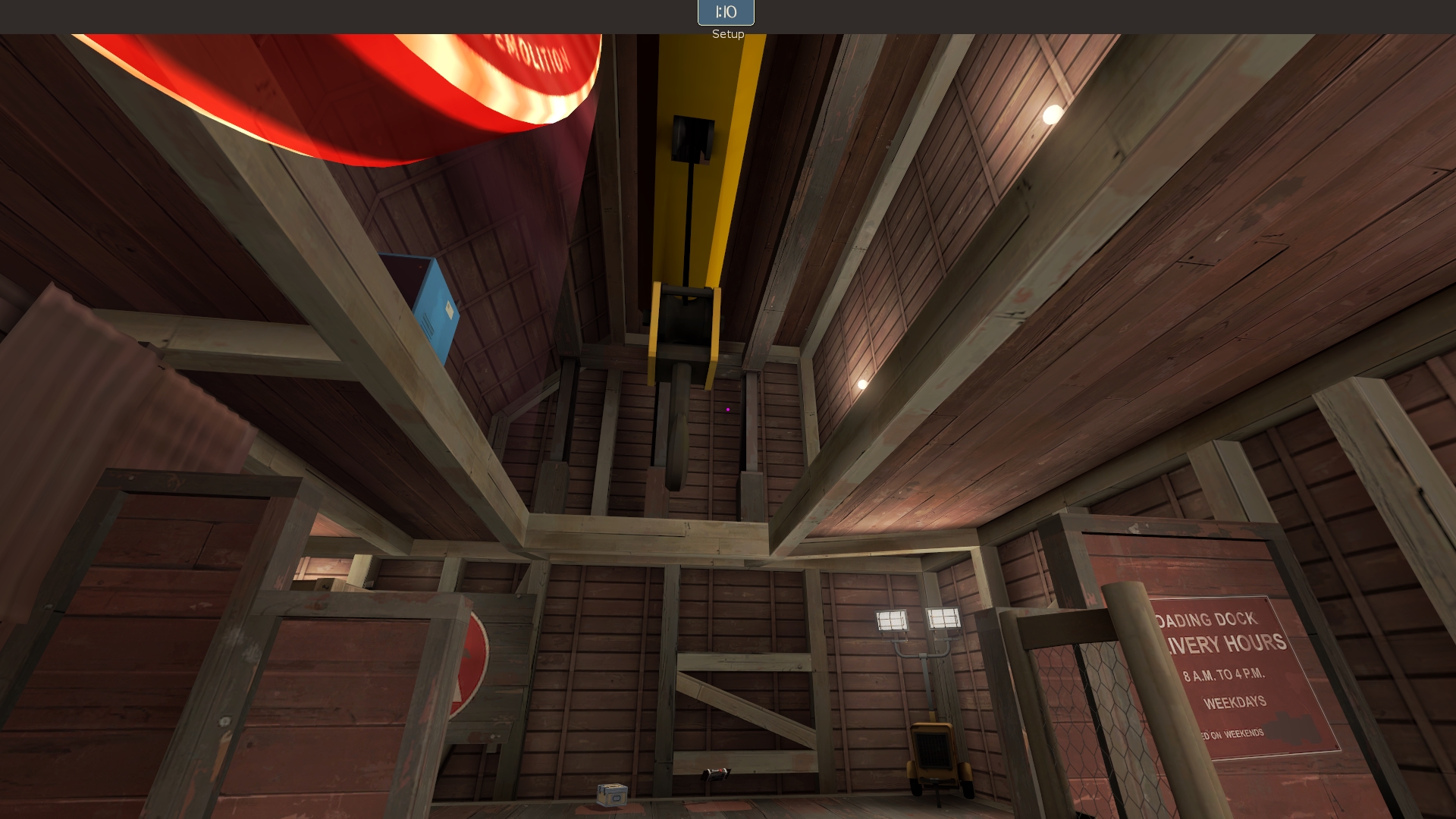
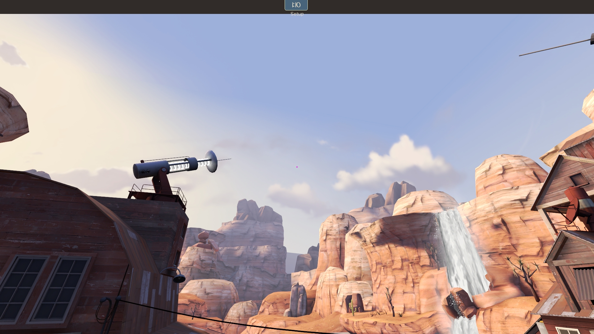
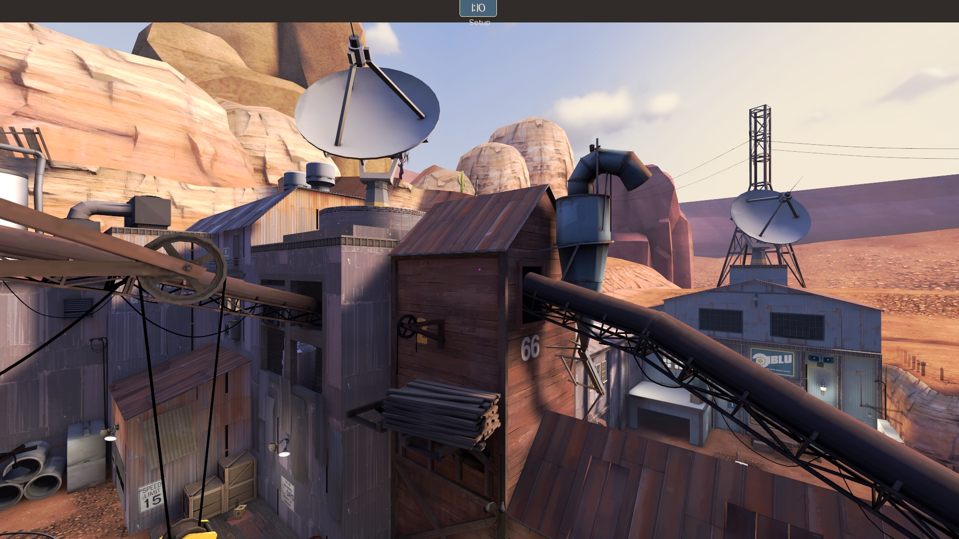
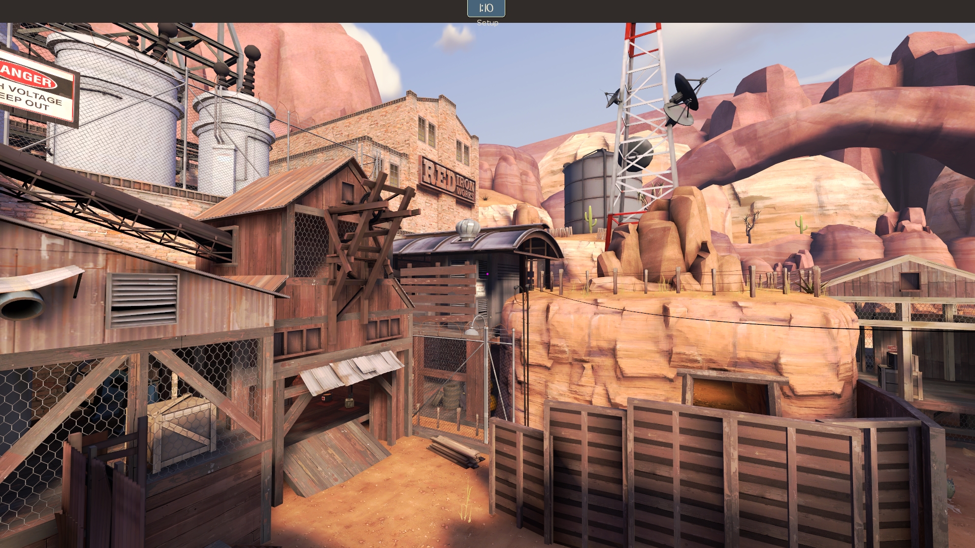
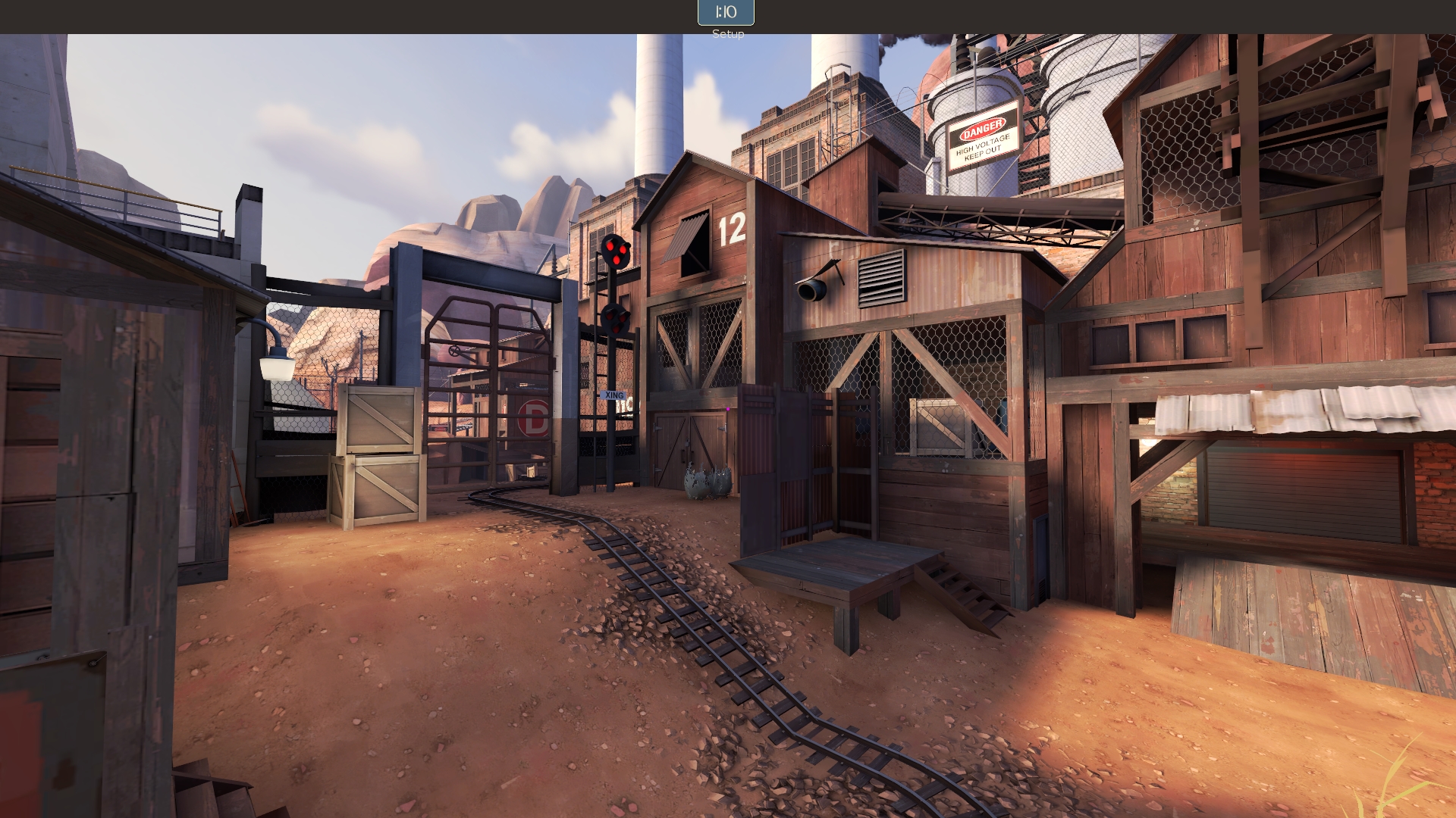
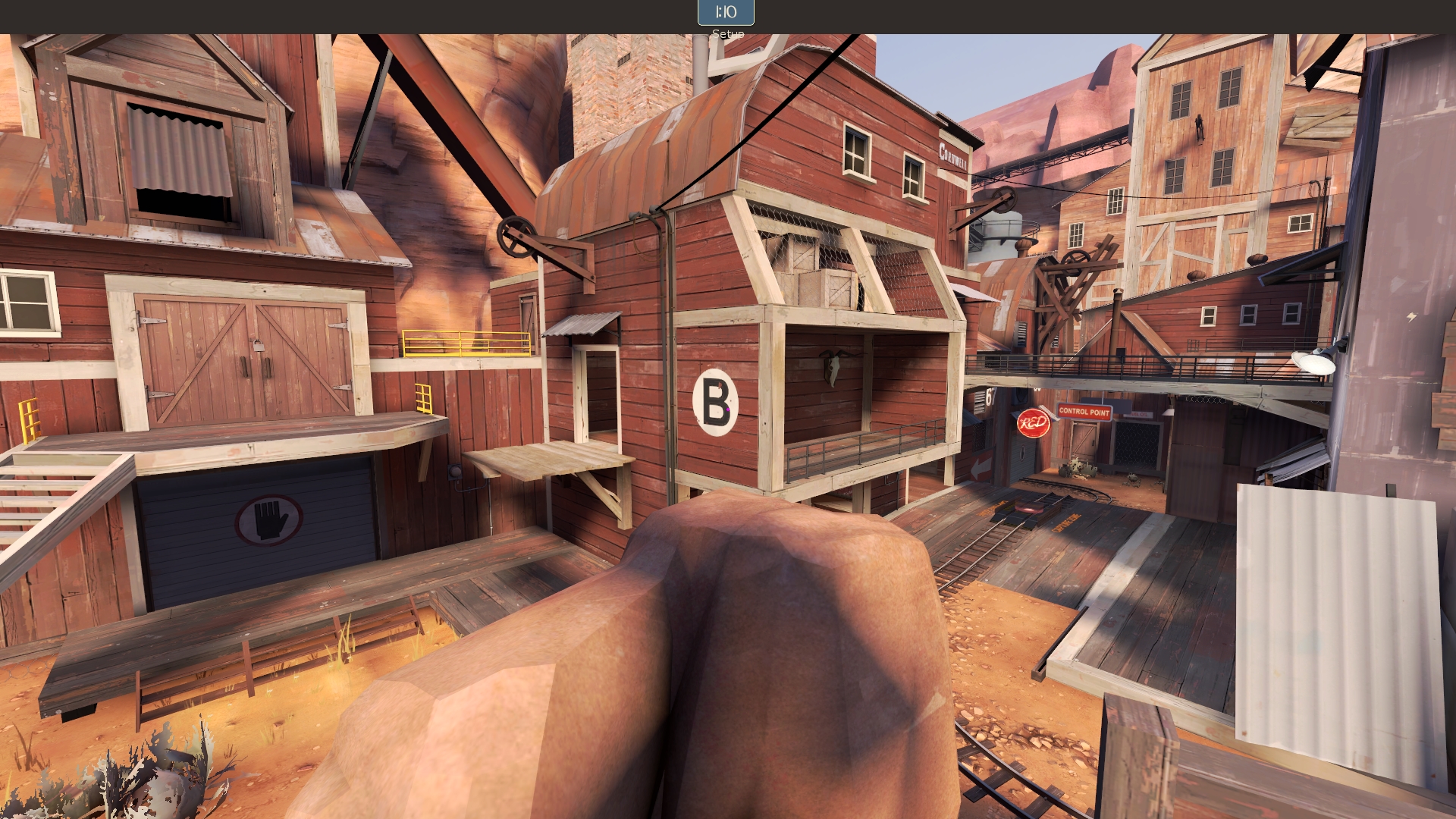
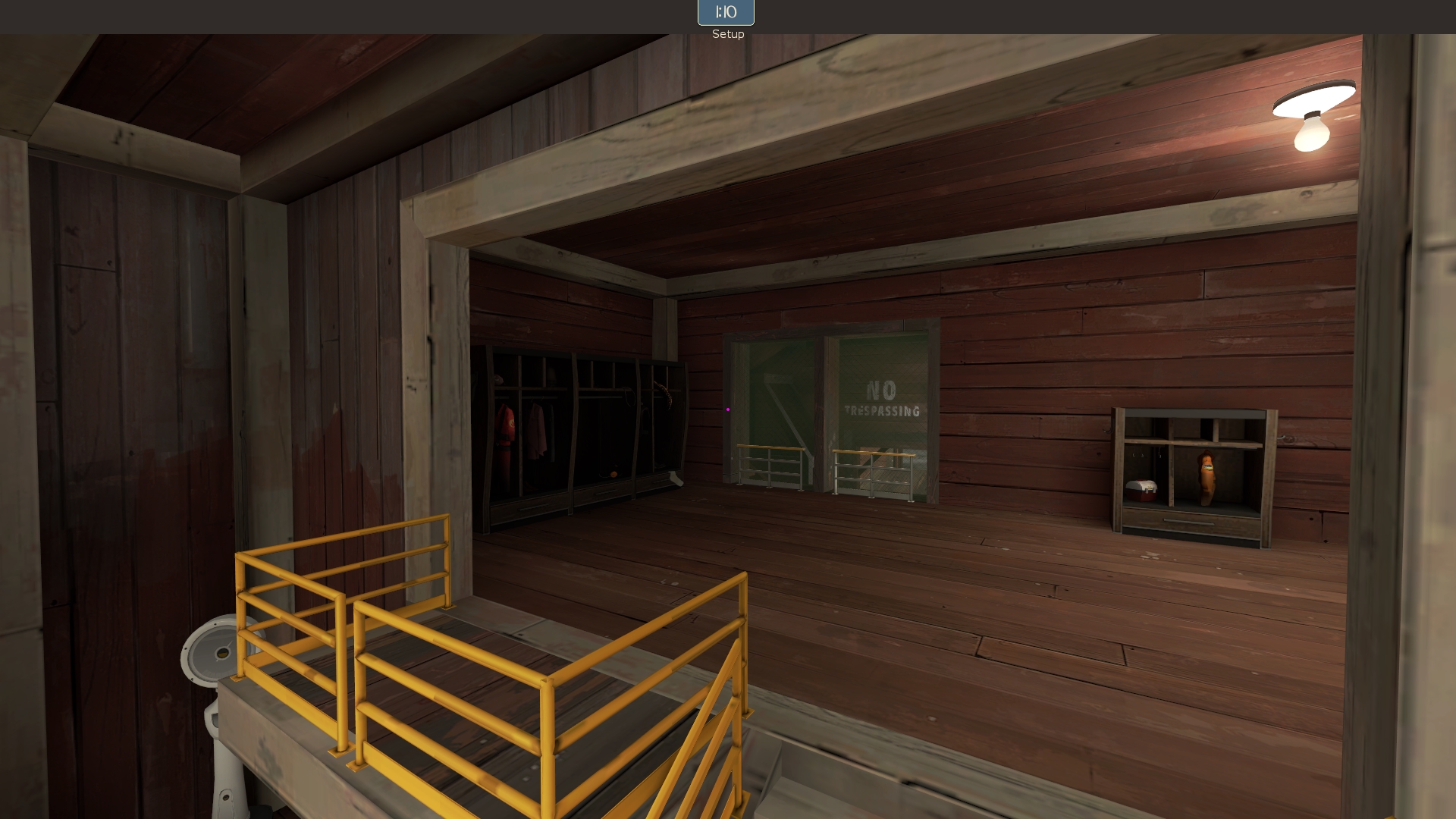
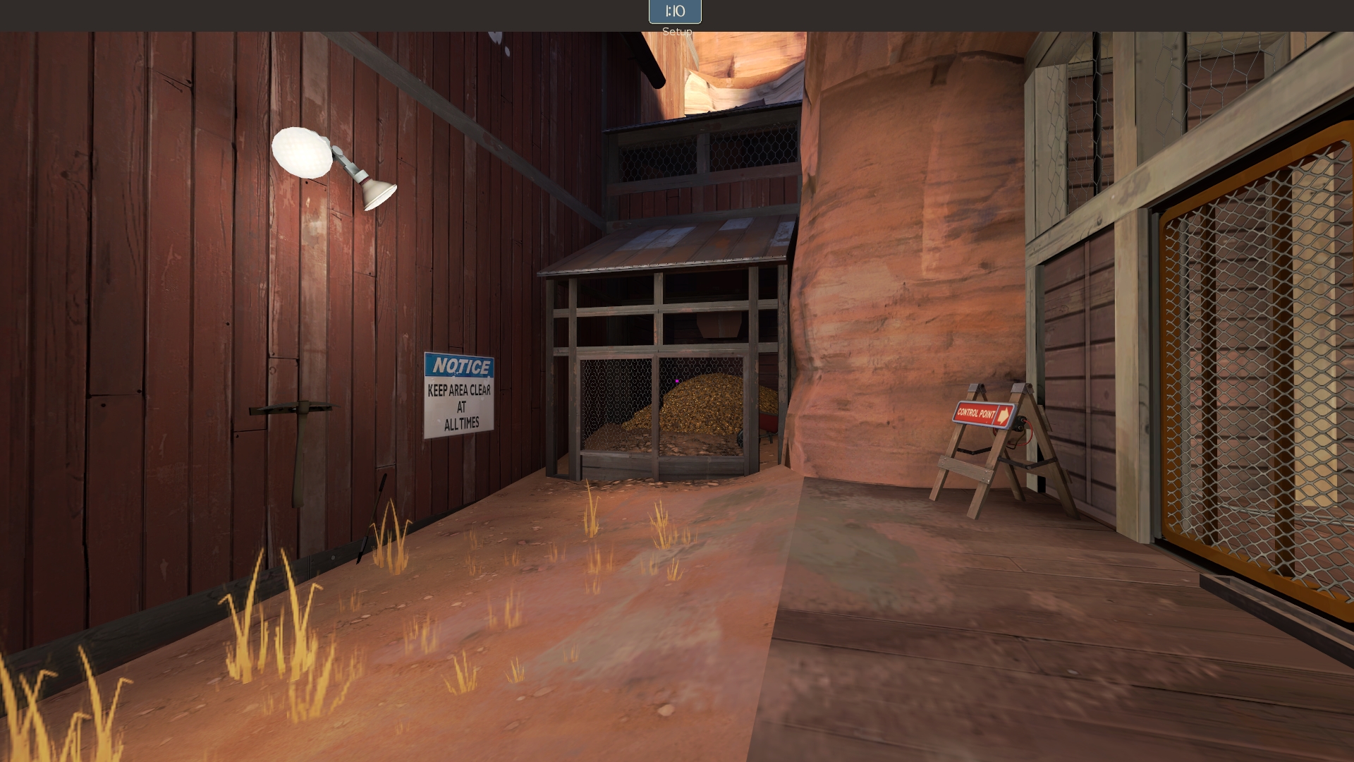
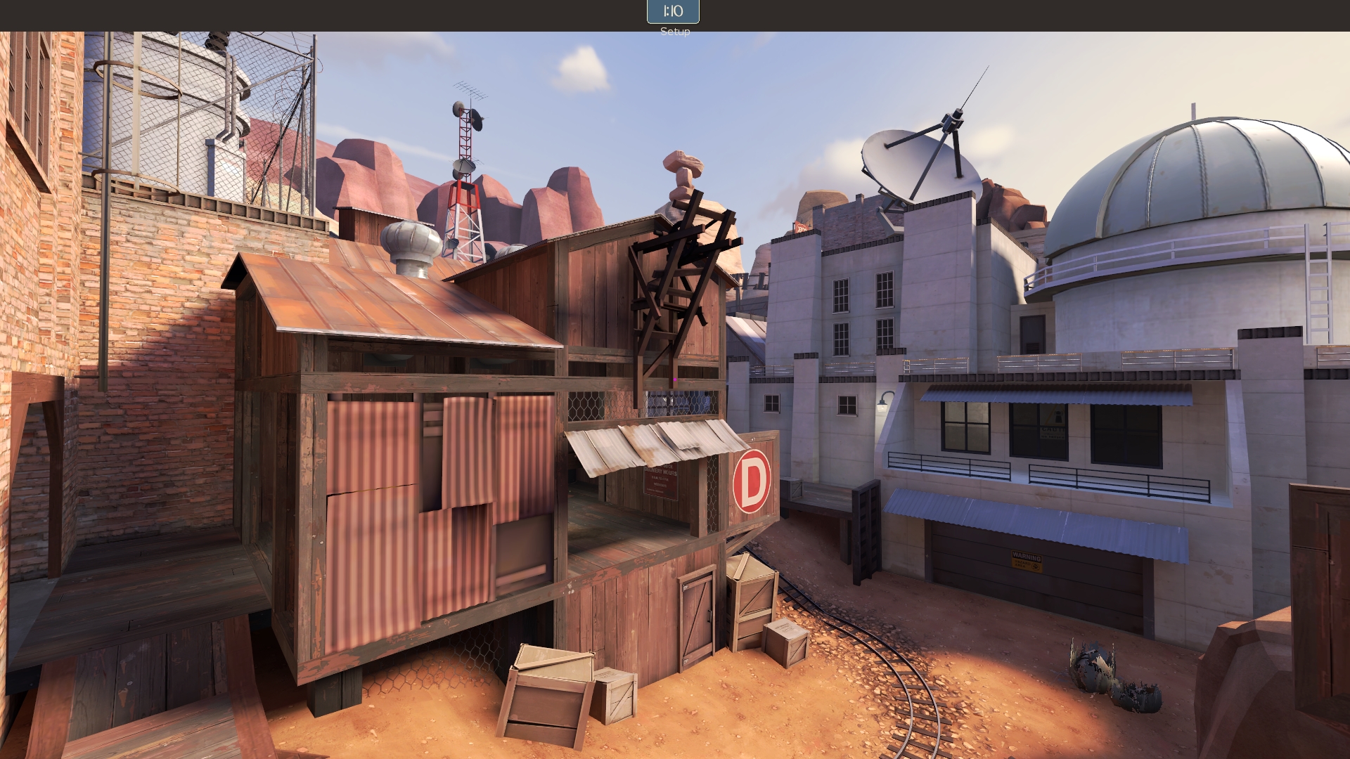
Mesaworks

PL Mesaworks Final

Jan 20, 2010
1,317
902
And again: why not?

Because it's visual static.

If you get feedback from non-mappers complimenting your map, good. I'm happy for you. But from one mapper to another, your map is significantly over-detailed and non-nonsensical. You can continue saying "why not?" but I'd highly encourage you to ask yourself "why" more often when you're detailing. Things need to be places for a reason, otherwise it's just chaos.

As for the addition of the eclipse as an after-thought, it is apparent. I'd encourage you to make it more significant as a story aspect in your map otherwise it just seems pointless. You named your entire map after it, shouldn't it have some baring on the events in the map?

Anyway, you can take what I say as you will. If you believe your map is perfect as is then feel free to ignore me. I hope I can give it a playtest sometime so I can give better feedback on the gameplay.
 

Flower_Shop_Guy

♪ -- ♫ -- ♪
aa
Mar 10, 2015
200
495
Because it's visual static.
Anyway, you can take what I say as you will. If you believe your map is perfect as is then feel free to ignore me. I hope I can give it a playtest sometime so I can give better feedback on the gameplay.

I try to listen to absolutely everyone, it's very important to me absolutely to have any opinion.
If the practice will show that it would be very necessary to remove the detals (honestly, I think they are quite normal), ok, I'll do. But I think this all right.
 

Yrr

An Actual Deer
aa
Sep 20, 2015
1,316
2,756
These doors are made in order to make the players forced to reduce the distance to the "A" point. In alplha stage playerd didn't noticise that flank.
You should guide the player to the correct route naturally, maybe have them leave spawn facing it. Don't have them presented with one obvious route, only to find out its not accessible yet, forcing them to look for another route. It's not fun.


What about all the details in general, I do not understand why it is so bad to them relate. Simply, I understand that the main gameplay areas needed the parts that more pronounced, but I've played on other detailed maps (such as pl_cashowork) and everything is good, and ro instenece take other games, such as CS:GO of where the parts even more detaled ( I'm not even talking about the DICE games), and I understand that is not the same game as TF2. In any case I have these things did not change by collecting. Please, hate, and the can never her not to play, but I want to say what I get enough good feedback from non-TF2maps community. And they are get alot of fun on it.
You clearly haven't paid attention to how detail is used in games. They do tend to have a lot of details but only in areas of importance. The amount of detail is proportional the the amount you want the player to be drawn to an area. If everything is massively detailed then nothing stands out and the player isnt drawn to anything at all. Even if theres only one way to go they will still feel lost.
 

Fruity Snacks

Creator of blackholes & memes. Destroyer of forums
aa
Sep 5, 2010
6,394
5,573
Not too sure what the big deal here is.

I don't see any issues with the prop usage. The only thing I see that could be a problem is that the lighting is generally the same throughout the map. You could play with the lighting a bit to help highlight and point out what some of the major routes are. That is, tone back your ambient light a bit, and use out-door lights (like overhead lights, or lights over doors). But thats my 2-cents.

Also, the eclipse doesn't need a story. You can have any story you want, and not include the eclipse. Its just a nice touch in the background, I think it's very creative and quite interesting.
 
Jan 20, 2010
1,317
902
Not too sure what the big deal here is.

I don't see any issues with the prop usage. The only thing I see that could be a problem is that the lighting is generally the same throughout the map. You could play with the lighting a bit to help highlight and point out what some of the major routes are. That is, tone back your ambient light a bit, and use out-door lights (like overhead lights, or lights over doors). But thats my 2-cents.

Also, the eclipse doesn't need a story. You can have any story you want, and not include the eclipse. Its just a nice touch in the background, I think it's very creative and quite interesting.

You honestly look at those screenshots and think the sheer overload of props is okay? I can understand personal opinion and taste, but it's just confusing and conflicting. You'll have to do a fair amount of convincing to make me think that it's anything other than overwhelming.

I don't want to sound like I'm wailing on the map because I hate it, I don't. I do think there are some nice spots and some creative usage in spots. I especially like the non-playable areas. I'm just trying to give constructive criticism for it to improve.

As for the Eclipse, I just personally cannot accept there not being a story of some sort when the map is named after the eclipse. I quite like the idea as well and what story there is doesn't need to be in your face or anything, but it'd be nice to feel like there's any sort of reason for what is going on in the map. There are Valve maps that don't give a story, and that's fine, but they aren't named after something that has little baring on the theme of the map. Valve maps tend to sit in a few categories: named after a place (Badwater Basin), named after what they are (Gorge), named after what they're fighting for (Nucleus), or named after what's going on in the map (Upwards & Barnblitz).

Really, in the end maybe I'm just overthinking it, but I personally think the naming of a map is important so I have a tenancy to overdo it. (I'd even rename Corrode at this point, but it's a bit too late for that now. :p)
 

JMaxchill

L5: Dapper Member
Jan 21, 2015
215
69
Just to confuse everyone, in the screenshot with all the lights (e:
2015-11-01_00008.jpg
) I didn't actually see the arrows until you said where they were. Frozen's solution is a good one - tone back ambient lighting and use brighter lights to highlight areas of interest. Another problem with visual overload is attention saturation - people's eyes aren't naturally drawn to any part of the room, so they don't have a natural path
 
Last edited:

Yrr

An Actual Deer
aa
Sep 20, 2015
1,316
2,756
i'd assume the "story" is the attackers trying to bomb the power station during the eclipse when the solar panels arent generating any power
 

Vel0city

func_fish
aa
Dec 6, 2014
1,947
1,589
Well, the video posted also showed a problem: you have too many doors that appear to be closed so people tend to ignore the paths that are actually behind the closed doors. It's best to keep entrances to flank routes door-free so that it's obvious that it's a flank route.
 

Fruity Snacks

Creator of blackholes & memes. Destroyer of forums
aa
Sep 5, 2010
6,394
5,573


Do I think there's a lot of props? Yea, maybe it could be toned back a bit. Is it so much of an issue that it's worth this big of a deal of? No, not at all. It all depends on the map.

LIghting is probably the bigger issue.

As for the story of the eclipse, that sounds like a personal issue, rather than a design issue.
 

tyler

aa
Sep 11, 2013
5,100
4,621
It's interesting to me that you bring up Cashworks as direct inspiration, because as I remember Cashworks isn't overdetailed. You've mixed up "well detailed" with "overdetailed" and because people tell you it looks pretty you think it's well done. I hate to tell you so bluntly, but it is not. It also occurs to me that maybe you just don't know what we mean because no one is really telling you.

Lighting is part of detailing, and yeah I think that needs work as Lem pointed out.

Here are some shots I took of Cashworks.
OCegZFA.jpg

3iHqCMA.jpg

e4dbyAI.jpg

Qu6lZGF.jpg

DijaRuV.jpg


Personally, I see a lot of blank walls. I see simple, thin wood trims, spare prop usage, and buildings whose functions are clear. As the map goes on, the buildings become more built up or are in progress. Busy areas are areas of importance--so the vault door with red lights, for example. The lighting on this map doesn't really do much though. I've always held that complaint.

Now your map:
qvyK22y.jpg


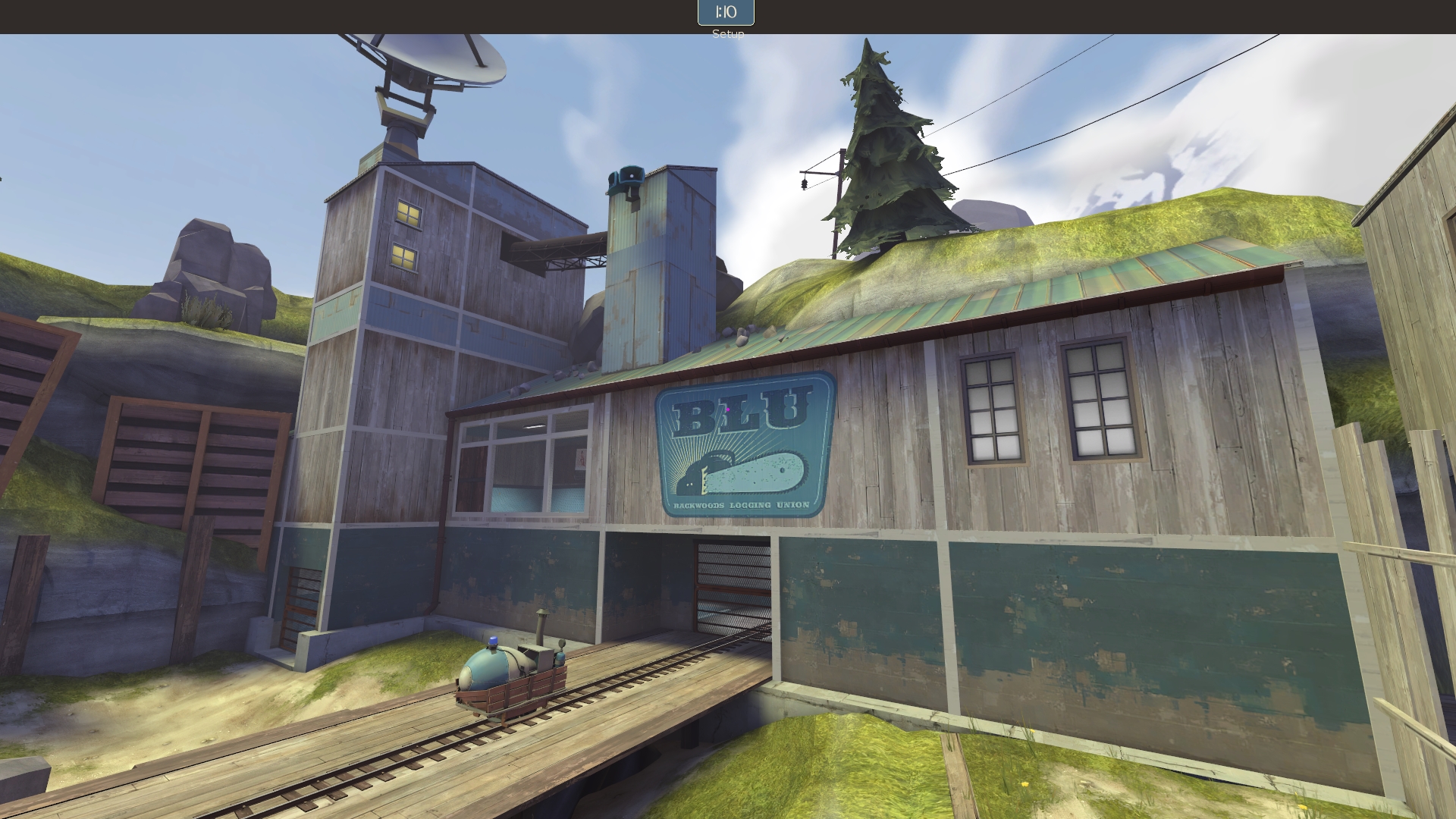
Every part of the buildings has something on it. Look to the side by the other payload. On Cashworks that would just be a flat wall, but you've put a payload, some fencing, 2 overlays, and 3 windows by it. It's not important, yet all this draws our attention. Similarly the platform next to blu spawn with the large stairs--why is this not just a solid brush? The door on the side is ok, but is it important? No, so maybe lose the overlay too. That would reduce the visual noise and make players concentrate on one area better. Similarly, you've got trim just like Cashworks, but you're using a really noisy metal texture that draws a lot of attention and visibly repeats. It's not really meant for this sort of application.
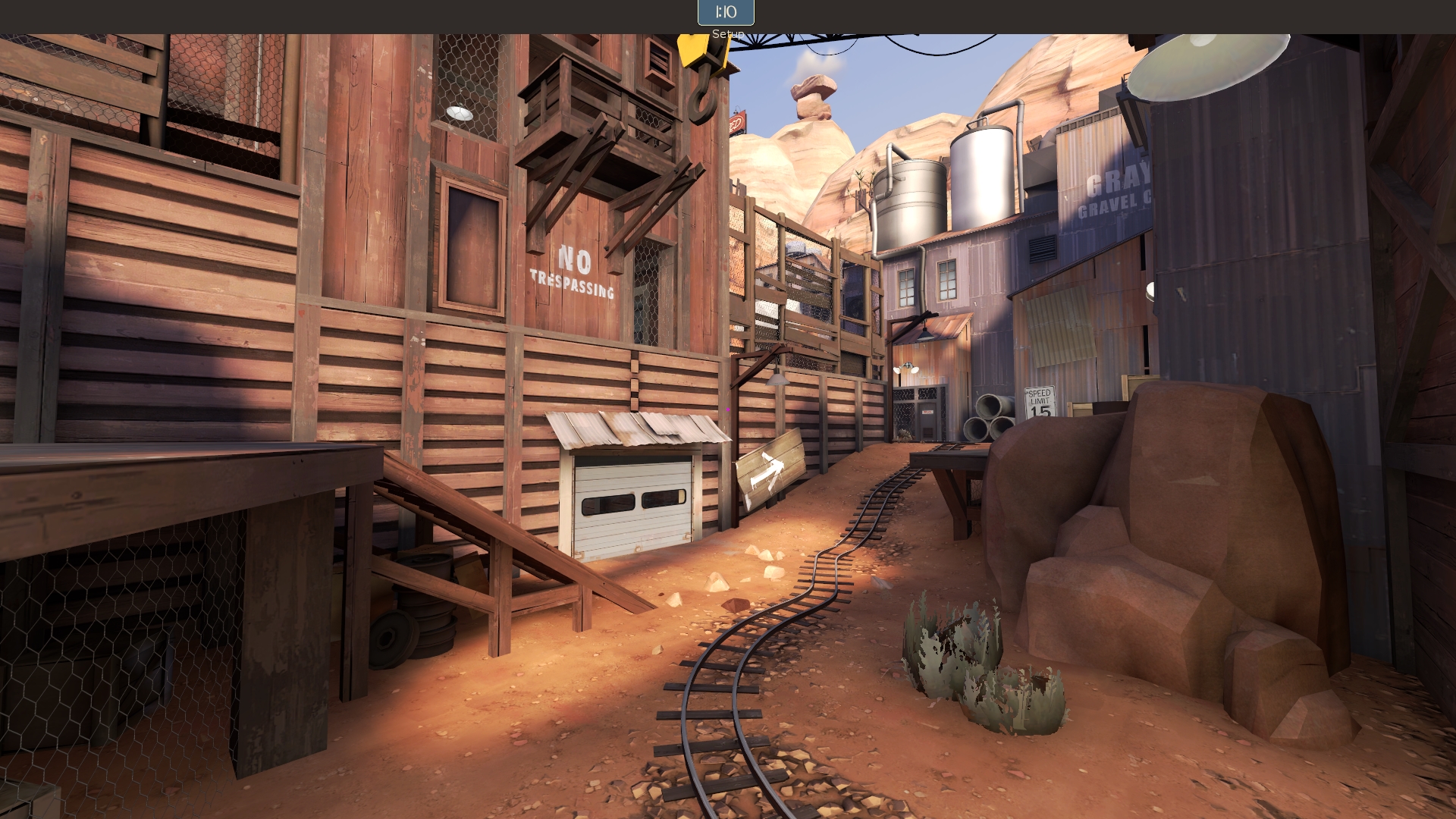
I3kNJrw.jpg


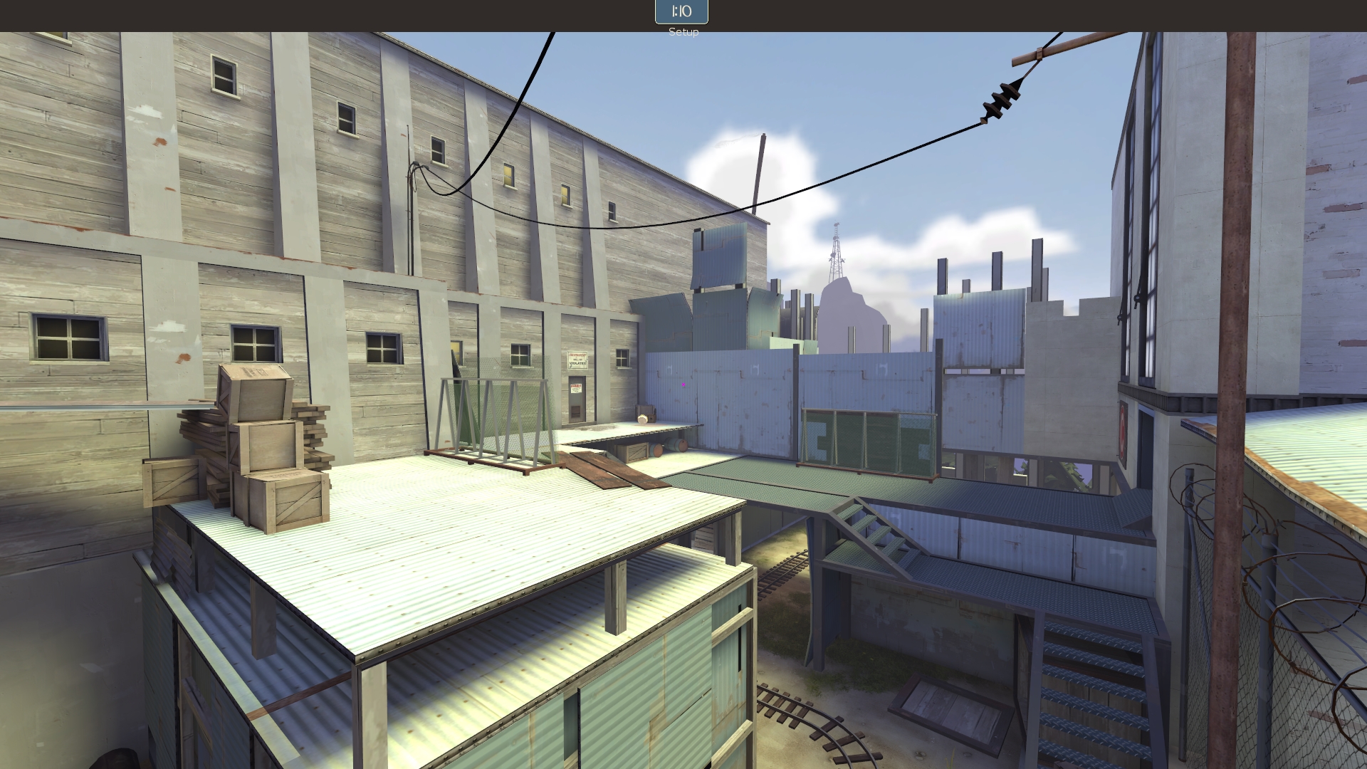
In this area, what's important? Above this door there is a sign that says no trespassing, plus a bunch of windows and different textures, sending mixed signals. In the back everything is lit the same and detailed just as densely. Because of this my eye has nowhere to rest--meaning my subconscious mind doesn't know where to ignore. This is a big deal in TF2 gameplay. This is not my theory or the theory of TF2maps.net.

Those buildings in the background aren't anything--like Lem says, they look improbable and bizarre. Unlike Cashworks, I don't know what you're going for here, because you've mixed the hard industrial props of Gorge with the mining set rather than bridging the architecture to something more industrial. This contributes to the lack of progression in the map--everything is the same kind of building, so players don't feel like they're making headway until they've won. This is a real problem I see quite often (in tests and in pubs) that leads to people giving up on the cart and messing around or whatever.

Likewise, the supports he pointed out are too much. They aren't doing anything! It just looks messy. Yes, the average Steam user will think it's amazing. But anyone with any design sense (or anyone at Valve) will see it (and everything else) and pass you by. Even the popular Steam Workshop maps don't do everything the public says.

XFK77aV.jpg


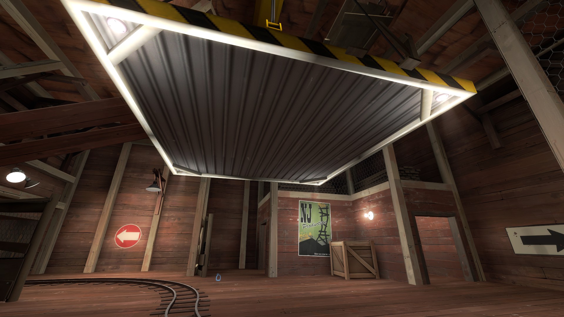
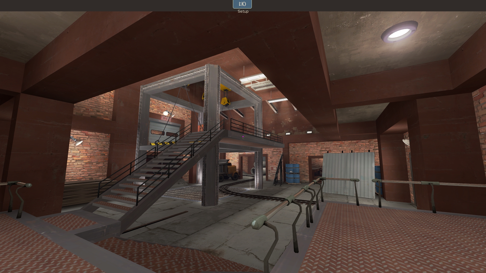
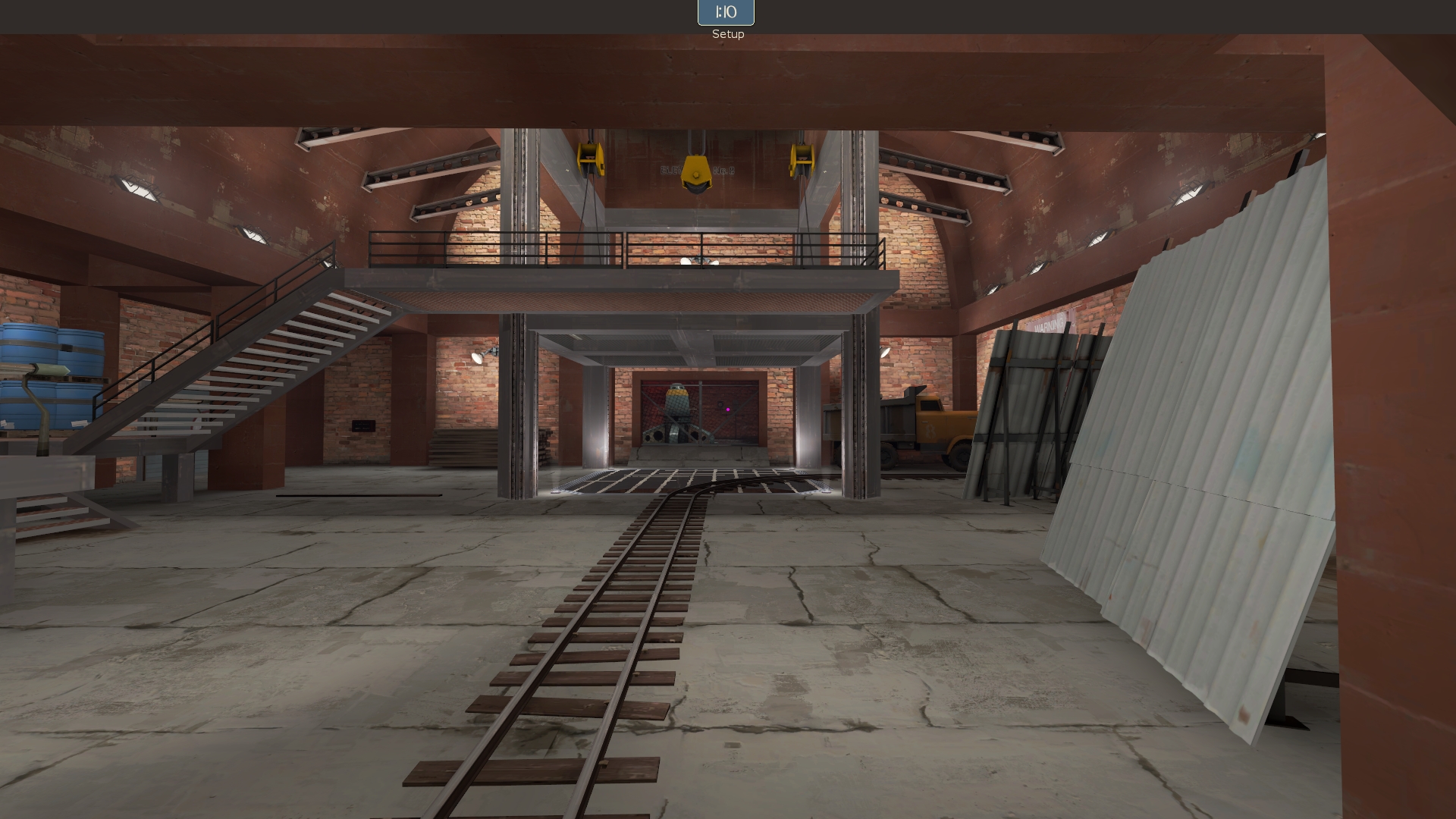
This is absolutely baffling. Not only is there too much in this room already, but there's also a crane, and it clearly goes to nowhere and does nothing. The spytech beams you use here are actually a nice touch that fit with the surrounding geometry--it just makes no sense for the crane to be there. And instead of going for interesting lighting, or hiding it from view a bit to at least give the illusion it goes somewhere, you use the same dumb exposed bulbs that Lem was talking about.

ixqRaK6.jpg


There's so much going on, and the props are from all over. Spytech handrails in an industrial building, holding these massive stairs, a truck, I can't tell where the doors are or what happens here, etc. It's a mess! When you come in from the intended direction as BLU, you can't even tell there is a door up there:

ojSniJ4.jpg


WcZzXjT.jpg


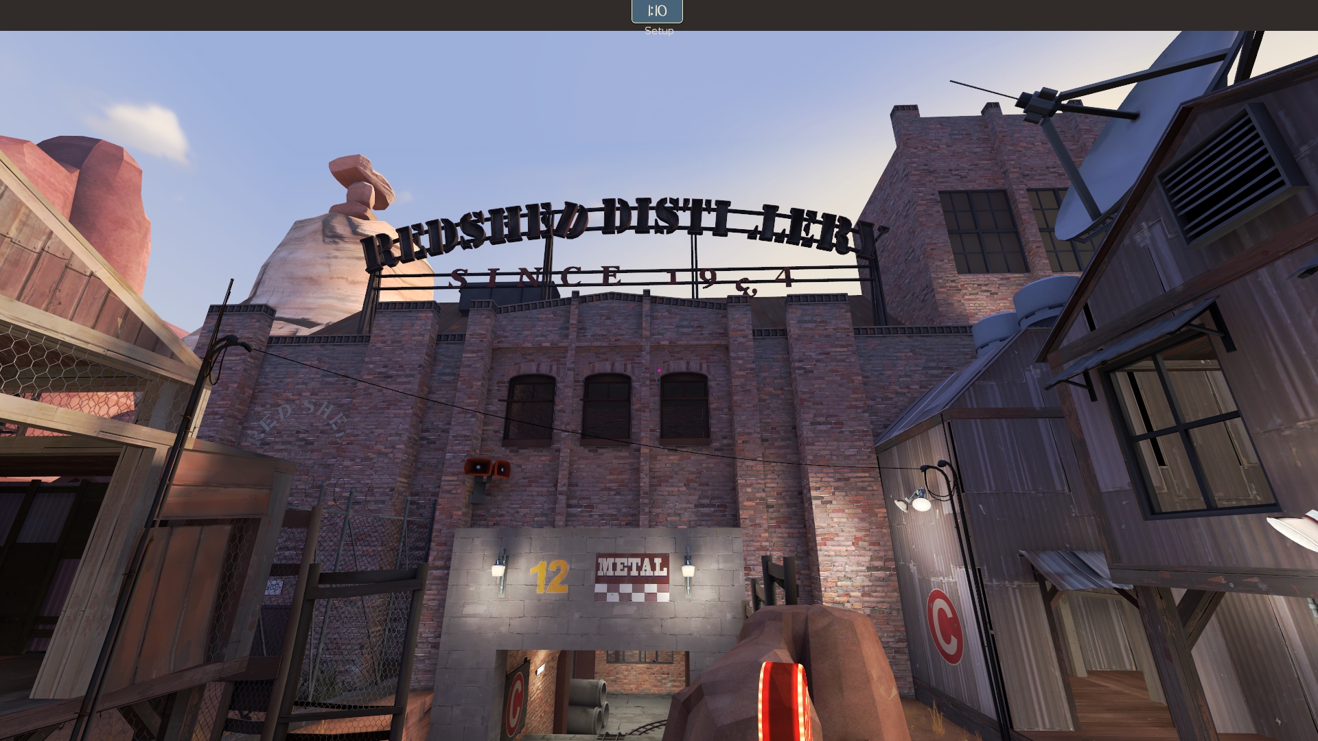
Why is the distillery sign here? Isn't this the back and not the front? It doesn't look anything like a distillery anywhere. And why is the METAL sign there? I don't get it. Why RED SHED on the left?

3y6MgIZ.jpg


Why is there so much detail in a place players will never go?

NIdOFav.jpg


What is this shooting at?

y9aFaXT.jpg


These are 2 of the 5 satellite dishes on the map. 2 of the others can also be seen at once. These are usually props used once per map due to their ability to tell a story and also because of how high poly they are. Because this gets shoved into every outdoor area, twice if you can manage it, it becomes meaningless. And just under the second dish there is an exposed industrial tank thing for some reason. It just doesn't make sense.

My suggestion is to fill in a lot of the things you added inside brushwork. It doesn't have to be what I pointed out, but it will help reduce visual noise. I'd also look at removing window props, overlays, excess light sources (and rethinking the lighting a bit) to lead players around the map better. Right now the only thing that leads them is the cart/tracks, which isn't enough.

There are times when the detailing is great and inventive:

tRbw9lw.jpg


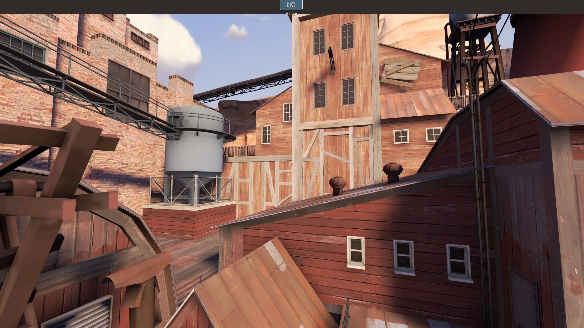
I like the Foundry mid prop here, but the fence, spinny roof thing, water tower, radio tower, conduits, RED IRON WORKS sign, displacement arch, red building in the foreground with the crane and too many window props, the overdetailed shed near the cave on the right... they all take away from that great prop usage and make it just another thing that blends in.

zJvjqXx.jpg


Why can I see in these buildings? Why is my attention drawn to them? There's no flank through them. I see players run at that red resupply on the right because they expect a route in those buildings. Watch the demos. See it happen.

Part of the problem, like Frozen says, is lighting. Because all your lighting is very similar, nothing draws the eye more or less than anything else. The detailing is part of this, but adjusting your lighting will really help. Get rid of weird, awkward lights (like on that platform, since how the hell are they powered, it makes no sense) and replace it with mining lanterns, or get some different lamp props, I don't know.

The other thing is cohesion. You're using too many kinds of everything.

KYNK26T.jpg


2 kinds of handrails. I count 4 kinds of wood on the big red building alone.

SS2weZp.jpg


2 kinds of handrails, which should probably all be removed--do a check on official maps of how often handrails are actually utilized. It's pretty rare, actually. Also the Poopy Joe locker. Why? This is a very specific kind of prop. It just looks like you're trying to use as many assets as possible.

In BLU's original spawn I found 4 different handrails. Think of it this way: when something is being built, the contractors don't decide to change materials every twenty yards.

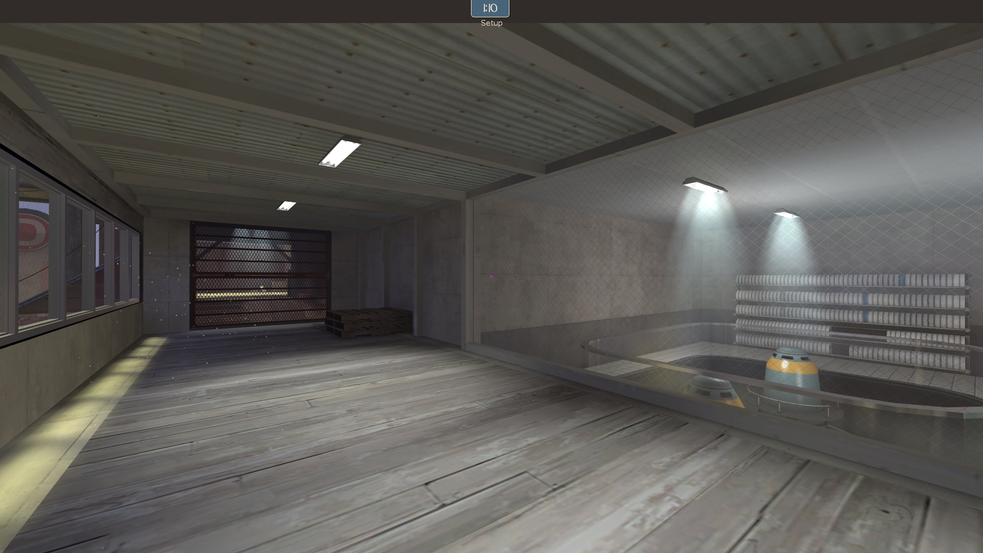
You use the spytech, broken spytech, and moon spytech props almost indiscriminately. A detail room near A or B has functioning spytech and moon computers, but the nearby RED forward has only broken spytech. What???

sAPSFWI.jpg


AND there's gold all over? This is actually a great spot to just fill in with brushwork. Change the lighting up. Make it direct players better and lower my framerate less.

eBRiQDY.jpg


With the awning in the way, that crane is useless. And those windows on the observatory wouldn't need an awning because they are already under a concrete one! (BTW, the concrete observatory should be the look your last point has--it doesn't make sense that BLU uses it as a flank, if it's important to the map somehow. And beyond that it confuses the progression of detailing even more.)

There's just too much detailing. Whether because it detracts from other detailing, because it makes no sense, because it's weird, because it lacks cohesion, because it's just noisy--you need to look at it and think about it. Where do you want people to go? Why? When? What should be important? What can be skipped? You have a few nearly bare-walled flanks--apply that ethic to other areas of the map, please.

I don't see the Cashworks comparison: Cashworks is detailed only where it needs to be, or in ways that reward exploring (like Thunder Mountain, for instance). Cashworks doesn't cover every surface with something, and uses a unified texture and color palette. It is a feasibly living and lived-in space. The lighting is varied and does some direction. I hate to say it, but if you intended to take inspiration from Cashworks, you failed quite badly.

Please read this thing grazr wrote years ago: Immersion and Your Map. Also the one about base facades. They should both illuminate these ideas further.

Then the layout--it's all kinda just tunnels. It's like Barnblitz with more and tighter buildings. Actually, that's probably a great map to compare visuals to since it's a similar idea in terms of layout. I think this map could really improve from being opened up in several places--unfortunately, I think the tight quarters are the only thing keeping the framerate manageable.

I don't think you're a bad mapper or stupid or anything. I apologize if parts of this sound rude. I do not speak for all of TF2Maps.net. It's clear you have a great understanding of the tools. I really am sincerely excited to see your next map(s)--including before detailing! I just hope that you can tackle your next project with this kind of stuff in mind and make it an even better map. I would not be typing this if I didn't think you could benefit from it. I don't like wasting my time. Don't get the wrong idea--I'm not doing this because I'm mad or something, but because I think your map is almost very good and you can still take it there.

Ultimately I don't really care if you update this and do what I say or not, because it's your map, and you can do whatever you want. But given your clear skill with the tools it's my hope that you refine your approach in order to improve it. You can go far in the mapping community, but a big portion of players are going to dislike your maps and not have the deep level understanding of aesthetics or TF2 detailing practices to know why. They are going to call it confusing despite the abundant signage. They are going to call it pretty and play it once or twice and then forget. I've watched it happen for nearly a decade now. Don't let it happen to you.

Do I think there's a lot of props? Yea, maybe it could be toned back a bit. Is it so much of an issue that it's worth this big of a deal of? No, not at all. It all depends on the map.
I think you should look again, or tell us why, in greater detail. It's obvious to me from the screenshots before I even get in game that the detailing is overdone. I'm curious as to why you'd say otherwise.
 
Last edited:

Flower_Shop_Guy

♪ -- ♫ -- ♪
aa
Mar 10, 2015
200
495
Thanks guys, it's a shame to read such of this.
But I understand what you're saying. Just at that map, I would like to see everything that I like in TF2 and as I personally imagine, say, a great variety, as I see it, I have it does not work...
In other words I do did not work.
Okay, I will consider the following projects in all aspects.
And about Cashworks, I looked in the distant past, it is the most beautiful and detailed map of the game, but I was wrong.
 
Last edited:
Jan 20, 2010
1,317
902
Thanks guys, it's a shame to read such of this... :(
But I understand what you're saying. Just at that map, I would like to see everything that I like in TF2 and as I personally imagine, say, a great variety, as I see it, I have it does not work...
In other words I do did not work...
Okay, I will consider the following projects in all aspects.
And about Cashworks, I looked in the distant past, it is the most beautiful and detailed map of the game, but I was wrong.

Well, don't feel discouraged, man. I hope you know that we're not critiquing you because we want to bring you down or anything. We just see a lot of potential and want to help you take advantage of it. I really hope you'll stick around and share with us other things you'll create. :)

Of course, opinions will vary about things, but I think Yyler did a good job of clarifying more specifically the things I was trying to say.
 

tyler

aa
Sep 11, 2013
5,100
4,621
I'm glad you understand. :) Don't take it as us being negative because we don't like it or think you did a bad job. We see skill and know you can become better!

And about Cashworks, I looked in the distant past, it is the most beautiful and detailed map of the game, but I was wrong.
There is an old saying, and it has many forms: "You can't have dark without light." In this case, it would be "You can't see beauty if there isn't something ugly or boring to compare to."

Cashworks is very pretty, I agree with you. But the detailing is more thoroughly considered, as though it were a gameplay aspect--because detailing is a gameplay aspect. It remained in your mind as a beautiful map for so long because it executed the detailing correctly.

I know the feeling of wanting to put a lot of details into one map, it feels really good. But then you run out of ideas for your other maps. ;)

EDIT: One last thing. I noticed you have a welcome point set, but it doesn't look at the eclipse. It just looks at some ground? It'd be better to either point it at something useful, or the eclipse, so players can watch it as the round goes on.
 
Last edited:

Fruity Snacks

Creator of blackholes & memes. Destroyer of forums
aa
Sep 5, 2010
6,394
5,573
I think you should look again, or tell us why, in greater detail. It's obvious to me from the screenshots before I even get in game that the detailing is overdone. I'm curious as to why you'd say otherwise.

I probably should've explain a bit better why I think that it's okay, but maybe could be toned back a bit.

It's easy to right off and without thinking say "This is over detailed!" because your eye isn't drawn to anywhere specific, let alone somewhere of importance. Not too surprised it's the first thing people say. The props are used in some odd, not-normally-used ways, and as I said could probably be toned back a little bit. Look again though through the pictures. The exterior lighting is heavily dominated, if not only done with, the sunlight. This makes the exterior lighting very bright and flat, without contrast. Normalized mostly. So things that would be normally small details, not really lit much, get highlighted as if it's something important... since everythings being lit by the same way. Toning the base ambient lighting back and using phantom/outdoor lights (Similar to blue spawn, though could be done a bit better... it's not a bad start) , would hide a lot of prop usage and details, and help keep focus down on the main field of view.

It's easy to point out the surface issues, but take a second or two more and think "Is there other solutions to this that could help the map even more?"

And, again, as I said... I don't think this needed to get as big as it did, but I'm glad Flowershopguy got some feedback and many members of this community offered up some good feedback.

(Post edit: I also think Cashworks could use a bit more detail and a bit more lovin' in the lighting department, but it's an *old* map and pretty good for the old style of making maps.)
 

tyler

aa
Sep 11, 2013
5,100
4,621
It's easy to point out the surface issues, but take a second or two more and think "Is there other solutions to this that could help the map even more?"

And, again, as I said... I don't think this needed to get as big as it did, but I'm glad Flowershopguy got some feedback and many members of this community offered up some good feedback.
I think Lem tried his best, as did I, to explain what props we meant and why... it's not always just about overdetailing, but also about changing the detailing so that it tells a story. Like I pointed out about the observatory. Or, for instance, if BLU is bombing a power station when it's at low power, why is the finale more of a barn? Etc. I could have spent all day picking what props I thought should be removed, but that's not half as useful as explaining why I think those props should be removed. Not to mention that much of the overdetailing isn't necessarily prop-based. So in that sense much of my detailing feedback comes from the direction of "What does it accomplish?" It sounds like FSG understands that goal now too.

And second, you're right, it didn't need several big posts. But, in the end, the map author seems to have come away with some advice that he wants to take to heart. I think the real problem was that we were speaking in abstracts--once it was solidified into screenshots with explanations, it became clear. That's what we're here for, so imo this should be encouraged more than anything. I'm sure if you had made a big post explaining detailing theory in depth, you'd have arrived at many of the same basic concepts I pointed to in my own post. :)
 
Last edited:

Vel0city

func_fish
aa
Dec 6, 2014
1,947
1,589
Hey, what are think about this map? Because, It's more detailed, than my map, IMHO.
It's not necessarily the issue of the amount of detailing, it's more an issue of what detailing you're using. I agree with people here that in some points on Eclipse have too much detail, but other areas are fine in the amount of detail, it's just that the type of detailing is making it look cluttered. TF2's gameplay relies heavily on recognizing player outlines and colors, and if those details are lost in the map's detailing it's a sign that there is too much detailing or improperly used detailing.
 
Jan 20, 2010
1,317
902
Hey, what are think about this map? Because, It's more detailed, than my map, IMHO.

I would need to give it a fly-around to get a good idea of it, but it looks it has many of the same issues your map does.

Honestly, you could probably benefit most from looking at maps that do detailing well, especially for your theme. Look at Barnblitz, Thunder Mountain, Upwards, and I also think you should take a look at Vector, which has problems of its own, but is a good map to look at in your case I think as well as Haarp.

I might come back and make a more detailed post for you, but I'm at work right now so we'll have to wait for that. ;)