PL Mesaworks Final1
- Thread starter Flower_Shop_Guy
- Start date
You are using an out of date browser. It may not display this or other websites correctly.
You should upgrade or use an alternative browser.
You should upgrade or use an alternative browser.


BothAre you using color correction? or just cool hdr for the white glowy effect on things?
")
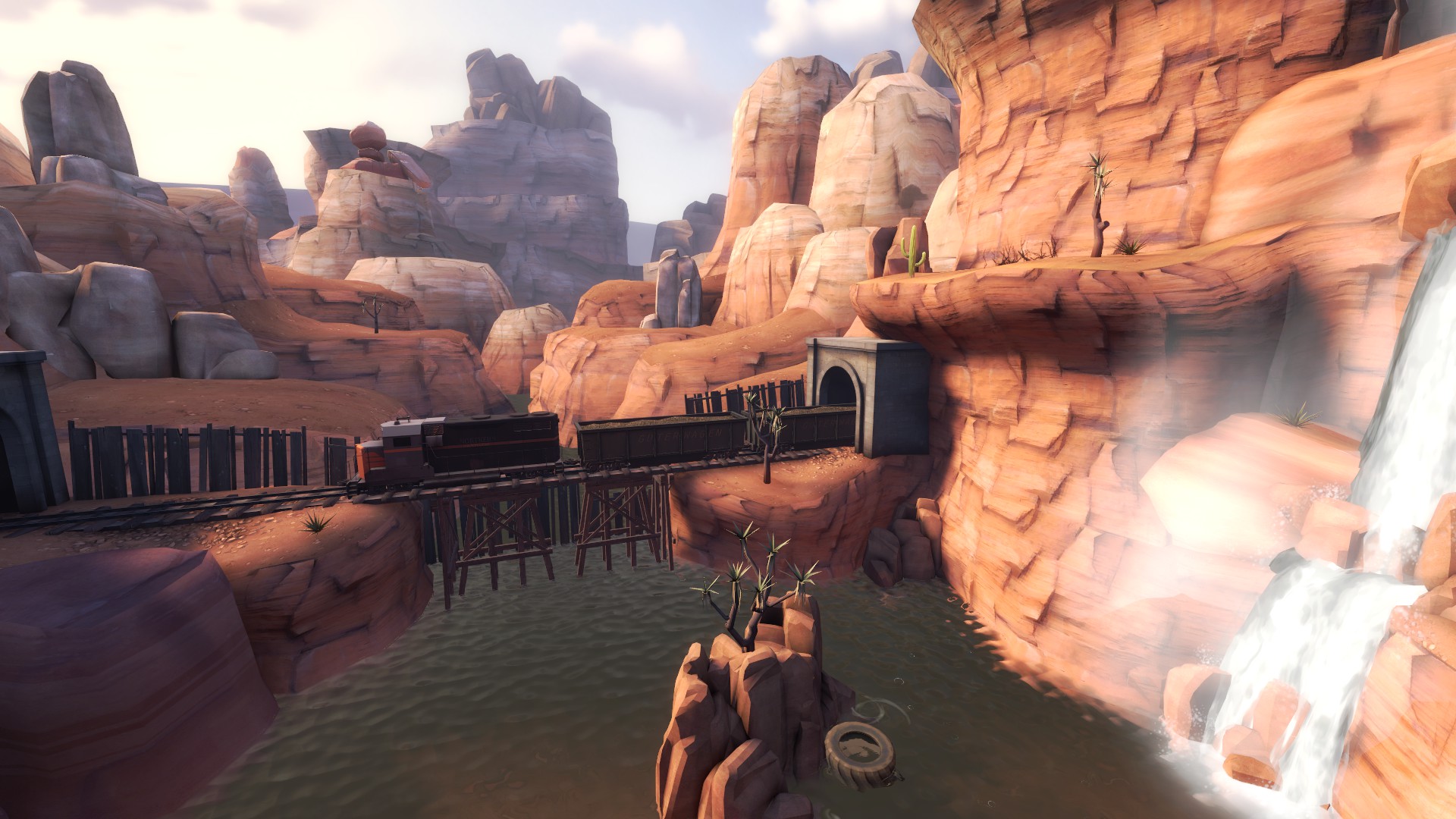
~5500 units from a center of 3D skybox.I'm curious, how far away did you have to place the moon in your 3D skybox in order to make the parallaxing not noticeable?
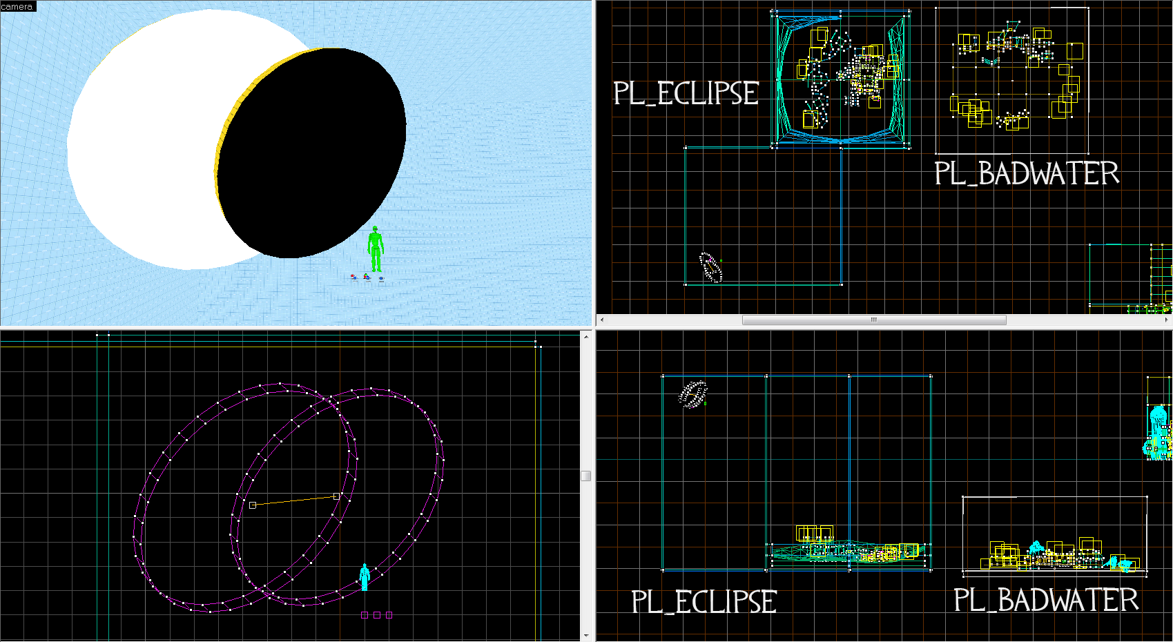
Ps: "Green Gordon" just for compare size.
Last edited:
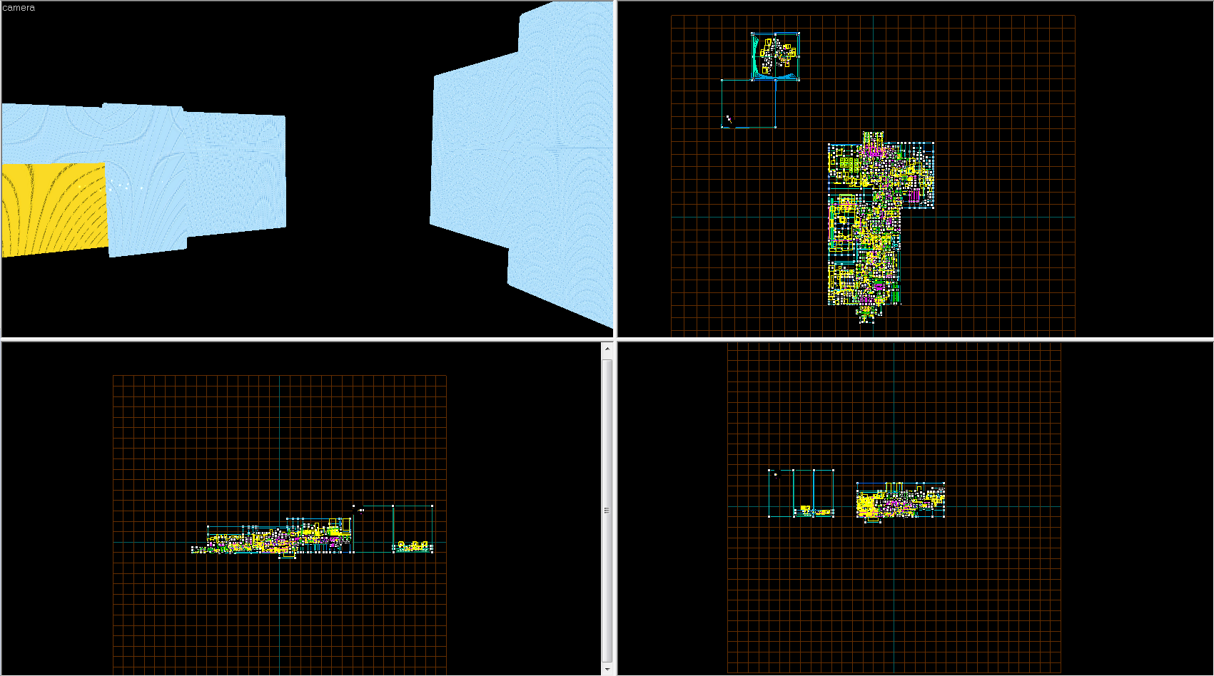
You get it wrong. That picture is a picture of 3D skyboxes. Here another image.
Last edited:
b2: 12-10-2015 (92 build):
- Fixed crashes on 32 player servers;
- Added small flank on the last point;
- Better clipping in some areas;
- Fixed player stuck in some areas;
- Cosmetic changes and fixes;
- Fixed reflections on non-Nvidia GPU's;
- Some various fixes and changes.
Read the rest of this update entry...
- Fixed crashes on 32 player servers;
- Added small flank on the last point;
- Better clipping in some areas;
- Fixed player stuck in some areas;
- Cosmetic changes and fixes;
- Fixed reflections on non-Nvidia GPU's;
- Some various fixes and changes.
Read the rest of this update entry...
Last edited:
RataDeOrdenador
L5: Dapper Member
- Oct 12, 2015
- 230
- 105
The ammount of details,paths,ammo/health distribution,sentry spots,spawns...
Everything,is just so beautiful. Probably a little bit laggy (crappy computer,you all know that),but still,it's wonderful.
And the eclipse? God,the eclipse. Making the map darker as BLU keeps getting the points.
Seriously,it's a wonderful and really well thought map. Hopefully I can reach this kind of level too... And everyone else,of course.
Keep your the good work,sir,because you deserve all the good things in the world.
b3: 24-10-2015 (94 build):
- Fixed player stuck in some areas;
- Fixed player stuck in gate doors;
- Added small ammo & health pack;
- Better clipping in some areas;
- Minor cosmetic changes and fixes;
- Balanced respawn time;
- Increased cart speed on the last point.
Read the rest of this update entry...
- Fixed player stuck in some areas;
- Fixed player stuck in gate doors;
- Added small ammo & health pack;
- Better clipping in some areas;
- Minor cosmetic changes and fixes;
- Balanced respawn time;
- Increased cart speed on the last point.
Read the rest of this update entry...
Last edited:
Leminnes
aa
- Jan 20, 2010
- 1,317
- 903
I just gave it a run through... I have a lot to say.
First, the eclipse.
I'll need to first try to explain my reasoning here. In Valve maps, they occasionally have Gimmicks like the eclipse. Nucleus has the... thing in the middle that the teams are fighting over. Doomsday has the teams fighting over the missile. And besides those, Valve likes to include a story of some sort with most of their maps in some way. Something that explains why the teams are fighting here and why.
I don't get that on your map. Not every map needs or has that, but when you include something like the eclipse, it just begs the question: why?
Why is it there? How does it effect the "story" of the map. Is one team trying to harvest the eclipse in some way? Did red cause it via voo doo or something and now blue is trying to stop it? Like, I see there are some solar panels, but why would blue be trying to blow up solar panels during an eclipse? Those solar panels are going to be less productive during an eclipse. If some weird energy is going to come from the eclipse and be absorbed by those panels, there's no indication of that anywhere. There's a complete lack of real narrative.
Alright, now for other stuff... This will all be speculation, as I haven't played the map, but take it as you will.
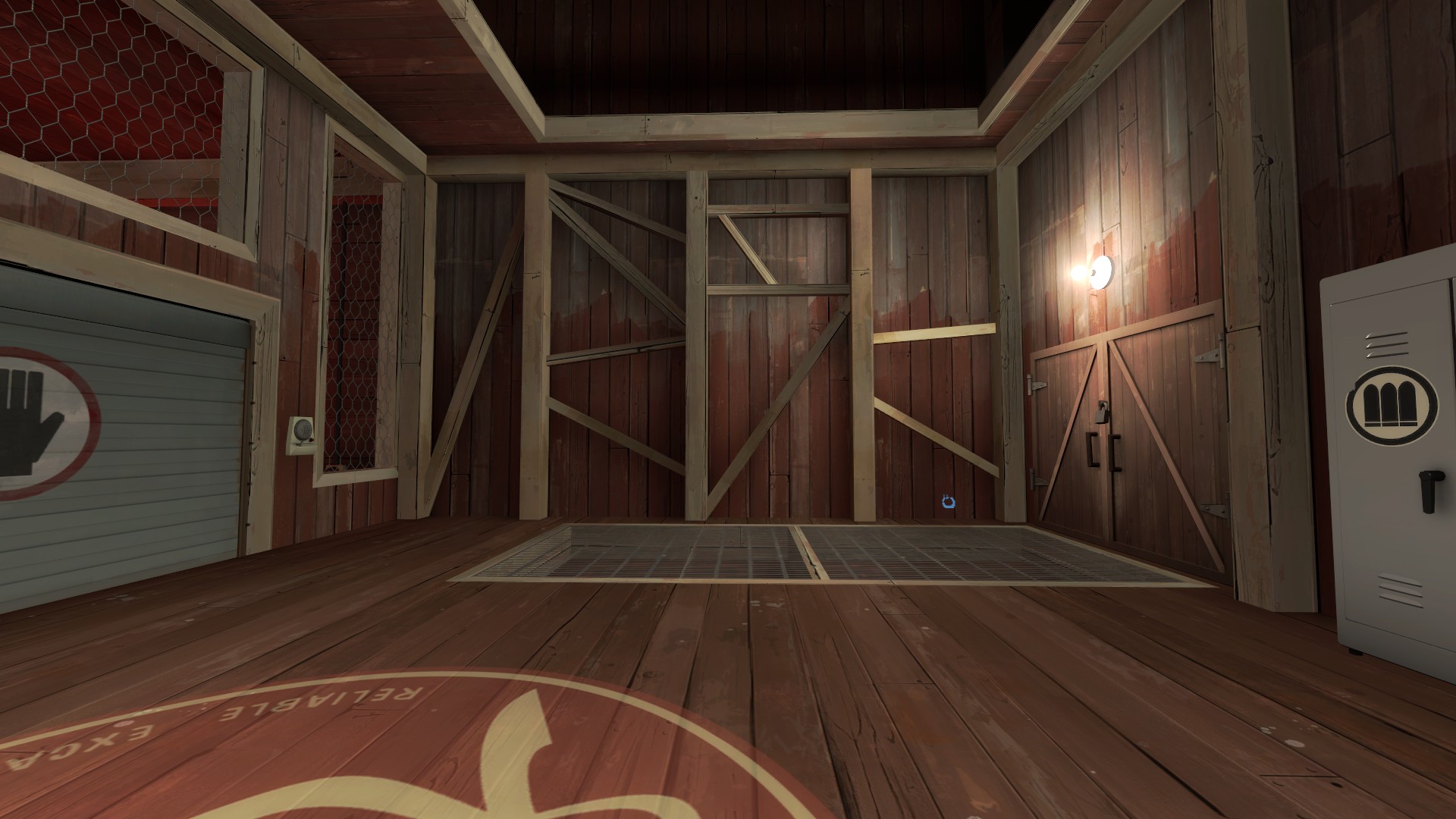
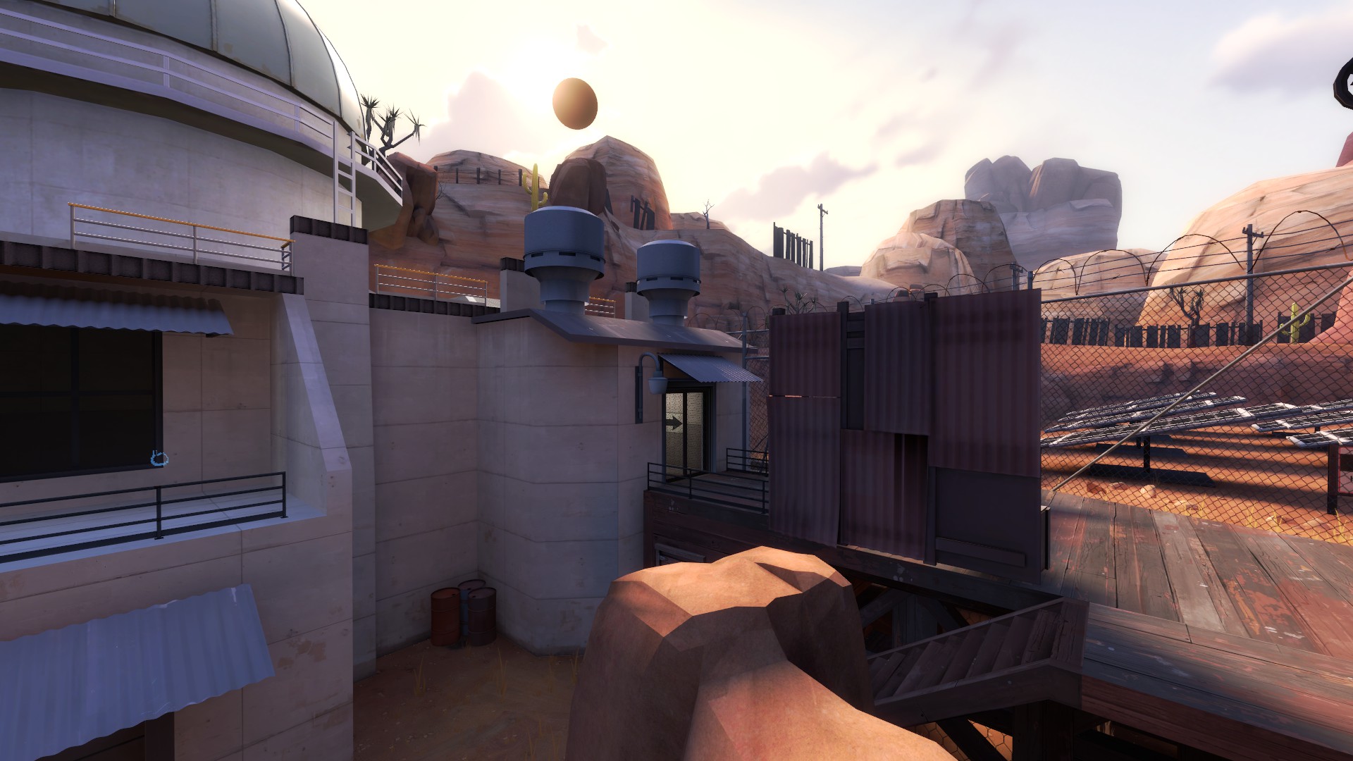
These supports look like the soldier tried his hand at being an engineer. They make no sense. Also... see that bulb on the right. You way, way, way too many of those just attached to walls. It looks weird.
Really really weird.
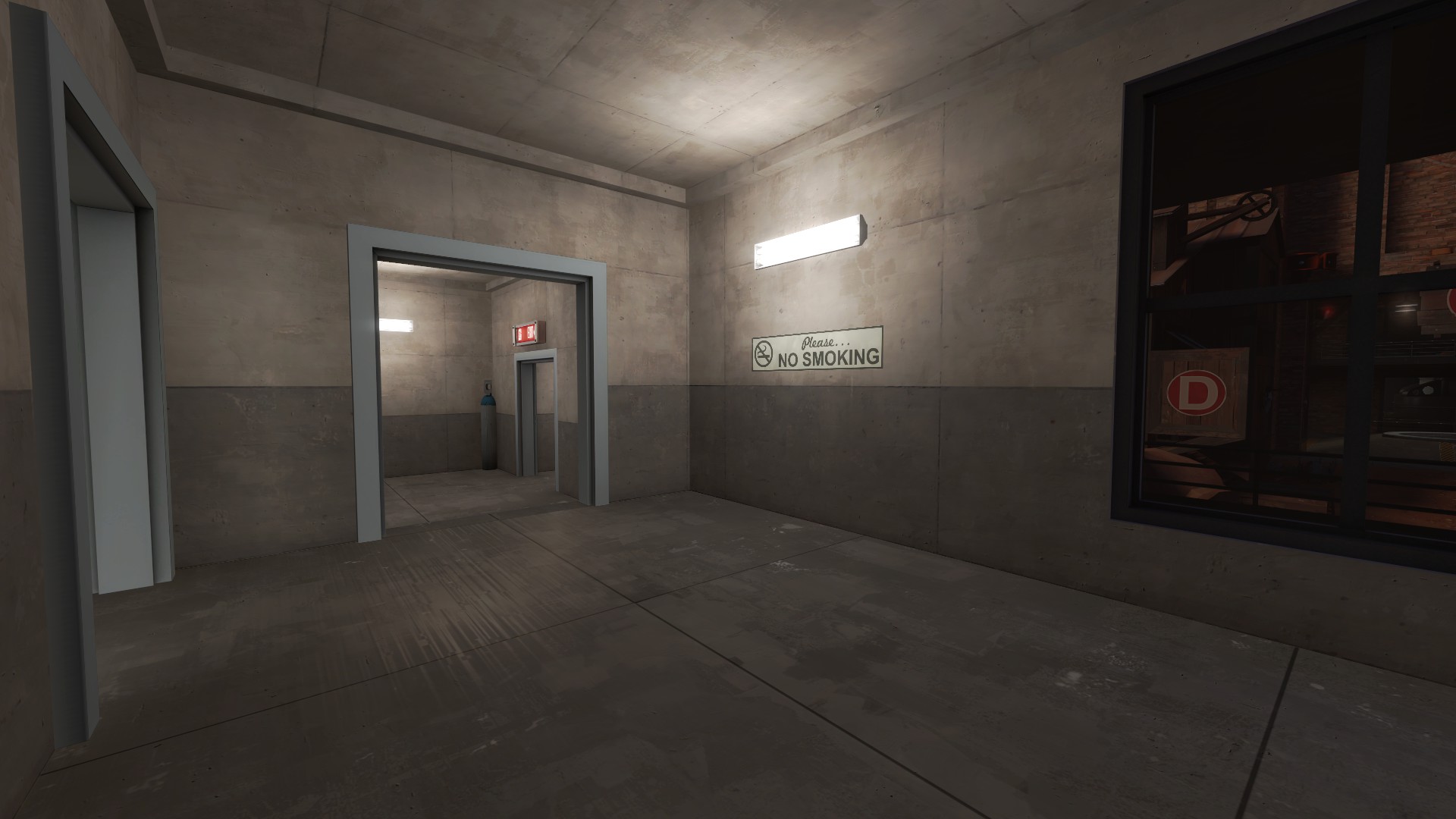
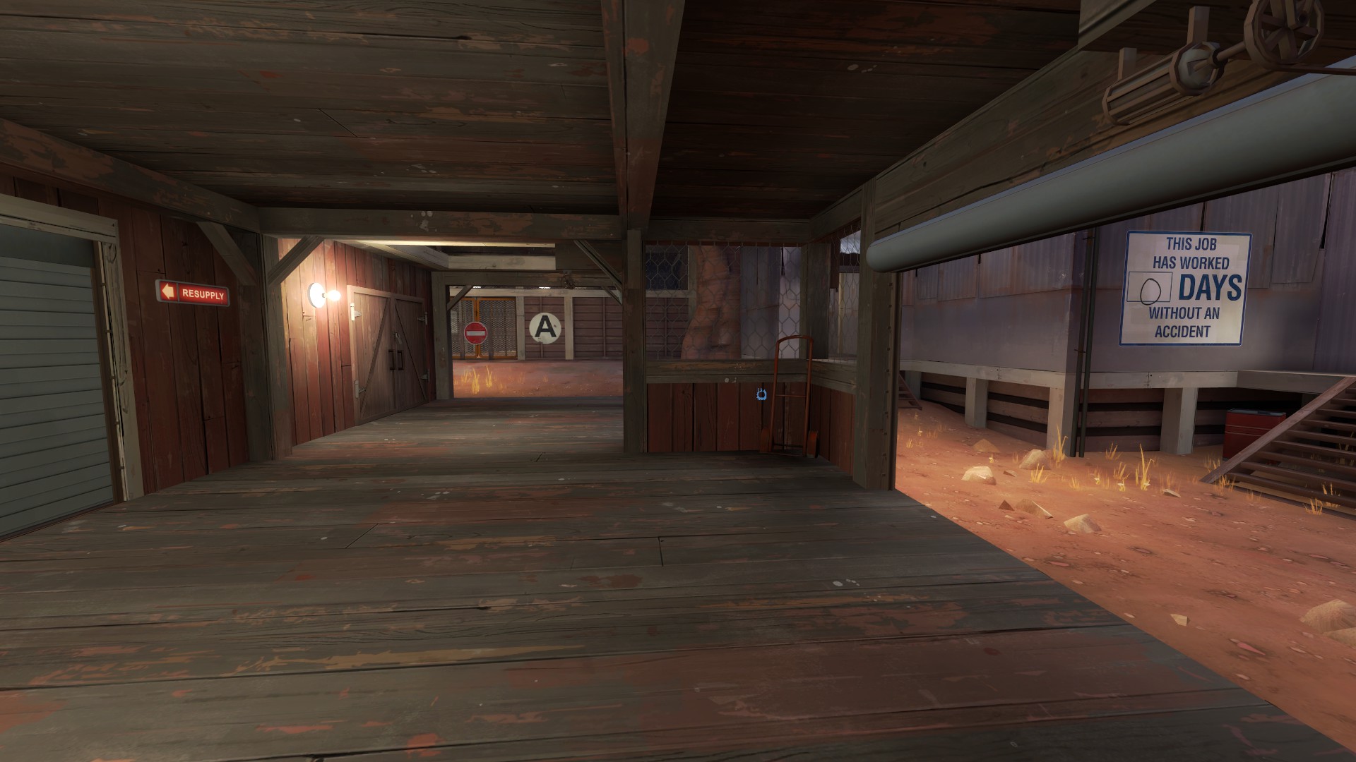
And speaking of Lights, you just have too many of them in general in places that make no sense. Like here:
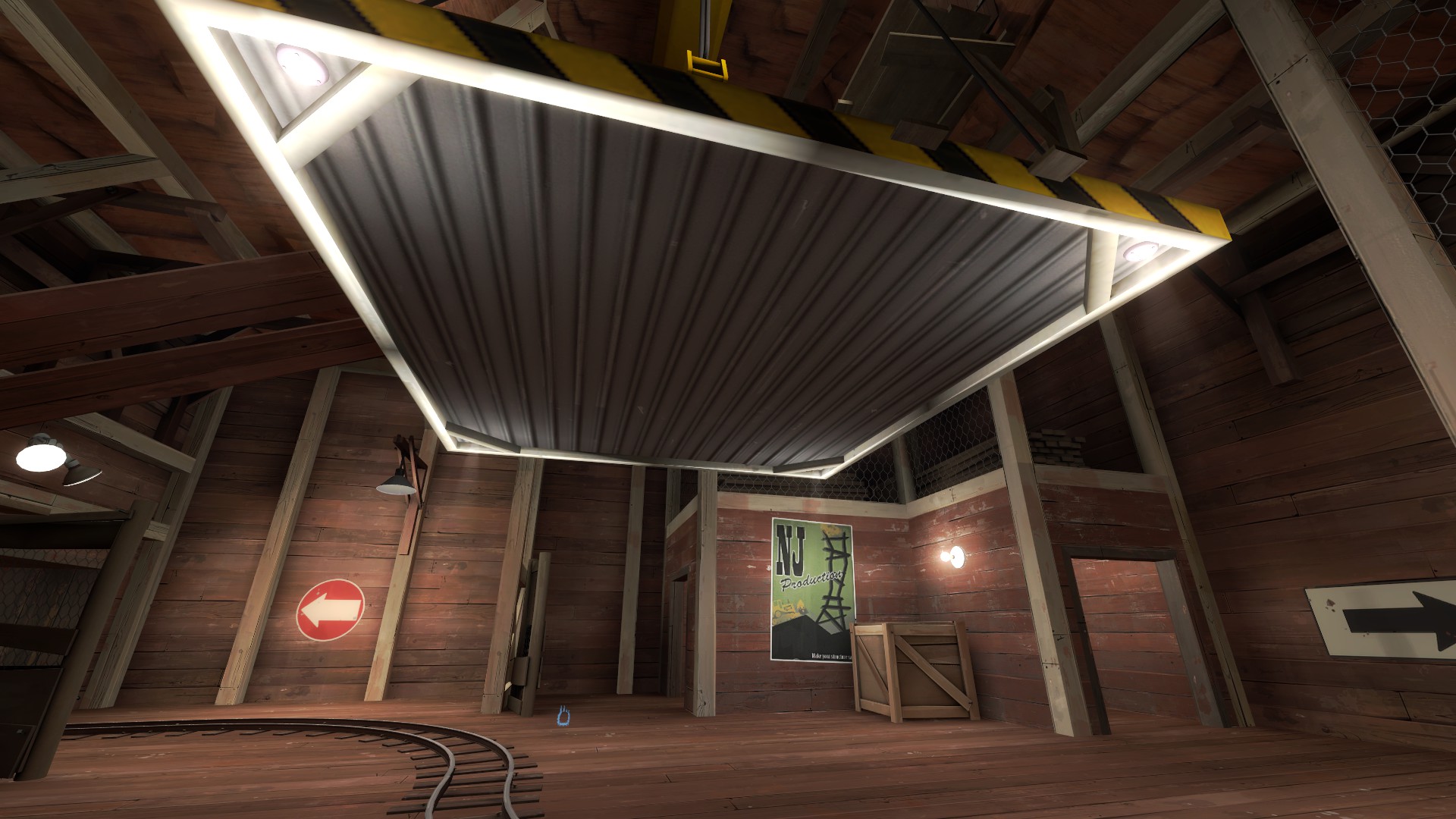
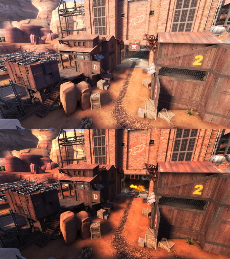
How are there lights under this? Why are there lights under this? You have plenty (too many) lights in this room already. There's no indication of where to go visually besides the red arrow. And then there's another arrow on the right. Two arrows + too many lights = very confused player.
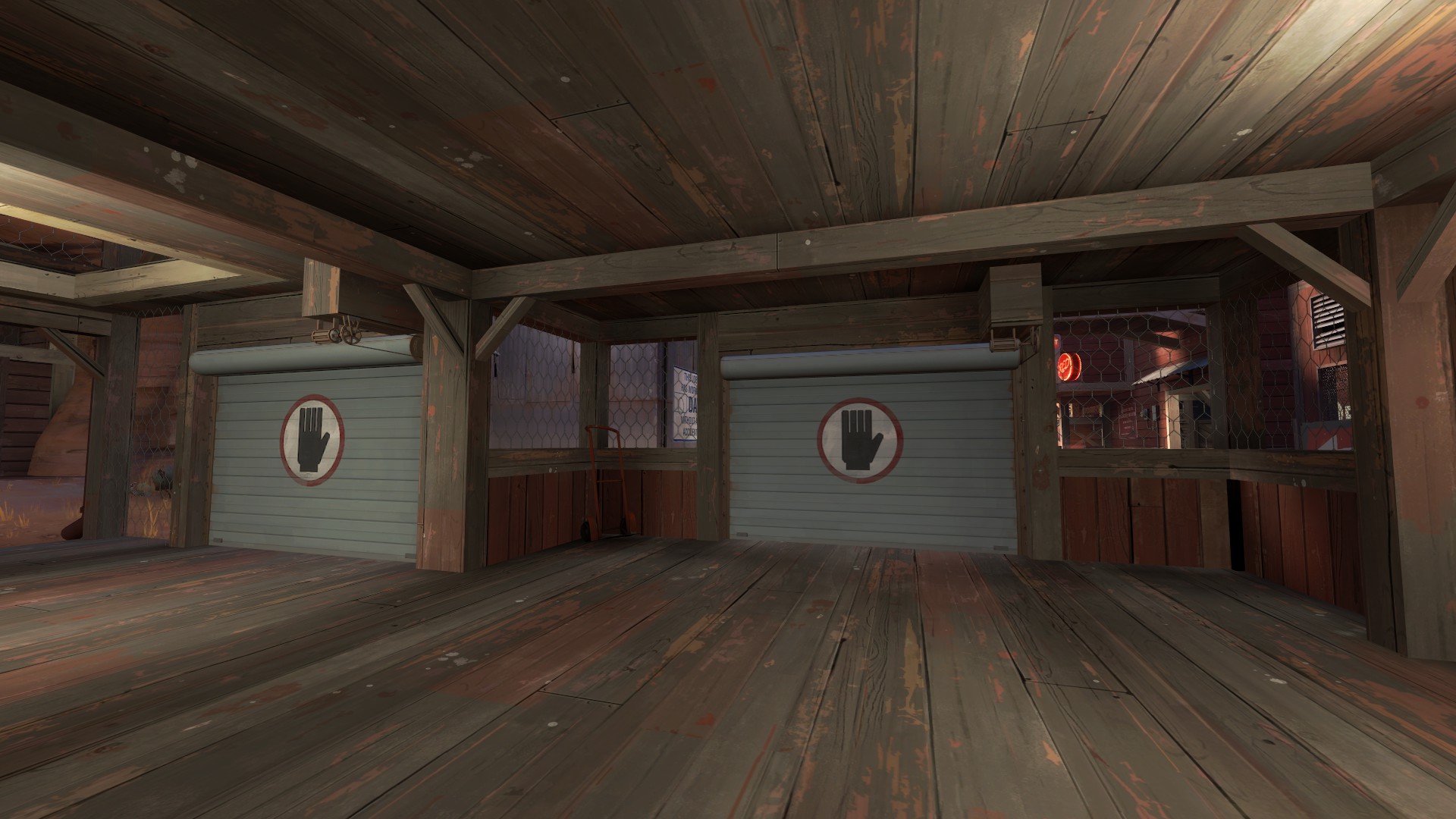
I walked right by that door multiple times. I had no idea it was usable. Like, I'll be the first person to say that a map being complicated is not always a problem. Complicated maps can be fun, but they just take time to learn. However, your map's layout isn't particularly complicated but the frankly schizophrenic detailing makes it feel like it is. Like when you leave red's first spawn you get this:
You have two doors and a control point within view of the player. Both those doors are inoperable, but the player will be attracted to that glowing red point. Why are there two doors? Why do we see a point if it's not important in the moment? There's just so many pieces of detail that feel like they could be indicative of affecting player agency, but they're not. It immediately causes me to question whether or not certain parts of the map are even there for a reason.
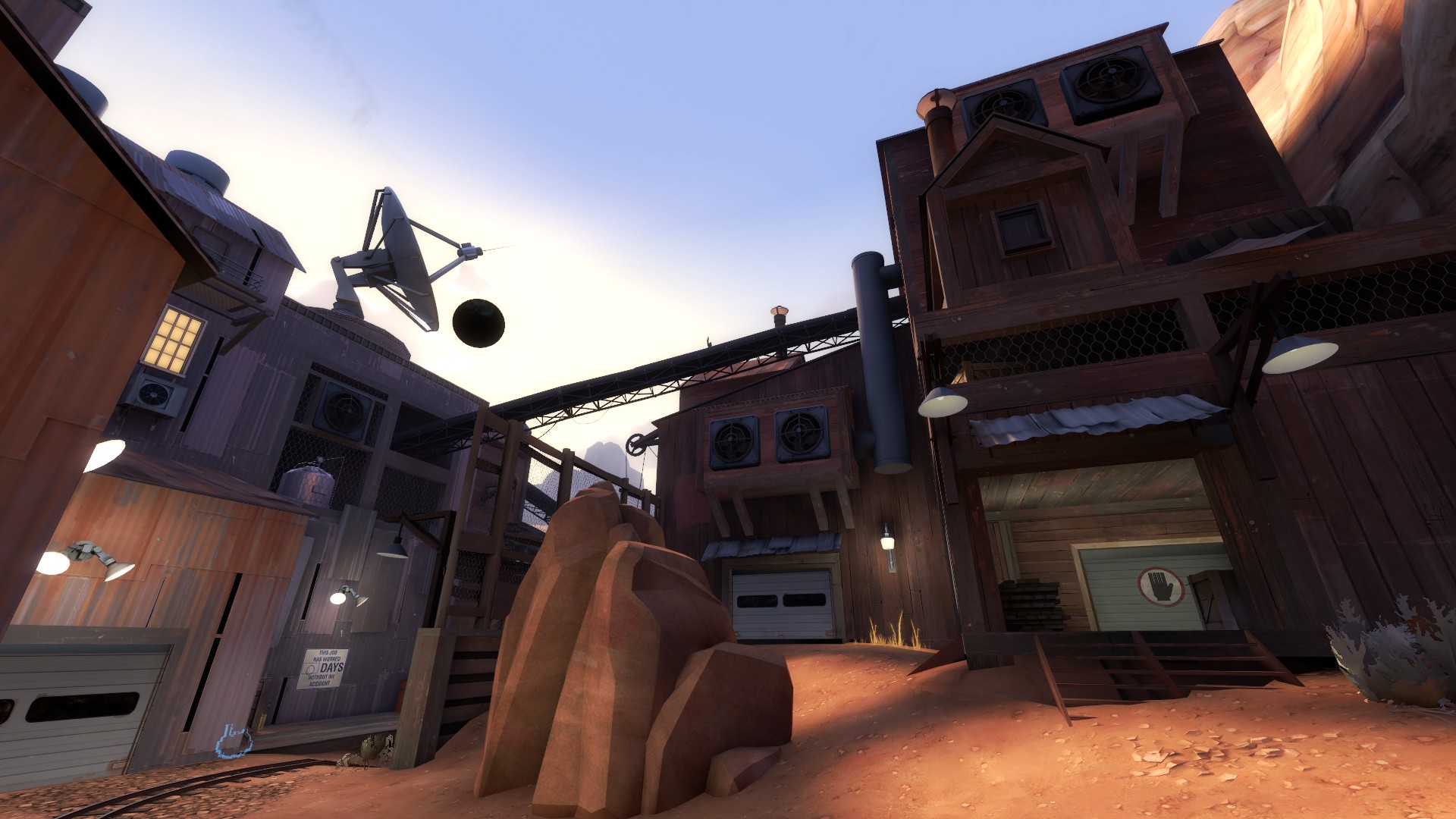
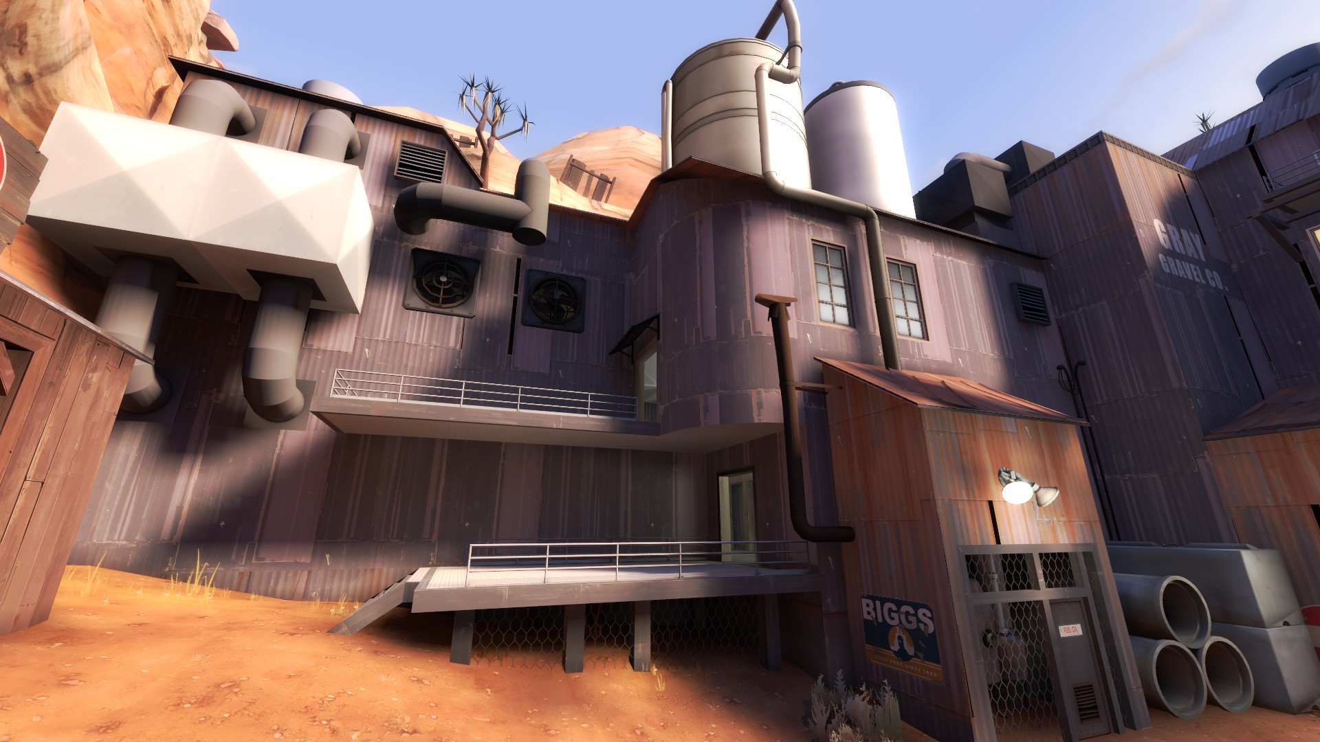
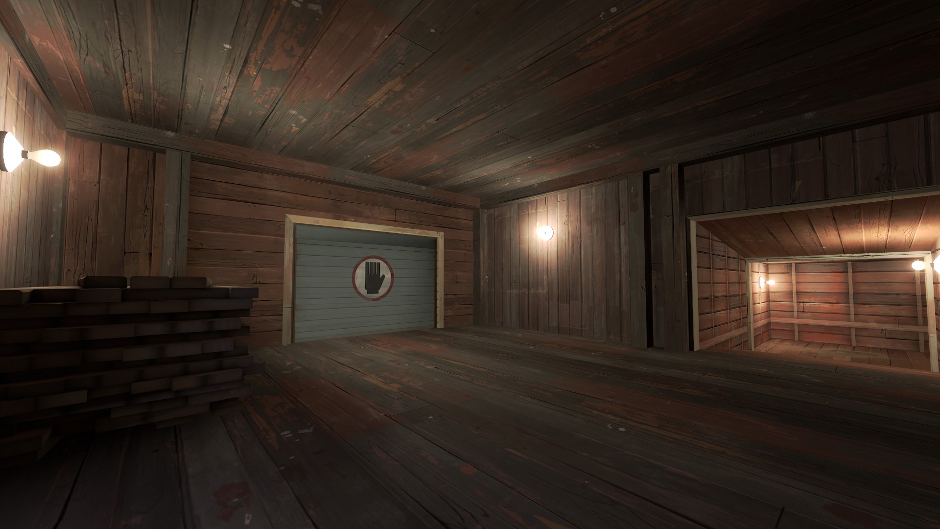
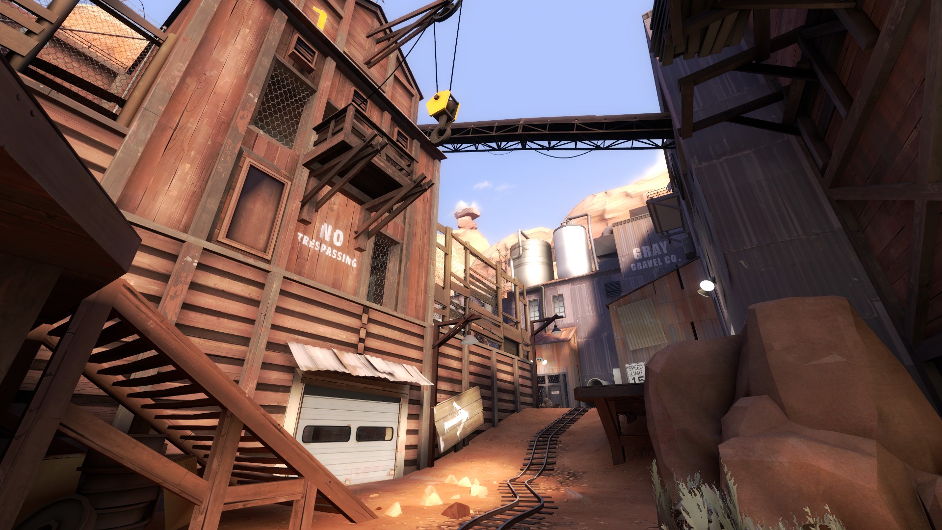
This is one area. This is the amount of detail I'd expect spread across an entire map, not one area. You have so many things going on here. There is a water tank on top of a tin roof, something that seems entirely physically impossible. You have at least a half dozen fans, but also an air conditioning unit. What is that metal box with tubes coming out of it?
This is also a good example of way, way too many lights. You probably need a third of what you have here. When I got feedback from Valve for Corrode, their main criticism was that I did not use lighting effectively. I needed to use it to draw attention of the player to places of importance. I am going to say the same thing to you. It is not important to light up the track. The track is an obvious point of interest, but it is important to light the areas where players are going. Places where they can get a vantage point or destination points of where the cart is going to go.
But it's not just lighting that attracts players, it's details. Special areas that feel unique that feel like places with a purpose. Your map is just so chock full of props, detail brushes, pipes, cliffs, windows, superfluous balconies, lights, ect. that no where feels particularly special. In fact, the places that felt most special were the areas outside the gameplay area, the detail areas in or near the skybox.
That's because those areas had the most amount of coherence, almost seemed to have a purpose. And most of them accomplished that by not overdoing the detail and keeping it concise and relevant.
Alright, I'm sorry if this is harsh but it's something I've tried to learn a lot while detailing my own map and something even I need to work on. However, I think, besides the lack of narrative, you could just reduce the gameplay area detailing significantly, have better choices of lighting, and the map would improve greatly. The narrative would certainly increase it, but I can't honestly give a true opinion of the map until I actual play it.
First, the eclipse.
I'll need to first try to explain my reasoning here. In Valve maps, they occasionally have Gimmicks like the eclipse. Nucleus has the... thing in the middle that the teams are fighting over. Doomsday has the teams fighting over the missile. And besides those, Valve likes to include a story of some sort with most of their maps in some way. Something that explains why the teams are fighting here and why.
I don't get that on your map. Not every map needs or has that, but when you include something like the eclipse, it just begs the question: why?
Why is it there? How does it effect the "story" of the map. Is one team trying to harvest the eclipse in some way? Did red cause it via voo doo or something and now blue is trying to stop it? Like, I see there are some solar panels, but why would blue be trying to blow up solar panels during an eclipse? Those solar panels are going to be less productive during an eclipse. If some weird energy is going to come from the eclipse and be absorbed by those panels, there's no indication of that anywhere. There's a complete lack of real narrative.
Alright, now for other stuff... This will all be speculation, as I haven't played the map, but take it as you will.
These supports look like the soldier tried his hand at being an engineer. They make no sense. Also... see that bulb on the right. You way, way, way too many of those just attached to walls. It looks weird.
Really really weird.
And speaking of Lights, you just have too many of them in general in places that make no sense. Like here:
How are there lights under this? Why are there lights under this? You have plenty (too many) lights in this room already. There's no indication of where to go visually besides the red arrow. And then there's another arrow on the right. Two arrows + too many lights = very confused player.
I walked right by that door multiple times. I had no idea it was usable. Like, I'll be the first person to say that a map being complicated is not always a problem. Complicated maps can be fun, but they just take time to learn. However, your map's layout isn't particularly complicated but the frankly schizophrenic detailing makes it feel like it is. Like when you leave red's first spawn you get this:
You have two doors and a control point within view of the player. Both those doors are inoperable, but the player will be attracted to that glowing red point. Why are there two doors? Why do we see a point if it's not important in the moment? There's just so many pieces of detail that feel like they could be indicative of affecting player agency, but they're not. It immediately causes me to question whether or not certain parts of the map are even there for a reason.
This is one area. This is the amount of detail I'd expect spread across an entire map, not one area. You have so many things going on here. There is a water tank on top of a tin roof, something that seems entirely physically impossible. You have at least a half dozen fans, but also an air conditioning unit. What is that metal box with tubes coming out of it?
This is also a good example of way, way too many lights. You probably need a third of what you have here. When I got feedback from Valve for Corrode, their main criticism was that I did not use lighting effectively. I needed to use it to draw attention of the player to places of importance. I am going to say the same thing to you. It is not important to light up the track. The track is an obvious point of interest, but it is important to light the areas where players are going. Places where they can get a vantage point or destination points of where the cart is going to go.
But it's not just lighting that attracts players, it's details. Special areas that feel unique that feel like places with a purpose. Your map is just so chock full of props, detail brushes, pipes, cliffs, windows, superfluous balconies, lights, ect. that no where feels particularly special. In fact, the places that felt most special were the areas outside the gameplay area, the detail areas in or near the skybox.
That's because those areas had the most amount of coherence, almost seemed to have a purpose. And most of them accomplished that by not overdoing the detail and keeping it concise and relevant.
Alright, I'm sorry if this is harsh but it's something I've tried to learn a lot while detailing my own map and something even I need to work on. However, I think, besides the lack of narrative, you could just reduce the gameplay area detailing significantly, have better choices of lighting, and the map would improve greatly. The narrative would certainly increase it, but I can't honestly give a true opinion of the map until I actual play it.
Last edited:
I feel like the lighting on this map should be considerably darker, especially during the eclipse.
Like a was saying before, the map is getting little bit darker when blue team cap last point. I don't want the map to be dark all the time.
I don't get that on your map. Not every map needs or has that, but when you include something like the eclipse, it just begs the question: why?
Thanks for the feedback.
Counterquestion: why not? I did this idea by chance, later just embellishment and attributing to it not long story with an emphasis on the whole map. Honestly, I would not find fault with the way this. It's all part of the essence "for a tick".
These supports look like the soldier tried his hand at being an engineer. They make no sense. Also... see that bulb on the left. You way, way, way too many of those just attached to walls. It looks weird.
I'ts just a pat of the detalind. Well... imagine this: this part of the house making a lot of effort, so this part requires more support parts to avoid collapse.
And speaking of Lights, you just have too many of them in general in places that make no sense. Like here:
How are there lights under this? Why are there lights under this? You have plenty (too many) lights in this room already. There's no indication of where to go visually besides the red arrow. And then there's another arrow on the right. Two arrows + too many lights = very confused player.
And again: why not?
I thought it it would be nice to see such a platform with the light sources. During the development stage it was carried out with the generator cables to create a visual effect that her power to see the highlight, but I decided to abandon the idea becauseI faced with some limitations.
About the arrows i'm still working on them. But in most cases people don't see this in problem.
You have two doors and a control point within view of the player. Both those doors are inoperable, but the player will be attracted to that glowing red point. Why are there two doors? Why do we see a point if it's not important in the moment? There's just so many pieces of detail that feel like they could be indicative of affecting player agency, but they're not. It immediately causes me to question whether or not certain parts of the map are even there for a reason.
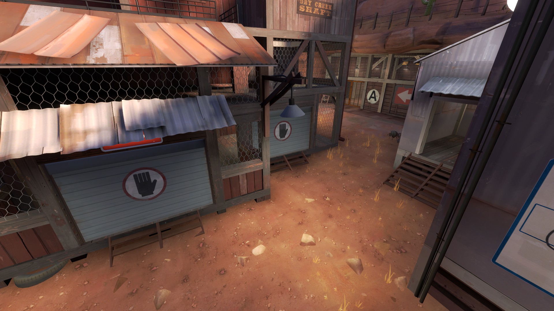
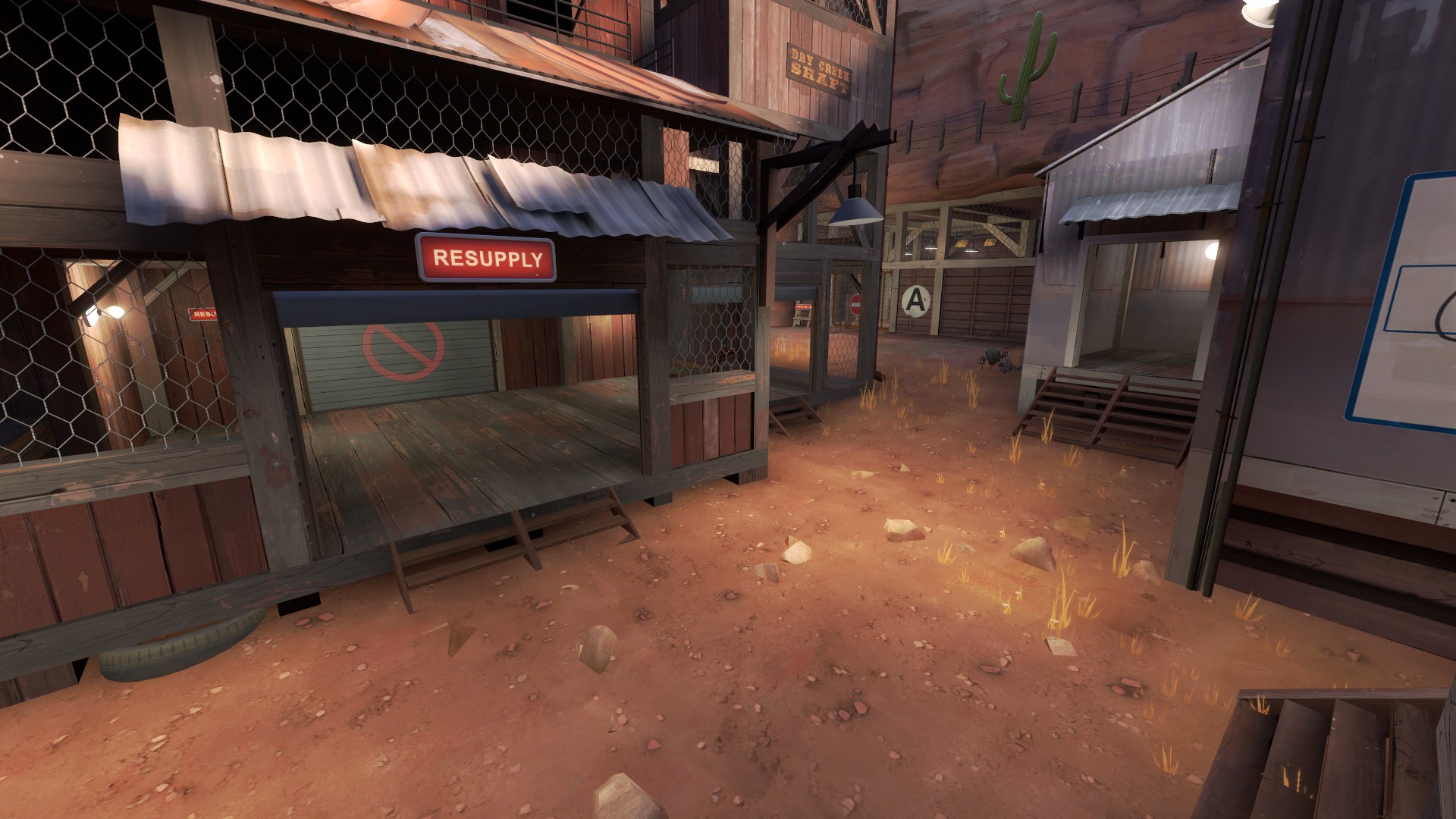
These doors are made in order to make the players forced to reduce the distance to the "A" point. In alplha stage playerd didn't noticise that flank.
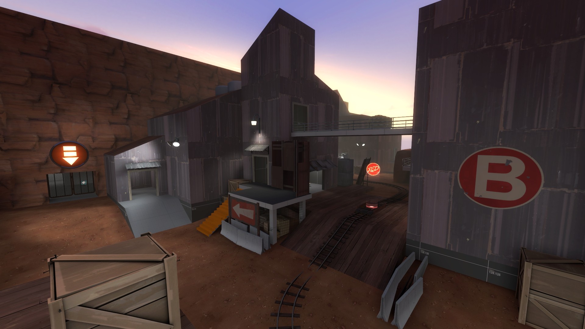
Wrong and long way to "A".
Right and short to "A".
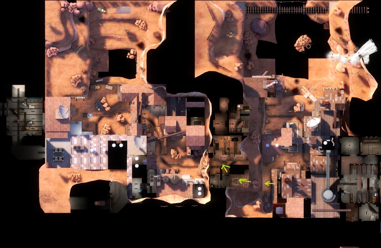
Afrer capping "A" theese doors opened.
Really really weird.
This is the second Blue spawn.
What about all the details in general, I do not understand why it is so bad to them relate. Simply, I understand that the main gameplay areas needed the parts that more pronounced, but I've played on other detailed maps (such as pl_cashowork) and everything is good, and ro instenece take other games, such as CS:GO of where the parts even more detaled ( I'm not even talking about the DICE games), and I understand that is not the same game as TF2. In any case I have these things did not change by collecting. Please, hate, and the can never her not to play, but I want to say what I get enough good feedback from non-TF2maps community. And they are get alot of fun on it.
Feedback:
30:00 - minute.
Last edited: