Introducing Kong King

tyler

aa
Sep 11, 2013
5,102
4,621
I've only looked at it in Hammer. No 3D skybox?

Also are the AC units stuck to the origin of soho models in the model browser for anyone else?

Lots of the textures look just like HL2 textures to me in the browser

I don't see any secrets in the files or the map :[

I guess it looks well done, cities have to be busy I guess. When you eschew the art and presentation style entirely I guess it's pretty simple to make an urban map. No compromises, no problems. (Sorry if this hurts your feelings 3DNJ, I don't mean it personally, it's a pretty map.)
 
Last edited by a moderator:

Pocket

Half a Lambert is better than one.
aa
Nov 14, 2009
4,694
2,579
It wasn't shiny apparently. The copy 3DNJ has does not have that issue apparently.
Funny, neither did mine. What is with some maps and disabling specularity when I play them? First Mann Manor and now this. Though it begs the question of why he designed those textures to be shiny in the first place.

Hey, if anyone here has a direct line to the guy, let him know that there's no antialiasing on the circular blue sign's character, too. And see if he'd be willing to replace the electrical outlets with ones that look like the ones they really use in Hong Kong. They're British, so they might eventually come in handy for other designers as well.
 

hydragorgon

L1: Registered
Feb 20, 2011
27
8
I've played the map for several hours already. I like the look and even tho it seems a little off, most of the textures are tf2 already. I like all the new models, in the sense that few of them are asian specific. the air conditioners and like are good for all types of non farm themes.

The map plays weird tho. Theirs a big fat full healthkit right next to the spawn. It causes insane spawn camps and prevents setting up teleporters for very long. One team i was on won during an overtime, after nearly 3 minutes of shutout. Also there are tons of poorly clipped props everywhere.

I like the look quite a bit, but the actual gameplay is off a bit. I hope they tweak the balance a little and clip it out.

hydragorgon
 

tyler

aa
Sep 11, 2013
5,102
4,621
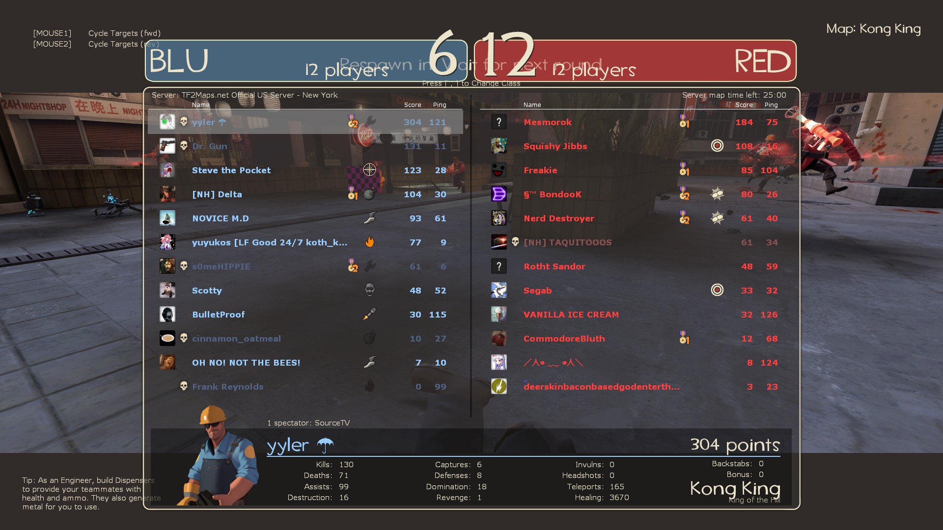
yeah mini sentries are incredibly fuckin good on this map
especially when a medic pockets you
and a sniper covers you

the top scoring players were playing about as long as i was. just not playing engie.

Wm6SS.jpg


at one point i had 7/12 dominations

pickups are pretty clearly intended to gimp everyone (especially engineer) by being placed really poorly

but otherwise i like it
 
Last edited by a moderator:

Yacan1

D I G I T A L I N F L U E N C E R
aa
Nov 7, 2010
411
793
Not to be dramatic but, most cities in China now (or even in 1969/70) are pretty much clashing cultures. You have traditional mixing with modern advancement, business, young architecture, etc. The art style for this map is pretty well defining those elements with the rough-ness of some textures and the clutter of it all. The vertical visuals of the map scare me somewhat and make me want to say "narrow" but there's enough flat outdoor sections to let me have some elbow room. I think the direction for the theme was more realistic than TF2-like. It should have been optimized to hell with all of the prop and door clutter. And I thought it was pretty cool to have actual neutral painted buildings and rooms around the mid since the lighting is painting the team sides. Scouts seem to have a good advantage with all the roofs and signs around. Aesthetics are a tad better than gameplay in my opinion. (I love the escalators btw)
 

EArkham

Necromancer
aa
Aug 14, 2009
1,625
2,773
I like the theme quite a lot. Think it fits in TF2 just fine. Looks to be a good interpretation of 60's era Hong Kong done in a TF2 art style.

I feel like maps such as pl_borneo, cp_zinkenite, and cough-cp_antiquity-cough has shown that this site isn't against new themes done in TF2 style, so I'm a little confused why there's a lot of dislike for koth_kong_king's theme.

Optimization on the map however needs a lot of work. Honestly I think this might be one of 3DNJ's weak spots since both koth_lakeside and cp_mountainlab are pretty rough on fps as well. No doubt that he makes beautiful maps, but that beauty comes at a price.

I haven't yet played any rounds on the map, so can't comment on gameplay yet. The large healthkit did stand out when I saw it though, and I wondered why it was there.
 

Pocket

Half a Lambert is better than one.
aa
Nov 14, 2009
4,694
2,579
I think I figured out what might be contributing to the "gritty" look some of you are talking about: The textures were compiled with mipmap sharpening on, which, in addition to making glowing edges around dark lines, enhances the noisiness of an already grainy texture. So those of you who don't have texture detail set at Very High will be looking at noisier textures than I am.

One of these days we need to try to get Valve to release whatever tools they use to create texture files. Clearly it gets better results than VTFLib does.
 

DJive

Cake or Death?
aa
Dec 20, 2007
1,465
741
I haven't played it yet but I'm all for anything that isn't a wooden barn on one side and a cement building on the other. /yawn.
 
Mar 20, 2012
391
806
I find it funny the line of officialized maps went from Doomsday, which is borderline alpha detailed to this, which has detail all over the place. Obviously, 3Djn didn't do Doomsday, but it shows the large contrast of how a mapper designs their maps.

I didn't mean to sound like we need to stomp out every theme that isn't a gravel pit. Considering I'm working on an international map myself, it wouldn't make sense for me to make that argument.

I believe there's a challenge in being able to root a setting in a game's story. As far as I can tell, the only visual representation that this game is still among the TF2 world is the spytech room next to the spawn and a few sign overlays.

We add the big rockets and the computer panels to our maps because that's how we root the environment for TF2. You can have beautiful international maps that fit the style: Atoll leads the carts into a mountainside reactor, Antiquity's finale contains doomsday-type dig machines to match its Cambodian style and Zinkenite blends a beautiful mix of Norwegian landscape with a vicious fight over powerful crystals.

I still can't figure out what I'm doing in this map. There's hundreds of these plazas in Hong Kong. Why this one?
 

Idolon

they/them
aa
Feb 7, 2008
2,105
6,106
I seem to remember that the narrative behind Lakeside was something like "archaeologists (blu) and loot raiders (red) fight over a dig site (out of bounds area behind full health kit room)."
 

grazr

Old Man Mutant Ninja Turtle
aa
Mar 4, 2008
5,441
3,814
I like how you can tell the mapper off of the mapper's style, i just wish we recognised 3DNJ's handywork for good reasons.

Over saturated visual noise.
Textures that don't smoothly transition into one another.
Poor optimisation.
Models and various details that get in the way of gameplay.
Use of content that looks more HL2 than TF2.
Underscaled gameplay space (although lakeside didn't have this problem).
 

Pocket

Half a Lambert is better than one.
aa
Nov 14, 2009
4,694
2,579
Or just ask 3DNJ, since he's the one who did all the assets.

I'll bet you almost anything he just used VTFLib. Or did you cut out the wrong part of my post?

I like how you can tell the mapper off of the mapper's style, i just wish we recognised 3DNJ's handywork for good reasons.
And to think, out of all the people who have made custom maps over the years, he's the one they decided to actually commission a map from. Well, him and the guy who made Barnblitz and Foundry, but he probably had other connections considering none of us have ever heard of him.
 

Deodorant

L6: Sharp Member
Oct 31, 2011
263
214
I got a chance to play the map now, and my one big complaint is how unintuitive it is to navigate. The whole area between spawn and hill consists of a whole bunch of different rooms and corridors connecting at confusing angles, and while they're quite visually distinct from each other, there's no clear sense of progression. I basically just either stuck to the one path I knew or ran around at random until I saw the plaza roof.

Now, if we're complaining about Lakeside as well, may I add one major thing that has always bugged me about that map? Why is the map named lakeside when everything except a little out-of-bounds area outside two low-action corridors is completely lake-free desert? That's just a terrible way of setting up expectations. Oh, and that tiny indoor pool is also pretty annoying. Whenever I try to get out of it I just bump pathetically against the edge or pillar until I eat a crocket.

Oh, and back to Kong King: There's a little cozy-looking noodle shop at the edge of the plaza. I think that's the objective.