


Phi's 5cp Analysis vol. 1: Glassworks
I'm just going to say it outright. This map probably plays fine in pubs, probably Highlander as well, but definitely is not a good 6s map. The layout, point structure, and use of flanks and extra routes are what really set it back from other maps. Definitely could get somewhere with a lot of editing and remaking but I don't know how much you're willing to do that. It looks like a fun pub map, at least. I wouldn't want to play it in 6s at all, though.
Let's take a look at why that is, shall we?
First up is mid. Now the first thing I noticed when playing this map is the extremely limited visibility a team will be provided when rolling out through the standard choke area:
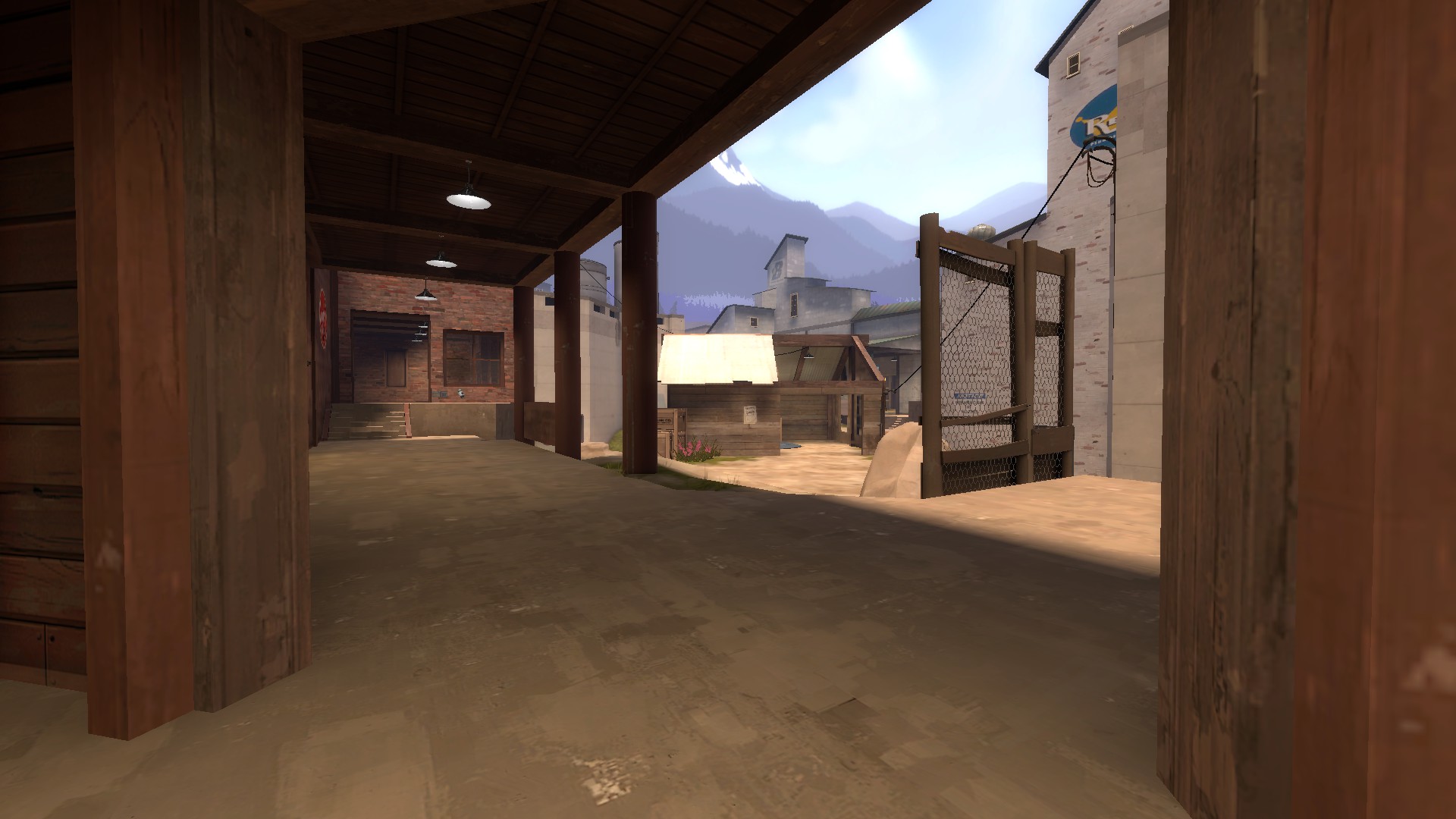
A demoman rolling out through that door would basically have to blind launch and blind detonate stickies onto the other demo.The demo couldn't push up any further, either, or else risk being annihilated by scouts he could not see coming.
Take a look at Badlands mid, Gully mid, Snakewater mid, Process mid, Metalworks mid (and Sunshine mid) and note how much visibility Demomen have. This is necessary for a good midfight, as without proper visibility onto the other team's scouts, demomen (and particularily Medics) will have a very hard time living out the midfight without being completely demolished by bombing soldiers and scouts.
Effectively what your mid has is three entrances:
This is fine, however what I think is bad about this map's mid is that if you want to have a proper hold over the doorways, you have to push really far forward onto the enemy's side of mid. The white brick building on the left is also essentially a safe hiding place for scouts, making them even more powerful on the already visibility-limited mid.
Standing in this position is a death sentence for combos and demomen:
and going underneath as anything but a scout will surely be the death of you, considering how low it is, how large it is, and how it has only one exit that can easily be spammed out by any combo/demoman holding the area above it or the choke to the immediate right of the picture.
The healthkit is also in a very strange place, as there's no reason for anybody to go and retrieve it in a midfight lest they get spammed out immediately and die. This limits this healthpack to scouts who can dart under and grab it really quick, and not much else until the midfight is through. This makes scout even more powerful on the midfight, essentially providing them with a free medium healthpack that necessitates no retreating. A better spot for the healthpack would be back inside choke, or an area that would be accessible to the combo that would require retreating from the midfight to gather (i.e. Badlands pack, Gullywash pack, Snakewater pack, Metalworks pack, Sunshine pack, etc etc...). Note that you already have a healthpack in this position. The one under mid isn't needed and takes away class balance.
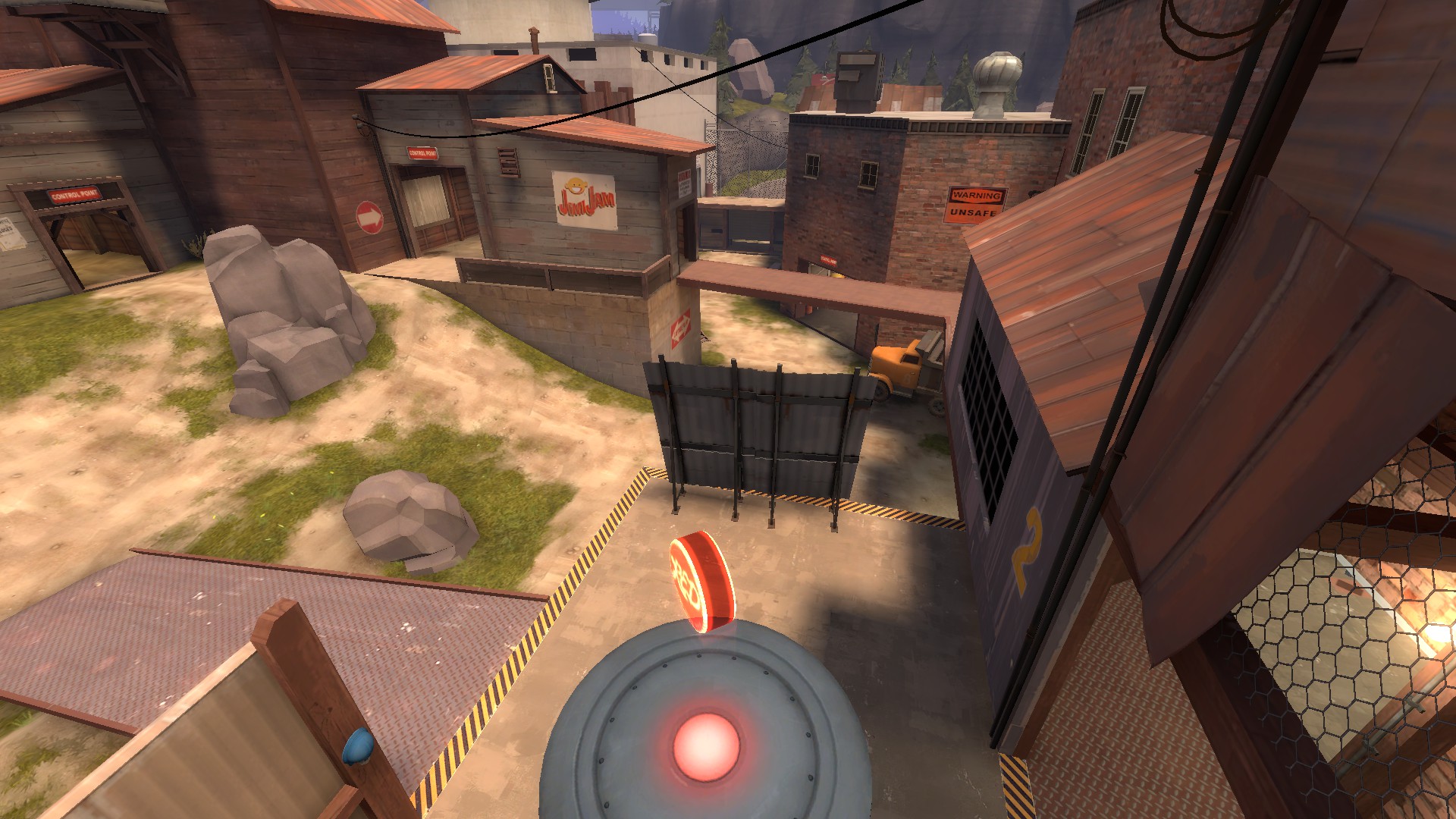
Heading on to this route:
This flank is essentially one of the least useful routes on the map, from my perspective. I haven't played this in a serious 6s environment so it might be useful to hold, but I can't imagine pushing into mid with it. It's a decent route to push through for second, but the choke to the immediate left of it has height advantage, space advantage, and is closer to the point. Smart scouts would never come close to this tunnel route either, instead heading through the low flank far away from the point. This makes this tunnel route useless for most any class pushing through it, as the small exit can easily be spammed out and every other route around it has better positioning advantages, and as a result, would be preferable to use over the tunnel route.
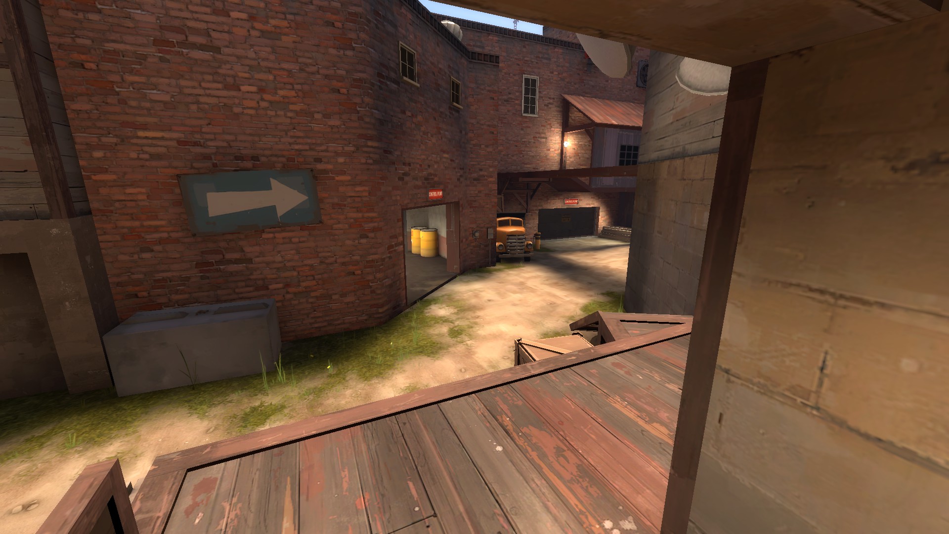
Next on the chopping block is the wide flank:
This route is incredibly out of the way. A scout can easily run from the exit in the bottom left/bottom mid to the entrance in upper mid without being seen at all by anyone holding second in any of the reasonable hold spots. The flanking scout on the defending team can't effectively hold this flank either, considering there's three different points of height advantages flanking scouts and roamers on the attacking team can use versus two the defending team can use. The blue metal bridge is fairly hard to hold as well, especially when the offensive team is holding lobby from mid, as the demo/combo can spam out flanking scouts trying to hold flank by holding blue bridge.
This problem is augmented by the extremely limited visibility teams holding second are given through holding the point in the only advantageous spot:
That grey metal barrier makes it so that a combo/demoman holding second on point can't see anything happening on flank, unless they push themself into a height disadvantage, or the extraordinarily cramped route behind the point that can get spammed out super easily via attackers pushing through the bridge over flank. I say remove that barrier altogether and think about reworking flank if you want the map to flow better and not have such easy ways scouts can just zip behind the defending team.
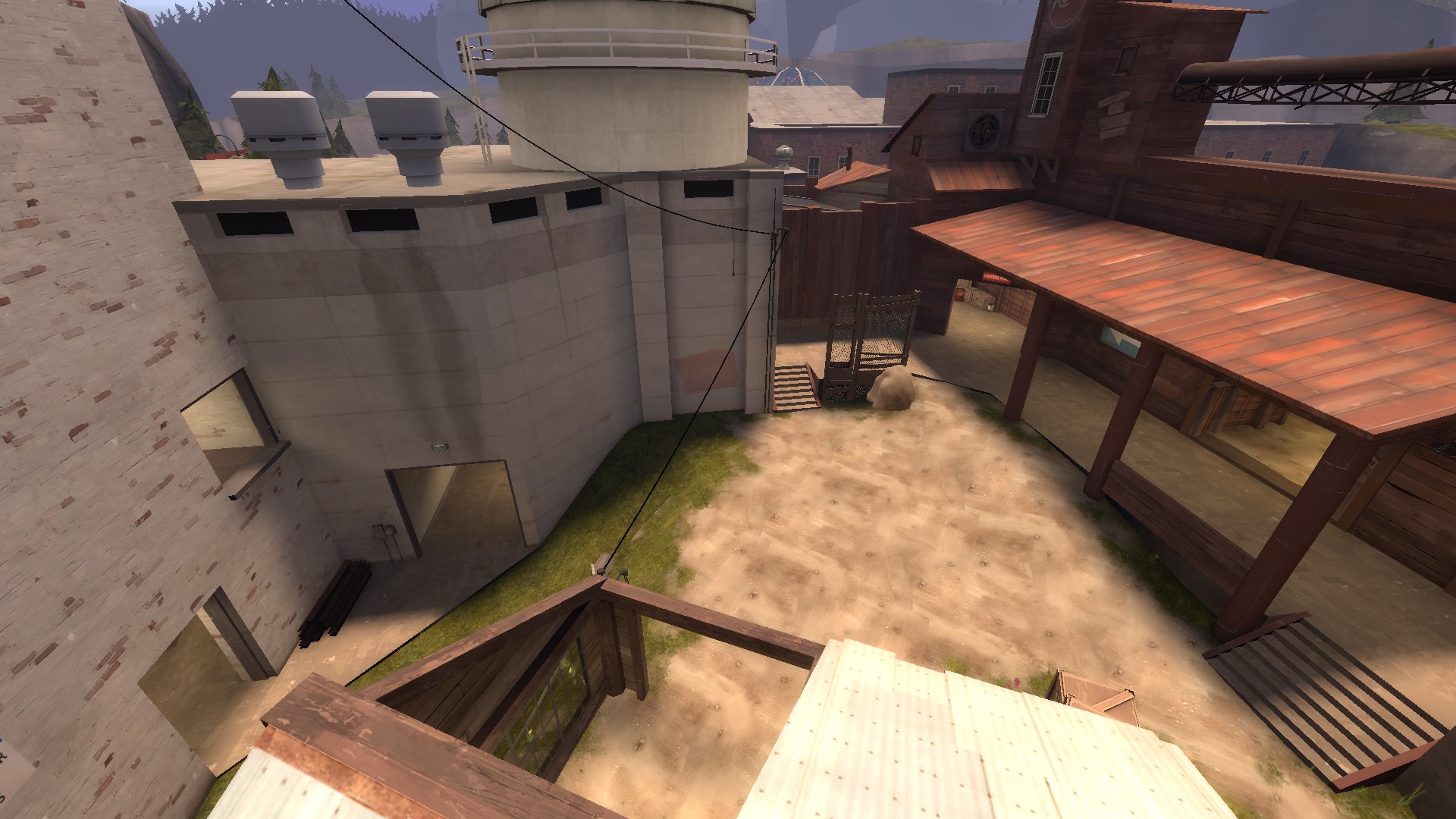
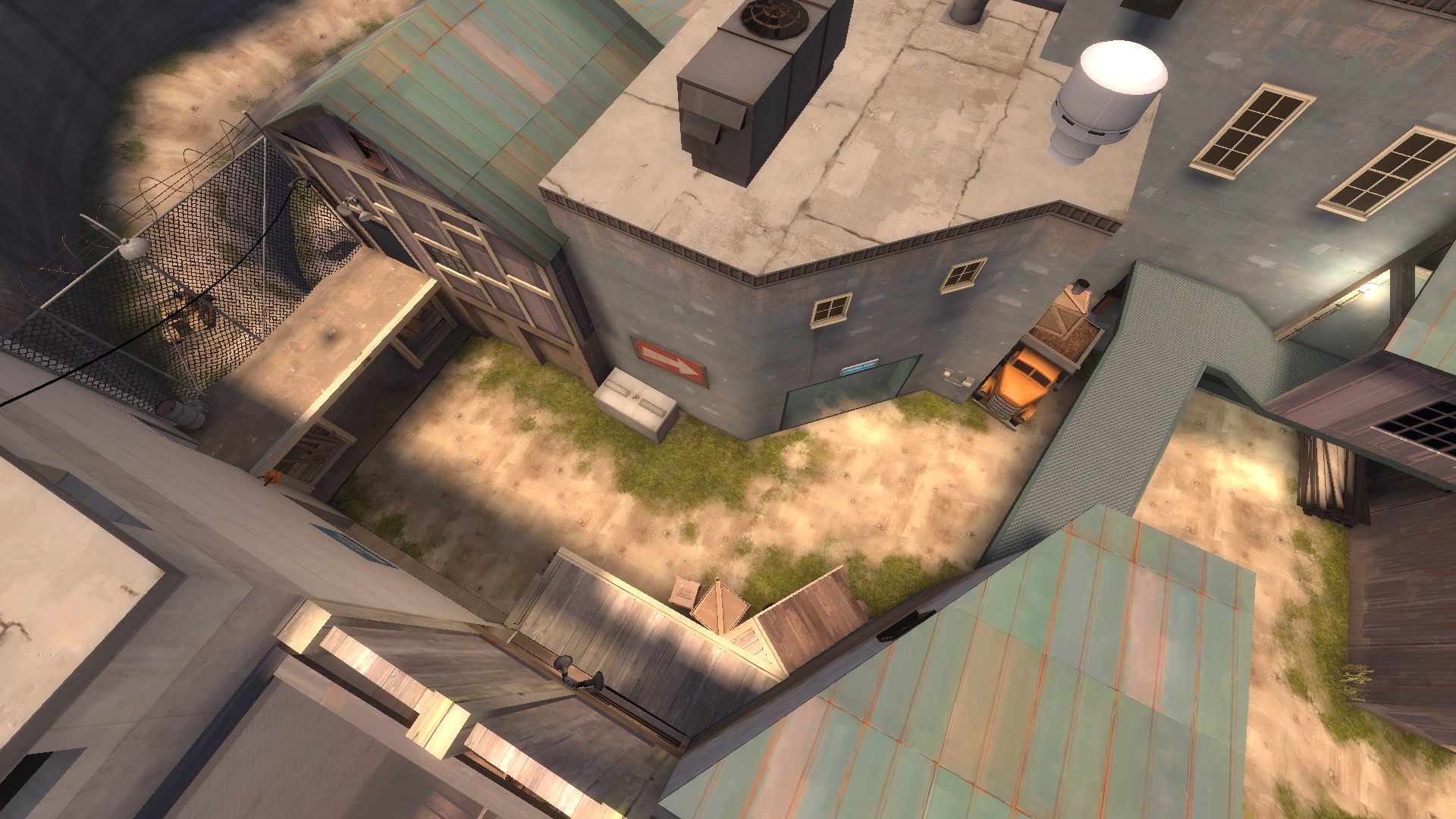
This position also is extremely advantageous for the attackers and extremely disadvantageous for defenders:
as this holding spot is right on the staircase that rotates into choke. No defenders can even approach this staircase as the combo/demoman can easily rotate around through lobby and blast any scout trying to flank them, as it has both height advantage over flank and a large visibility compared to what defenders have on second. Additionally all routes for attackers have height advantage over second.
NOW, onto what I think is the map's worst flaw when it would come to 6v6 play. Its last.
Many ESEA and CEVO players have called Sunshine's last lobby "labyrinthine" and "excessively complicated". Under those jurisdictions I can only call your last lobby on par with the labyrinth Daedalus built for the Minotaur. If Sunshine's last is "maze-like", your last is like getting lost in London.
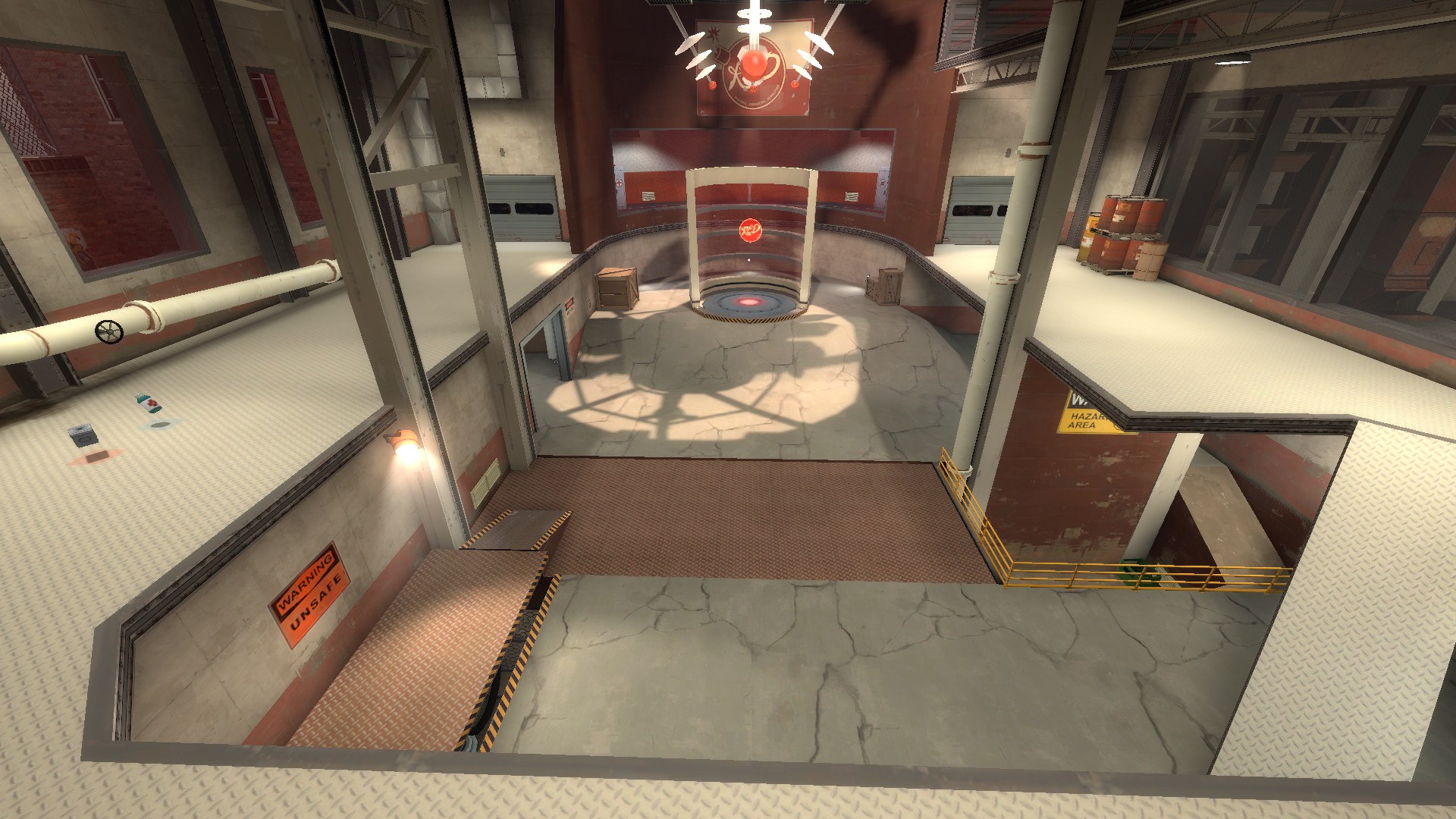
What does this mean...? Well, let's start slow. Let's start with this:
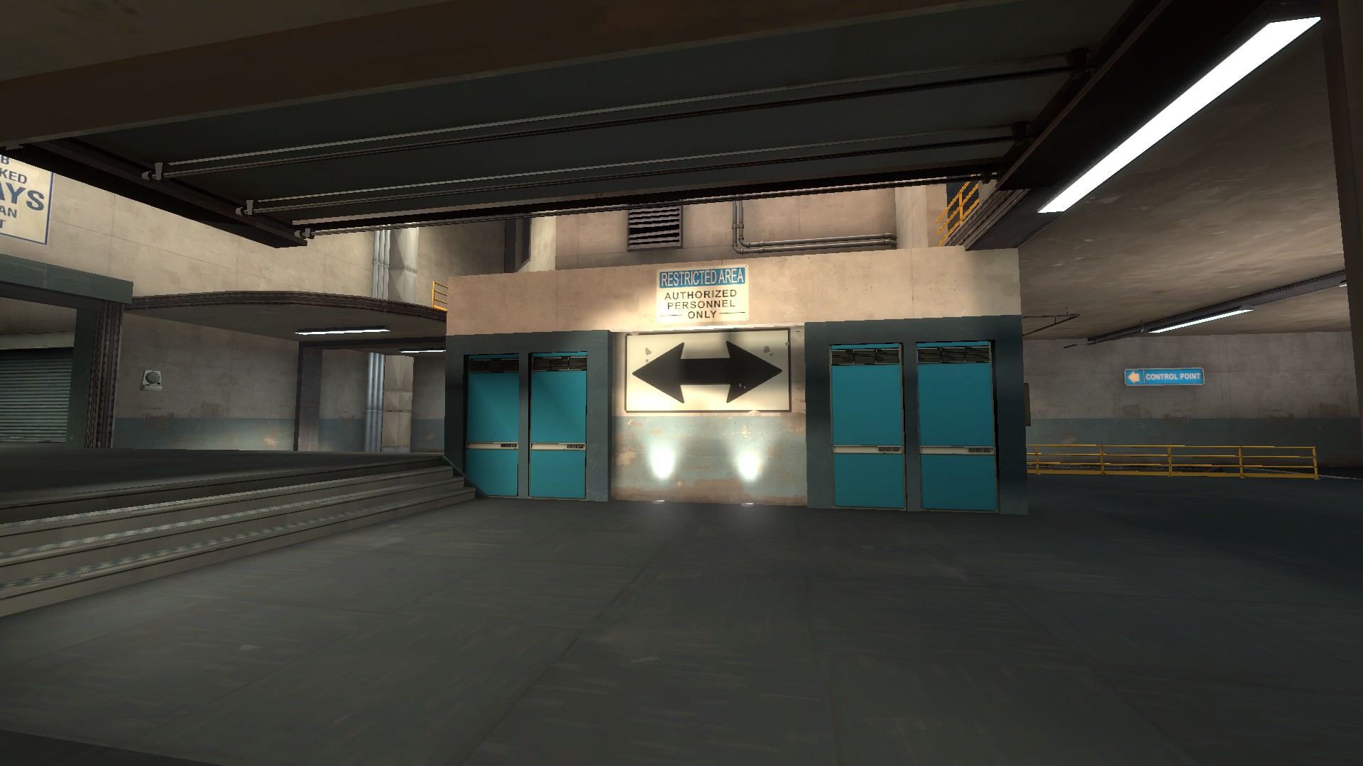
After capping second, attackers that want to take the most spacious route are immediately faced with this. What is most apparent: the lack of vertical space in this room. The ceiling to the right doesn't look to be any more than 192 units. The space to the right is even more cramped, and the door itself doesn't help one bit.
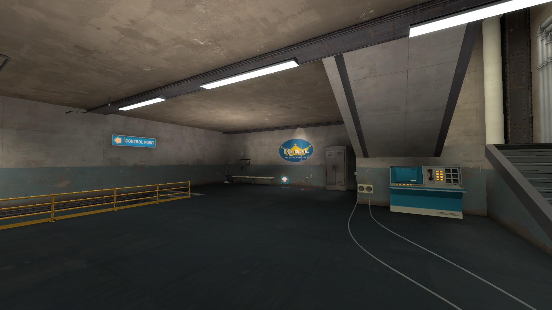
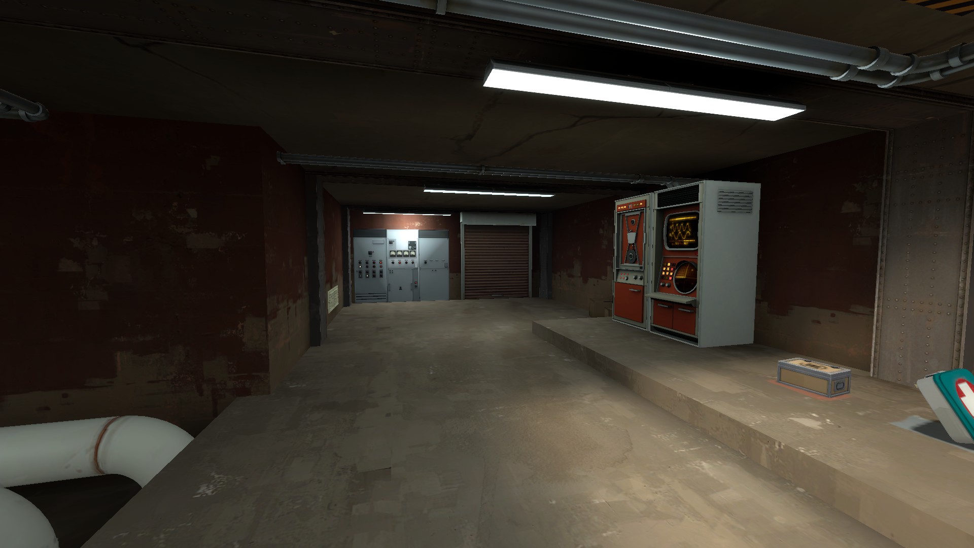
The healthkit is also in a spot that requires extreme deviation from any logical pushing path into last. It took me awhile to actually find it. The staircase leading up into the room overhead is also small and cramped, while the room above is very useless to hold as it has extremely limited visibility:
I'd recommend getting rid of at least one of those walls to the right/left of the yellow barrier, to open up the room a bit more and provide the players with actual breathing space.
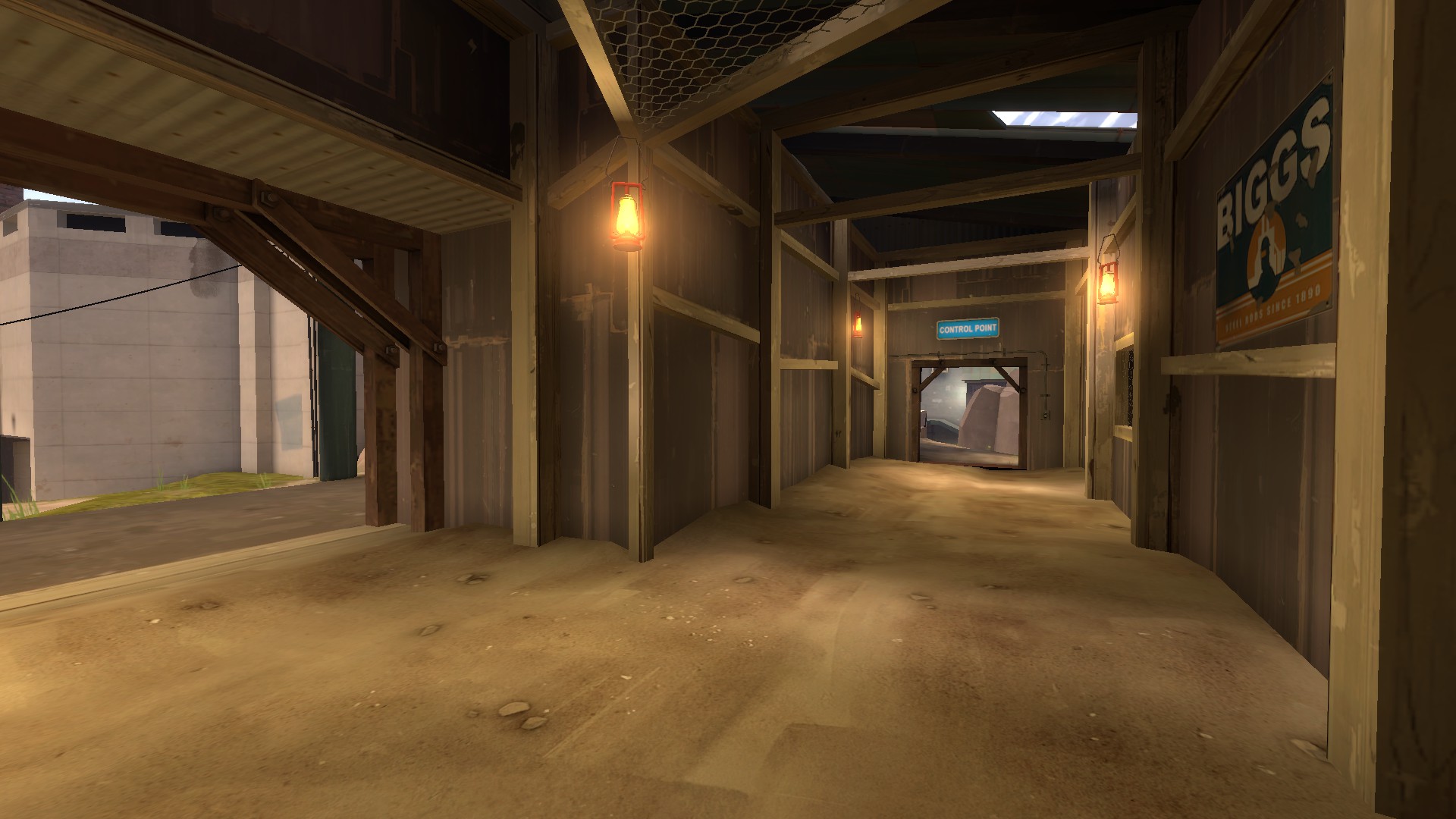
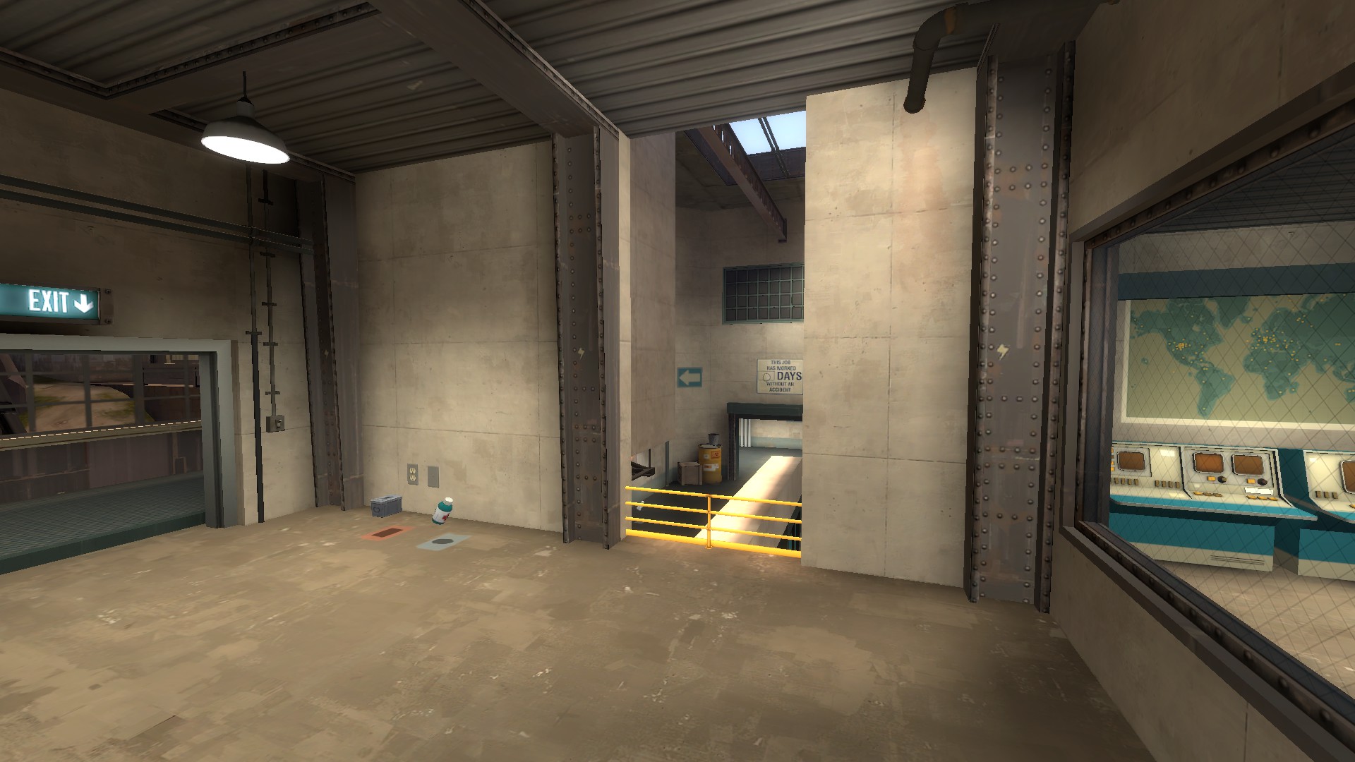
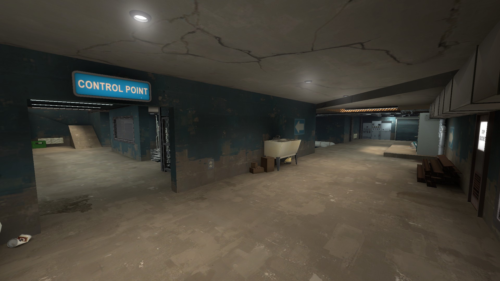
I can't but help noting how small the hallways are to push into last, as well:
with the main exit at the bottom being the tightest squeeze I've seen in a while. This route becomes something that can be spammed out with the greatest of ease, especially considering how cluttered it is around the entrance. There's no way anybody will ever push through that door without ubercharge. And even then, there's no real reason to: it's at such a disadvantage to the holding points in last that the attackers can just get bounced around by explosives without any real difficulty on the part of the defending team.
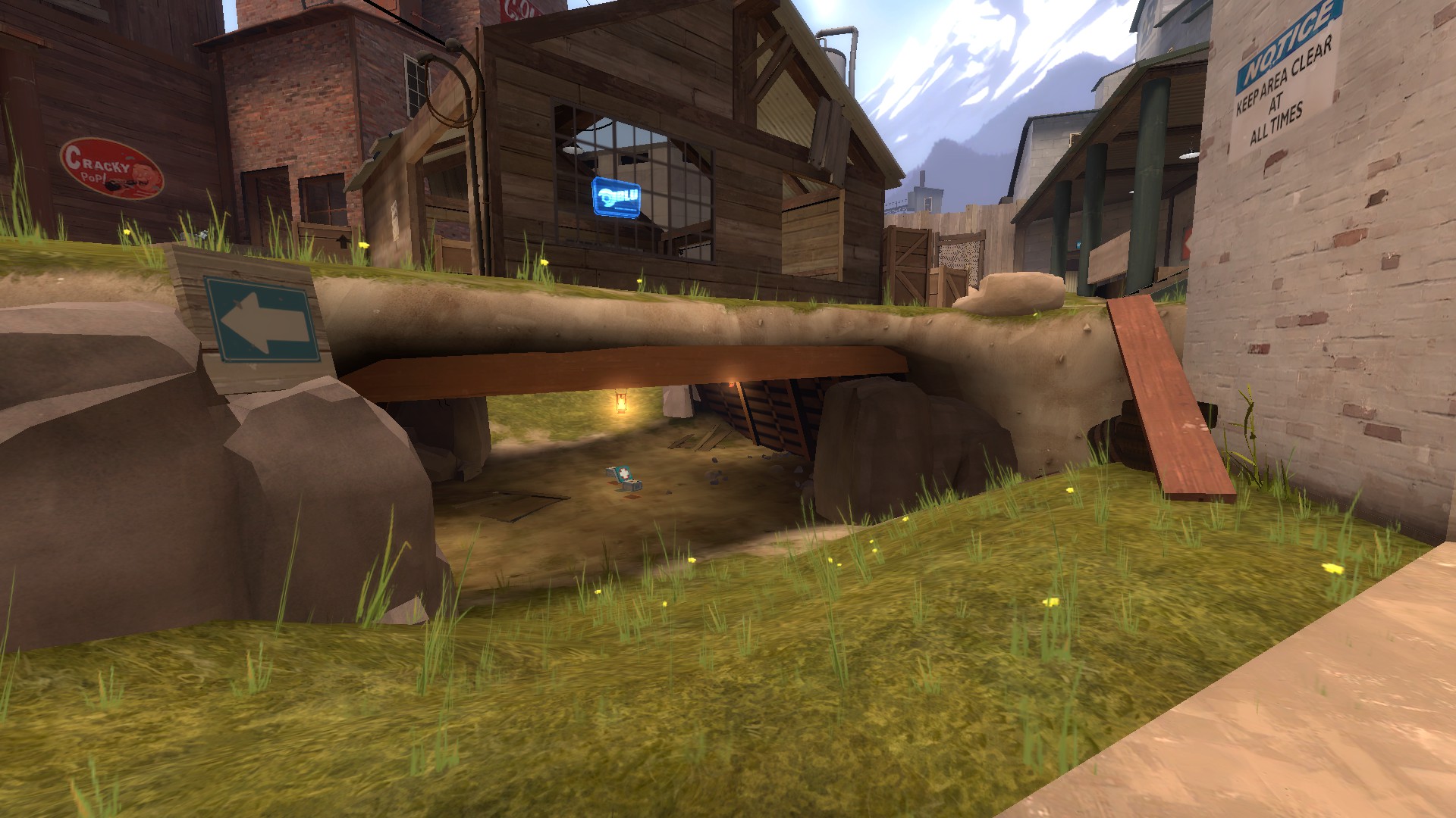
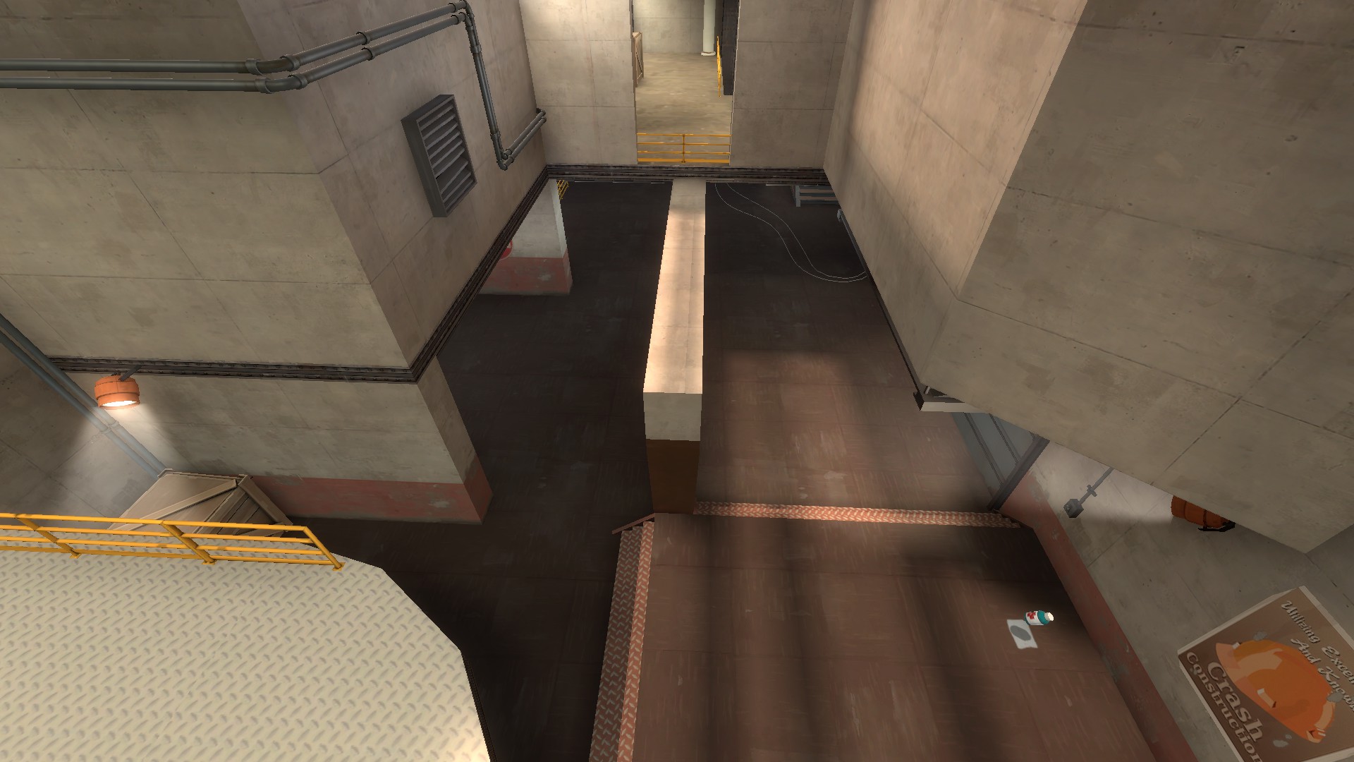
If we look at last, we also find another major flaw with it:
Your flank is absolutely impossible to have any visibility on in the slightest. In no position are the defenders ever able to tell when anyone is pushing up through it. The only reasonable holding spots for last are on either side of the point on the high ground. If they held on the right, they would have absolutely no visibility at all, and if they held on the left, they still don't have any! Even if they held as far forward as I took that last picture from (which is essentially a death sentence if the attacking team is any good), they only see people in flank when they're already pushing in and can gather a huge influence over the size of the low ground. Speaking about low ground, there's no way the defending team can viably hold there, as the only route up towards high ground from low ground is very far forward and can only really be used by the attackers.
LASTLY, your flank. It is the labyrinth to end all labyrinths.
Dead ends, redundant rooms, long narrow pathways that actually loop back on themselves. The dropdown doesn't help, either; it only makes things even more unnecessarily complicated. There's no visibility for either team down here and it makes backcapping and flanking something that WILL happen with EXCESSIVE force. That's the real deal-breaker here.
I won't be going into critiquing detailing as I think the map needs major improvement if it is to be liked or adopted at all in 6s. It's just too complicated, and the routes don't really have a focus or immediate direction. Teams are very unbalanced on certain points and scout will absolutely outplay every other class on this map.
Good luck improving the map, if you need any help or greater explanations as to why these are valid don't be afraid to contact me. As I said, the map probably plays fine in pubs, so if you're okay with it being a subpar 6s map then by all means the map is very close to being finished.
Cheers
I'm just going to say it outright. This map probably plays fine in pubs, probably Highlander as well, but definitely is not a good 6s map. The layout, point structure, and use of flanks and extra routes are what really set it back from other maps. Definitely could get somewhere with a lot of editing and remaking but I don't know how much you're willing to do that. It looks like a fun pub map, at least. I wouldn't want to play it in 6s at all, though.
Let's take a look at why that is, shall we?
First up is mid. Now the first thing I noticed when playing this map is the extremely limited visibility a team will be provided when rolling out through the standard choke area:
A demoman rolling out through that door would basically have to blind launch and blind detonate stickies onto the other demo.The demo couldn't push up any further, either, or else risk being annihilated by scouts he could not see coming.
Take a look at Badlands mid, Gully mid, Snakewater mid, Process mid, Metalworks mid (and Sunshine mid) and note how much visibility Demomen have. This is necessary for a good midfight, as without proper visibility onto the other team's scouts, demomen (and particularily Medics) will have a very hard time living out the midfight without being completely demolished by bombing soldiers and scouts.
Effectively what your mid has is three entrances:
This is fine, however what I think is bad about this map's mid is that if you want to have a proper hold over the doorways, you have to push really far forward onto the enemy's side of mid. The white brick building on the left is also essentially a safe hiding place for scouts, making them even more powerful on the already visibility-limited mid.
Standing in this position is a death sentence for combos and demomen:
and going underneath as anything but a scout will surely be the death of you, considering how low it is, how large it is, and how it has only one exit that can easily be spammed out by any combo/demoman holding the area above it or the choke to the immediate right of the picture.
The healthkit is also in a very strange place, as there's no reason for anybody to go and retrieve it in a midfight lest they get spammed out immediately and die. This limits this healthpack to scouts who can dart under and grab it really quick, and not much else until the midfight is through. This makes scout even more powerful on the midfight, essentially providing them with a free medium healthpack that necessitates no retreating. A better spot for the healthpack would be back inside choke, or an area that would be accessible to the combo that would require retreating from the midfight to gather (i.e. Badlands pack, Gullywash pack, Snakewater pack, Metalworks pack, Sunshine pack, etc etc...). Note that you already have a healthpack in this position. The one under mid isn't needed and takes away class balance.
Heading on to this route:
This flank is essentially one of the least useful routes on the map, from my perspective. I haven't played this in a serious 6s environment so it might be useful to hold, but I can't imagine pushing into mid with it. It's a decent route to push through for second, but the choke to the immediate left of it has height advantage, space advantage, and is closer to the point. Smart scouts would never come close to this tunnel route either, instead heading through the low flank far away from the point. This makes this tunnel route useless for most any class pushing through it, as the small exit can easily be spammed out and every other route around it has better positioning advantages, and as a result, would be preferable to use over the tunnel route.
Next on the chopping block is the wide flank:
This route is incredibly out of the way. A scout can easily run from the exit in the bottom left/bottom mid to the entrance in upper mid without being seen at all by anyone holding second in any of the reasonable hold spots. The flanking scout on the defending team can't effectively hold this flank either, considering there's three different points of height advantages flanking scouts and roamers on the attacking team can use versus two the defending team can use. The blue metal bridge is fairly hard to hold as well, especially when the offensive team is holding lobby from mid, as the demo/combo can spam out flanking scouts trying to hold flank by holding blue bridge.
This problem is augmented by the extremely limited visibility teams holding second are given through holding the point in the only advantageous spot:
That grey metal barrier makes it so that a combo/demoman holding second on point can't see anything happening on flank, unless they push themself into a height disadvantage, or the extraordinarily cramped route behind the point that can get spammed out super easily via attackers pushing through the bridge over flank. I say remove that barrier altogether and think about reworking flank if you want the map to flow better and not have such easy ways scouts can just zip behind the defending team.
This position also is extremely advantageous for the attackers and extremely disadvantageous for defenders:
as this holding spot is right on the staircase that rotates into choke. No defenders can even approach this staircase as the combo/demoman can easily rotate around through lobby and blast any scout trying to flank them, as it has both height advantage over flank and a large visibility compared to what defenders have on second. Additionally all routes for attackers have height advantage over second.
NOW, onto what I think is the map's worst flaw when it would come to 6v6 play. Its last.
Many ESEA and CEVO players have called Sunshine's last lobby "labyrinthine" and "excessively complicated". Under those jurisdictions I can only call your last lobby on par with the labyrinth Daedalus built for the Minotaur. If Sunshine's last is "maze-like", your last is like getting lost in London.
What does this mean...? Well, let's start slow. Let's start with this:
After capping second, attackers that want to take the most spacious route are immediately faced with this. What is most apparent: the lack of vertical space in this room. The ceiling to the right doesn't look to be any more than 192 units. The space to the right is even more cramped, and the door itself doesn't help one bit.
The healthkit is also in a spot that requires extreme deviation from any logical pushing path into last. It took me awhile to actually find it. The staircase leading up into the room overhead is also small and cramped, while the room above is very useless to hold as it has extremely limited visibility:
I'd recommend getting rid of at least one of those walls to the right/left of the yellow barrier, to open up the room a bit more and provide the players with actual breathing space.
I can't but help noting how small the hallways are to push into last, as well:
with the main exit at the bottom being the tightest squeeze I've seen in a while. This route becomes something that can be spammed out with the greatest of ease, especially considering how cluttered it is around the entrance. There's no way anybody will ever push through that door without ubercharge. And even then, there's no real reason to: it's at such a disadvantage to the holding points in last that the attackers can just get bounced around by explosives without any real difficulty on the part of the defending team.
If we look at last, we also find another major flaw with it:
Your flank is absolutely impossible to have any visibility on in the slightest. In no position are the defenders ever able to tell when anyone is pushing up through it. The only reasonable holding spots for last are on either side of the point on the high ground. If they held on the right, they would have absolutely no visibility at all, and if they held on the left, they still don't have any! Even if they held as far forward as I took that last picture from (which is essentially a death sentence if the attacking team is any good), they only see people in flank when they're already pushing in and can gather a huge influence over the size of the low ground. Speaking about low ground, there's no way the defending team can viably hold there, as the only route up towards high ground from low ground is very far forward and can only really be used by the attackers.
LASTLY, your flank. It is the labyrinth to end all labyrinths.
Dead ends, redundant rooms, long narrow pathways that actually loop back on themselves. The dropdown doesn't help, either; it only makes things even more unnecessarily complicated. There's no visibility for either team down here and it makes backcapping and flanking something that WILL happen with EXCESSIVE force. That's the real deal-breaker here.
I won't be going into critiquing detailing as I think the map needs major improvement if it is to be liked or adopted at all in 6s. It's just too complicated, and the routes don't really have a focus or immediate direction. Teams are very unbalanced on certain points and scout will absolutely outplay every other class on this map.
Good luck improving the map, if you need any help or greater explanations as to why these are valid don't be afraid to contact me. As I said, the map probably plays fine in pubs, so if you're okay with it being a subpar 6s map then by all means the map is very close to being finished.
Cheers
Last edited:

")