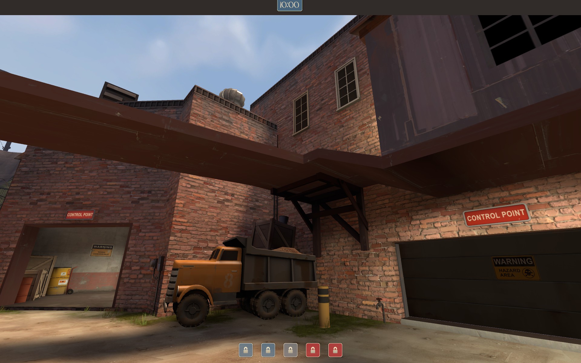
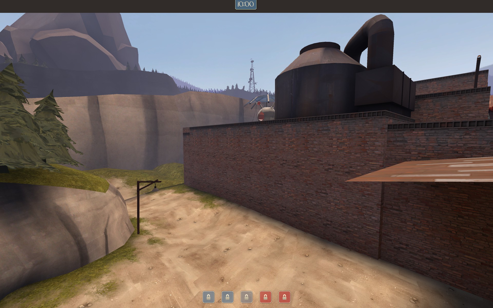
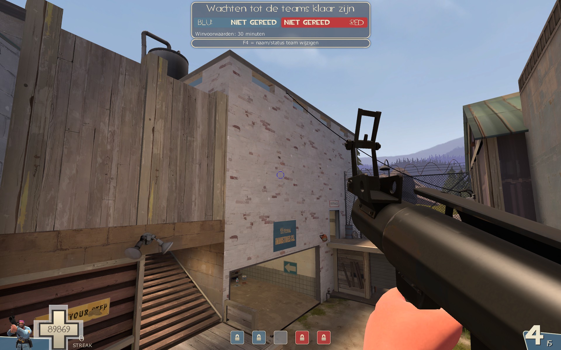
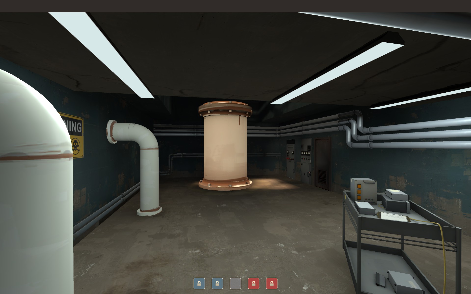
Glassworks

CP Glassworks RC7a

  • This map is featured! Our best maps, all together in one place for your viewing pleasure.

Crash

func_nerd
aa
Mar 1, 2010
3,349
5,524
Update! Downloads in OP.

Release Candidate 5-
Improved fps/ optimization significantly on last
Added a couple new small ammo packs near second area (good idea, yttrium!)
Fixed clipping issue on basement drop-down (thanks yttrium!)
Fixed window changes between last and upper lobby not being mirrored (thanks ScarF4ce!)
Fixed minor stickybomb hiding spot in narrow tunnel between second/ last (thanks ScarF4ce!)
Reduced minor details all around map for optimization purposes
Adjusted some lighting on last
Added/ changed some small details in key places
 
Last edited:

Vel0city

func_fish
aa
Dec 6, 2014
1,947
1,589
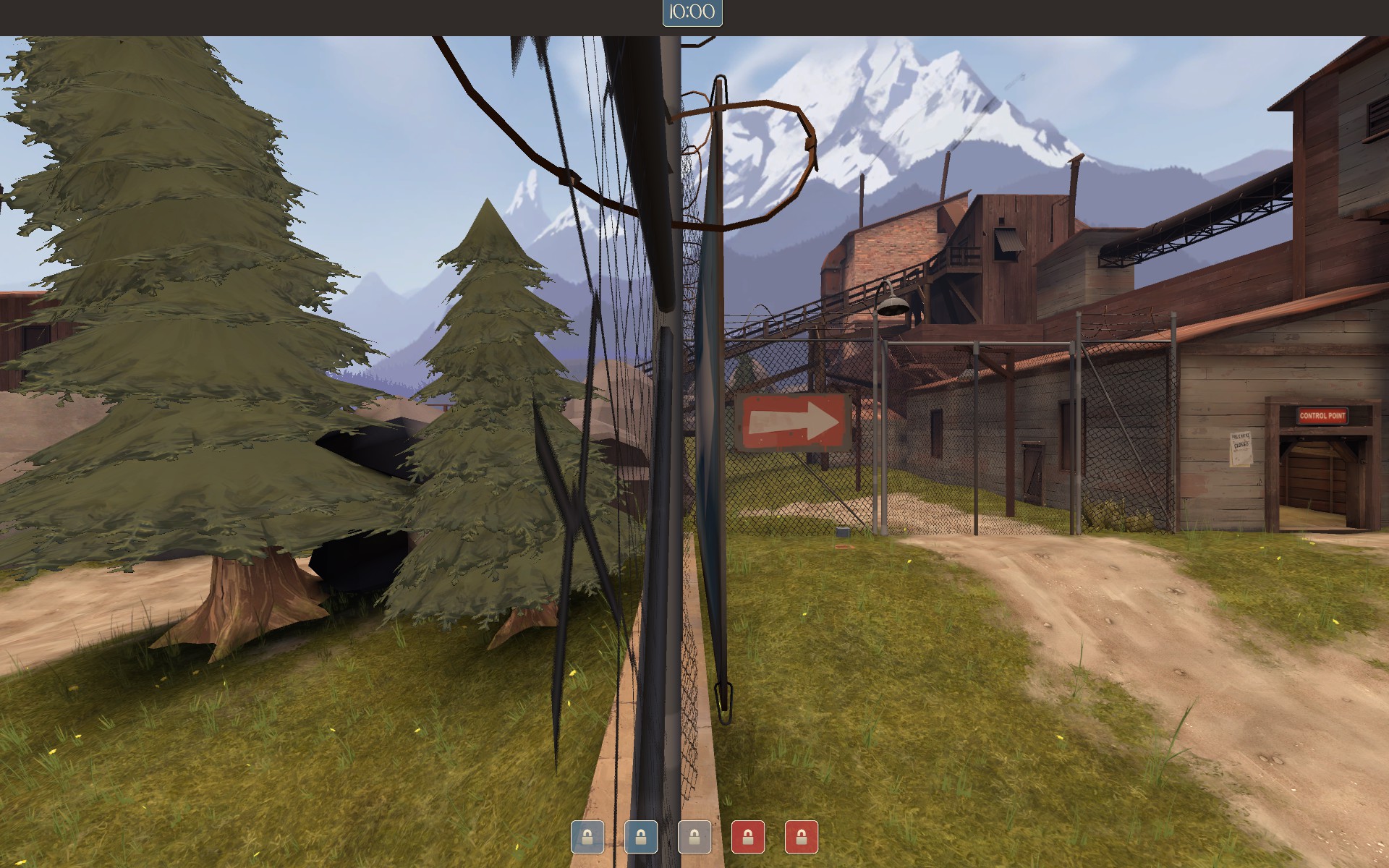
WALL OF PICTURES INCOMING.

So I flew around RC5 a bit, and got some things for you. Only detail stuff, no gameplay feedback. But the later is pretty well set now.

Ok so here goes in totally random order.

2D13B5CB611A88881020752B9C94F10ED12833FD


Floating sign is floating. Goes for both sides.

880815111426051E6EC235ED210D7D9FA39828B5


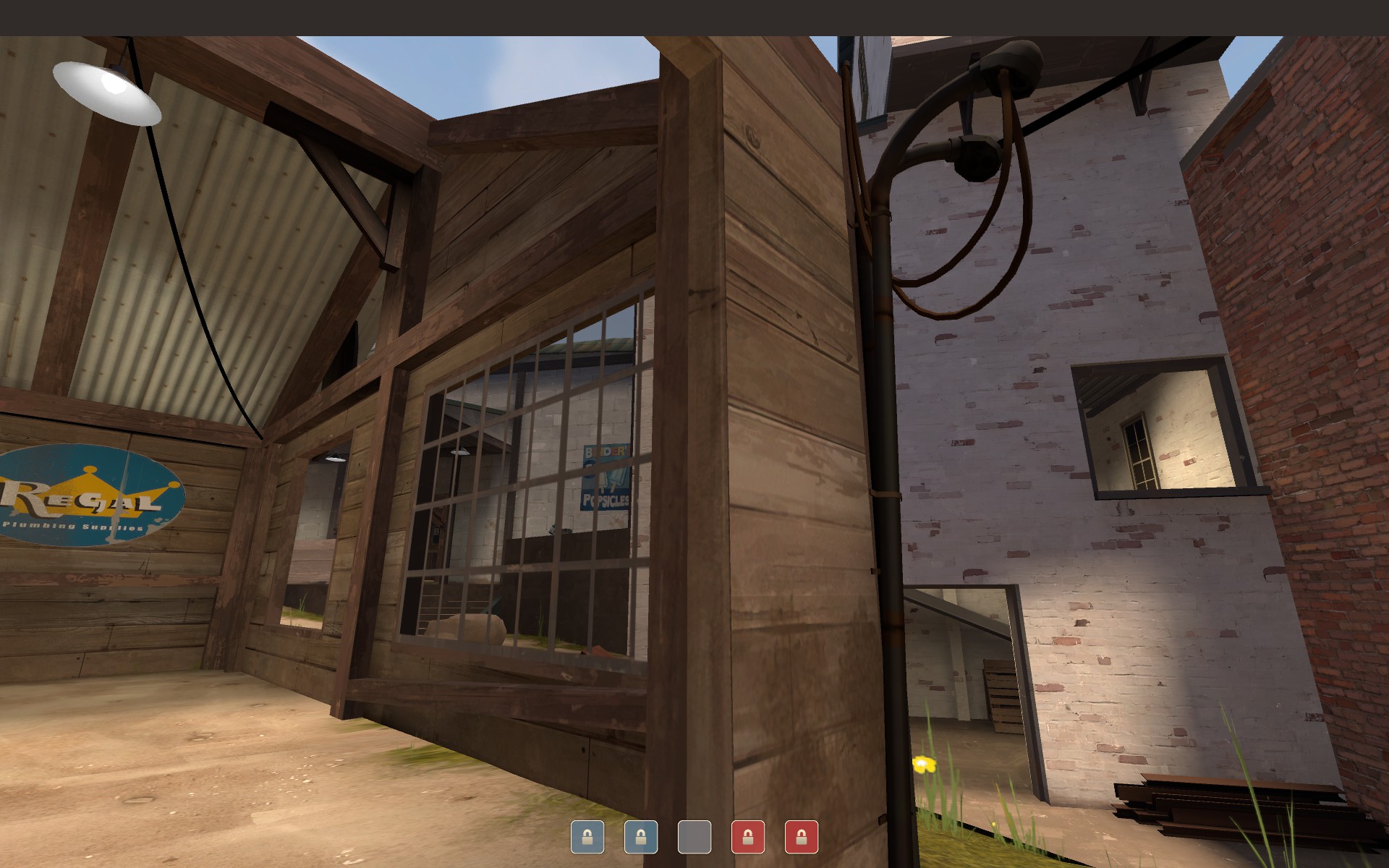
Thick metal floors supported by puny wooden support, and only on one end. Goes for both sides of the map.

2C9CF1EDB23A627CBE046BFD5CFCB8399B557463


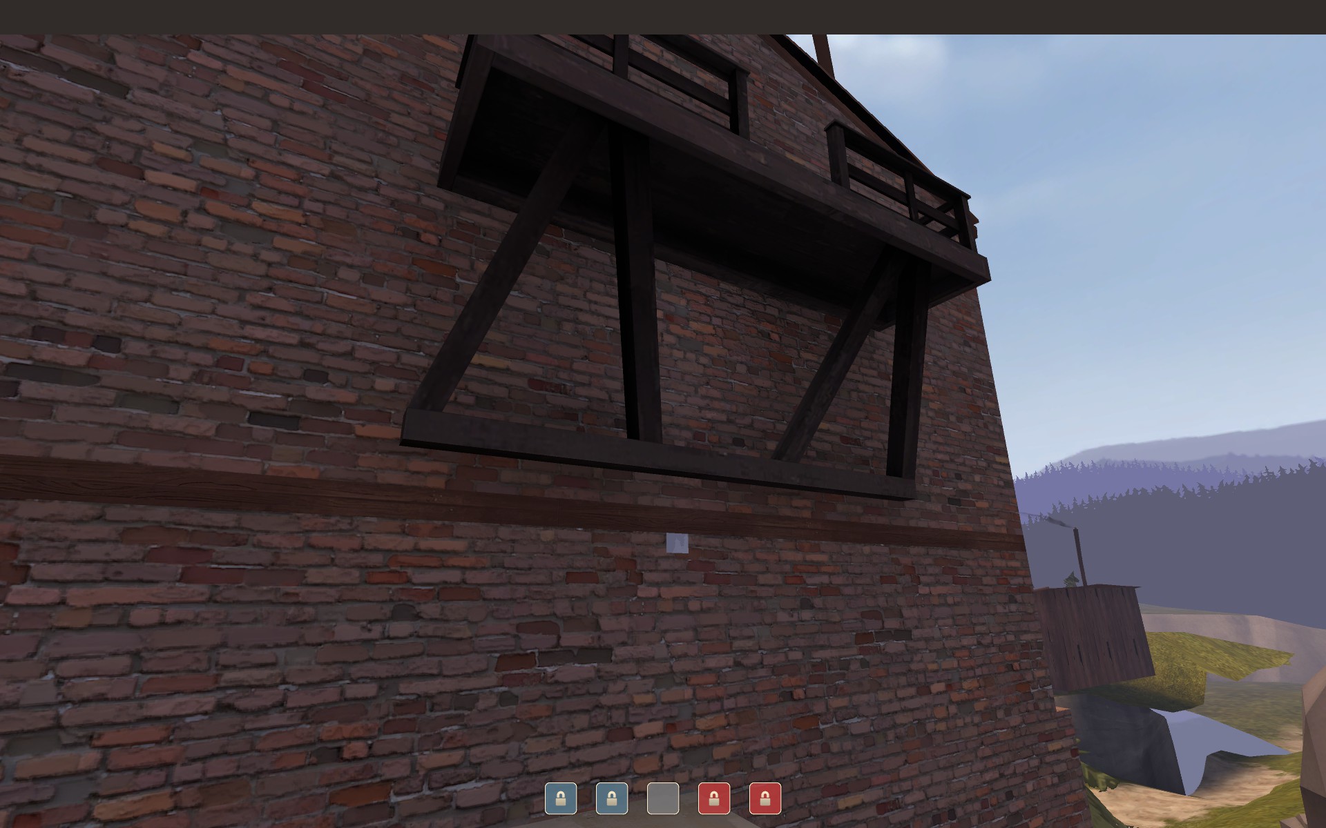
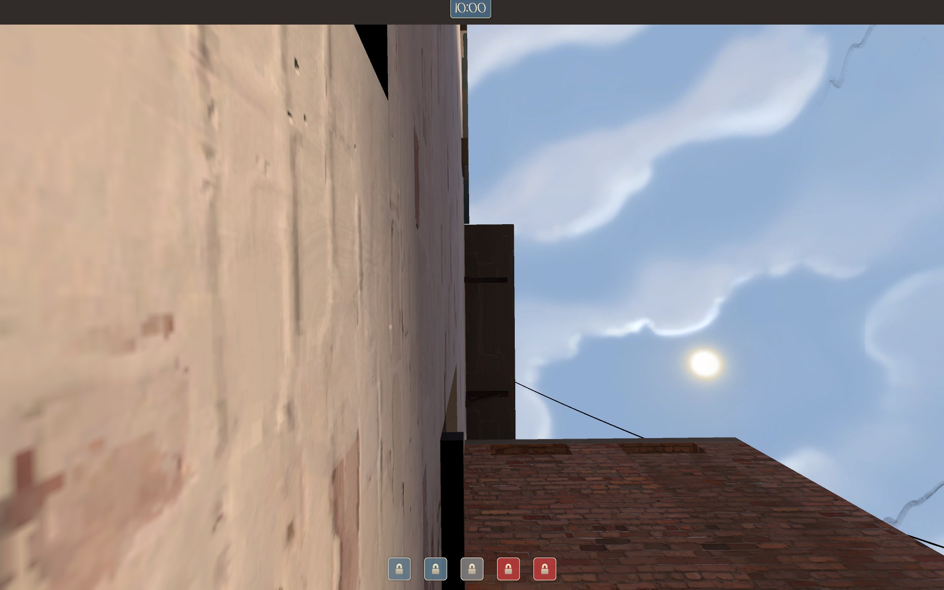
Nobody can see this huge wall yet it eats up file size for the light maps. And beyond that big thing on the roof the wall is as thin as paper.

50F0AE8B624CC3D12BE3308F2C1ECCA13B8BEFD3


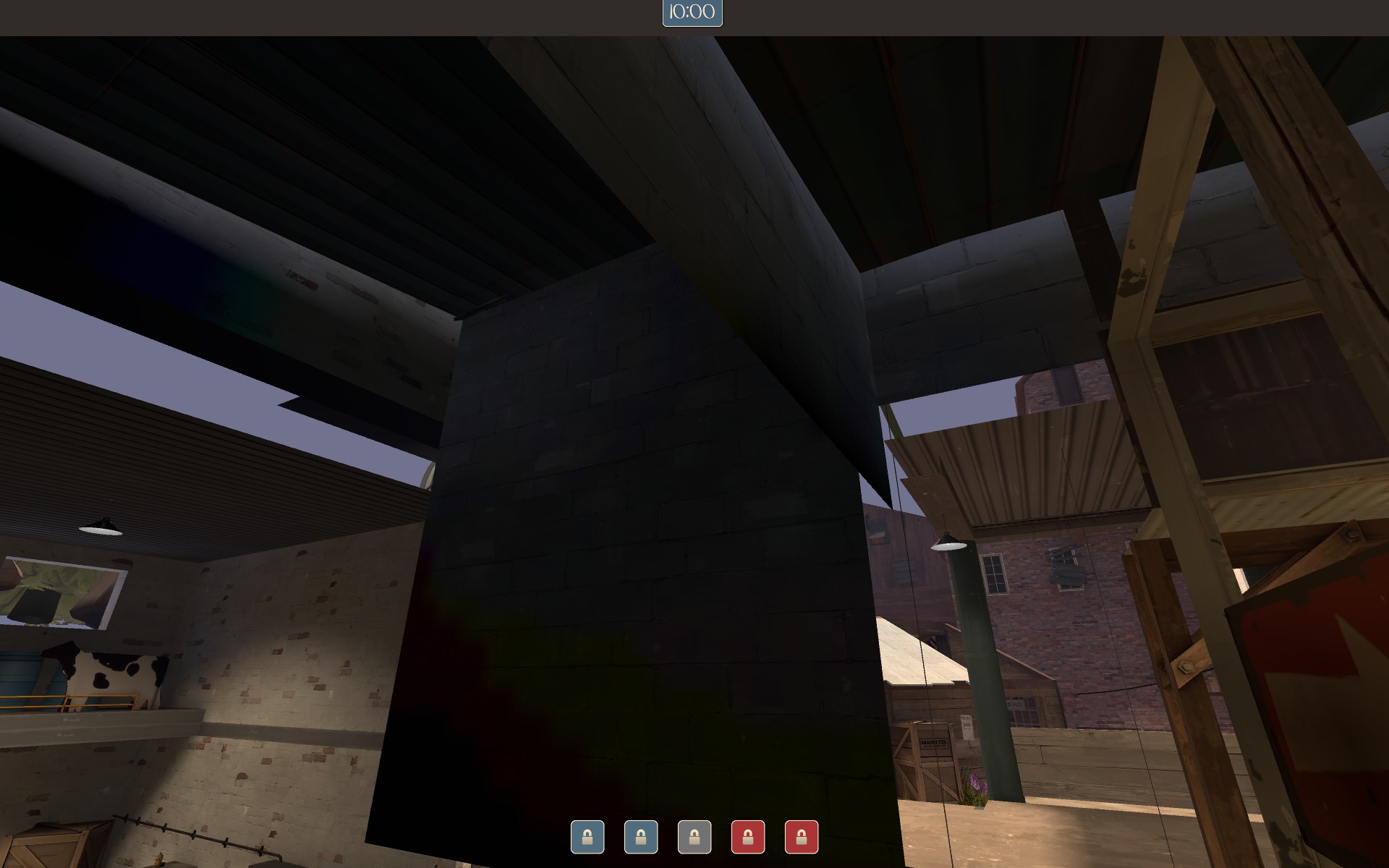
Obvious ghost lighting.

A0971D5F9A14EAFF06F045F019292E5C858957B4


Wrongly lit prop. And where does that patch of sunlight come from? Prop is properly lit on RED's side.

439DE88EBC2BB0A2654BFA18947F0B3CB7E1620F


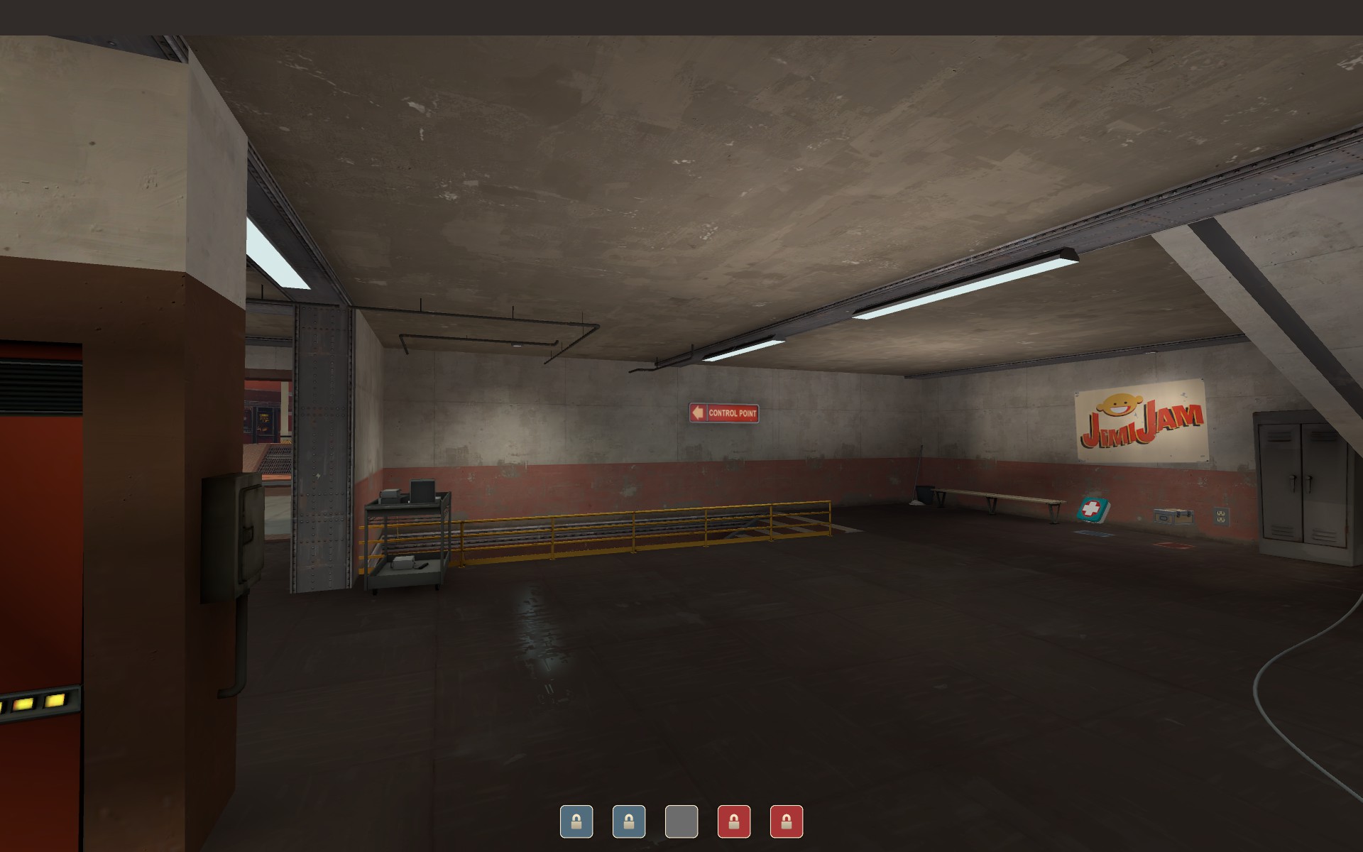
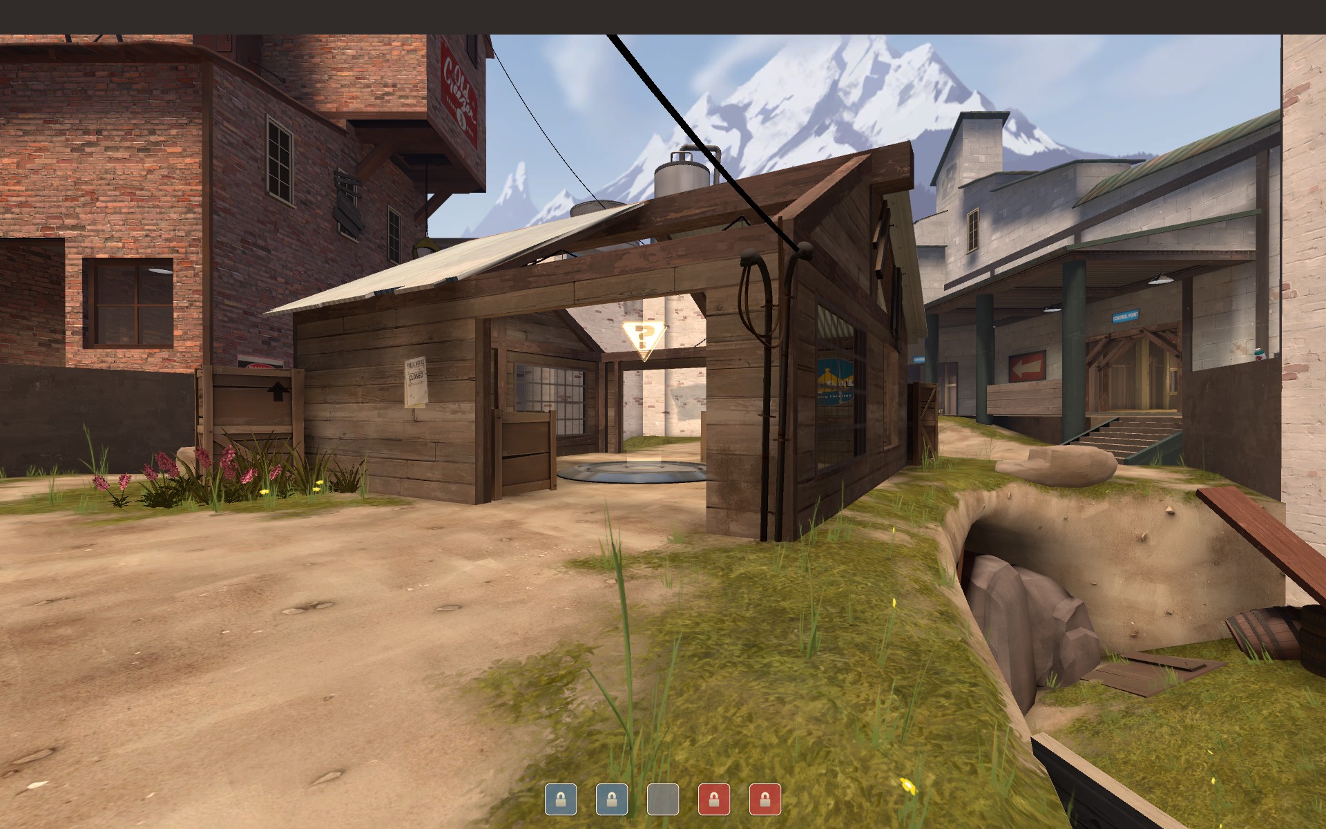
Competent players know there's a staircase there, but that one Gibus Heavy will miss it. Point the sign slightly downwards. Goes for both sides of the map.

DF60E246268C3FDD52BD733A7FB2176C0EF53A9A


Misaligned texture. Is good on other side of the map.

3499941D9E17EB6BFA423C73763BBD7B1005A40E


Double floors eating up lightmaps. Nodraw them, or clip them away.

D724791E0A507DC487C929F1F1875488203EC80F


Obvious hole is obvious. There's another one on the other side of the wall, right across this one.

BF450B7C674B6BB62608DEE5BF436FB0B500B5CB


You made your own tutorial on how to rotate textures but you forgot to do it yourself right here. Same thing on the other entrance.

8EE0ABD527BDE08D95F6B209849FF6A004DC3B78


I WILL STRANGLE YOU. GET THIS STRAIGHT. (next to middle cp, next to the wooden plank. Goes for both sides).

The following 9 pictures have one common theme. Have an imgur link.

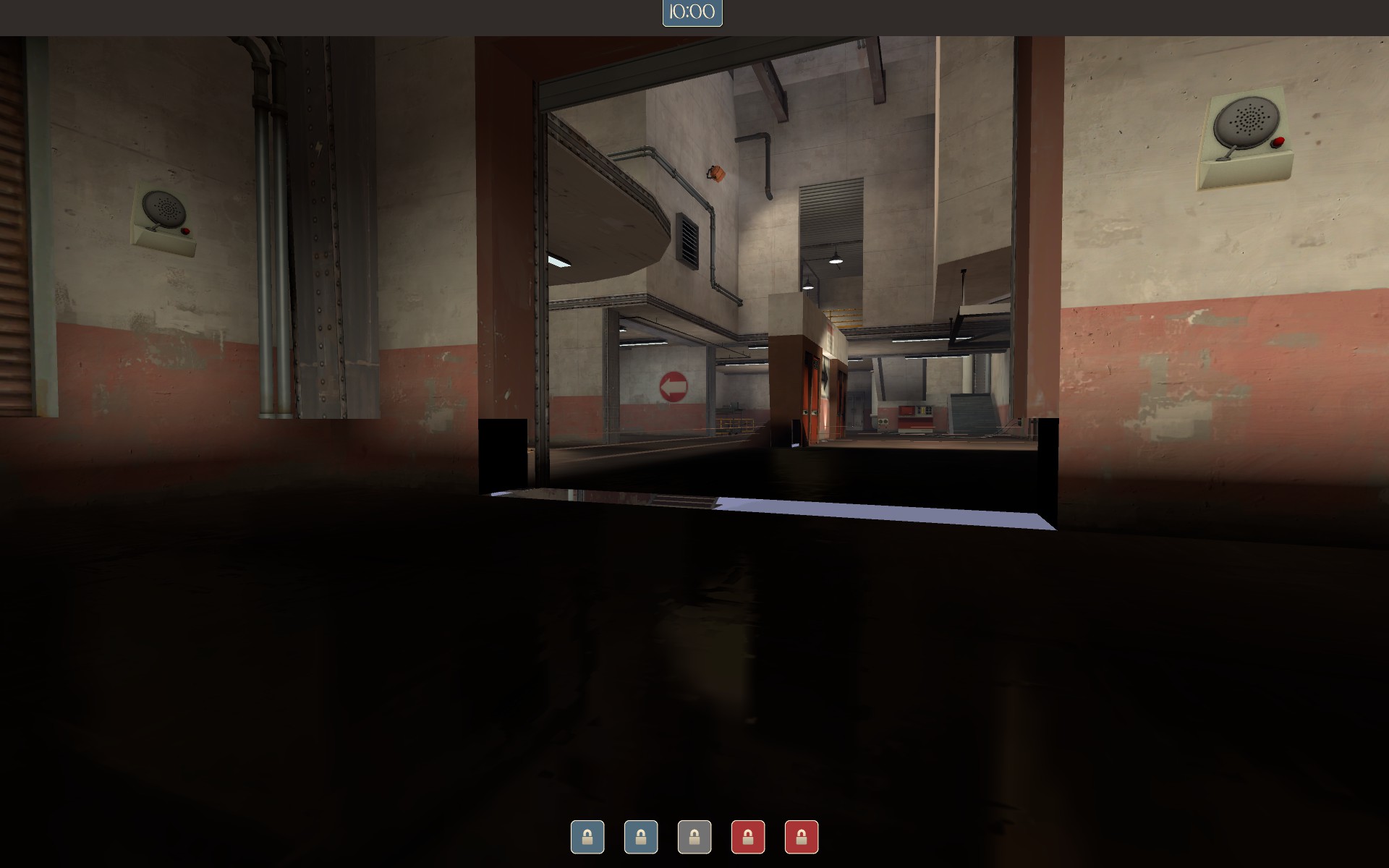
The point is this: all of those underground areas are never seen by people, so why bother with proper textures? Clip them away or nodraw them so the bsp doesn't have to store so many lightmaps. You'd get rid of a lot of unneeded lightmaps which lowers the overal bsp file size.

2B1D9C52954C839DFB98B1F3C2C5033B4F04D034


2BB70652D44B9A7B463B13FEC6D097A93EF7A1BC


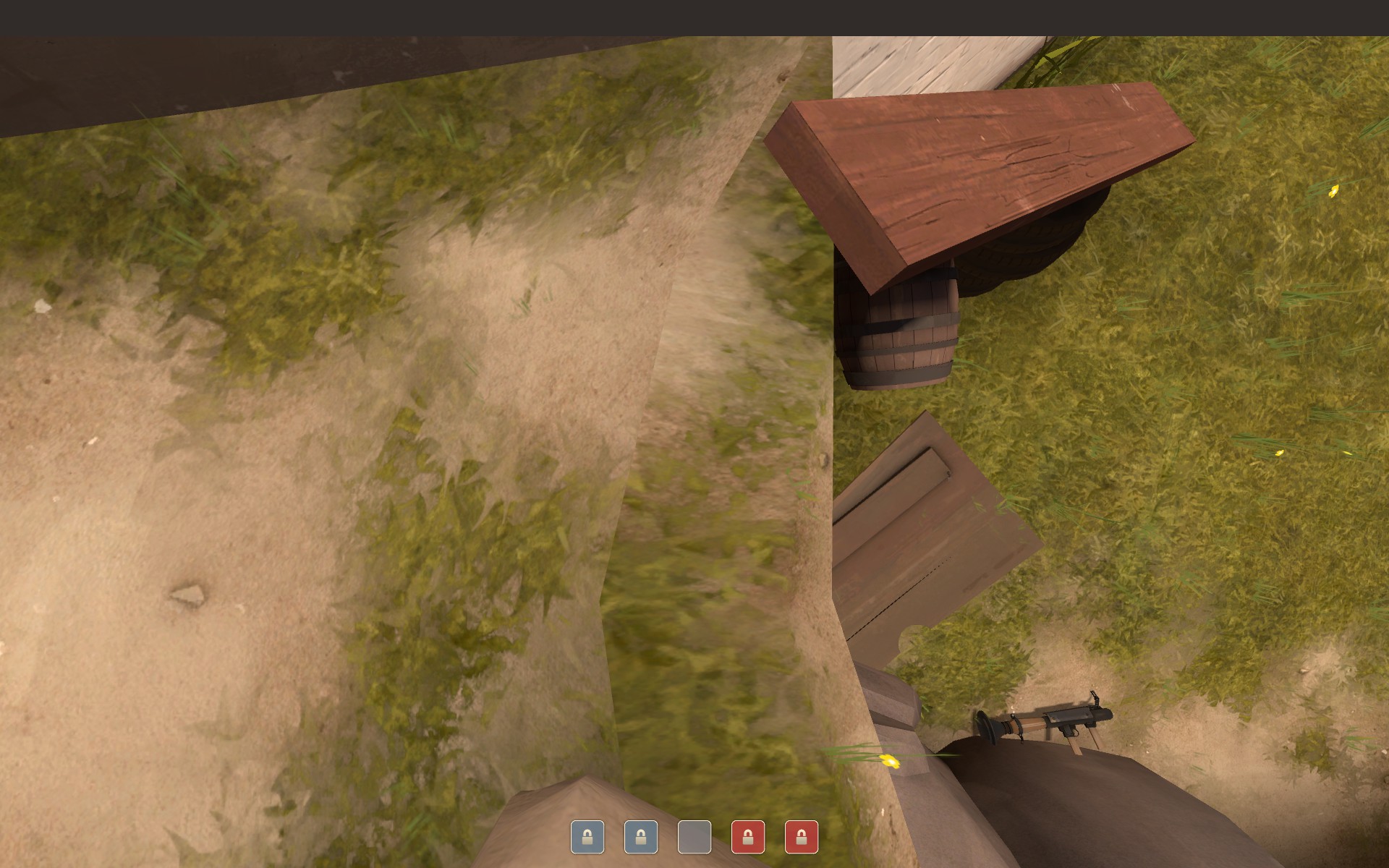
The sun angle is all wrong compared to where the sun actually is in the 2D skybox. In the 1st picture, the shadow extends so far down as if the sun is in the middle of the frame. In the second picture the sun is right behind the building in the center (just left of the chimney) yet the ground is still fully lit.

VyPrqSv.jpg


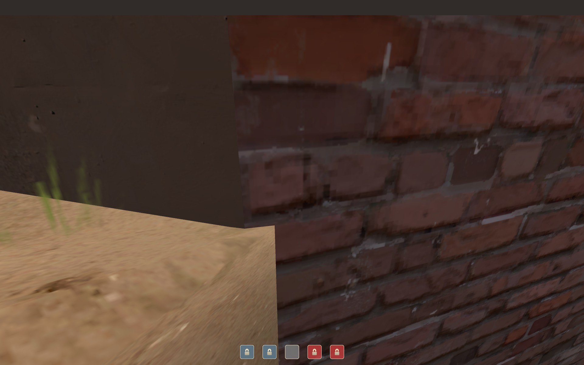
The wood near the grassy and dirty ground is waaaay too clean. There are dirt wood textures for this.

upUF0gL.jpg


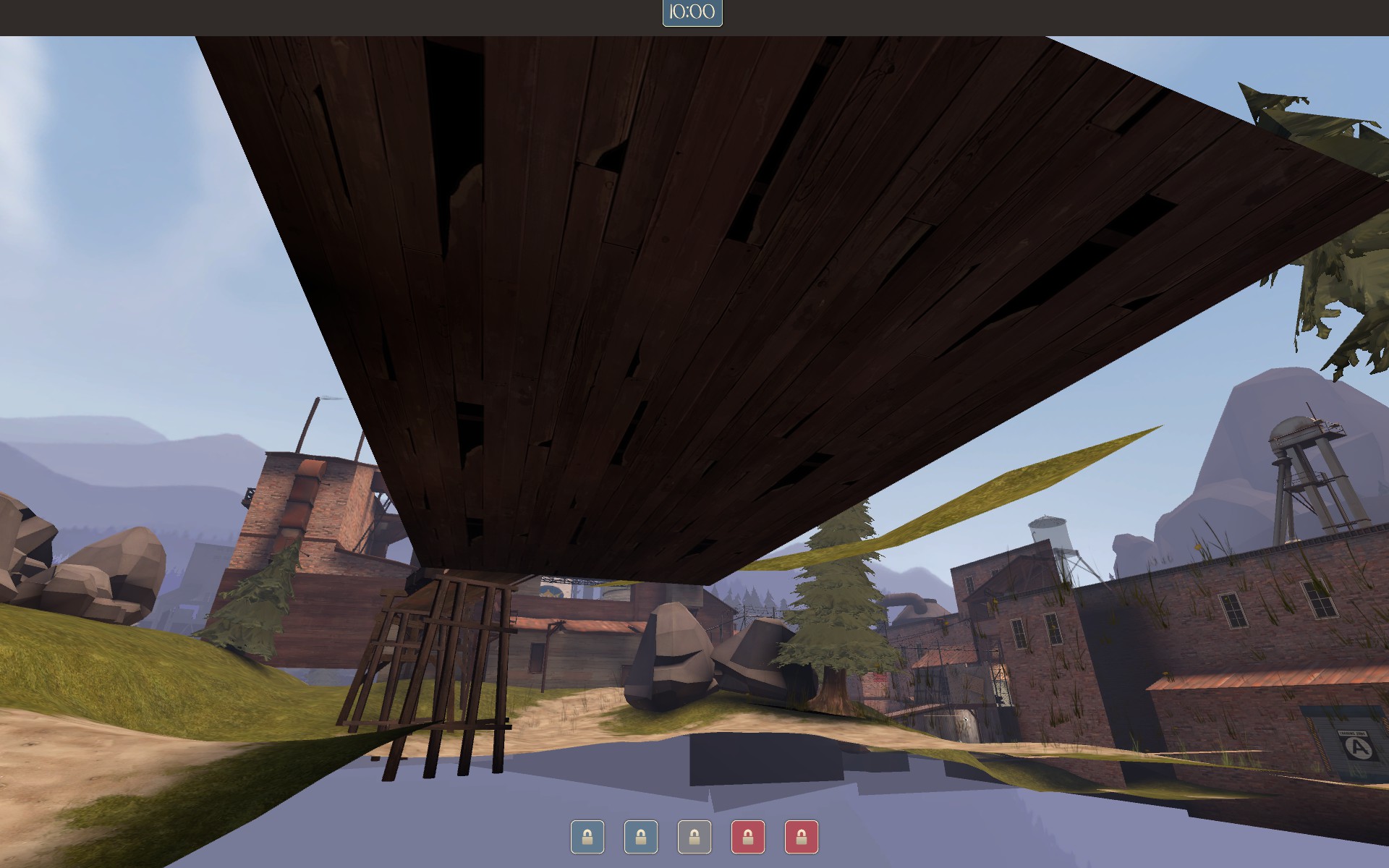
Wood texture on the underside of a building in a detail area outside the playable space. Nodraw that thing.

GeksvYp.jpg


Give this wall a nodraw, or just clip it away. It's not visible at all.


That should do it. Sorry for being nit picky, but Valve will do exactly the same thing when they review a map that has potential to become official.

soupcan out.
 
Last edited:

Freyja

aa
Jul 31, 2009
3,011
5,839
That should do it. Sorry for being nit picky, but Valve will do exactly the same thing when they review a map that has potential to become official.

No they won't. Have you seen the maps in game, both valve made and community accepted? They don't screen maps like this. Not that it's any reason not to ourselves, but.
 

Crash

func_nerd
aa
Mar 1, 2010
3,349
5,524
I'm not entirely sure how many of those faces are worth making more brushes to nodraw. I'll dig around though.

Also, there's an angle you can see the big flat brick face on the side of the building from gameplay space (albeit with an explosive jump) so I left it in there. I didn't detail it because it wasn't worth the cost, but I didn't want it to be transparent in that rare situation. Also, the "paper thin" wall is a recent optimization fix for the detail area you can see from last. It's not as noticeable while jumping and saves a ton of fps on last, so it was worth it.

The trim around the door is intentional and is designed to look like a flat piece stuck on the end. Maybe I'm thinking of my wood as being too thin, though.

The sun angle is something only the most nit-picky mapper (no offense :p) is going to notice and is really important to balancing the lighting for the 5cp mode. It's landing in all the places I want it to (especially how it highlights on last) so it's worth it to have it not quite match the skybox.

I'll take it all into consideration though, thanks!
 

wareya

L420: High Member
Jun 17, 2012
493
191
You should only nodraw things that people will never, ever, EVER see. Everything else, you should just set the lightmap resolution to something incredibly low, and if people are really losing frames off of the 10-20 faces you left un-nodrawn because they can technically see them from obscure locations, you can give them actual better performance with actual optimization.
 

Crash

func_nerd
aa
Mar 1, 2010
3,349
5,524
It's not a FPS issue, it's lightmap and filesize. I'm just debating whether or not it's worth cutting a bunch of these brushes up further to nodraw them.

Some of the ones pointed out would have to be angled cuts that would most likely be harmful to my visleafs.
 
Last edited:
Apr 14, 2013
662
344
I'm not entirely sure how many of those faces are worth making more brushes to nodraw. I'll dig around though.

Also, there's an angle you can see the big flat brick face on the side of the building from gameplay space (albeit with an explosive jump) so I left it in there. I didn't detail it because it wasn't worth the cost, but I didn't want it to be transparent in that rare situation. Also, the "paper thin" wall is a recent optimization fix for the detail area you can see from last. It's not as noticeable while jumping and saves a ton of fps on last, so it was worth it.

Just to point out, rocket jumping does not matter to Valve at all. Just do a small rocket jump on dustbowl's 3,1. You see all those huge nodraw unrealistic stuff, right ON the cp, where everybody is rocket jumping? That's how much Valve doesn't care.
 

wareya

L420: High Member
Jun 17, 2012
493
191
>It's not a FPS issue, it's lightmap and filesize.

Absolutely. But if you set the lightmap resolution to something incredibly low then the effect those faces have on the filesize should be next to nothing, and it's less immersion- (and in some cases, gameplay-) breaking than fully nodrawing them.

>I'm just debating whether or not it's worth cutting a bunch of these brushes up further to nodraw them.

The answer is usually no; but it's a judgement call for each face. With stuff that you can get a straight gain out of cutting orthogonally, I always do so if it saves me enough lightmap texels, but I optimize for compile-time, not runtime, and splitting a brush makes it so it doesn't batch as efficiently.

>That's how much Valve doesn't care.

Doesn't mean community mappers can't do better!
 

Vel0city

func_fish
aa
Dec 6, 2014
1,947
1,589
It's pretty clear takabuschik was talking about being able to see unfinished parts of the map while rocket jumping not the actual act of rocket jumping or weapons that allow you to rocket jump.

>the joke
>your head
>*whoosh*
 

Crash

func_nerd
aa
Mar 1, 2010
3,349
5,524
>It's not a FPS issue, it's lightmap and filesize.

Absolutely. But if you set the lightmap resolution to something incredibly low then the effect those faces have on the filesize should be next to nothing, and it's less immersion- (and in some cases, gameplay-) breaking than fully nodrawing them.

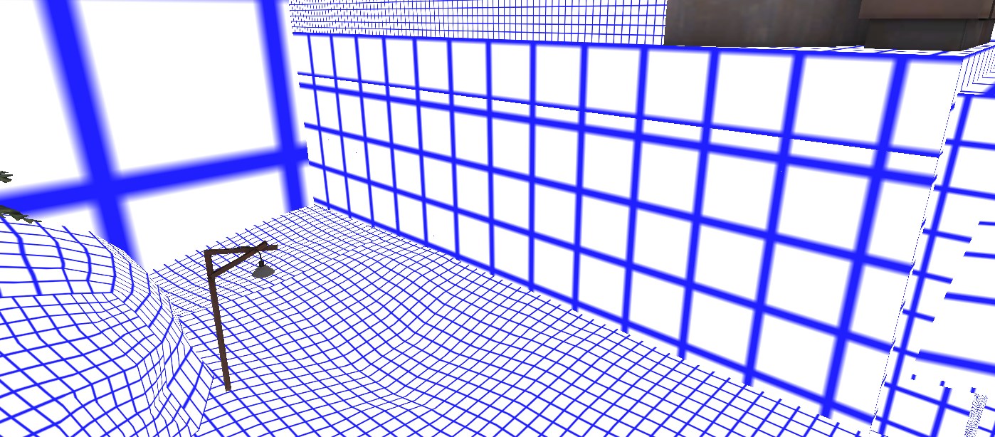
Yeah, I've been doing this the whole time. This is the same big brick face that was brought up:

2015-05-10_20-40-49.jpg


128 lightmap scale.
 

Pocket

Half a Lambert is better than one.
aa
Nov 14, 2009
4,701
2,583
E0CFA22CE322562CD621AED0832D5E5336225189


This staircase ... why is the bottom step touching the floor? Does this mean either the floor or the stoop isn't on the 16U grid? :colbert:
 

Lain

lobotomy success story
aa
Jan 8, 2015
723
757
No they won't. Have you seen the maps in game, both valve made and community accepted? They don't screen maps like this. Not that it's any reason not to ourselves, but.

You're right, there are a tonne of dev textures on ctf_doublecross