I think what you need is closer attention to accent reds, because right now that looks far too creamy to me? Maybe you need rock walls or something, I don't really know. You're going to hate us all pretty soon for this.
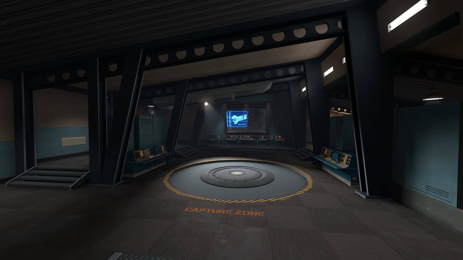
One thing I really wish you would do is adjust the ceiling more.
In these shots on Hydro, the ceiling is barely slanted but it makes the entire room loads more interesting to be in and look at. Your last point really isn't lacking any pizzazz so much as it's something of a box, and I think that if you started with the ceiling you'd quickly find it a lot easier to change the rest of the room to accommodate more interesting geometry. Even if you kept your ceiling, you could at least do
something like this.
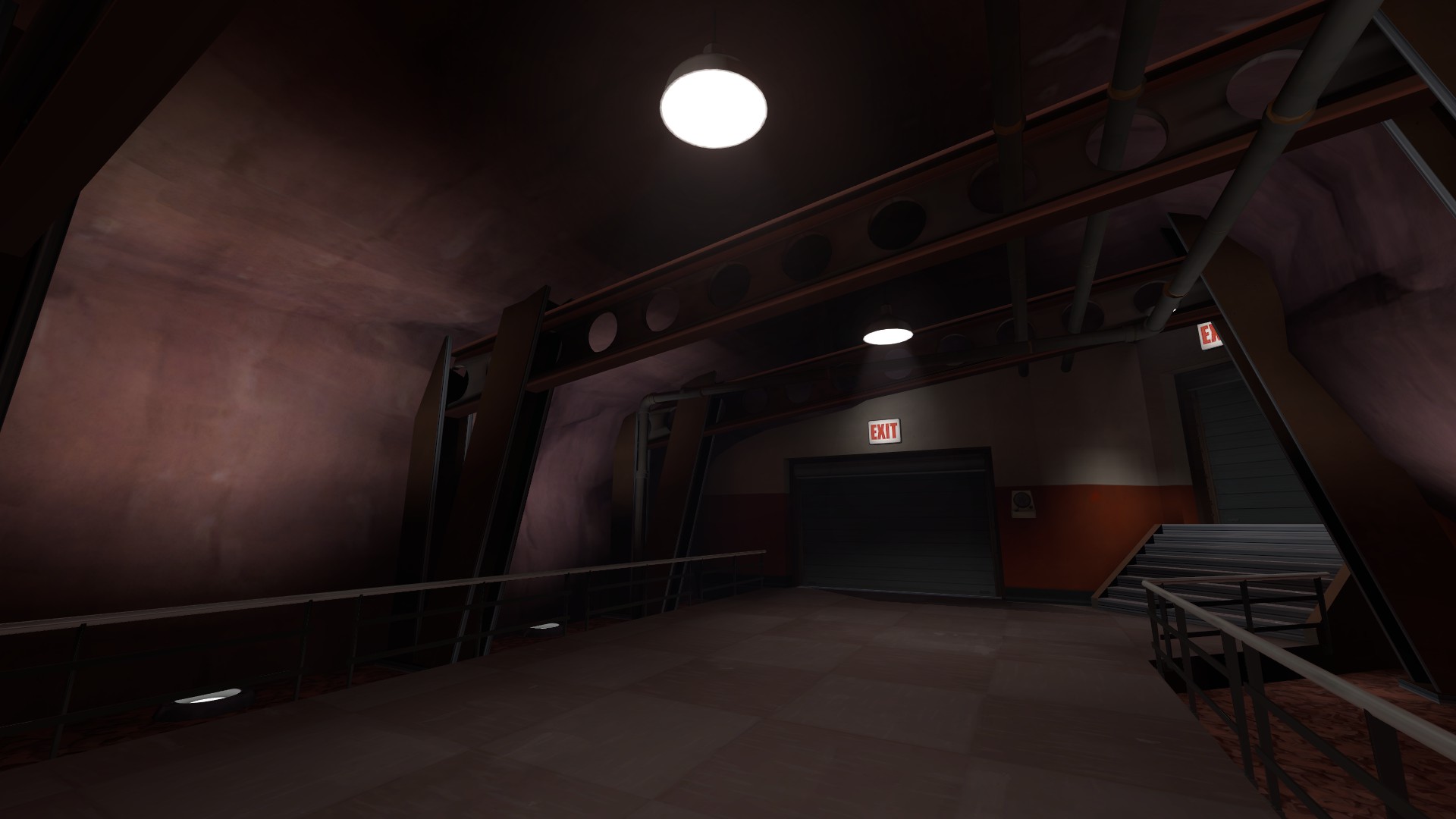
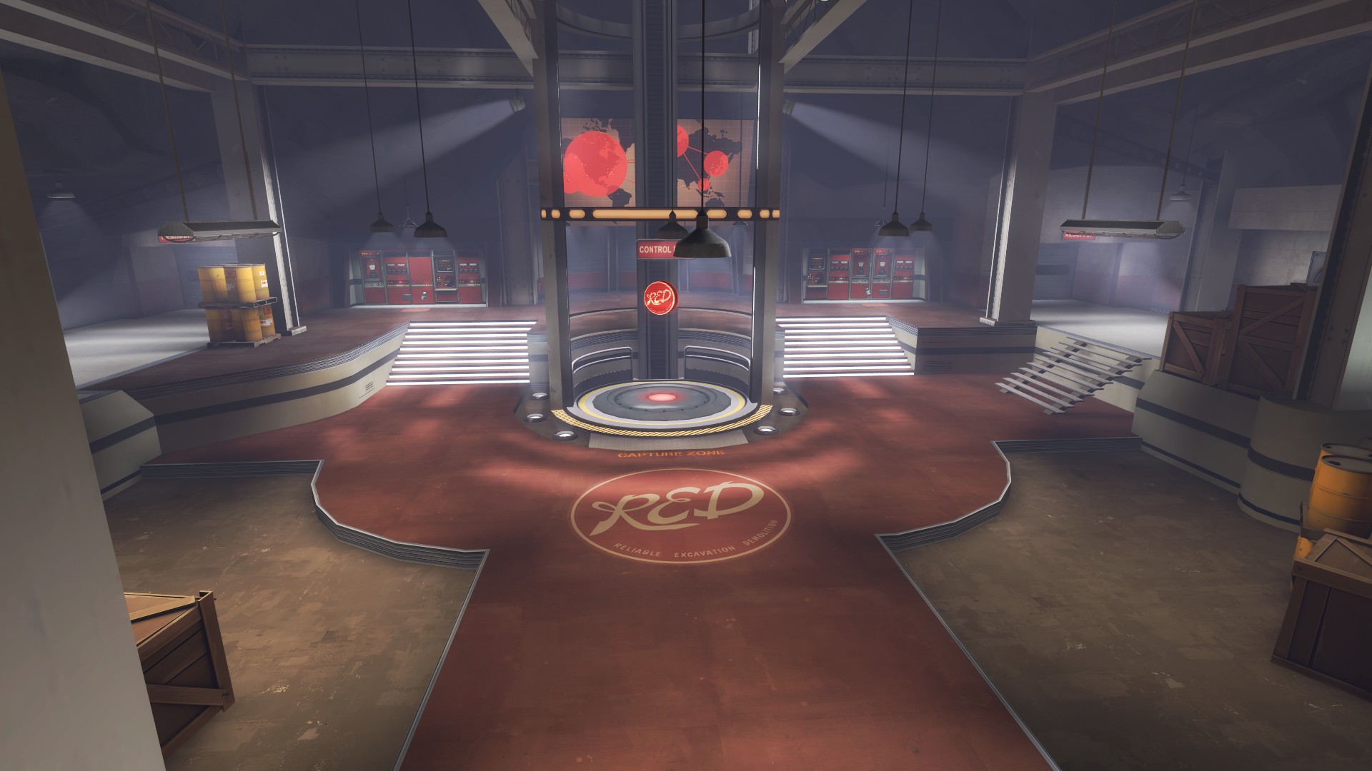
Something else I think you should look at is what I refer to as "pathing" (and I am sure other people are aware of it and have other names for it):
Pathing is a fantastic way to break up a monotonous ground texture with, well, a path. Coldfront and Well are two great examples, with Coldfront's being a lot more noticeable and loud. Something like this that goes around that one-way window and onto the point could very well work wonders for you. I don't know, but think about it.
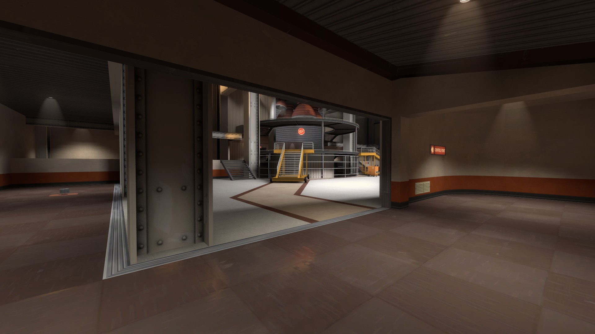
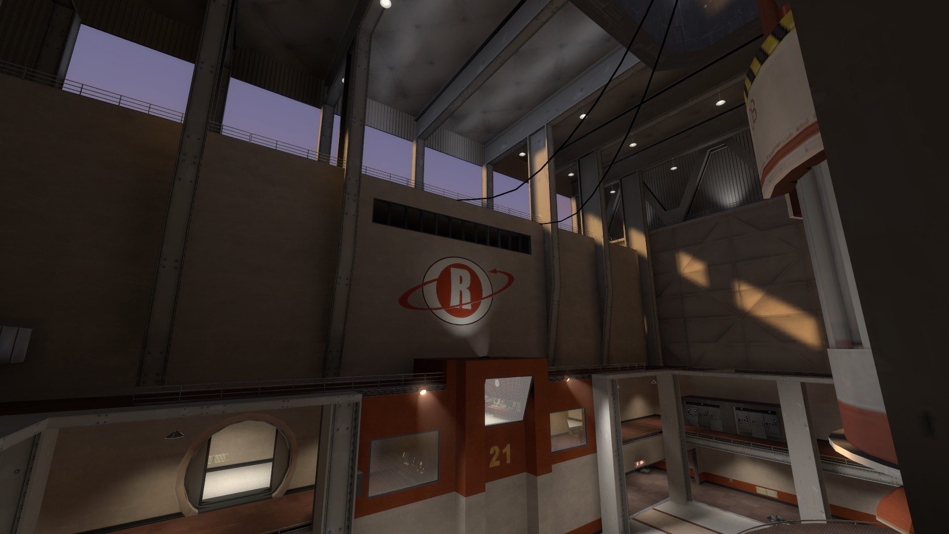
Finally, as grazr mentioned, you might benefit from natural light. I'm not sure how many people know that Well does this on the last point:
It's literally just a skybox texture that is too high up for players to really see the base of. It requires almost nothing and makes the room a lot brighter.
Obviously you're at the stage where detailing and lighting take ages to figure out, and it doesn't help that you've got a group of people that love your map and want it to look as good as it plays. Anyway, I hope this helps.