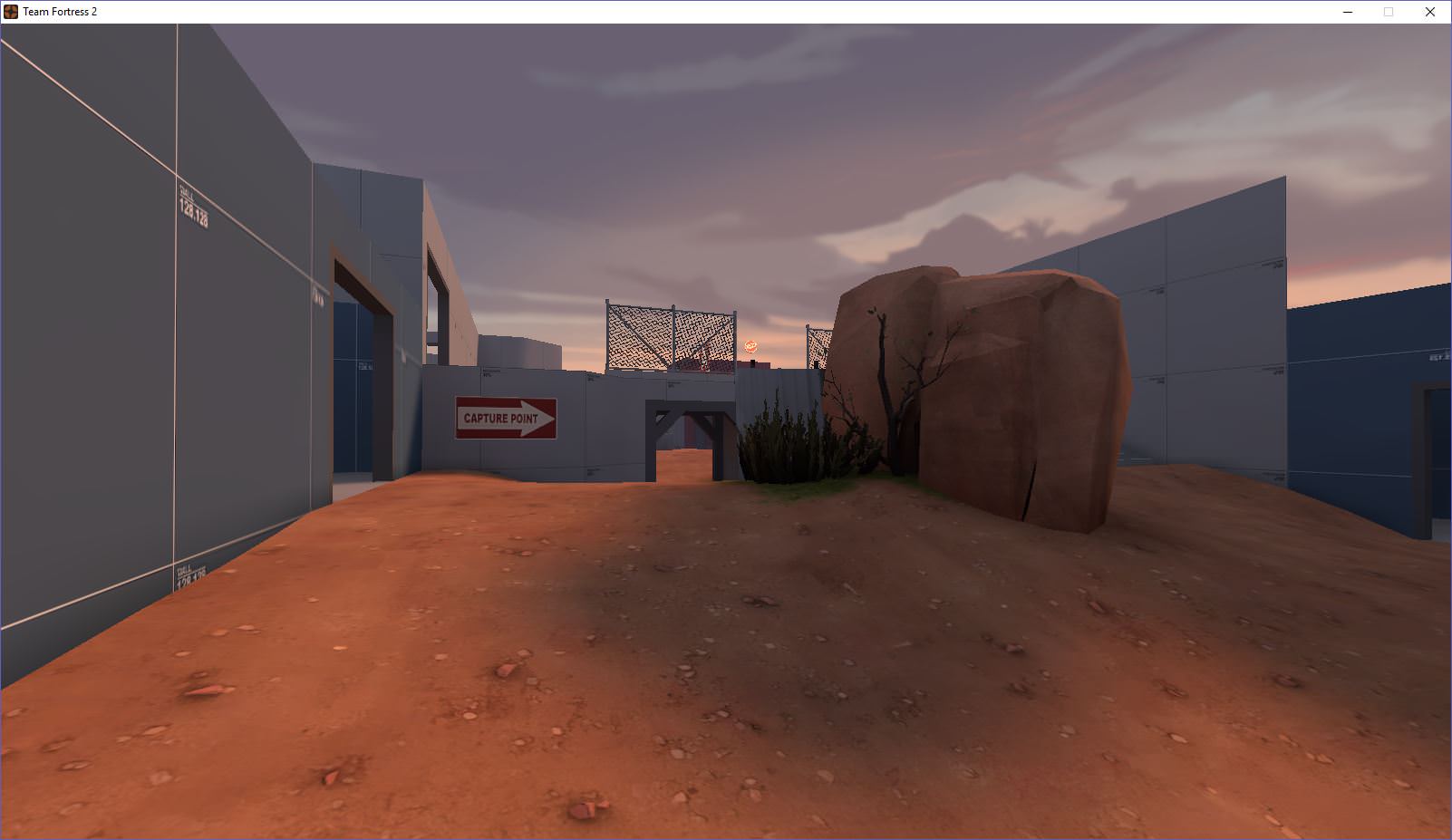
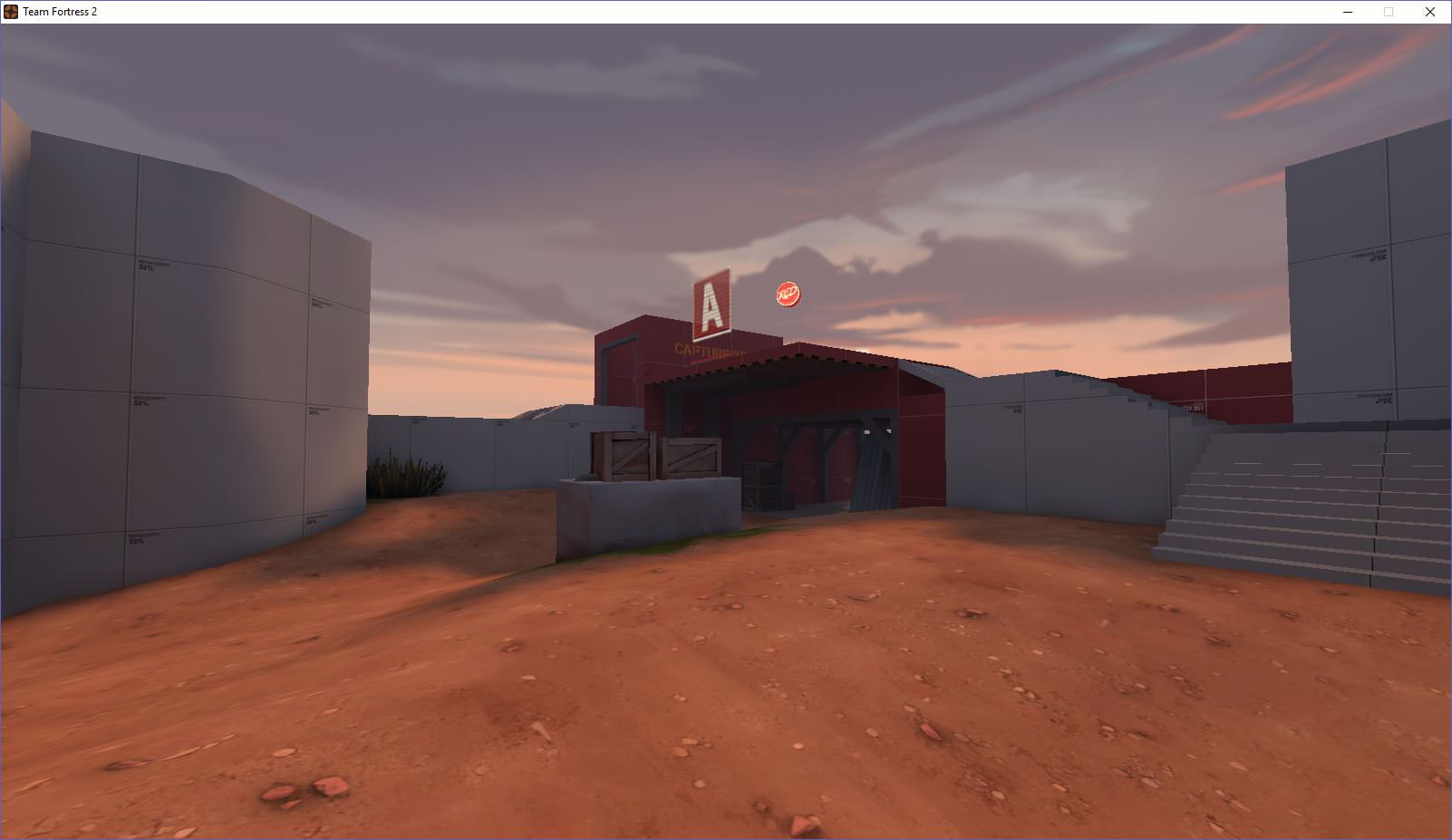
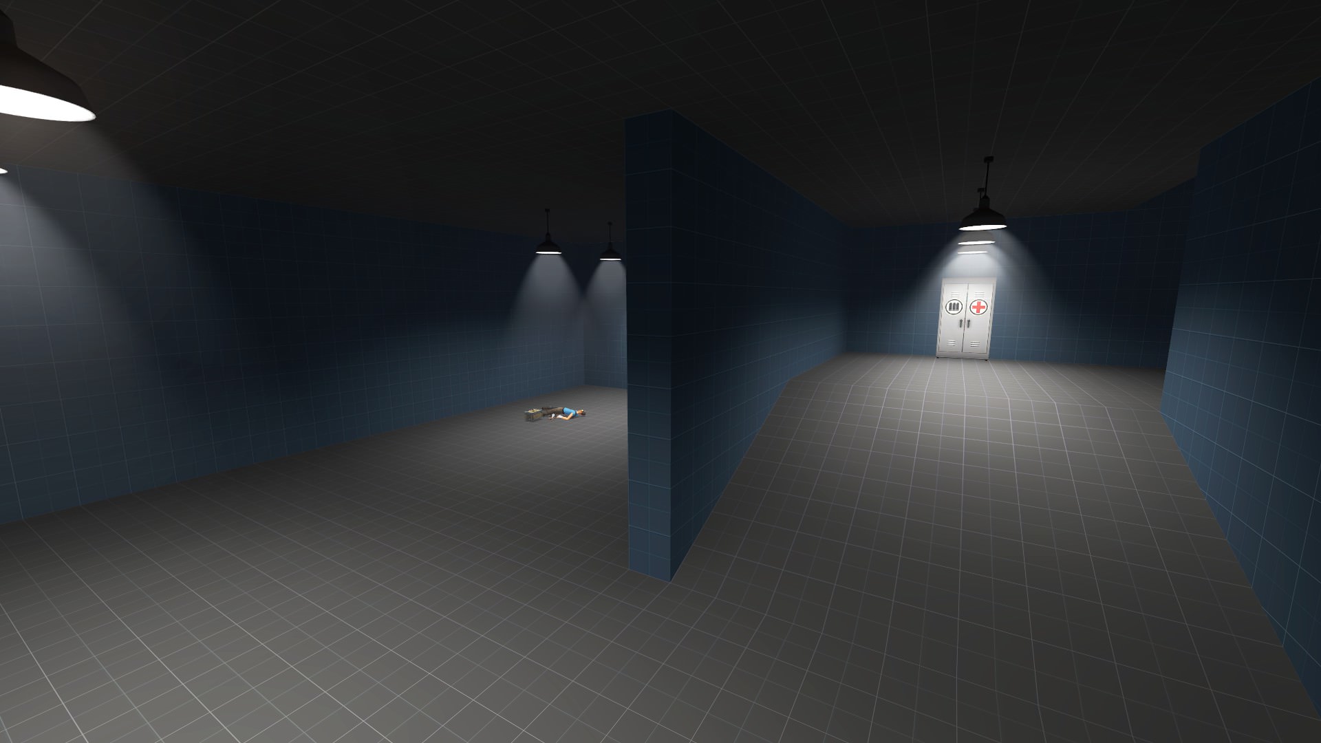
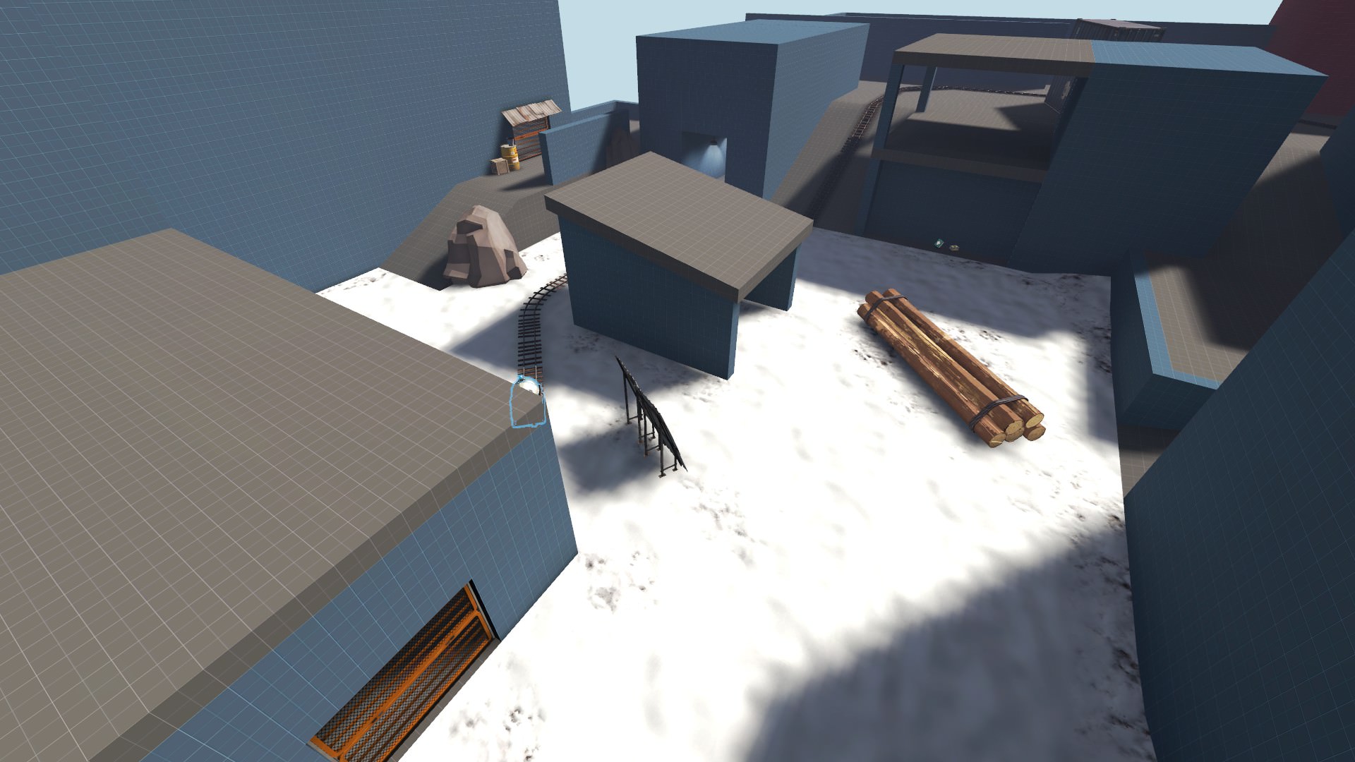
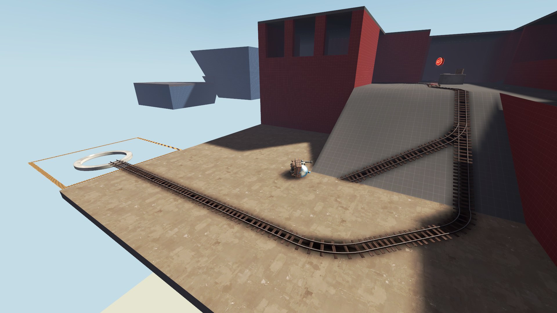
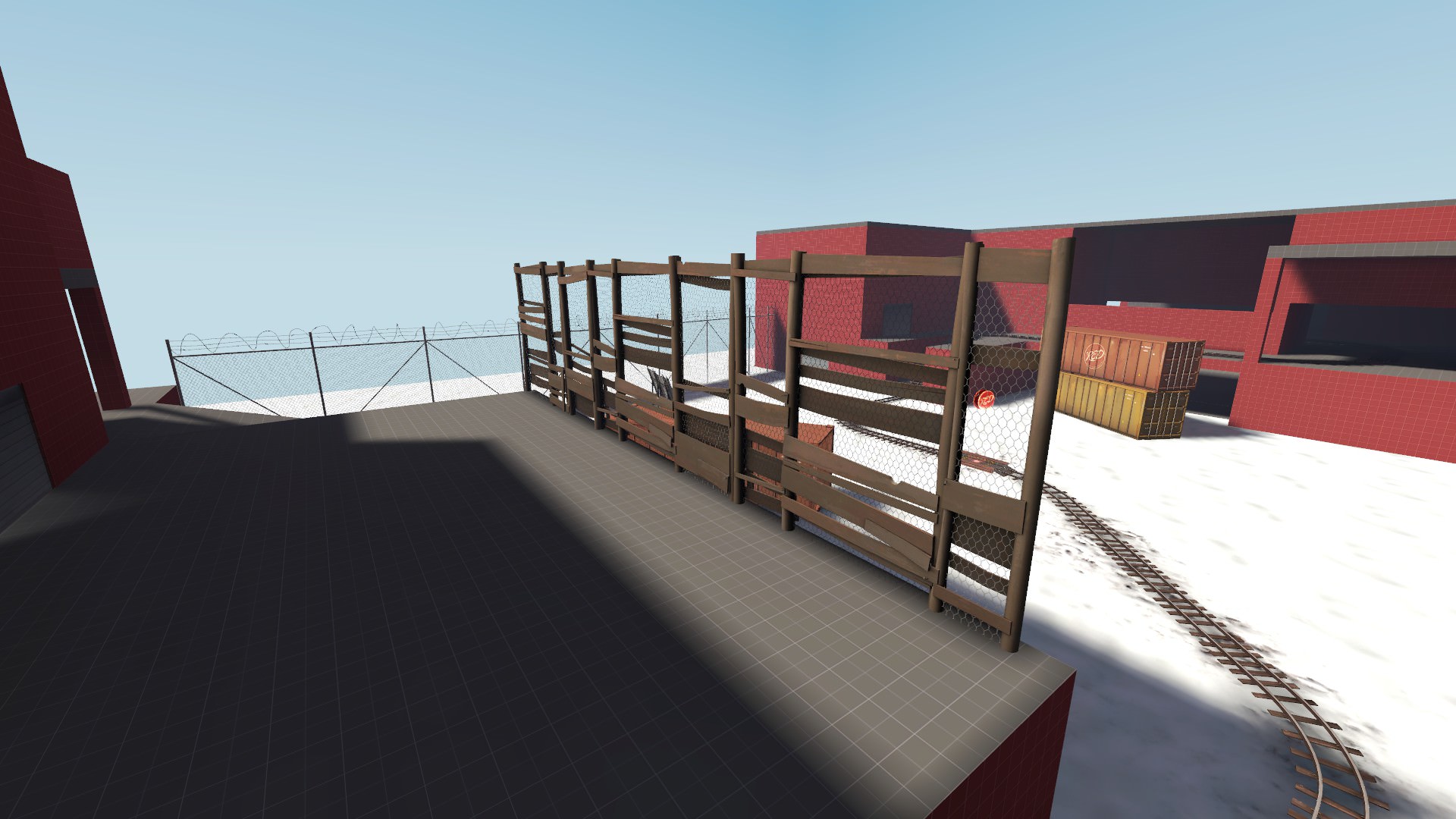
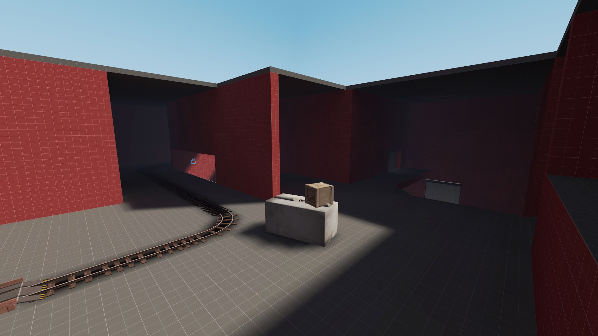
WiP in WiP, post your screenshots!

hutty

aa
Mar 30, 2014
547
446
[Alden Kroll] Two-dimensional HUD elements present a particular art problem, because they have to look good and sharp no matter what resolution the user is running their game at. Given today's availability of high resolution wide-screen displays, this can require a lot of texture memory and a lot of work anticipating different display resolutions. The problem for Team Fortress 2 was even more daunting because of our desire to include a lot of smooth curved elements in our HUD. We developed a new shader system for drawing 'line art' images. The system allows us to create images at a fixed resolution that produced smooth silhouettes even when scaled up to a very high resolution. This shader system also handles outlining and drop-shadows, and can be applied in the 3D space to world elements such as signs.


As far as I know the signs in tf2 don't use the shader system they built for the hud, but they could.
 

EArkham

Necromancer
aa
Aug 14, 2009
1,625
2,774
Nevermind the fact that TF2 was originally designed with non-language visual cues, such as lighting intended routes differently so they stand out, intuitive directions, and icon bubbles over characters' heads. Signs that indicated point A, B, C etc are still valid in many languages and are effectively symbolic since they match the hud.

Signs with actual readable text are almost always just detail and unnecessary to the game itself, so it's understandable why the team didn't want to go to the extra effort of converting any of it or getting a translation team involved at that level.
 

Pocket

Half a Lambert is better than one.
aa
Nov 14, 2009
4,701
2,583

As far as I know the signs in tf2 don't use the shader system they built for the hud, but they could.
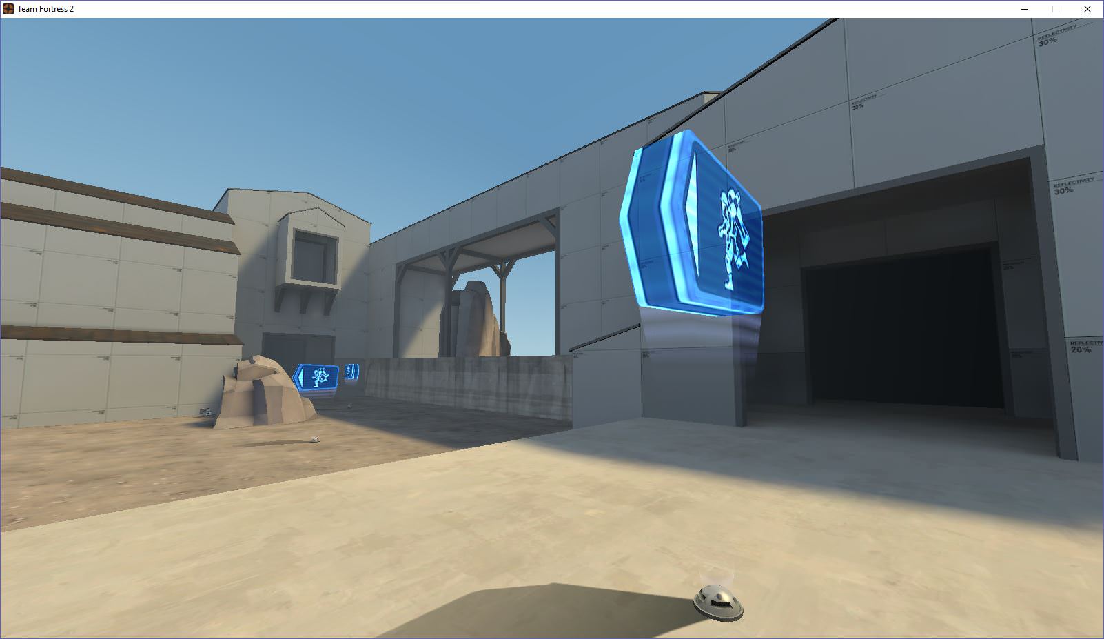
It doesn't get used for environment textures because it starts to look aliased at grazing angles. Try it with the floating no-entry sign on enemy spawn rooms sometime and see what I mean.
 

Hyperion

L16: Grid Member
aa
Jun 8, 2015
840
659
upload_2017-11-19_1-9-1.png

#tomorrow hopefully
 
S

saph

I have the entire week off. Thought I'd play with MVM a little. Displacements will look nice and I think I need to set the lighting back to what I originally had with it. (The hatch area is pretty butchered at the moment, but I'll clean it up tomorrow.)
ac1915ce-06db-4c25-8004-c3c28c7ea160
c0I0FQT.jpg
 

B!scuit

L5: Dapper Member
Aug 12, 2016
205
267
merc_park_screenshot.jpg

Got my script to import all the props in a .bsp into Blender working pretty well. Still plenty of props I couldn't load though.
Had to unpack the 27MB cp_mercenarypark.bsp into a 70MB copy but 430MB of RAM's not bad for 2.5K props

Unfortunately once the import finished I realised I needed to flip the X & Y rotation axis 3;
Also going to try to get less ERRORs
 
P

Prosciutto

YOG7HGQ.png


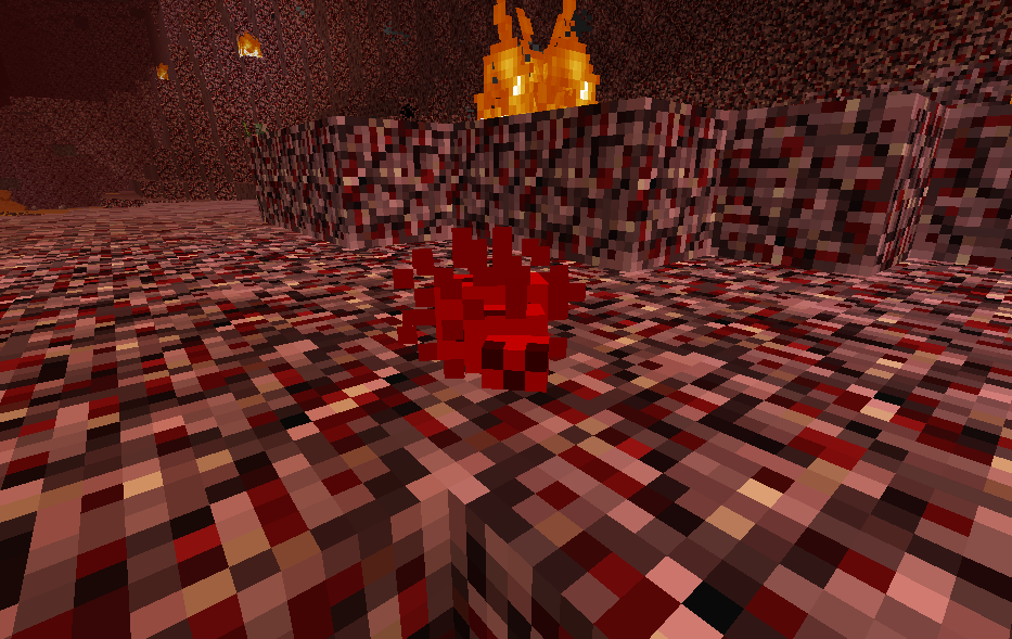
this is an new enemy in my minecraft mod. its the bloodsucker. they do low damage but they are very fast and they come in big groups. they currently only spawn in the nether
 

Kube

Not the correct way to make lasagna
aa
Aug 31, 2014
1,342
1,850
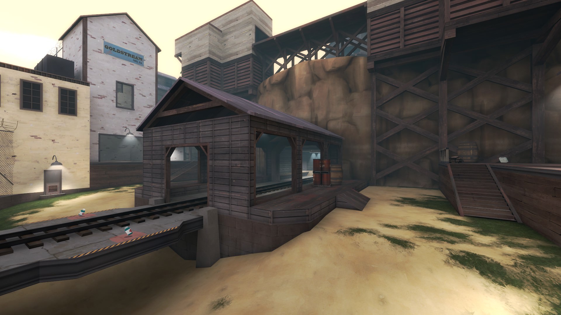
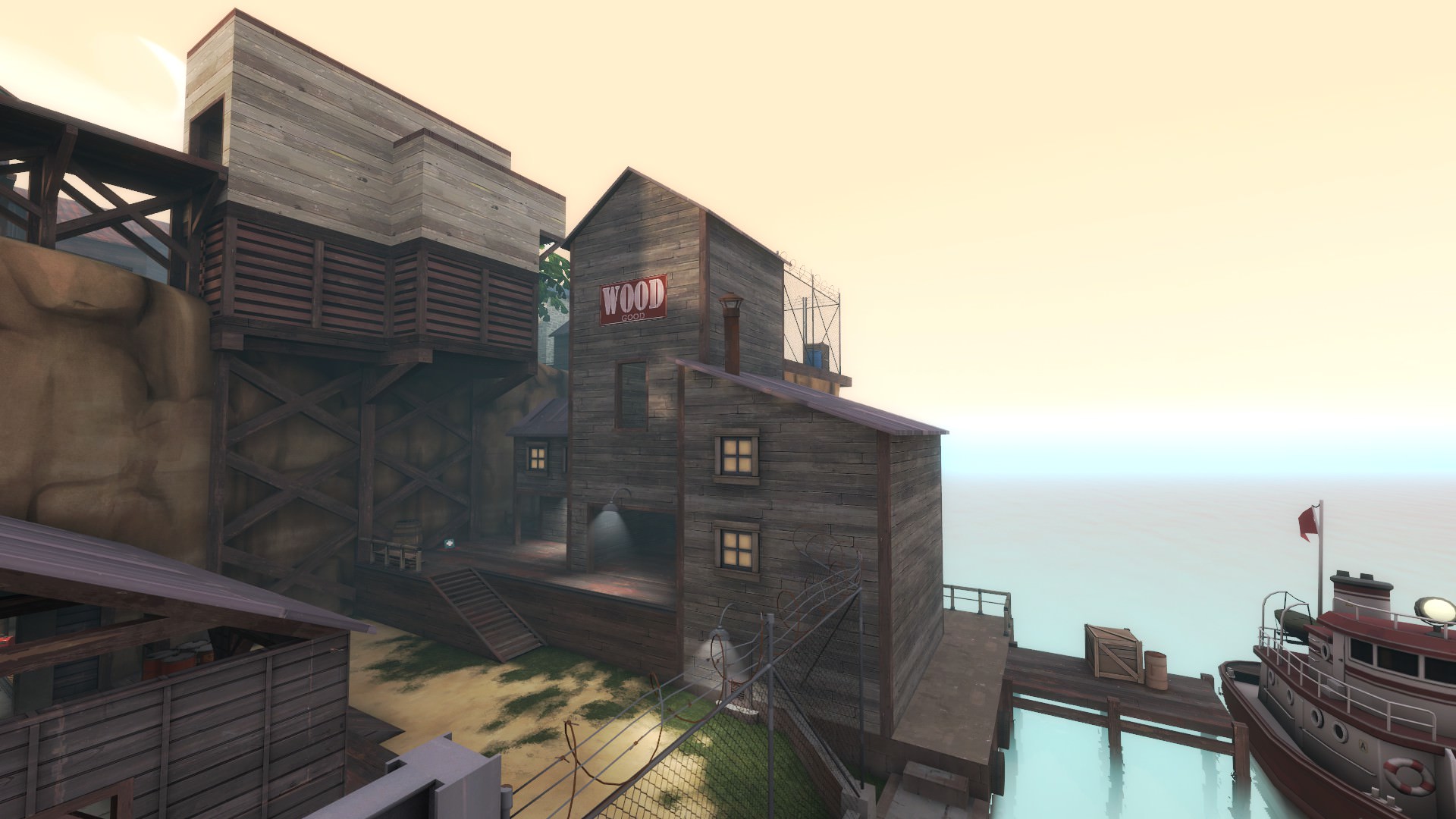
This isn't so much a "WiP" as it is a "Let's hope I'm done with this project," but here's version 9 of the trade map I've been working on:
dUfl7bZ.jpg


ho605dg.jpg


jGSAeQX.jpg


Hti52to.jpg


Full album of screenshots
 
Last edited:

Cytosolic

L5: Dapper Member
May 1, 2015
201
169
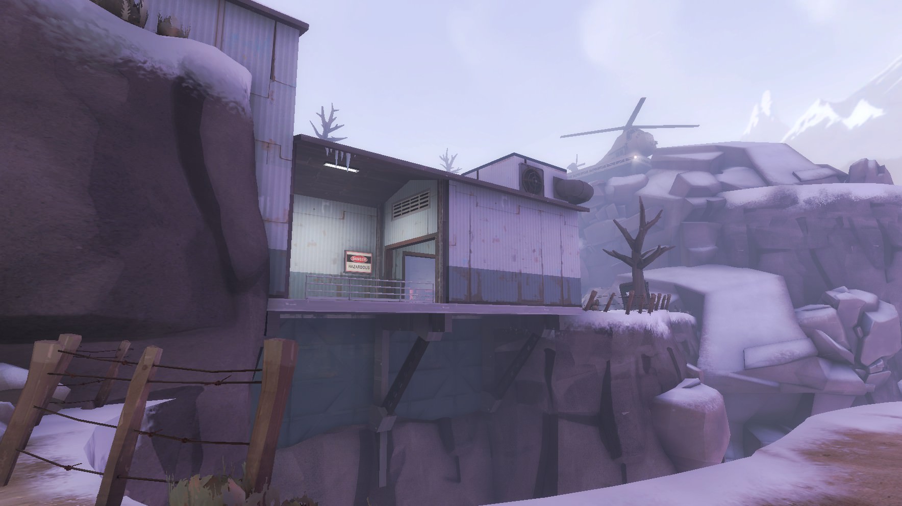
This might be a bit of a page-hog, but here are some WIP pictures of me giving my farm themed arena map a proper facelift!

Before:
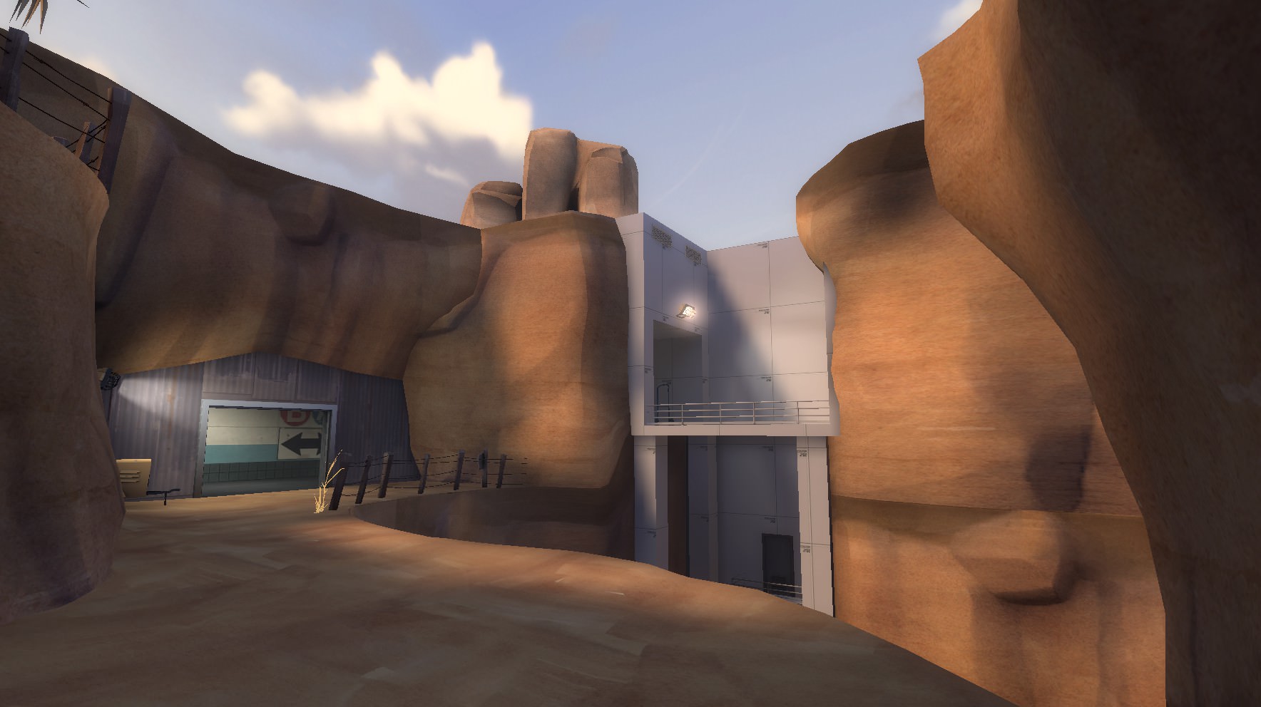
7KBsas8.jpg


After:

b5RjGkH.jpg


Before:

meoHxK4.jpg


After:

YSldVHL.jpg


And a few for the road (no pun intended):
MgtacfI.jpg

IZK8ZSp.jpg

aMkAjaK.jpg

znfw9qo.jpg

DwnxPH4.jpg

Oh shit, that's really cool (pun sort of intended). I like the farm theme but this works too. Well done.
 

BigfootBeto

Party Time 2.0!
aa
Jun 8, 2016
498
848

Simulacron

L-3: Simulated Member
aa
Feb 17, 2016
313
326
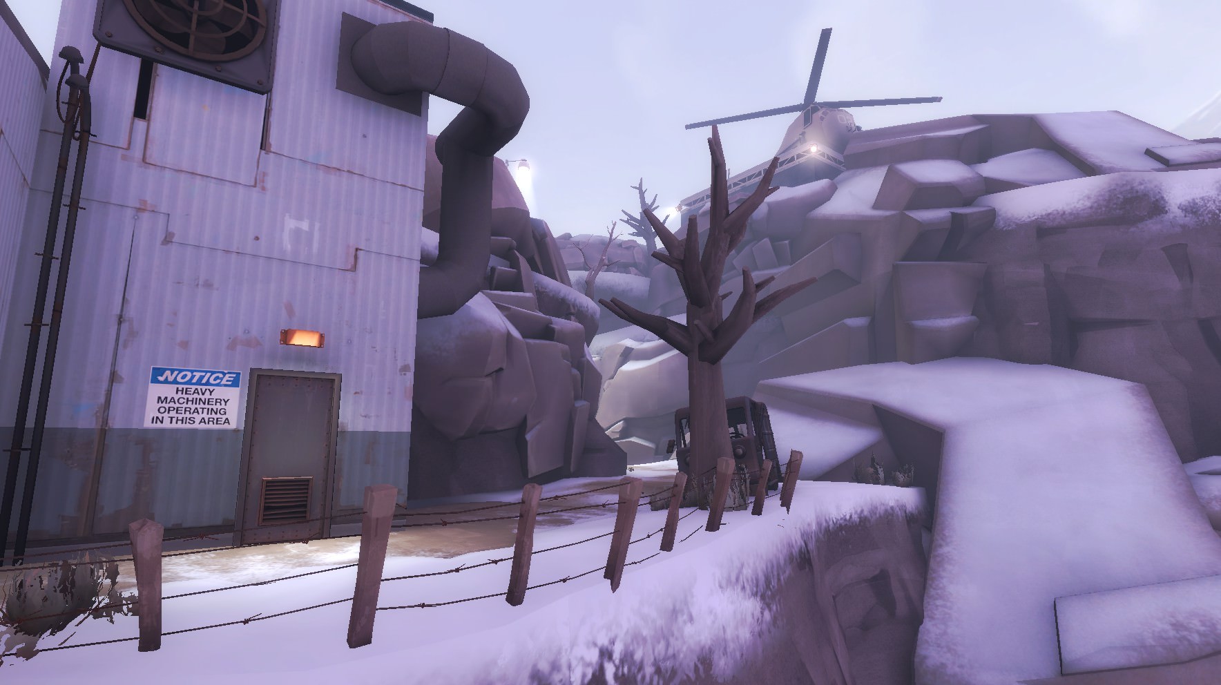
This might be a bit of a page-hog, but here are some WIP pictures of me giving my farm themed arena map a proper facelift!

Before:

7KBsas8.jpg


After:

b5RjGkH.jpg


Before:

meoHxK4.jpg


After:

YSldVHL.jpg


And a few for the road (no pun intended):
MgtacfI.jpg

IZK8ZSp.jpg

aMkAjaK.jpg

znfw9qo.jpg

DwnxPH4.jpg
Does anyone else feel like it's a sin to remove these awesome displacements from the first screenshot? (Don't get me wrong the detailing looks great!)