WiP in WiP, post your screenshots!

ToxicRave

L1: Registered
Nov 28, 2014
48
70
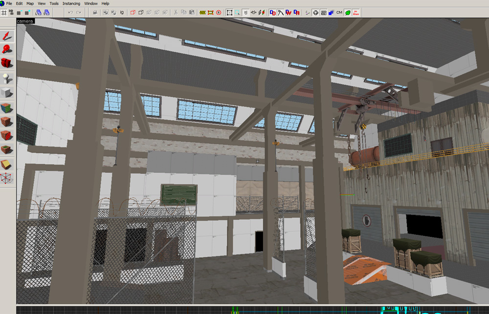
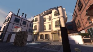
This isn't for the jam, however I've been working on this koth map for the past five days now and I'm liking how it's coming about. It's pretty rough around the edges still but once I get back on a computer that isn't a potato you can see me come up with a playable version rather soon. So for now here are some rough wip screenshots:

koth_obsession_a1_wip_pic_1.jpg

koth_obsession_a1_wip_pic_2.jpg

koth_obsession_a1_wip_pic_3.jpg

koth_obsession_a1_wip_pic_4.jpg

koth_obsession_a1_wip_pic_5.jpg
 
Sep 19, 2010
476
500
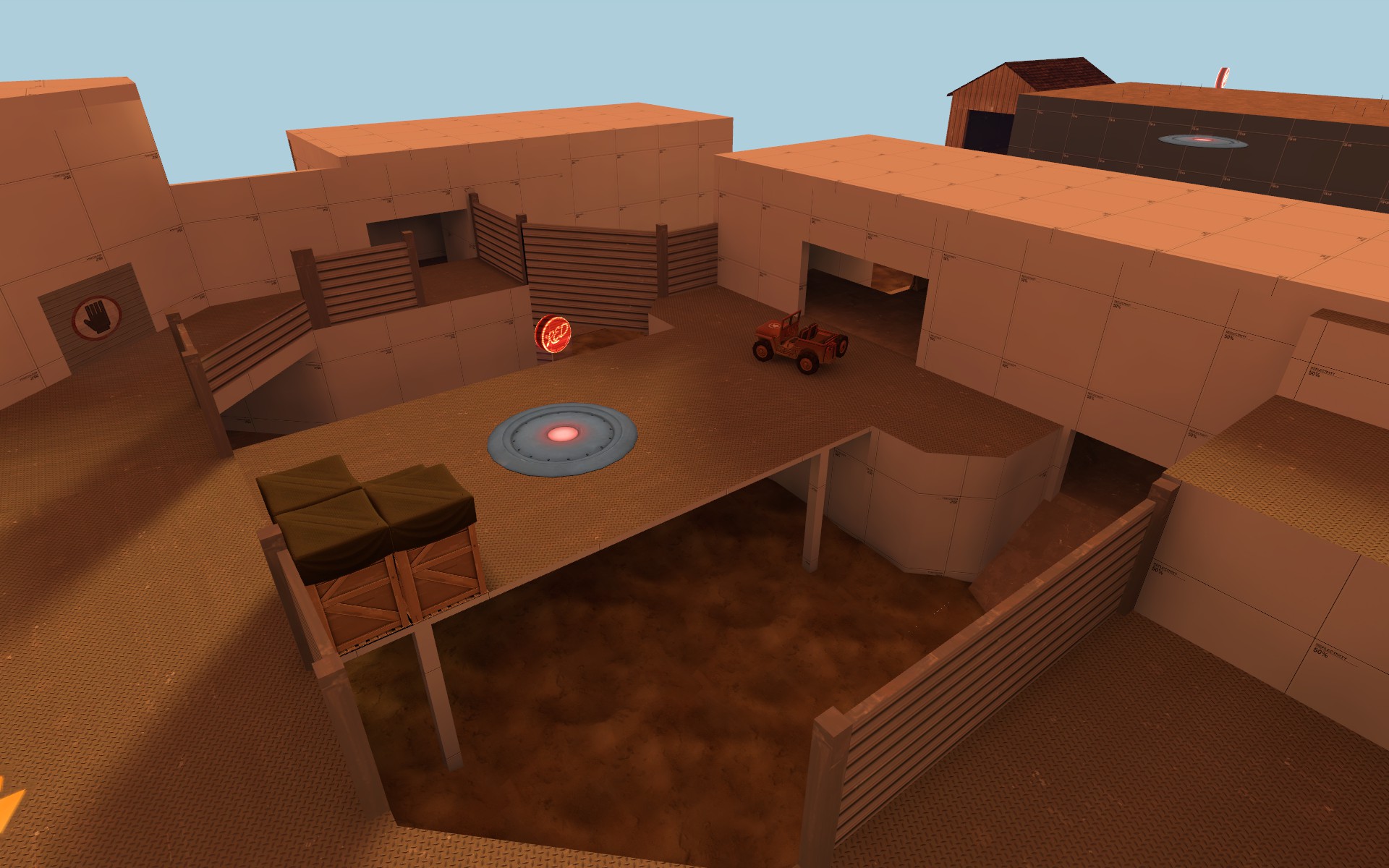
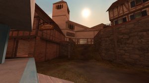
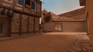
Going to call it a wrap on day one. Pretty happy with what I've achieved so far. Just have last and Red's spawns to work out and I'll have a1 ready to go.
20160723012800_1.jpg
20160723012856_1.jpg
 

EArkham

Necromancer
aa
Aug 14, 2009
1,625
2,774
PD Manufactorum -- kill enemy players, grab the parts they drop, repair the tank or the facility at one of two capture zones. If I can actually get this compiled and walkaround-able during the 72 hour jam, even without PD mechs, I'll call that a success:

JFSrpoz.jpg
 

Crowbar

aa
Dec 19, 2015
1,455
1,298
1 day of 72hr, you say? layouts complete you say? start detailing you say
hahahaHAHAH nope
upload_2016-7-23_20-56-53.png

thats all. i mean, all i managed to do. lol
 

zahndah

professional letter
aa
Jul 4, 2015
764
647
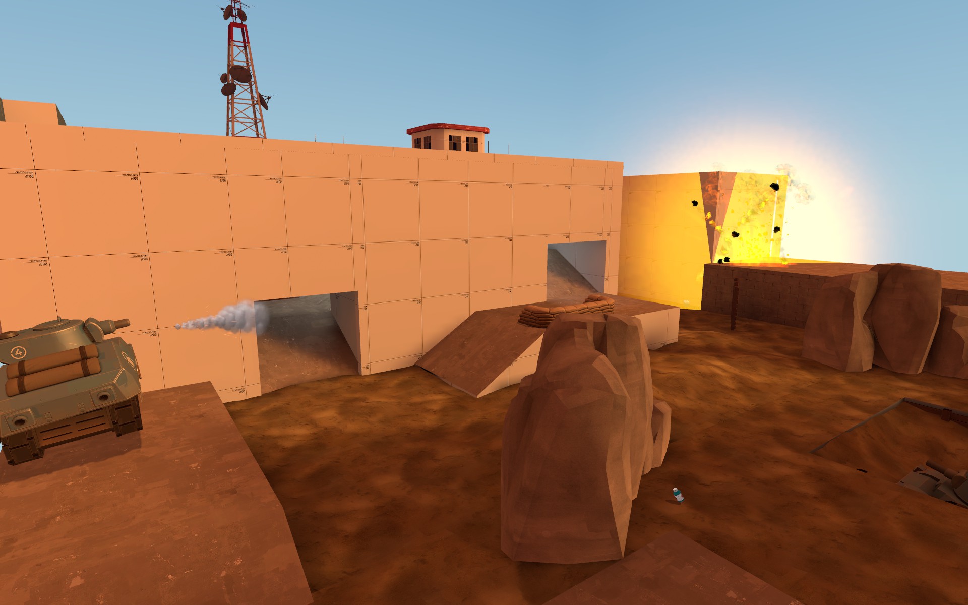
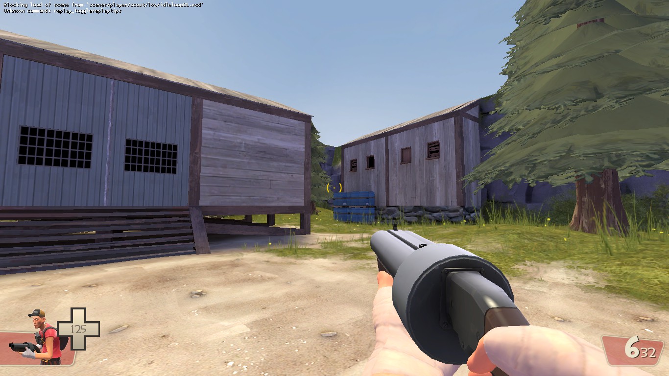
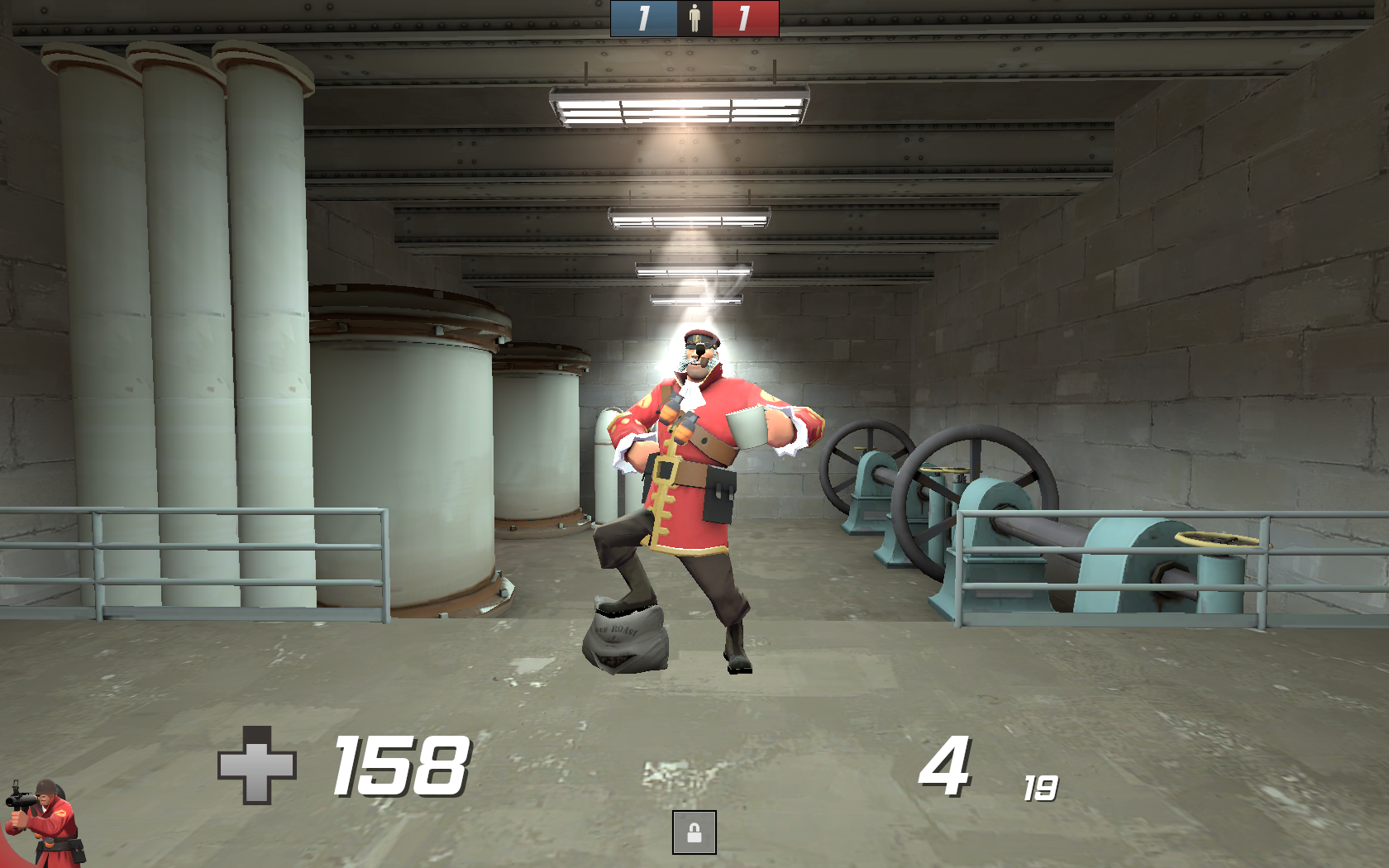
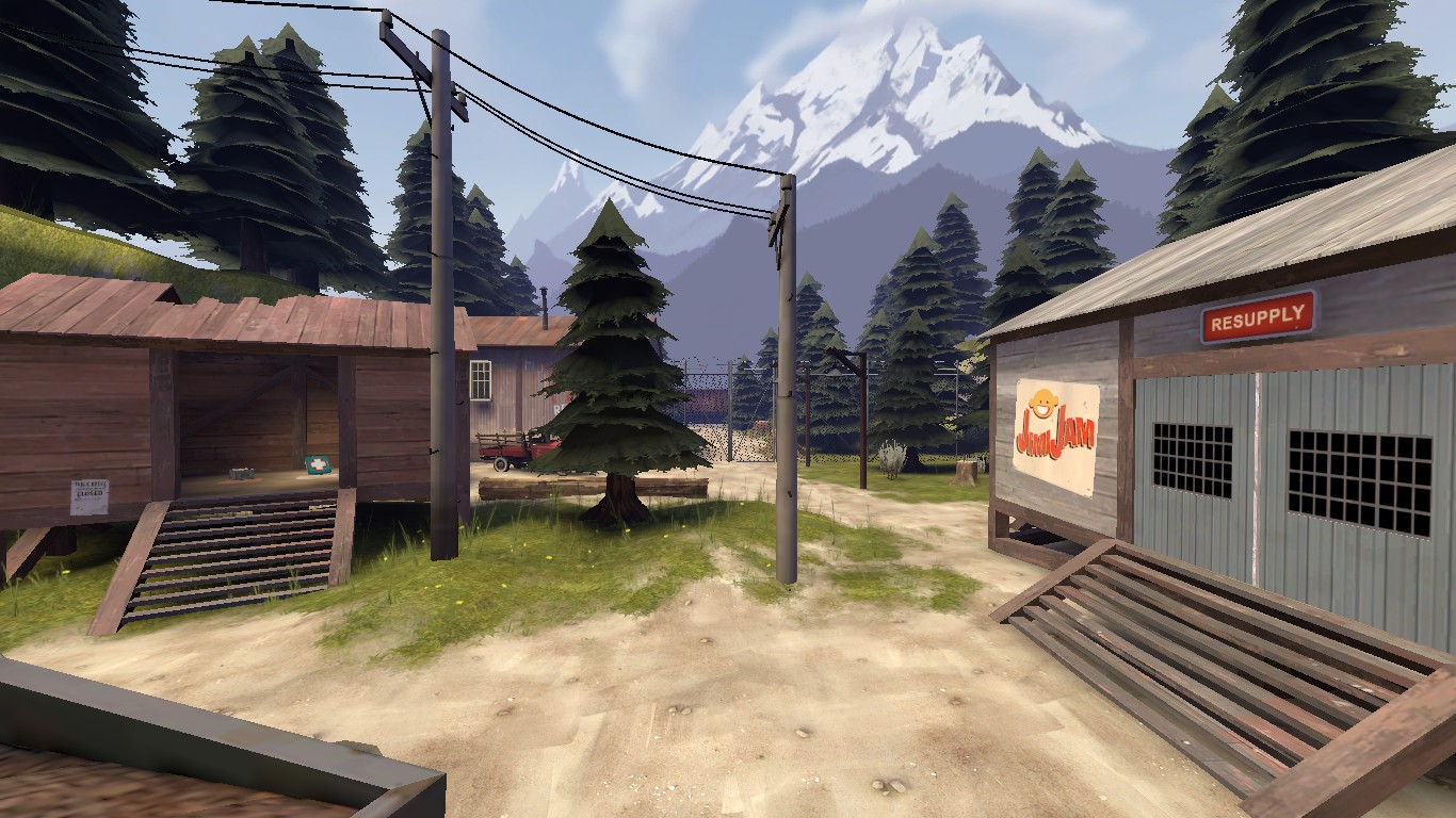
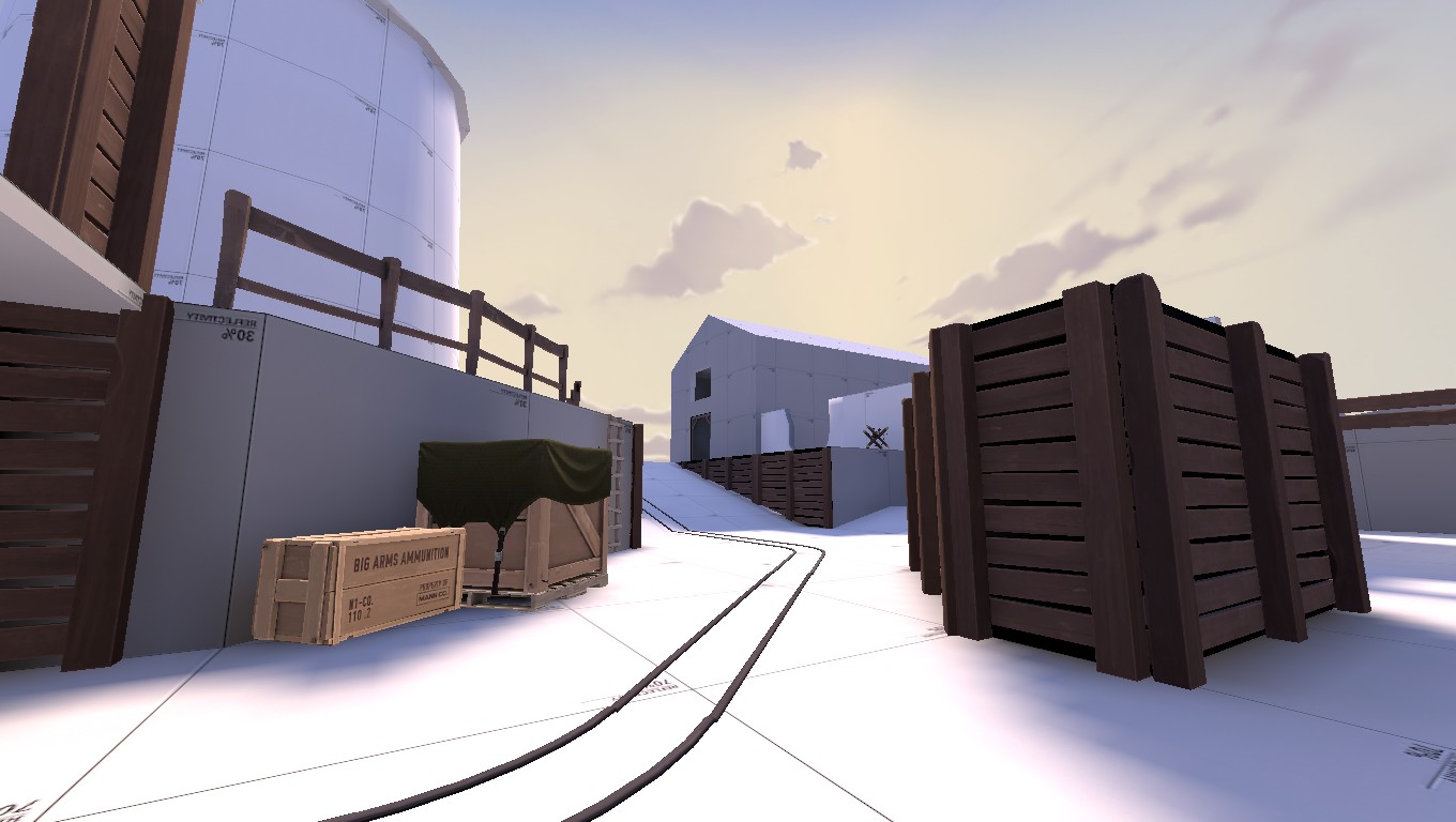
Half mannpower map, half detail practice.
ctf_zahnnpower_72hr_a1a0014.jpg

ctf_zahnnpower_72hr_a1a0015.jpg

I like to call it 'ctf_zahnnpower' (still WIP btw).
 

Moonrat

nothing left
aa
Jul 30, 2014
932
585
Half mannpower map, half detail practice.
ctf_zahnnpower_72hr_a1a0014.jpg

ctf_zahnnpower_72hr_a1a0015.jpg

I like to call it 'ctf_zahnnpower' (still WIP btw).
Eugh those spammed rock props do NOT look good. You need to face your fears and make displacements that look good.

(Also that half life sky needs to go)
 

nickybakes

You should've played Rumbleverse
aa
Jul 28, 2015
912
1,741
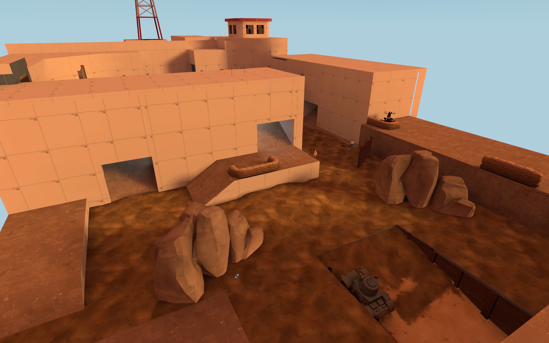
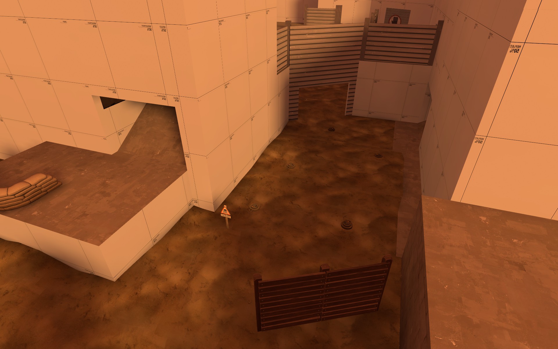
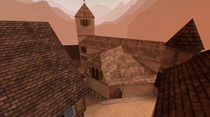
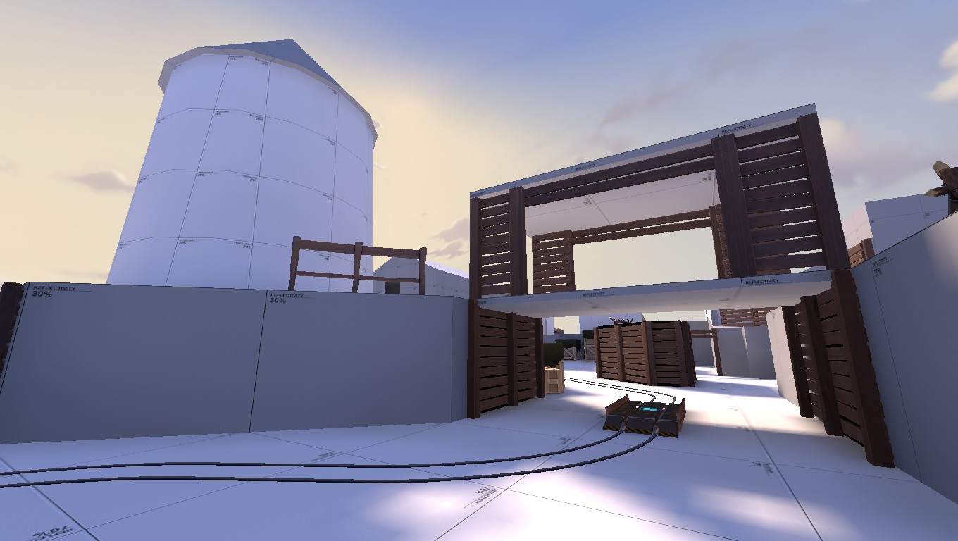
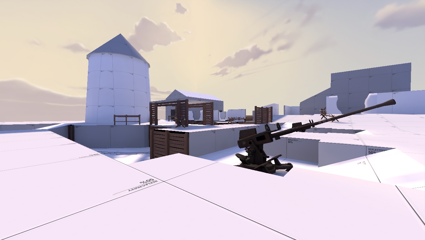
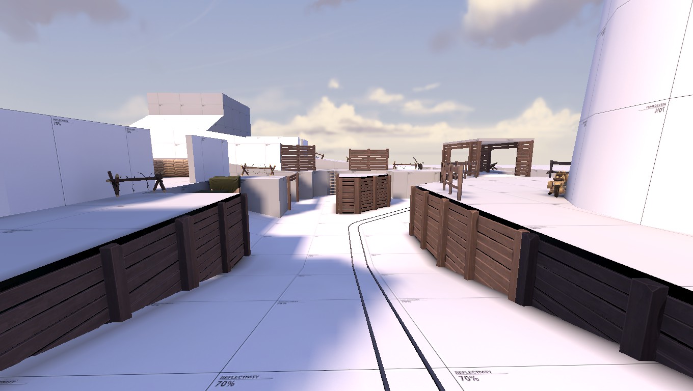
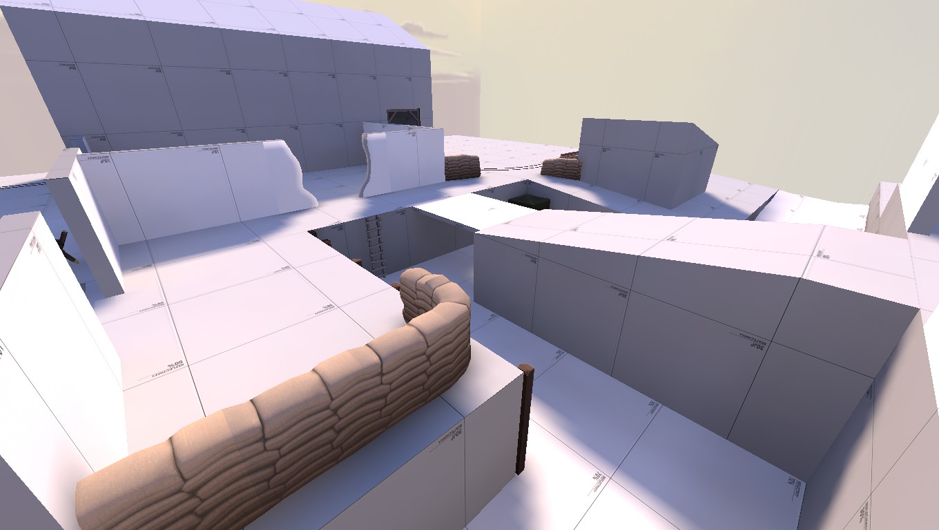
Why, hello there last devtextured building on Bloodshed. I see you're finally taking shape. That roof of yours was a bitch to create though.
20160726230655_1.jpg 20160726230716_1.jpg 20160726230732_1.jpg
That lighting looks mighty redish-orangeish. Might become hard for players to tell the red gamers from the background. I suggest changing it, but that's just my two cents.
 

DrLambda

L69: Teeheehee, Member
aa
Feb 18, 2015
458
475
Right now, this is the lighting that the Frontline pack suggested for that skybox. It might still change, it wasn't something i was going to change during the 72 hours contest. I kinda like it though, just might make it a bit brighter (as in color brightness, not brightness level.)