You're succeding too!I am trying to do that thing where you make an alpha map that doesnt look terrible.
WiP in WiP, post your screenshots!
- Thread starter Arhurt
- Start date
You are using an out of date browser. It may not display this or other websites correctly.
You should upgrade or use an alternative browser.
You should upgrade or use an alternative browser.
S
saph
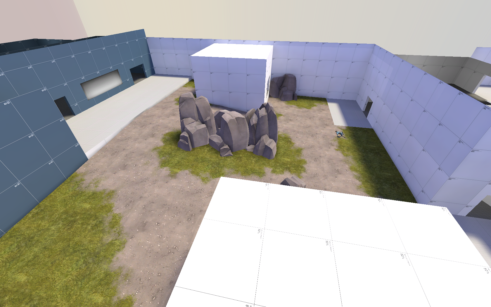
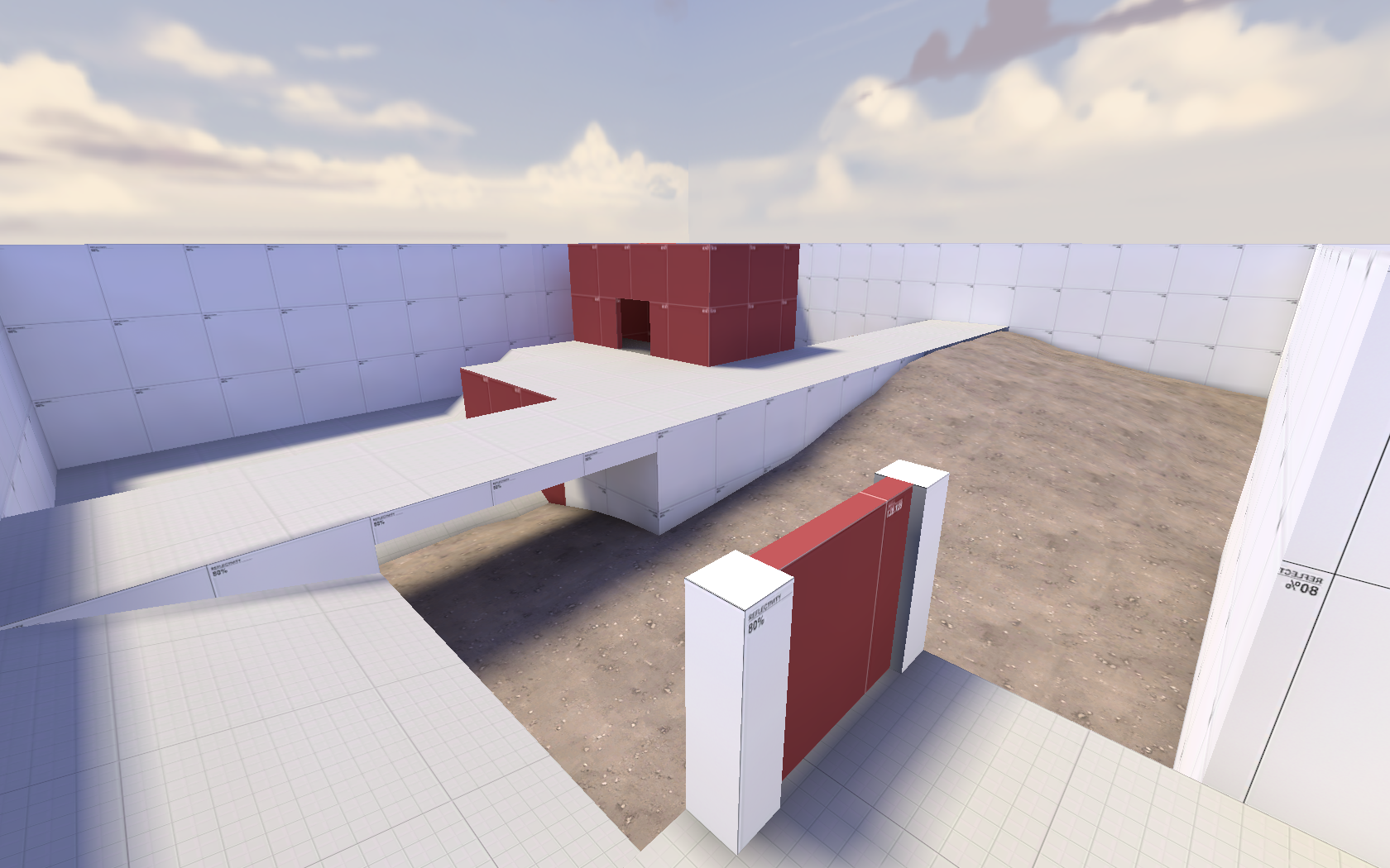
I am trying to do that thing where you make an alpha map that doesnt look terrible.
- screenshots snip -
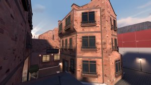
Im not fond of the supports, they are too frequent. Other than that i am pretty happy with it.
For the first screenshot, the grates and the material on the barrier (right of the door) look weird. I think grates look weird because it's normally on the floor, so it's probably just me and my stupid preferences. The texture on the barrier probably looks weird due to the perspective.
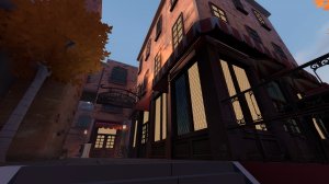
Once again, in the second screenshot, I dislike the texture for the doorway. It blocks most vision, so you might want to scale it up or find one that reveals more behind it. Other than that, you might want to use a brighter texture to add contrast between the supports and walls. Overall, I love the look of that work. The geometry is spot-on, but that point will suck for when you blockbullet around it (for the splash damage bug). I'd probably brighten up the point to draw attention to it more, but it's probably my dark screen.
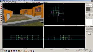
For the third screenshot, it's all vertical and horizontal. You might want to vary the lengths or heights of the pillars, or break it up with more negative space and diagonal supports. Once again, you see a texture being repeats, so maybe using negative space would be better. The similar tones between the grate and supports could be contrasted with the supports and the white diamond plating texture (imetal003, I believe).
I love it Zahn, just maybe change things up a bit and add some variance. Good luck with your work!
but that point will suck for when you blockbullet around it (for the splash damage bug).
I already have :B1: I used a cone with the same amount of sides, scaled it (with select tool) to be the correct ratio then clipped off the top to be flat.
I do agree with you about the grate texture on walls really. It does look a tad odd now that you have mentioned that.
I'm going to remove half of the supports (or more) and see how it looks then, should be a lot less noisy and look a lot better overall then.
Thanks for the feedback on it, probably wouldn't have changed these things otherwise.
RataDeOrdenador
L5: Dapper Member
- Oct 12, 2015
- 230
- 105
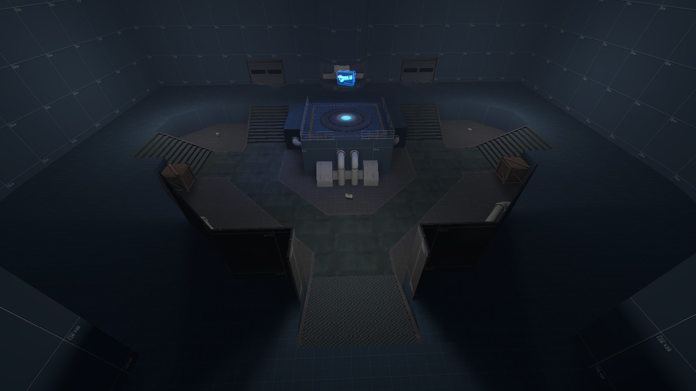
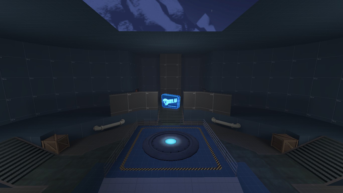
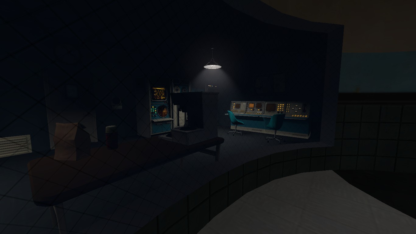
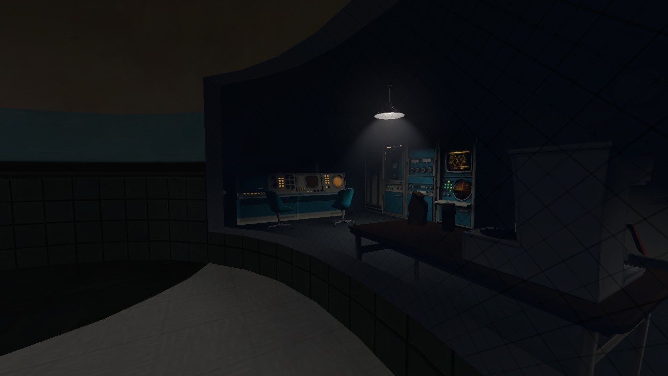
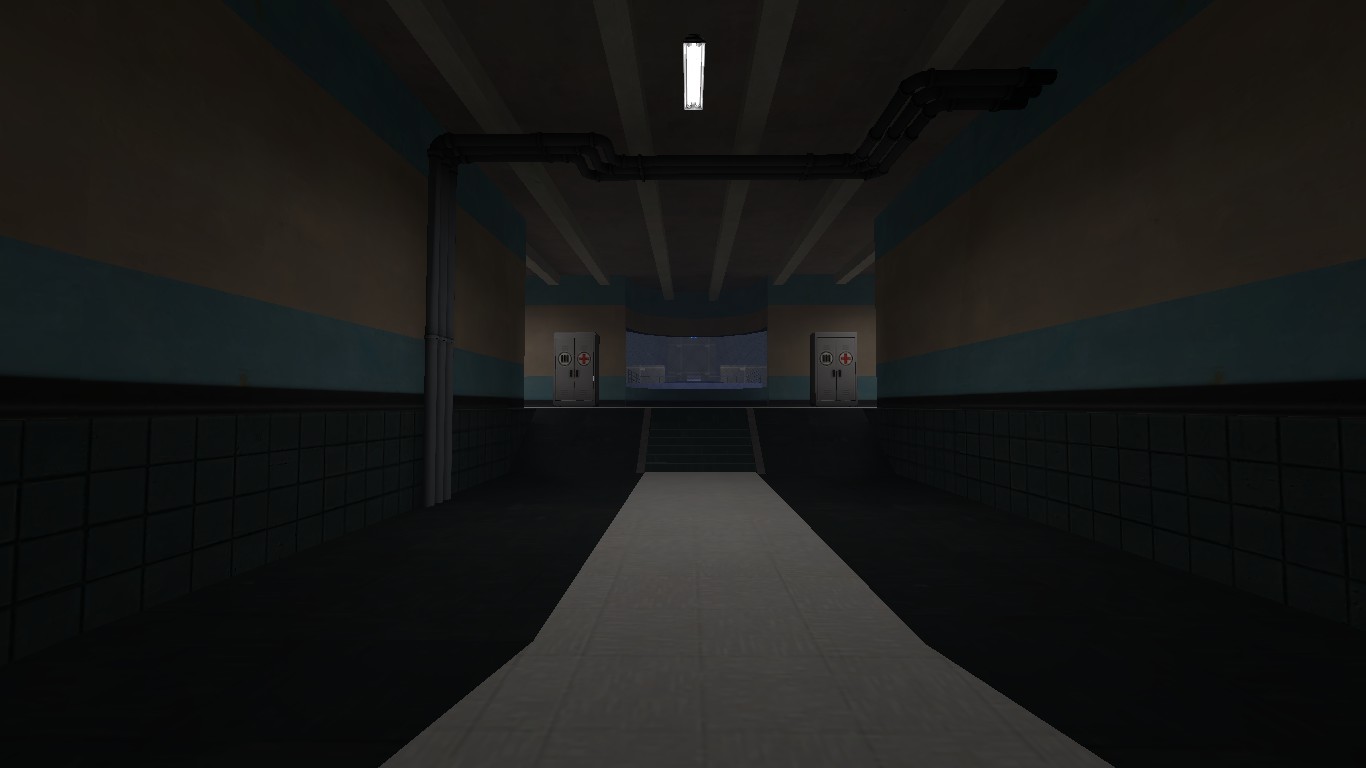
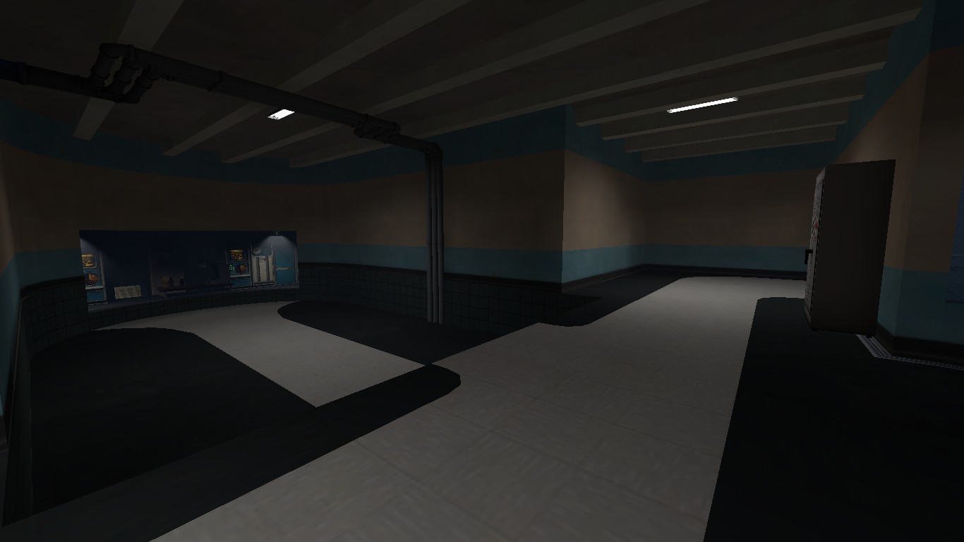
Gotta fix some lights here and there,but this map is taking shape. I still have like 5-6 maps on my pocket. I should work a little bit with all of them... But I'm really enjoying working on this one. I still have to think how am I going to make second and mid,and how am I going to connect all the CP. BUT HEY! I'll solve the problem when I get there. Probably.
I am trying to do that thing where you make an alpha map that doesnt look terrible.
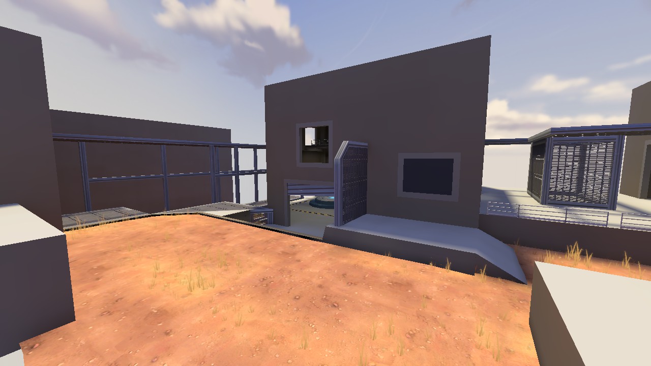
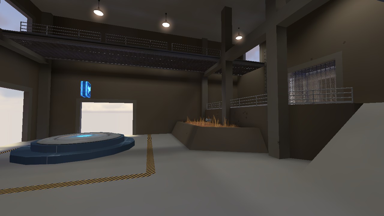
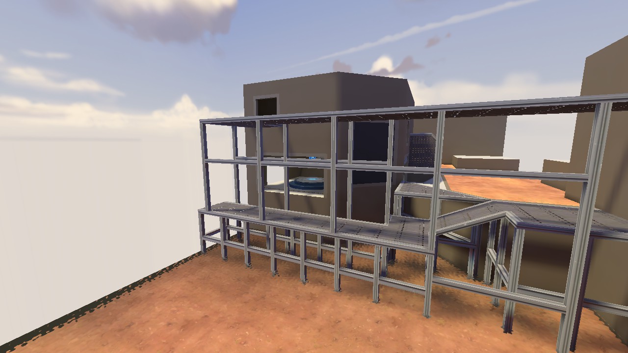
Im not fond of the supports, they are too frequent. Other than that i am pretty happy with it.
Health and ammo in a planter--that's a bold strategy, let's see how it plays out.
Health and ammo in a planter--that's a bold strategy, let's see how it plays out.
Its going to grow a pickup tree for the soldier to celebrate his victory under!
S
saph
I revived an old map name, but restarted the actual layout. I like the style I was going for and I was designing this payload for smaller teams, but right now, I oversimplified the layout. There's not enough space to extend the map and there's very few flanks. I'm probably going to scrap everything but the outside part and also keep the track layout.
This was made in a few hours last night and touched up a little today.
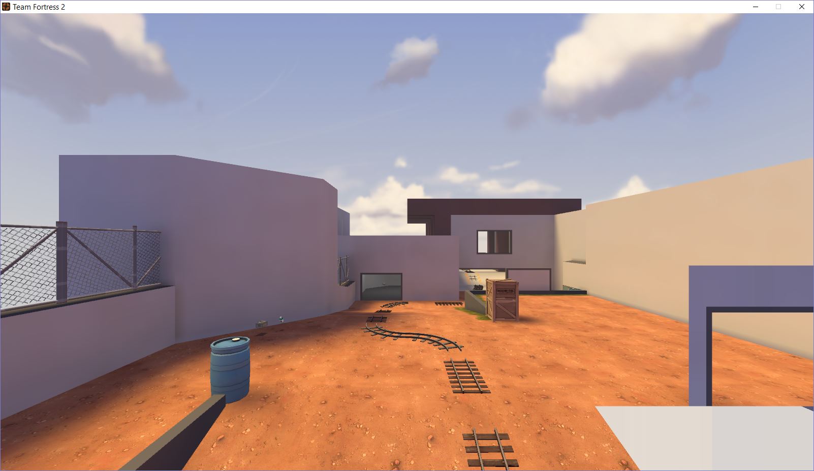
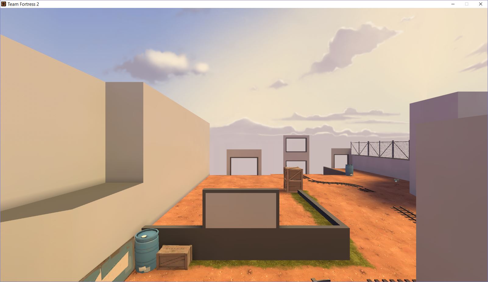
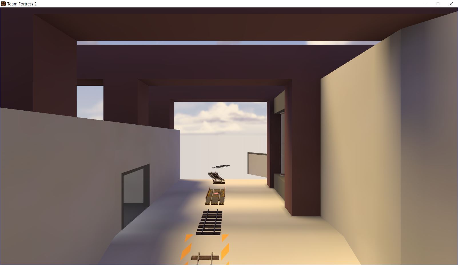
This was made in a few hours last night and touched up a little today.


ades
L4: Comfortable Member
- Jun 27, 2014
- 165
- 58
This looks really neat can't wait to see what you do with thisI am trying to do that thing where you make an alpha map that doesnt look terrible.


Im not fond of the supports, they are too frequent. Other than that i am pretty happy with it.
Edit: Im also proud of the map name :B1: try find it.
1 round TC
Or possibly lap-based A/D
nope, but 1 round TC is actually a pretty cool idea.
"Single-round TC" to me suggests having every point and route open simultaneously, and having to somehow capture every single point. So basically Domination.Wouldn't that just be 5cp? Minus 3 cps?
I'm surprised no one has tried that.
I'm assuming for the same reason people dont think CTF goes well with TF2, domination as a gamemode is fine, but in TF2 it might not play out very well."Single-round TC" to me suggests having every point and route open simultaneously, and having to somehow capture every single point. So basically Domination.
I'm surprised no one has tried that.
Zloykotara
L1: Registered
- Jul 21, 2015
- 22
- 229
I'm gonna make a new version of ixem, im gonna finish this map someday?
It solely depends on your motivation for your project.
Its just when im making the map i dont like it and i start over again, then i cant finishi it...It solely depends on your motivation for your project.


