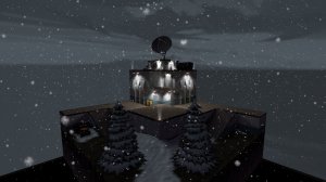
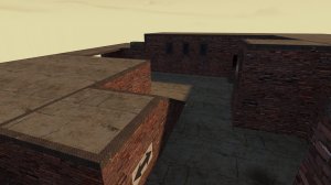
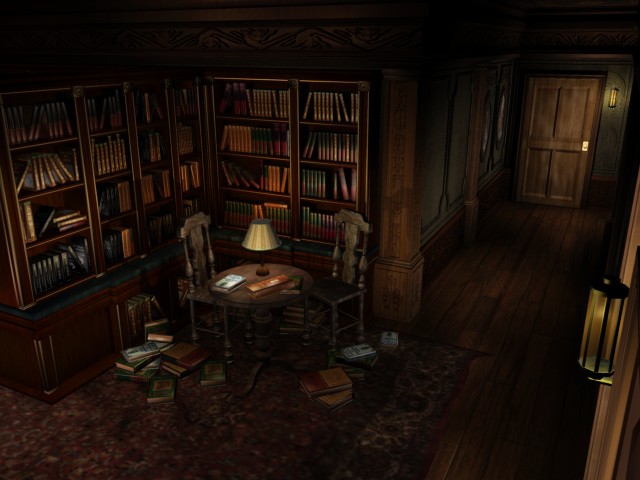
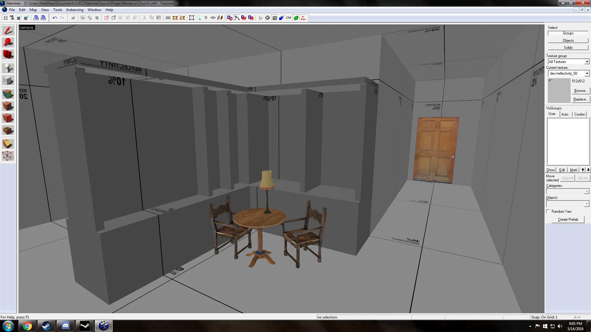
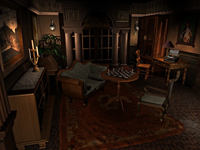
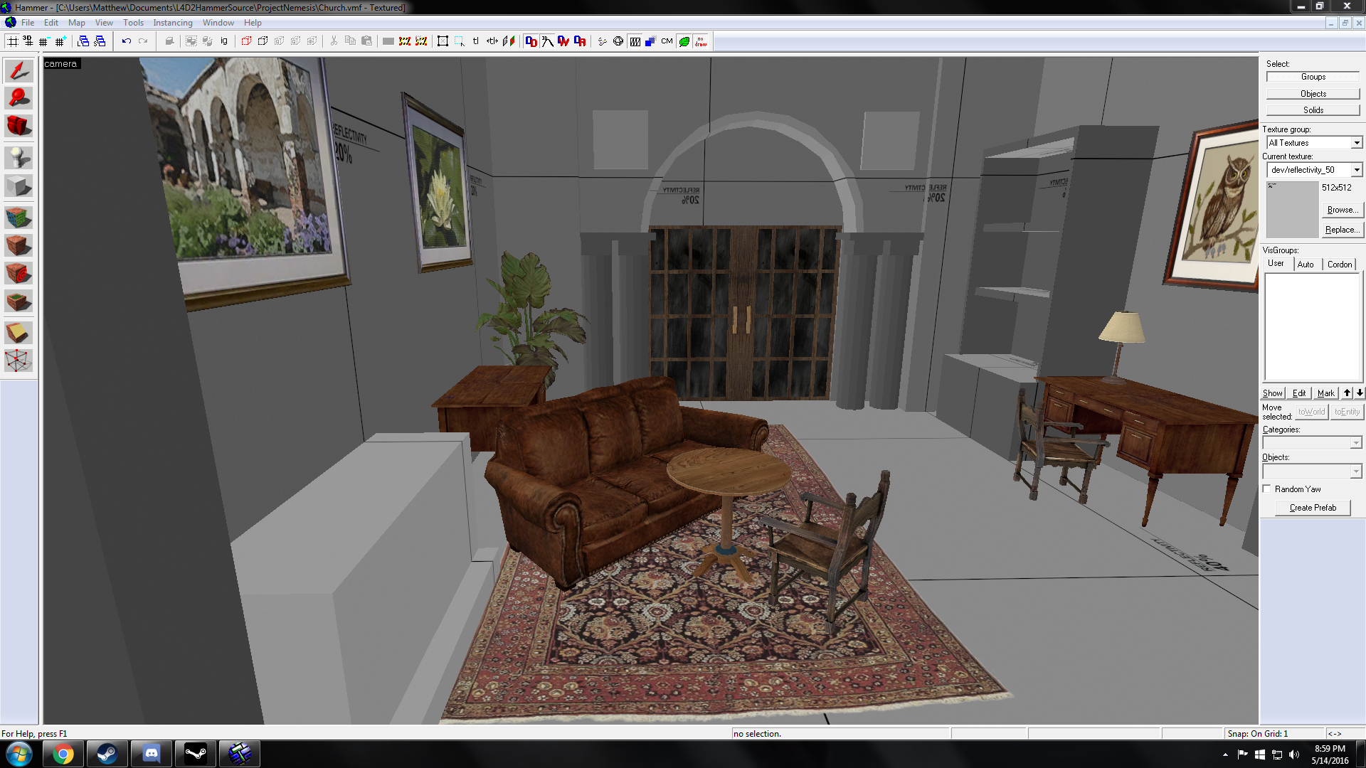
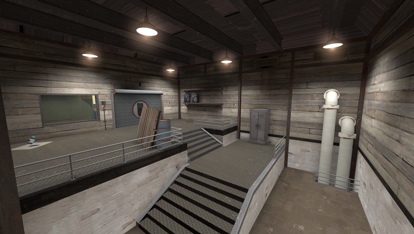
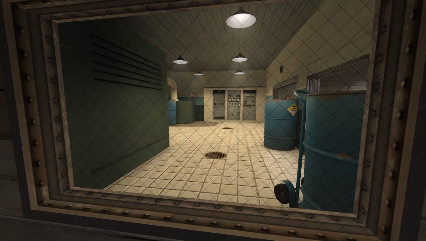
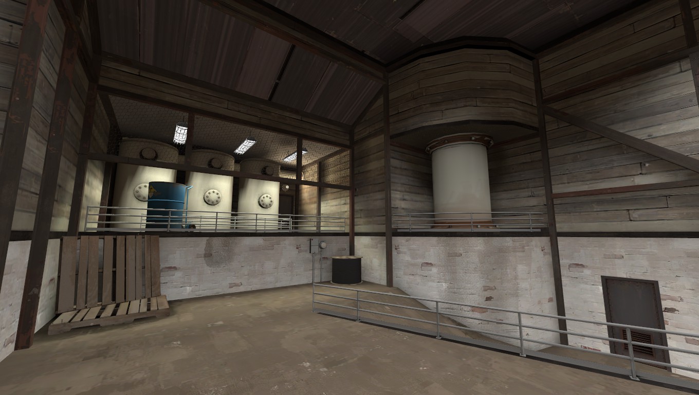
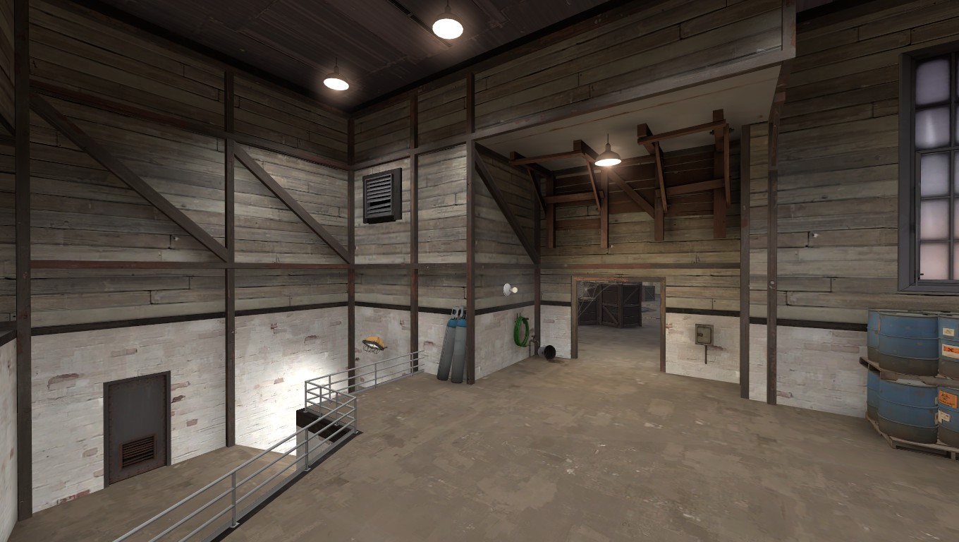
Looks weird when skybox is bright but map itself is very dark*snip*
WiP in WiP, post your screenshots!
- Thread starter Arhurt
- Start date
You are using an out of date browser. It may not display this or other websites correctly.
You should upgrade or use an alternative browser.
You should upgrade or use an alternative browser.
RataDeOrdenador
L5: Dapper Member
- Oct 12, 2015
- 230
- 105
Actually,the sun is what emits a good chunk of the light. But since it gets blocked by the walls,I've been using ambient_lights with the same colour scheme-thingie..Looks weird when skybox is bright but map itself is very dark
I either place the sun somewhere else (might look bad[skybox,perhaps? I dunno. :X ]),or I make the lights brighter. It might look better when there's less "80feettall" walls blocking everything.
Probably,I hope.
But since it gets blocked by the walls
the walls shouldnt be blocking it, the skybox should come up at the walls, sealing each individual area. Not a big box.
RataDeOrdenador
L5: Dapper Member
- Oct 12, 2015
- 230
- 105
the walls shouldnt be blocking it, the skybox should come up at the walls, sealing each individual area. Not a big box.
But the sun itself is at a very,VERY low position. Don't think you/I want a pretty small walls with a big skybox.
I'm basically using this skybox.
But the sun itself is at a very,VERY low position. Don't think you/I want a pretty small walls with a big skybox.
I'm basically using this skybox.
Even when you have a low sun it should be possible to have a map well lit. If the sun is too low dont use that as an excuse, fix it by making the sun be a bit higher or compensate it with artificial lights.
Dark areas in most cases dont do well. They make team identification harder, and often benefit classes that dont want to be spotted fast (spy, sniper, medic, pyro), and especialy when too dark these classes can cause ninja wins or frustrating deaths.
If you realy want the sun to be low, add lights to make the map itself brigher. For an example just look at http://wiki.teamfortress.com/wiki/File:Pipeline02.jpg
For a map at night its a well lit zone.
Even my own map and using earkhams assets it has a low sun position (-30), but its still a quite bright map because i add light at every place that was recieving shadows.
Redoing the concept in Koth as that seemed to make more sense for the map's "story," and the old one just wasn't a good layout compared to this one.
koth_digsite
TOO STEEP
for a gentle slope, 3 or 4hu along for every 1hu vertical is good. For general purpose ramps 2x1 and stairs 3x2. Going in at 1x1 is just dangerous!
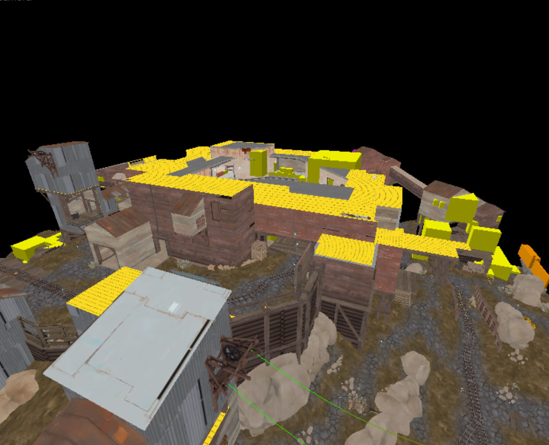
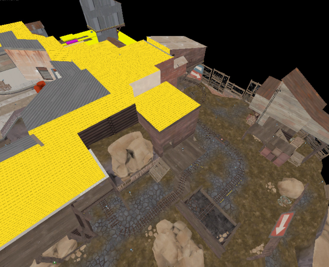
Started on a new cp project please ignore the crap lightning
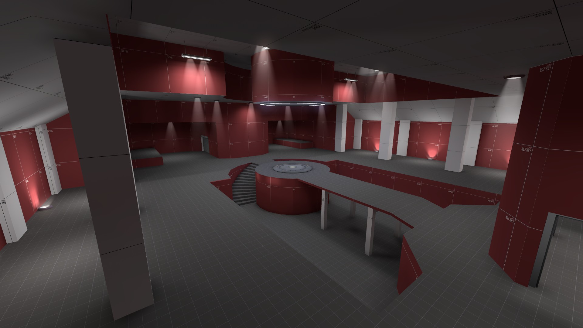
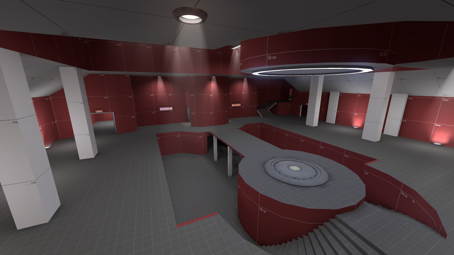
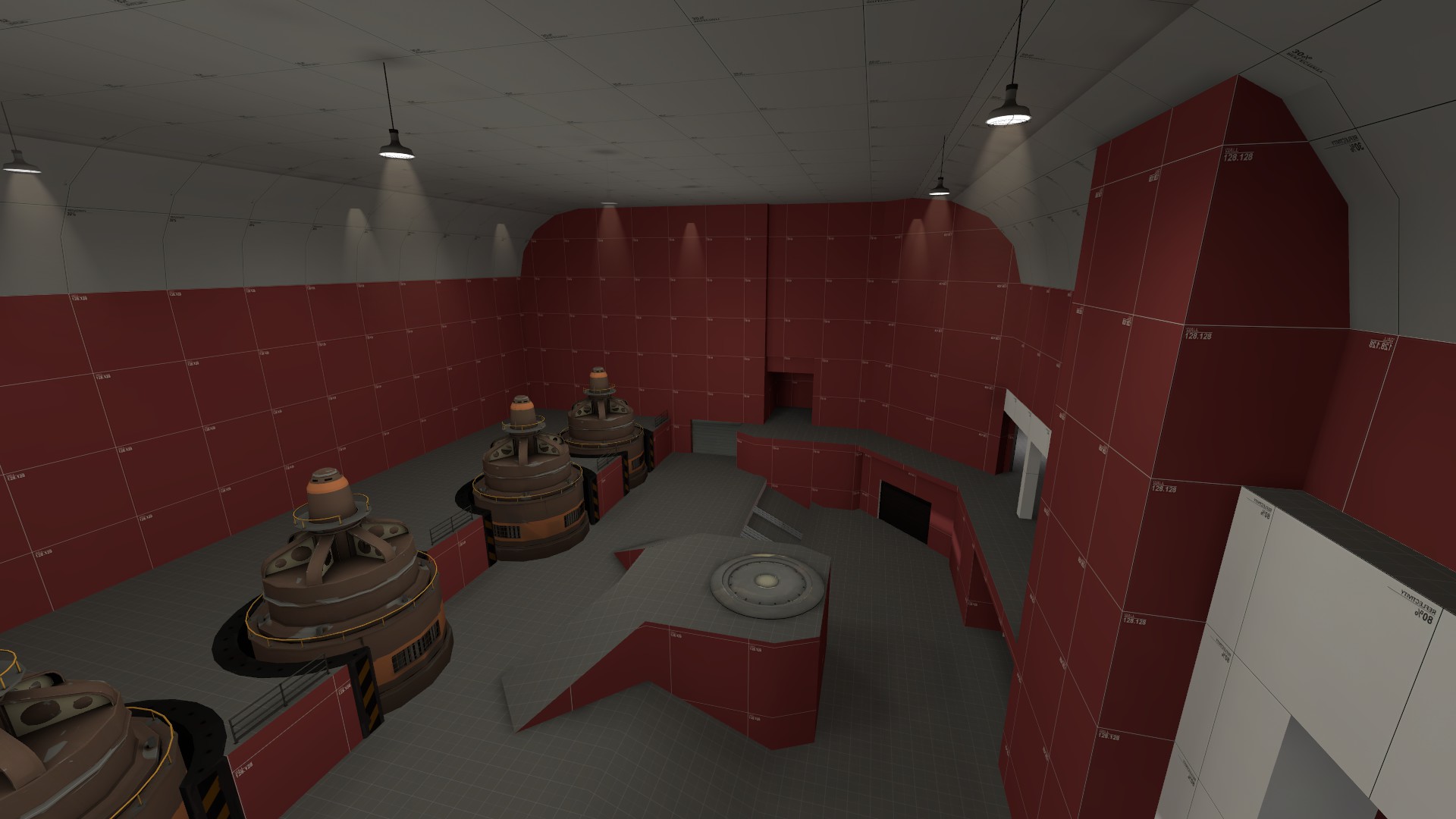
Holy overscaling, Batman! We're in a Jimijam.
TOO STEEP
Whule you should avoid 1:1 stairs if possible, they aren't unacceptable. Valve uses them fairly often in Hydro.
In this particular situation, the more egregious thing is that the stairs change slope between flights. While we don't have to worry about how dangerous this would be to walk on (because it's a video game), it does look odd from an aesthetic perspective.
They're also present in spades in Gorge. I think I spotted about two staircases in that entire map that weren't at a 45º angle.Whule you should avoid 1:1 stairs if possible, they aren't unacceptable. Valve uses them fairly often in Hydro.
Blu spawn of a 2 cp a/d map I'm working on.
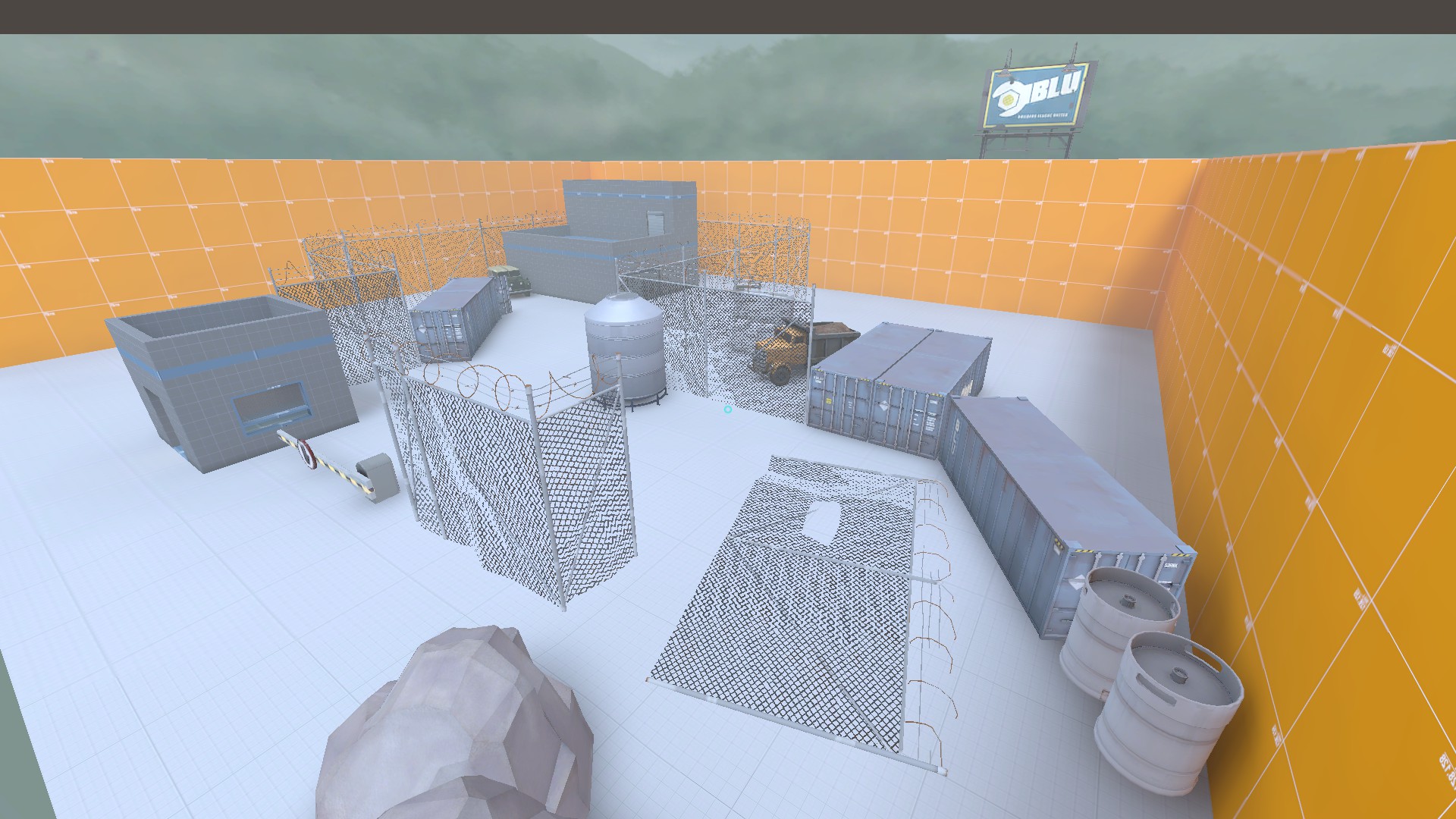
The surrounding orange walls will be cliffs.
(Just on a side note any tips for displacements on cliffs? My cliffs always end up looking very square and it just doesn't look good at all.)
The surrounding orange walls will be cliffs.
(Just on a side note any tips for displacements on cliffs? My cliffs always end up looking very square and it just doesn't look good at all.)
@Hipster_Duck Please be very careful about using those security fence models in gameplay areas. Throughout TF2's history they've delineated primarily between the playspace and the out of bounds areas.
I hope that the orange walled box isn't how you're sectioning off this whole area, a few buildings inside an empty box isn't really a good way to create an interesting space, and that's ignoring that there's no way to optimise a big empty space like this.
I hope that the orange walled box isn't how you're sectioning off this whole area, a few buildings inside an empty box isn't really a good way to create an interesting space, and that's ignoring that there's no way to optimise a big empty space like this.
The surrounding orange walls will be cliffs.
But yea, I see your point, I was debating on adding another building behind the two parallel containers (maybe an airplane hanger of some sort) and I was also going to make it look like the area was cut out of a forest, putting tree stumps near the fence and full trees outside the fence. And you're right about the fact I should probably do something about the fences being in the play space. Thanks for the feedback.
Edit: (Just cause I don't think I explained it very well) the orange "cliffs are outside the map and are unreachable, the gameplay space its shown by the fences that go around it (except for that "L" shaped peice that was there, which I have now removed: 20160514121813_1.jpg )
Attachments
Last edited:


