WiP in WiP, post your screenshots!
- Thread starter Arhurt
- Start date
You are using an out of date browser. It may not display this or other websites correctly.
You should upgrade or use an alternative browser.
You should upgrade or use an alternative browser.
The cover is only gonna make the spawn camping worse in most cases. I'd say use a fence or something to let people see the spawn, but not camp it like they can now.So, i've been working on plr_hierarch. Except for tons and tons of work on the deathpits (I'm really not that good with displacements) without having anything to show for (yet), i added the gameplay changes i talked about.
The obvious things are the new cover on the bridge to make the spawns harder to camp...
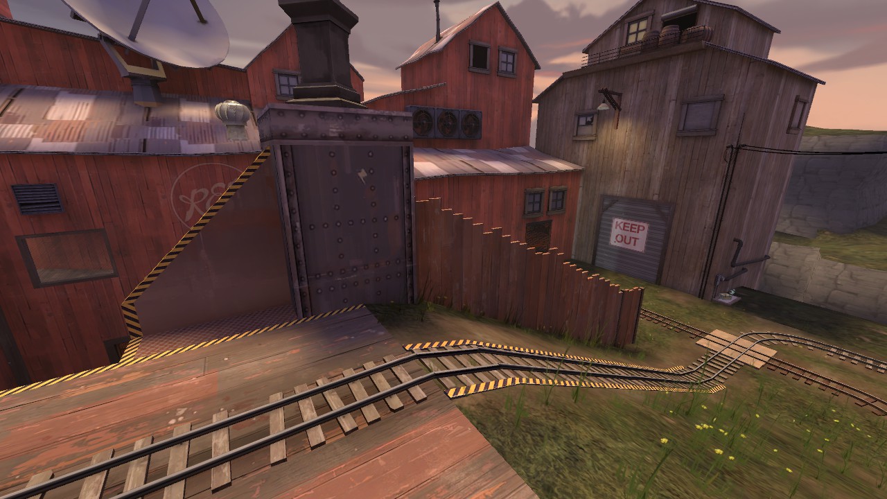
... and the new one-way path from spawn to give an additional angle of attack against anyone holding the hill, starting here...
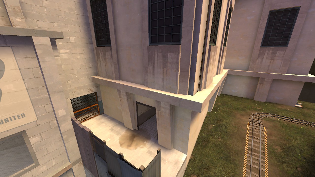
... going through this...
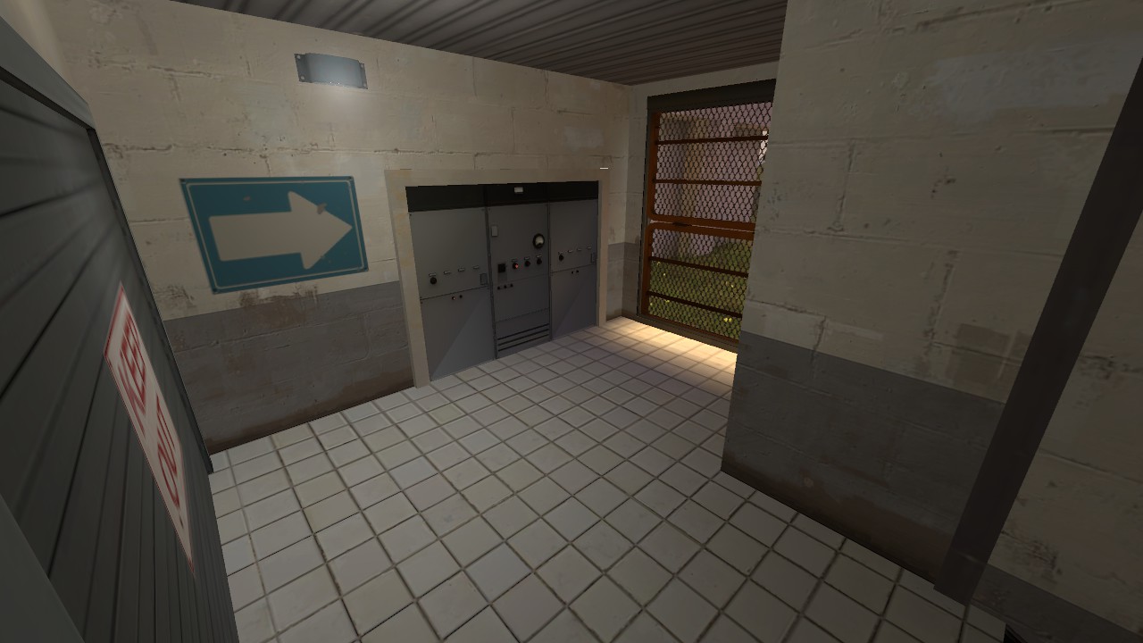
... exiting here.
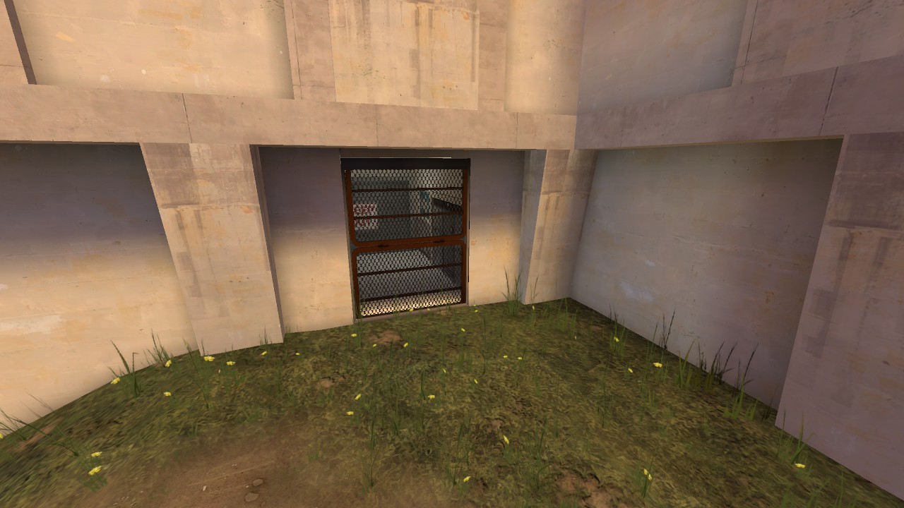
I really hope this works to make the first part of the map easier for the attackers, and i can't wait to test it once i got most graphical stuff done.
@sevin
Thanks for your feedback, but I have to disagree.
The whole part of the map you're looking at is gonna have the "build in a hurry / there is totally no secret base here" theme. In my opinion those tiles, laid carelessly only to an absolutely necessary extent fit in nicely.
Also, I know it is not a popular opinion here, but I disagree that detailing in TF2 needs to make sense. It needs to show purpose or tell a story. But sense? What is the sense of having two bases facing each other? What is the sense of delivering a bomb to an enemy base by pushing a cart right through the main gate? What is the sense of having a "drop a bomb here to boom" hole in the middle of a base? If the game breaks the sense so drastically by covering it with some sarcastic humour and cartoony formula, why should I be concerned that those tiles wouldn't make sense in real life. Why not tell yourself a story. "Some drunk was doing the job", "someone was doing the job and BLU attacked", "it was meant to be an undercover for a real facility and someone didn't care enough". This is the way I consider making things believable in TF2 detailing.
I think it is a topic for an interesting discussion, but probably not here and not now.
@sevin
The whole part of the map you're looking at is gonna have the "build in a hurry / there is totally no secret base here" theme. In my opinion those tiles, laid carelessly only to an absolutely necessary extent fit in nicely.
I'd put some unopened boxes of tiles in the room just to suggest that there was the intention to tile the rest
I disagree that detailing doesn't need to make sense. Sure, pushing a bomb cart through the danger zone isn't the most efficient method of blowing up a building or two, but the whole concept is still somewhat grounded in reality - you're pushing a thing that blows things up into a thing you want to blow up.-snip-
Everything in TF2 could theoretically exist in real life (passtime, mannpower and halloween bosses notwithstanding). There are no dragons or unicorns or sharks that shoot laser beams out of their eyes. Sure it's all exaggerated for comic effect but not to such a degree that it's completely nonsensical. (Again, halloween bosses notwithstanding.)
I'm also very wary about telling a story - it's all well and good but for smaller details can also lead to strangeness like half a floor of tiles, that when the story isnt sufficiently obvious, just looks bad.
@Muddy
I probably didn't lay out my thoughts precisely enough.
I'm not talking about some basic sense of the – for example – layout concept. You're right, it needs to be somewhat grounded in reality. What I mean is that the focus of detailing should be put on telling some story rather than debating whether or not someone would really put prop X in room Y in real life, because in my opinion it leads to uninspired artpasses of many maps.
I will use my screenshots with tiles posted above as an example:
Sure, you can wonder why has someone decided to put tiles there and for what reason – to put two mining computers and a desk on it? My point is, if you give a purpose to those objects themselves and tell a story using them, it is enough. You see some tiles put there on the floor, some tiles in a box, you figure out the story and the purpose in objects and I think it is enough. Would it make more sense to make the ground pure concrete? Yes. But isn't it worth it to trade off on some sense in order to make things more interesting visually and – what's more important – help player remember layout more quickly and intuitively by making areas differ from each other?
The cover is only gonna make the spawn camping worse in most cases. I'd say use a fence or something to let people see the spawn, but not camp it like they can now.
Why would it? The ramp gives the defenders a high ground attack point onto two of the three spawn doors while giving them perfect overview of the lower ramp. By adding that fence, i force the defenders to choose one of those things.
Telling a story through objects is fair enough, but remember this is TF2 we're talking about, in which the main focus is blowing people up into chunky bits - not parking your bum on the floor and taking in the sights. If something looks odd, it looks odd; nobody is going to say "well if you look at it from this perspective..." (because they will have been blown up into chunky bits)-snip so I don't spam the page-
I disagree that detailing doesn't need to make sense. Sure, pushing a bomb cart through the danger zone isn't the most efficient method of blowing up a building or two, but the whole concept is still somewhat grounded in reality - you're pushing a thing that blows things up into a thing you want to blow up.
Everything in TF2 could theoretically exist in real life (passtime, mannpower and halloween bosses notwithstanding). There are no dragons or unicorns or sharks that shoot laser beams out of their eyes. Sure it's all exaggerated for comic effect but not to such a degree that it's completely nonsensical. (Again, halloween bosses notwithstanding.)

Attachments
Get out.I'm not about to point out everything in TF2 that doesn't make sense because that's muddying the issue
haha muddying
Muddy: imagine if we started an imp and then realised we didn't have any maps
Muddy: we would have to
Muddy: imp rovise
Ⅎʎɔɔɐw: get out
Muddy: ok
Muddy left chat.
Muddy: we would have to
Muddy: imp rovise
Ⅎʎɔɔɐw: get out
Muddy: ok
Muddy left chat.
Little something I did for Iron Gauntlet. Feel like the "Electric Sheep" effect (the green one) came out much nicer than the other, but deadline is here this weekend so I'm moving back to other projects (I still have models promised to Freyja and Snowbat!).

View: https://www.youtube.com/watch?v=2PvjdG_VpQs
http://steamcommunity.com/sharedfiles/filedetails/?id=633073496

http://steamcommunity.com/sharedfiles/filedetails/?id=633073496
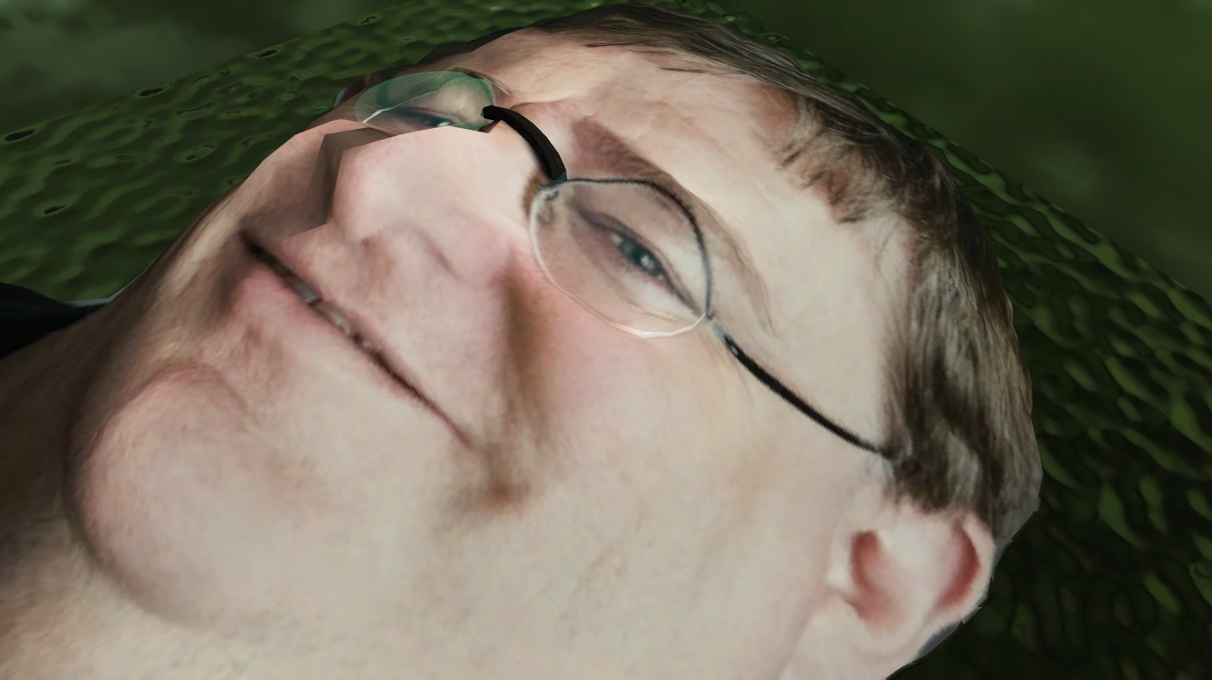
I got bored while reading BSP files for the uploader, and decided to mess them up instead:
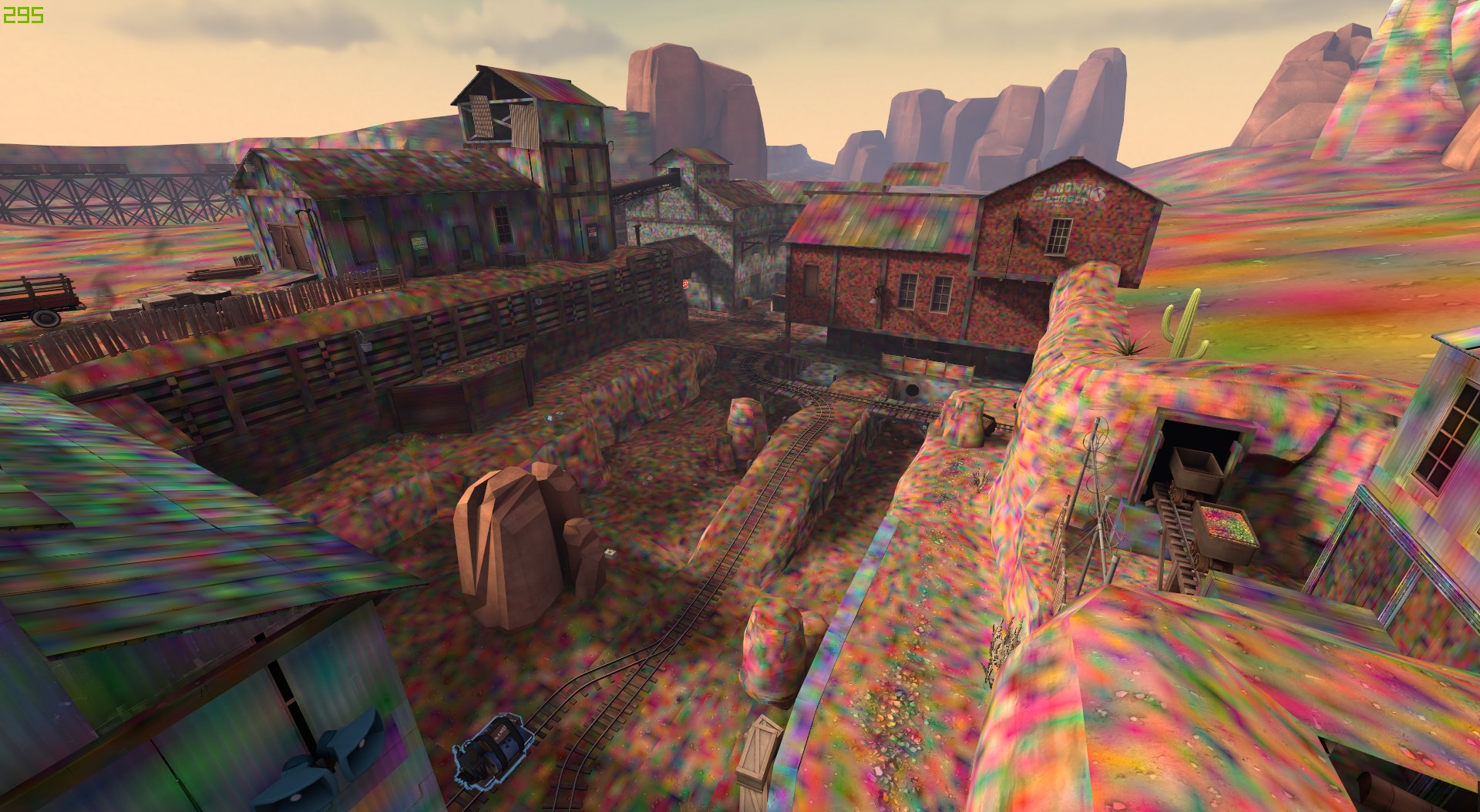
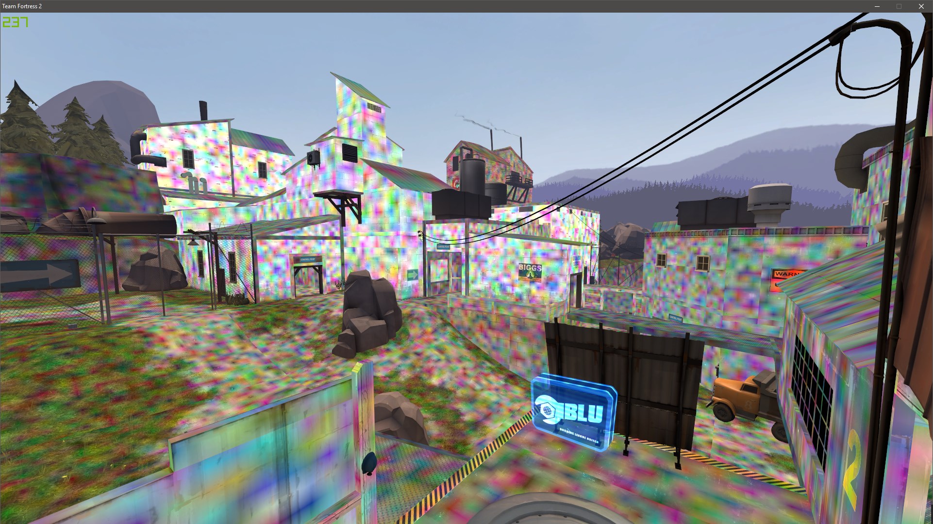
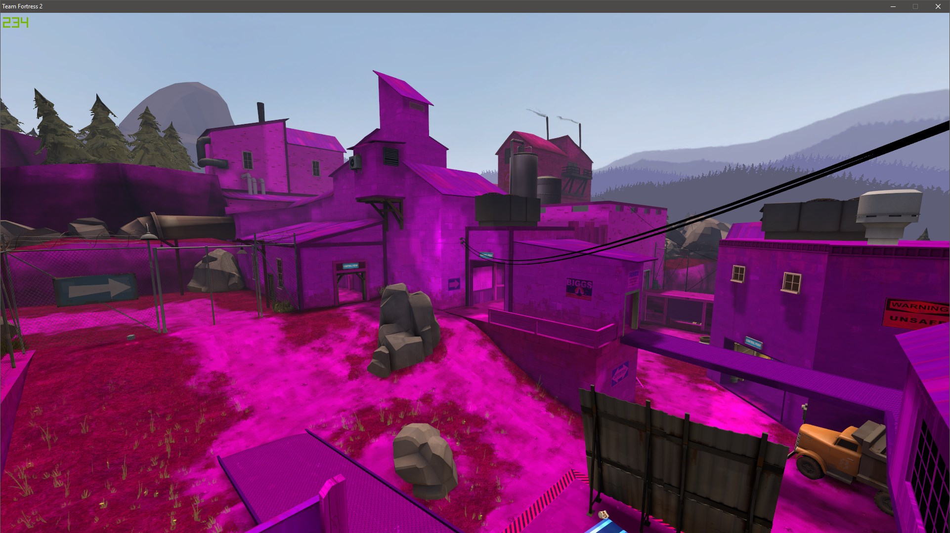
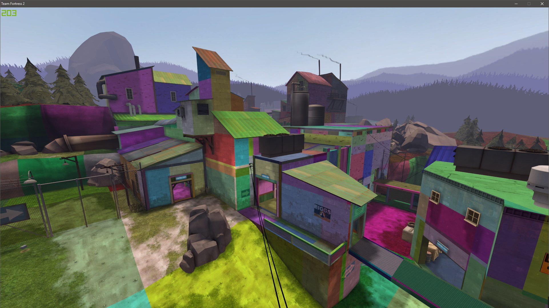
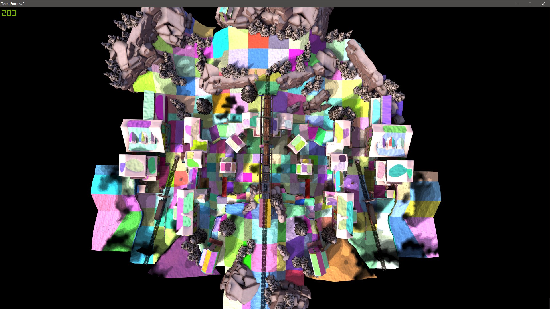
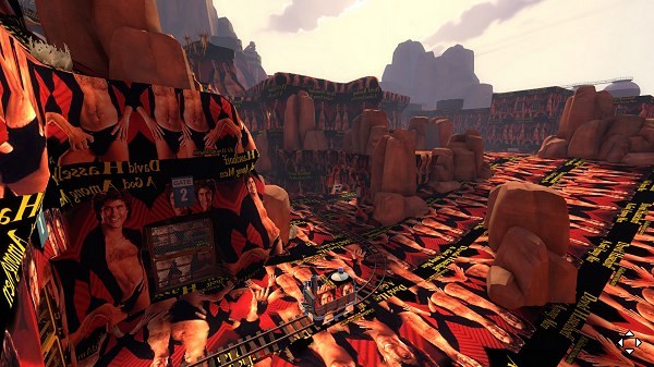
I remember this one map I saw like 3 years ago that was basically Watchtower but with every single brush/displacement covered in Justin Bieber's face. But this takes the cake.
I'm waiting for someone to discover this and remake a map with "other" textures.
You know.
The really nsfw stuff.
I'm waiting for someone to discover this and remake a map with "other" textures.
You know.
The really nsfw stuff.
Umm, speaking about face, I remembered something.I remember this one map I saw like 3 years ago that was basically Watchtower but with every single brush/displacement covered in Justin Bieber's face.
https://steamcommunity.com/sharedfiles/filedetails/?id=138938960
Last edited:


