Tutankabron
L1: Registered
- Feb 23, 2013
- 27
- 49
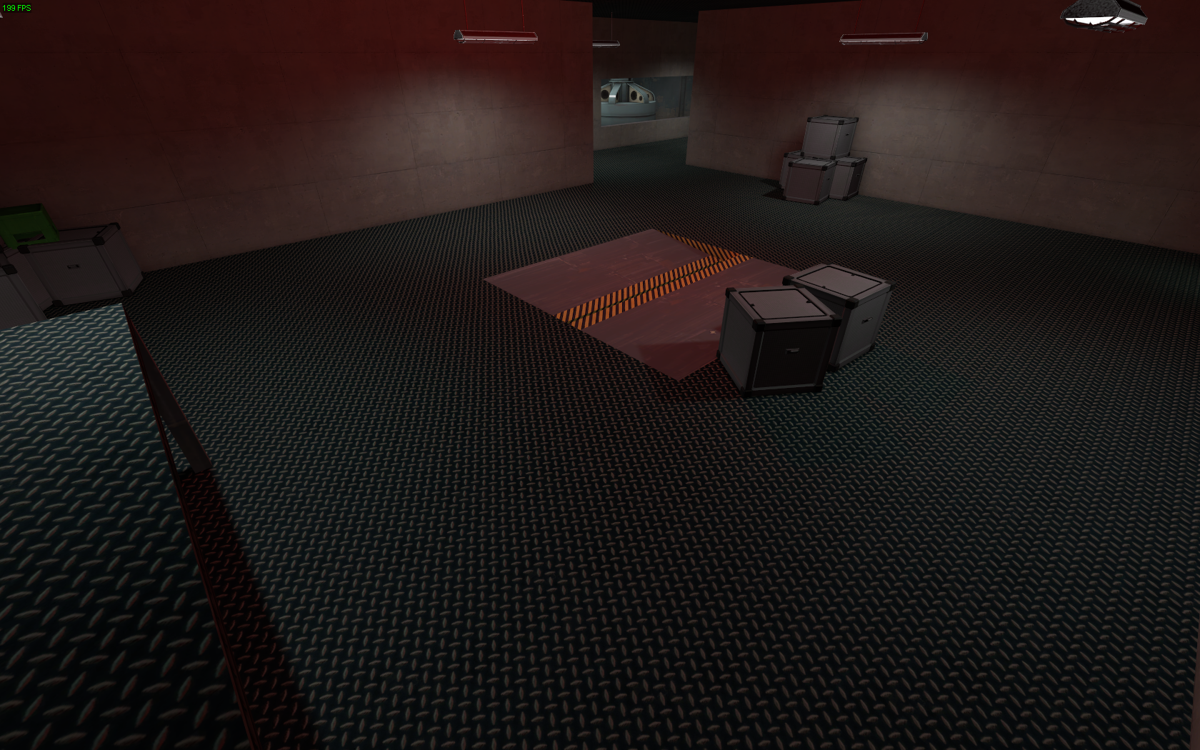
Looks great from a detail perspective, but terrible from a gameplay perspective, too much flat ground and height advantage to people off of the point.
Take an adventure...
snip
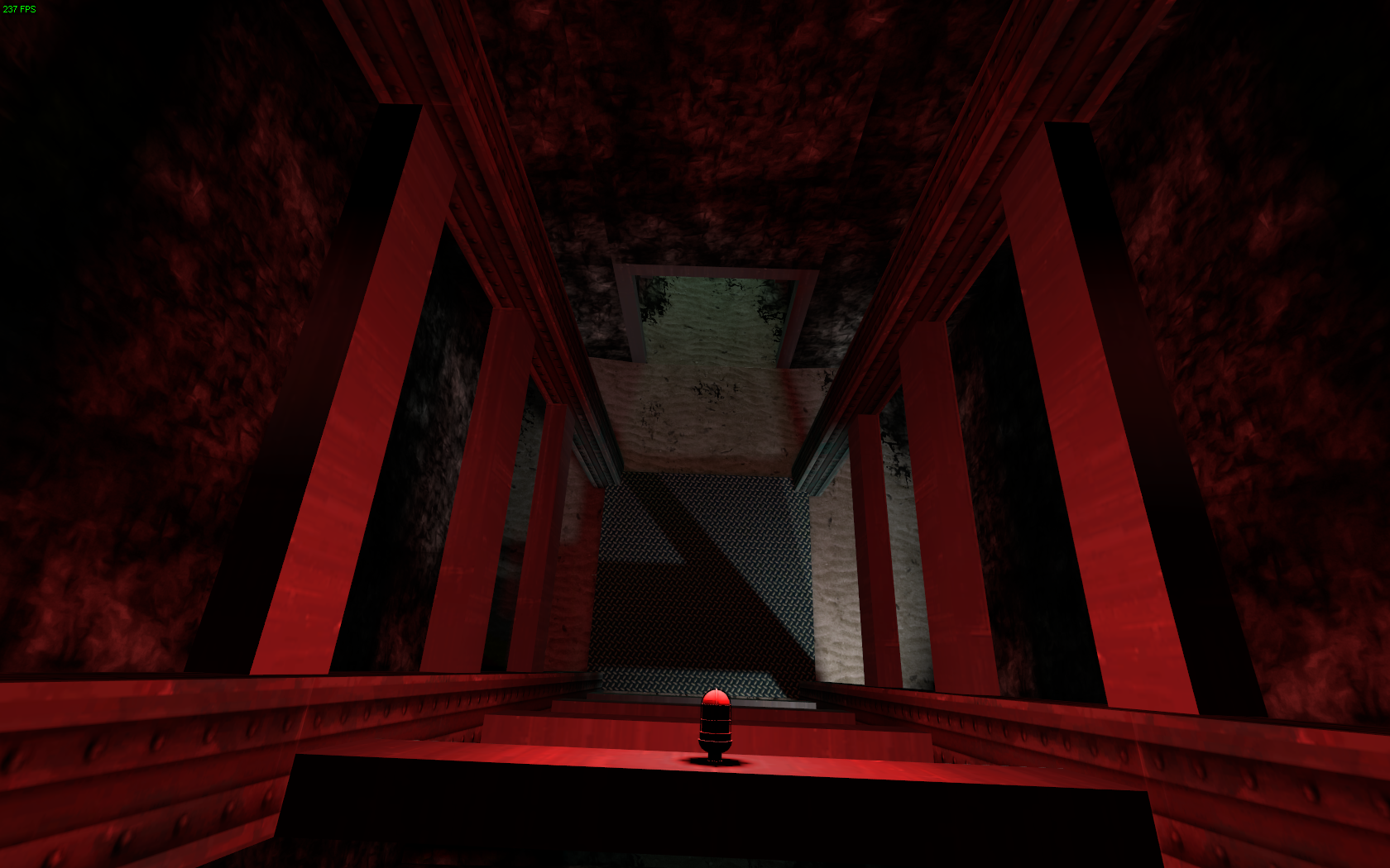
Deep down....
snoop
Far away...
snupp
In a place....
sneep
Under the sea...
snope
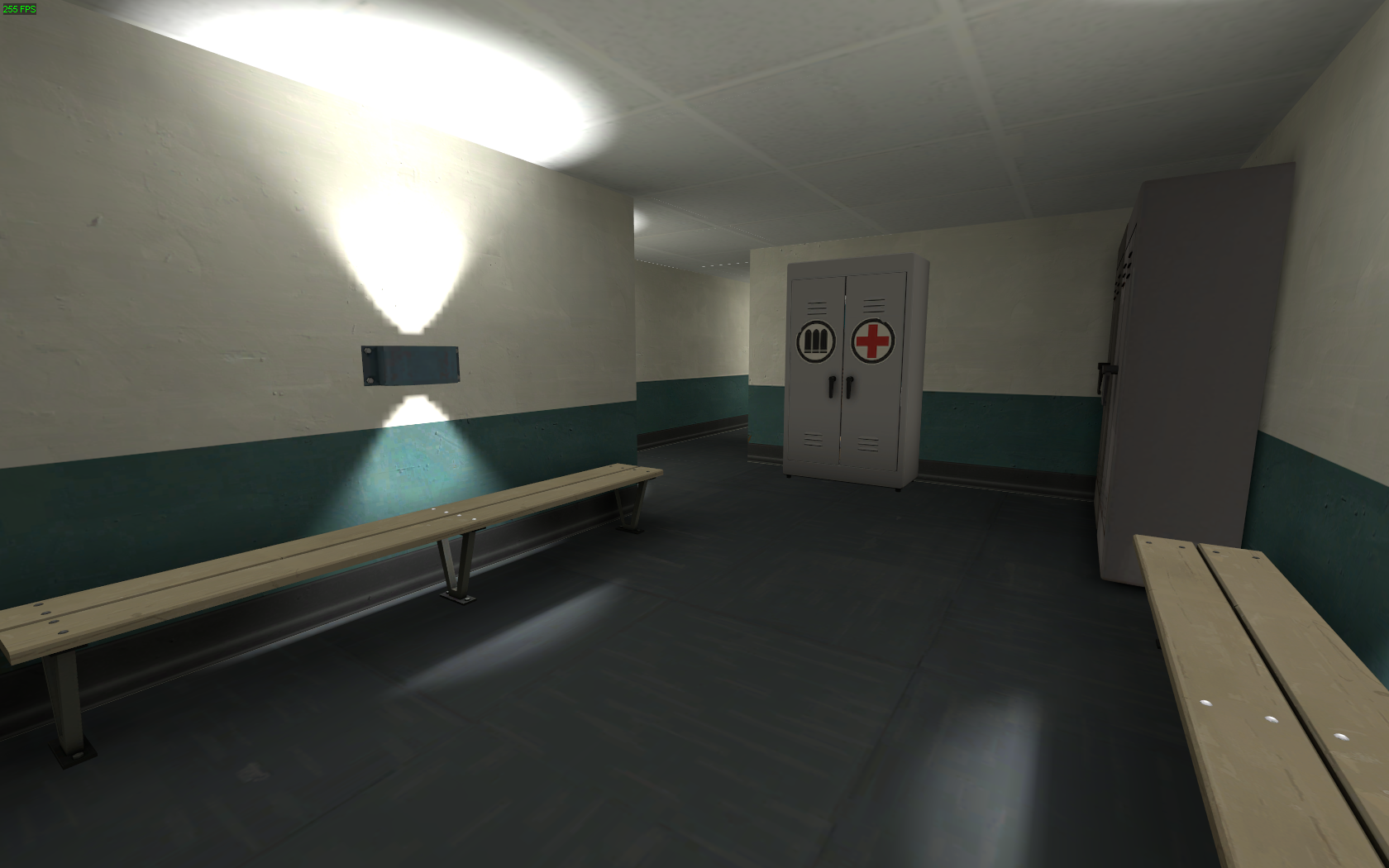
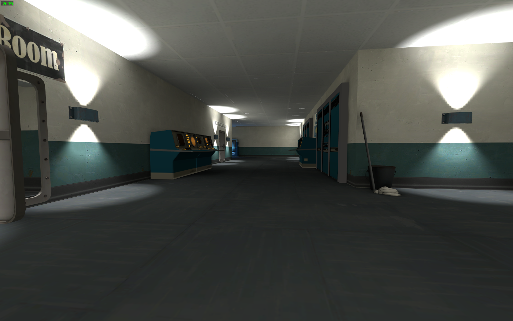
It's probably not the best idea to light your map entirely with those wall lights. All those small lightmap scales are gonna bloat your filesize.
Please, please, please hang some corpses from the log that stretches over the deathpit.
Also, working on a non-srs project that contains this WIP super-structure:
- smeerp -
It's a hotel thingy. The black doors indicate rooms that are accesible. Said rooms are spacious with living room, kitchen, two bedrooms and two toilets:
- snape -
The most time consuming part was definitely editing the poo out of the toilet model.