WiP in WiP, post your screenshots!

HQDefault

...what
aa
Aug 6, 2014
1,056
536
d7c326cf5a.jpg

Ooooh, mysterious!

Anyway...

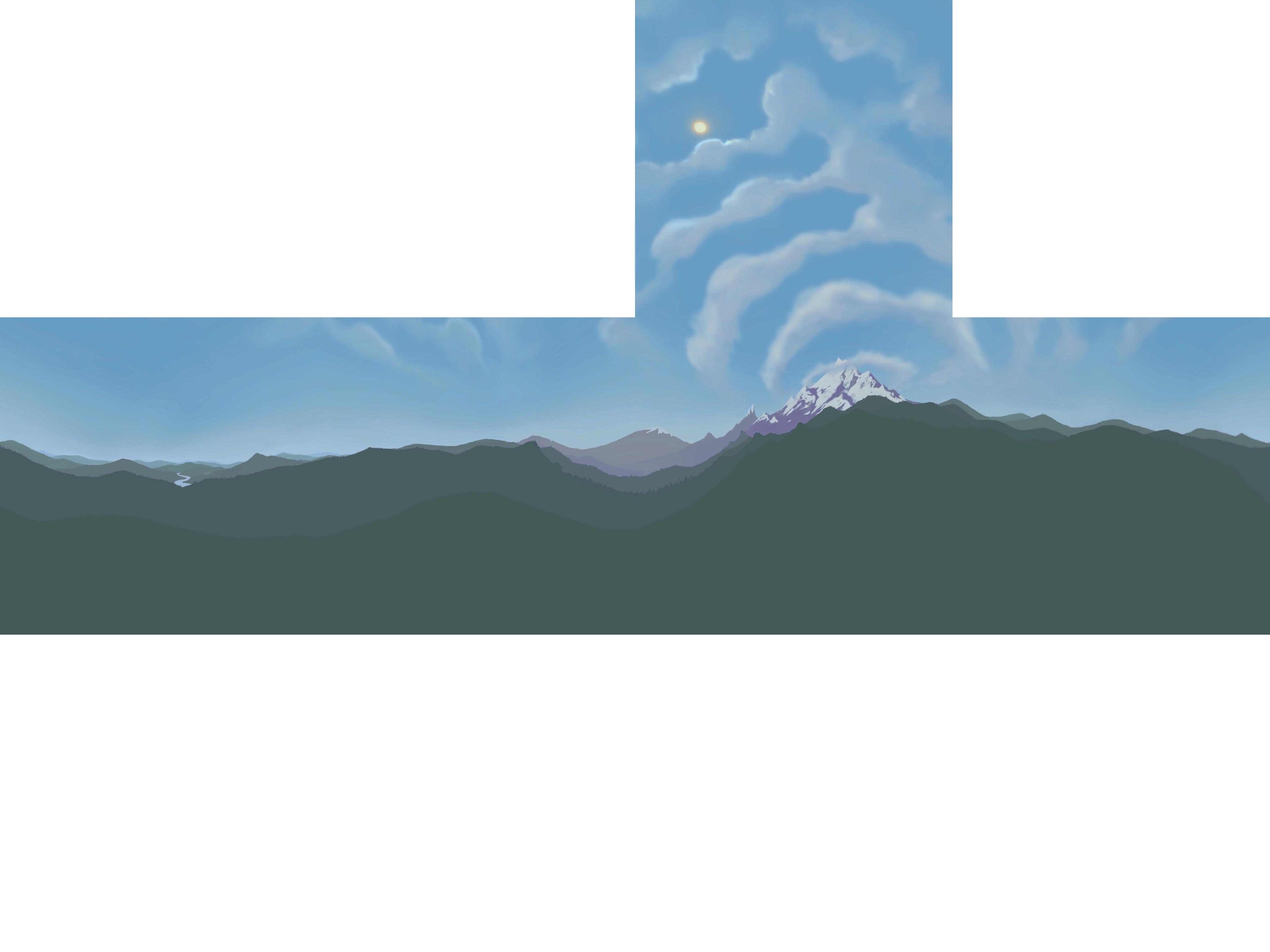
I think I fixed the main problems with the skybox. Now it's a little less "punch" and has a much more sane color scheme.
SaTkuKY.jpg
 

spudboy

L1: Registered
Feb 8, 2015
37
6
So koth_stockhouse is difficult to salvage due to layout issues so I'm trying to make a farm themed A/D map. Behold my noobish barn.
aac30caa7f.jpg

be7b5740b8.jpg
 

spudboy

L1: Registered
Feb 8, 2015
37
6
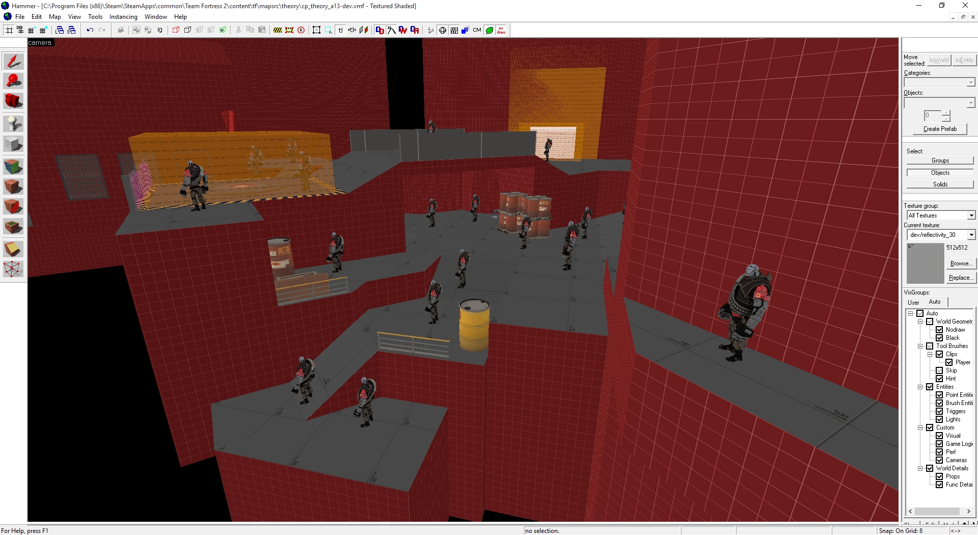
Those hay bales were stacked by the magical powers of paste special. I'll obviously pretty that up during the detailing process. I just wanted something to indicate that the area there is blocked by a clip brush.
 

Kraken

Few more zeros and ones for the site to proccess
Dec 21, 2014
430
121
Those hay bales were stacked by the magical powers of paste special. I'll obviously pretty that up during the detailing process. I just wanted something to indicate that the area there is blocked by a clip brush.

You should put chichen wire to indicate that players cannot go there. Makes little more sense than magic hay bales.
 

tyler

aa
Sep 11, 2013
5,100
4,621
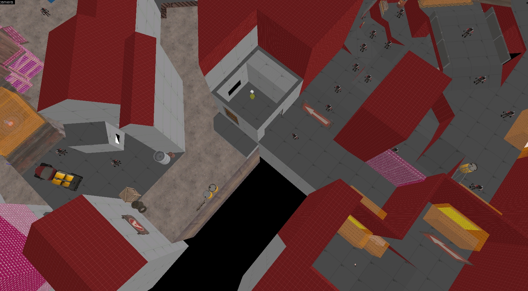
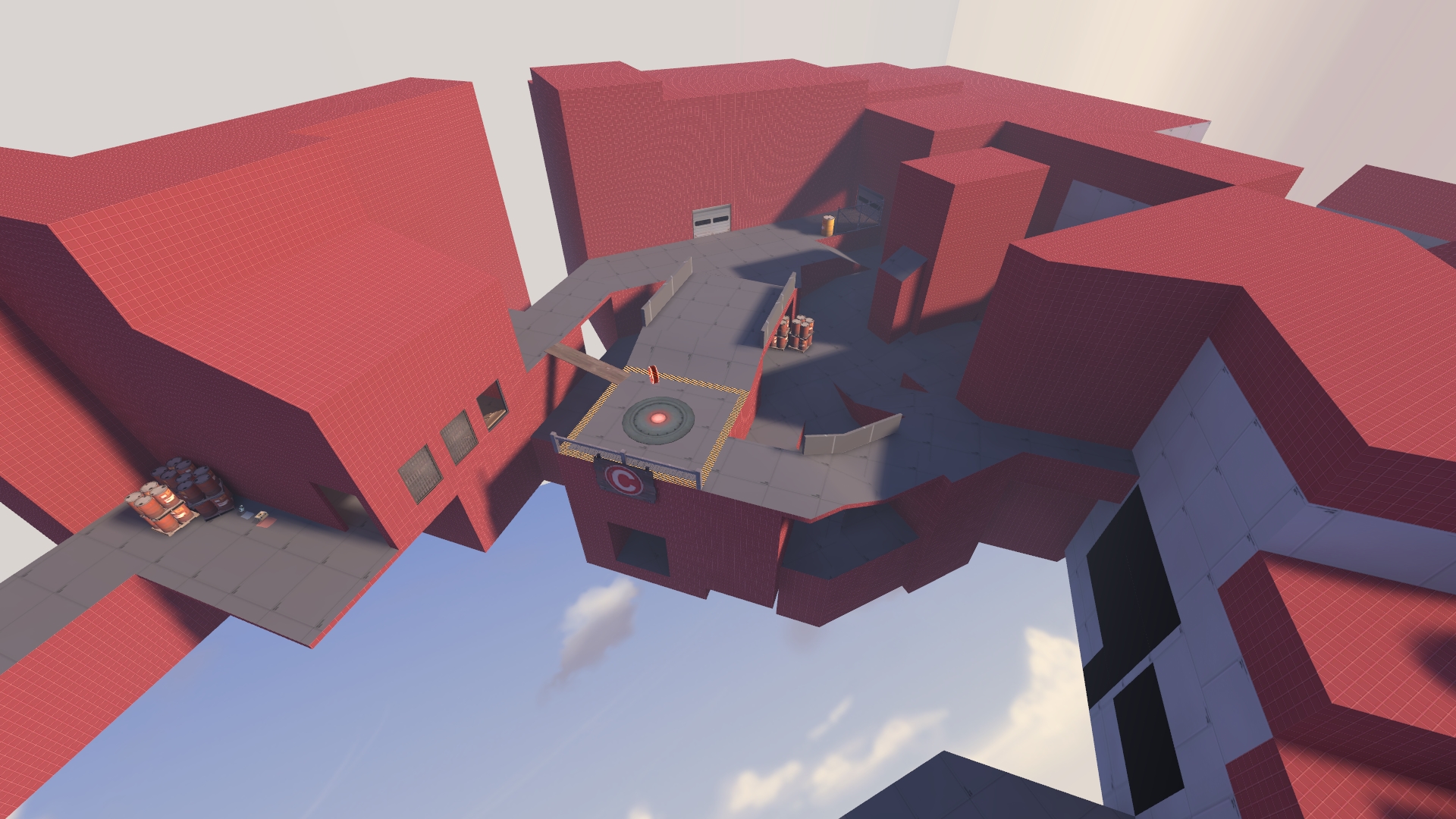
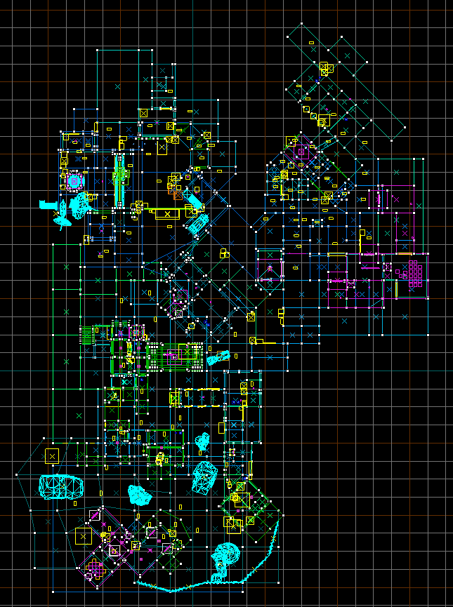
i think C on the new theory is getting out of hand

f3b98gi.jpg


here's the new path being added in more detail

aCJjGlS.jpg


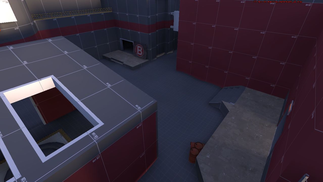
reconstructing the rest might encroach on where B is though, so i might have to redo B to fit this better next (which is fine, because i haven't built blu a forward spawn yet and dont like where i initially planned to have it anymore)

hqG7kyP.png


btw, red now has a shortcut right to A out of their spawn room

Cwgfs81.jpg
 
Last edited:
Apr 14, 2013
662
344
192468A019E84427E6D107534D289DFA69B981C7

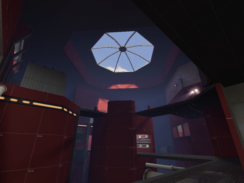
The lighting is obviously WIP. The picture is taken from a flanking route, that you can't clearly see the point from (the point is on top of the big red octagon in the middle, but I was afraid that it wasn't obvious enough).
My solution, to make the point more visible: The cp_gorge sunroof, is casting a nearly perfect light reflection on the wall, to make sure that the people would look at it, and hopefully this, with a bunch of spotlights I'll add soon, would be enough to attract the attention. (Yyler thanks for your lighting tutorial that gave me this idea)
 

radarhead

Basically? Kind of a Huge Mess
aa
Mar 6, 2013
1,044
627
Those hay bales were stacked by the magical powers of paste special. I'll obviously pretty that up during the detailing process. I just wanted something to indicate that the area there is blocked by a clip brush.
Why are you using paste special on what are hopefully just static props?
 
Oct 6, 2008
1,968
451
Just got back from vacation - here's my mpl_doublehelix update - looks like the custom HUD is now working just a couple of more things to do with it - I'm getting some z-fighting with the red cart coding and am trying to fix it + got rid of all

mpl_doublehelix_b2-04.jpg
 

LeNitrous

L2: Junior Member
Feb 11, 2015
57
10
I might aswell join in the fun... A preview of RED Courtyard for my upcoming 3CP Domination map. Environment Lighting needs some angle changes since I'm not really happy with it. Overlays broken. Won't show up for some reason.
[EDIT] No lighting indoors. Just pointing out my error.
2015_08_14_00001.jpg
 
Last edited:

re1wind

aa
Aug 12, 2009
644
588
[snip]

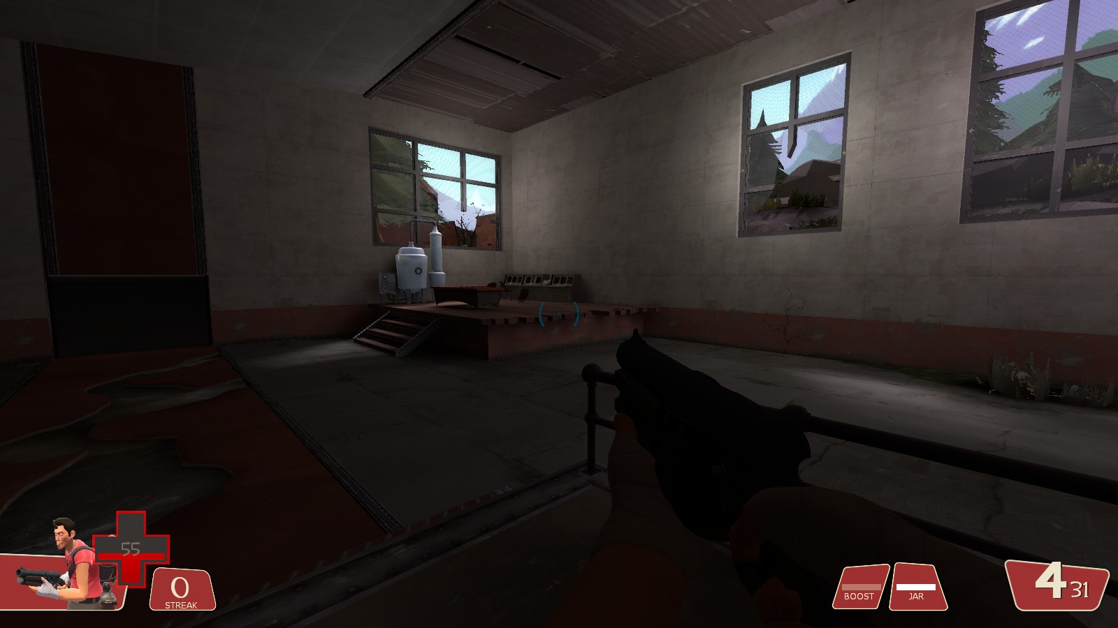
If you're not sick of crusoe yet, boy you will be. But, i made it thundermountain and ran a full compile and its turned out pretty nice i think.

those bloom and hdr settings look a bit too much for tf2's style, imo. There seem to be lots of high-contrast areas not created by textures but from light intensity: the white wall by the lighthouse, for example. Reducing the bloom may help with alleviating the apparent contrast, but some of the indoor/darker areas may still require some extra lighting. And/or don't use white textures for brushes exposed to direct sunlight, but that will make shadowed and dim areas even darker.
 

LeSwordfish

semi-trained quasi-professional
aa
Aug 8, 2010
4,101
6,597
those bloom and hdr settings look a bit too much for tf2's style, imo. There seem to be lots of high-contrast areas not created by textures but from light intensity: the white wall by the lighthouse, for example. Reducing the bloom may help with alleviating the apparent contrast, but some of the indoor/darker areas may still require some extra lighting. And/or don't use white textures for brushes exposed to direct sunlight, but that will make shadowed and dim areas even darker.

yeah, thundermountain uses darker textures a lot: i'll start playing with settings.
 

SSX

aa
Feb 2, 2014
392
411
Just doing some detailing. (And a shit ton of clipping)

3Wrf8th.jpg

6WvFhwd.jpg

fKEPWsy.jpg

mVpYcQb.jpg

dSmLU8q.jpg

tECtKnp.jpg