WiP in WiP, post your screenshots!
- Thread starter Arhurt
- Start date
You are using an out of date browser. It may not display this or other websites correctly.
You should upgrade or use an alternative browser.
You should upgrade or use an alternative browser.
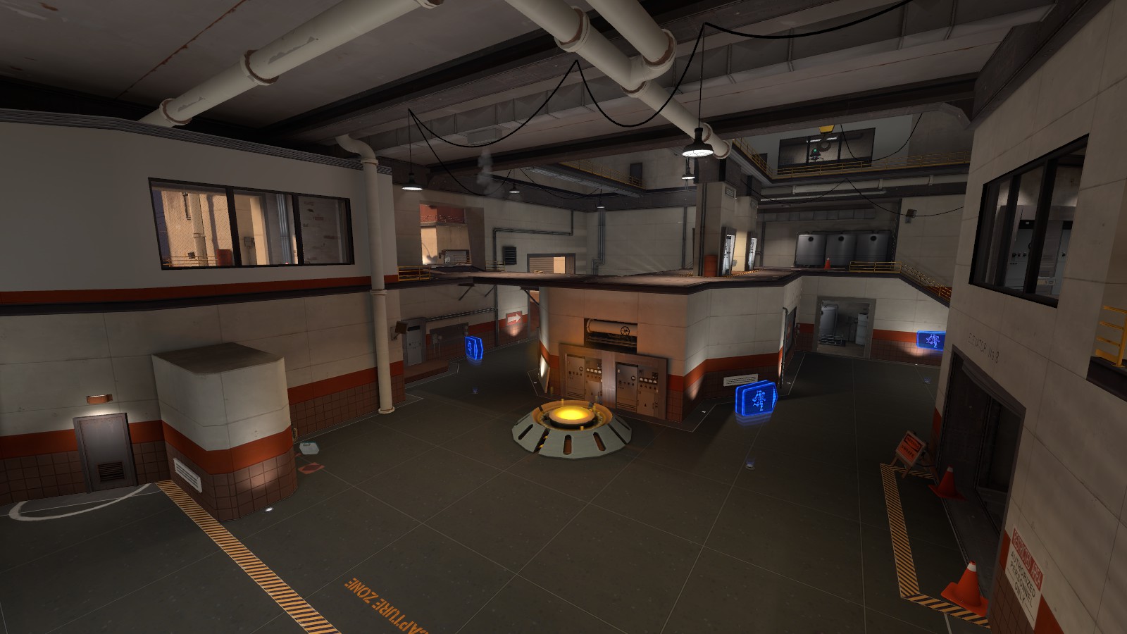
Just doing some detailing. (And a shit ton of clipping)


Holy mother of Batman does this look amazing.
SSX
aa
- Feb 2, 2014
- 392
- 411
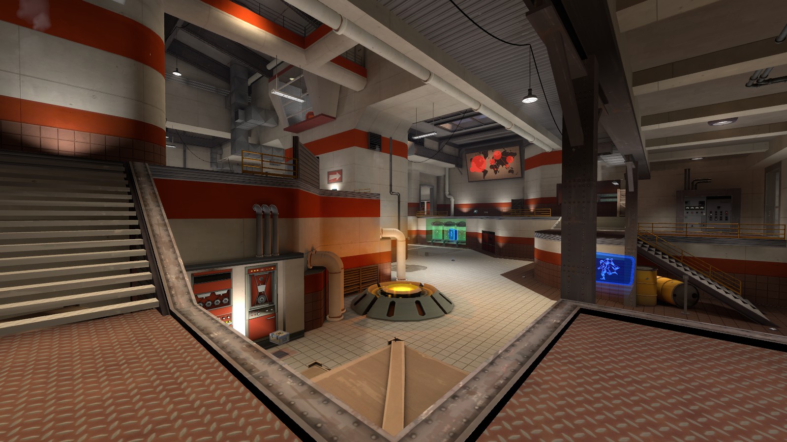
Looks great so far, Shadow, but I'm wondering why the team colors are brighter outside and more weathered inside.
Probably gonna sound stupid, but I did the outside brighter because I wanted to make a more vibrant distinction between blue and red's side. When you're in the middle and in combat, it's easy to get turned around in a koth map because you were fighting. So I made the colors brighter outside to give a better feel of which direction you're facing. Given, yes, there's a shit ton of other visual ques to this but I wanted to just make it a little more obvious.
My first attempt at making a custom weapon skin. I used the colours from the Japan pack to try and emulate Suijin's visual style. I apologise for my shit graphics and crap selection of skins to replace:


I only replaced the 'main' texture for each skin so some of them still look a tad weird. I also plan on making a red version. What do you guys think?
Also I need a name, and it's a tricky subject to come up with puns on.


I only replaced the 'main' texture for each skin so some of them still look a tad weird. I also plan on making a red version. What do you guys think?
Also I need a name, and it's a tricky subject to come up with puns on.
Woozlez
L3: Member
- Jul 28, 2010
- 129
- 287
Lampenpam
aa
- Mar 23, 2013
- 1,013
- 347
I hope Valve will include custom community created skins at some point.
You know what, I'll email my contact at Valve tomorrow and ask him about this.
It is very certain that this happens anyway. There are already custom skin entries at the workshop and since this is a CSGO inspired update, then we know where this is going. Don't bother valve with a question, they probably got plenty of already
That pit makes no sense in the context of the theme. Farms are on large flat areas, and some cobblestone pit to hell has no business eating the hard workers on the fields.KotH_plum
Small map
Granary theme
- Snips -
I really hope future skins will be avaiable for non-stock weapons as well. Don't we all have festive, australium, and various botkiller stock weapons?
Can you currently test custom-skins only on stock weapons?
The system for skins is only setup for weapons that officialy use any. Right now the only way of making a custom skin is to replace the funny textures.
Tutankabron
L1: Registered
- Feb 23, 2013
- 27
- 49


