WiP in WiP, post your screenshots!
- Thread starter Arhurt
- Start date
You are using an out of date browser. It may not display this or other websites correctly.
You should upgrade or use an alternative browser.
You should upgrade or use an alternative browser.
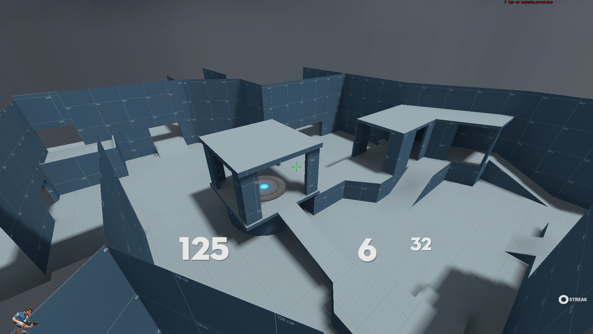
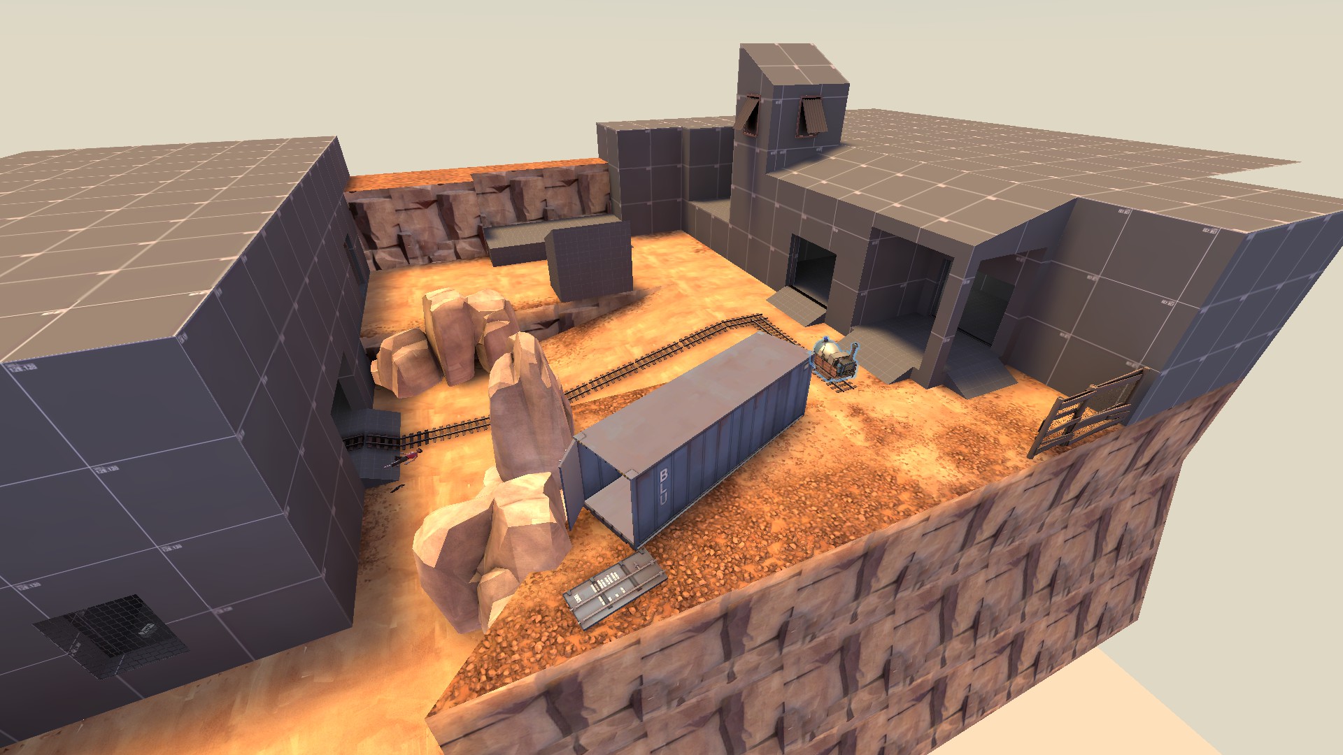
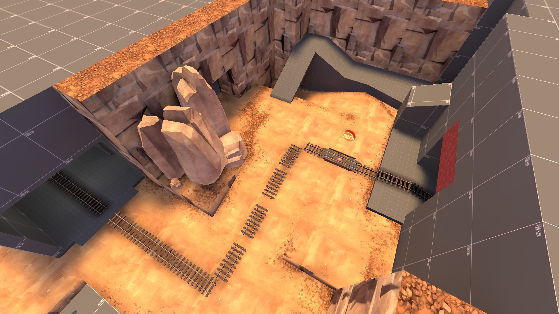
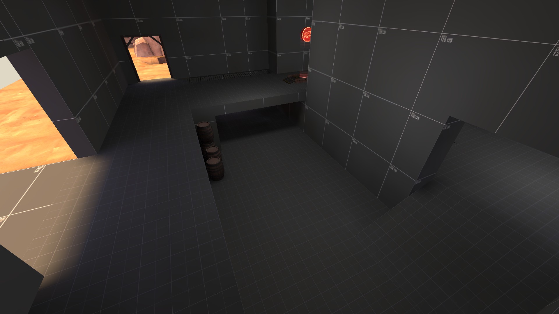
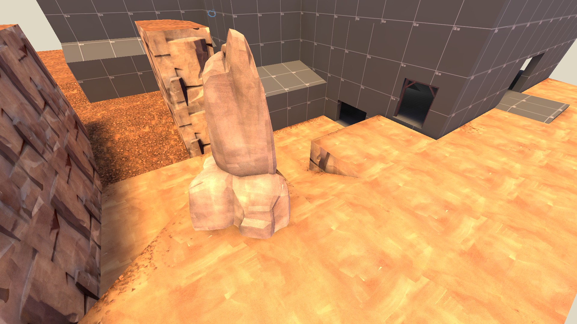
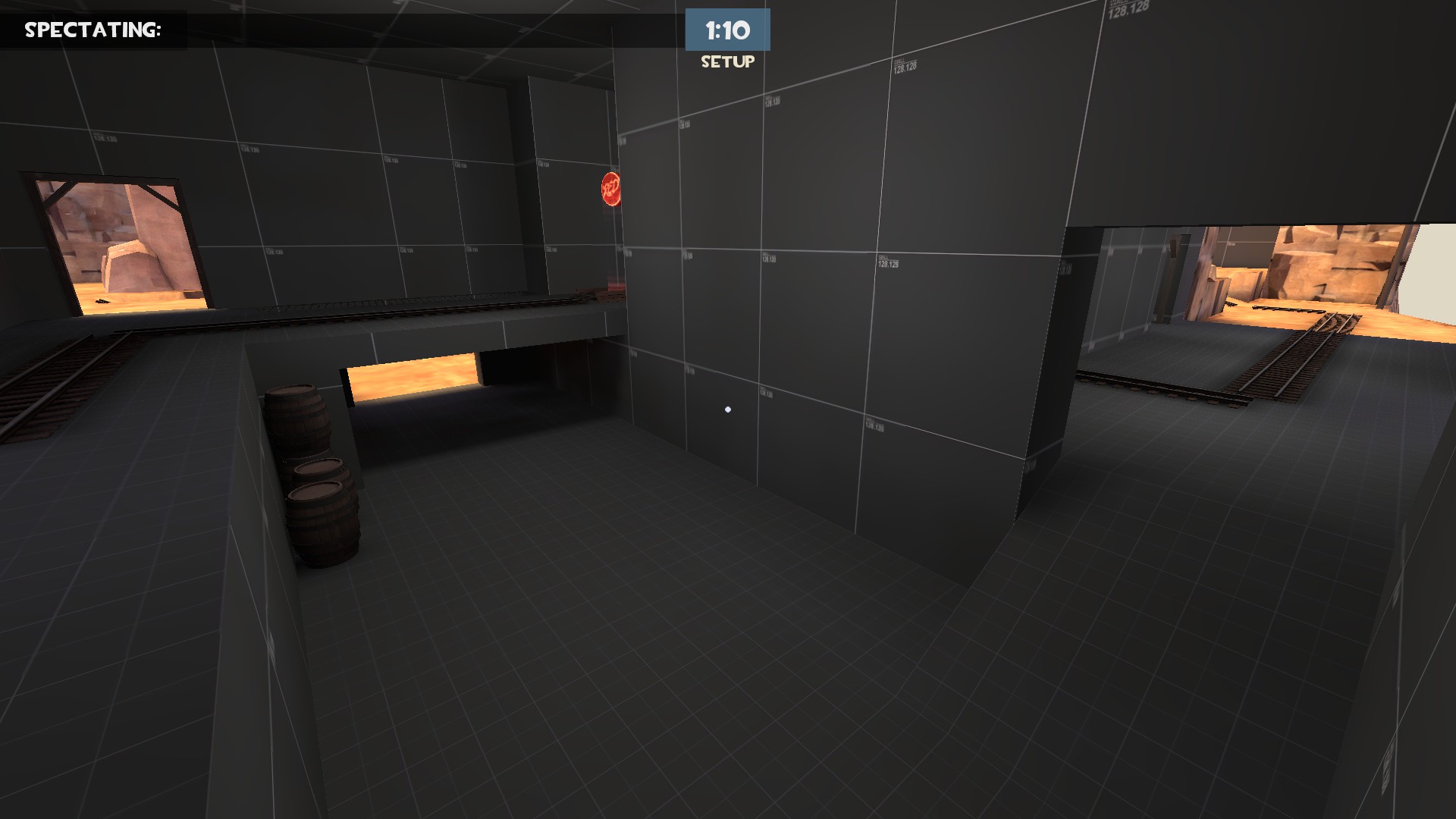
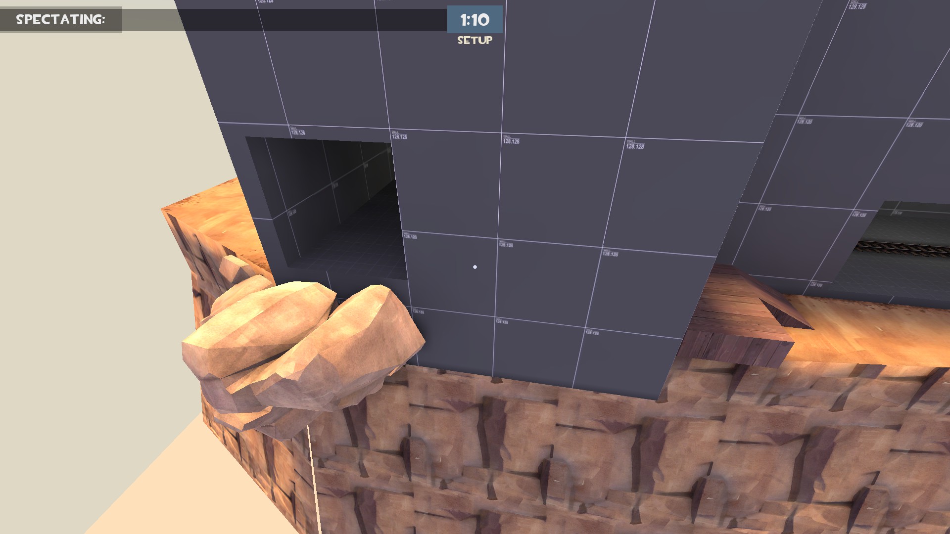
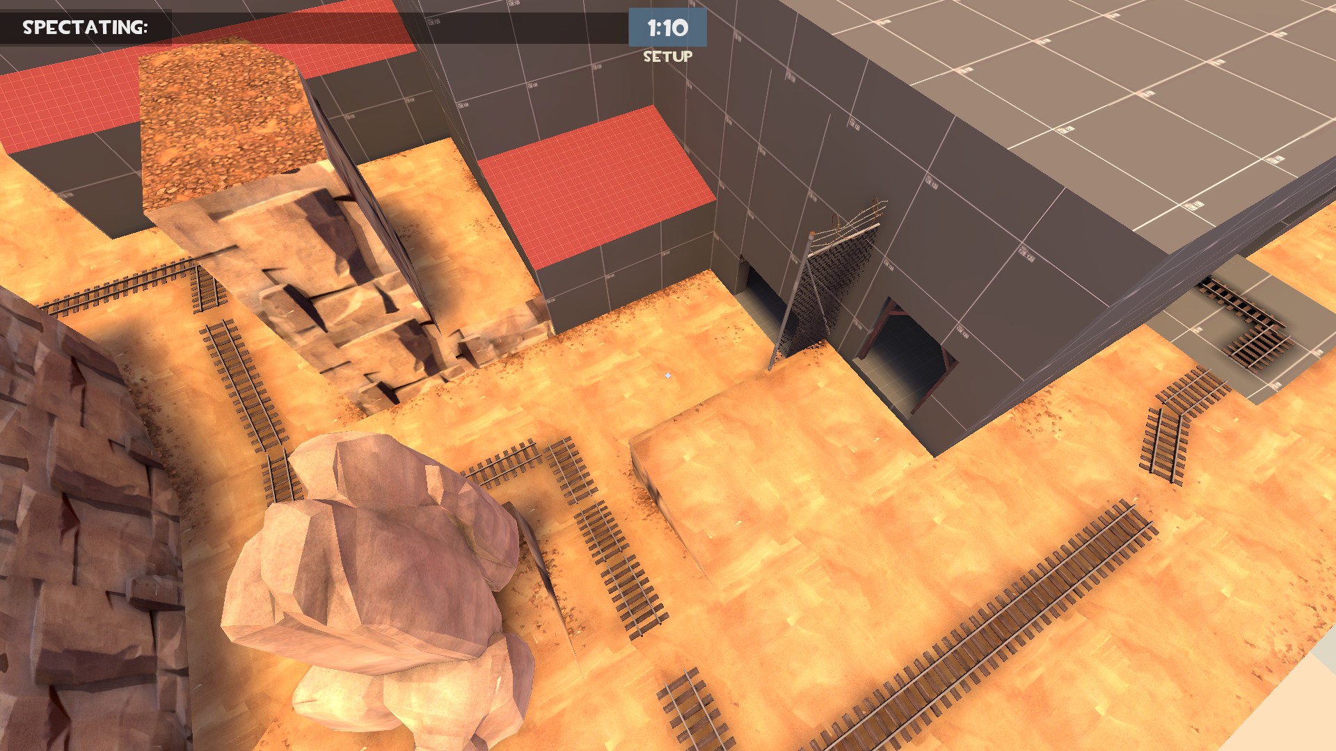
[ wip and shitty lighting and a lot of useless/not-deleted-yet geometry ]
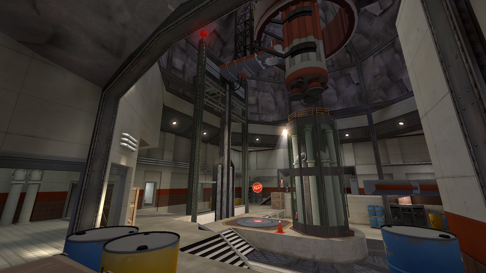
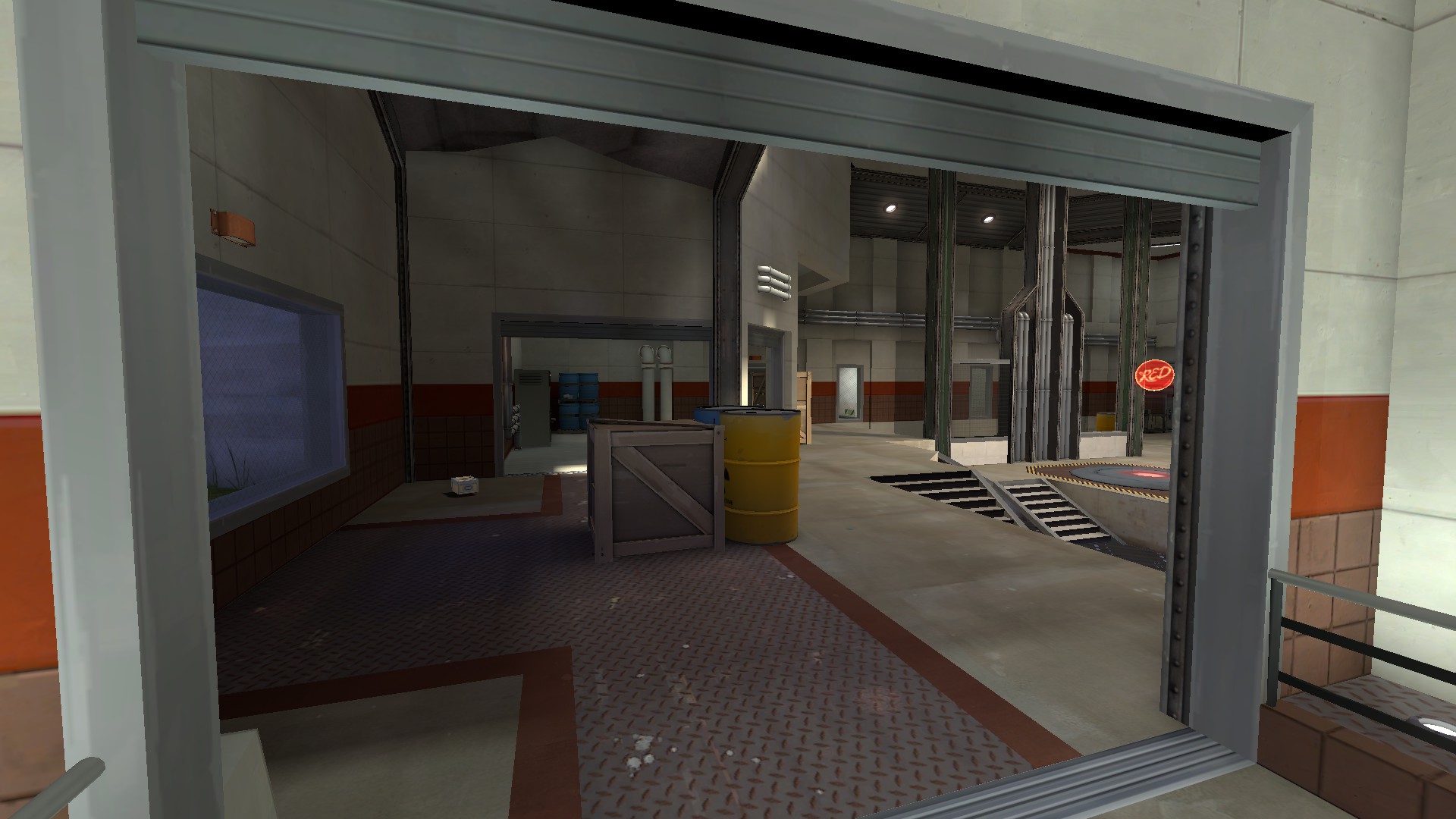
I like that new structure behind last a lot more than the previous. Good change!
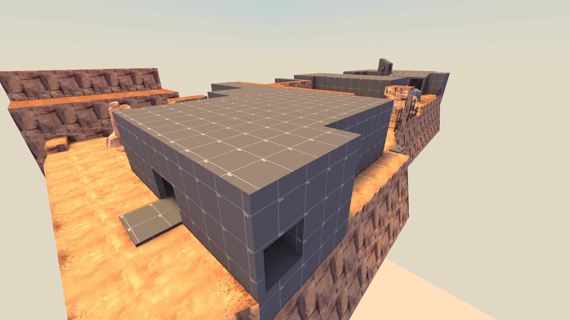
[ wip and shitty lighting and a lot of useless/not-deleted-yet geometry ]
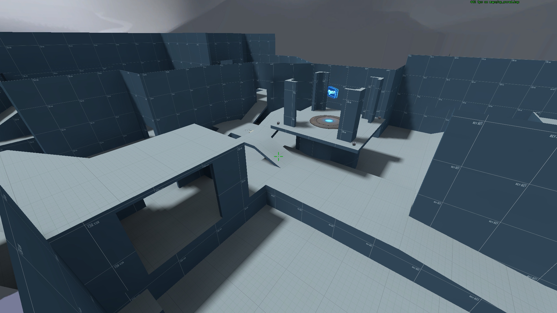
-pretty images-
This has a lot of potential of becoming official.
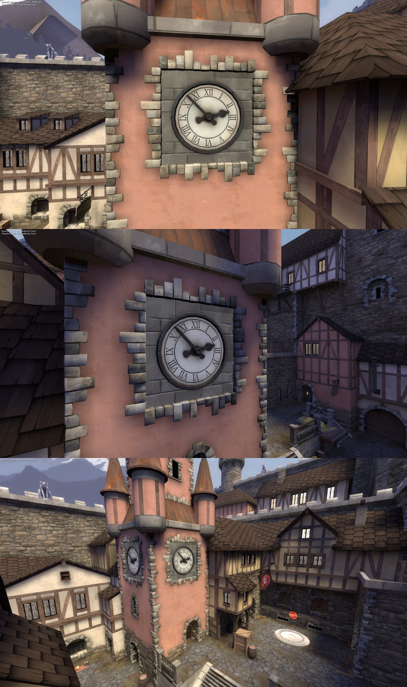
I've made a prop for the tower but I'm having a hard time deciding whether the design really fits in visually:
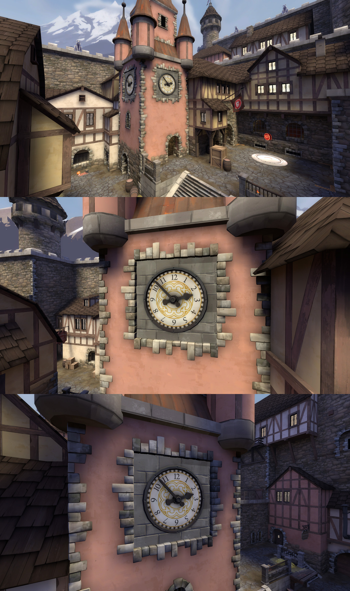
I think it looks too noisy and has too sharp looking texture.
I've made a prop for the tower but I'm having a hard time deciding whether the design really fits in visually:
-snip-
I'd say that the prop looks excellent, but you might have to rework the tower's brushwork to make the tower's function clear.
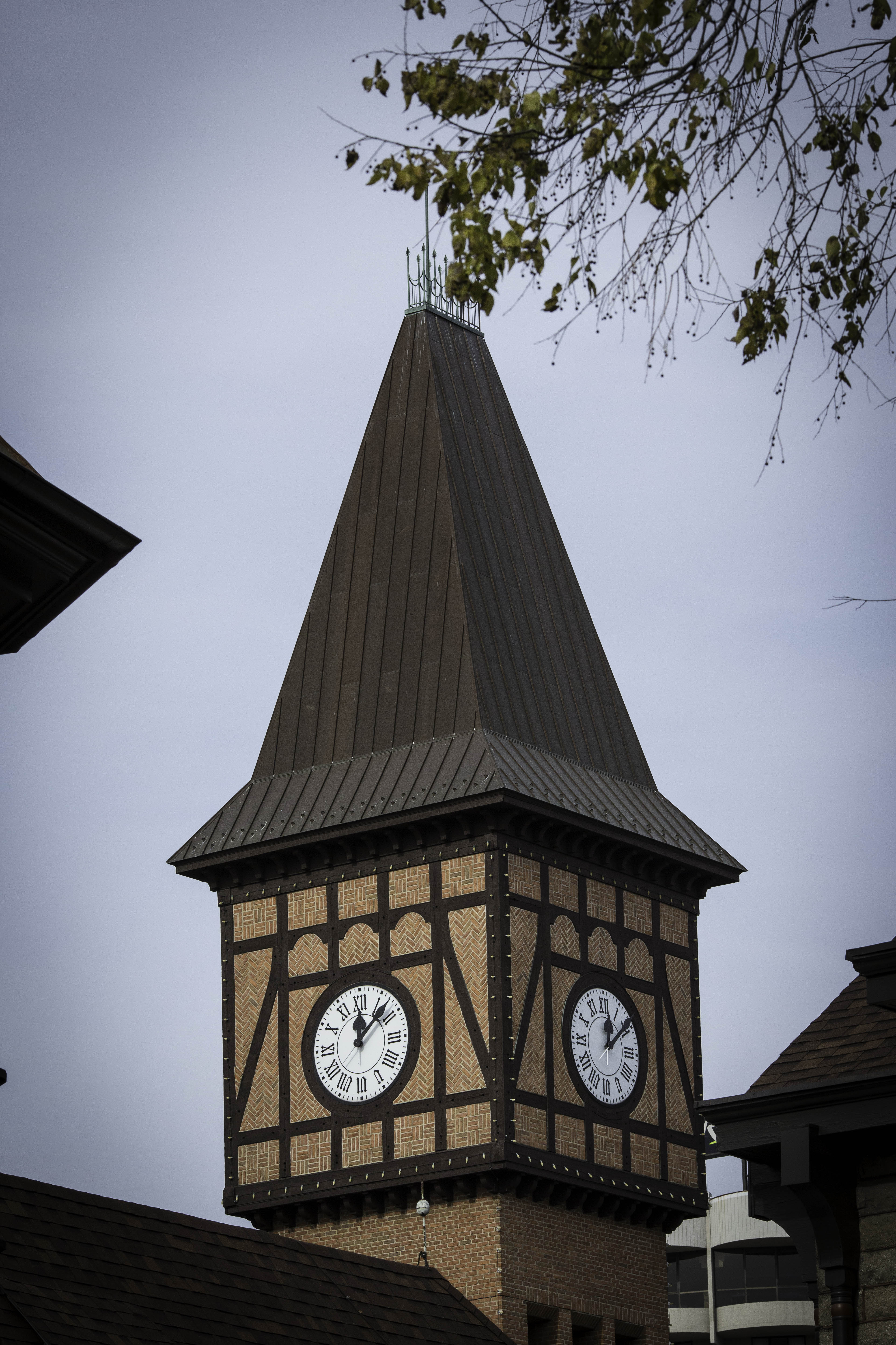
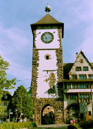
In the end, you might just want to bring the clock to the top portion of the tower, and making the clock portion larger(?), even though I would argue it looks good in the place it is now.
I'm very excited to see such a polished Medieval style!
Last edited:
Reduced the details on the clock:
-snip-
Oh, that's certainly better. Scrap what I said earlier about the placement of the clock, this version looks great where it is.
Maybe I'm wrong, but I feel like a clock tower makes the most sense when it is high up and can be seen by most of the town. I guess the point needs to have a landmark, but a clock tower like that where only a few people in the street can see it seems strange. Although... that's just assumption. It might be really common.
EDIT: Or maybe the tower in the picture can be seen by most people. I can't really tell for sure
EDIT: Or maybe the tower in the picture can be seen by most people. I can't really tell for sure
Last edited:
https://www.youtube.com/watch?v=TGsdhv-77pE
A little update on Smissmas Eve, Seasons End and my upcoming map, Sandsnake!
A little update on Smissmas Eve, Seasons End and my upcoming map, Sandsnake!
To me even that clock looks a little noisy, especially at the distance people will see it from.
Kill_the_Bug
aa
- Oct 6, 2008
- 1,969
- 451
The problem isn't the clock - it looks great! The problem is the edge of the clock face where it meets the bricks - it's too clean - sharp 90 degree angles? Smooth it out or try to do a round set of bricks to help soften the look.


