WiP in WiP, post your screenshots!
- Thread starter Arhurt
- Start date
You are using an out of date browser. It may not display this or other websites correctly.
You should upgrade or use an alternative browser.
You should upgrade or use an alternative browser.
any screenshots?
Very soon, I just need to finish the logic and recompile
Hooray!
Alrighty! After a month or two of learning hammer and regurgitating information, i'm almost ready to release my first map!
(Are areaportals/other stuff important for an alpha?)
Notes:
Anyways, here it is! It was originally gonna be called spacebound, but I somehow typed in spaceage, so w/e
koth_spaceage/spacebound/whatever
Inspired by:
Screenies:
http://imgur.com/a/ngtsL
(I dunno where some of my screenshots went, but they aren't that important.)
Too lazy to re-type all the descriptions and stuff, as well as individually link it. Once i make my actual post i'll bother, don't worry
The story: On an abandoned forested hilltop littered with former industry, Red and Blue are fighting over an [as of yet unconstructed] rocket-silo hidden inside the hill. The rocket just needs to be fueled with either enough RED-TROLIUM or Blue Baby Oil (tm) to blast off.
Even if it's crap, I tried hard and had fun and learned a lot
Alrighty! After a month or two of learning hammer and regurgitating information, i'm almost ready to release my first map!
(Are areaportals/other stuff important for an alpha?)
Notes:
- *half the map is missing (since it's koth)
- The displacements are godawful, as it was my first time using them, but that will get fixed in time.
- Lighting is basic, but usable
- Currently the entire outside is bathed in blue sunlight, which I am leaving for now just to make visual clarity. Will be changed
- Going to be an alpine sunset theme, on a hill with aging abandoned buildings
- Mid is probably too narrow but i'll have to see it fullsized. Won't be too hard to change
- Doorways may be too short, might have to lower the floors
- Probably, most likely, incredibly unbalanced.
- God this is a long list
- Building in between battleground and spawns might be too narrow/cramped
- Spawn blocker building probably needs to be pushed back to make more room for fightings
- Still need to finish buildings and add clips
- Need to entity some stuff and make consistant colourings
Anyways, here it is! It was originally gonna be called spacebound, but I somehow typed in spaceage, so w/e
koth_spaceage/spacebound/whatever
Inspired by:
- Viaduct (The cliffs beside the point, the building divider; unintentionally the spawn)
- Cactus Canyon (The level geometry, as well as standing on rooftops)
- A bit of Frontier (Hills, and I think i may have developed a pointless drop-down fetish)
Screenies:
http://imgur.com/a/ngtsL
(I dunno where some of my screenshots went, but they aren't that important.)
Too lazy to re-type all the descriptions and stuff, as well as individually link it. Once i make my actual post i'll bother, don't worry
The story: On an abandoned forested hilltop littered with former industry, Red and Blue are fighting over an [as of yet unconstructed] rocket-silo hidden inside the hill. The rocket just needs to be fueled with either enough RED-TROLIUM or Blue Baby Oil (tm) to blast off.
Even if it's crap, I tried hard and had fun and learned a lot
Last edited:
snip-
(Are areaportals/other stuff important for an alpha?)
-snip-
YES IT IS. (consider these 3 words flashing brightly to instantly grab your attention)
Optimization should be done from the very first alpha release (heck you should consider it before you've even made the first brush in Hammer). It ensures that people can focus on the map and how it plays and give feedback about that rather than giving feedback about nothing other than terrible frame rates.
It doesn't have to be perfect from day one, but it should at least be done. I've seen too many maps, even on TF2maps.net servers where early alpha maps are downright unplayable because of very poor (or sometimes lacking) optimization all over the map. One area is doing fine and suddenly you're at 10 fps because the engine tries to render the entire map.
If your level isn't designed with optimization, yea, you want to get something in during alphas. Nothing heavy, area-portals, some hints if needed can help A LOT.
If you don't have it, and no one complains about frames, then you can sneak through without it.
If you don't have it, and no one complains about frames, then you can sneak through without it.
@ExtraCheesyPie
Although your geometry looks very nice, judging from the images, the map looks like it's going to be tricky to optimize. I also hope you've had sightlines in mind making this, given how open the mid is/looks like (again, it's a bit hard to judge from the pics)
Although your geometry looks very nice, judging from the images, the map looks like it's going to be tricky to optimize. I also hope you've had sightlines in mind making this, given how open the mid is/looks like (again, it's a bit hard to judge from the pics)
YES IT IS. (consider these 3 words flashing brightly to instantly grab your attention)
Optimization should be done from the very first alpha release (heck you should consider it before you've even made the first brush in Hammer). It ensures that people can focus on the map and how it plays and give feedback about that rather than giving feedback about nothing other than terrible frame rates.
It doesn't have to be perfect from day one, but it should at least be done. I've seen too many maps, even on TF2maps.net servers where early alpha maps are downright unplayable because of very poor (or sometimes lacking) optimization all over the map. One area is doing fine and suddenly you're at 10 fps because the engine tries to render the entire map.
I absolutely disagree. Split up the outdoor portions of your maps properly like any official maps do, having sky blocking above it and no sights from one side out to the other, then make sure you're doing a normal (not fast) compile or at least vvis.
FPS will be fine even on the lowest of computers, visibility is way more important than areaportals, as without proper visibility set up your areaportals won't do a hell of a lot.
How is the big yellow YES IT IS thing different from this post? He said area portals/other stuff, and by other stuff I think he means splitting areas, sky blocking, hinting etc, basically every crucial thing about optimization.
How is the big yellow YES IT IS thing different from this post? He said area portals/other stuff, and by other stuff I think he means splitting areas, sky blocking, hinting etc, basically every crucial thing about optimization.
Let me word what I have to say differently. For an alpha, I don't think you should bother doing any more than sky division and proper visibility (no sights through multiple areas). This is a lot of effort that will barely save any FPS other than on absolutely hopeless machines (you probably lose more by having to re-do these every version than by hand)
Géza!
L4: Comfortable Member
- May 12, 2008
- 183
- 40
Hmm, before I post any WIPs, I gotta ask: How okay is it to take the layout of an existing map that ISN'T from TF2 as a basis for a map?
Because I just had the grand old idea of taking cs_assault, tweaking it around to fit TF2's combat, and using it as the first stage of a Dustbowl-esque CP map, and have in fact mostly recreated the map by now in dev-textured boxy form.
Because I just had the grand old idea of taking cs_assault, tweaking it around to fit TF2's combat, and using it as the first stage of a Dustbowl-esque CP map, and have in fact mostly recreated the map by now in dev-textured boxy form.
How is the big yellow YES IT IS thing different from this post? He said area portals/other stuff, and by other stuff I think he means splitting areas, sky blocking, hinting etc, basically every crucial thing about optimization.
Yeah, I mean optimization, everything included
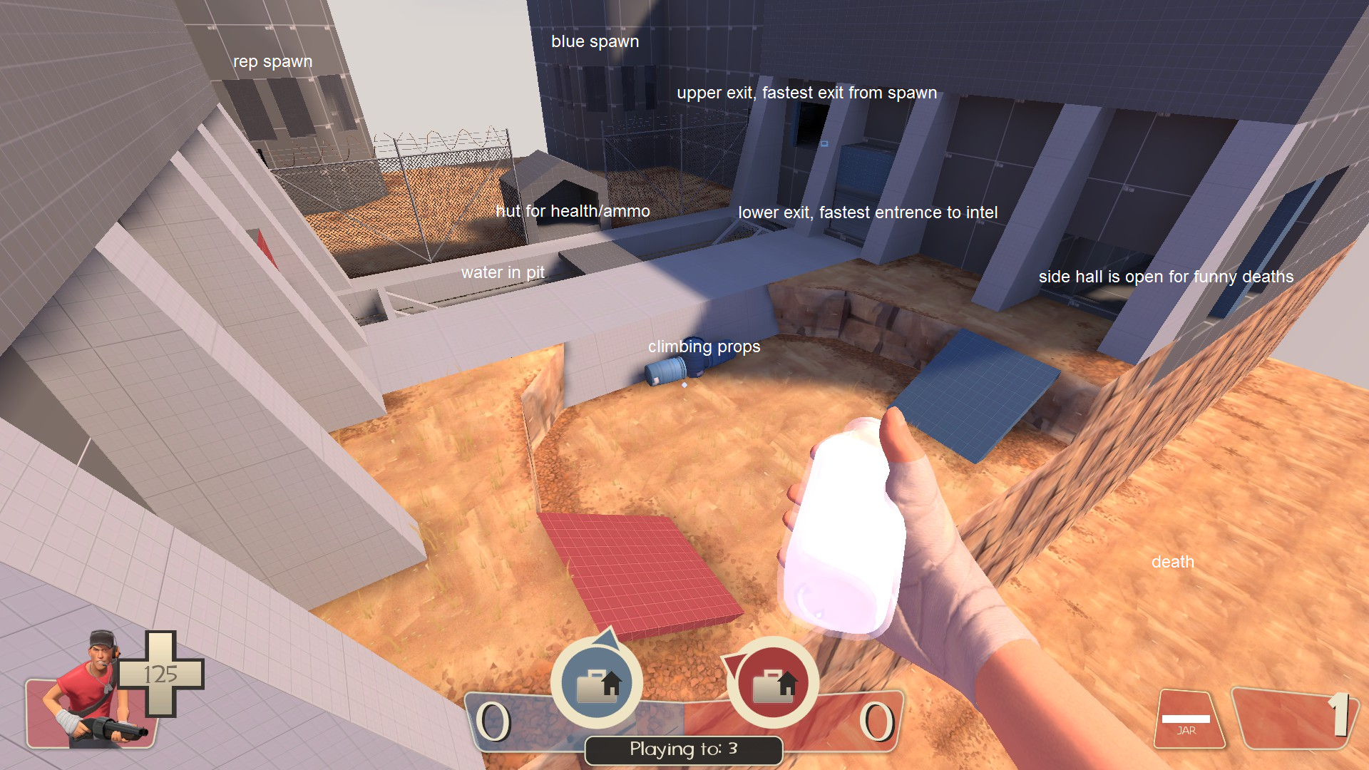
I'm back, made this map in around 2 and a half hours, lighting and prop clutter still needs to be done before im happy with it, but here's a sneak peak of mid

*red, not rep
Isn't that a little... small? And no cover?
Isn't that a little... small? And no cover?
It's about the size of turbines mid, and twice the size of 2forts mid. So nope.
Cover is part of the prop clutter I have to do, also feel like it needs a pipe or something through the middle. Should have a1 available later.


