WiP in WiP, post your screenshots!
- Thread starter Arhurt
- Start date
You are using an out of date browser. It may not display this or other websites correctly.
You should upgrade or use an alternative browser.
You should upgrade or use an alternative browser.
And I know where you can start.
Also you've got a rather large brick structure supported by wood beams... just sayin'.
I think the brick texture is fine; it's not as noisy compared to this circled area:

Even though the bricks are rather noisy, a large swath of them will blend together and be seen as mostly the same color. Creating larger areas of just brick and removing like 40-50% of your current detailing in that circled bit will increase contrast and draw the eye more.

Even though the bricks are rather noisy, a large swath of them will blend together and be seen as mostly the same color. Creating larger areas of just brick and removing like 40-50% of your current detailing in that circled bit will increase contrast and draw the eye more.
You're going to add more lights, right? Only this is looking very dark.
This is a remake thing of Commannications, using the Construction Pack!

Will it actually be functional this time?
I got spawn doors, and yes, I won't release the actual map (besides some test versions to get early layout feed back) until the points and such work right.
Woozlez
L3: Member
- Jul 28, 2010
- 129
- 287
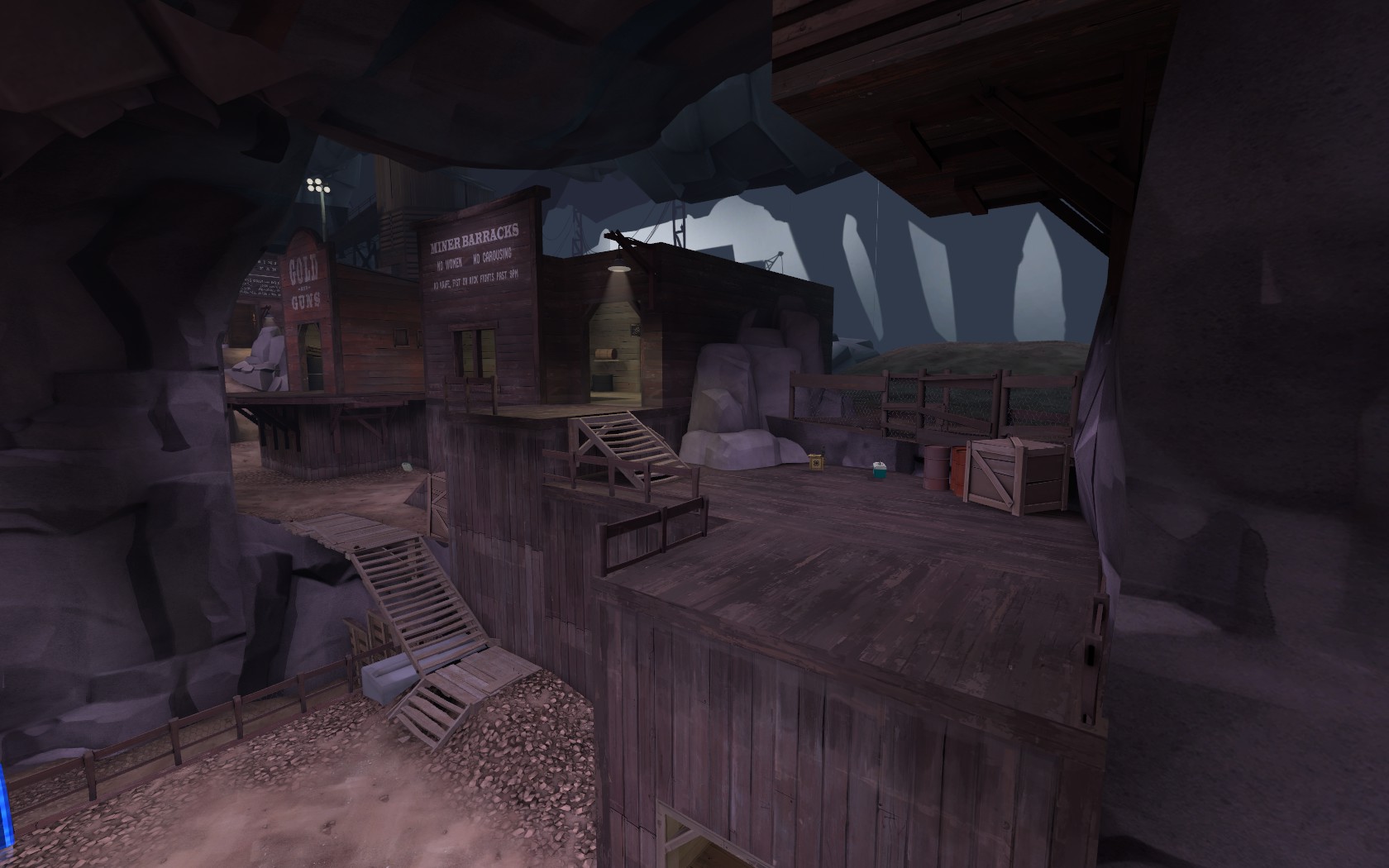
This was the previous flank to the right side of the pit in MVM Underground. I thought it was too visually distracting, especially when first entering the map from spawn.

This is the new side of the pit, which keeps the area around the pit more symmetrical and conducive to vertical combat.

You can see in an overview of the pit area that the flanking bots now get visually funneled through the cave structures, and that the stairs to access the flanking sides maintain an abstract symmetry.

When bots take the right path, it's now more obvious that the bots are dropping off towards the central path, or continuing with the flanking path. Think about the bots in Decoy, and how they flank along the high route. That's similar to what I was attempting with the varied layout on this side, but still giving the bots the chance to continue with the central path and assist with the bomb.

Finally, just another pretty screenshot of the skybox:


This is the new side of the pit, which keeps the area around the pit more symmetrical and conducive to vertical combat.

You can see in an overview of the pit area that the flanking bots now get visually funneled through the cave structures, and that the stairs to access the flanking sides maintain an abstract symmetry.

When bots take the right path, it's now more obvious that the bots are dropping off towards the central path, or continuing with the flanking path. Think about the bots in Decoy, and how they flank along the high route. That's similar to what I was attempting with the varied layout on this side, but still giving the bots the chance to continue with the central path and assist with the bomb.

Finally, just another pretty screenshot of the skybox:

Last edited:


