WiP in WiP, post your screenshots!
- Thread starter Arhurt
- Start date
You are using an out of date browser. It may not display this or other websites correctly.
You should upgrade or use an alternative browser.
You should upgrade or use an alternative browser.
Just so you know, EArkham and I kind of made a asset pack to help with that kind of thing http://japan.tf2maps.net/
Last edited:
That gives still the option of both brigther and darker.RE FOG:
it should get closer to the colour of the air as it gets further away. That is to say brighter. making each layer darker would look weird, really weird.
In portal its bright since the outer shell of the facility has major gaps in it. If that cave has it aswel then bright is a good thing, if it doesnt then darker is better to be expected. But since the roof in the playable area already has a gap, i wouldnt be surprised if other areas also have that. Brighter in that case makes more sense.
Where portal has it bright, pipeline has a dark fade.
From the mvm testing i did on that map the skybox wasnt hurting it visualy at all. The flat colors made you not get distracted at all and gave a clear border.I do think maybe the cards look a little flat, but that's only because they're solid colours, the nice things about the trainyard skybox is that there are subtle gradients in the mountain silhouettes.
They look a little cartoony but I haven't seen them in motion so don't know how they really look.
Those skycards are a cheap yet very efficient (which in mvm is important) way to get some detail in the sky at a low cost. And they are unique within tf2 aswell which is a good thing to identify the map with.
takabuschik
aa
- Apr 14, 2013
- 662
- 344
An MVM map I had an inspiration for

The bombhole and spawn, you can see the deathpit in the back.

A chokepoint near the bombhole.

A chokepoint after the first spawn, you can see the A Spawn that the Robots can capture.

The Robot's first spawnpoint and the drop down area.

The bombhole and spawn, you can see the deathpit in the back.

A chokepoint near the bombhole.

A chokepoint after the first spawn, you can see the A Spawn that the Robots can capture.

The Robot's first spawnpoint and the drop down area.
Fix your imgur links to make all images show, now we only get the first. I gave the correct urls with my comments:An MVM map I had an inspiration for
http://imgur.com/RAf0i1N
A deathpit this close to spawn can make it very easy to delay a map into a very long state. In none of the valve maps there is a deathpit this close that is easy to use. Rottenburg has it hidden quite far in the back, and coaltown has it a bit higher meaning once its in the pit its harder to get it out.
http://imgur.com/wsdYEE0
I cant see what this image is trying to show. it just shows a rough blocking area of a defense position, but it doesnt show its usability
http://imgur.com/jo6NLHk
Although the path seems clear its a bit dull to me. Its a straight rectangle path, i would try to put some objects in to force a little zigzag behaviour. Alternatively a simple slope as path itself is also capable of providing some change as in that case you get some changes in the vertical aiming.
http://imgur.com/EeMBIj5
This at least is a good screenshot to show how a defense area is ment. but again its still just a few rough blocks.
For an mvm map its quite vital to set the detail shapes quite early. These are going to provide key parts into the defense. A straight path in early playtests might not provide them building defenses, but as soon as there is 1 crate they suddenly might use it as a primary place. The strongest defense position is what people take, try to create and find these as early as possible and base the map around those.
Also, your map doesnt seem to show alot of spine's. These are blocks at more central places which are often used as a place to safely build a teleporter and at lower levels build the sentry nest. Without spines a map will become hard to defend as there are no good spots to start on. And the only option you would have is running.
And last, with mvm maps which are ment to get a shape ready. provide an overview with arrows of the bot paths. thats the best mvm indication you can have.
- Aug 6, 2014
- 1,056
- 536
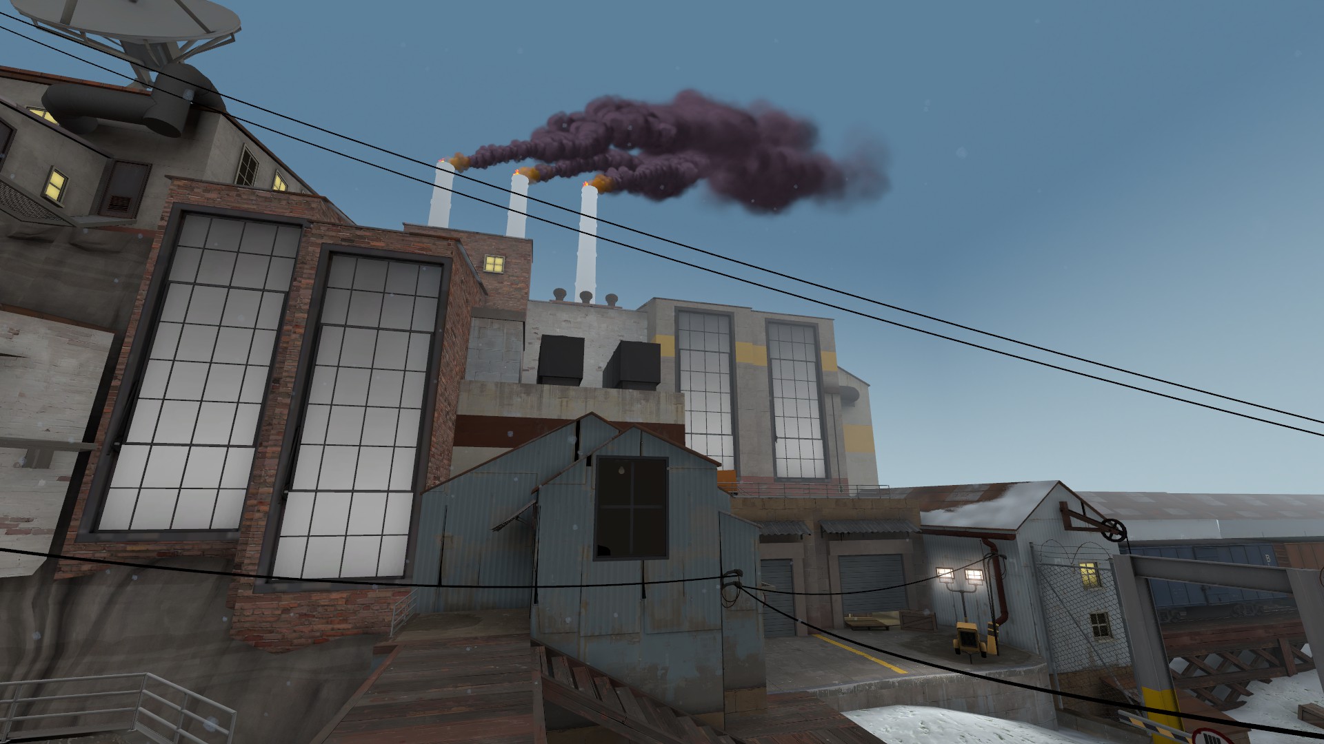
Due to Aly's 24 hour extension of the deadline to the detail contest, I updated my entry as well.

Much more cinematic and texture-variated.
You know, I'd just like to give a quick opinion on your entry:
When I looked at this, it didn't feel like, anything really. It just felt like a bunch of buildings in some snow. While I'm sure it's not actually what you were thinking: I felt like this was just something you made, only with the intention of making something look cool to win the contest. It felt very uninspired, although I can tell you put effort into it. I don't know, I guess it just doesn't feel tied together.
- Aug 6, 2014
- 1,056
- 536
... why?
mercenaries have needs too
Edit: I made it even better now.
Last edited:
takabuschik
aa
- Apr 14, 2013
- 662
- 344
mercenaries have needs too
Edit: I made it even better now.

Needs a cloaked spy hiding in the tub.
- Mar 6, 2013
- 1,044
- 627
mercenaries have needs too
Edit: I made it even better now.

Now you've done it, you've gone and broken the art style!


