WiP in WiP, post your screenshots!
- Thread starter Arhurt
- Start date
You are using an out of date browser. It may not display this or other websites correctly.
You should upgrade or use an alternative browser.
You should upgrade or use an alternative browser.
insane3004
L1: Registered
- Jan 23, 2013
- 12
- 16
takabuschik
aa
- Apr 14, 2013
- 662
- 344
T
The Asylum
takabuschik
aa
- Apr 14, 2013
- 662
- 344
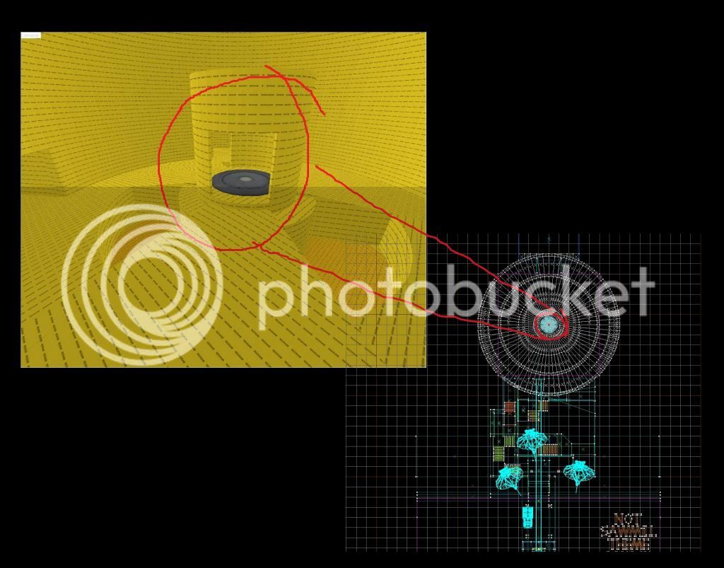
I believe that super secret message says "not sawmill THEME". Must be a 2ss map. If so, I would totally make it sawmill themed.
what??
oh that...
No, that's not what I meant. It wasn't for the contest...
EDIT: Actually that is a good idea, and since I started 2 days ago, I can make this a contest map. So I officially started mapping for the contest, without even knowing.
If so, you may make it sawmill theme, it is your decision, not mine.
evanonline
L420: High Member
- Mar 15, 2009
- 485
- 273
I got distracted
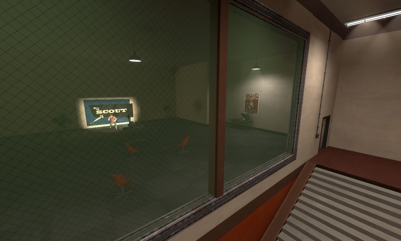
what's going on back there???
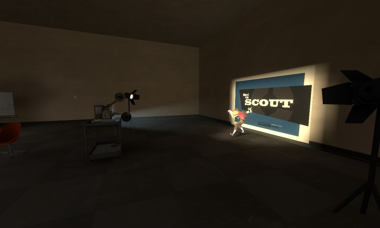
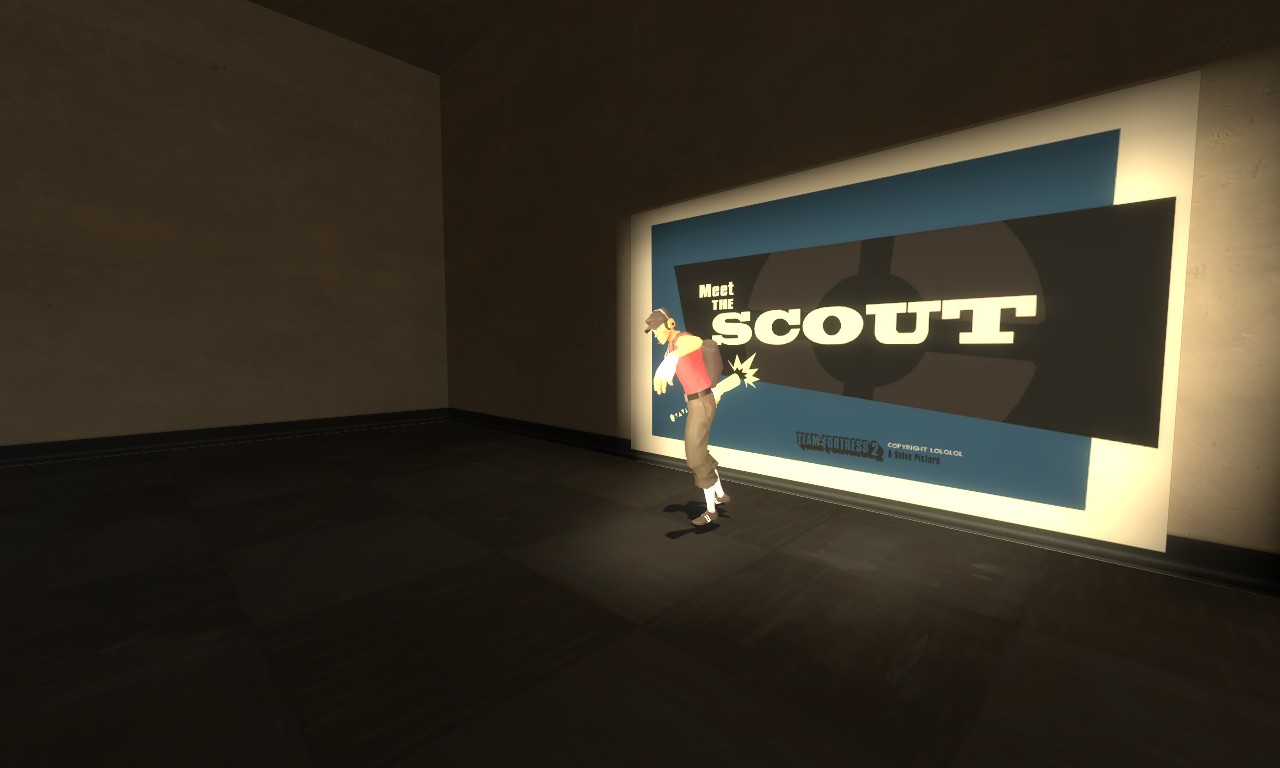
He animates a la Thunder Mountain, only put in like 2 animation cycles so far tho
The projector model is by Sgt. Frag for a model request I made years ago for making a vista room exactly like this, but then I stopped mapping. He also did a really nice projector screen model but I hadn't really thought about the fact that the MTS logo took up the whole screen when I requested a projector screen model, so I just put the screen against a wall in the back.
still needs some work but I can finally scratch that mental itch I've had for years

what's going on back there???


He animates a la Thunder Mountain, only put in like 2 animation cycles so far tho
The projector model is by Sgt. Frag for a model request I made years ago for making a vista room exactly like this, but then I stopped mapping. He also did a really nice projector screen model but I hadn't really thought about the fact that the MTS logo took up the whole screen when I requested a projector screen model, so I just put the screen against a wall in the back.
still needs some work but I can finally scratch that mental itch I've had for years
Sorry, but that just lacks detail... if you want to have a high detail model hire him:
https://www.youtube.com/watch?v=JkguBgUxvFM
(nice easter egg)
https://www.youtube.com/watch?v=JkguBgUxvFM
(nice easter egg)
nightwatch
aa
- Sep 7, 2012
- 638
- 501
Kill_the_Bug
aa
- Oct 6, 2008
- 1,969
- 451
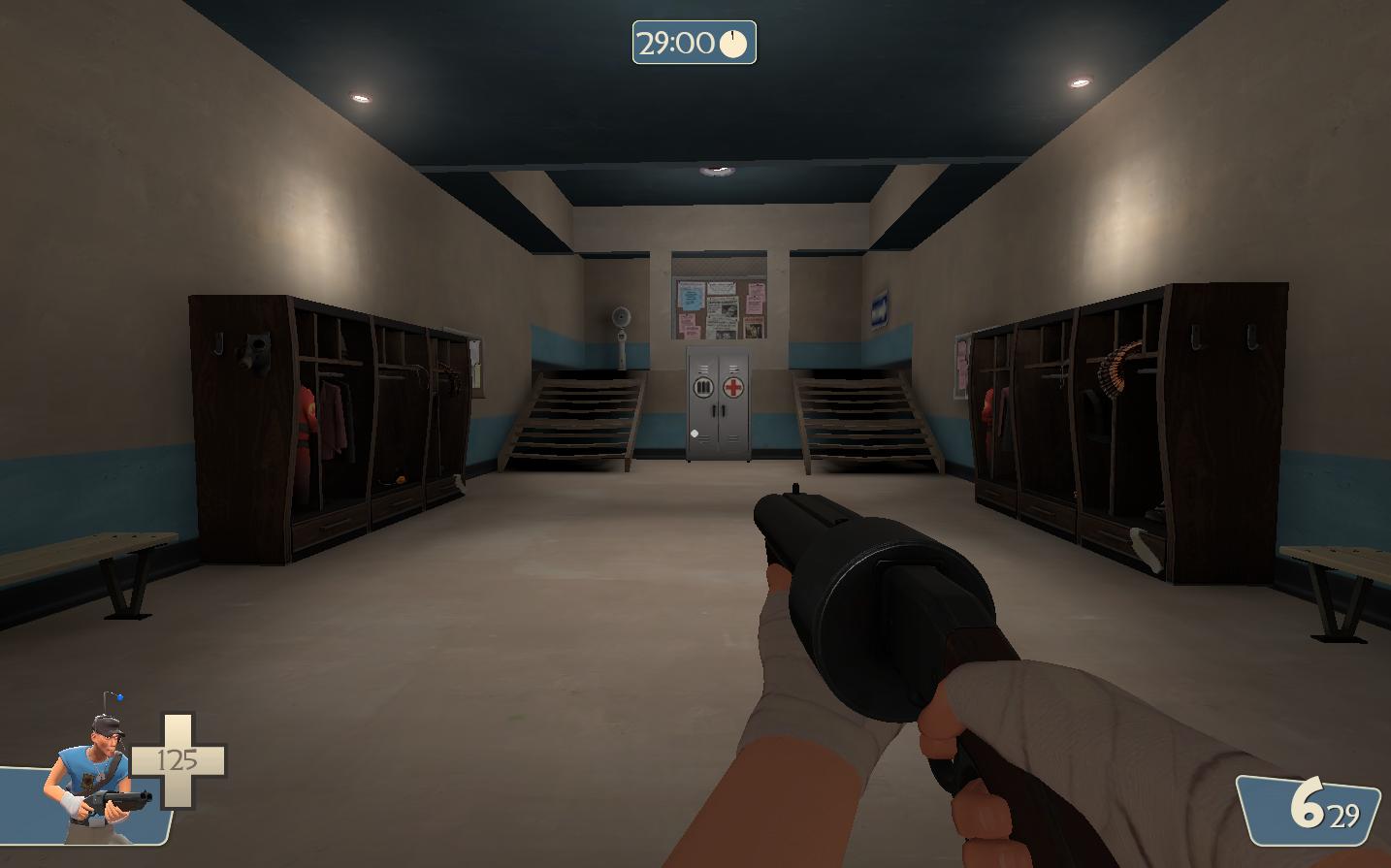
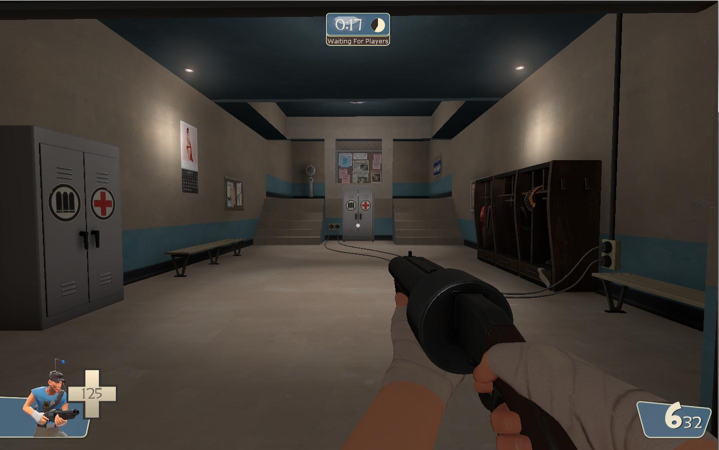
my spawn room for blu, is it good and how can i improve it?
you need some artwork on the walls - they look kind of plain - maybe a carpet overlay on the floor
you need some artwork on the walls - they look kind of plain
nvm im retarded found them


