WiP in WiP, post your screenshots!

keeks

L1: Registered
Jan 28, 2014
5
4
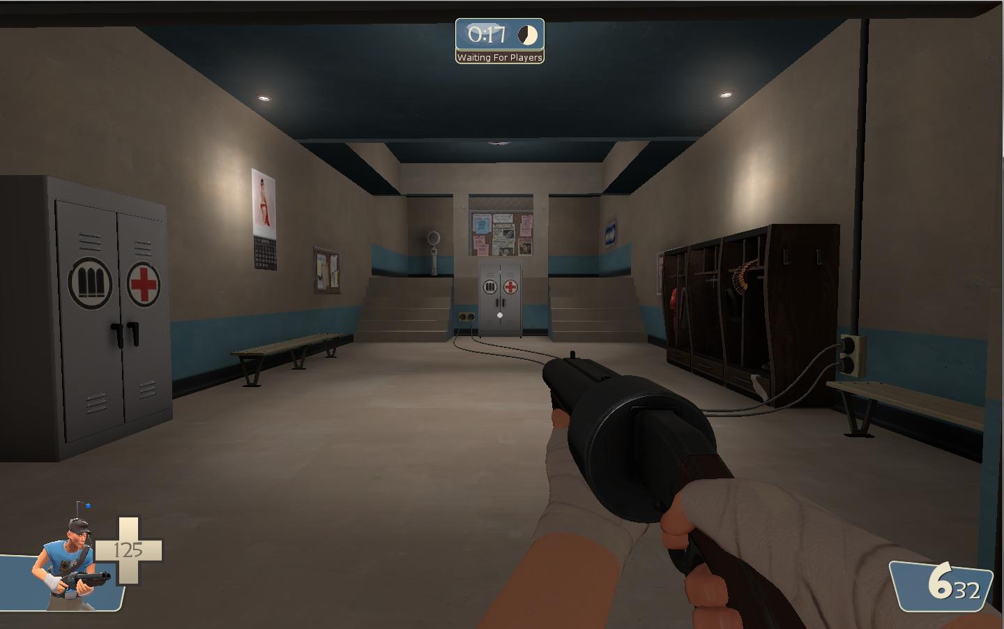
revised spawn:
eoEIHsj.jpg


is the 2nd resupply cabinet too much? idk what else to put in corner
 
Sep 19, 2010
475
499
revised spawn:
eoEIHsj.jpg


is the 2nd resupply cabinet too much? idk what else to put in corner

Don't worry too much about filling up the spawn. Players will only be in there for a few seconds anyway and it doesn't need to be beautifully detailed.

To me, it looks like you could cut off a big chunk of your spawn by moving your spawn points forward a little bit.
 

dustmotes

L1: Registered
Jan 20, 2014
18
10
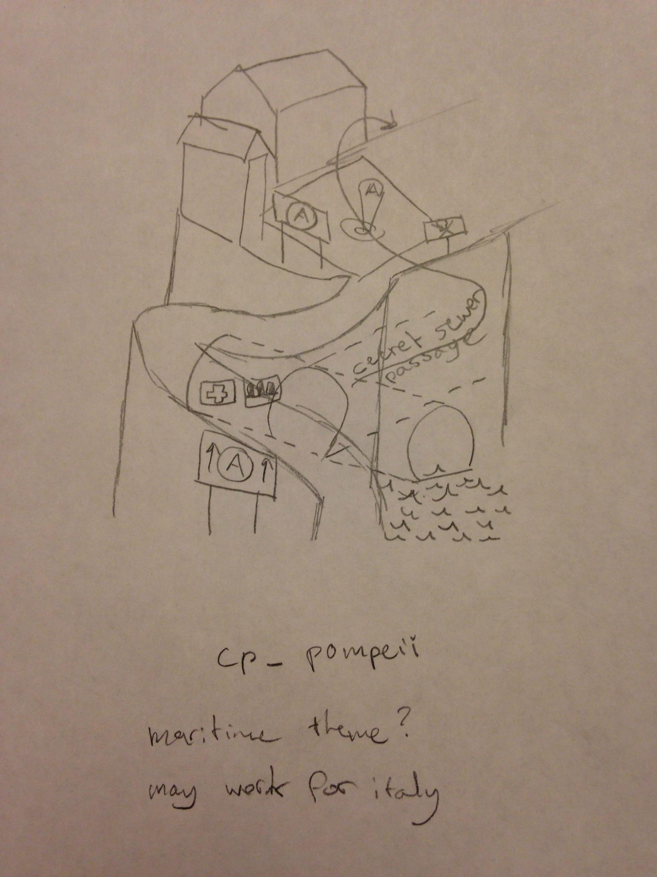
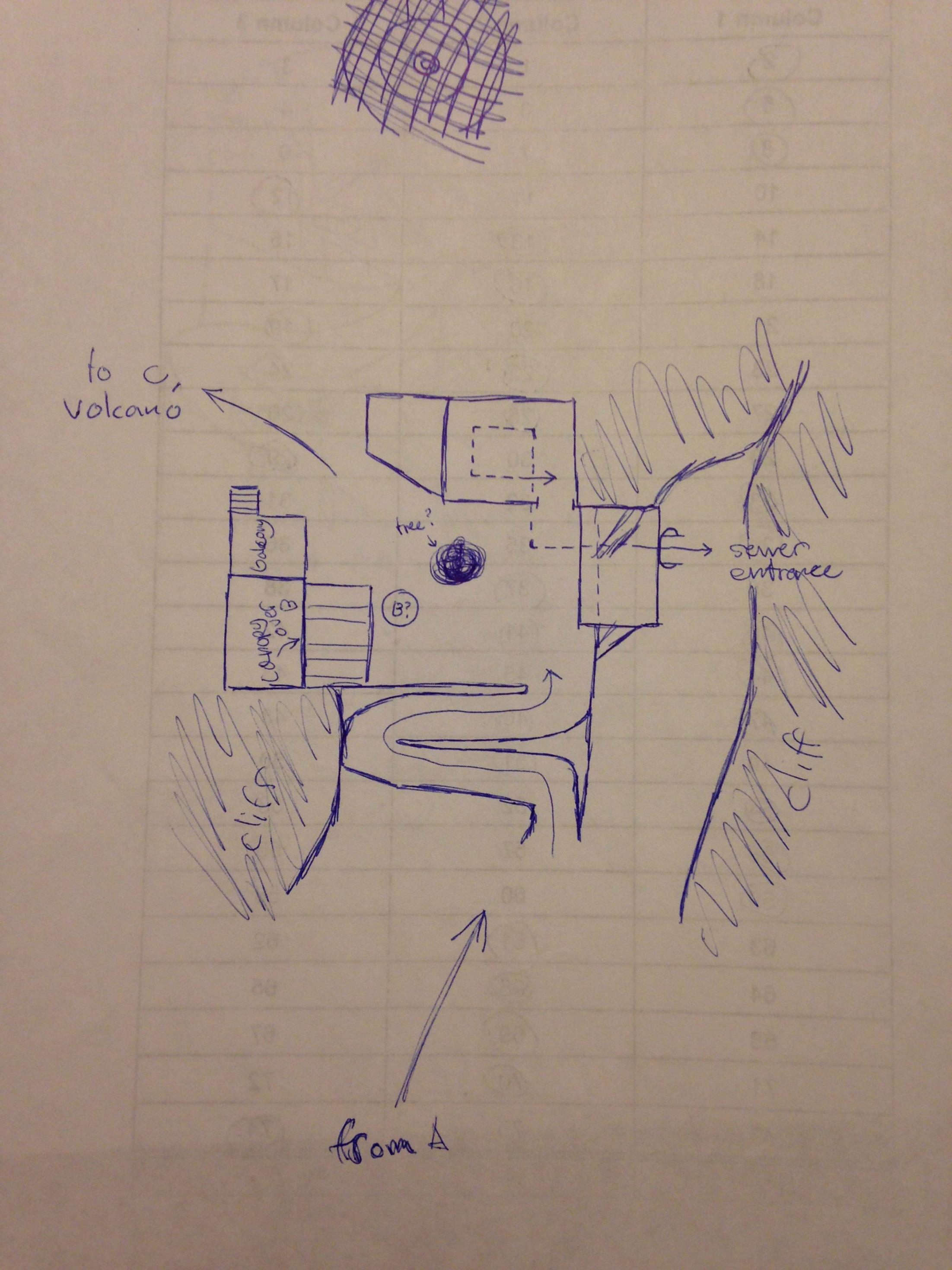
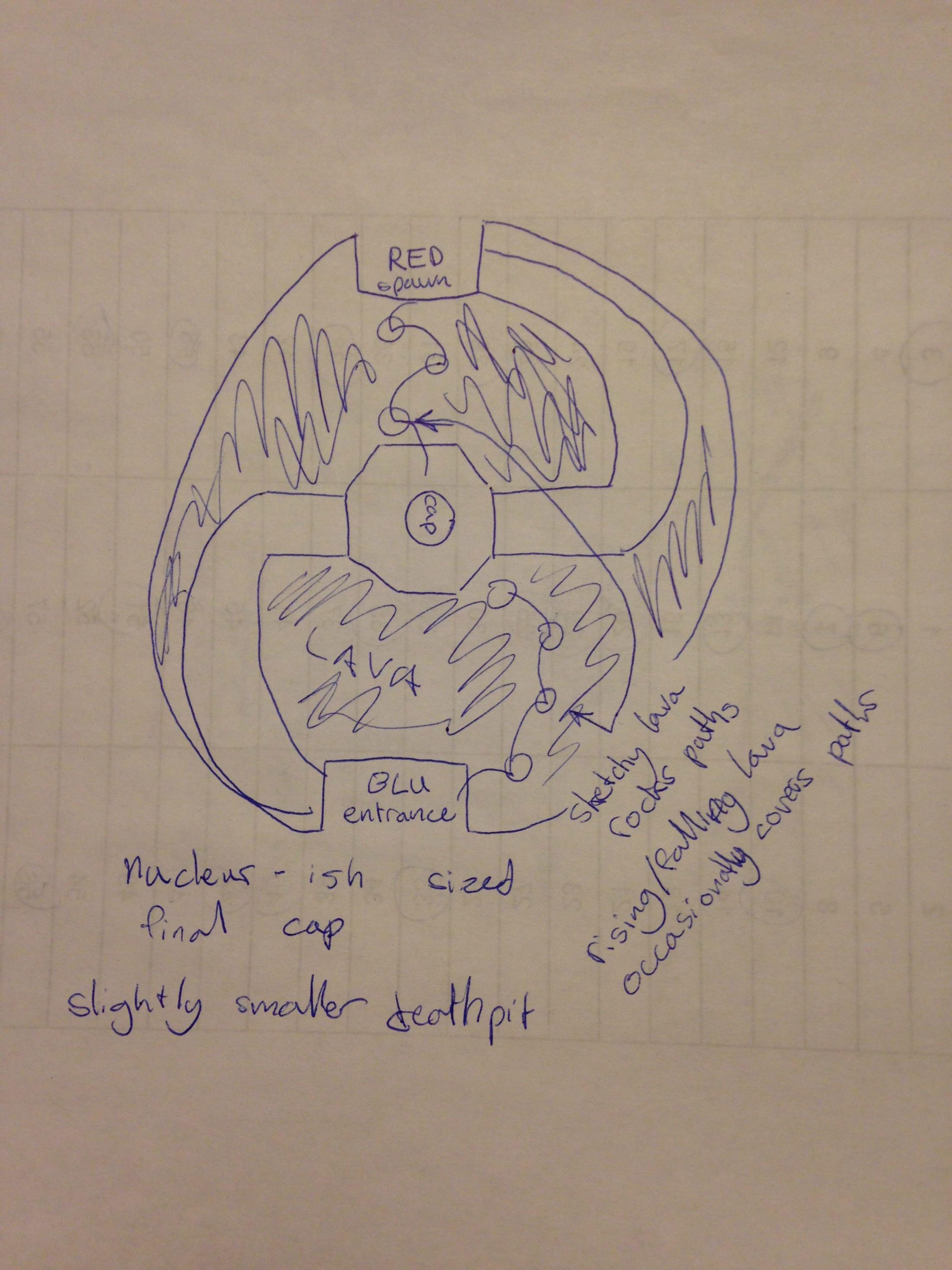
Just some drawings for a map I'm going to maybe make. I tried to make a post in the map workshop but it kept going to a blank page when I tried to preview or publish it.

JnGScnY.jpg


nrtDOea.jpg


Rqm8l11.jpg


I know, I'm really gifted at drawing.
 

Egan

aa
Feb 14, 2010
1,378
1,724
I would also try to think of areas not just as visually striking points, but also from the gameplay perspective: as a player, as your best class, what areas seem important in the gametype, what areas do you look out for, what areas do you have the most fun playing repeatedly over and over - try putting these in your map somehow. Cause while Nucleus has a great idea of a visually striking aesthetic, personally I can't honestly say I've had any fun playing that map.
 
Mar 23, 2010
1,874
1,699
looks and probably plays so much better wow
 

re1wind

aa
Aug 12, 2009
644
588
...Beautiful :eek:


Some minor issues that sprung out at me; the water and what looks like clouds attract a fair amount of attention, as they --especially the waterfall-- seem to be lit up by some light source that only affects them; the candles could use a bit more intensity to improve the scene; a light at the top and bottom of the lantern should help with soft light in the scene.

my :2cents: :)
 

Snowbat

L4: Comfortable Member
Apr 23, 2013
165
74
Some screenshots of my MvM map in progress. No trees and details yet and the lighting as well as the skybox are not as they should be neither. Plus I also plan to add a 3D skybox, but this is just to already give an idea of the setting:

Bot spawn area:
mvm_inca_3.jpg


Second area:
mvm_inca_2.jpg


Area near the hatch:
mvm_inca_1.jpg


Far from being totally done, but I'd like to have a raw version ready so that we can at least start making the missions.
 
Jan 8, 2011
397
393
It seems very open and empty - there aren't really a lot of buildings or interesting features. Look at some of the official MvM maps, they all have lots of height variation and things to block lines of sight.
I also can't really tell yet but it seems very overscaled?
 
Last edited: