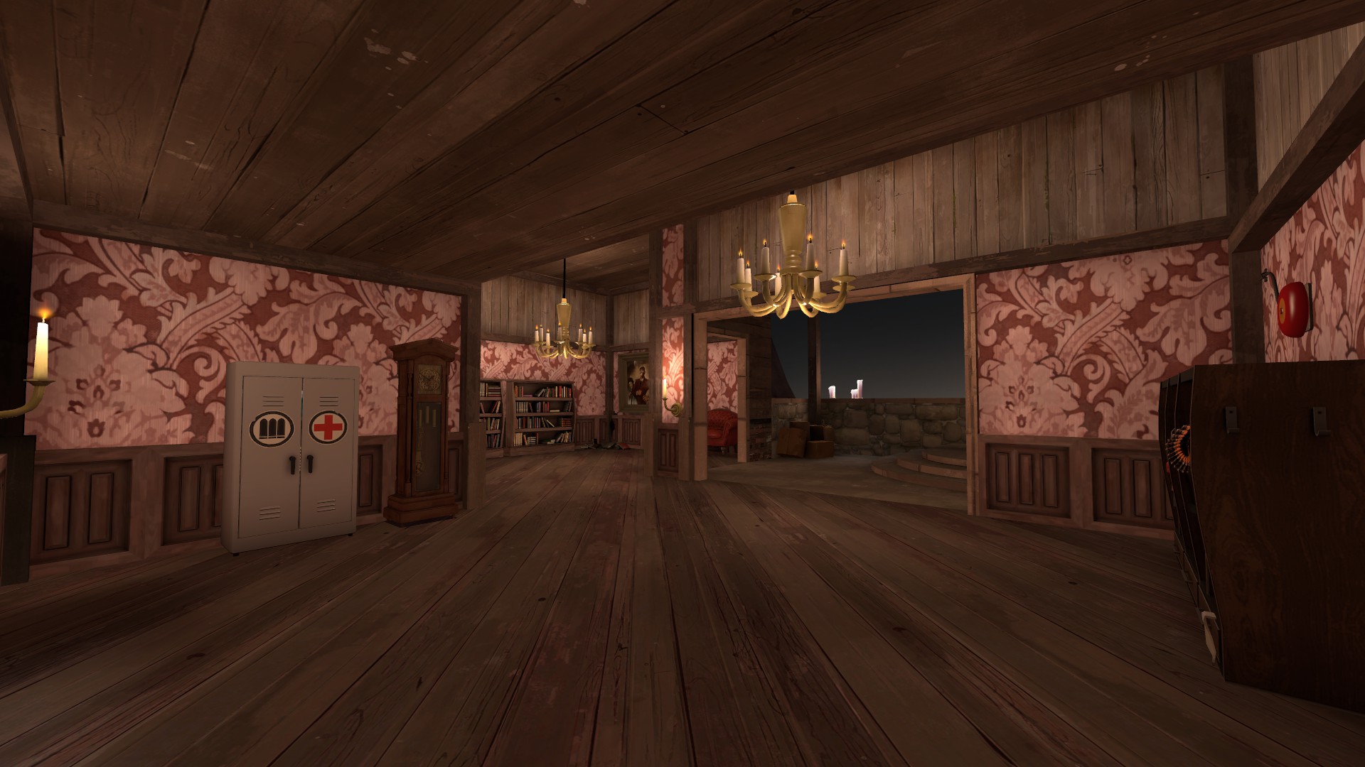
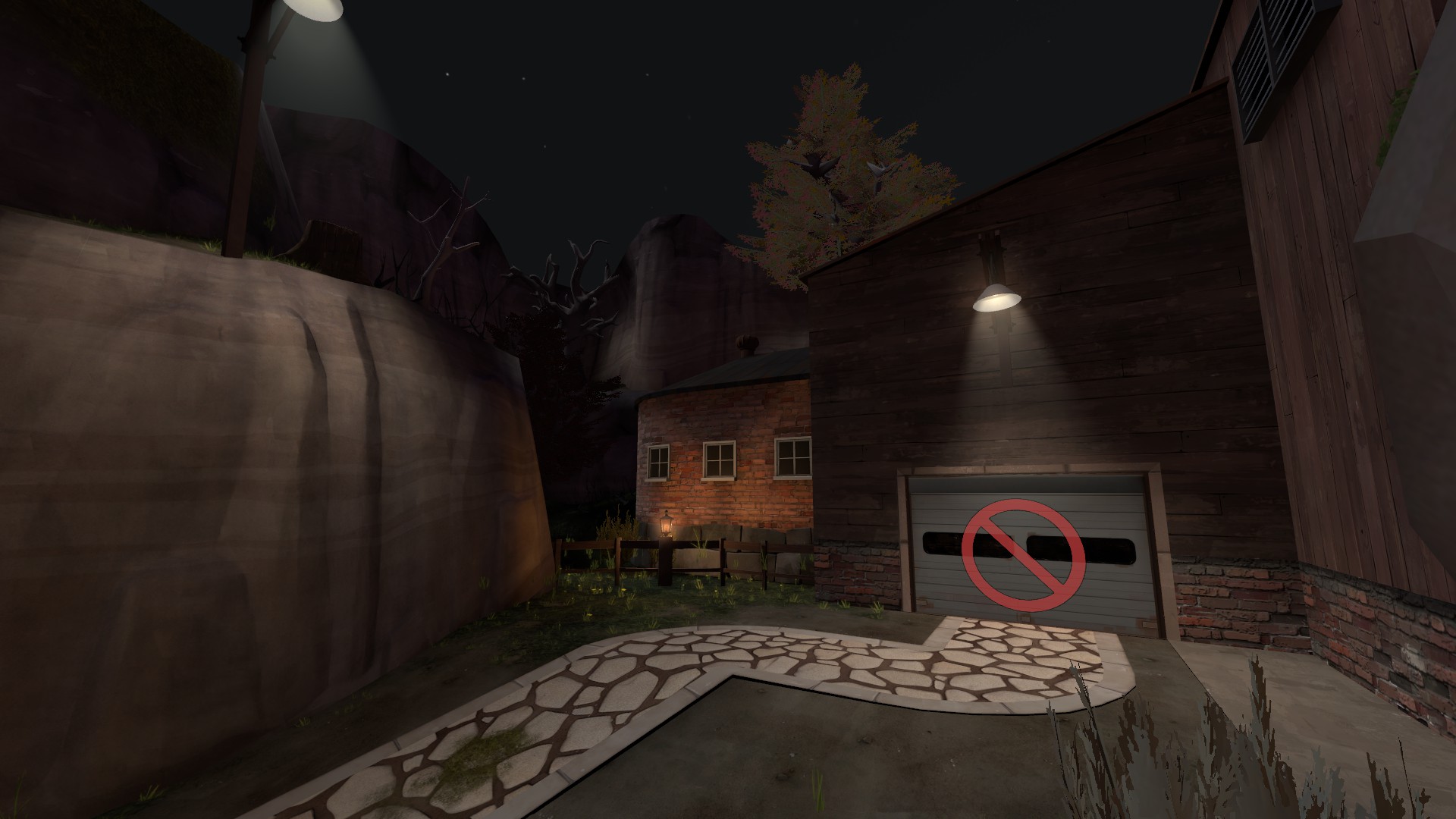
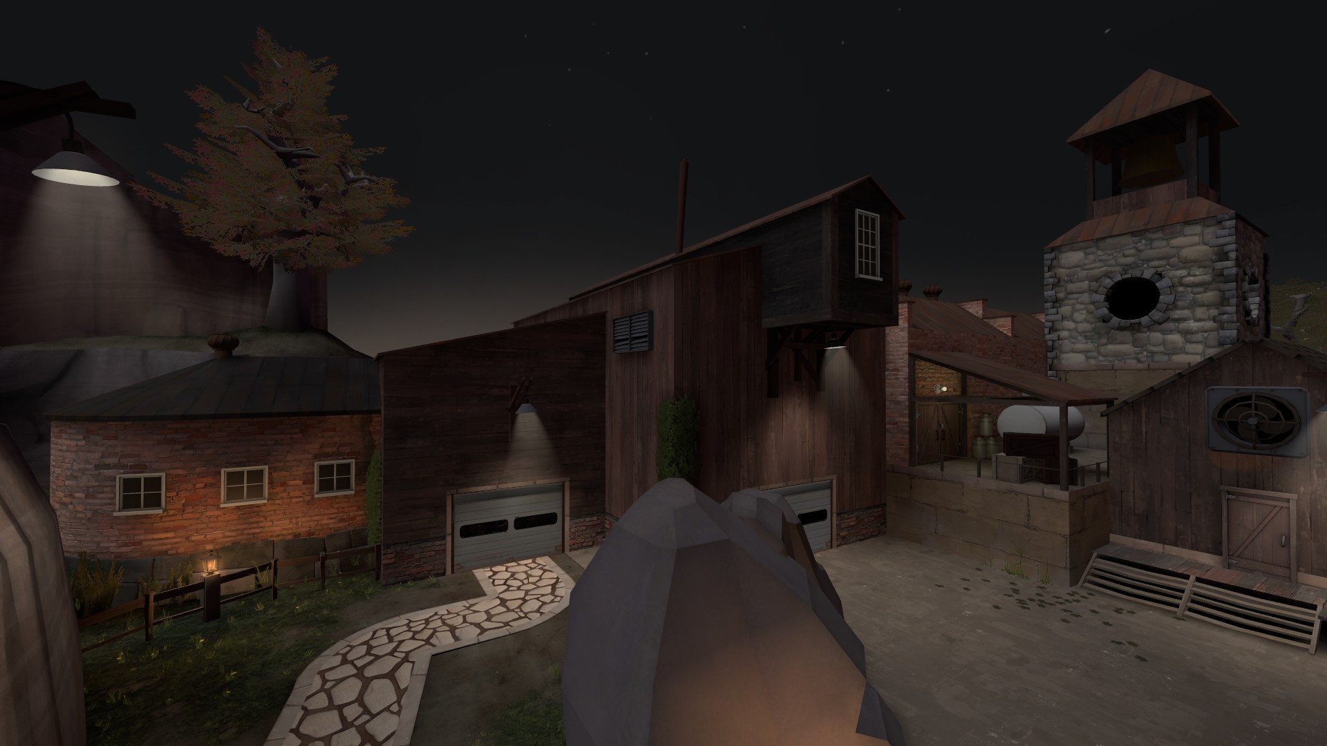
What you posted is a great indication of exactly what I'm talking about. Yes, you need cover, but how is it accomplished on those maps? A rock, a stack of wood, large containers? None of those (except Harvest, which is more similar to Coldfront than the others and thus not applicable) utilize walls on the point itself. The point is a high traffic area that should have the most combat, so you want it free from obstructions if at all possible (in this case anyway). I don't know what you could do because I'm not sure what your theme is, but I would look into other options.
WiP in WiP, post your screenshots!
- Thread starter Arhurt
- Start date
You are using an out of date browser. It may not display this or other websites correctly.
You should upgrade or use an alternative browser.
You should upgrade or use an alternative browser.
And, does anyone know of the command to make overlays be seen again in-game? I have highframes config with dx8 running and it automatically disables overlays.
your config is probably turning off r_renderoverlayfragment
set that to 1 to view overlays and sprays.
- Jul 31, 2011
- 872
- 1,021
oh hey 666 pages
I only see 167.
Default 10 post per page settings are for losers. Pros use 40.
You should bevel the edges of that stone tower. It could just be me, but the sharp edges don't fit with the rest of your buildings.
Also, rococo is underused, you're cool for using it. More people should use rococo style buildings, it sounds funny
Deodorant
L6: Sharp Member
- Oct 31, 2011
- 263
- 214
Looking neat!increased the overall brightness and ambient brightness, think i'm gonna tone it back down juuuust a bit but hey at least you can see now
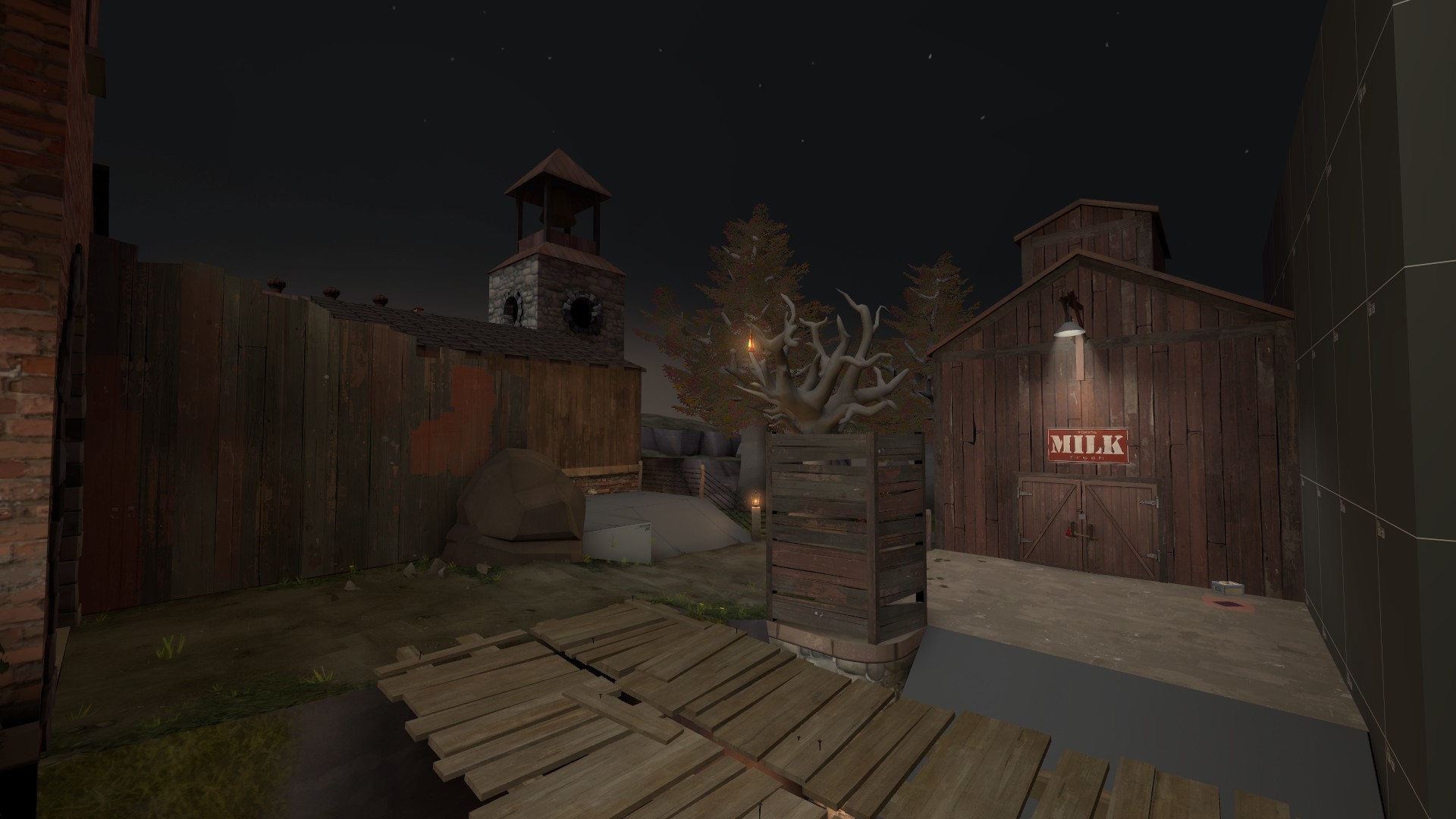
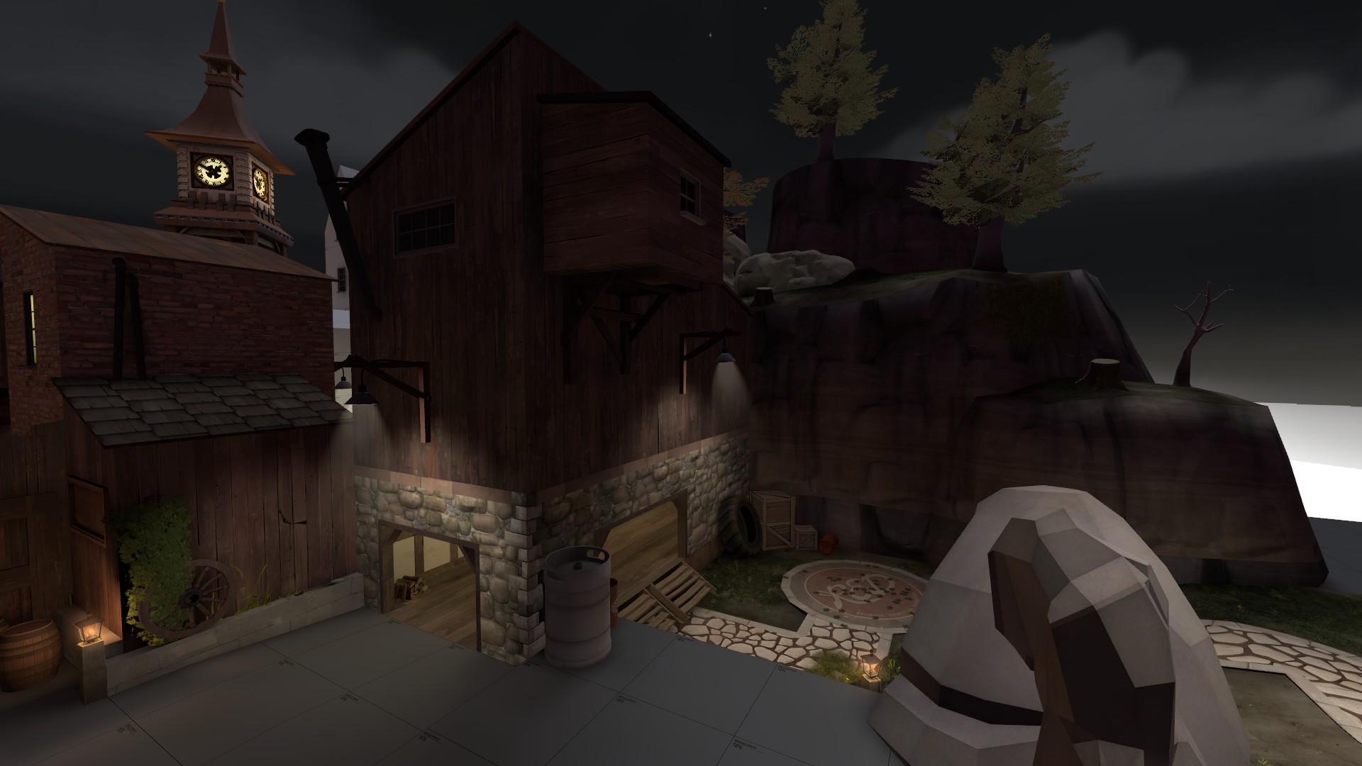
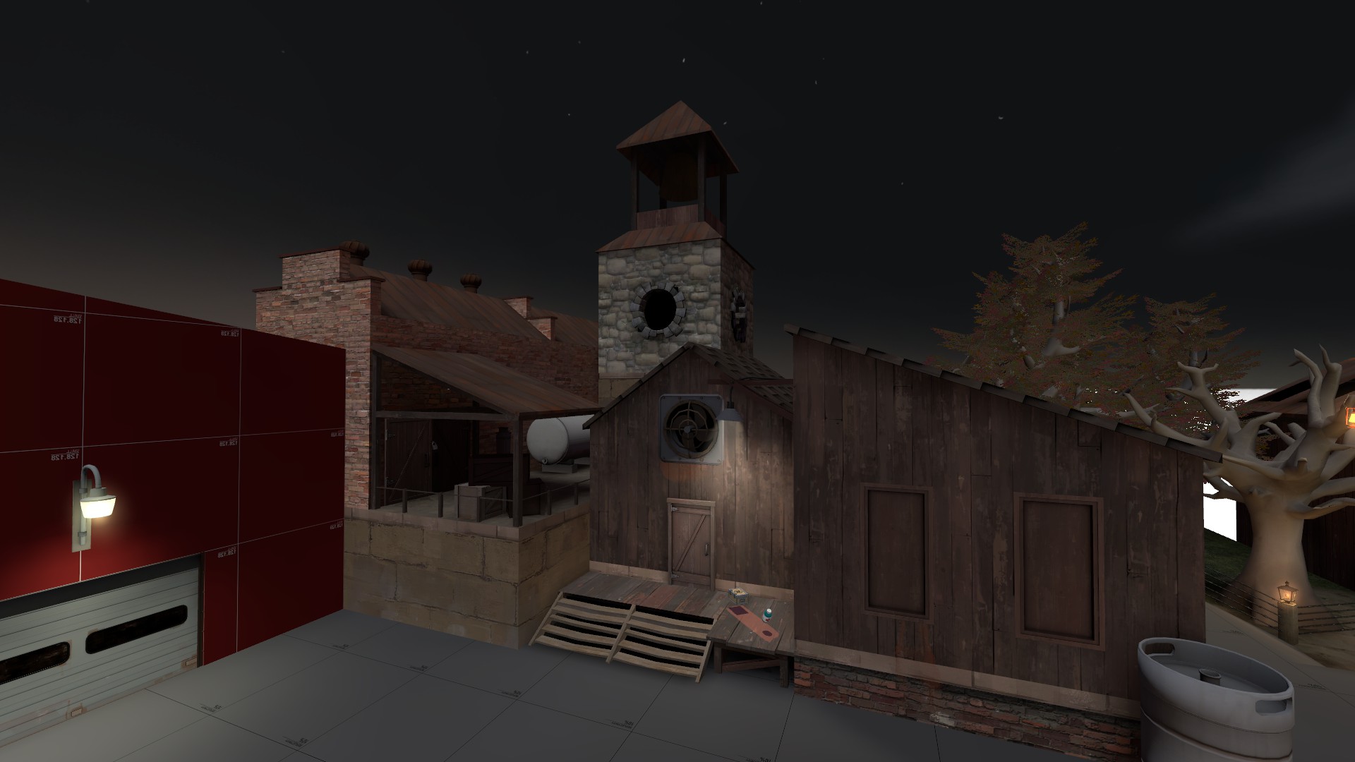
some other lighting bugs to work out, plus detailing spawn and figuring out what the dev texture ground should be
but whoo

This is so picturesque my socks just transformed into clogs.

Is.. Is that a tree in a cage? If that tree doesn't throw hatchets at passersby, I'll be sorely disappointed.

As fitting as it looks, I'm not sure using the Mann Manor clocktower is a good idea. It may turn out to be one of those 'Oh hey I recognize this thing' immersion breakers.
Bermuda Cake
L9: Fashionable Member
- Feb 20, 2009
- 679
- 480

Is.. Is that a tree in a cage? If that tree doesn't throw hatchets at passersby, I'll be sorely disappointed.
I'm pretty sure that's just a fence, and the tree isn't enclosed on all sides.

As fitting as it looks, I'm not sure using the Mann Manor clocktower is a good idea. It may turn out to be one of those 'Oh hey I recognize this thing' immersion breakers.
I don't agree, it's just a clocktower, and it's not a massive focal point in manor.
trees will look bad until you use final compile settings, yyler.
I don't mean the trees really


