WiP in WiP, post your screenshots!
- Thread starter Arhurt
- Start date
You are using an out of date browser. It may not display this or other websites correctly.
You should upgrade or use an alternative browser.
You should upgrade or use an alternative browser.
Kill_the_Bug
aa
- Oct 6, 2008
- 1,969
- 451
Kill_the_Bug
aa
- Oct 6, 2008
- 1,969
- 451
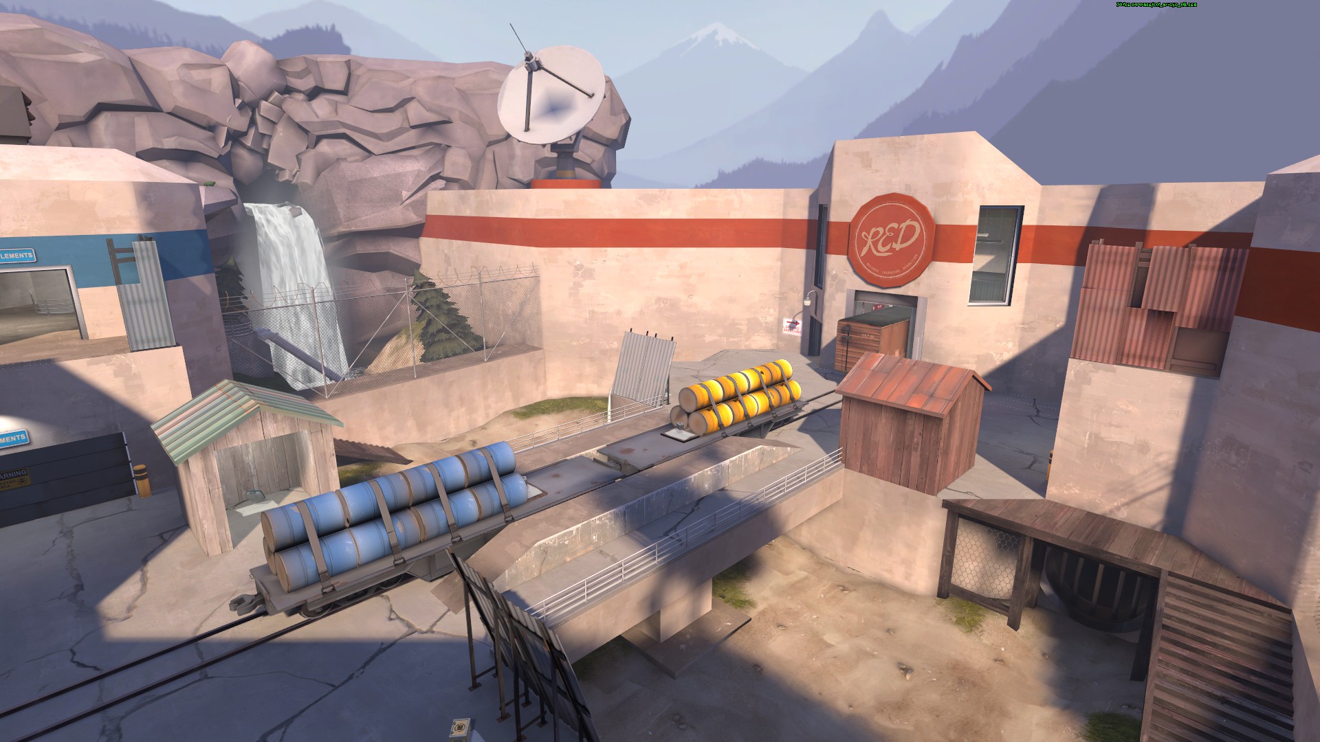
1. this train needs to be SO Animated - Massive death train opportunity :wow:
2. need ramps up to those ledges to increase the carnage potential of the train! :wow::wow:
3. add in different lengthed trains, vary the timimg, different speeds and change the direction once in a while = GOOD TIMES FOR ALL!! :wow::wow::wow:
Last edited:
Kill_the_Bug
aa
- Oct 6, 2008
- 1,969
- 451
Even if you follow bug's suggestions, there won't be enough trains. Never enough trains.
I smell a contest coming on! "Avoid the Train Chicken Run Contest". Your team wins is just one of you can make it to the end of the map!
I also have dibbs on the map name "The Chicken Run"
T
The Asylum

I don't think I can do much more gameplay-wise.
Upgrade to beta, maybe?
You mean that's an alpha!?
And I thought I went crazy with detailing early on
Pushing Montane to beta in glorious DX8
-snip-
(yes I know I need spotlights)
Looks nice however the proportions look off.
You mean that's an alpha!?
And I thought I went crazy with detailing early on
I did all of that excluding the waterfall/cliff part within the 72 hours of the contest... and yeah, I dunno if I should bump it up yet to beta. The gameplay seems pretty solid and everyone seems to like it (except yyler, obviously).
Eyce
L6: Sharp Member
- Jan 13, 2010
- 370
- 225
1. this train needs to be SO Animated - Massive death train opportunity :wow:
2. need ramps up to those ledges to increase the carnage potential of the train! :wow::wow:
3. add in different lengthed trains, vary the timimg, different speeds and change the direction once in a while = GOOD TIMES FOR ALL!! :wow::wow::wow:
Oh, it absolutely moves. Hence the spectator camera.
Not sure about train lengths, keeping them team-neutral is a difficult task.
- Feb 26, 2008
- 1,626
- 1,325
Pushing Montane to beta in glorious DX8

(yes I know I need spotlights)
Looks like you've got a texturing bug over there on the right. I think just retexturing the face manually fixes it.
Deodorant
L6: Sharp Member
- Oct 31, 2011
- 263
- 214
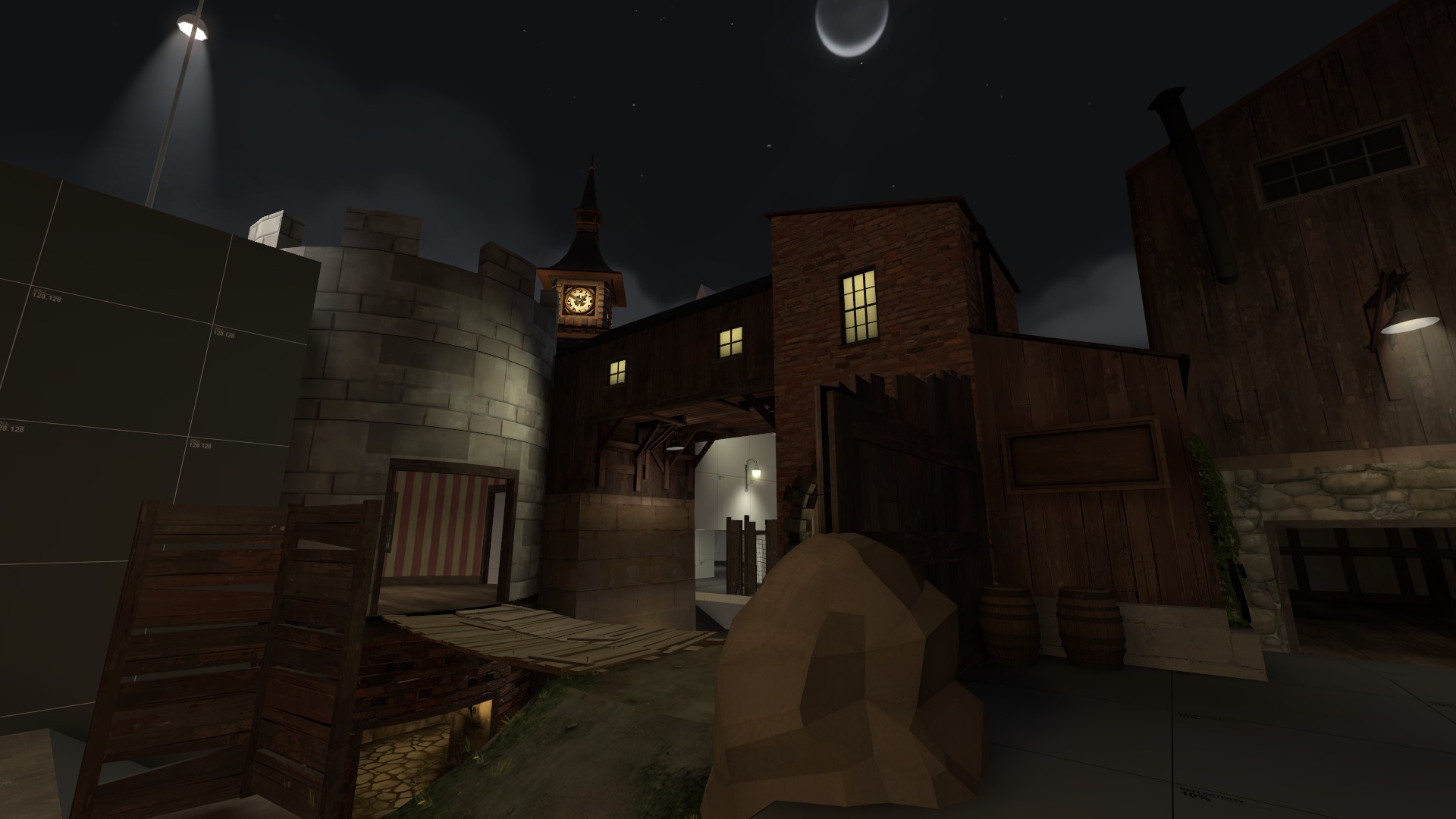
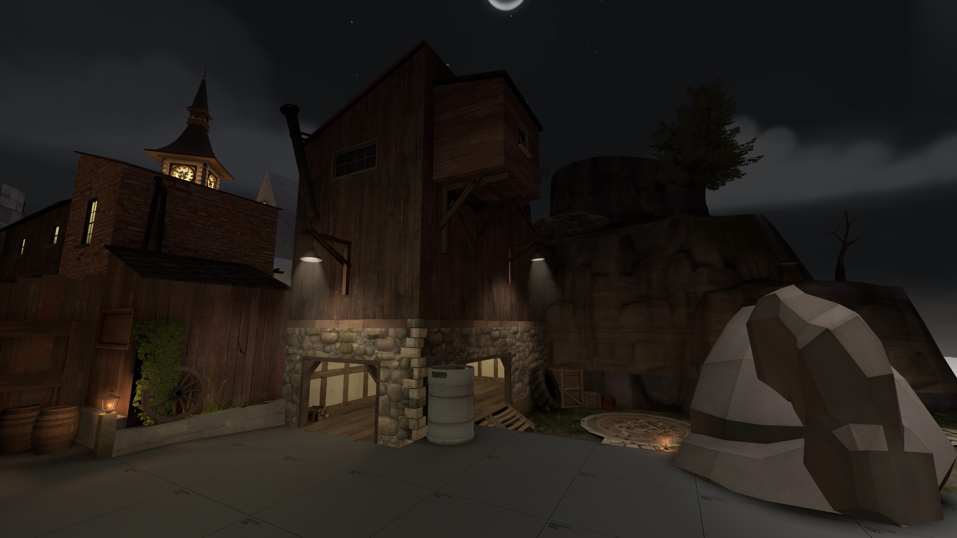
As the biggest problem with my mapping thus far has been my total inability to scale things correctly, I'd like a scale check on this. Pointing out other flaws is... Appreciated, I guess, but I'm mainly asking for feedback on the size of stuff.

The room is marginally larger than the central room in Sawmill. It varies a bit with the rounded corners and stuff, but I think was around 128-256 units wider last time I checked. It does, on the other hand, have more geometry in it. Ah, and those gentle inclines leading up to the point are meant to be stairs, so a detailed version the room would look busier and the passages around the point would feel narrower than here.
What do you think? Overscaled? Underscaled? Or perhaps *gasp* more or less ok?
Also, you know what's awesome? Angles. Angles are awesome.
I would have to play it to be sure, but it looks a whole lot better than previous versions. The size looks just fine, not too small, not too large. I think you've got it down this time. It may need slight tweaking here and there but I think it'll play well, actually.
It might, just *might* be a tad overscaled, which is better than underscaled in this context, but again I will have to play it to be sure.
It might, just *might* be a tad overscaled, which is better than underscaled in this context, but again I will have to play it to be sure.
For a busy, indoor point, that is probably the right scale. I would err on the side of slightly too large than slightly too small for a Sawmill-esque point. I guess we'll see in a test.
I don't like the walls on the point though. Being inside a building should be cover enough. Again, look to Sawmill. I know you probably don't want to draw many comparisons to it, but I also think the walls will be annoying in their current state.
I don't like the walls on the point though. Being inside a building should be cover enough. Again, look to Sawmill. I know you probably don't want to draw many comparisons to it, but I also think the walls will be annoying in their current state.
Deodorant
L6: Sharp Member
- Oct 31, 2011
- 263
- 214
You sure about the walls? The point being indoors does indeed provide protection from Snipers (there would be a sightline from one entrance to the other without those walls, bit that could be easily fixed by adding a foyer of some sort so it's not that relevant), but isn't cover from medium/short range fire important as well? When I'm near a point and something like a Heavy-Medic combo attacks me, I'm pretty grateful for stuff like the rock on Viaduct, the corners on Harvest, the plank stacks on Sawmill or the containers on Granary to take cover behind. I'm reluctant to remove the walls, for fear that the whole room would turn into a big dull bowl of spam.For a busy, indoor point, that is probably the right scale. I would err on the side of slightly too large than slightly too small for a Sawmill-esque point. I guess we'll see in a test.
I don't like the walls on the point though. Being inside a building should be cover enough. Again, look to Sawmill. I know you probably don't want to draw many comparisons to it, but I also think the walls will be annoying in their current state.


