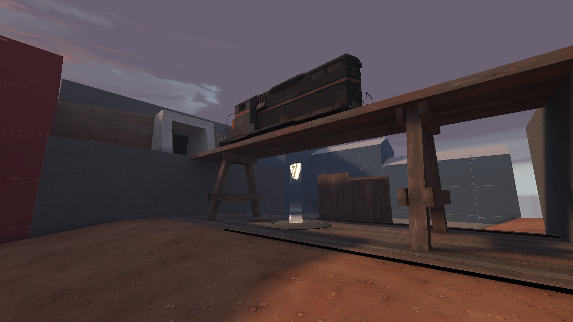
WiP in WiP, post your screenshots!
- Thread starter Arhurt
- Start date
You are using an out of date browser. It may not display this or other websites correctly.
You should upgrade or use an alternative browser.
You should upgrade or use an alternative browser.
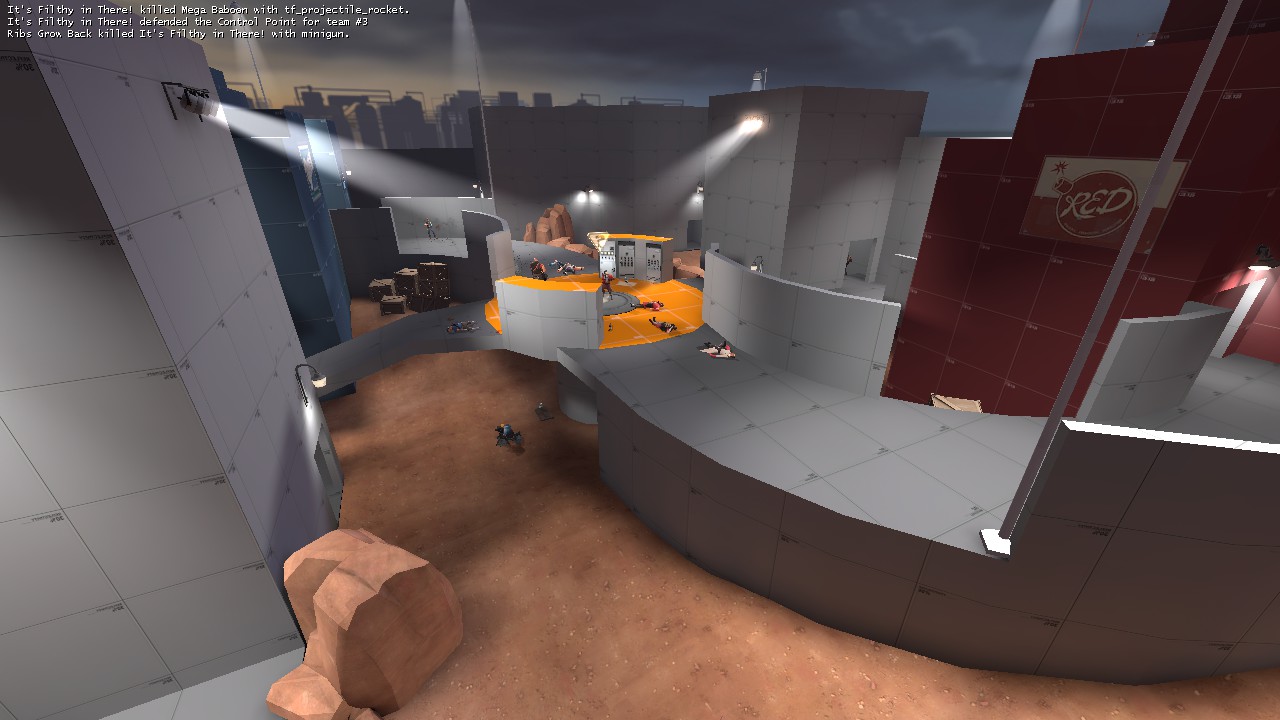
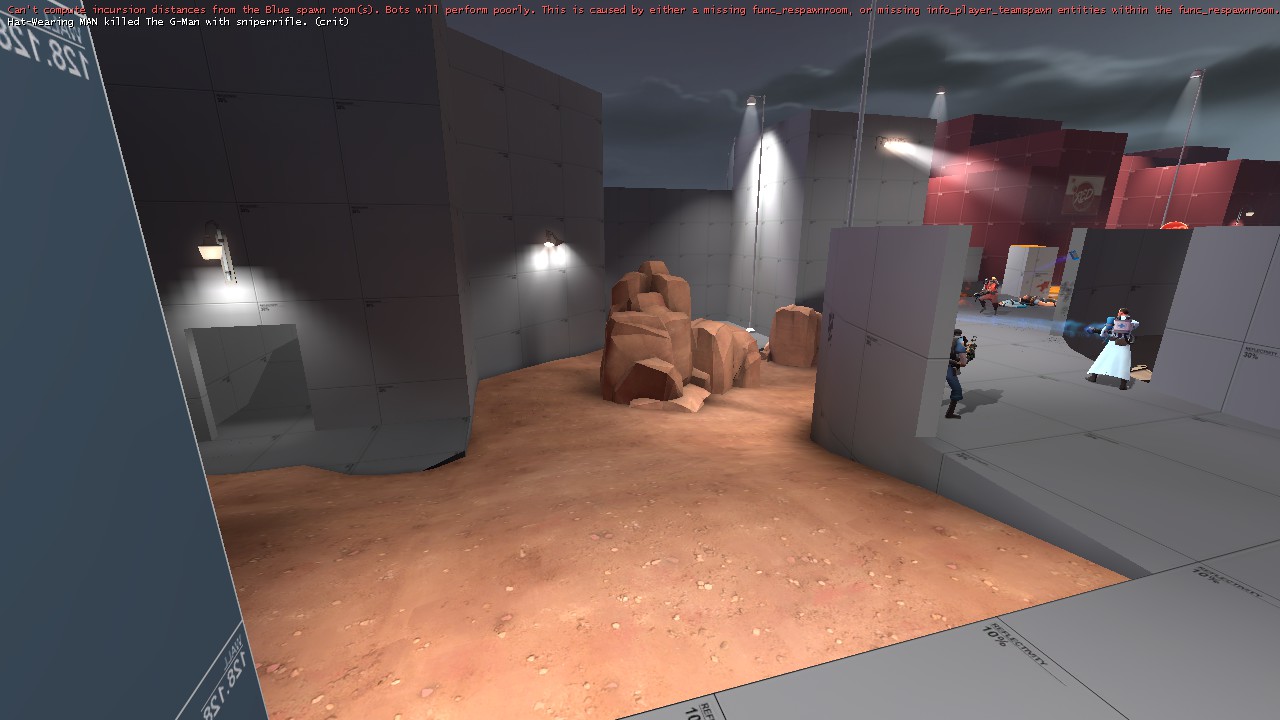
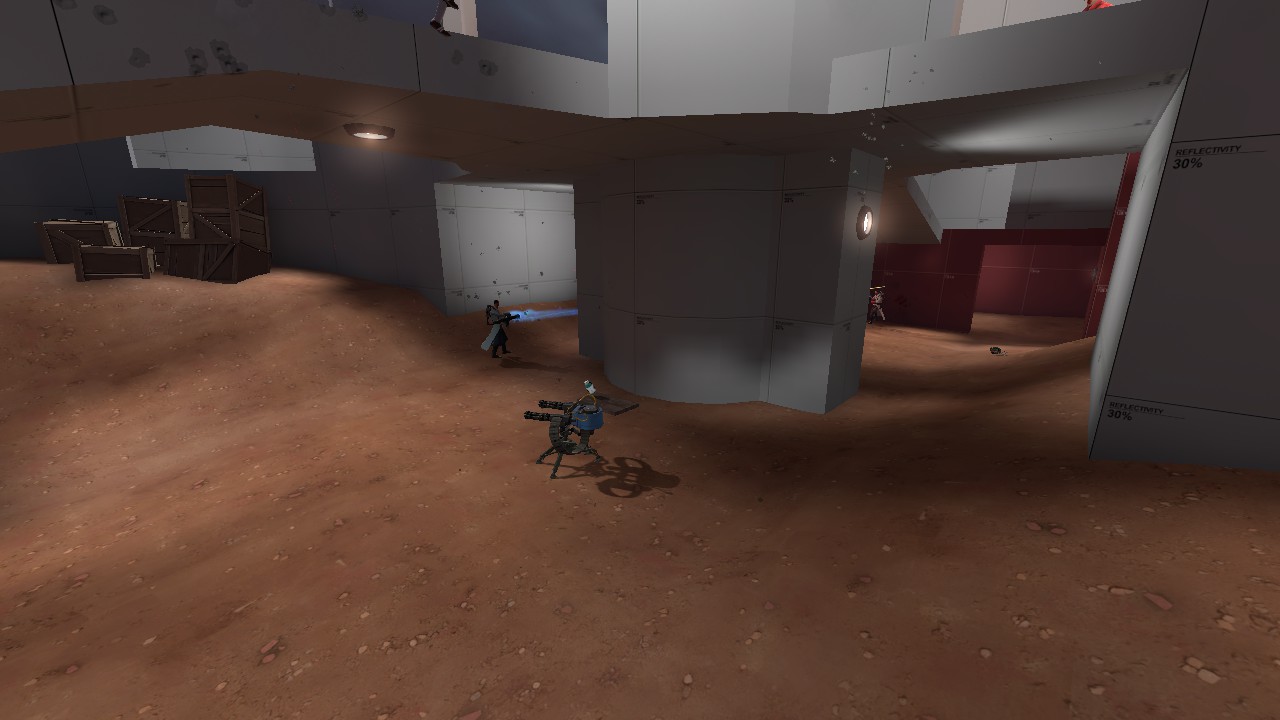
I'mma detailin' in alpha guise!
Okay, okay, it's only the spawn areas. And lighting is very bleh. This was just a quick compile to check composition and see where I needed some lights.
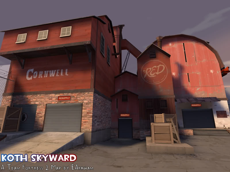
Not a huge fan of the barn to be honest. If you are going for that style of building, check how they do it in doublecross (I think they peak it a bit more).
But, just in general I feel like that spawn area would be better if you stuck to the foundry theme. You could replace the barn with a one-two of angled rooftops (one lower than the other), and I think it would mesh well with the rest of the map.
Also, it feels like your really mingling a lot of textures together there that maybe you don't need. Like, the tiny angled building between doors is a bit odd, especially with the wood on the bottom, as opposed to the brick a building over from it. They seem like they would have the same foundation, so its odd that one has wood and the other brick. Just my thoughts.
- Sep 5, 2009
- 912
- 684
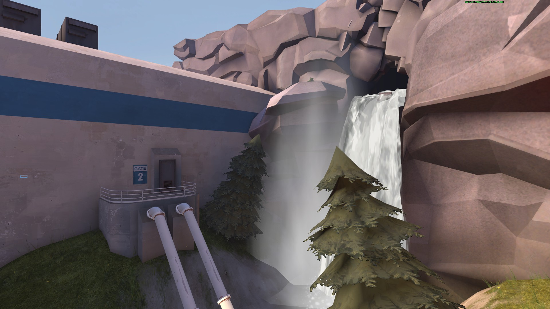
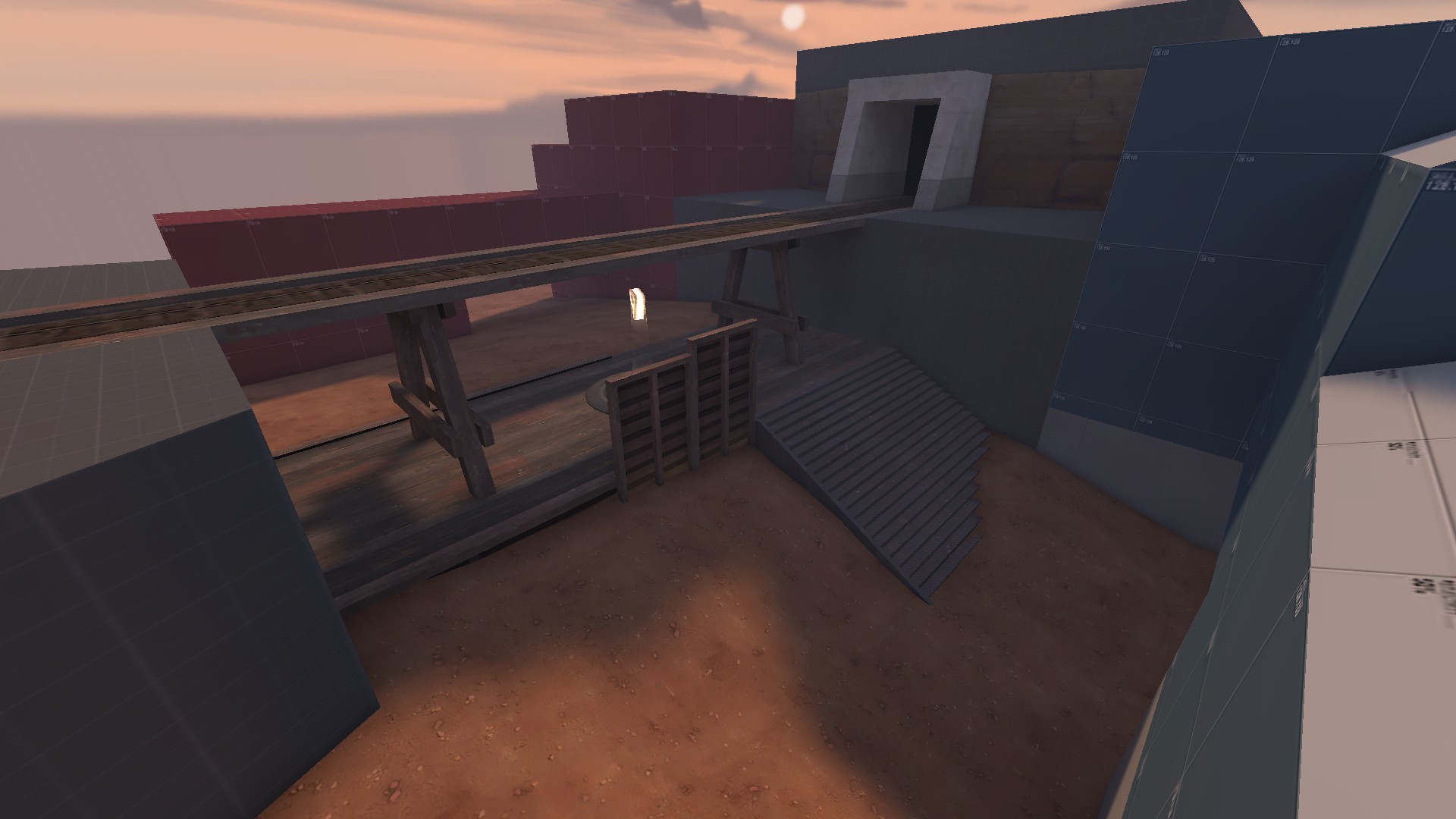
Can you tell I love the gorge/alpine theme?
Skybox area? If it is that looks pretty nice.
Low detail, nice and clean.
- Feb 26, 2008
- 1,626
- 1,325
Not a huge fan of the barn to be honest.
-SNIP-
You could replace the barn with a one-two of angled rooftops (one lower than the other), and I think it would mesh well with the rest of the map.
-SNIP-
Also, it feels like your really mingling a lot of textures together there that maybe you don't need.
You are absolutely correct. Looks much better (ignoring the stupidly bright spotlights, will fix that later, hehe):
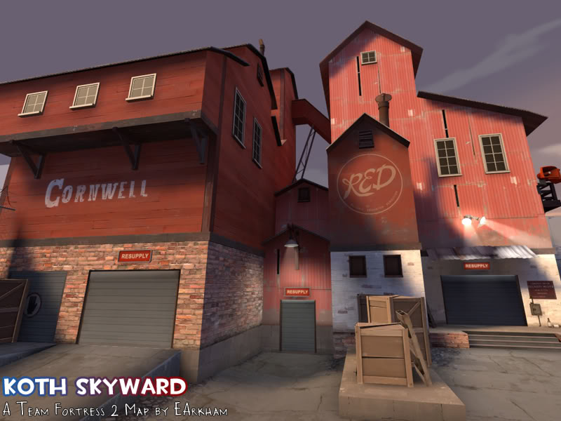
Also, detailing is probably the most fun thing about map design! What are you guys on about.
- May 21, 2009
- 2,039
- 1,484
Die.
Detailing is about the only fun part of the map making process, yeah.
Well, it just depends person to person. I prefer the design process over the detailing process, to be honest.
no, one of them must be right as they state their opinions as fact.
Leminnes
aa
- Jan 20, 2010
- 1,317
- 903
no. NO
edit: NO
Haha, well, we'll have to agree to disagree.


