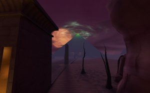
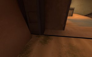
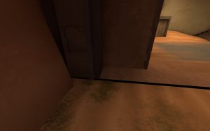
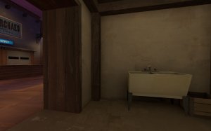
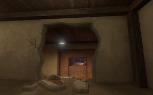
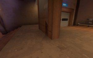
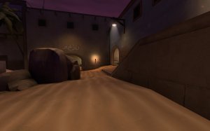
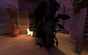
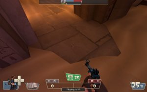
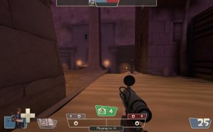
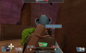
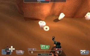
Scarab

Scarab RC6

  • This map is featured! Our best maps, all together in one place for your viewing pleasure.

Suna

What's a greybox?
aa
Nov 10, 2017
416
627
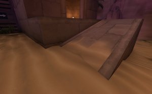
  • Expanded the capture area for B, moving the jumppad platform further back (and raised it slightly).
  • Moved the position of the stairs and jumppad on the jumppad platform so that there are now 2 sets of stairs, and only one jumppad.
  • Removed the bridge between B and the area underneath the scaffolding.
  • Added stairs to the B-facing side of the highground access for B
  • B detail overhaul
  • BLU side detail improvements
  • Increased the height of a building on BLU side to fix a vis error
  • Major skybox improvements
  • Clipping fixes and improvements
  • Optimisation improvements
  • Adjusted the fog inside the temple to be slightly weaker
  • Increased voiceline volume (will probably re-record at a later date)
  • Added custom sounds for the jumppad
  • Added custom soul-deposit sounds
  • Lighting improvements
  • Fixed some props not animating correctly
  • Adjusted prop fades
  • General bug fixes
So what's next? For B3, I aim to get most, if not all, of the custom models/textures made and included. This includes the PD pickup, a pumpkin bomb replacement, various props, and a bunch of overlays.

Known issues:
  • Some fog problems
  • PD deposit sounds are quiet

Read the rest of this update entry...
 

Suna

What's a greybox?
aa
Nov 10, 2017
416
627
  • Added custom particles for the jumppad (thanks Yrrzy!)
  • Adjusted volume of several sounds
  • Improved detail on RED side
  • Improved lighting
  • Improved skybox detail
  • Fog changes
  • Fixed overlays not being applied on some faces
  • Optimisation improvements
  • Fixed candles being to 'glowy'
  • Added a shit ton of new voicelines
  • Finale improvements
  • Added temp pumpkin bomb replacements
Known issues:
Bomb sounds play globally for some reason
Some bombs spawn in walls???
Some bombs are floating
Skybox fog is kinda weird
Some voicelines get cut off
Sound quality on some effects is shit

Read the rest of this update entry...
 

Suna

What's a greybox?
aa
Nov 10, 2017
416
627
  • Added custom bomb models (thanks Freyja!)
  • Improved custom bomb sounds
  • Fixed bomb sounds playing globally/not at all
  • Fixed an issue causing players games to run out of memory (if this still happens, delete your sound.cache or uninstall quicktime player)
  • Improved jumppad particle (thanks again Yrrzy!)
  • Improved fog
  • Lowered voiceline volume
  • B detail improvements
  • HUD improvements
  • Fixed B not depositing red points
  • Fixed some floating props
  • Increased height of jumppad trigger
What's next for B5?:
  • Many additional custom overlays (if you'd like to help, let me know!)
  • Detail improvements to blue side interiors
  • PD pickup replacement
  • Something to replace the brushwork capzone borders
  • Optimisation improvements
  • Red side exterior detail improvements
  • Asset improvements
  • Bug fixes

..And after that?:
RC1 - Soft deadline of September 4, 2020

Read the rest of this update entry...
 

Suna

What's a greybox?
aa
Nov 10, 2017
416
627
  • Lighting improvements
  • Blue side detail improvements
  • Bomb improvements (added particle, fixed sound, changed colours)
  • Optimisation improvements
  • Adjusted finale flash
  • Audio improvements
  • New icons (thanks Yrrzy!)
  • Voiceline improvements
  • Added custom pickup model
  • General detail improvements
  • Fog improvements
  • Skybox improvements
  • Bug fixes
The next version will be RC1, the deadline has been moved up to 28/08

Read the rest of this update entry...
 

Suna

What's a greybox?
aa
Nov 10, 2017
416
627
Okay so there were a couple problems with today's test.
Firstly, bomb sounds still play globally, so i'll have to tie an ambient_generic to every single one
Secondly, the pickup model didn't pack for some reason???

Otherwise, just a couple little detail additions/sound changes and this will be good for RC1!
Here's a to-do list for the 'final' update, since i'll probably forget it lol.
  • Brighten up a couple areas of the map, especially areas around the points
  • Tie ambient-generics to bombs to make sounds directional and not global
  • Adjust prop fades on several props around mid
  • Redo scoring sounds to be more indicative of teams scoring points
  • Add more foliage-based detailing
  • Adjust announcer voicelines
  • Add a bit more wear to signs
  • Remove pumpkin bombs from sniper spots
  • Library detail improvements
  • Create more signs/overlays
  • Add blockbullet behind the box at arch highground
  • More 'surface' detail in general, a lot of walls still look pretty bare
  • Make sure everything is packed you dumb of ass
There'll probably be more than this in the patch notes, but I should be able to get this done within a day or two.
(Overlays may take longer lol)

In the meantime I would appreciate if people could walk around the map and just.. nitpick it! Wanna make sure I nail everything!
 
Last edited:

Maid

Succubus
aa
Sep 29, 2018
246
554
nitpick time !!!!!!!!

DETAILING/POLISH STUFF

upload_2020-8-24_9-51-55.png

idk if this is something you can fix, but a description here would be great; especially since youre dealing with a more complex pd variant that people might need extra help to understand.

upload_2020-8-24_9-55-54.png

i personally feel like these barrels might b out of place? idk if they appear in other places in the map, but they dont really fit the theme imo.

GAMEPLAY STUFF/CLIPPING

upload_2020-8-24_9-53-51.png

a little triangular ramp here would help to clip this prop properly

upload_2020-8-24_9-57-21.png

this could do with clipping too

upload_2020-8-24_9-58-10.png

so could this

upload_2020-8-24_9-58-35.png

and the little notch between these props could maybe be smoothed out?

upload_2020-8-24_10-0-10.png

walking over this prop from this angle sends you leftwards into the hole - it would b a bit weird but if the top part of this prop could be made noncolliding so its just a smooth little ramp i feel like itd help

upload_2020-8-24_10-1-14.png

these little notches in the ground throughout the map should probably be blockbulleted to not absorb splash damage

upload_2020-8-24_10-2-31.png

i can stand up here !!!!!

upload_2020-8-24_10-3-18.png

and here too

upload_2020-8-24_10-4-11.png

another lil spot that could do with clipping

upload_2020-8-24_10-6-41.png

this is probably preference since you might prefer players being able to get up on this, but especially since its not present on the other side i think it might be a slight issue

upload_2020-8-24_10-8-24.png

i might b tempted to add clipping to just this block? since the blocks on the left act as a smooth ramp from this angle, but this one blocks the ascent.

upload_2020-8-24_10-10-19.png

this torch in this lil trench has collisions, unlike all the other torches in the map

upload_2020-8-24_10-11-23.png

this canister is quite close into the clip brush but isnt smoothed out, which it should be at least from this angle in my opinion
 

Attachments

  • upload_2020-8-24_10-5-52.png
    upload_2020-8-24_10-5-52.png
    1.8 MB · Views: 245

Maid

Succubus
aa
Sep 29, 2018
246
554
lol posted that early accidentally - pt2!!!!

DETAILING/POLISH STUFF

one lil thing - can you swap out the merasmus gargoyle voiceline for one of your own?

upload_2020-8-24_10-19-45.png

since the platform up there is broken off, it might be nice to have some matching debris in the water below. right now youve got cracked columns, but no explanation for where the rest of the debris went

upload_2020-8-24_10-21-29.png

this mat being completely flat to the ground looks kinda bad in my opinion - it looks painted on rather than a solid object

upload_2020-8-24_10-24-40.png

the break between map and skybox can be seen quite easily over there imo

upload_2020-8-24_10-33-34.png

while i like this spotlight, im not entirely sure whats meant to be lighting it up? it matches the lighting colour of the torches which makes it seem like it has a physical origin. i think if you made it warmer to match the lighting colour of the candles, it would pass off more as magical in origin

upload_2020-8-24_10-34-57.png

while its only visible from above, i feel like itd be nice to have something in this space? it seems perfect truck size imo

upload_2020-8-24_10-36-22.png

it might not end up looking as good, but id be tempted to try recompiling these props without the fullbright texture (which ive done in the past and works fine) - right now theyre the brightest thing in the room and grab a lot of the attention

GAMEPLAY/CLIPPING STUFF

upload_2020-8-24_10-14-46.png

the inside of this door could do with a clip

upload_2020-8-24_10-15-6.png

jus the bottom of this sign prop here

upload_2020-8-24_10-15-33.png

all these paintings - i can stand up here on top of them, and get stuck up against the edges of them

upload_2020-8-24_10-16-16.png

while this would usually be fine imo, an awning like this above a spawn door feels like it could very easily be exploitable, especially since there's no equivalent awning on the other side

upload_2020-8-24_10-22-24.png

i can get stuck in here on blu side and be completely forced into a surf, meaning im fully unable to get out without an explosive jump

upload_2020-8-24_10-23-48.png

these blocks r a bit awkward to move and fight around and i feel like they could be smoothed out a touch?

upload_2020-8-24_10-25-42.png

same again with these windows, since theyre not reflected on the other side they could b a bit of an issue

upload_2020-8-24_10-26-46.png

upload_2020-8-24_10-26-57.png

a bit of smoothing would help out here between the wall and column

upload_2020-8-24_10-28-43.png

not only could this lil stickout benefit from cliiping, but for some reason my game seems to think the extreme left side of this staircase (when im hugging the wall) is too steep and i start to slow down? needs a bit of investigation i think, idk

upload_2020-8-24_10-31-28.png

another standard clip bit
 

Suna

What's a greybox?
aa
Nov 10, 2017
416
627
Took a while, but we made it, RC1!
Before I move on to the changelog i'd like to thank a few people in particular.
Obviously, I need to first thank the wonderful asset creators, Freyja and Yrrzy, for their contributions to the map. There is exactly 0% chance that this map would release if it wasn't for them.
Next up are those who contributed to the map, but in minor (but still very appreciated!) ways: Lofi, for their illustrations used for some overlays in the map; Maid, for their scutinous nitpicking of the map as it approached RC1; Lazersofa, for creating the concept art for the bombs; 14Bit, for helping out with the PD logic; and Yoshimario, for creating a model to house the pickup particle.
Lastly, everyone who helped playtest, because it REALLY woudn't be the map it is now without them.

Right, that's enough theatrics, onto the changelog!
  • Adjusted sound volumes
  • Remade the deposit sounds
  • Made bomb sounds directional, and no longer global to all players
  • Lighting improvements
  • Adjusted prop fades
  • Changed palm tree models to the ones made by Ravidge
  • Removed pumpkin bombs from sniper perches
  • Blue side detail improvements
  • Added detail sprites
  • Global clipping pass
  • Added map intro text and photos
  • General minor detail improvements
  • Added shake effect to bombs
  • Added particle effect to active points
  • Capzone border now has a scrolling texture
  • Disabled shadows on pickups
And that's all folks! Hope to see you in Scream Fortess!
scarab_promo.png


Read the rest of this update entry...
 
Last edited:

MegapiemanPHD

Doctorate in Deliciousness
aa
Mar 31, 2012
2,002
1,311
I've liked this map every time I've played it. Here's some feedback:

20200831001523_1.jpg
-this sign is really stretched out
20200831002418_1.jpg
-since this is a oob area near one of the cap zones where players will be often, I feel like it's a wasted opportunity to hide something in there. Maybe a sarcophagus from the pd_tribute props?
20200831001628_1.jpg
-I can get caught up on the clipping on the welding machine here.
20200831001839_1.jpg20200831002900_1.jpg
-Can hide stickies in this rubble plus red side doesn't have it so it gives one team a bit of an advantage since this is well used path.
20200831002111_1.jpg
-something's up with the texture above the arch. It doesn't seem a smooth transition even though it doesn't fully look misaligned
20200831001639_1.jpg
-the inner support beams in the middle of this texture above the doorway doesn't make sense to BE above a door way.
20200831002429_1.jpg
-love this pyramid. Reminds me of a Metal album cover.
20200831002533_1.jpg20200831002535_1.jpg
-z clipping
20200831001722_1.jpg
-wood pillars like the one in the corner here are used pretty often in this map and few if any seem to have any clipping
20200831002509_1.jpg
-clip the sign smooth
20200831001539_1.jpg
-While the map is set in a desert, it doesn't make sense that a team wouldn't clean this sand out of their spawn room, especially since it's not in a building that's broken nor buried
20200831002513_1.jpg
-remove shadows from the foliage here. Also the spike thing on the left goes in the wall
20200831001544_1.jpg
-These steps are real thick. Egypt/ruin theme lets you get away with thicker steps to a point but something about these and where they are seems off
20200831002130_1.jpg
-probably should try to connect the displacement on the ramp and sand here to make the transition from one to the other look smoother. It's also kinda odd that there's sand on the inner part of the ramp but not the ramp trim
20200831002250_1.jpg
-can hide stickies in the rocks
20200831002807_1.jpg20200831002809_1.jpg
-pop in on the red banner
20200831001848_1.jpg
-the broken walls don't transition to the normal wall seamlessly. Maybe try smoothgroups or messing with lightmap scale?
20200831001758_1.jpg
-the resupply locker shadow goes through the wall here
20200831002300_1.jpg
-might be hard to see but there's a really odd seam on the wall between the torch and arch. Dunno if that's just source being source though.
20200831002322_1.jpg
-remove shadows from the foliage, also it clips through the wood brushes
20200831002644_1.jpg
-can still snipe behind this crate
20200831002153_1.jpg
-is this a model or a texture? either way it's a neat effect.
20200831002713_1.jpg
-I get the plunger and barbwire cable is similar to how lakeside did something like this but with this being located in an area where players will be more often, it really doesn't look all that great. probably could make the cable out of a metal beam texture and displacement.
20200831001911_1.jpg
-clip it smooth
20200831002048_1.jpg
-misaligned texture behind the fence. The fence also seems kind of low for keeping players out of that area behind it
20200831002139_1.jpg
-prop clipping into the floor

That's all for now :D
 

Suna

What's a greybox?
aa
Nov 10, 2017
416
627
Was waiting for this, thanks. I'll try get around to most of these, though there are a couple exceptions.
Maybe a sarcophagus from the pd_tribute props?
I would like to use these, but I don't want ot pile up the contributor list too high, plus i'm not even sure what the permissions are on those props.
20200831002111_1.jpg
-something's up with the texture above the arch. It doesn't seem a smooth transition even though it doesn't fully look misaligned
Think this is to do with lightmap scale, but if not, it may not be fixable.
20200831002509_1.jpg
-clip the sign smooth
Could have sworn I already did, are you sure it's not clipped?
20200831001758_1.jpg
-the resupply locker shadow goes through the wall here
No idea why this is happening.
20200831002644_1.jpg
-can still snipe behind this crate
There's a blockbullet there now, so no, you can't (unless i'm an idiot and forgot). Even then, it's not exactly a powerful sightline.
20200831002153_1.jpg
-is this a model or a texture? either way it's a neat effect.
Texture, you can thank Yrrzy for that.
20200831002048_1.jpg
-misaligned texture behind the fence. The fence also seems kind of low for keeping players out of that area behind it
I'm guessing you mean the beam in front of the fence (same texture the sign is resting on), which is intentional. I'll change the texture to something else to make it more obvious though.
 

Suna

What's a greybox?
aa
Nov 10, 2017
416
627
Apologies if I don't get to all the changes in this version, I didn't keep a written list this time around and the number of changes just kept increasing so this is from memory alone.

  • Added additional detail in OOB areas
  • Clipping improvements
  • Fixed some props floating
  • Fixed some props not lighting correctly
  • Adjusted position of several props
  • Fixed bomb explosion sound playing globally (for real this time I swear)
  • Improved particles (pickup, finale)
  • Improved gold textures
  • Improved detailing in RED cavern
  • Replaced voicelines with ones done by the fantastic Emnudge!
  • Lighting improvements
  • Major optimisation improvements
  • Jarate now extinguishes players
  • Fixed waterfall models being fullbright (thanks maid!)
  • Added custom bomb explosion particle
  • General texture improvements
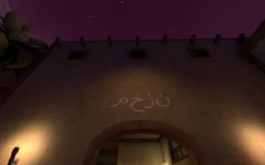
  • Fixed arabic text being absolute nonsense (thanks pdan!)
  • A bunch of other stuff idk

Read the rest of this update entry...
 

MegapiemanPHD

Doctorate in Deliciousness
aa
Mar 31, 2012
2,002
1,311
Here's more feedback:

20200907235746_1.jpg
-I can get back here in blu spawn. There's no clipping on the door prop
20200907235919_1.jpg
-there's an obvious split between textures here. Not sure if I suggested this before but try messing with smooth groups and lightmap scale to make it seamless.
20200908000208_1.jpg
-Inside the building has a nice blend texture between stone and sand while out here it's not
20200908000611_1.jpg 20200908000613_1.jpg
-z-fighting
20200908000108_1.jpg
-the torch on the far wall pops in and out obviously here
20200908000415_1.jpg
-these text boxes disappear faster than I can really notice them. Probably should have them stick around a bit longer.
20200908000228_1.jpg
-candle in the sand
20200908000318_1.jpg
-no respawnroom visualizer on the side red spawn exit
20200908000523_1.jpg 20200908000254_1.jpg20200908000238_1.jpg 20200908000729_1.jpg
-clip the lips in these screenshots on both sides of the map
20200908000221_1.jpg
-remove collision on board as well as the grass going through it.
20200907235937_1.jpg
-foliage goes through post

Lastly while the new voice lines are great and just the right volume, the first one that played for me had a really loud static pop at the end. It was one that played at the start of the round saying something about collecting souls.

That's all for now.
 

Suna

What's a greybox?
aa
Nov 10, 2017
416
627
I've got some time on my hands, and have been thinking about doing a write-up on a making of Scarab, so I suppose I may as well.

Pre-production:
All the way back in 2018 I was experimenting with may different PD layout styles, including mars base, mayan temple, and of course, egyptian temple. I actually did a substantial amount of development into a mayan temple-based PD map, but ended up not releasing an A1 as I wasn't confident at all with the layout.

Then in 2019, I restarted development, this time going for an egyptian theme. This actually occured twice, once in april, and again for the 72hr Jam. The april version, again, had a decent amount of work put into it, but I was unable to figure out an engaging layout for mid, and abandoned the map. The 72hr jam version had similar issues, this time however the prolem lay within the connectors. I quickly switched from that project to Theia, completing it in a little over a day.

Then of course, this year comes the 'Pick it up!' Contest. I originally planned to do a invade-ctf map for this, but upon further thought realised this would be the perfect opportunity to once again try to create a egyptian PD map. Obviously, I went with that idea.

I began by making the mid temple interior, which I imagined as being a popular flank, similar to the one in lakeside. Next came center mid, which is actually the very same mid used in my ill-fated PLR map, Yikes.
I knew that while that map wasn't.. good, it did have good DM in that area. Then came the 'yard' flank, where the arch is located now. I had never intended any of these areas to be, or house, capture zones. Instead, it would be more similar to cursed cove or pit of death, with the capture zone being the underworld. Across mid, doors would open to allow players access upon the timer hitting 0. As for the connectors and spawn, I tried something a bit more expirimental. I had the layout set up so the full layout was essentially a U shape, but with a shortcut form spawn leading directly to the mid temple. I did a quick layer of detail, and published A1.

Alpha:
A1 was.. not very well recieved. The shortcut from spawn straight to mid was the route players took the most, but it was able to be camped very easily and led to a lot of frustration. Players were also confused as to how they deposit points, as there was no communication to say "hey, go to the underworld to score points!". While I could have created that, the underworld itself would have needed a rework as well. It was too large for what it was trying to accomplish, and presented very little risk to those who entered. Speaking of very large, this is what this map was. Rather than big teamfights, most conflicts were usually 1v1's, which weren't especially interesting.

So, I made the decision to switch to the style of PD seen in 14Bit's Waterlog. 2 points at opposite ends of the map that alternate. I already had to suitable positions (temple and yard), so all I had to do was add the points. Obviously, I also had to rework the spawns so I did that as well. This version was recieved much better, and I made a few more layout tweaks over the next couple of versions in order to create more flow between the points, but the hardest challenge was balancing temple. This was not designed to be an area for players to stay in, and no amount of layout tweaks would change that, so I knew it had to go, with the point moved into mid instead. But, if I do that, then there's only one way into mid. If I did this, then it would require me to redo the majority of the layout.
I did it anyway.

And, it worked out (kinda)! For this layout, I decided that I would try to go for a layout similar to koth, since that's basically how the map works now (but with two points). Pretty standard spawn>yard>connector>yard>conector>mid layout. I was pretty confident with the gameplay in the early playtests of this iteration, and just thankful I wouldn't have to remake the layout yet again. So I stuck with this, and tried to refine it as best I could. One thing that had slowly been creeping up on me though were sightlines. The oringal version of Scarab had some sightlines, but nothing too extreme. But as I made more and more layout changes, more and more little gaps started appearing. Then Tekku found a sightline spanning from the spawn connector all the way to the enemy's mid connector. I tried my absolute best to block this sightline, but there was always another sightline I created to take its place. In the end, the version I submitted to the contest didn't have these sightlines fixed, I simply ran out of time.

Honestly, I seriously considered just leaving the map as it was and moving on to a new project.
But, a month later I returned to the map and fixed the sightline my making a route which had previously been outside... inside. I saw general gameplay improvements immediately, and it was a lot more than I was expecting. At that point, I knew that this map was ready for beta. I would make my last few layout changes, and that would be it.

Beta:
As I prepared to move the map into beta, I was contacted by Diva Dan, who expressed concerns at the detailing I was currently using for the map. I had stylised it based off of Crypt, one of his own maps. This was detailing I was generally intending to be placeholder, though would retain parts of later on. However he made it clear, and I agreed, that the detailing could not continue using this style. There were too many similarities to be considered just coincidental or inspired, and I knew it needed to look completely different going forward.

So, I started on a complete re-artpass of the map. Freyja's egyptian theme however doesn't allow for too much variation (it is all just stone bricks after all) so it was difficult to create something that looked unique when compared to other maps that used this theme, such as Crypt or Oasis. You can see inspiration from both in the finished product.

As I worked on the re-artpass, I attempted to get some help from people in the emporium, though didn't find much success besides a couple of concept artists as I wasn't well known in their community, nor had much to go off of. So instead I turned to people I knew. First was Freyja, since they had created the assets I was already using. They agreed and soon enough I had my first custom model for scarab: A resized pillar.

Before long, I had my first beta release for Scarab in August, and with that I was able to convince more and more people to hop on and help out. Lo-fi helped out with some sign illustrations, Yrrzy made several particles and textures, Yoshimario made a model to house the pickups, and Freyja made the explosive pots. During this time I also tried my best to learn the particle editor, with varying amounts of success.

Release Candidate:
Four months after the initial relase (exactly!), Scarab hit the milestone of Release Candidate. There were however some problems that presented themselves. One that had been recurring for several versions was the bomb sounds being audible globally. Thankfully in this case it was due to my own error, and not a technical issue.

The next, and more pressing issue, was the custom announcer. I had done the script, recording, and editing myself, and felt the lines were acceptable, but could certainly be better. But, feedback I recieved convinced me to reach out to voice actors for better lines. I reached out to both Emnudge and Benjamoose, but ultimately went with Emnudge, who you can hear in the map right now!


Besides those two issues, the map was practically complete. There was some extra polish done in RC2 but at this point i'm not sure what else i'd add!

Technical:
Lastly, i'd like to talk about some of the technical things involved with the making of the map (which is probably what you want to read). Since I just got done talking about the voicelines, let's talk audio.

90% of all technical issues throughout the development were audio-related, because my god, source is not good with audio. It's pretty well known that you often need two ambient_generic entities to make some sounds be audible, but what do you do if you're using a soundscript? Unfortunately the scripts for soundscripts have no function to boost audio levels in the context I was using them, so the only option left is to increase the volume of the raw audio files. If you were to extract the sounds from Scarab and listen to them raw, you would find that they are all loud. Very loud. Because they have to be loud. This caused a lot of problems with my own announcer files, as increasing the volume, with the filters applied, made the lines difficult to understand. Getting a good balance is very difficult and i'm honestly baffled at how Emnudge was able to make the lines as clear as they are with the accent they're using.

Secondly, tf_generic_bomb. If you want to use a custom sound on these, it's busted. It's also busted with some stock sounds, and I don't know why. They're supposed to play the sound in a radius, but for some reason it plays it globally. This wouldn't be too much of an issue if it was only to the player who shot it, but no. It's to everyone. To solve this, you need to have a ambient_generic for each bomb that plays whenever the bomb explodes, and obviously the bomb needs to be silent.

Another thing with audio is that source will just decide it doesn't like certain files sometimes. Some players may, to this day, may have their console filled with errors related to mp3 decoding. But i've yet to find a reason as to why certain players expirience this when the majority doesn't. It's a wild ride, i'll say that much.

Okay, lets get out of the negatives shall we? Lets talk curses.
Scarab features four curses: Skeletons, Crits, Jarate, and Magic. These curses are picked randomly whenever a point closes, but not every time a point closes. It works using the logic_case entity, and the input PickRandomShuffle.
The chance of a curse coming into play is 1/3, but since it's PickRandomShuffle, it will go down the list. If the first point closure results in a curse, then the next two point closures are gauranteed to not result in a curse. Through this logic, it's possible to have 4 point closures in a row without a curse, or two with a curse. It's random, but predictable, keeping chaos balanced.
The same logic is used for the curses themselves, making it likely that each curse will only be seen once per round; and giving them all an equal opportunity to come into play.

The skeletons, crits, and magic curses are all simple, but what about the jarate? How was that done? Well, the simple answer is that I use Yrrzy's custom pickup templates, and just enable/disable the jarate/pickups. That's pretty much it. If you want to know how the pickups themselves work, you should ask Yrrzy since she made them.

If you have any other questions regarding the map, just post them in the thread and i'll answer as best I can!

Conclusion:
I'm very grateful to everyone who has supported me throughout the development of this map, from those who have directly contributed, to those who have simply said 'this is cool', or 'this sucks', because your opinion matters. This map is made using my own failures (literally), and I wouldn't have it any other way.


Is this kinda egotistical? It feels like it.
 

Scarfulhu

L1: Registered
Nov 24, 2016
10
7
I've had a lot of fun watching the development of this, and I do love the whole vibe this gives off. It's different and fun, so I hope Valve picks it up for Scream Fortress XII.
 

Zhiris

L1: Registered
Apr 26, 2020
29
18
I was really convinced that this entry would make it to Scream Fortress and it might not have happened this year but I like to think it deserves a spot in one of the future ones for sure!

It was so fun to see the whole progress of creation on one of my favorite map (totally based) and make it to this point.
This map is going to be a major reason why I am going to create another server slot for a all year around Halloween server.
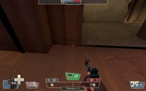
^ This is why I added a pd_scarab.nav file here for you since I see you have a nav included for your skeletons but I am very nitpicky when it comes to bot AI and smoothing the gameplay experience for people who enjoy playing against bots and make them reliable, worked a couple of hours on this nav to smooth out some kinks it had like skeletons thinking they can reach you on walk platform since your auto generate told them they can reach places they clearly couldn't.
Also removed left my nav out which connected the boost jump platform to be connected with the upper one since Skeletons can't take them (Originally made the nav for player-bots)

Sorry for the long blabbering about navs... anyhow really looking forward to your next work/projects!
 

Attachments

  • pd_scarab_rc2b.nav
    1.5 MB · Views: 175

Suna

What's a greybox?
aa
Nov 10, 2017
416
627
Happy late anniversary!

  • Fixed a bug causing servers to crash after a round lasted too long
  • Fixed point deposit sounds not playing
  • Added new sound for souls dropping
  • Improved detailing in some areas
  • Improved capture zone particle
  • Improved bomb particle
  • Added a couple small easter eggs
  • Probably some other things!

Read the rest of this update entry...