-
This map is featured! Our best maps, all together in one place for your viewing pleasure.
You are using an out of date browser. It may not display this or other websites correctly.
You should upgrade or use an alternative browser.
You should upgrade or use an alternative browser.
- Aug 5, 2010
- 307
- 288
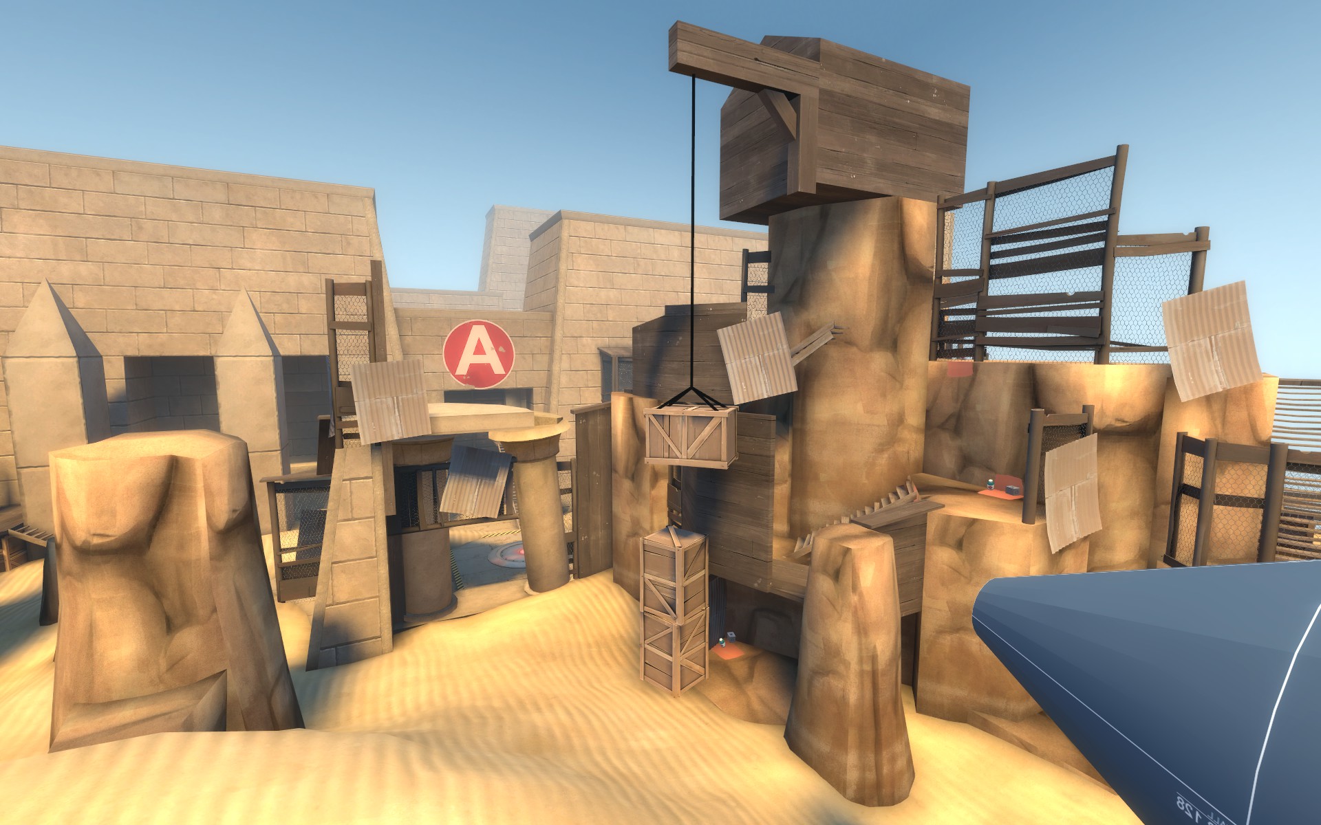
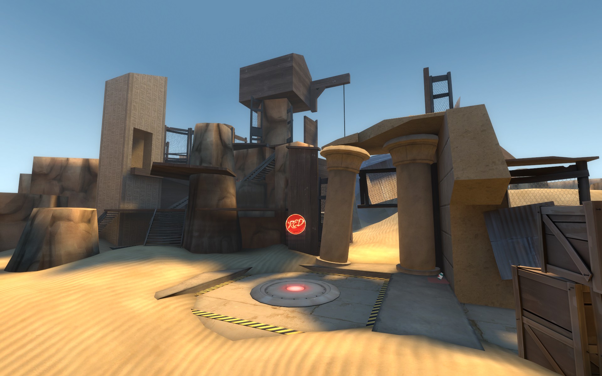
I started to texture and minorly detail this version as I feel large scale gameplay changes are finally a thing of the past. There are a few texturing and detail placeholders (namely the medium pillars with a texture scale of 1  ) Fleshing the details should also help with player direction in a few areas as well. I also got a really talented friend of mine to make some assets further down the road. The lighting is still shitty temp lighting.
I would like to note there are a few things I still want to fix but am not sure how yet. (I can make a detailed post about this later) Red's first spawn and B's general sloppiness being two main examples.
A
-Reworked left side (as blue facing A) near the point to be a little tighter
-Left side near point now has access to the height immediately above the point via a very thin two-jump jumping "puzzle"
-All rocks converted to displacements from func_details. I hope this fixes a few people getting abysmal fps in the area
B
-Removed some cover red had while standing on the very top house over the point. Blu should now be able to easily snipe any really pesky top house campers
-Added tall fence to front tall flank so red cant camp immediately above the lowest flank into the area
C
-Brightened up side flank to point
-Reworked entire covered sentry area immediately above the point. Its lower, thinner and has more distinct sentry spots.
-Moved main hallway healthpack so both teams have a sort of risk getting to it in the middle of battle.
-Brightened main flank to point
D
-Removed sentry ledge hovering just over the point
-Expanded main right flank to have some pathing options. A lot of gameplay happens in this little hallway so I wanted something a little less insta-deathy.
-Removed red ability to spam out of the hallway flank into the blu holding area flank spot
-Thinned out rock pillar in main flank to make choke jus a lil less intense
EDIT: I could have sworn I put a setmaxtime on C to 16 minutes but apparently it got removed. No big deal though as it only ever gets used if blu completely destroys red on A B and C. Ill get it in for the next version.
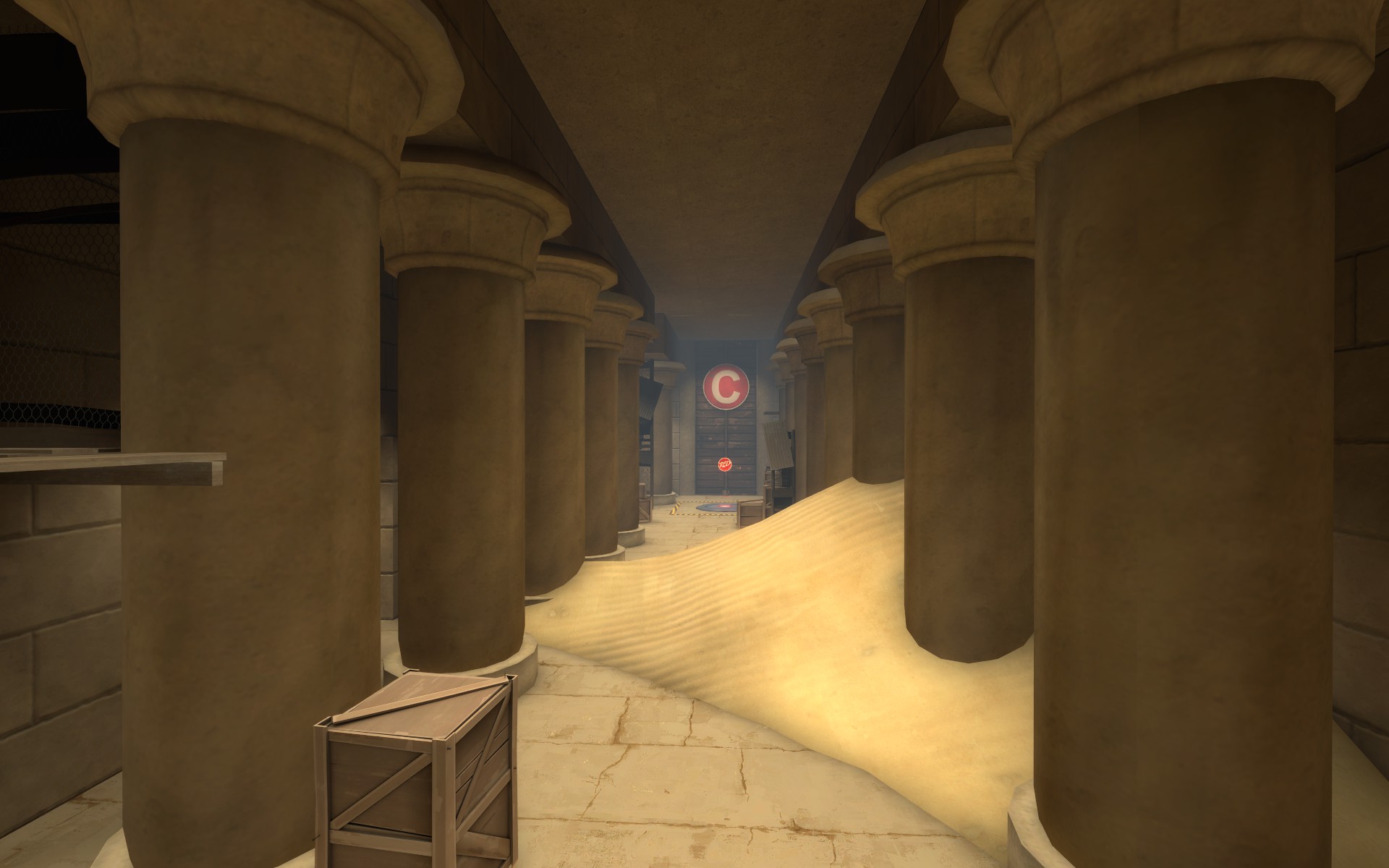
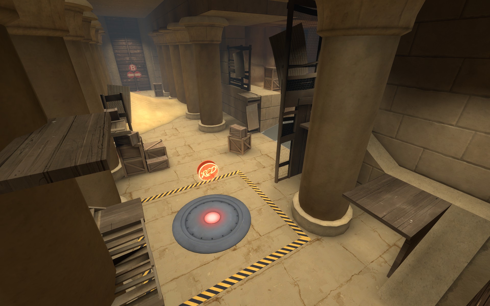
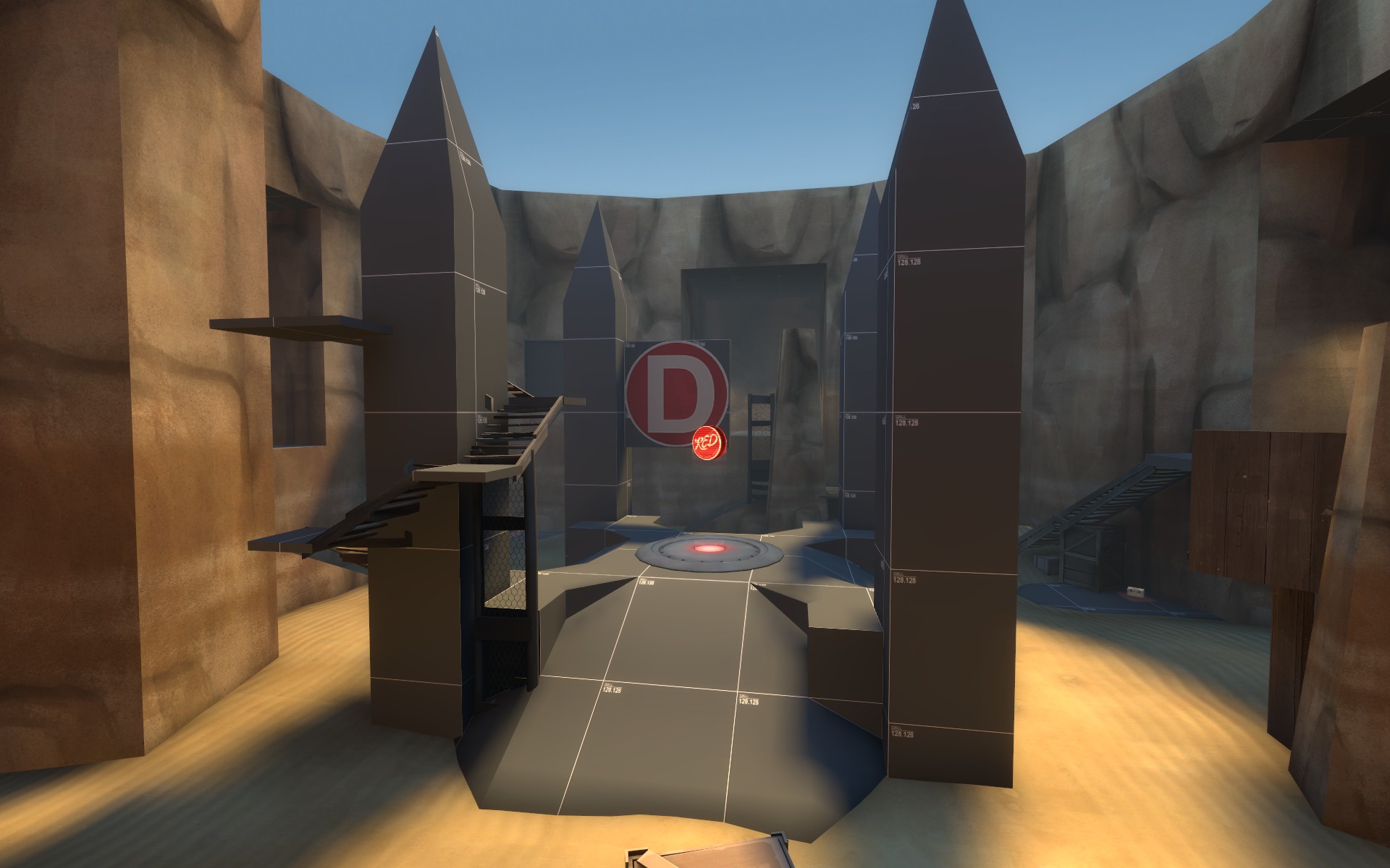
Read the rest of this update entry...
I would like to note there are a few things I still want to fix but am not sure how yet. (I can make a detailed post about this later) Red's first spawn and B's general sloppiness being two main examples.
A
-Reworked left side (as blue facing A) near the point to be a little tighter
-Left side near point now has access to the height immediately above the point via a very thin two-jump jumping "puzzle"
-All rocks converted to displacements from func_details. I hope this fixes a few people getting abysmal fps in the area
B
-Removed some cover red had while standing on the very top house over the point. Blu should now be able to easily snipe any really pesky top house campers
-Added tall fence to front tall flank so red cant camp immediately above the lowest flank into the area
C
-Brightened up side flank to point
-Reworked entire covered sentry area immediately above the point. Its lower, thinner and has more distinct sentry spots.
-Moved main hallway healthpack so both teams have a sort of risk getting to it in the middle of battle.
-Brightened main flank to point
D
-Removed sentry ledge hovering just over the point
-Expanded main right flank to have some pathing options. A lot of gameplay happens in this little hallway so I wanted something a little less insta-deathy.
-Removed red ability to spam out of the hallway flank into the blu holding area flank spot
-Thinned out rock pillar in main flank to make choke jus a lil less intense
EDIT: I could have sworn I put a setmaxtime on C to 16 minutes but apparently it got removed. No big deal though as it only ever gets used if blu completely destroys red on A B and C. Ill get it in for the next version.
Read the rest of this update entry...
Last edited:
- Aug 5, 2010
- 307
- 288
Same as a23 only this time I compiled it with tool brushes enabled! 
I also snuck in the 16 minute setmaxtime when C is captured.
Read the rest of this update entry...
I also snuck in the 16 minute setmaxtime when C is captured.
Read the rest of this update entry...
- Aug 5, 2010
- 307
- 288
This morning I was told of a (apparently) large steam chat discussion about me and osiris. So I figured it was a good time to make this post ive been procrastinating/forgetting since my map is, seemingly, still in everyone's minds. 
__________________________________________________
The map issue: first red spawn player direction
Ive noticed in almost every test of the last few versions of osiris at least 2-4 people go the wrong way out of red's first forward spawn at the beginning of the first round. Personally I dont find it to be too much of an issue because it only happens the FIRST time you play the map and never again. However it does irk me that my design leads to such an issue so I would like to fix it if possible.
Here is a hammer 2d overview
http://i.imgur.com/SpxZNol.jpg
red - playable space in the area
orange/yellow - spawn door locations (main and secondary exit)
Here is the view standing inside the main spawn door exit
http://i.imgur.com/NFLLW3Z.jpg
Here is the view standing in the secondary spawn door exit
http://i.imgur.com/gAx9xrm.jpg
Now before going and suggesting any ezpz solutions keep in mind the area immediately outside this spawn has to accomodate the following things:
1. Elevated spawn exit with ramp so red cant be easily spawn camped
2. Two exits so red cant be spawn camped
3. When blu captures B and the fight is moved to capturing C this area needs to give blu the height advantage going into C since its the first area before C.
4. The area needs to remain tight so its immediately clearable
5. The spawn needs to be as close to the final spawn (look at the overview to see where final spawn is) so I can connect the two spawns into one large spawn when I finish detailing
6. 90 degree corners only. Egypt theme stuff and I want to avoid strange angles in the area.
So far the only solution I can come up with is to block the secondary spawn exit and the path to C like this:
http://i.imgur.com/LMS9w8d.jpg
http://i.imgur.com/ieAKTYH.jpg
I would disable these metal func_brushes upon round start so they only guide the player when its needed - first leaving spawn at the beginning of setup. However I find this idea to be ugly, restrictive and hacky.
Any ideas?
Last edited:
due to the way the spawn is laid out, while the main door is directly ahead of the players, the doors overall are to their left

players are much more likely to continue going the way their eyes are drawn (which in spawn is looking toward the exits) and in this case it's sending them backwards
reorienting the spawn such that the doors are toward the point from the players will direct them much more in the right direction, either by simply flipping the spawn

or by moving where inside it the players spawn

However there is still an issue in the the doors are either side of a large wall and so the player is greeted with two directional routes which look equally viable (ignoring signs, since when a player is "in the zone" they are much less likely to notice signs even if plastered all over), potentially removing the exit the "wrong" side of that wall would eliminate that issue.
It is worth noting that due to the massive height advantage, red is very unlikely to be spawncamped for very long there, and that's barely even a consideration in A/D maps.
FTR there is a similar issue in the red spawn outside the last point but that one is much harder to fix due to the layout of the area and the final point being the most eyecatching feature when leaving the spawn, potentially aligning that spawn with the grid such that players spawn facing straight down (in the hammer orientation) would solve it but it might not, i'd really need to look at that spawn a lot more to find a good solution

players are much more likely to continue going the way their eyes are drawn (which in spawn is looking toward the exits) and in this case it's sending them backwards
reorienting the spawn such that the doors are toward the point from the players will direct them much more in the right direction, either by simply flipping the spawn

or by moving where inside it the players spawn

However there is still an issue in the the doors are either side of a large wall and so the player is greeted with two directional routes which look equally viable (ignoring signs, since when a player is "in the zone" they are much less likely to notice signs even if plastered all over), potentially removing the exit the "wrong" side of that wall would eliminate that issue.
It is worth noting that due to the massive height advantage, red is very unlikely to be spawncamped for very long there, and that's barely even a consideration in A/D maps.
FTR there is a similar issue in the red spawn outside the last point but that one is much harder to fix due to the layout of the area and the final point being the most eyecatching feature when leaving the spawn, potentially aligning that spawn with the grid such that players spawn facing straight down (in the hammer orientation) would solve it but it might not, i'd really need to look at that spawn a lot more to find a good solution
Last edited:
Instead of having the spawn doors side by side, maybe have them both on top of each other in front of that wall. Coming out of that second spawn room door is behind the wall and players are more drawn to the open space toward C than trying to go around said wall. Keeping both spawn doors in front of the wall could help.
Expanding on what Yrr said, you could even move the smaller exit to the next wall, like this:
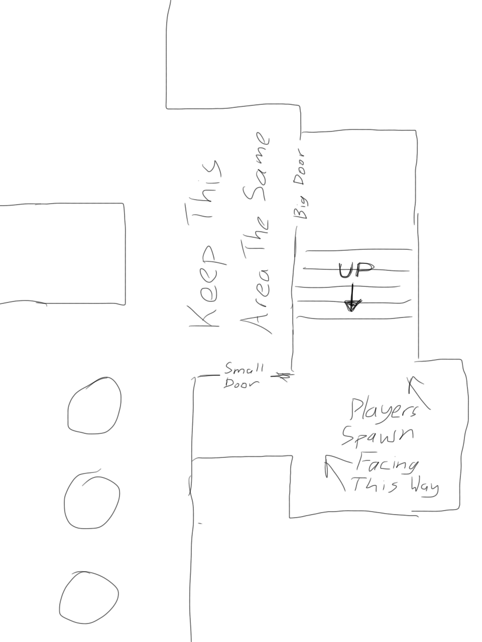
You could even move the wall that the big spawn door is on to the right a bit and make both doors big doors.
(Sorry about the large picture, I'm on mobile right now, and have no choice of how big I can make my images)
You could even move the wall that the big spawn door is on to the right a bit and make both doors big doors.
(Sorry about the large picture, I'm on mobile right now, and have no choice of how big I can make my images)
- Aug 5, 2010
- 307
- 288
Most of my time working on this map since a24 has been spent reworking B and B to C connector so if people read these posts Id definitely appreciate centering comments and feedback around those two areas for this version.
One thing I consistenly noticed in a few tests was strong polarization in B's gameplay. The first round would have B captured pretty easily and without a battle (like normal for the first round.) However once the second round rolled around it was a little different - instead of playing like a normal B point it would almost always get held by red till the timer ran out. Im not sure if this is still because of a playtest quirk or not but I made B a lot more blu friendly this time around. I hope I didnt give blu too much advantage but we'll have to test and see!
A
-Added fades to every prop I could so A should run better than last version.
B
-Reworked right side (as blu facing B) to be a "close range" area leaving the left side mostly untouched as the "long range" side.
-Added one way door entrance connected through the right side flank into B which sits higher than B. (its damn tall)
-Moved large cover wall from front of fallen obelisk to the back for the long range side. This may sound like a small change but it effects a lot.
-Reworked right side tower to (hopefully) be less flanky
-Added signage and new designs should make B immediately understandable.
-New blu entrance might make B a scout hell but well see
C
-Extended length from B to C by 128 units
-Added two raised platforms for blu to use going into C. One is for snipers and the other is for short range stuff.
D
-Widened the first entrance to the right flank into last so any red spamming into the choke has to be exposed to do so. (not sure if this is a good fix yet)
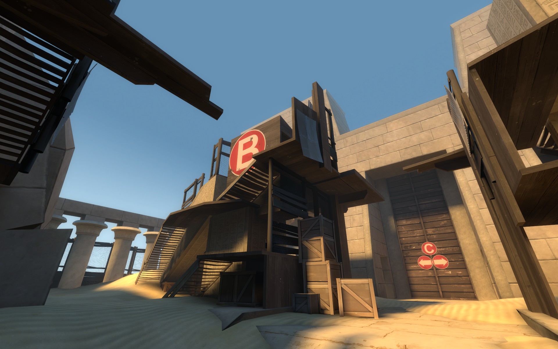
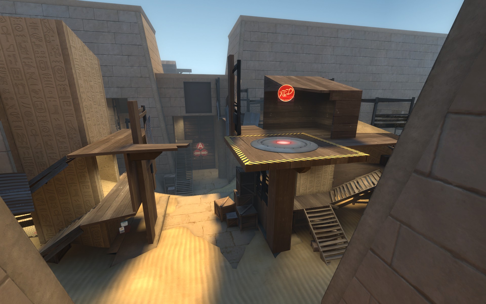
Screens of new stuff (the last shot is standing on the new blu entrance into B) B is a bit uggo at the moment but ill fix that as I go.
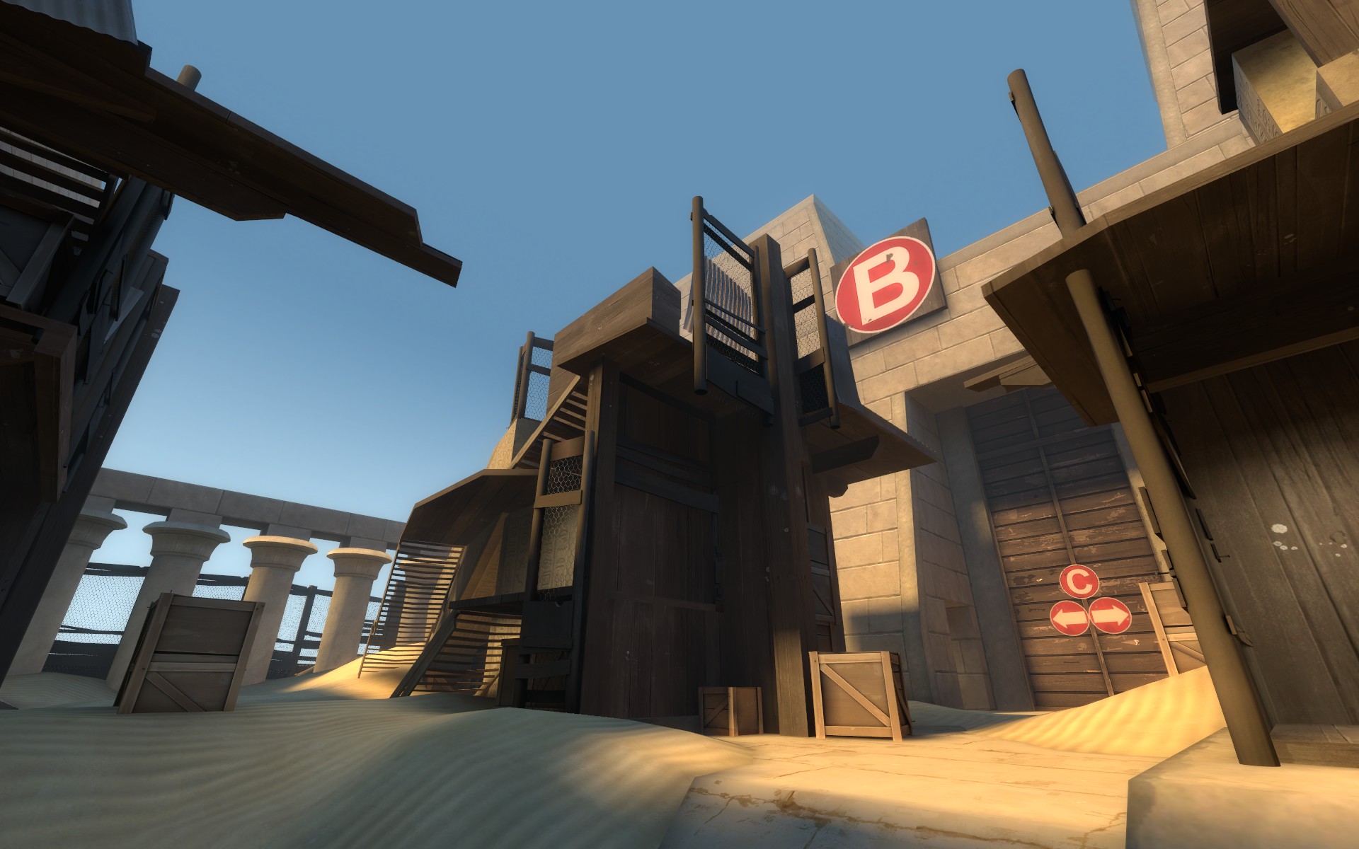
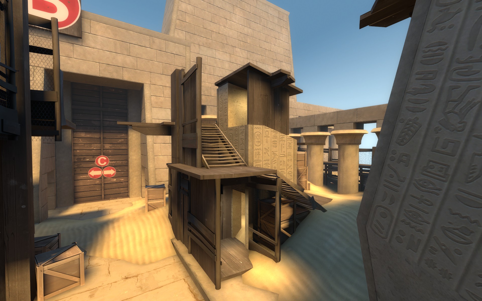
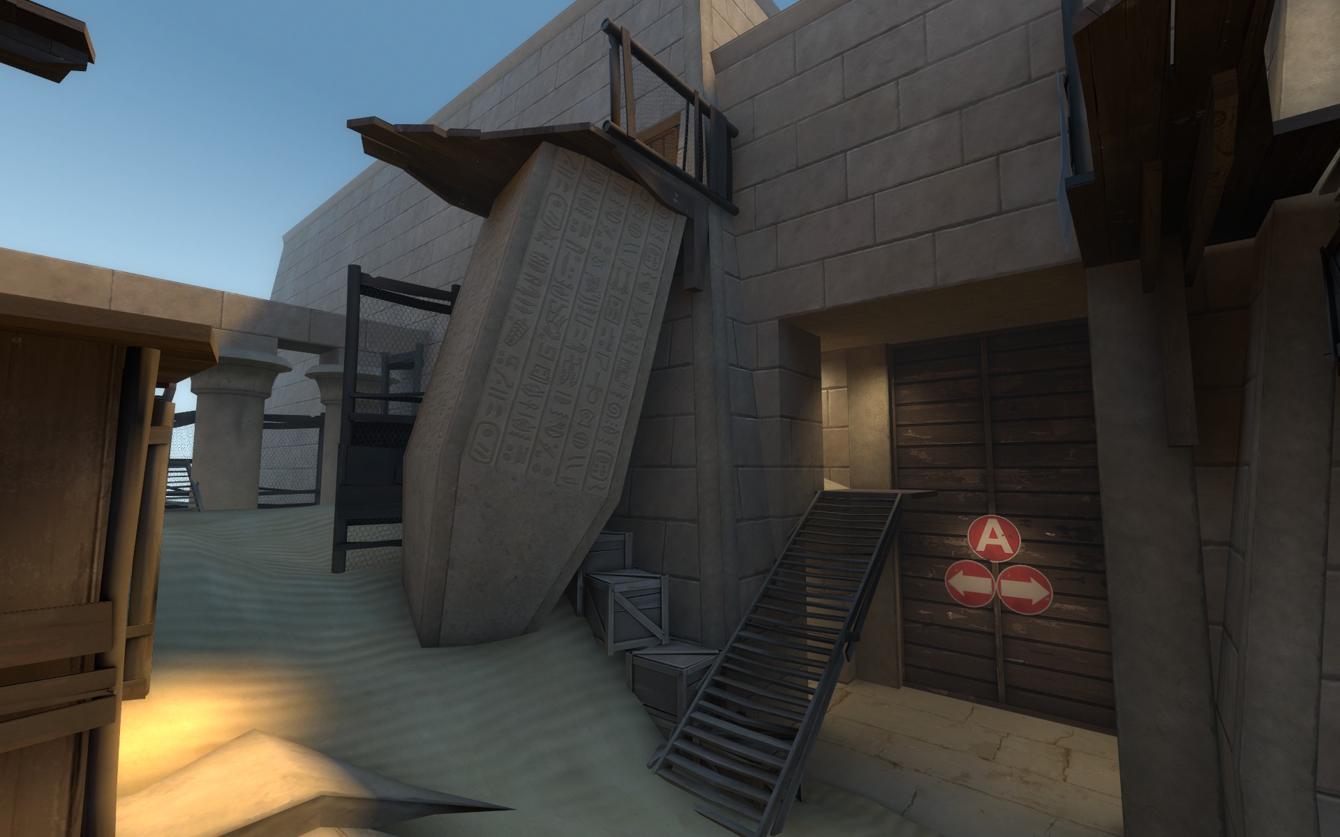
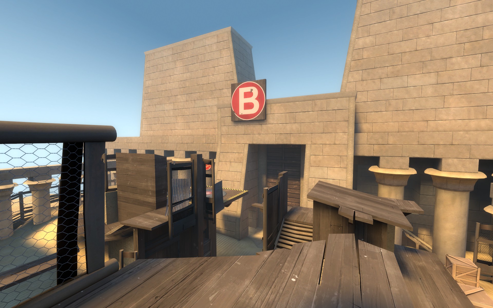
Read the rest of this update entry...
One thing I consistenly noticed in a few tests was strong polarization in B's gameplay. The first round would have B captured pretty easily and without a battle (like normal for the first round.) However once the second round rolled around it was a little different - instead of playing like a normal B point it would almost always get held by red till the timer ran out. Im not sure if this is still because of a playtest quirk or not but I made B a lot more blu friendly this time around. I hope I didnt give blu too much advantage but we'll have to test and see!
A
-Added fades to every prop I could so A should run better than last version.
B
-Reworked right side (as blu facing B) to be a "close range" area leaving the left side mostly untouched as the "long range" side.
-Added one way door entrance connected through the right side flank into B which sits higher than B. (its damn tall)
-Moved large cover wall from front of fallen obelisk to the back for the long range side. This may sound like a small change but it effects a lot.
-Reworked right side tower to (hopefully) be less flanky
-Added signage and new designs should make B immediately understandable.
-New blu entrance might make B a scout hell but well see
C
-Extended length from B to C by 128 units
-Added two raised platforms for blu to use going into C. One is for snipers and the other is for short range stuff.
D
-Widened the first entrance to the right flank into last so any red spamming into the choke has to be exposed to do so. (not sure if this is a good fix yet)
Screens of new stuff (the last shot is standing on the new blu entrance into B) B is a bit uggo at the moment but ill fix that as I go.
Read the rest of this update entry...
- Aug 5, 2010
- 307
- 288
Hindsight is a hell of a drug. The previous version of osiris had a very strange setup at B but I just had to test it just to make sure. I have a feeling my changes on this version's B will make it play a LOT better.
A
-added little sentry ledge to left side flank into B for a potential blu holding spot that wont get (hopefully) wrecked by any red pyro uber that walks in there.
B
-removed one way door room
-reverted right side tower to a24 geometry
-closed off right side far right flank so now you have to go up the tower to get around - sort of like the mountain at A.
-closing off the far right flank creates a nice additional sentry/holding spot on the ground for red with spots that cover the point.
C
-added intense sentry spot covering the point on the far back left wall behind the control point. Youll see what I mean by intense in the screenshots.
D
-nothing.
Screens of new stuff:
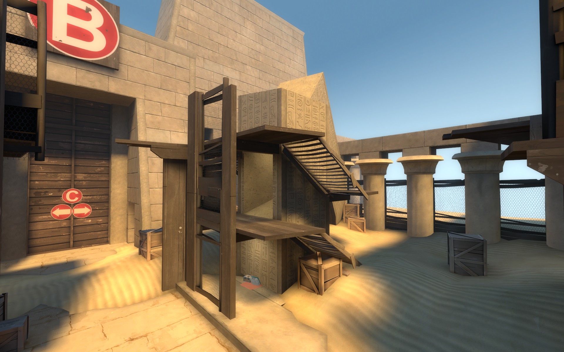
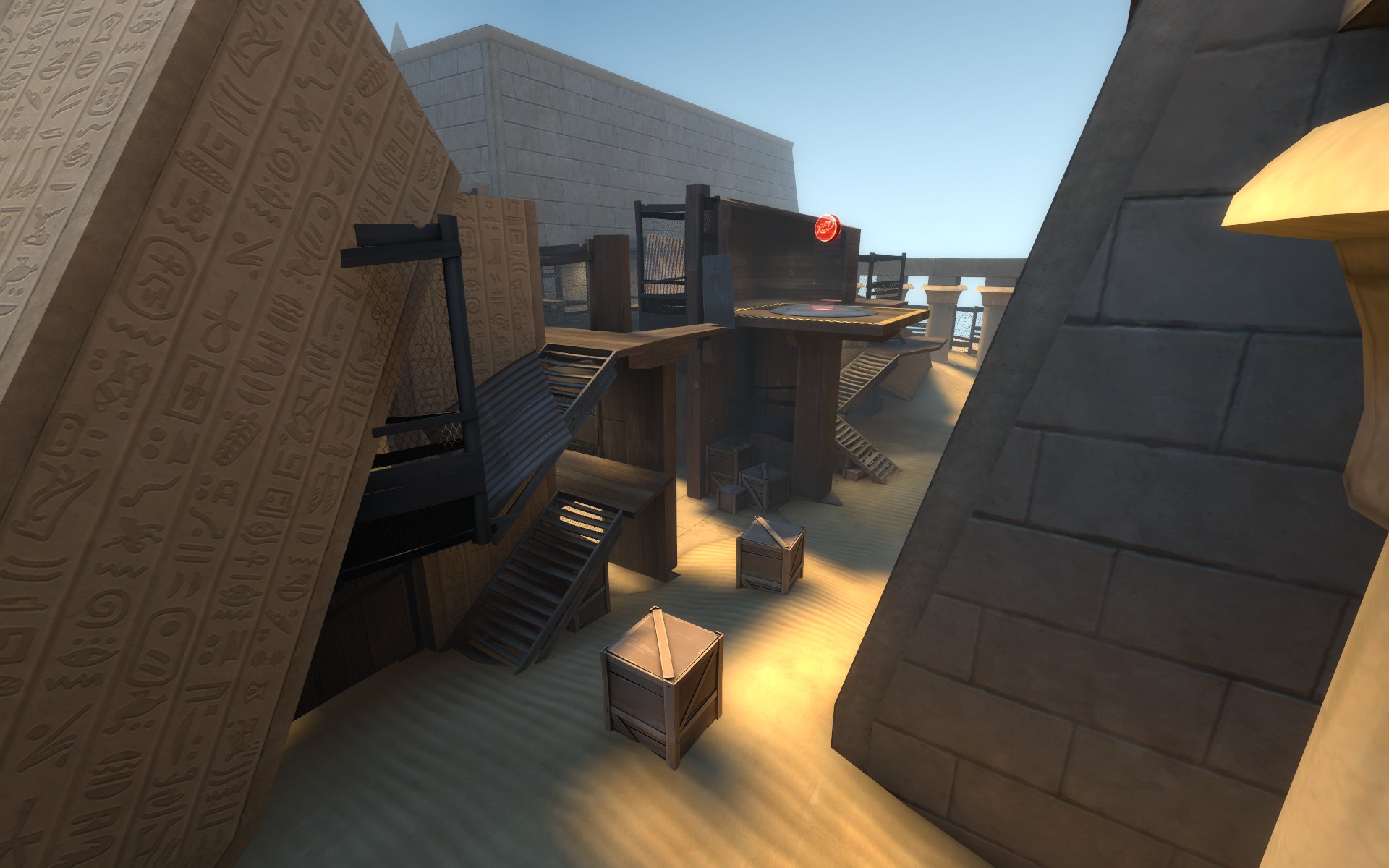
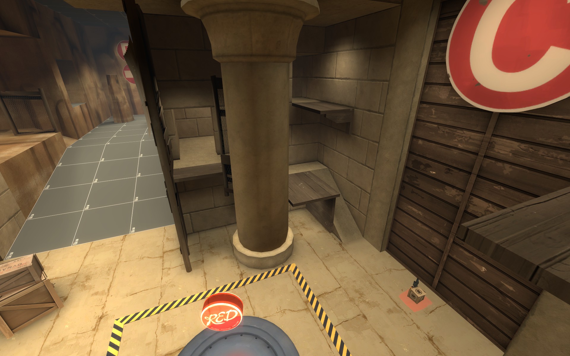
Read the rest of this update entry...
A
-added little sentry ledge to left side flank into B for a potential blu holding spot that wont get (hopefully) wrecked by any red pyro uber that walks in there.
B
-removed one way door room
-reverted right side tower to a24 geometry
-closed off right side far right flank so now you have to go up the tower to get around - sort of like the mountain at A.
-closing off the far right flank creates a nice additional sentry/holding spot on the ground for red with spots that cover the point.
C
-added intense sentry spot covering the point on the far back left wall behind the control point. Youll see what I mean by intense in the screenshots.
D
-nothing.
Screens of new stuff:
Read the rest of this update entry...
Last edited:
- Aug 5, 2010
- 307
- 288
Ah yeah Osiris time again! Being really busy with black mesa xen coupled with a complete and utter mappers block trying to redesign B were both contributors to the large time gap since my last test. However, I think my new B changes will really shine so lets test this beotch!
A
-Added some hint brushes for better FPS
-If FPS is still really bad for a few folks its definitely the brushwork drill so sorry about that until its made into a prop.
B
-Completely new design
-The new desgin should be slightly easier to cap for a better "B" difficulty
-Extended the playspace by 128 units length wise
-Lowered control point by 128 units
-Blu's right side flank into B is now one way to non-explosive-jumping classes. This might need an extension further into B but well see.
C
-Pushed the point back 64 units
-Reduced the size of the capture area
-Widened the side ramp room near the point
D
-Nothing
C and D will be my next focus now that B is not a clusterfuck of brushwork. These changes will be mostly small so a beta version is near!
Pics of the new stuff at B
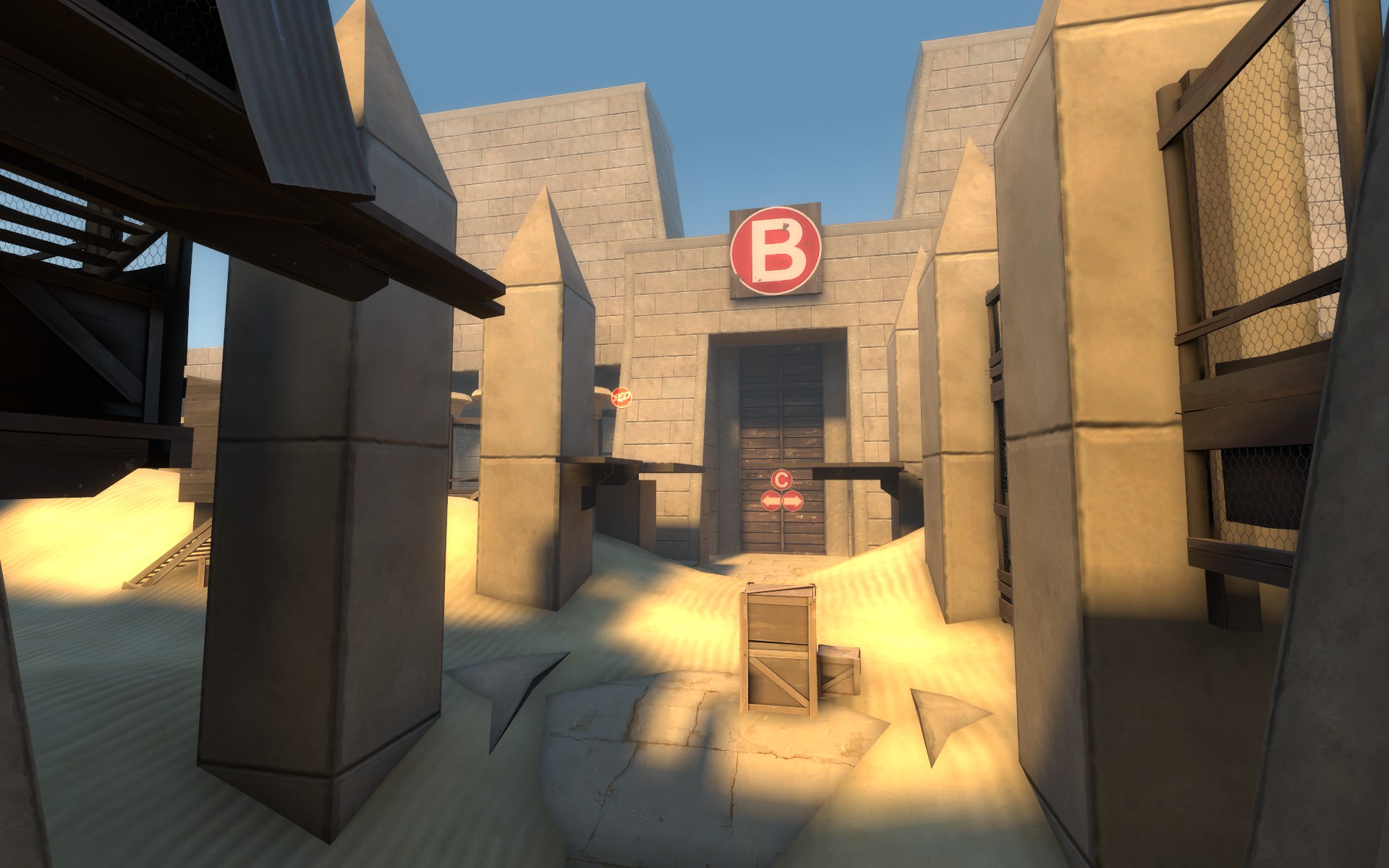
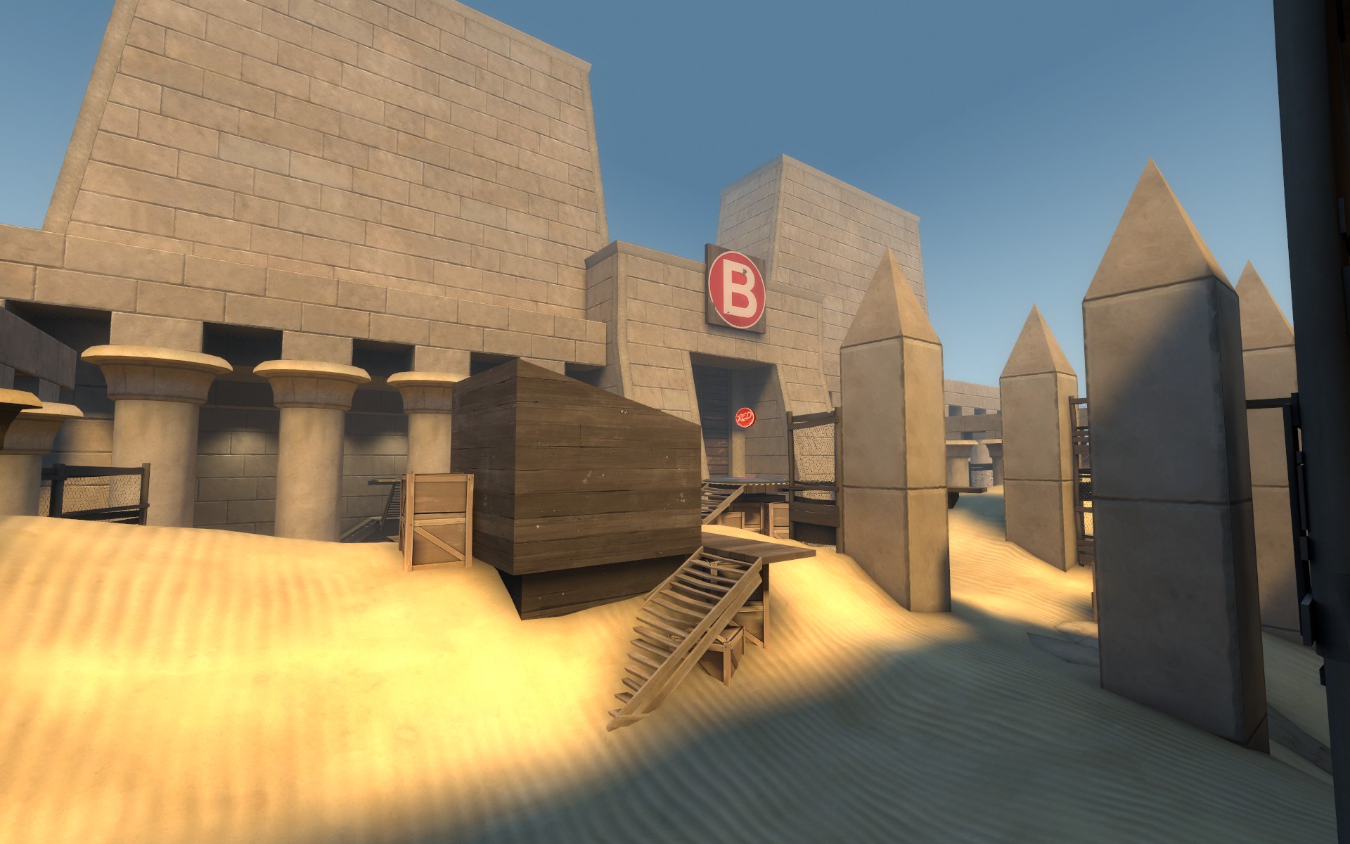
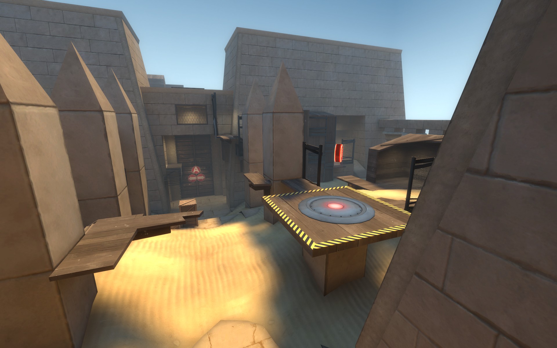
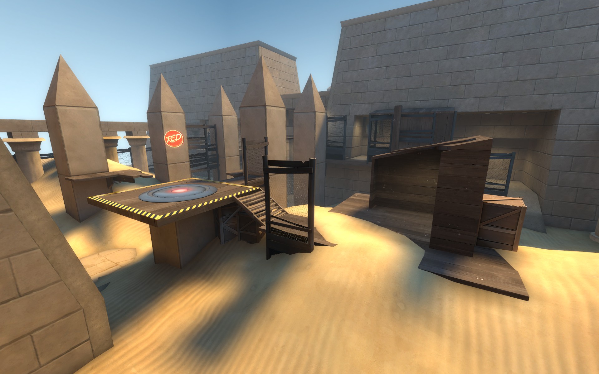
Read the rest of this update entry...
A
-Added some hint brushes for better FPS
-If FPS is still really bad for a few folks its definitely the brushwork drill so sorry about that until its made into a prop.
B
-Completely new design
-The new desgin should be slightly easier to cap for a better "B" difficulty
-Extended the playspace by 128 units length wise
-Lowered control point by 128 units
-Blu's right side flank into B is now one way to non-explosive-jumping classes. This might need an extension further into B but well see.
C
-Pushed the point back 64 units
-Reduced the size of the capture area
-Widened the side ramp room near the point
D
-Nothing
C and D will be my next focus now that B is not a clusterfuck of brushwork. These changes will be mostly small so a beta version is near!
Pics of the new stuff at B
Read the rest of this update entry...
- Aug 5, 2010
- 307
- 288
So when is the lawsuit against Blizzard for stealing your map hitting?
Just as soon as I can afford a team of lawyers
- Aug 5, 2010
- 307
- 288
Same as a27 except I fixed a non-walkable displacement at B that was in a rather important location.
Read the rest of this update entry...
Read the rest of this update entry...
- Aug 5, 2010
- 307
- 288
- Aug 5, 2010
- 307
- 288
This is a small update but marks a big milestone - the next version of osiris will be beta! I still have the intention of changing the time given on point caps in some way im just not sure how yet.
A
-Nothing
B
-Nothing
C
-Blocked all gaps in prop fences
D
-Final choke elevated platform has a little fence to block sightlines to blu's elevated route into the area
-Blocked a sightline from red spawn into blu right side choke
Read the rest of this update entry...
A
-Nothing
B
-Nothing
C
-Blocked all gaps in prop fences
D
-Final choke elevated platform has a little fence to block sightlines to blu's elevated route into the area
-Blocked a sightline from red spawn into blu right side choke
Read the rest of this update entry...


