Osiris

CP Osiris b27

  • This map is featured! Our best maps, all together in one place for your viewing pleasure.

JeanPaul

L6: Sharp Member
Aug 5, 2010
295
284
Just after a13's last test Ravage pointed out to me how I didnt funnel players enough from B to C. It was embarassingly obvious now that I look at it. I might have gotten a little carried away with C but I really hope its at least a little fun to begin with.

Changes/additions in a14:
-Both red and blue forward spawns that change upon blue capturing B
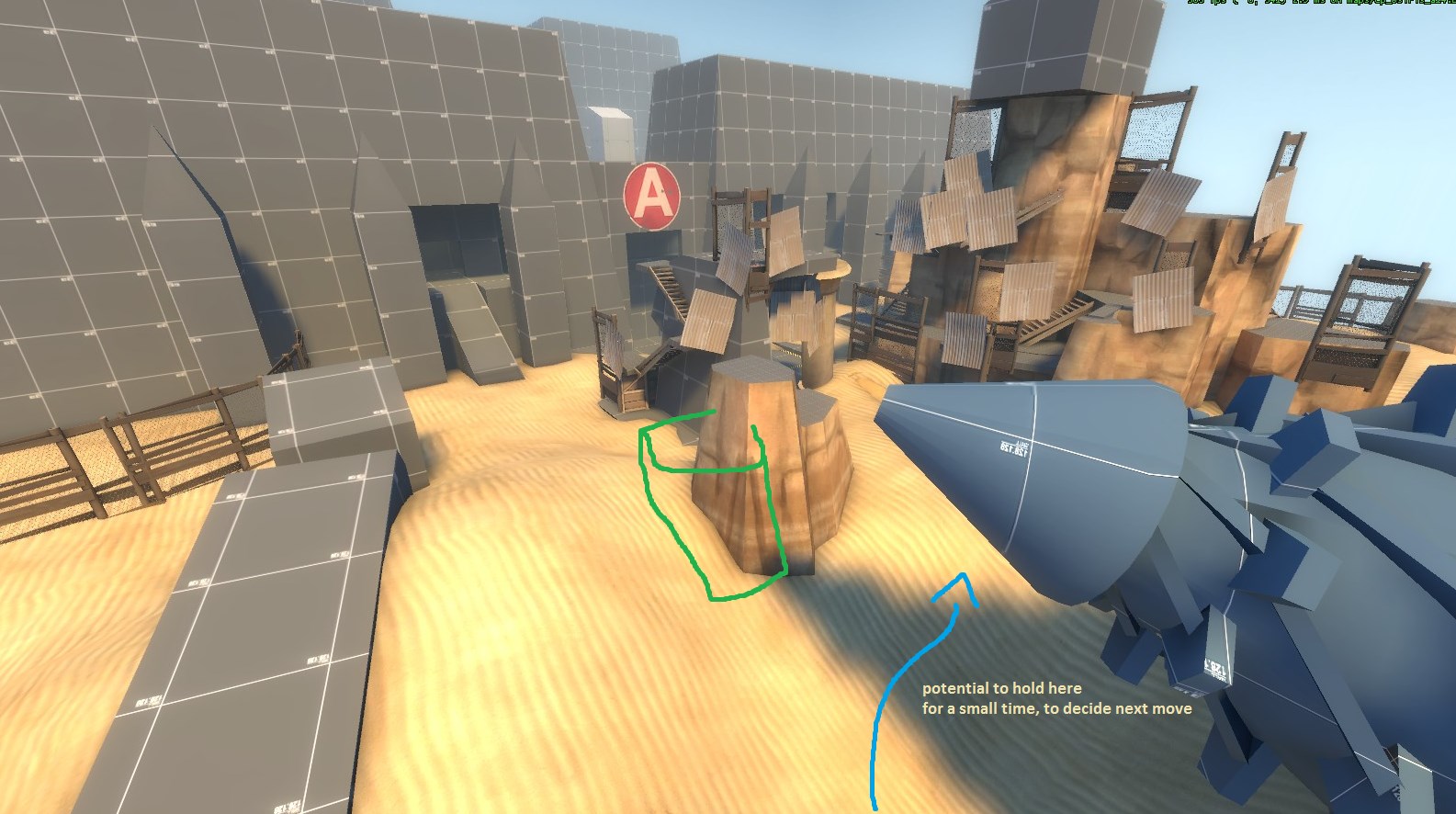
-A should be more defendable now
-entirely redesigned C and the final choke leading to C

Things to note about a14:
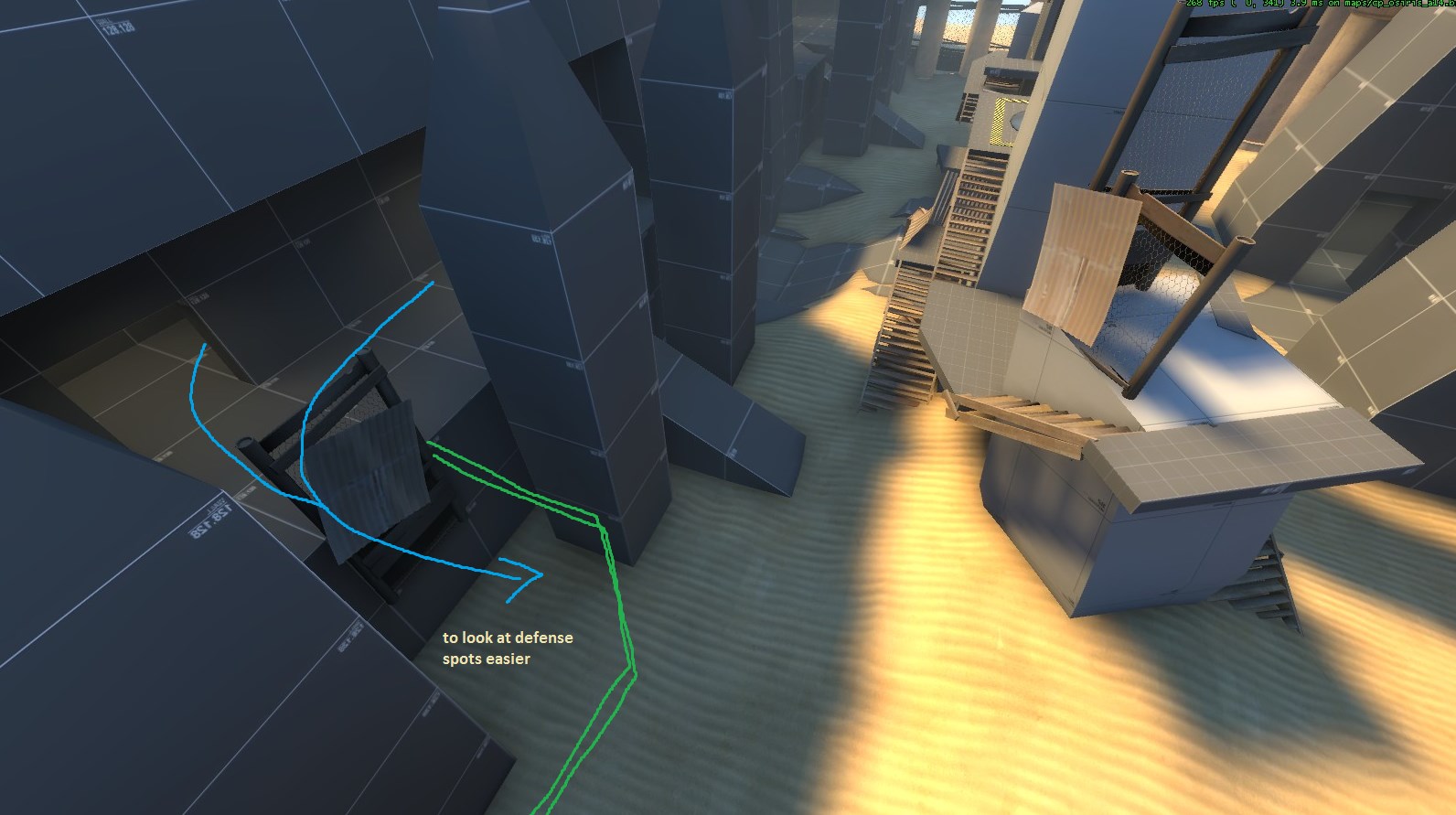
-The choke from A to B is still a little wonky. I might need to add a wall you can explosive jump over on one side to open it up a little bit (think gorge's first area on the right)
-General timings in the map (capture time, time given upon capture, respawn times) might need to be tweeked.
-None of the stairs surrounding C are clipped. I apologize for this but takes a serious amount of time to clip curved stairs.
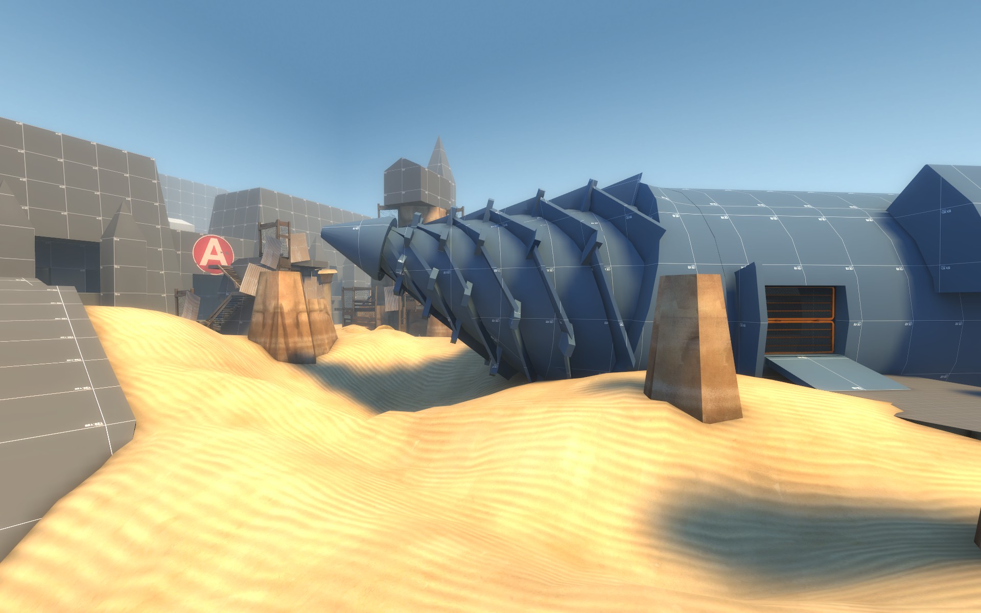
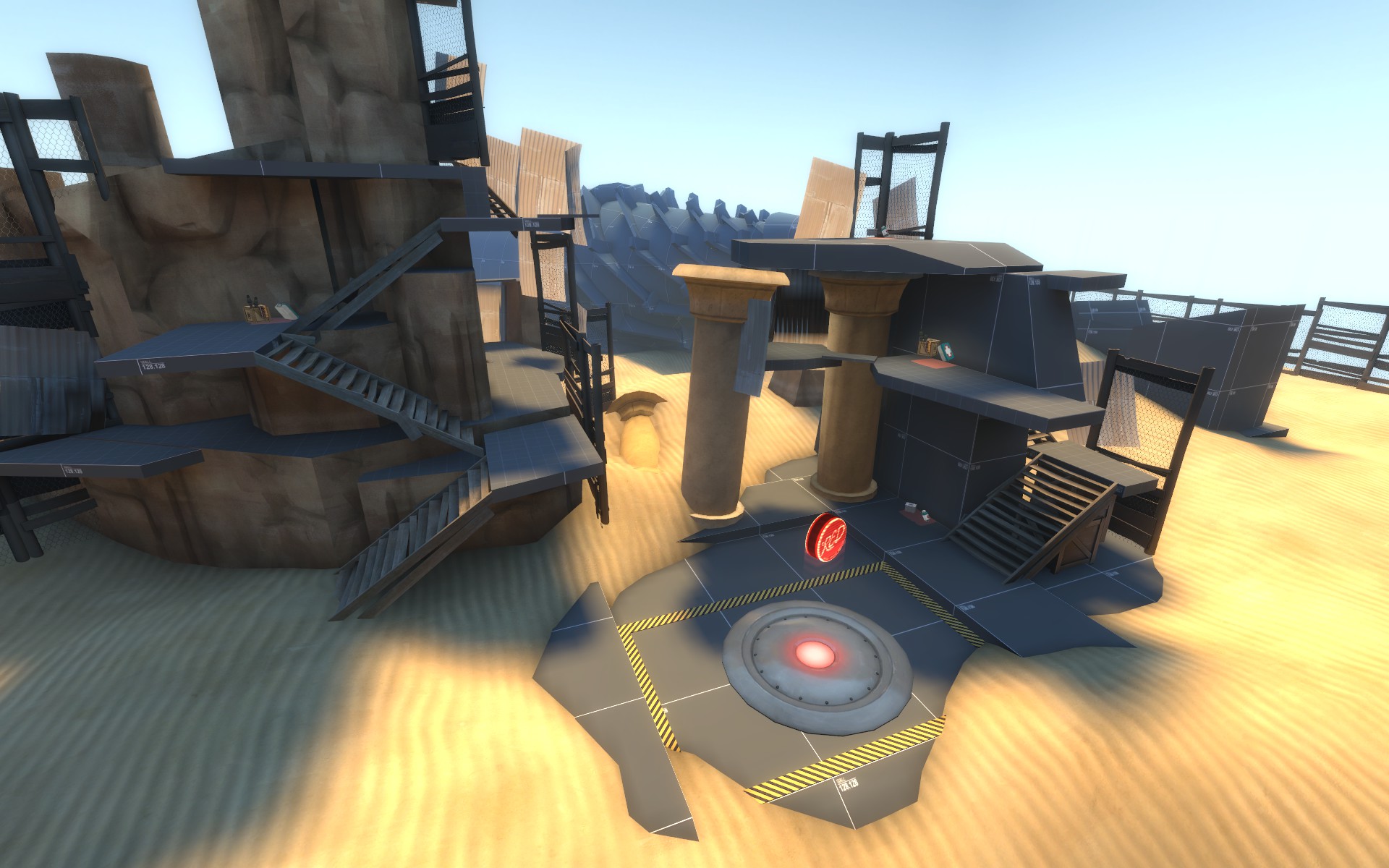
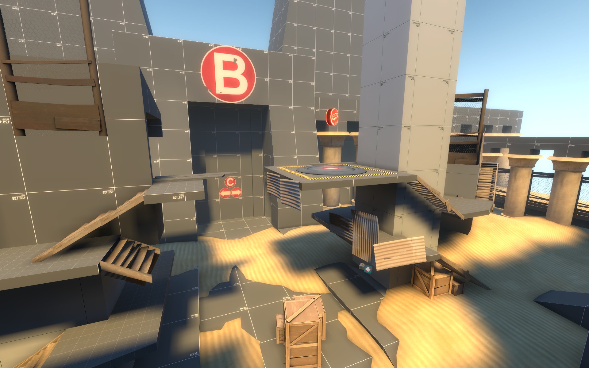
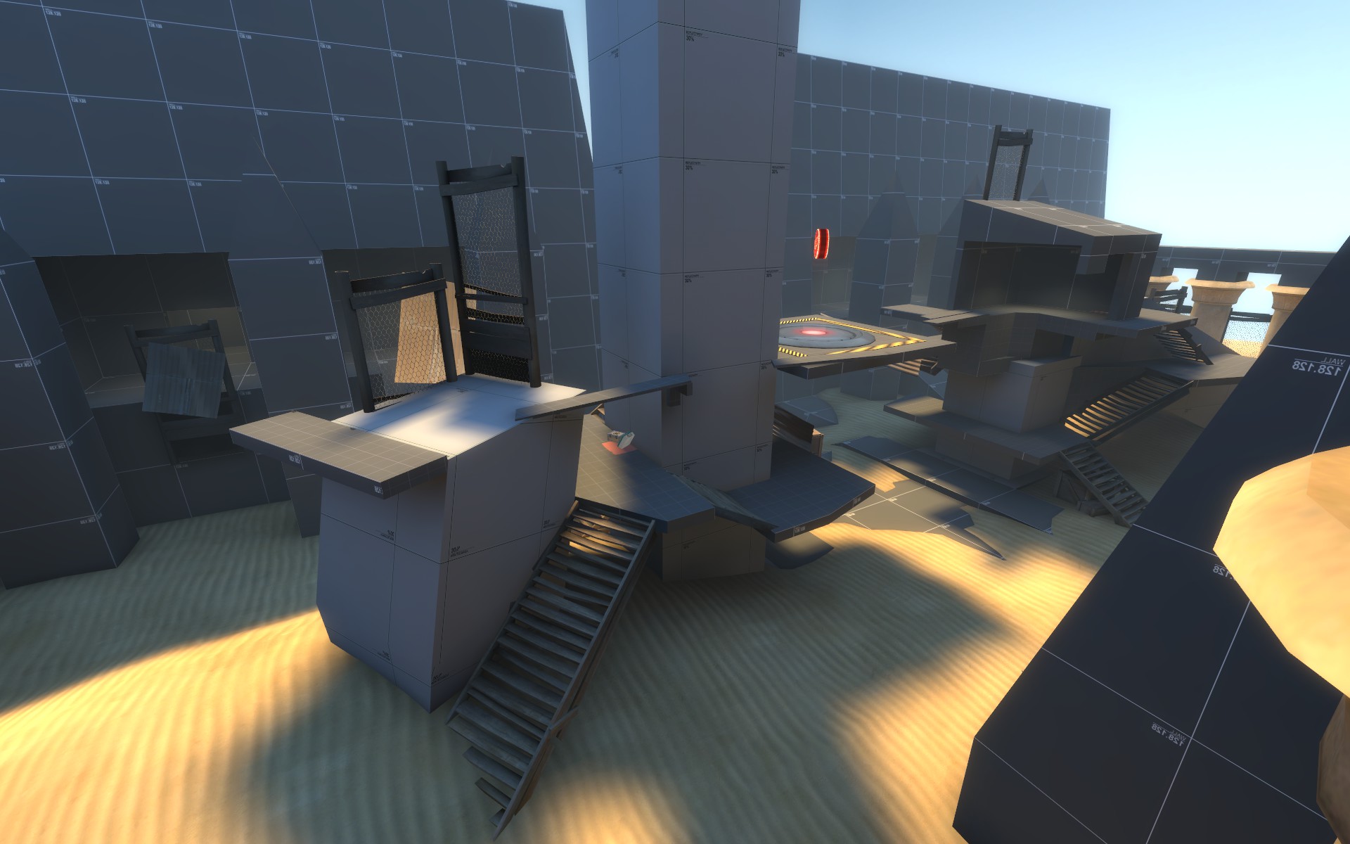
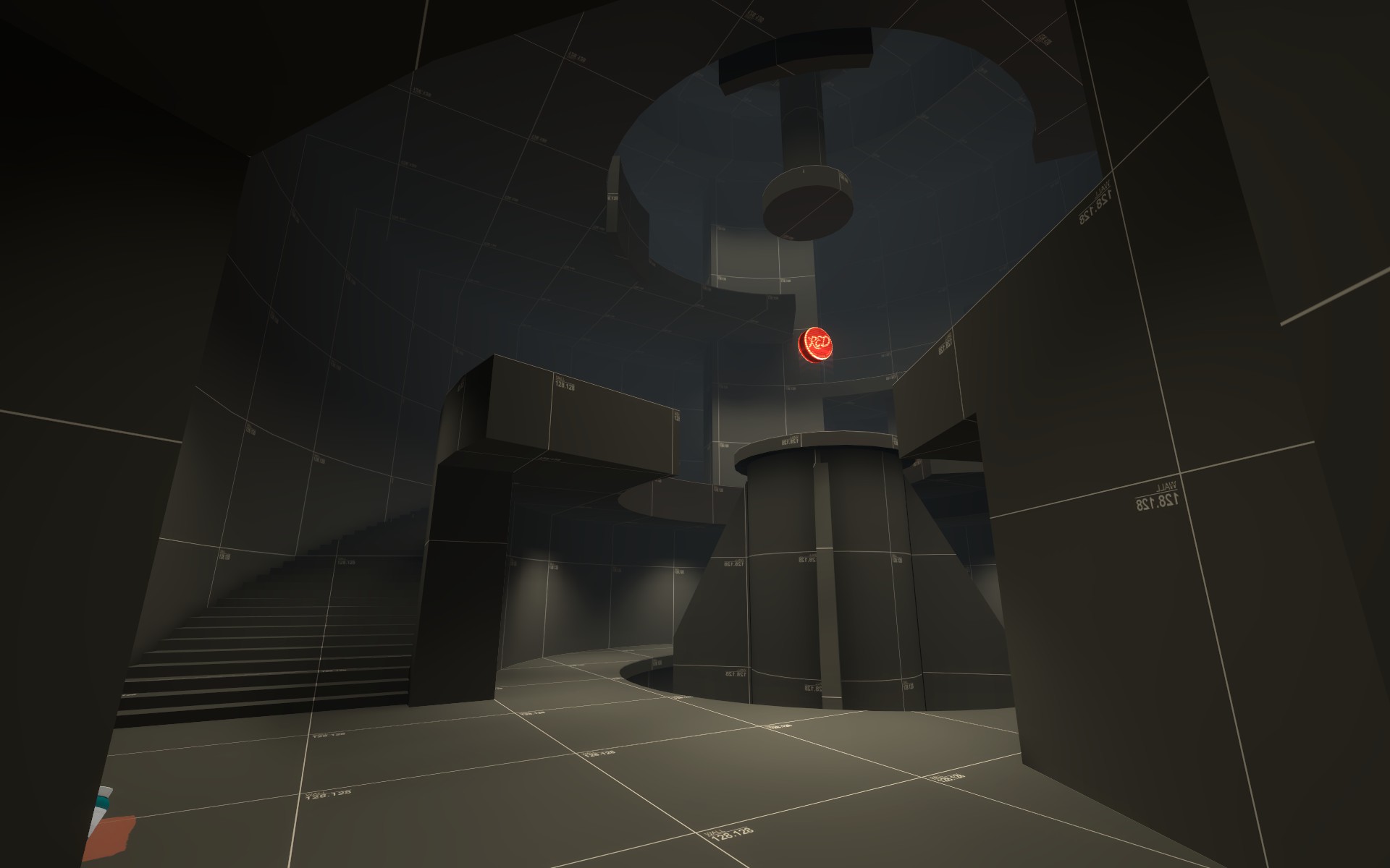
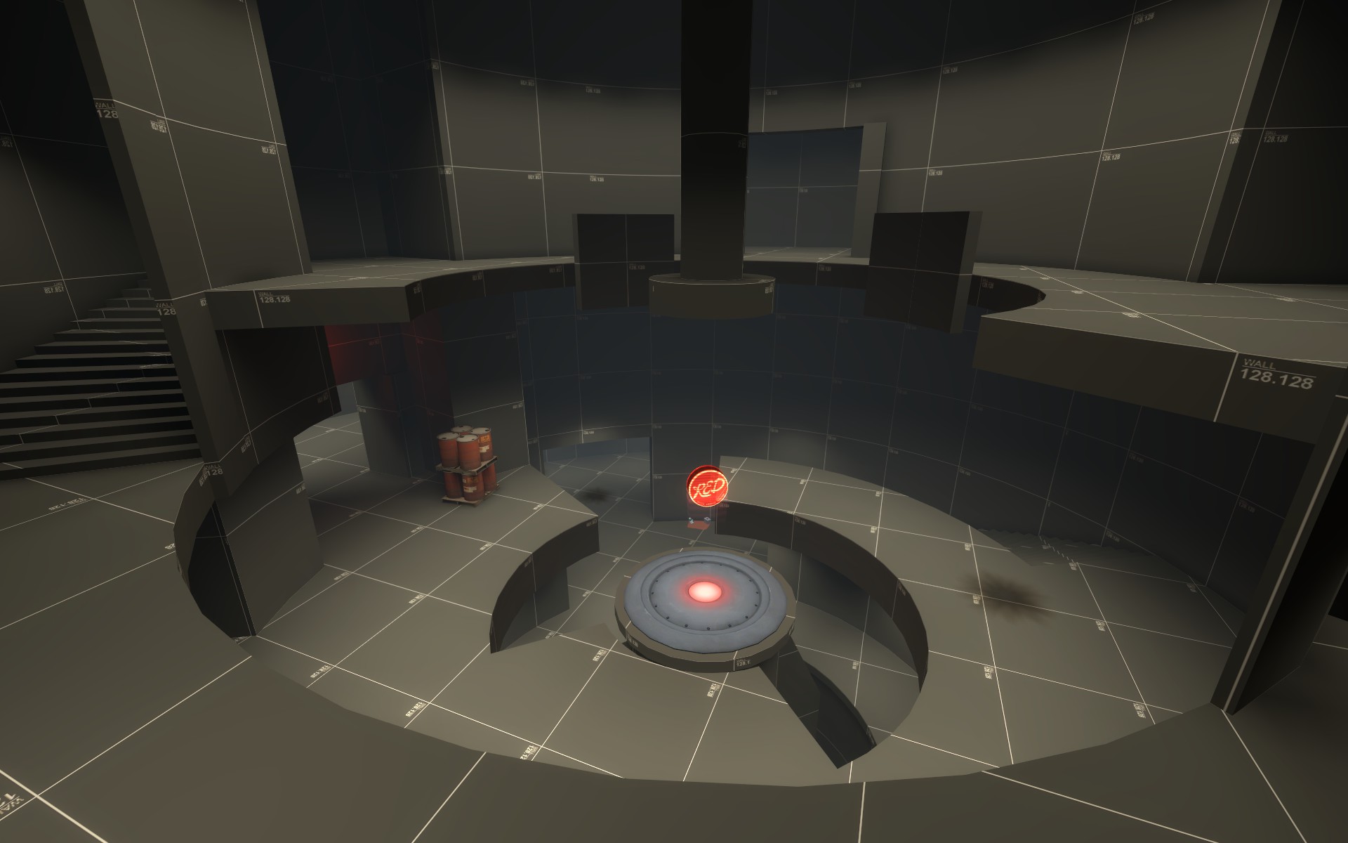
2016-02-20_00002.jpg
2016-02-20_00003.jpg
2016-02-20_00004.jpg
2016-02-20_00005.jpg
2016-02-20_00006.jpg
2016-02-20_00007.jpg


Read the rest of this update entry...
 
Last edited:

YM

LVL100 YM
aa
Dec 5, 2007
7,158
6,079
Take aways from today:

  • It's a refreshing difference from standard TF2 maps that are often flat and generic and boring
  • The rocks outside A are great, more please
  • Don't add a left exit to Blu spawn, just make the higher exit more obvious and less awkward to walk to
  • It isn't a confusing layout but the same textures eeeeevverywhere doesn't make it easy to recognise where you are if you pop out of a tele
  • People are going to fixate on the obvious feedback (that's just a fact of life) so spend a few minutes to vary the textures or add an arrow or two to those areas to allow people's brains to focus on the next most obvious feedback thing. (I seriously think that arrow overlays or the billboard props are more useful as landmarks than as actual arrows, their placement is usually different and helps make corridors look different from one another)
  • The stairs out the back of red's final spawn are hard a bit hard to notice.
  • It's possibly a little big. A/B seem maybe 110-120% of what they might be better as. C seems fine but the distance between B and C is a big one.
 

Pocket

Half a Lambert is better than one.
aa
Nov 14, 2009
4,699
2,581
Everyone was talking at you at once during the test, so I'll reiterate what I was getting at: I'm impressed at how you've made it intuitive where to go in the first two-thirds of the map, even though it looks like a total clusterfuck. Seriously, there are enough maps where you spawn somewhere in the middle and you instinctively go precisely the wrong way, and I didn't have that problem here despite being dumped into what felt like a three-dimensional maze.

The third section is another story, however. There are paths that take you out of the vicinity and others that just sort of loop back around on it, and it's not clear which are which. I'm not sure if this is really that big of an issue, since RED's job once they start spawning there is just to defend the point and there's not necessarily a huge benefit to pushing back, but... I dunno. I'd like to hear what others think. Pushing into C meanwhile just feels like a slog. That could just be a detailing problem, with everything looking the same. A good point of comparison would be the artpass map. Even in its original for where everything was the same gray dev texture, it felt like there was a lot of variation between the different areas, so you always had a decent sense of your bearings.
 

Egan

aa
Feb 14, 2010
1,378
1,724
Here's some video feedback for _a14:
https://youtu .be/XKbaBjy3cao

Main thoughts are that A and B are hard to feel like I can approach them - blue is too scared to take risks to take the height because they do not naturally get height in the attacking locations. C was hard to decipher routes in cause it kinda all looked the same - as YM said.

LJ0Rpon.jpg

iHp8nLi.jpg
 
Last edited:

JeanPaul

L6: Sharp Member
Aug 5, 2010
295
284
Alright cool thanks a lot for the feedback guys! I already have a list of things I want to change and add for the next version. I do however want to test a14 a little more though.
 

JeanPaul

L6: Sharp Member
Aug 5, 2010
295
284
A
-Gave blue a little more cover
-Blocked the sniper sightline from blue spawn to inside the A-B choke
-More sentry spots
-Increased size of sentry nest spot above the point + gave it more cover from above
-Blocked far right flank for blue
-Blue now has 6 minutes to cap A

B
-Gave blue two vantage points to see into the capture area more
-Red forward spawns have more room for sentries

C
-Shortened and simplified choke from B to C
-Added more sentry options
-More cover for red
-Larger upstairs room
-Different floor colors for each floor
-One main wall has been made red for easier navigation
-Navigation signs added

2016-03-05_00005.jpg
2016-03-05_00006.jpg
2016-03-05_00007.jpg
2016-03-05_00008.jpg
2016-03-05_00009.jpg
2016-03-05_00010.jpg
2016-03-05_00011.jpg
2016-03-05_00012.jpg
2016-03-05_00013.jpg


Read the rest of this update entry...
 

Crowbar

aa
Dec 19, 2015
1,455
1,298
I love the brushwork, but the sand texture is too... rowdy to me. This thing at first screenshot is kinda easy to make but looks so good.
 

hutty

aa
Mar 30, 2014
547
446
I don't know if you want to deviate from TF2 design this far, but the map could use some pass_time style speed powerups because navigating as heavy is really slow in the map's current state.
 

JeanPaul

L6: Sharp Member
Aug 5, 2010
295
284
This should be an interesting test because ive made a few weird additions and changes that I hope will be fun. The first point might be a little laggy for lower end users.

Map general:
-Added forth point before final to make this map a 4cp A/D. The distance between B and D is the same as it used to be as B to C.
-Removed red respawn penalties as blue captured B
-Removed teleport function from red forward spawn once blu captures B. New behavior is to just open the door until all red leaves the spawn room and then permenently shuts. These resupply cabinets also disable upon capture of B.

A
-Gave blue a few height advantages right out the door if you take the under drill flank
-Moved a few peices around
-Gave blue drill spawn a window
-Clipped drill spawn exit

B
-Middle-left flank from A to B now has a sentry ledge so blu can hold the lower area while trying to capture B.
-Medkit near the busted building next to the point is now small rather than medium
-Some healthkits added to back of B arena

C
-New capture point!

D
-Removed mini side flank from main curved hallway to D

20160315193916_1.jpg
20160315193935_1.jpg
20160315193949_1.jpg
20160315194008_1.jpg
20160315194021_1.jpg
20160315194058_1.jpg
20160315194130_1.jpg
20160315194153_1.jpg
20160315194217_1.jpg
20160315194226_1.jpg
20160315194317_1.jpg
20160315194336_1.jpg
20160315194347_1.jpg


Read the rest of this update entry...
 

JeanPaul

L6: Sharp Member
Aug 5, 2010
295
284
I am very excited to test this version as Ive made a lot of changes and I hope they are all for the best. I fixed about 90% of the issues pointed out in the last version in addition to the new stuff.

Map general:
-Blue now has 3 total spawns. The drill and two forwards (forward 1 upon capture of B and forward 2 upon capture of C)
-Red has two spawns with a shortcut from final to C that closes upon capture of C.
-Captimes are a little wonky atm. I just need more testing for these.
-Added tons of signage so if you get lost now then may god have mercy on your soul

A
-Rotated, centered, and moved blue drill closer to first point.
-Drill spawn has two exits now
-Facing A in blue spawn: left leads to the long(er) range and right leads to closer range
-Close range side now requires you to climb up the mini-mountain rather than being able to walk around
-Long range side is now one giant sand dune rather than lots of little ones
-Removed "OP" sentry spot right above first point
-More sentry friendly immediately around point
-Entire "drill bit" part of blue spawn can be played on

B
-Chokes from A reworked so every entrance into B immediately shows where the point is located.
-Widened main choke into B
-Blue now has some more height advantages
-Moved point from standing tower to broken tower
-Reduced size of play space
-Blocked off some paths from middle so lower area isnt such insta death zone

C
-More sentry spots near control point
-Lowered height of main sentry spot
-Jump boxes are now a ramp

D
-Entirely new. I scrapped the entirety of the previous D and started from scratch.
-Final choke leading to D is longer and more focused. I might need to add another flank here but I want to test it in its more simple form first
-Since D is entirely new a few of the design decisions in certain areas are essentially a "crap shoot" until I can get more testing data so go easy on me here.
-Ill let the screenshots do most of the explaining since its all new

Whoo!

20160603183039_1.jpg
20160603183050_1.jpg
20160603183110_1.jpg
20160603183123_1.jpg
20160603183141_1.jpg
20160603183146_1.jpg
20160603183156_1.jpg
20160603183206_1.jpg
20160603183217_1.jpg
20160603183259_1.jpg
20160603183312_1.jpg
20160603183320_1.jpg


Read the rest of this update entry...
 
Last edited:

JeanPaul

L6: Sharp Member
Aug 5, 2010
295
284
I fixed most of the main complaints about the previous version and added in a few small new things.

Map general
-Each point gives 6 minutes now rather than 8

A
-Moved the drill 256 units further away from the point
-Shifted around some of the rocks in the long range side

B
-Wided capture area to the edge of the platform
-Added 128 units to the hallway between red forward and B
-Reworked red forward spawn area to be more simple and give blue access to stuff when attacking C

C
-Moved the behind pillar wall up so blue has a little more freedom in the beginning of C
-Added an elevated area for red or blue to hold inside the tiny flank near the point
-Smoothed out back ramp behind point so you dont have to jump anymore

D
-Added two rock pillars in beginning of choke
-Added flank route and cover from snipers
-Added sand displacements

20160615234137_1.jpg
20160615234157_1.jpg
20160615234243_1.jpg
20160615234253_1.jpg
20160615234316_1.jpg
20160615234334_1.jpg
20160615234348_1.jpg
20160615234403_1.jpg
20160615234413_1.jpg


Read the rest of this update entry...
 
Sep 7, 2012
638
501
Every noticeable change looks like a definite improvement with the exception of the main choke between B and C, which I am undecided on. I suspect it will remain a slight problem area, though the red hold point will be closer to B than it was previously. Testing will tell of course, and I look forward to playing it. I think it's definitely moving in the right direction.
 

JeanPaul

L6: Sharp Member
Aug 5, 2010
295
284
This update is mostly focused on C. I didnt like how some of the battles were happening and I hope this update makes C a lot more fun. C has also been having issues with being rolled so if that keeps (consistently) happening I have a few more ideas I can try. I still have ideas for the map around other control points but I need to test more before I can make decisions.

A
-Smoothed out the main sand dune jus a lil
-Refined the tiny path to the overhang over the point

B
-Gave blu a slight geometry advantage coming out of the large hallway choke

C
-Added side path for flanks
-Beefed up side choke that leads to the point
-Added some sentry spots that are powerful but can be out ranged if you use the side flank

These screens are just of the changes at C

20160624221501_1.jpg
20160624221513_1.jpg
20160624221529_1.jpg
20160624221559_1.jpg
20160624221627_1.jpg
20160624221656_1.jpg


Read the rest of this update entry...
 
Last edited:

JeanPaul

L6: Sharp Member
Aug 5, 2010
295
284
I fixed a few issues I noticed in the previous tests and made a few additions that are ridiculous but hopefully fun.

General
-Added some retracting prop arrows for direction near reds first forward spawn. They retract upon capture of B and go back down on capture of C for blu guidance at blue forward 2.

A
-Added rock platforms for some player predictablility for both sides fighting in the area
-Added some elevated paths on the long rage red side for some variation

B
-Cleaned up some of the visuals
-Added just a little more cover going up the tower next to the point

D
-Reworked first area of the final choke to have a mini spire
-Recessed the wall in the main blue holding point near the end of the final choke
-Added really tall blue stair access into final point
-Removed ramp on boxes into side flank so once blue clears out the hallway area in there it doesnt get instantly reflooded with red.
-Removed crazy long sniper sightline from red back area. It is now lower down on the ramp and has less of a view.

Screens of the new stuff:

20160709032812_1.jpg
20160709032839_1.jpg
20160709032913_1.jpg
20160709032929_1.jpg
20160709032937_1.jpg


Read the rest of this update entry...
 

JeanPaul

L6: Sharp Member
Aug 5, 2010
295
284
I only tested a21 once but it was all I needed to notice some of the awkwardness in certain areas. This new version should fix a lot of ambushing that was going on at A and B and hopefully make the areas a lot more fun. B now has some more advantages for blue and hopefully a few spots for blu to hold while trying to capture.

A
-Reworked the short range side to have fewer places to ambush
-Reworked the height on short range so red isnt directly over the main path blue can take
-Short range side should be less confusing
-Added fence inbetween the two large rock pillars on the long range side to lower amount of ambushing

B
-Added third pathway at the same height as the point that -should- be blu dominated for some offense assistence
-Reworked the "stair tower" side to have fewer flanks and be a little more blue friendly
-Added fence under the broken obelisk side to reduce weird sightlines

D
-Removed huge blue height advantage coming out of choke because it instantly turned into the worst sniper tower of all time

Screens of new things:
20160717121220_1.jpg
20160717121237_1.jpg
20160717121243_1.jpg
20160717121329_1.jpg
20160717121349_1.jpg
20160717121359_1.jpg


Read the rest of this update entry...