Osiris

CP Osiris b27

  • This map is featured! Our best maps, all together in one place for your viewing pleasure.

JeanPaul

L6: Sharp Member
Aug 5, 2010
295
284
Beta time!

Normally I would like to get all my details and lighting in before considering the map beta but I can see the merits of releasing earlier so I can test final gameplay stuff and push the detail based on performance feedback.

Visual stuff to-do list:
-Hero props + other assets
-3d skybox
-Displacement editing
-Additional lighting pass (especially at C)
-Smaller details pass depending on performance
-Red spawn detail

Gameplay changes:

B
-Left side flank (as blu facing B) now has a really strong holding position and removes direct access for red onto the platforms into B
-Red forward spawns have been moved back around 256 units further from the point to counter the red reflooding B problem after a team wipe

C
-Moved the point back 64 units

D
-Shortened cap time from 7 to 6 seconds
-Added a tiny ramp on the back stairs so blu doesnt get trapped easily
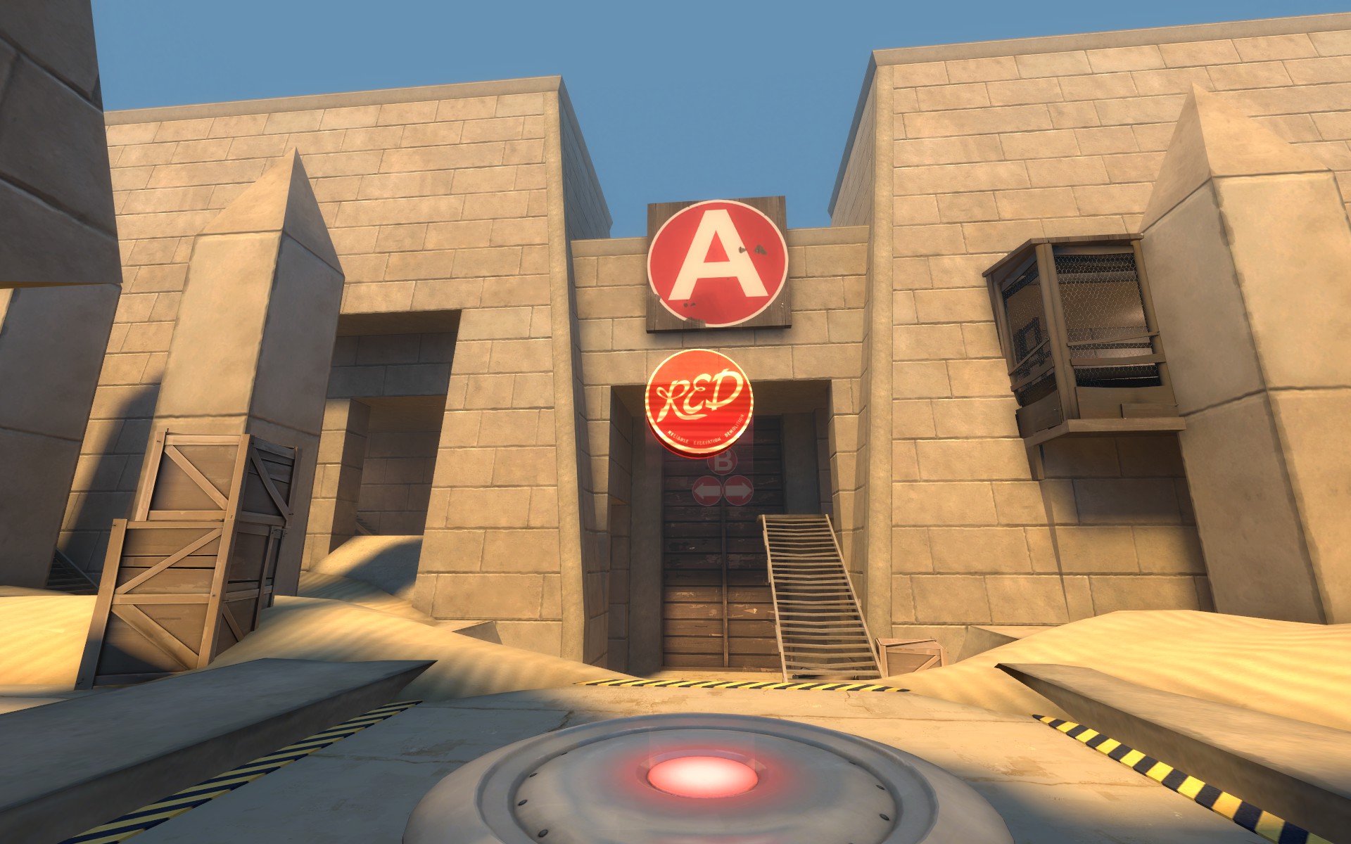
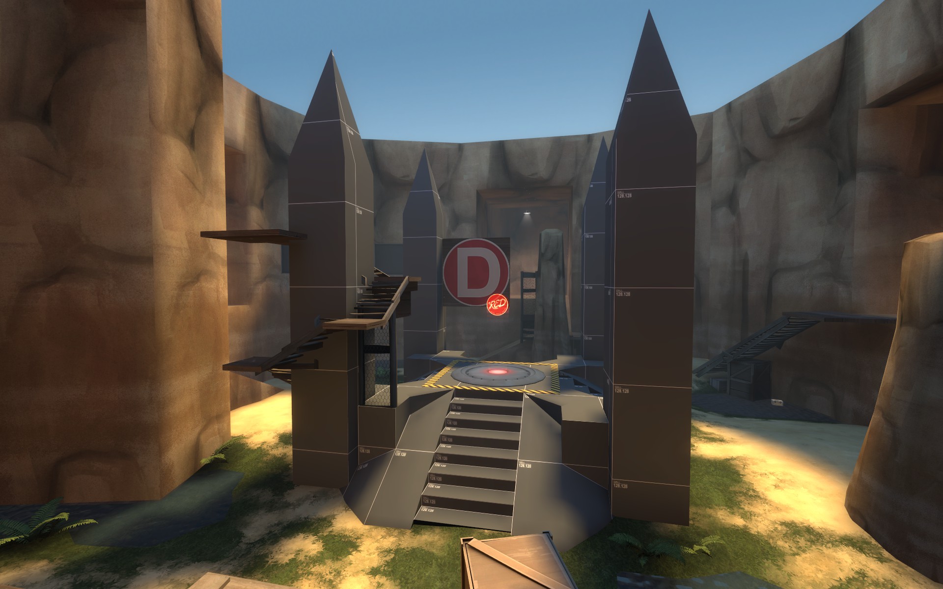
20170501220247_1.jpg
20170501220300_1.jpg
20170501220315_1.jpg
20170501220329_1.jpg


Read the rest of this update entry...
 

Kube

Not the correct way to make lasagna
aa
Aug 31, 2014
1,342
1,850
Beta time!

Normally I would like to get all my details and lighting in before considering the map beta but I can see the merits of releasing earlier so I can test final gameplay stuff and push the detail based on performance feedback.

Visual stuff to-do list:
-Hero props + other assets
-3d skybox
-Displacement editing
-Additional lighting pass (especially at C)
-Smaller details pass depending on performance
-Red spawn detail

Gameplay changes:

B
-Left side flank (as blu facing B) now has a really strong holding position and removes direct access for red onto the platforms into B
-Red forward spawns have been moved back around 256 units further from the point to counter the red reflooding B problem after a team wipe

C
-Moved the point back 64 units

D
-Shortened cap time from 7 to 6 seconds
-Added a tiny ramp on the back stairs so blu doesnt get trapped easily
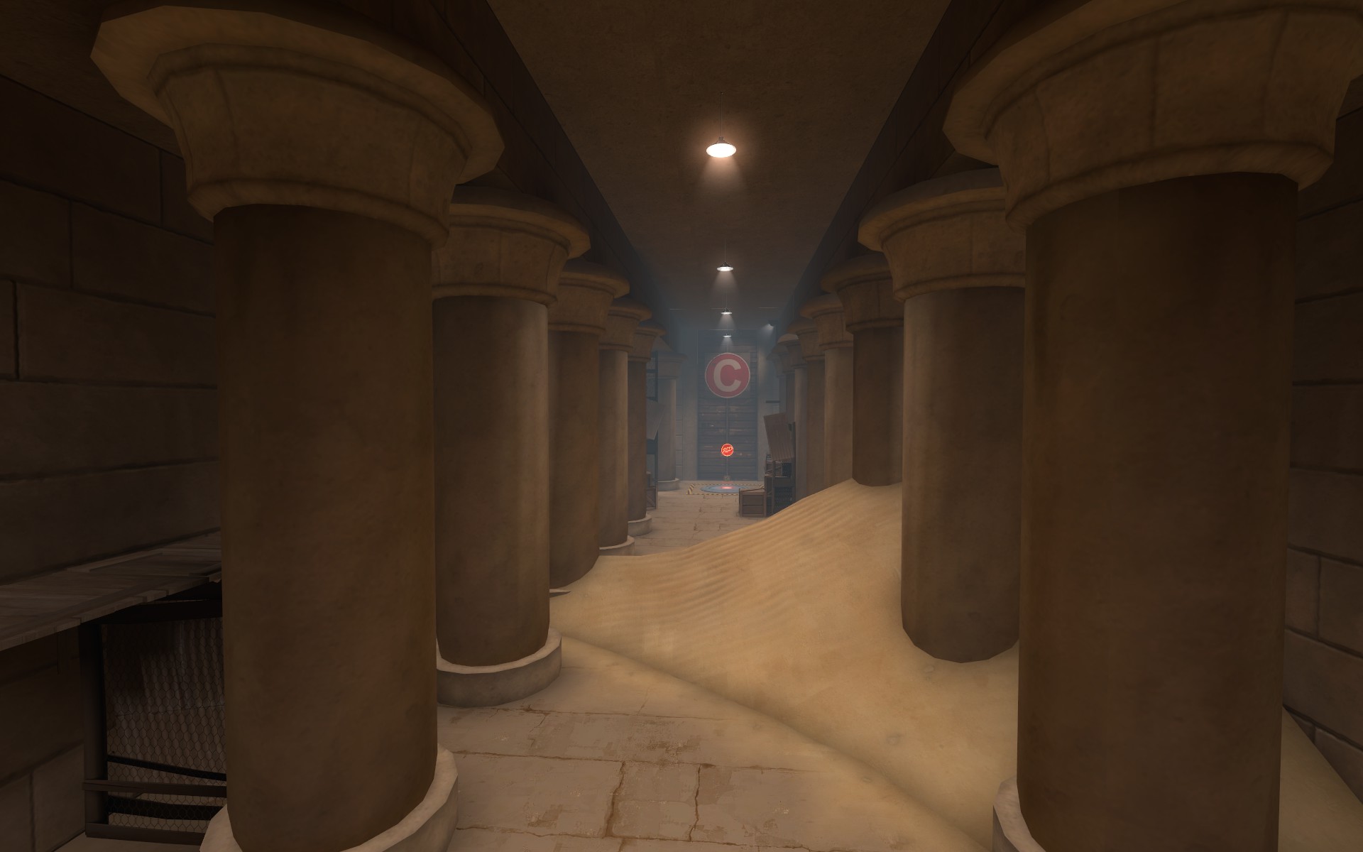
20170501220247_1.jpg
20170501220300_1.jpg
20170501220315_1.jpg
20170501220329_1.jpg


Read the rest of this update entry...

More than any other mapper, you've been open to making huge layout changes in the name of polishing gameplay. It's a trait I really admire, and a mindset I've since made efforts to pursue for each creative project I take part in.

I've had fun both playing on Oasis and watching it grow. Happy Beta!
 

JeanPaul

L6: Sharp Member
Aug 5, 2010
295
284
Beta two featuring custom content by the incredibly talented Mark Foreman with more to come later!

There are lighting improvements all over the map however if there is a spot anyone finds a little too dark (most likely at C) just let me know as I am walking a thin line between atmosphere and readability in a couple locations. 3d skybox and displacement editing coming soon :p

After a few tests on the FITH server (thanks guys!) I have also made a few drastic-yet-simple-to-make changes at B all in favor of blu team. I noticed a majority of players complaints being made around B due to its difficult nature. These changes should remove a lot of frustration in assaulting this point. This version also has some timer changes to reduce the massive time that can be accumulated if blu steam rolls.

Timer changes:

A
-Reduced initial time to 5 minutes down from 6
-5 minutes given on cap down from 6
-On cap max time set to 8

B
-5 minutes given on cap down from 6
-On cap max time set to 8

C
-On cap max time set to 12 down from 16

Hopefully now even with a complete blu roll the timer wont become totally unreasonable.

Layout changes/fixes:

A
-Fixed all collisions on gameplay important props
-Made a few more fences opaque

B
-Left side flank now lets you build on the height advantage inside the choke
-Right side flank now has a one way door
-Lowered the point 64 units
-Added an additional ramp to the point from center
-Added quite a few small med packs and ammo packs (there were almost none before lel)

Pics of some new stuff

20170530124750_1.jpg
20170530124823_1.jpg


Read the rest of this update entry...
 

JeanPaul

L6: Sharp Member
Aug 5, 2010
295
284
Vitamin B3! Taking a break from this beast due to needing more time on black mesa helped give me a semi refreshed view on the map and make the changes necessary to bring it just a notch higher. I also have a bunch of new visual additions to the final area which is still a WIP. I cant wait to test these new gameplay changes.

Map general
-Reworked All red spawns
--A+B spawn shifted against interior temple wall and added about 1 second walk time to B
--C now has its own spawn which goes through the connector from D to C which closes upon C capture
-Increased fog distance for sniping at final
-Edited displacements all throughout map (still needs more work)

A
-Added a fence inbetween the left (as blue facing A) large obelisk and the tiny mid rock spire to make the area less of a "comb"

B
-Right entrance (as blu facing B) now has more cover for blu and a ramp back up to the ledge if you want to back track
-Left entrance into B now has more cover for blu and a further reaching mid flank
-Right hand side staircase to B now has a tiny red blocker so blu doesnt get creamed every five seconds there.

C
-Added right hand side (as blu facing C) elevated platform(with some cover) which leads to a small room and one way door for a blu holding room.
-Moved the point to be in the middle of the T-intersection of the pillar temple hallway and the entrance into D choke
-Reduced cap time from 20 seconds to 15
-Added a little chubby sentry spot immediately next to the point

D
-Added elevated platform for blu sniping into final area
-Relocated "D" sign to open up red sniping area into control point area
-Widened the mid path on the main corner into the final area
-Much more cover for blu secondary entrances into final point

My only prediction with the new spawns are a potential for C to be way too hard but well see what happens in testing.

20171112220004_1.jpg

20171112220201_1.jpg

20171112220015_1.jpg

20171112220052_1.jpg

20171112220102_1.jpg

20171112220126_1.jpg


More to do but almost done:
-3d skybox
-final detail pass
-final displacement pass
-finalize red spawns to start detail
-sound

Read the rest of this update entry...
 

Pocket

Half a Lambert is better than one.
aa
Nov 14, 2009
4,699
2,581
I'm just now noticing the custom brick textures that have probably been in use since forever ago. I like it. Looks better than the stock Egypt bricks, for sure.

The cap point structure at D, though, needs some work. I'm guessing it's supposed to look like solid cold, but it looks more like yellow brickwork that's been sprayed down with clearcoat. And the main reason, probably, is that real gold has a sort of a lightwarp thing going on with its reflections where darker tones get redder. I'm not sure how you'd achieve this in Source, short of either (A) cloning the cubemaps that attach to the structure and manually editing them, or (B) converting the structure into a model and messing around with phong shading, but the results would be worth it.
 

JeanPaul

L6: Sharp Member
Aug 5, 2010
295
284
I agree its a lil uggo at the moment. Ill have to mess with the texture and potential ways of changing the reflections. A model is probably out of the question due to lighting concerns but im not totally closed to the idea.

I am going to try faking it on the current world texture with lighting and reflections before anything else.
 

JeanPaul

L6: Sharp Member
Aug 5, 2010
295
284
B4! The previous version's single test yielded complaints basically entirely revolving around C and with good reason. However I feel I really got it right this time so lets test it and see.

C
-Gave blu a shortcut to height advantage in B to C choke upon capturing B
-Widened playspace around pillars
-Added two one way door flanks in B to C choke in favor of blu
-Added left side (as blu facing C) cubby hole
-Placed a bunch of displacements in B to C choke for some variation and hopefully blu assistance
-Reworked left hallway flank to be one way via dropping off a ledge and hopefully offer blu more resisting power
-Reworked right flank back area via removing spiral path and extending the height advantage for blu
-Moved red spawn back
-C red spawn now has a second door just in case there is a bad case of spawn camping (its a zany solution I know)
-Removed D to C connector

Screens of some new stuffs:
20171119022140_1.jpg
20171119022218_1.jpg
20171119022234_1.jpg
20171119022247_1.jpg
20171119022301_1.jpg
20171119022322_1.jpg


Read the rest of this update entry...
 
Last edited:

JeanPaul

L6: Sharp Member
Aug 5, 2010
295
284
Small update but an important one as I feel the flow in the map will greatly improve with these changes. Hopefully we can get some more data on D now that C should be a little more possible :p

C
-Brightened everything for better visibility
-Reduced cap time from 15 seconds to 12
-Moved red spawn to further back inside the final choke to D
-Removed some cover behind the point

I noticed in the previous test that while C was difficult blu could successfully completely overtake red in the area and cap til about 75-80% but then red would respawn in and completely wipe blu out. I wanted to retain this intial difficulty (because it results in some really intense battles) but remove the ability for red to wipe blu before cap. Reducing the cap time 3 seconds in addition to the 1.5 seconds added to red walk from spawn to C should do exactly that. If blu needs additional help at C I can lower the cap time as needed.

D
-Added an additional spawn exit door to blu forward.

Pics of new stuff: (last one is view of out of new red C spawn)

20171203215416_1.jpg
20171203215436_1.jpg
20171203215500_1.jpg
20171203215533_1.jpg


Read the rest of this update entry...
 

JeanPaul

L6: Sharp Member
Aug 5, 2010
295
284
B has remained untouched for the last few versions since it has been entirely trouble free over the course of C's revamp playtesting. However the latest test had some overly hard B difficulty feelings emerge again so I decided to add the one thing I felt it lacked with minimal changes needed: blu height over the point. This was also pointed out to me in the test for a nice little confirmation.

I want to wrap this map up so this or the next version should the last version with gameplay changes.

B
-Beefed up blu's highest entrance into B. Blu should now have a place to directly spam the point from a position of advantage.
-Blocked off left side of blus highest entrance into B for a little cover
-Extended the height advantage platform for blu in left flank
-Widened the mid height entrance into B
-Closed some gaps in blus left entrance into B so its a better holding spot
-Removed a window in the wood wall left blu flank.
-Lowered tiny house near point roof by 32 units

20171210174234_1.jpg
20171210174247_1.jpg
20171210174303_1.jpg
20171210174311_1.jpg
20171210174329_1.jpg
20171210174408_1.jpg
20171210174430_1.jpg


Read the rest of this update entry...
 

JeanPaul

L6: Sharp Member
Aug 5, 2010
295
284
I told myself I wouldnt do any more semi-major gameplay changes but I just couldnt help myself! This is absolutely the end of major gameplay changes as the next version of this map will be small fixes from b7 tests, a final detail pass, (including spawn rooms) a finishing of my skybox (almost done) and then its off to the workshop.

On the last test of my previous map version Phi mentioned the final point as being "useless for scouts". Normally I find final points to be a little anti-scout just by their nature but after trying out scout myself during the same test I pretty much instantly agreed with Phi. I actually felt the final point was in a good place but personally couldnt shake the feeling that an area which is bad for scouts has deeper/larger issues than just one class feeling a little constricted. So the final point got a sort of soft revamp.

Gameplay changes:
A
-Nothing

B
-Outer wall got visually reworked (has gameplay implications with both sides being different shapes now) and should be more readable as a result as well
-Reworked cover on right side (as blu facing B)

C
-Cap time reduced to 12 seconds (so the cap times are now 25, 12, 12, 6)

D
-Main blu entrance into D now has an additional and even higher up sentry spot. I am hoping this new spot can be used by red but get instantly melted (since you can outrange it) but be very oppressive to red if blu uses it. This is probably pretty delicate so I am keeping my eye on it.
-Main side flank and all of its "doorways" for blu are now taller (and a little wider in spots)
-Created additional one way door flank for blu that leads into the final point on an elevated pathway (like B only a little harder for blu to use)
-Added a new platform for red for sentries (this is in response to the new blu advantages)
-Added a whole new "sneak room" sort of behind the point so both red and blu have a few more options in the area
-There should be a little more cover for blu on the side flanks in this area now as well

And boom done with the map's gameplay I hope lel. Also yes the final point shrine is still a little ugly right now as I am still working on it.

Pics of new stuff:

20180819144858_1.jpg
20180819144908_1.jpg
20180819144935_1.jpg
20180819144946_1.jpg
20180819145027_1.jpg


Read the rest of this update entry...
 

JeanPaul

L6: Sharp Member
Aug 5, 2010
295
284
Historically B has given me the most problems in this map by a long shot. B usually seemed to be a fair bit harder to cap than it should, always had a slight feeling of deathmatchiness, and was a bit ugly in spots. (might still be a bit ugly in spots doe lel)

I was willing to ignore these slight problems because the most recent tests I was doing never resulted in any of these problems.

However in the most recent (b7) test I had what seemed like quite a few completely new players and almost all the previous B issues came vaulting back. So I took a closer look at all the current capture points in the map and compared them to each other to see what B was missing.

I noticed a huge issue: there was no way to get close to the point without being exposed to long range classes. So I completely enclosed the blue height advantage entrances into the area and slapped some one way doors on the exits. This should allow for blu to get close to the point uncontested but it is also a pretty massive balance change so I really dont have a clue how this will play. I hope this is an improvement but it might also result in a completely undefendable point - well have to test though as the red holds were pretty wicked before.

Changes:
A
-nothing

B
-enclosed both height entrances into the area and gave them one way doors to create a really strong blu holding spot
-knocked down some of the pillars on the right side (as blu facing the point) to give some shorter range classes a chance to get into the mix and keep scouts from utterly dominating the area
-knocked down pillars also created a second red sentry spot (potentailly a blu one too I think)
-raised the left (as blu facing the point) lowest entrance and made it so if red wants to use it they have to do two crouch jumps
-moved right side wall (as blu facing point) 64 units outward to open up the space a smidge
-opened up left side flank entrance for a little breathing room

C
-nothing

D
-nothing

Pics of new stuff:

20180902131522_1.jpg
20180902131552_1.jpg
20180902131713_1.jpg
20180902131820_1.jpg
20180902132050_1.jpg


This could either be a great improvement or a massive disaster but either way the test should definitely be interesting thats for sure.

So yeah hopefully this plays better because im getting tired of this map and just want to move on at this point lel.

Read the rest of this update entry...
 

JeanPaul

L6: Sharp Member
Aug 5, 2010
295
284
This is not something I expected to do but after the previous map test of b8 it was pretty obvious B and A to B connector were really bringing down the map is a very large way.

So I did a total revamp of both. I am extremely excited to test this new B and A to B connector as I feel it will be a massive improvement to the entire feel of the first two points. There might be a few awkward spots and some undesirable sniper sightlines but I wanted to test this area a little more open first as I feel like ive been historically too obsessed with certain sightlines and cover. Hopefully cap times and time given on cap are still appropriate for these new changes but I have to start somewhere so ill leave them what they were in the previous version for now.

Changes:

-Setup timer is now up to 1:30 (previously 1:15)

A to B connector
-Extended length of connector by 256 units
-There is now one main central choke
-Reduced number of chokes from 4 to 2.5
-Rotated exit of main flank so its facing B upon exit as blu
-The one way door seen previously now connects to the main flank rather than being entirely separate
-Blu should now be able to hold and cover all red entrances back into A once A is captured
-The view of A to B connector (from A as blu) should now be obvious as to where it spits you out into B
-Main flank should be viable for all classes

B
-Entirely new shit everywhurr
-Enterable buildings
-Extended length by 512
-New large sunken down sentry table
-So much newness

Pictures of all the new stuffs:
20180908145106_1.jpg
20180908145116_1.jpg
20180908145147_1.jpg
20180908145159_1.jpg
20180908145211_1.jpg


hell yeah!

Read the rest of this update entry...
 

JeanPaul

L6: Sharp Member
Aug 5, 2010
295
284
While I only got to test b10 for two rounds I feel I had a strong enough grasp on the changes I needed to make as the issues I noticed during the test were a little obvious and confirmed by a few of the testers playing the map.

Someone mentioned during the last B playtest "ugh I keep getting flanked every five seconds". This was definitely something I noticed very quickly as well - it was just a constant battle of fighting scouts off your ass. So I went in and added some walls, removed some flanks, and reworked the entrance to the 'short range house', which was new in B10, to be accessible for blu via covered flanks.

I also reworked one of the flanks INTO B to be way shorter and attached to the main flank. This flank before was entirely out of the way to the point of having blu solders use it without a single red person contesting them. This means A has only one entrance for red but I hope that doesnt result in A being changed very much. Heres a crude drawing to show the old vs new flank setup:

https://i.imgur.com/dkjK6aU.jpg

C was also held twice in a row so I figured the extra length of B might have made it a smidge harder to cap as blu. So I lowered C's cap time from 12 to 10 before I decide if any layout changes or additions are needed. I also removed the tiny see through fences blocking corners in a few spots as I feel it was a large factor in contributing to blus difficulty in the area.

New map cap timers:
25, 12, 10, 7

Changes:

A
-None.

A to B connector
-Large wrap around flank reduced in size and moved to be attached to main flank

B
-Paths around close range house removed and consolidated into one path leading from blues choke into B to remove constant flanking
-Added windows in close range house so blu can see what red is up to
-Blocked right side path to force blu and red players to pass right next to the point rather than being able to walk around it
-Some of this wall adding to remove deathmatchiness has resulted in red having a one or two more sentry spots.

C
-Reduced cap time from 12 to 10
-Removed annoying corner fences from flanks

Pics of new stuff:
20180917114440_1.jpg

20180917114447_1.jpg

20180917114518_1.jpg


One last thing I would like to note: To everyone playing this map and giving small visual feedback (this area is too monochromatic, this little thing has a weird shadow, etc) I am listening to you and plan on implementing all comments once I get B's gameplay squared away and the map in a gameplay complete state.

Read the rest of this update entry...
 
Last edited:

JeanPaul

L6: Sharp Member
Aug 5, 2010
295
284
Before we get to the update part of this post there is some feedback I received during my last test of b11 (a couple months ago) that I want to address. It was basically a few players saying the map would be improved via cutting one of the control points.

Honestly - I mostly agree. However there are parts of me that disagree. I wanted to make sure these everyone knew these comments were heard because I actually spent quite some time debating whether or not I wanted to go through with such a change. It ultimately boils down to three things:

1. I want to wrap this map up and have it out of my life :p (removing a control point would be a fair bit of work)
2. I put a LOT of effort into making the map have four control points and since that is pretty unique in the tf2 a/d cp map world I feel it lends to the maps fun via a little novelty/a new dynamic
3. Personally I enjoy longer maps

Basically ive learned a fuck ton from the development of this map and id much rather take my lessons learned and put it into a new map. Hell I might come back later and make a 3cp version of osiris who knows but for now im sticking with four control points.

__________________________________

Osiris b12!

I feel ive said this a few times already but this version should be the last gameplay changes this map receives. This hopefully means the next version will be fully detailed and have a 3d skybox. A felt a little tight for defenders refilling the area and B needed a few visual/gameplay refinements to get it on par with the rest of the control points. B also needed some defense help.

Changes:

A
-Added red drop down into A that connects to the main choke with a door on the connection to the choke that closes upon capture of A
-Added a small hallway that connects left side (as blu facing A) to the main choke

B
-Refined main blu forward hold house
-Raised blu height advantage exit from house
-Removed a small cross-point sightline (via the fence attached to blu height advantage leaving house)
-Removed lower door entrance into house
-Improved sentry spots near point
-Added slightly more cover for red to lower area around point

Pic of new stuff:

20190305175322_1.jpg


Read the rest of this update entry...
 

JeanPaul

L6: Sharp Member
Aug 5, 2010
295
284
Okay, change of plans!

About two or three map versions ago I started to noticed a much higher than normal rate of rounds with complete blu team steamrolls over the whole map. Having just fixed the map being in a state of red holds every round it was definitely a little frustrating to realize. I was hoping the phenomenon was based in lack of map knowledge (new players in tests or map changes etc) but after almost 4-5 tests in a row on different servers/communities resulting in the same behavior its almost impossible to think its not the maps fault anymore. :p

All of the issues I noticed in playtests pointed to the problem area being specifically just the immediate area around B and red teams approach to it compared to blus.

So I moved the location of the B point and redesigned the surrounding area to give red a LOAD more advantages/options. I also slightly changed the cap times for A and B a bit to hopefully give red an easier time defending B. I gave red a LOT of advantages this version - maybe too many we will see - but id rather stop this blu steamroll in its tracks than to make changes that barely effect it.

Changes:
A
-Reduced cap time from 25 seconds to 22 seconds. The hope here is the shorter cap time reduces the strength of the "blu steamroll ball" that forms on the point as its being capped.

B
-Moved the point from on top of one of the side pillars to the center of the area in between the two main architectural buttresses
-increased cap time from 12 seconds to 16 seconds (this will be first to get lowered if my changes are too red strong)
-Gave red direct covered access to the point
-Added a very strong elevated sentry spot immediately above the point which can only be out-ranged via the far right (as red facing B) flank routes
-thinned the entire right side (as red facing B) to contain players a little better.
-Added a large window in the doors immediately behind the point so both red and blu can keep an eye on each other while capping or defending.
-Refined the left (as red facing B) side to be both a potential red forward holding spot and a blue forward holding spot via opening it up and blocking off sniper sightlines into and out of the area.

Woof thats a lot of new red advantages heh.

Pics of new stuff:

20190401130651_1.jpg
20190401130755_1.jpg
20190401130811_1.jpg
20190401130850_1.jpg


Read the rest of this update entry...
 

JeanPaul

L6: Sharp Member
Aug 5, 2010
295
284
I knew the previous version of B was a little awkward but I really didnt feel like fixing or changing it. However in the last test of osiris I had a really annoying underlying feeling there was something not right/fun about B. I said to myself "I feel like all ive done is die in a hallway". But I ignored it because I just wanted to finish the map. However towards the end of the test one of the players in the match said over the mic: "attacking B just feels like picking one of three hallways to go down".

Its hard for me to ignore confirmation in a test like that so therefore I did one last edit to B and im happy and confident about it. The next map version will have a skybox and all the final details I have planned.

Changes/additions:

A
-nothing

B
(orientation being blu facing B)
-left side short range area is both opened up and simplified
-left side short range area has a holding spot that should be very good for blu
-Added left side holding area ledge that views B mid and point
-removed an entire flank that went around the short range area
-right side one way door flank was given a 64 unit tall ledge platform to give blu a little help from being overrun once they go through the door
-removed right side sand hill area building
-raised right side sand hill displacements to be a blu advantage (I hope lel)
-added a ladder to ledge inside blu choke into B so they dont have to go around to get inside the choke
-added a small bridge to right side area near point so blu doesnt have to go around to gain access to the point

C
-nothing

D
-nothing
-I might add a dropdown in the next version to let red get to the point just a little faster at the expense of entering the area lower rather than at a height advantage

20191006143058_1.jpg
20191006143404_1.jpg
20191006143436_1.jpg


Read the rest of this update entry...