cp_nautilus

CP Nautilus a5

Soilbleed

L2: Junior Member
May 7, 2015
62
246
cp_nautilus_a1

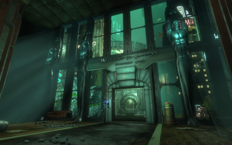
Nautilus is a 3 a/d control point map set in a underwater indoor facility. The Nautilus facility is cold, grimy and barely maintained leading to parts of the facility falling apart.

cp_nautilus is a 3 point attack/defend cp map set in an underwater facility.

Alpha 1.0 consists of the map blocked out and working available for playtest. I added some detail to point A and B just to solidify the theme and play around with some lighting. There are a number of rooms that were added to offer the players from both teams a chance to flank the points, but these have had little thought put into them and are likely subject to change as a result of playtesting.

My main concerns at the moment:
* The map is too small
* The lighting is too dark (My PC monitor displays the lighting fine, but on my laptop the screen shots came out very dark)
* The attack/defense position of each control is unbalanced
* It's unfun (i guess this is every mappers concern)
 
Last edited:

Géza!

L4: Comfortable Member
May 12, 2008
183
40
I quite like the visuals, but won't this be a little too dark for TF2? Most maps are ridiculously bright, and for good reason, considering how important color recognition is
 

Muddy

Muddy
aa
Sep 5, 2014
2,581
4,597
It does seem rather dark, and I'm also noticing a lot of Half-Life 2 textures lying around. In case you didn't know, if you type in "tf" into the keywords bar on the texture browser, it'll just give you just the Team Fortress 2 textures.
 
Last edited:

Soilbleed

L2: Junior Member
May 7, 2015
62
246
I quite like the visuals, but won't this be a little too dark for TF2? Most maps are ridiculously bright, and for good reason, considering how important color recognition is

Yeah it's a little awkard. The monitor on my work PC seems to display it considerably brighter than other peoples. I'll boost the general brightness.

It does seem rather dark, and I'm also noticing a lot of Half-Life 2 textures lying around. In case you didn't know, if you type in "tf" into the keywords bar on the texture browser, it'll just give you just the Team Fortress 2 textures.

Ah, Just realised the screenshots i posted were before i replaced all the HL2 textures xD.
They now have their TF2 equivalents.
 

Bunbun

aa
May 18, 2014
401
782
The lighting kinda made the whole place feel like it was covered in moss.
 

Vel0city

func_fish
aa
Dec 6, 2014
1,947
1,589
Hasn't Egypt told you anything? Don't make cps with only one way to get in and out (if you're not a rocket/sticky jumper).

Last needs more cover than just a few crates. Open up the back area where the rocky wall is, and give the last point a skylight to let in light.

Other than that, looks promising.
 

Soilbleed

L2: Junior Member
May 7, 2015
62
246
It might be a good idea to open up the roof above the last point, to give a more open-air feel, as well as making the finale feel more cinematic.

Last needs more cover than just a few crates. Open up the back area where the rocky wall is, and give the last point a skylight to let in light.

Yeah Point C is likely to have a pretty large redesign in the next update. The flat roof was put in just to seal the room, but i would much prefer to have a bigger open space like point A. More cover will also be offered to both teams.

Hasn't Egypt told you anything? Don't make cps with only one way to get in and out (if you're not a rocket/sticky jumper).

For each point I tried to ensure there's at least 2 paths (both of which shouldn't be too close to each other). I originally had a sewer system that could navigate to each point from below allowing the attacks/defenders to flank each other but it felt really convoluted and was easy to get lost in. I might bring it back in a more simplistic form.

Alpha 2.0 is now available. After watching the demo of the playtest it was immediately obvious that red spawn is awkward and needs a complete redesign which is likely to be in alpha 3.0. But in Alpha 2.0 I wanted to quickly address some of the more immediate issues (namely the clipping, lack of health/ammo packs and poor lighting in some areas.

Alpha 2.0 Changes
* Removed collision from all props and replaced with Clipping brushes
* Clipped all stairs
* Standadised stair height throughout the map
* Added Health and Ammo packs throughout the level
* Increase overall lighting brightness
* Removed a number of un-needed railings to improve player flow from ledges
* Added wall in Blue spawn to hide rising spawn door
* Blocked off under the stairs at Point B (now preventing engineers building sentries under the stairs)
* Blocked off fence area at point A (now preventing engineers building teleports on the other side)
* Fixed the Spawn No Entry sign being seen by both teams
* Made trigger boxes for the doors at Point B bigger (scouts were getting caught slightly on the doors)
* Increased the upper ledge's width at Gate 3 Point B so players don't immediately walk off the edge
* Capping each point now adds 90 seconds to timer
* Rotated Red team_player_spawn to face the stairs leading to point A and B (this is a temporary edit as Alpha 3.0 intends to completely rebuild and move Red Spawn)
 
Last edited:

Soilbleed

L2: Junior Member
May 7, 2015
62
246
After 2 and a half years I have resurrected this from the grave and given it a complete overhaul for alpha 3 (it feels awesome to go back and dust off an old project)

Alpha 3.0 Changes

  • Stripped out a fair chunk of detail for the alpha
  • Rebuilt most of the level geometry moving it from a 1 unit grid to 4
  • Rebuilt most of the level geometry around Point A
  • Removed right pathway to B from BLU spawn (people were getting lost)
  • Rebuilt all connecting paths from B to C
  • Rebuilt all of Point C now descending down into the mountain
  • Moved and Rebuilt Red spawnroom
  • Added forward Red spawn room by point A
  • Added skybox
  • Rebuilt all stairs and doorways so they are the correct height
  • Rearranged all of the health and ammo packs
  • added spectator cameras
Known Issues
  • Console is churning out a bunch of error messages regarding a missing trigger on spawn. It's to do with the forward spawn room (though the map still appears perfectly functional despite the errors). Will look into fixing this asap
  • Time from BLU spawn to Point A is pretty short and will be extended in next update.
Also please could a mod move this from the import category to maps if the conversion is complete (I can't see an option to do it on my end)
 

Soilbleed

L2: Junior Member
May 7, 2015
62
246
A4 update - Completely rebuilt A along with the "pre A section for BLU" and updated a bunch of minor changes based on feedback

Alpha 4.0 Changes

Layout
  • BLU spawn rebuilt to include setup area
  • Pre A point area built, BLU should take longer getting to the point and should have a harder time reaching it
  • A point made larger - raised roof and rebuilt surrounding geometry so as to feel less cramped
  • Moved RED forward spawn around the corner giving RED longer to A and fixing a horrid sightline
  • Added ramps out of the pit at B
  • Opened up area after tunnel to guide players from A to B easier
  • Setup displacements around A
  • Red Team Back spawns now face direction they need to head
Gameplay
  • Increase all cap times by 12 seconds (up from 5 seconds)
  • Capping points now grants 3 minutes extra (up from 1:30 minutes)
  • Added a bunch new pickups around certain area of A
  • Added Forward spawn for BLU at B that becomes active for Point C
General
  • Clipped door frames
  • Oranges Crates that were causing issues have been replaced with clipped Barrels
  • Added more signage
  • Added more lighting
  • Changed skybox (currently placeholder)
  • Gave the Env_lighting a green/blue tint to give appearance of underwater
Known Issues
  • C still lacks something of a "front line" for defenders. Will look into rebuilding bits of C when i have more feedback from playtests
  • Skybox is wrong - it's currently a placeholder for the custom one i would like to add
  • Parts of the map are still a little dark
  • Still getting console errors regarding the forward spawn (they still work however)
  • Respawn times haven't been changed despite feedback - want to test out the new capping time first

Read the rest of this update entry...
 

Soilbleed

L2: Junior Member
May 7, 2015
62
246
A5 update - Completely rebuilt the connect between B and C to create a smoother and more understandable flow for both teams:

Alpha 5.0 Changes

Layout
  • Added a connecting tunnel from the main room of C to a new room just outside of B
  • Added connecting room between B and C which replaced the Upper/Mid rooms after B
  • Increased B's area of conflict
  • Removed the awkward ramp that went to a lower level of C
  • Moved all of C up at least one floor so there isn't as much of a height difference from B to C
  • Blocked off that little room just outside of BLU spawn
  • Rebuilt C point and gave cappers / defenders a bit of cover when inside of it.
Gameplay
  • Added a bunch new pickups around certain area of C
General
  • Clipped a bunch of stuff
  • Added a door in BLU spawn to prevent taking too much damage from snipers
  • Added more signage
  • Fixed RED being able to enter BLU spawn
  • Fixed all visualisers
  • Neatened up the stairs in RED spawn
Known Issues
  • in alpha 6 i'm going to potentially rebuild the lower path to A. I wanted to do it for this update but felt a little burnt out (would also like to playtest it a little more)

Read the rest of this update entry...
 

Cincomma

bonk sploosh
aa
Aug 2, 2017
429
413
The map looks great! But it is a bit too dark. It looks a bit mining themed, so if you don't really wan't ceiling lights, you could use some mining lamps and other cool things to light it up! [:
 

Soilbleed

L2: Junior Member
May 7, 2015
62
246
The map looks great! But it is a bit too dark. It looks a bit mining themed, so if you don't really wan't ceiling lights, you could use some mining lamps and other cool things to light it up! [:

Thanks! Yeah a fair amount of the lighting is still dev right now, but i'm going to start actually implementing some of the final "ideas" of lighting in the next update. Namely that i want the level to mainly be lit by the underwater skybox (akin to that of Rapture)
bioshock-the-collection_bio1_welcome-to-rapture_1920.0.jpg