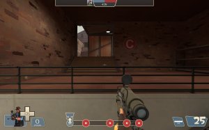
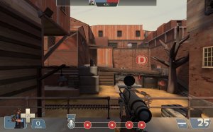
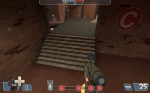
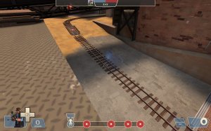
Midwest

PL Midwest rc1a

  • This map is featured! Our best maps, all together in one place for your viewing pleasure.

MegapiemanPHD

Doctorate in Deliciousness
aa
Mar 31, 2012
1,942
1,281
-swapped low and high ground for blu when going to A so they get the high ground now. Should help with capping A and stopping it from being such a grinder
-fixed broken area portal
-moved around health and ammo at A
-fixed physics prop spawning under the map and spamming the console about it cause it's life is just SO MUCH MORE IMPORTANT than everyone else's, drama queen....
-other stuff and things whatever

Read the rest of this update entry...
 

Gravidea

L5: Dapper Member
Apr 17, 2017
237
105
Here are some things I noticed with the latest update, and two are around the same spot:

This roof after A is clipped a bit oddly, and you can stand on top of an invisible clip that can also prevent you from walking around freely on the roof.
upload_2022-2-2_0-56-6.png

This railing area right near that same roof after A seems to have a nodraw texture which I imagine is unintentional, as you can use it to see parts of the map that you shouldn't be able to.
upload_2022-2-2_0-57-17.png

For some reason this overlay is a little smooshed thanks to the door, and I imagine this isn't intentional so I figured I'd also bring it up.
upload_2022-2-2_1-1-45.png

Other than that, keep up the good work as per usual Pieman!
 

Billo

aa
Feb 8, 2016
921
404
Got some more feedback!

Alright so, I noticed something here. You have a wall up ahead, which either blocks sightlines or helps with performance. I am going to talk about sniper sightlines predominately though.
If I am standing here:
20220207135110_1.jpg
Is almost the equivalent of standing here.
20220207135115_1.jpg
These stairs block the sightline, thus you shouldn't worry about any crazy sightlines imo.
You could either remove a part (Or the whole ) Wall which would make C feel more open.
20220207135120_1.jpg
Also I feel like the point should be a little more forward, it's awkward to defend C from afar when this big pipe thing is in the way. This highground I am standing, is a good place for a sentry, it might as well be used right?
20220207135152_1.jpg
You forgot those doors here
20220207135158_1.jpg
btw this area down here doesnt need to be so narrow and small, I dont feel safe being down here. Setting up a sentry or something down there is a huge no no. Plus there is space to make it bigger so...
20220207135206_1.jpg
I had an idea, dunno if it's good or not. You could keep the point's location where it currently is but you could raise the pipe higher.
20220207135219_1.jpg
It would feel a little better imo.
20220207135225_1.jpg
I am not sure if you make this area any bigger or not, but it needs more space to hide underneath.
20220207135249_1.jpg
And there is space to do that. Not much, but there is.
20220207135256_1.jpg
I really like the changes here.
20220207135303_1.jpg
seam in the displacement.
20220207135312_1.jpg
I feel like I can jump up there, perhaps add a small fence or something to block my jump and feel more logical.
20220207135329_1.jpg

That's all I got for now. While testing midwest some people said That parts of the map feel a little awkward to play, so I tried to come up with solutions for that. Obviously it's your map, you know better what's right and wrong so keep whatever you like. Hope I helped!
 

Gravidea

L5: Dapper Member
Apr 17, 2017
237
105
Minor issues post! Love what you did with the recent version and how you apply feedback.

This is an interesting window lol. Though I imagine it has something to do with you cutting off the side of this building here. Either way, I figured I'd mention it! Screenshot below.

1644523467674.png

EDIT: It would also seem this arrow sign just nearby the previously mentioned window has no clipping. While it is minor, I believe it could result in people hiding behind it, shooting downward at the point while being obscured just enough to make it cheesy. Do what you wish, though!

1644523937375.png

EDIT 2: Also, these doors are sticking out juuuuuust a tad too much, similar to what was shown in billo's feedback. If I find anything else, I'll just make an entirely new post at this point.

1644524373631.png
 
Last edited:

MegapiemanPHD

Doctorate in Deliciousness
aa
Mar 31, 2012
1,942
1,281
Minor issues post! Love what you did with the recent version and how you apply feedback.

This is an interesting window lol. Though I imagine it has something to do with you cutting off the side of this building here. Either way, I figured I'd mention it! Screenshot below.

1644523467674.png

EDIT: It would also seem this arrow sign just nearby the previously mentioned window has no clipping. While it is minor, I believe it could result in people hiding behind it, shooting downward at the point while being obscured just enough to make it cheesy. Do what you wish, though!

1644523937375.png

EDIT 2: Also, these doors are sticking out juuuuuust a tad too much, similar to what was shown in billo's feedback. If I find anything else, I'll just make an entirely new post at this point.

1644524373631.png
Stuff like this drives me nuts. With how much this map has been worked on, there always seems to be some oversight details I forget to fix up. Thanks for the heads up and I'll get this fixed for the next release.
 

Gravidea

L5: Dapper Member
Apr 17, 2017
237
105
Stuff like this drives me nuts. With how much this map has been worked on, there always seems to be some oversight details I forget to fix up. Thanks for the heads up and I'll get this fixed for the next release.
Hey man, there's always gunna be something! This is a big, detailed Payload map with a buncha' points! Only makes sense that a few things would be missed here and there. Essentially; don't sweat it! Either way, I'm just glad to help out as I enjoy playing on this map quite a lot and always feel happy looking out for new updates. Keep up the good work, and don't feel too bad haha!
 

MegapiemanPHD

Doctorate in Deliciousness
aa
Mar 31, 2012
1,942
1,281

MegapiemanPHD

Doctorate in Deliciousness
aa
Mar 31, 2012
1,942
1,281
MegapiemanPHD updated Midwest with a new update entry:

Jeremy did it!

-moved around health and ammo at A and B
-removed lil roof outside long blue window between A and B, replaced with vent prop
-clipping fixes
-minor detail changes
-added prop jump inside blu building between A and B
-Thickened bricks at A
-fixed area portal window bug in blu first spawn

Read the rest of this update entry...
 

MegapiemanPHD

Doctorate in Deliciousness
aa
Mar 31, 2012
1,942
1,281
MegapiemanPHD updated Midwest with a new update entry:

Go Push!

-added more windows to blu's upper area at A
-moved around some health and ammo
-readded long turn track around the wall between B and C to give defenders more time to set up at C
-locked door by B now only opens after B is capped instead of after A is capped
-gate through wall between B and C now only opens after the cart reaches a specific point past it
-moved red spawn forward at last
-removed tight awkward route on the left of last from red spawn
-optimization around B
-probably other...

Read the rest of this update entry...
 

Tiftid

the Embodiment of Scarlet Devil
aa
Sep 10, 2016
531
398
Hi Pieman :)
It looks like you're having a hard time, dealing with conflicting feedback and going back and forth on changes that may or may not improve the map. In fact, you said that in #wip earlier.
For a while now I've thought about making one single, big midwest feedback post, to look at the most current version and see if the issues I've had with the map in the past are still around in any capacity, and suggest solutions to them if they are (something I'm not normally able to do in imps).
So here it is, I guess.

I was initially going to comment on the rotate time issue on A, but it looks like you really have shifted things around to change the balance. I couldn't say exactly how it'll play now. I suspect RED will have a difficult to impossible time getting and keeping a forward hold, but maybe I have the wrong concept of what the A forward hold should be in the first place. So I'll reserve judgement.

B just keeps on getting capped without enough of a fight. I think the root of the problem is this high ground:
1645619182154.png

It only takes BLU 7 seconds to reach this from A. RED takes a similar amount of time to reach B from their spawn, and that doesn't even count the amount of time they spend respawning!
... not that that matters, cause RED instantly respawns once A is capped.
But that doesn't help players who die after the point is captured, and the fact remains that RED simply is not taking this high ground before BLU gets there. If RED is lucky, they'll win the little initial skirmish that happens where BLU peeks RED from the high ground and RED peeks BLU from the concrete blocks, then assume a forward hold and B becomes balanced to attack and defend.

But, if BLU wins that initial skirmish (which they often do because they have the cart and the ability to stop RED from reaching their only useful health and ammo pack), they take B in a single fight, which feels unfair and unfun for both teams.

So how should you fix it? Well, it's pretty simple - make it take 7-8 seconds longer for BLU to reach the high ground, so RED can get there first. Normally I would recommend extending the distance between A and B, but luckily in this case you can make one simple change to avoid having to do that:

Block off these two doorways with doors that open 15 seconds after A is capped.
1645619713711.png


After you did that, BLU would be forced to use the upper building if they want to push B fast.
1645620123514.png

The above represents what the routing would look like if BLU was forced to use the upper building. As you can see, the teams would meet somewhere along the cart path choke. This would probably improve RED's chance of winning the initial skirmish greatly, but they'd still lose B if they lost. To solve that, I'd recommend lengthening the upper building by about 4 or 5 seconds (or making access to it from A harder) so RED can form a more concrete forward hold in front of the doors.

Hopefully, this would finally let RED have a chance at holding B even if they lose the first fight after A is capped.

C is pretty much in the same boat as B. I almost never see it defended. In theory, it should be possible for RED, since a pair of doors delay BLU's progress towards C. Or at least, they used to before b63. (or was it b62?)
In any case, it was always more like "BLU just goes around the doors and prevents RED from getting a forward hold set up because it takes ages for RED to walk to C from their new spawn."

With the new closed barricade, it now takes BLU about 10 seconds to walk to the cart path choke after capping B, and about 13 or 14 to walk to C proper.
It takes RED about 8 seconds to reach C proper, and about 13 to reach the cart path choke.
Do you see the problem? Even with the game_forcerespawn, RED simply cannot reach the cart path choke to get a forward hold in time after B is capped, because BLU just gets there first. As such, I expect this new C to roll just as easily as the old ones. (now watch the playtest somehow prove me wrong lmao)

How do you fix this? Well, sadly it's not as simple as B in this case. However, there is some good news; since you're already committed to giving BLU a forward spawn to attack this point, you can just increase the distance between B and C!
Now, to do that you'd want to put BLU's forward spawn right on B. "But that encourages spawncamping!", you cry. I say "skill issue". It should be no problem to build a spawn room with exits that are so spread out that even the most evil demoman could never feasibly camp it.
You may also want to build one of the spawn exits to be in a somehow inaccessible area so that it can't be camped by multiple, coordinated demos.
Maybe you could put a door or two in the middle of a massive, fenced-off hill that the demomen can't enter cus of respawnroomvisualisers, but the attackers can exit from multiple points on the hill?

I'm starting to feel like I'm repeating myself, but after C is capped, both RED and BLU reach the main C area in only 5 seconds. So, if RED loses this initial fight, they lose D. Once again the solution is simple; block off the main doorway into D for a while after C is capped so RED can start poking the flanks, or increase the distance between C and D.

I've always felt like the lighting is a little bland.
Although, in recent versions you've done based things like increasing the lightmap resolution on various surfaces.
By the way, the combination of that and the custom assets is a killer, and the map is 55 mb because of it.

But anyway, I've always kinda felt like the map suffers from the "Borneo problem" where there isn't enough contrast between the direct and ambient light. It doesn't help that the skybox and textures all combine with this to lead the map's colour palette towards one ambiguous, drab, low-contrast shade of brown-yellow.

To illustrate my point, I did something very naughty and decompiled the map to play around with the lighting to see if I could achieve a result I liked better.
So here are some comparison shots, and you can judge for yourself which you like more.

MegapiemanPHD​
Tiftid​
pl_midwest_b630006.jpg
1645622548488.png
pl_midwest_b630008.jpg
1645622735797.png
pl_midwest_b630014.jpg
1645623111401.png
Here's what I did:
-Changed the sun's colour/brightness to 251 230 191 700
-Lowered the ambient brightness to 120
-Shifted the sun's yaw by 10 degrees (basically irrelevant)
-Changed the sun's pitch to -42
-Changed the skybox from sky_granary_01 to sky_goldrush_01 (this was a mistake)

Now, this admittedly isn't a fair comparison for either side.
But I hope from this you can glean some insight into how higher contrast in lighting can make an area look less washed out and monotone.

If you could up your contrast like this, add some little trims, cranes and balconies protruding out from the big brick walls and change the sun's yaw to mostly target these big brick walls, you'd pretty much be solving every detailing issue I have with the map all at once.
And I think that'd be pretty based.
Also, are the bricks even bumpmapped? I swear a normal map exists for them in the game's files, and I swear I remember it making them look 10000x better.

Whenever you run around a beta map on your own, you find some little visual bugs. Here they are.
1645624000853.png

The overlay here doesn't apply to the top brush, so it looks like a W in quotation marks.
This strangely doesn't seem to be an issue in the vmf. Maybe it was something to do with all the messing around I did with console commands.

1645624141925.png

Underneath this vent prop between A and B is visible nodraw.

Oh, also, the dog bleeds when you shoot it.
Happy mapping!