14bit

L14: Bit Member
aa
Oct 5, 2014
661
2,121

DrSquishy

we've all had better times to die
aa
Feb 10, 2017
1,329
989

FloofCollie

I really suck!
aa
Nov 5, 2016
600
670
https://tf2maps.net/downloads/yahoo.11215/

Whoops, late again
Initial gamemode: Steel-type A/D
New gamemode: CTF

20210418152301_1.jpg 20210418152308_1.jpg
 
Last edited:

14bit

L14: Bit Member
aa
Oct 5, 2014
661
2,121
This one turned out to be quite an interesting one! Despite a lot of early dropouts, this one tied for second most submissions in a microcontest so far alongside MC11 with 24 maps, beat only by MC4 with 28 maps. We had a wide range of "this works really well" to "this is terrible" this time, with lots of maps falling between. I'm impressed with the creativeity across the board though! Without further ado, here's the feedback:

Seems harder for Blu as CP, and I originally thought the points hadn't been reworked enough to compliment the mode change. I'm unsure after all the rounds though? Second is definitely weird and open with out the cart to play around; more cover might help. Final doesn't work well, since Red has to forward hold to have any shot a defending due to the one-way point near the point. Decent mode shift, though I'd have liked to see a few more changes to compliment it.

The timer is too short, and the intel is to hard to reach. This might actually work as Arena CTF with how it's scaled? Overtime was weird, with an instant win for the team that touched a flag, but I might just not be familiar enough with how CTF's overtime works; I barely play the mode. Routing across mid is the weakest part otherwise, with it being very unclear how exactly you're supposed to cross mid. The obvious routes direct you to behind the intel building, which feels strange. I've not played the original, but I have a feeling this might work better here than as a KotH map?

Certainly more gameplay happening than the original PL version I've played before! That tunnel for Blu to final is very odd; it's hard for Red to find, and leads directly to the point, but almost works? Red has to defend two different places at once, and it makes it kind of hectic in a fun way to defend. If Blu could rotate easier, it might work decently well. I've got no clue how you'd do that with the current layout, but well done in shifting this into A/D CP!

An interesting shift in modes that almost works! The first point is fun, but since the low ground area wasn't changed Blu can push past the first point before it's capped, from an angle Red won't expect. Final is way too hard for Blu, either from a lack of a forward spawn, just how few entrances there are to the area, or both. Only two of the routes for Blu go to the point, and they go down to a choke just before it; the other route swings past Red spawn first. If you opened up the point area and reworked the routes it might work!

I love Rocketforge, but I'm not sure this version works. It's kind of cramped for the mode, and there's some really cheap shots at the goal built into the layout. It's also somewhat broken and missing a lot of the QoL features I added to Goalrush (Red not getting crits, the ball blocker so Red can't camp the ball spawn), but that's the fault of the prefab, not the map. The goals are too easy, and I think it's mostly because the goals have been put where the points were, and not behind them. A/D Pass seems to like having the goals just slightly past where Red should be holding so Blu has to set up and make a push, closer to how Payload is designed rather than CP. Here, they don't need to push; they can just toss it in the moment they enter a combat space. Final might work if you got rid of the one-way door and reworked that flank into some kind of ledge or dropdown, but as it stands it doesn't work too well. A neat mode shift, decently executed!

I'm not a fan of where the intel is, but the general structure isn't bad for CTF. It's pretty much two parallel routes, and each team uses one to attack while trying to defend the other it seems like. The train adds a lot of fun; more people should use train hazards in my opinion! The spawns are too close to the flag, though, and the intel area leaves something to be desired, leading to spawn camping. Moving it to the lower ground and maybe expanding the area out where the fence looking out to the cliff is might help, since then it's sort of in it's own area, and you don't have to go past spawn to get it. I've not played the original, but I really like this mode shift and think it works really well as the start of a CTF map!

I don't think this works as Mannpower. Well, I don't think Mannpower works as a mode anyways, but this layout doesn't help. Mid isn't fun to move through or fight in. Since the intel room is built from a CP last, it's too hard to get into. The grapple hooks help, but it's still too easy to lock down with sentries. This is a big problem; since you can't cap unless your flag is at your base, both teams can easily just hold the game hostage unable to cap since they're too focused on defending the enemy's flag in their own base. There's also not enough health around to counter all the fall damage from the grapple hooks or fight the plague power, though I don't think it spawned in our match. If that was intentional of you, great work leaving it out! Though it's also missing the revenge crits mechanic, the King power, and Supernova as well, so it seems like a mistake. Decent shot at reusing a layout, but it doesn't seem to play to Mannpower's (very few) strengths.

I like this! It seems to work pretty well as Invade CTF. My biggest complaint is that mid is hard to cross and feels unfocused. I think this might be because it's designed like a control point, where control of it involves standing up on it. I'm not sure that works for Invade CTF, and would look into lowering it or making it harder to hold that way if you continue this version. I like the giant doors, they are neat! I'd make them slam shut faster though, since there were a few times when people tried to get under them while closing and died. I've not played the original 3CP version, but this seems like a nice shift from that into this.

It feels about the right size for Mannpower, and there's plenty of places to grapple. During the testing, I never once saw my own or the enemies' intel rooms, but they seem neat and take advantage of the grapples. The biggest issue (other than the issues caused by the mode itself) seem to be a lack of smaller cover; it's mostly big, empty hallways, which makes pushing with teammates hard. The grapples help, but don't make up for it. I've not played the original version of this map, but the shift seems well done.

I have no idea what's going on with this one. The asymmetric arena with one side big and the other small is interesting, but it doesn't really work with... whatever else was going on. I think you're trying for a sort of base-defense thing, but it doesn't work well and having Blu be defenders is confusing. It seems they can cap mid though, so maybe they're not defenders? Whatever you did with the cap points that messes up the HUD and makes the holograms invisible just adds to the confusion. It's impressive that you chose to do a custom mode for this, but I'm not sure it was well thought out or works well. I'm very curious about the original version of this now, it seems interesting. I hope I get to play it someday!

I don't think this works as a KotH map, at least not without more changes. The approaches to the point are odd, and direct you to places you're you can't easily reach the point; see the whole lower area for details. Once you fall, you have to go almost all the way back to spawn to get back up. The point itself is far too open; being on it is a death sentence. The layout forces teams to hold from a distance on their own side, which just isn't very interesting. Also the logic is completely boned. I've not played the original, but this was certainly an ambitious choice—I just don't think it works in the end.

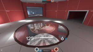
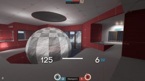
This map unfortunately showcases a fundamental misunderstanding of Player Destruction as a mode from my perspective. In PD, team just kind of DM, building up points, before it suddenly turns into a mad dash to deposit all the points. None of that is present here. There's no good combat spaces to build up points, so everyone just huddles around the cap zone. The cap always is always open, so there's no incentive to hold onto points or move to different parts of the map. As it currently stands, it's just KotH but worse. The spawn exits are claustrophobic, the lighting is too dark, the routing doesn't work, and there's no health. I've not seen the original, so I can't comment on if it's better or worse, but I don't think this mode shift worked for this layout, at least without better capture mechanics. Maybe alternate open capture zones between the warehouse at one end and the building at the other, instead of a single point in the center?

If you're interested in reading more on my design theory for PD, you can check out this 16 page document I wrote about a PD map called Doomtown: You can find that here.

I really like this one, and it's one of the better mode shifts here. So many interesting ideas! I'm not a fan of the Mid->2nd transitions, but the rest is neat. Overall, I think it's too wide. That makes sense considering the original needed ways for flag bearer to avoid enemies, but for 5CP I think it needs to be tightened a bit. The underground bits around 2nd feel extraneous, and the diagonal bridges are weird to navigate to mid with. The spec cams in the trucks are a nice touch. It feels about as big as a PASS Time map at the moment! Maybe you should try that out someday :)

I really like this! I really like the room with the model of the map, though having a mop and bucket in a room where the floor is carpet bothers me more than it should. This was a very clever way to deal with the mode shift; I wasn't expecting it to be about map design! Here's a video of me playing it, since you didn't get a demo file from the test:
View: https://youtu.be/ekzzxayzVYs

Total chaos. Mannpower's mechanics are at odds with how small the map is. Since players spawn with uber, you can wipe the point while still invincible. Over half of the map's area is a death pit, and in a mode where being able to pick up flags from dead players this doesn't feel good. Having spells and grapple hooks are mutually exclusive since they use the same loadout slot, though this did lead to a somewhat interesting trade off of better mobility or being able to use spells. Unfortunately there was too much chaos for it to really matter. The idea of PD where you have to deposit at the enemy's base isn't new (Egan did a map called Cuisine years ago that did this), but it's not been tried in a long time and I think it was worth exploring. It's just a shame all the Mannpower stuff got in the way.

Great work, it feels like this was the original mode with all the changes made! Someone in chat told me that Final is the one that was originally KotH, and if so, very impressive; I would have thought it was first that was the original! It's still impressive if first was the point; you've managed it expand it out into a solid base for an A/D map. Red spawns a bit close to second making pushing very hard, but Blu eventually broke through in every round, I think. Final is way too Red-sided; Blu did manage to win it once, but only by rolling directly from what was basically a team wipe on Second. Adding more room between Second and Final would be my solution. A fantastic change in modes, well done!

Unfortunately too small, and the resupply lockers don't work for red, but a decent enough CTF. I'd look into trying this with Arena CTF if you're looking to continue this mode shifted version; it seems like it might be the right size for it. In general, it seems there's too much clutter, and the routes are quite narrow in places, too. It's hard to tell where teammates and enemies might be, so there's a lot of blind corners. While I've not played the original, shifting from PL to CTF was ambitious, and I think it's done decently well, good job!

Oh god, the framerate! While technically playable, you might want to work on optimization if you do continue this. Seems to play alright other than that, though there's a ton of stuff that should probably be clipped or lit better. Looking at it now, there's even less clipped off than I expected! I wish it was easier to get up into the center building, or that there was another route through the middle; perhaps a tunnel or cave. Taking the roof route to the building is slow, so most fights clump up around the point which isn't very interesting. Very pretty though, I really like the dragons!

I really like the detailing, but the mode is almost worse than the 3xPLR thing, and unfortunately it's all Mannpower's fault. The powerups lead to spawncamping when teams are focused around just one objective, and during the test the flag kept seeming to spawn on the winning team's side of the map, just pushing the imbalance farther. If the flag spawned at the bottom, the upper spawn exits were better protected, and the Mannpowers removed (but the hooks remained) this could be something quite neat. The layout works well with the hooks, almost like it was designed that way. The visuals are also quite impressive; when I saw the original one I had no idea how it would ever look remotely like a place that could exist, but I now see I've been proven wrong. Interesting attempt at a mode shift, but ultimately I don't think either mode really works for this. Maybe just multi-cap SD with grapple hooks? There's a lot of neat ideas here, they just don't all work together.

This one is mine, and it works better than I expected. It's built from one of the more interesting points coupled with the worst connector from my TC map National. In National, round that uses the caves doesn't work since there's not enough room to have teams push around each other. Importantly, the suspended bridge in the caves is inaccessible during the round that uses the cave, so this Invade CTF version was an experiment to see what would happen if I reworked the layout to have both the lower cave and the bridge open at the same time. Results are promising, and I think I'll do that for the next version of National. The Orchard -> Lighthouse transition also got messed with to make this version work, and I kind of like how it connects with the caves so I might work that into National as well.

A really fun point from one of my favorite custom maps made in recent years, turned into an Arena map? Sign me up! This works really well as arena, and it just makes me want to see Hardwood finished more than ever. Out of the three points in the map, I'm glad you chose this one; first would have been interesting to see adapted, but this one is probably the most fun with the least changes. The health pack placement is very fun, and the whole thing is just fun to fight around. Great work on the mode shift, and I hope to see this or Hardwood again soon!

Fun idea, but the layout doesn't really do it justice. Having more space between the bases to allow the water sphere to interact with gameplay more would be nice. Nobuilding the platform and blocking the under route would also help. That slow side door is a very strange element; I get why you did it but it seems like such an odd solution. I've go no idea what else you'd do other than making it a longer route or tying the opening/closing to the flags or something. It's good, goofy fun, and you've done a great job adapting the final CP into a very unique CTF map. Well done!

Interesting. Seems to work alright, though the intel is a bit close to spawn. Not sure where else you'd put it though, without having to make a lot of structural changes to account for a whole new intel room. Not sure what the intended main route is for attacking, either; it's dangerous to pass the enemy spawn, so zig-zagging through the buildings seems the best at the moment. The dropdowns heading towards mid seem alright for getting teams and flags out of the enemy base, but they seem to have left some strange disconnected rooms above them near the mid that don't seem to serve a purpose here, and confused me on several occasions. They might make sense for the KotH version, if they're there in that one, but here I'm not sure they're needed. I've not played the original, but this seems like a decent mode shift!

I wish this had been done in time, I would have loved to try it! As it stands, I can't give layout feedback, but it's a neat idea. I was excited about the random spawns, then disappointed when I loaded it up to find there's just two and it's random which team, then thought about it more and realized it's probably better than having like four different possible ones that it picks two from. Hopefully I'll get to play it at some point! Wildly creative mode shift; you took a map from an entirely different game, well done!

And as usual for Season 2, here's the mode breakdown, split in half this time to show both the original and new modes. Across both starting and ending modes, we hit 13 of the 17 official modes, only missing Domination CP, Medieval, MvM, and RD:

Shifted from:

PL 3
KotH 7
A/D 4
3CP 1
SD 2
ICTF 1
CTF 1
Detail 1
PLR 1
TC 1
Steel 1
OFDM 1

Shifted to:

A/D 5
CTF 5
PASS 1
Mann 2
ICTF 2
Arena 4
KotH 1
PD 1
5CP 1
TR 1
Custom 2
- - (Mann/PD) 1
- - (TAG (Mann/SD)) 1

Thanks for playing along as a mapper, tester, or observer! I'm once again impressed by the turnout, and once again I'll be seeing you all next month for another microcontest.
 

Punn Ames Ardum

L1: Registered
Jan 16, 2021
46
26
This map unfortunately showcases a fundamental misunderstanding of Player Destruction as a mode from my perspective. In PD, team just kind of DM, building up points, before it suddenly turns into a mad dash to deposit all the points. None of that is present here. There's no good combat spaces to build up points, so everyone just huddles around the cap zone. The cap always is always open, so there's no incentive to hold onto points or move to different parts of the map. As it currently stands, it's just KotH but worse. The spawn exits are claustrophobic, the lighting is too dark, the routing doesn't work, and there's no health. I've not seen the original, so I can't comment on if it's better or worse, but I don't think this mode shift worked for this layout, at least without better capture mechanics. Maybe alternate open capture zones between the warehouse at one end and the building at the other, instead of a single point in the center?

If you're interested in reading more on my design theory for PD, you can check out this 16 page document I wrote about a PD map called Doomtown: You can find that here.
Thanks for the feedback, if I was able to do this again I would definitely put more health and pickups around (I think I had an arena mode mindset for some reason) and I knew the point being open the whole time was going to be a problem but I had to bite the bullet because I just don't understand the logic at the time (yes, it is quite an idiotic decision to dive into a pool knowing you can't swim); After reading your document/essay I would definitely try something like the can folding in on itself into a grinder where if you die to it you would deposit all of your points (or maybe that would be the "gimmick" where it only takes it in while it's open? I'll have to think about/test it more)
Again, thank you very much for your feedback and I'll try to take it too heart (and stop acting like I'll be saved by Deus ex Machina/Prefabs for the logic)