-
This map is featured! Our best maps, all together in one place for your viewing pleasure.
You are using an out of date browser. It may not display this or other websites correctly.
You should upgrade or use an alternative browser.
You should upgrade or use an alternative browser.
Giant UFO ships hovering in the sky.
There is. it's just nt shown in the screenshots because vvis.
nightwatch
aa
- Sep 7, 2012
- 638
- 501
This is probably your most fun map yet, especially as sniper. I feel like the cart doesn't get a lot of vertical travel though (which isn't necessarily a bad thing) but the height variation always seems to happen on the edges and not really much around the cart itself.
I found it really hard to create heights for the cart to travel due to it being granary theme - farms are flat...that's the point. It's kind of my own fault for limiting the layout due to aesthetics, but I've considered even just changing the theme to get a little more variation in there.
I found it really hard to create heights for the cart to travel due to it being granary theme - farms are flat...that's the point. It's kind of my own fault for limiting the layout due to aesthetics, but I've considered even just changing the theme to get a little more variation in there.
Barnblitz does a very good job at have a relatively flat cart path, while having a LOT of good height variation. You might want to look at that a bit for inspiration.
- Dec 15, 2013
- 533
- 802
Remember; a flat payload route does not equal boring. You have quite the interesting building geometry, I would say, and that more than makes up for it. If you think about goldrush, it doesn't have much height variation on the tracks except for a few ramps, and the buildings never go above 2 stories tall. In my quick run-through I didn't see any huge sight problems or massive choke points that usually happen with flat and open maps.
I found it really hard to create heights for the cart to travel due to it being granary theme - farms are flat...that's the point. It's kind of my own fault for limiting the layout due to aesthetics, but I've considered even just changing the theme to get a little more variation in there.
I love the farm theme, i think it's the most under rated environment; but i've found similar difficulties with height variations. I think the trick will boil down to how you incorporate structures and as Frozen mentioned, Barnblitz does a relatively decent job of that.
I'm getting back into mapping and trying the farm theme again. This is basically what i've found with my past experiments with the theme.
Another technique, which I picked up on when I was looking into ways to develop Minecraft themed maps (which can't really get away with much uneven ground), is to rely on artificial structures for height variation. Even Badwater Basin's cart only goes up a natural hill once, despite a decent amount of sloped ground; the rest is wooden ramps.
- Dec 15, 2013
- 533
- 802
Having this all been said, have any of you checked out the map? Because, I did take inspiration from these and I think I did a pretty good job creating height around the track using structures.
Yes. I played it with bots for a good hour. However, I'm terrible at feedback so I cannot really help you there.
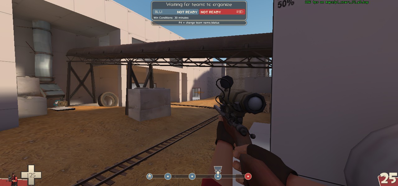
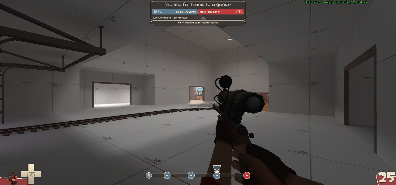
Those pics will give you a sense of one thing I feel is currently off about the map. In the first picture my crosshair is on red's spawn at last. The second is a little easier to understand, my crosshair is next to the side exit out of blu's initial spawn. That first sightline I'd hazard a guess at being 3000 units or so long, which other than just being painful against good snipers will cause issues for optimization of course.
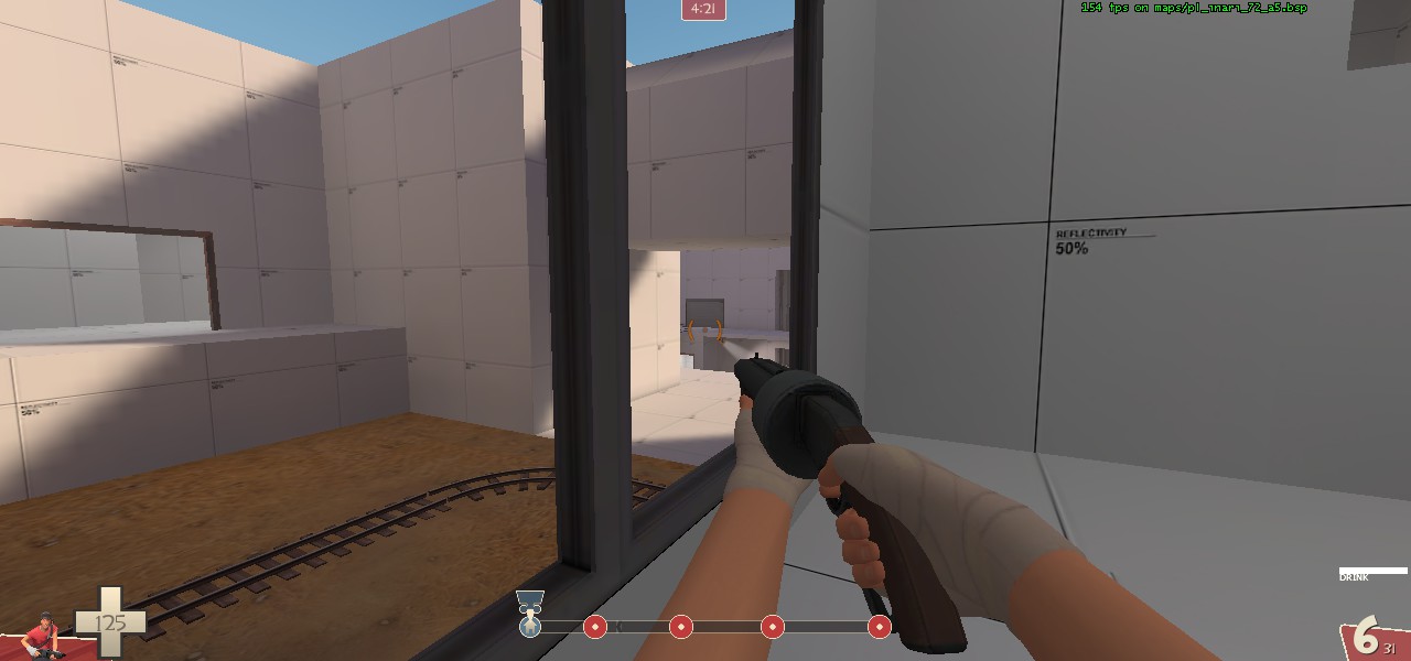
Another pic of that first sightline about half way through.
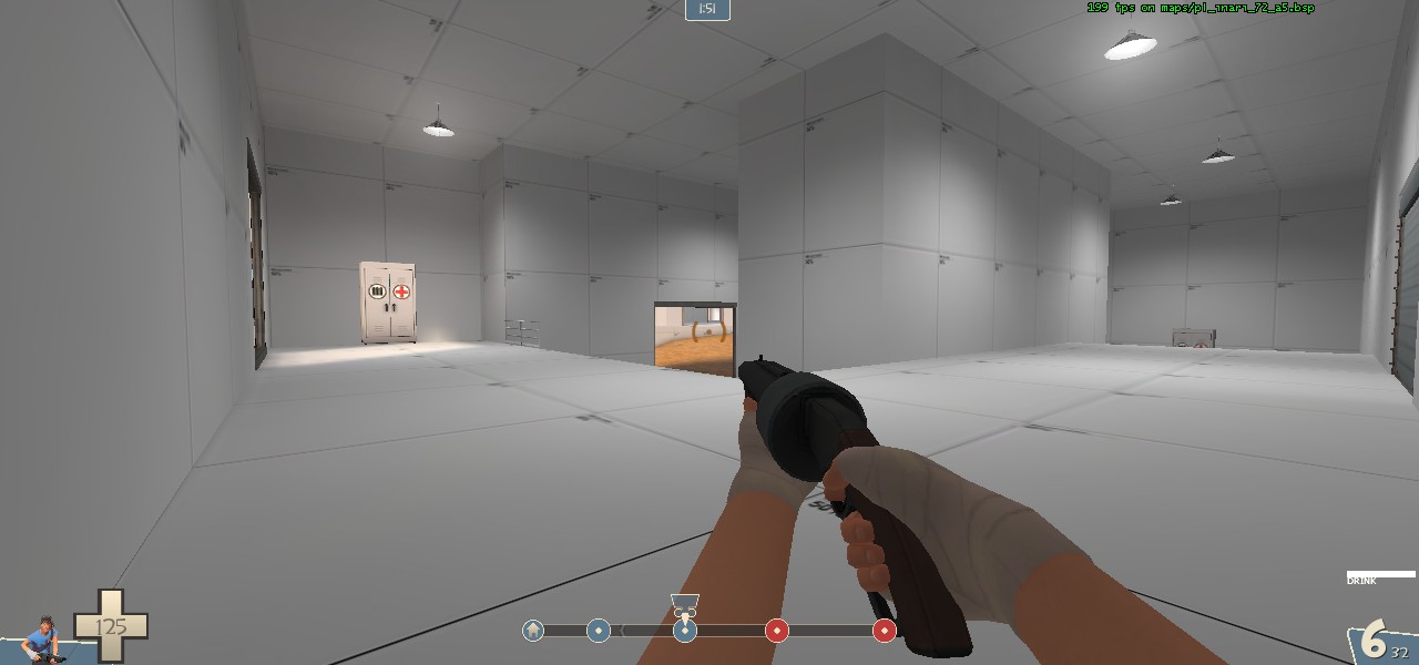
This is from blu spawn to area right after the first point.
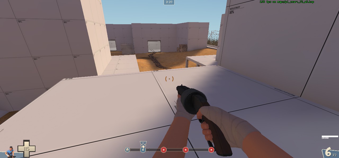
Sightlines of all three spawn exits.
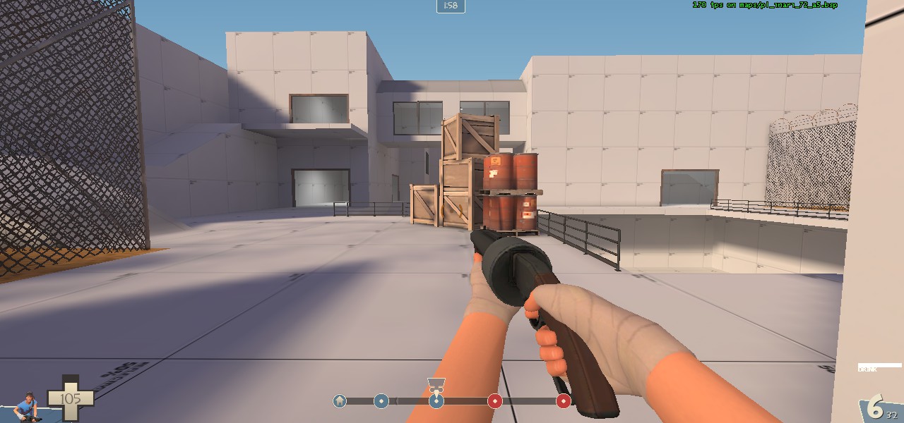
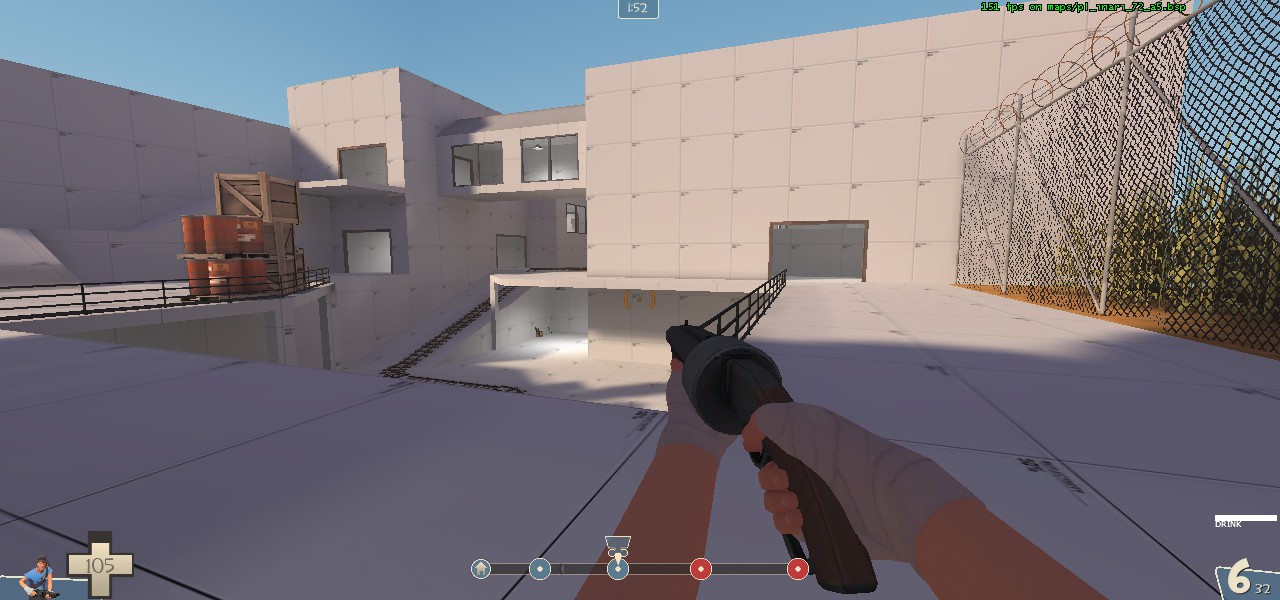
Sightlines right out of last's spawn doors. This aren't necessarily enormous sightlines, but they still are quite large. 1000 unit sightlines can have their place in payload maps, but sightlines to spawn points generally aren't fun for players. Another thing to consider, and I think I bring it up later as well, but---the player's ability to deal with the information provided in their field of view and make assessments based on what the see initially is limited for most people. What I mean by this is something along the lines of: when a player respawns and exits out the door, you don't want to overload them possible variables to consider. Coming out of blu's initial spawn and red's last spawn have this overload effect with the shear amount of possible positions for the enemy to be in and come out of. In that last picture there a basically five different positions where I could expect enemies to be, and I don't even have cover.
These last few pictures also bring me to my next point.
First and last feel completely indefensible. If I was a sensible engi (which sometimes I am) I'd set up before or around second, and in the room above the third point.
Here:
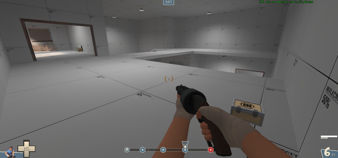
While sightlines are a major determining factor of where I'd setup (what with sentry range versus snipers and rockets), the first and last have many routes and in looking for places that would make great nests I always found a flank right behind that position. I think it's acceptable to have first be an easy win for blu, but last should not suffer the same issues.
I do actually have some minor ideas that would help make last more defensible, that would be akin to both defensive positions on boundary and badwater (you have a very similar last to badwater anyway).
This flat white area here (under my crosshair):
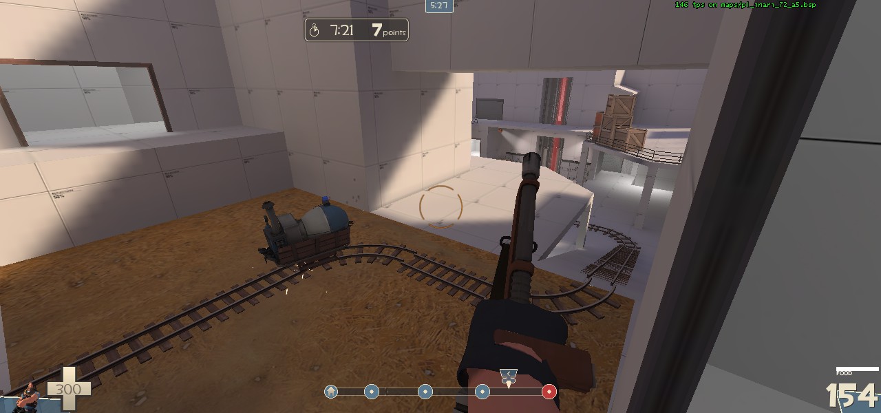
If you extend the building just to the left of it to completely cover the flat area it will cut up a sightline as well as remove an attack route for blu. But you must also keep the ledge that is behind as that can become a possible sentry position (would take a good engi to keep it alive there, but it's more than nothing).
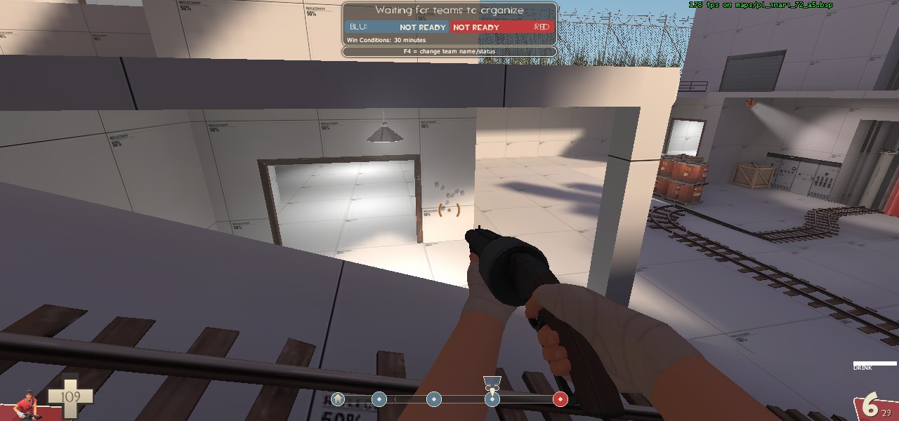
I think you need to follow badwater here and simply block this (either solid or chicken wire), that way engis have the possibility of setting up there without dealing with pill spam (they still have to deal with that flank right behind them).
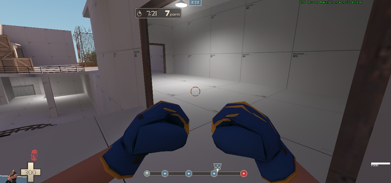
I don't know whether it is necessary, but I think you can remove this route right here as blu already has the advantageous spot above with the height advantage, and this would reduce the amount of paths that red has to access coming out of spawn.
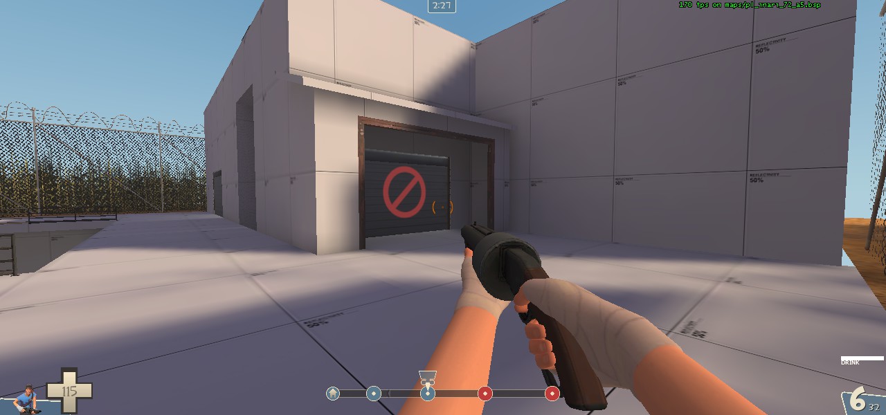
The least you can do here is clip the roof over the exit, but I would recommend making an open garage out of the exit so red has more cover coming out. Essentially, keep the same door, but add a roof extension to the fence (clipping over the roof of course) and possibly arrange the open garage so that it cuts down on this sightline:
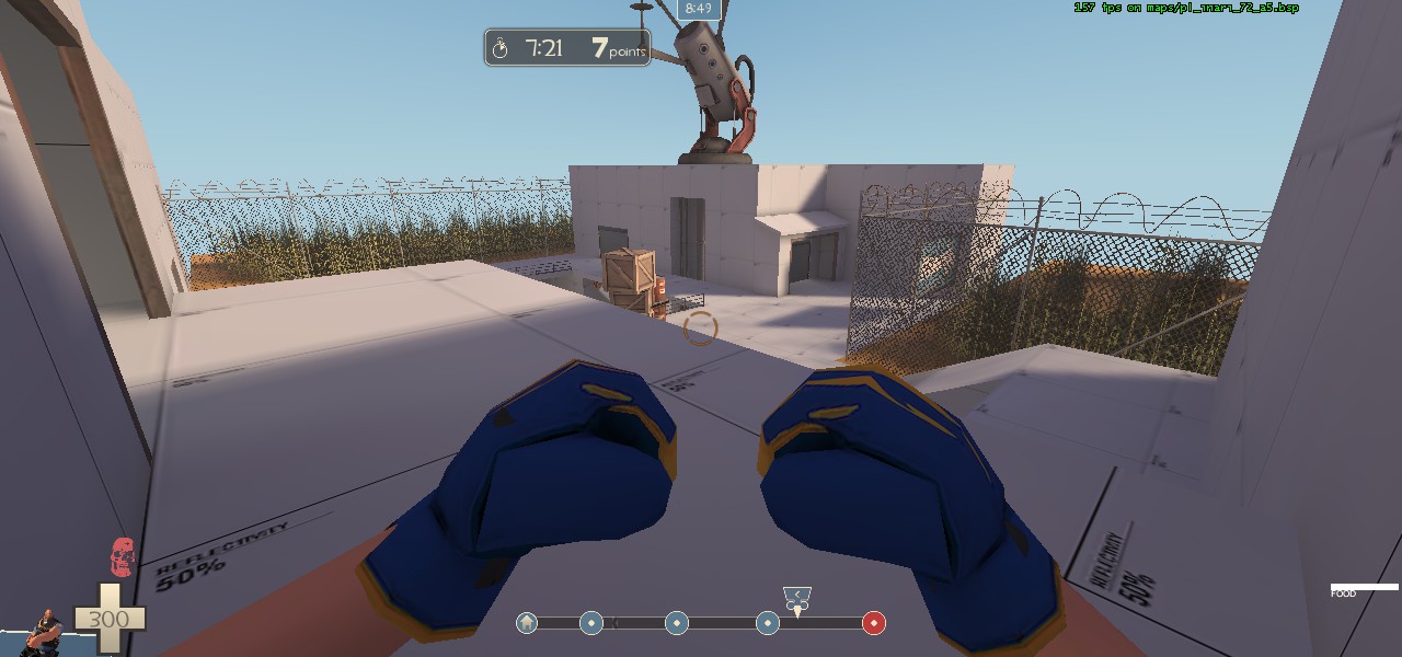
I would also recommend making some cover for the other upper exit for red's spawn, maybe similar to badwater again, but that is up to you.
One big last point before I move on to general nitpicking:
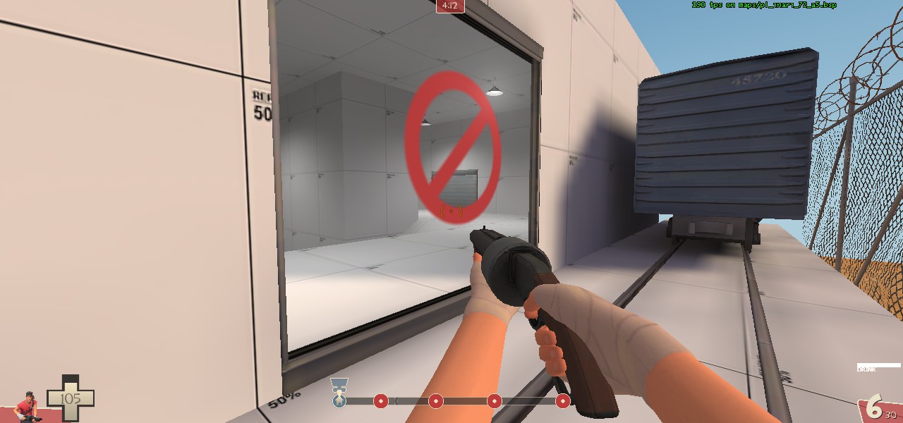
This will lead to game-start krit abuse similar to gravelpit, cashworks, or even for that matter escarpment. And it is not fun. (I guess I should mention that probably about the last 400 or so of my tf2 hours have been spent on "Top Notch Clan" payload rotation server. I think I saw blade post about pier over there recently. Escarpment, as well as a lot of different custom payloads are in rotation over there.)
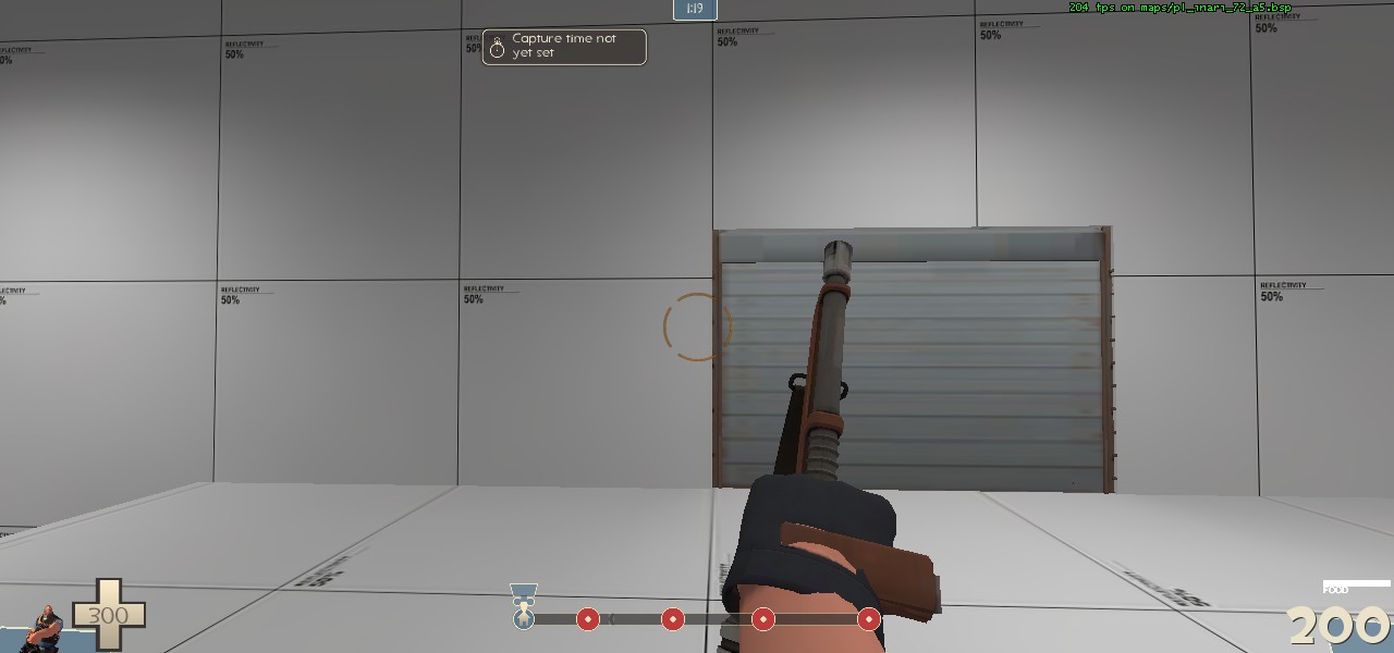
Possibly moving the door over 128 units or more would help somewhat.
Okay nitpick time:
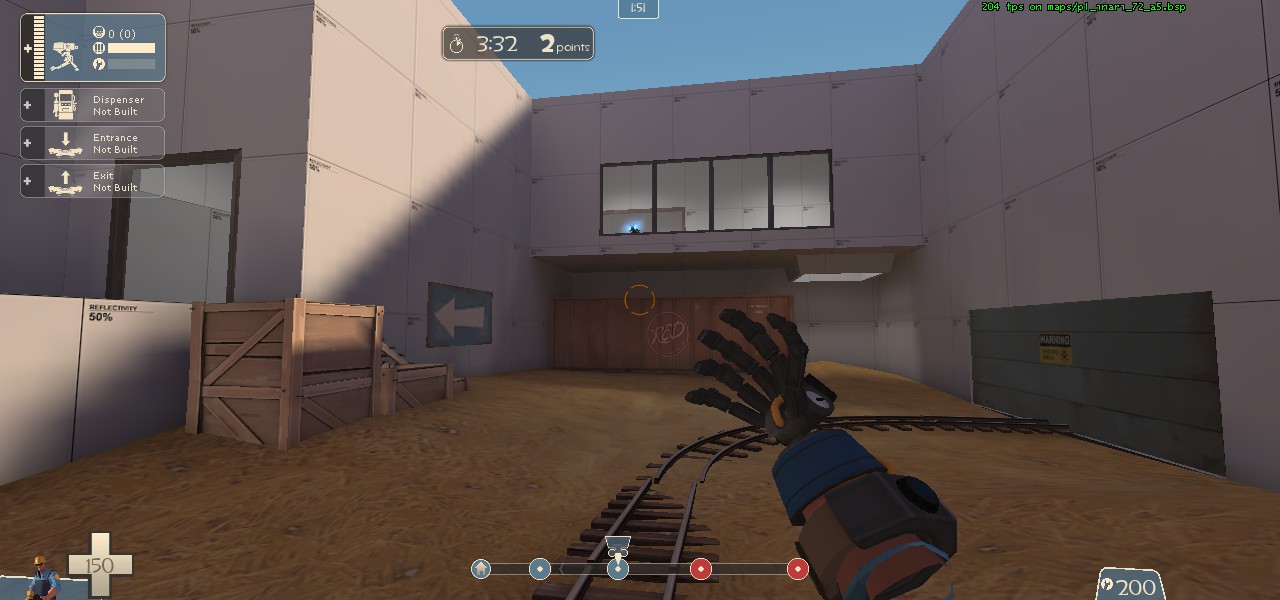
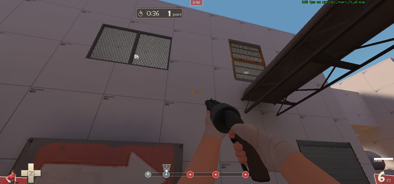
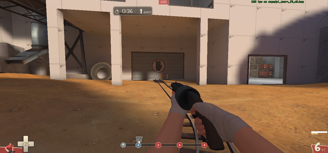
More of just a suggestion: I think these doorways/windows should open after first is capped, not second. Maybe not the garage door, but the upper areas would create a flank route for blu to attack red on second if they are entrenched.
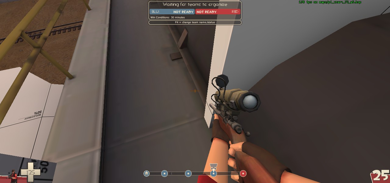
You can get caught on this doorway on the right side, and do to how small the doorway is already I think it's a little annoying (especially because it's right in a gameplay area).
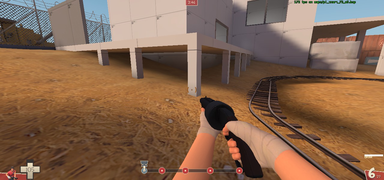
I think it would be best to clip/chicken wire this area. It will never really be useful besides an annoying mini sentry, players will only get stuck on edges.
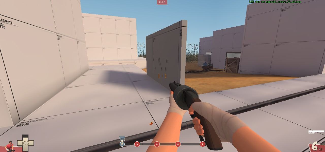
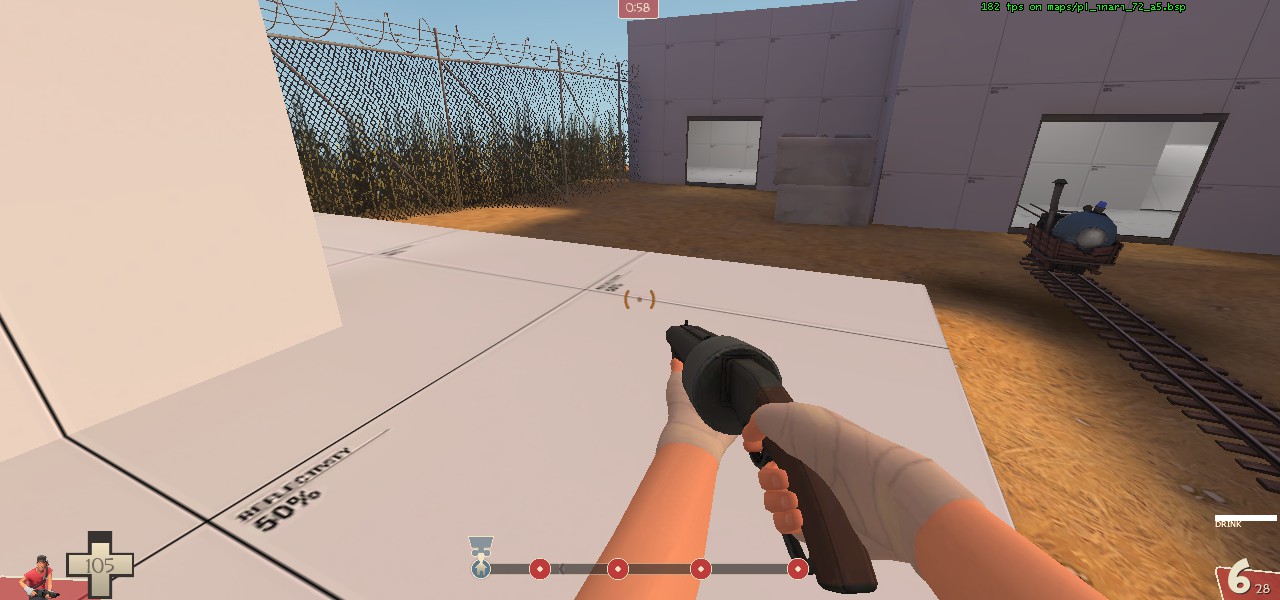
The wall in the first picture would be better placed in the second picture (would also help break sightlines a little).
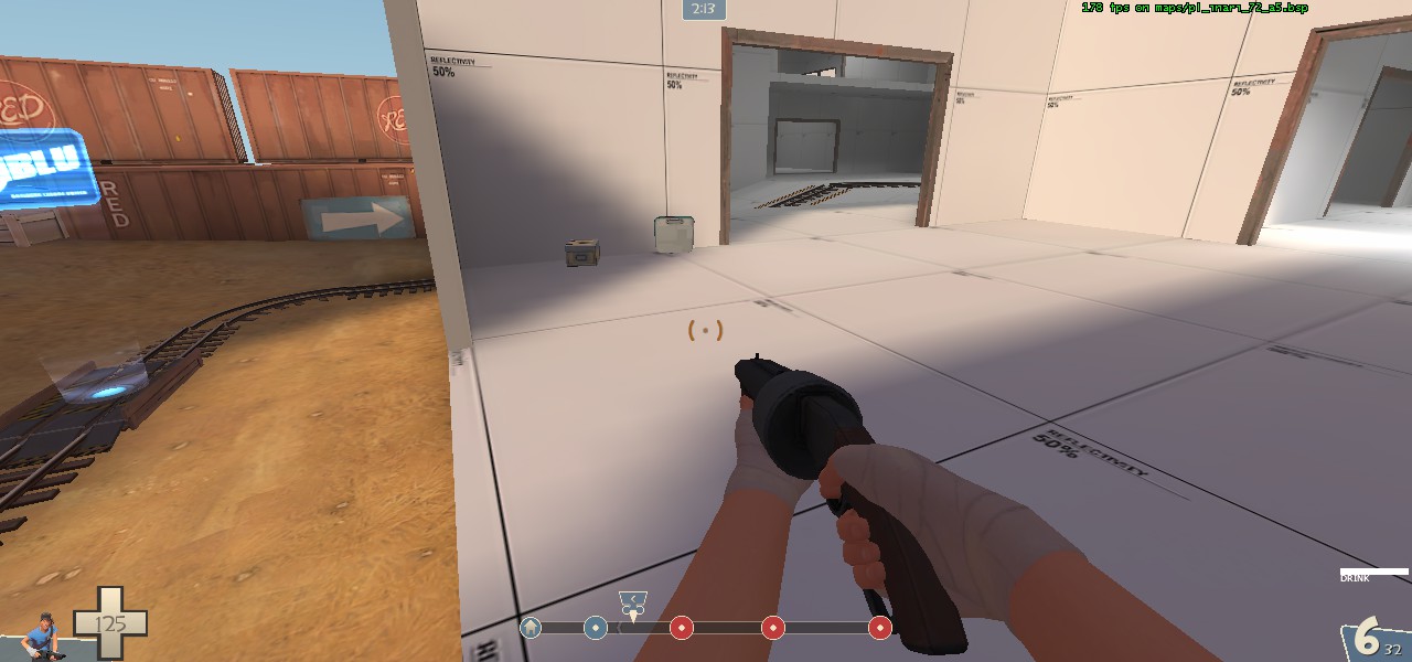
I'm unsure of this one, but I think extending the little wall/barrier next to the ammo/health another 128 units will break up sightlines more and generate a more secure location.
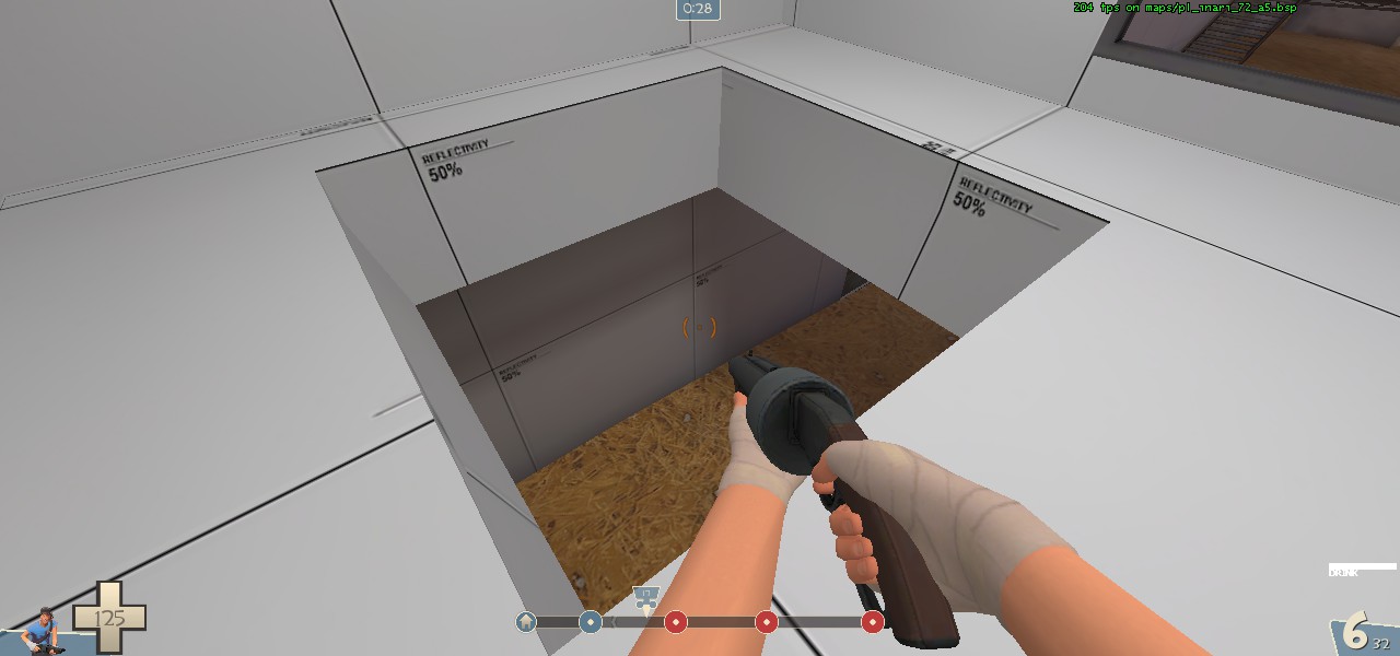
I think it should be harder to get up this shoot.
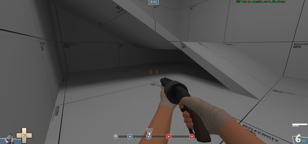
Not really necessary, but making these solid instead of having space under them is probably better to fight around.
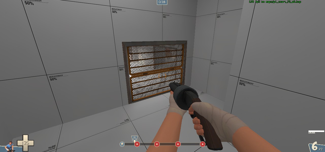
Currently this door doesn't open until first it captured, but I think it would be better as a one way door, so if a red player finds themselves over here they can still get through.
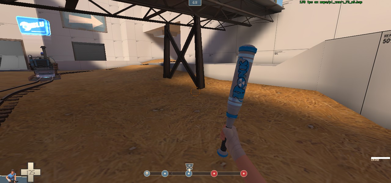
Not necessary, but adding cover here would create an interesting spot for blu to try and push to the inevitable sentry nest behind the concrete block next to the point.
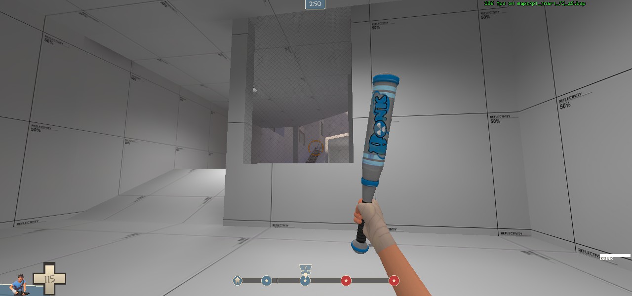
This makes it easier for attackers to spawn camp/see players coming out of spawn, especially since there is already a height disadvantage.
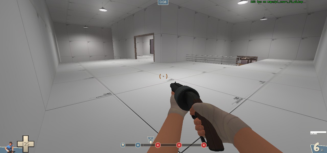
This room is very barren/large, but I'm sure you'll have found a way to fill it up or change it later.
With your current set up, I see blu pushing first easily, getting stuck on second, rolling third before red has time to set up, and then a kind of empty battle on last because there are large varying routes into last. As I mentioned, a roll-able first is fine, but last should not be so easy.
I'm sure there are probably things I've forgotten, or may not have explained well, just ask if so.
Last edited:
Long sightlines are fun. But when you have a clear shot through 3-4 doorways, then you have some problems. Yea "Use another door" is a fine excuse, but isn't a reason to keep it. (Will also cause some optimization problems down the road). Should adjust some of the doorways so that you can't see that far through the map early on.

I see a lot of people who try and use this door, thinking it'll open, or thinking it's something else and then get confused when it doesn't do anything. It's along the path of flow for players, so its likely they'll hit it and it's deep into a hallway, which makes it a little more inviting. "Well, they'll learn to not use it, then they'll stop using it" is a fine excuse, but isn't a reason to keep it like this. I would suggest moving adding a second door to the top of this section, and just lock it off completely.

And just some various scribbles I have about final I did because I got my tablet working again \o/ ... I wouldn't leave that left door uncovered like that, I would do something like how badwater did it (or like how did it on the other side) and add that little shack.)


I see a lot of people who try and use this door, thinking it'll open, or thinking it's something else and then get confused when it doesn't do anything. It's along the path of flow for players, so its likely they'll hit it and it's deep into a hallway, which makes it a little more inviting. "Well, they'll learn to not use it, then they'll stop using it" is a fine excuse, but isn't a reason to keep it like this. I would suggest moving adding a second door to the top of this section, and just lock it off completely.

And just some various scribbles I have about final I did because I got my tablet working again \o/ ... I wouldn't leave that left door uncovered like that, I would do something like how badwater did it (or like how did it on the other side) and add that little shack.)

a7:
Moved red forward spawn back a bit.
Reduced grass around pickups to increase visibility.
Changed the gate that somehow confused people into a door.
Added cover on final.
Removed lower route at final.
Added windows to skybridge after 2nd.
Changed upper area of building after 3rd.
Fixed many sightlines
~Download~


