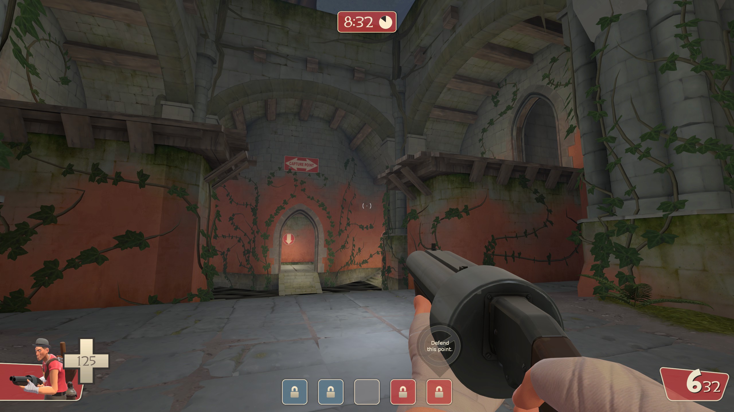
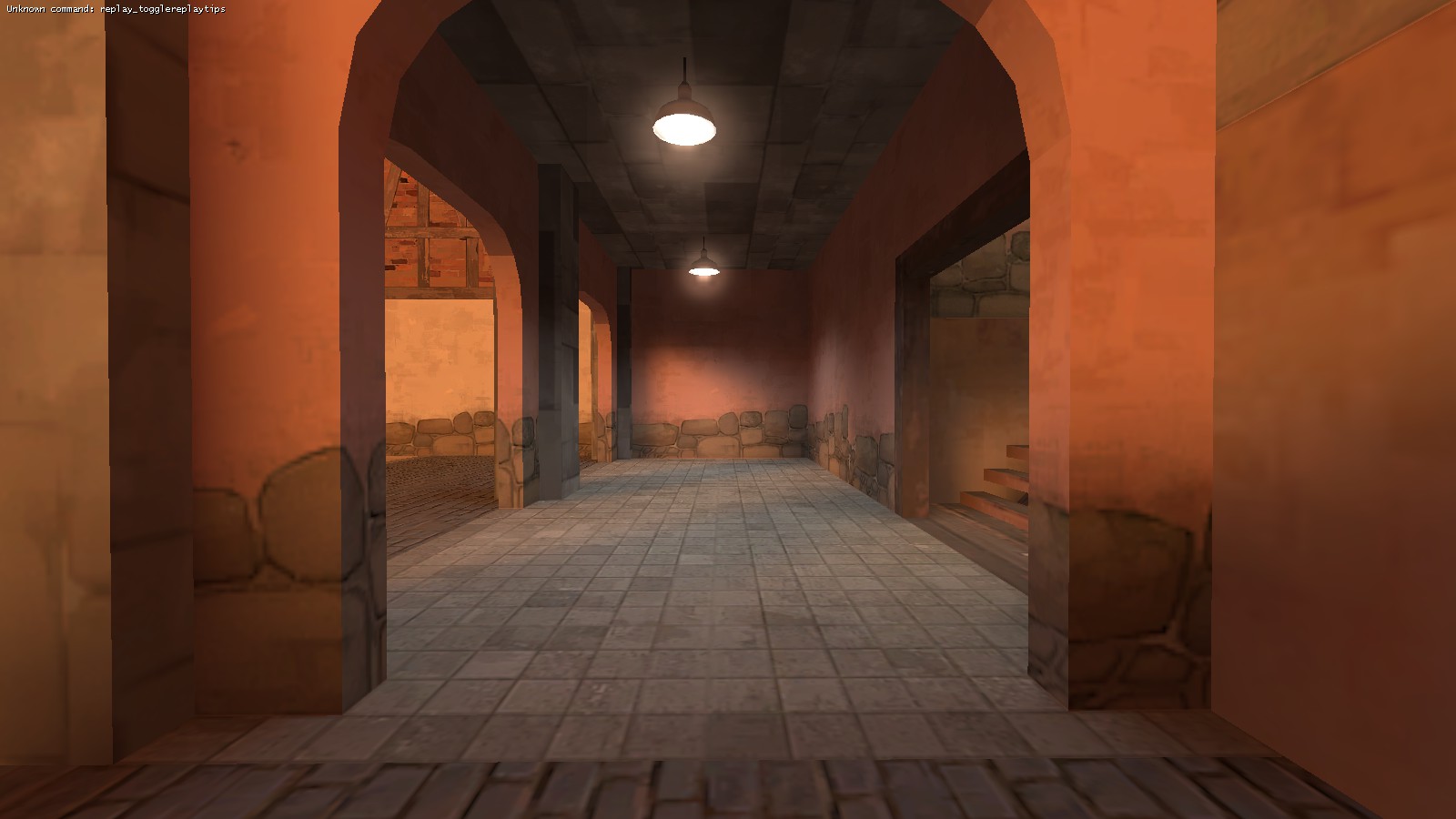
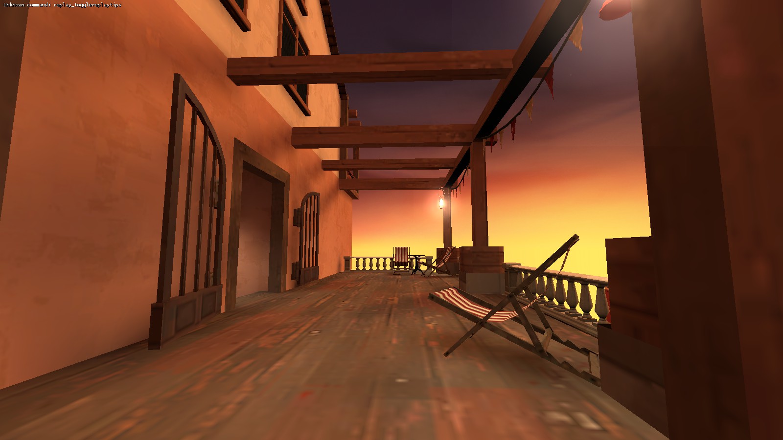
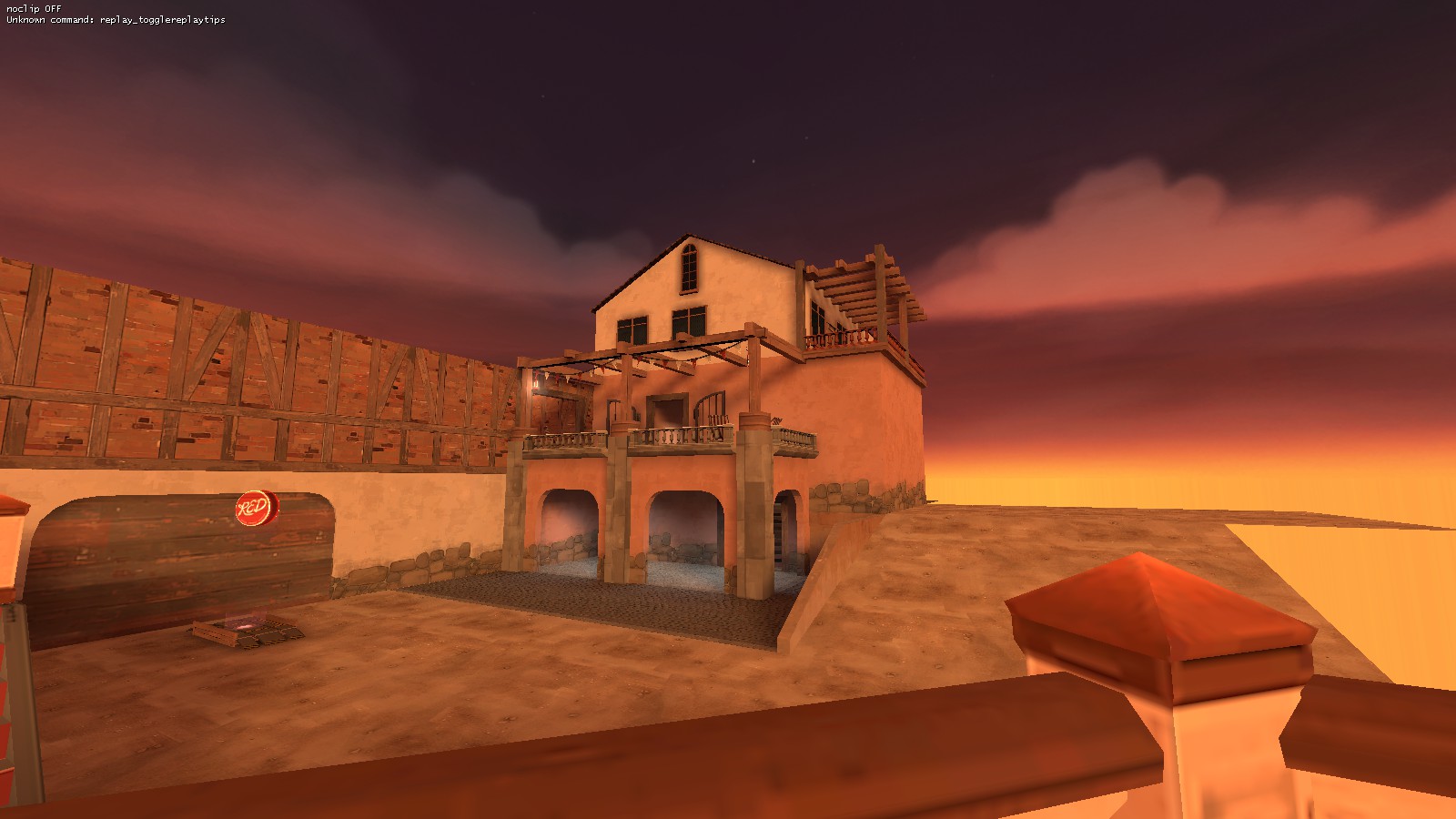
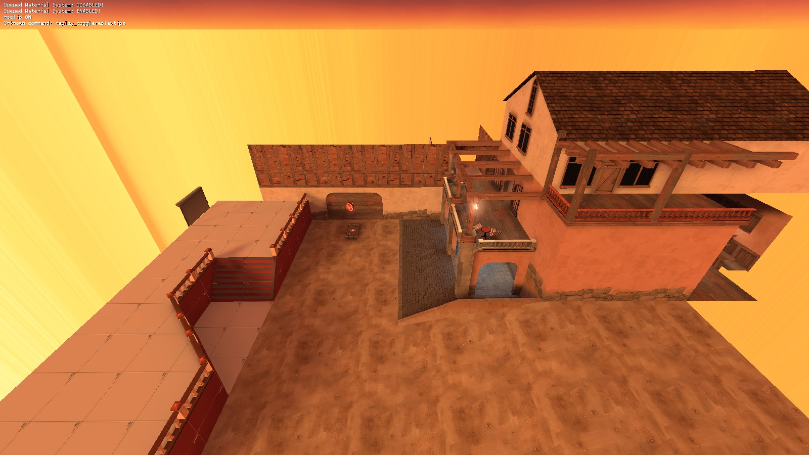
I am not sure how a brick texture blends into concrete like that.
WiP in WiP, post your screenshots!
- Thread starter Arhurt
- Start date
You are using an out of date browser. It may not display this or other websites correctly.
You should upgrade or use an alternative browser.
You should upgrade or use an alternative browser.
Looks more like spray paint or colored dust than plaster. You only get a soft gradation between materials if they're soft or loose, which you don't want for walls. If you want a decayed plaster sort of look you'd want some hard edges, but those will draw the eye in a way that you probably don't want. Also the way its localized on the wall (where the plaster has and hasn't fallen off the wall) looks wrong. I'd recommend making walls either fully stone or fully colored, and maybe removing a few chunks to show age.
If you're locating the colors towards the bottom to provide some sort of compositional grounding, you could supplement that with some denser foliage. Vines tend to be denser where they start growing, and the vines as they are look kinda lonely.
If you're locating the colors towards the bottom to provide some sort of compositional grounding, you could supplement that with some denser foliage. Vines tend to be denser where they start growing, and the vines as they are look kinda lonely.
You could try using blend displacements with a proper blendmodulate mask. Both pd_watergate and cp_overgrown use displacement textures like that to great effect. Basically the wall as you have it now is nodraw, and then you have a displacement in the same spot. The displacement will show through the nodraw, and the blending will let you get the transistion better looking and without repetitive patterning you'd have with non-displacements.
You could try using blend displacements with a proper blendmodulate mask. Both pd_watergate and cp_overgrown use displacement textures like that to great effect. Basically the wall as you have it now is nodraw, and then you have a displacement in the same spot. The displacement will show through the nodraw, and the blending will let you get the transistion better looking and without repetitive patterning you'd have with non-displacements.
yeah, it would be very easy to convert all the brushes to displace, agree that it does not look 100% right now
some b4 screens (also changed the name to Heart of the Oak)
download it here: https://tf2maps.net/downloads/heart-of-the-oak.3270/
Have I gone overboard?
http://antiquity.necrotalesgames.com/changes-antiquity-2011-to-2017-b15.php
[edit] It was easier to set up than doing the imgur album comparisons I did for snowycoast, btw.
http://antiquity.necrotalesgames.com/changes-antiquity-2011-to-2017-b15.php
[edit] It was easier to set up than doing the imgur album comparisons I did for snowycoast, btw.
Last edited:
great to see you still working on portal 2 maps! The maze with the cube of doom puzzle really scared me XD
EDIT: Also I love Art Therapy style
Last edited:
I don't get the overwatch reference, can someone explain?
Lampenpam
aa
- Mar 23, 2013
- 1,013
- 347
I don't get the overwatch reference, can someone explain?
Not really a reference. The "hologram" texture looks inspired by how Overwatch's control point borders look.


