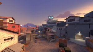
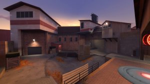
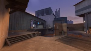
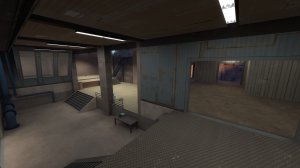
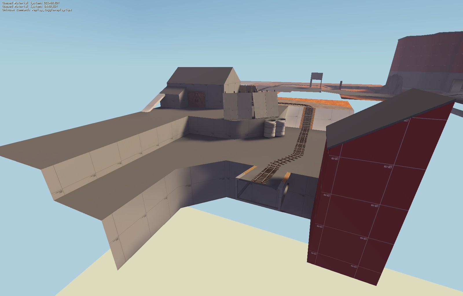
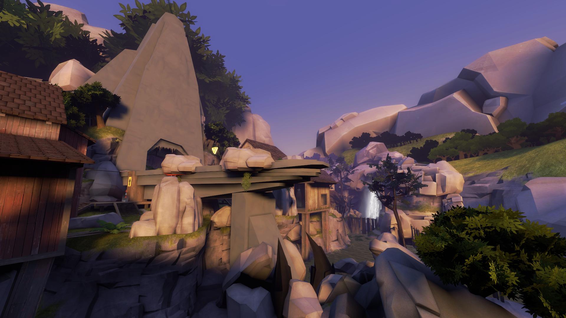
WiP in WiP, post your screenshots!
- Thread starter Arhurt
- Start date
You are using an out of date browser. It may not display this or other websites correctly.
You should upgrade or use an alternative browser.
You should upgrade or use an alternative browser.
I did a draw over on your sketch with some thoughts I had.
Red is where I thought you should block doorways, openings off.
Blue is where I though you should open some doorways, as well as remove that little wall.
The bright green is a predicted flow chart for the attacking team.
The dark Green is the flow chart for Blue after taking point A.
Orange is the likely holding positions for the defending team.
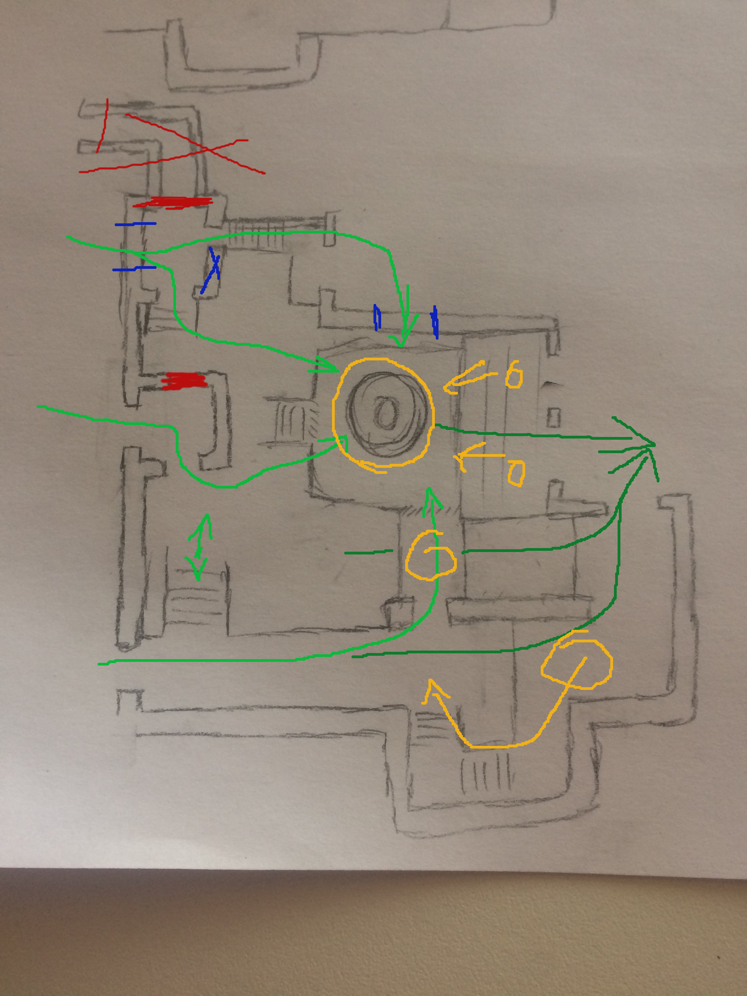
I could disagree. The bottom red subject-to-close is unnecessarily so, and would make that part of area a straightforward mess. The blue new doorway to open near the point would make the flank that the area there provided unviable, and make ALL the flow go directly to point with little other options. The replacement of the top hallway with one a bit to the left leaves attackers with considerably less sight to the point, how good is that depends on how strong the defense positions are which I'm not very able to judge.
some things that you got wrong, according to how i want my map to work, that i think you should know, and i feel a little bad for leaving out...I did a draw over on your sketch with some thoughts I had.
Red is where I thought you should block doorways, openings off.
Blue is where I though you should open some doorways, as well as remove that little wall.
The bright green is a predicted flow chart for the attacking team.
The dark Green is the flow chart for Blue after taking point A.
Orange is the likely holding positions for the defending team.

first, the area directly right of the point is a roof that only jumping classes could use, making that green arrow probably be removed...
the middle dark green arrow falls over 3 different heights... the first height is ground level, followed by a slightly raised platform, followed by ground level again, followed by a significantly raised platform, meaning that dark green arrow can also probably be effectively removed...
this would make all the fighting be focused towards the top, and bottom of the point... into the two hallways...
Yeah I mean orange is a great color and all, but literally every single one of those maps just use the same orange ground texture, orange tree props, and somewhat orange, hazy lighting.
I like the idea of the autumn theme but (and I kinda saw this coming after void made camp Redmond and slasher, which use the textures uniquely imo) I feel like it's just becoming the new alpine theme/alpine grass textures. I mean that as in the textures and the props can be used literally with any form of skill and they'll always fit and be considered to look good. Because of this, a lot of the maps that use them literally look the same.
If you want to do autumn theme I'd suggest doing something like pl_rebirth, where it uses lots of colors from a similar palette (or a toned down palette with splotches of vibrant color here and there) and isn't just orange spammed all over any bit of nature in the map.
Not trying to shit on anyone's work here, but I feel like the orange textures and props are being way overused for how good they actually look.
honestly if its so overused i can switch the color straight over to green or something else.Yeah I mean orange is a great color and all, but literally every single one of those maps just use the same orange ground texture, orange tree props, and somewhat orange, hazy lighting.
I like the idea of the autumn theme but (and I kinda saw this coming after void made camp Redmond and slasher, which use the textures uniquely imo) I feel like it's just becoming the new alpine theme/alpine grass textures. I mean that as in the textures and the props can be used literally with any form of skill and they'll always fit and be considered to look good. Because of this, a lot of the maps that use them literally look the same.
If you want to do autumn theme I'd suggest doing something like pl_rebirth, where it uses lots of colors from a similar palette (or a toned down palette with splotches of vibrant color here and there) and isn't just orange spammed all over any bit of nature in the map.
Not trying to shit on anyone's work here, but I feel like the orange textures and props are being way overused for how good they actually look.
Yeah I mean orange is a great color and all, but literally every single one of those maps just use the same orange ground... *snip*
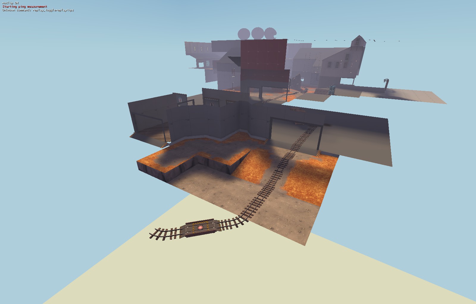
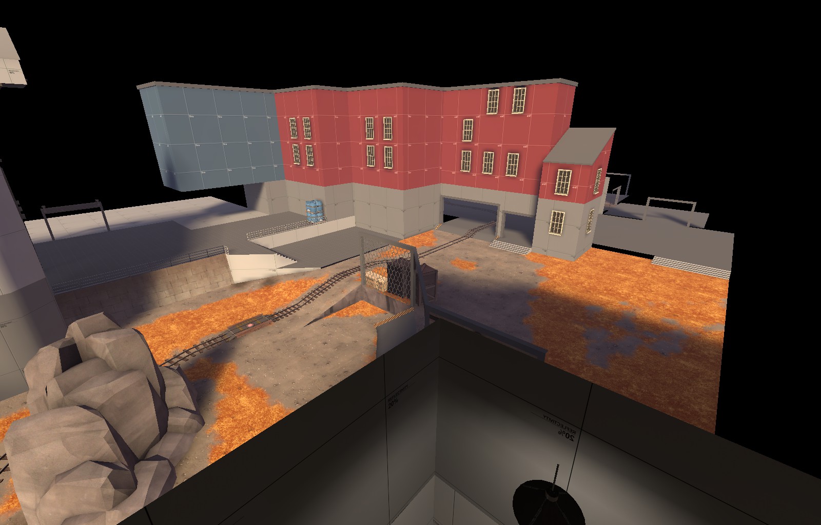
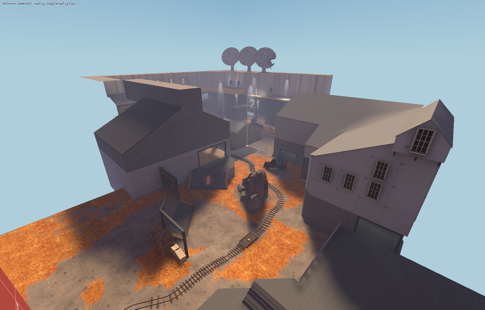
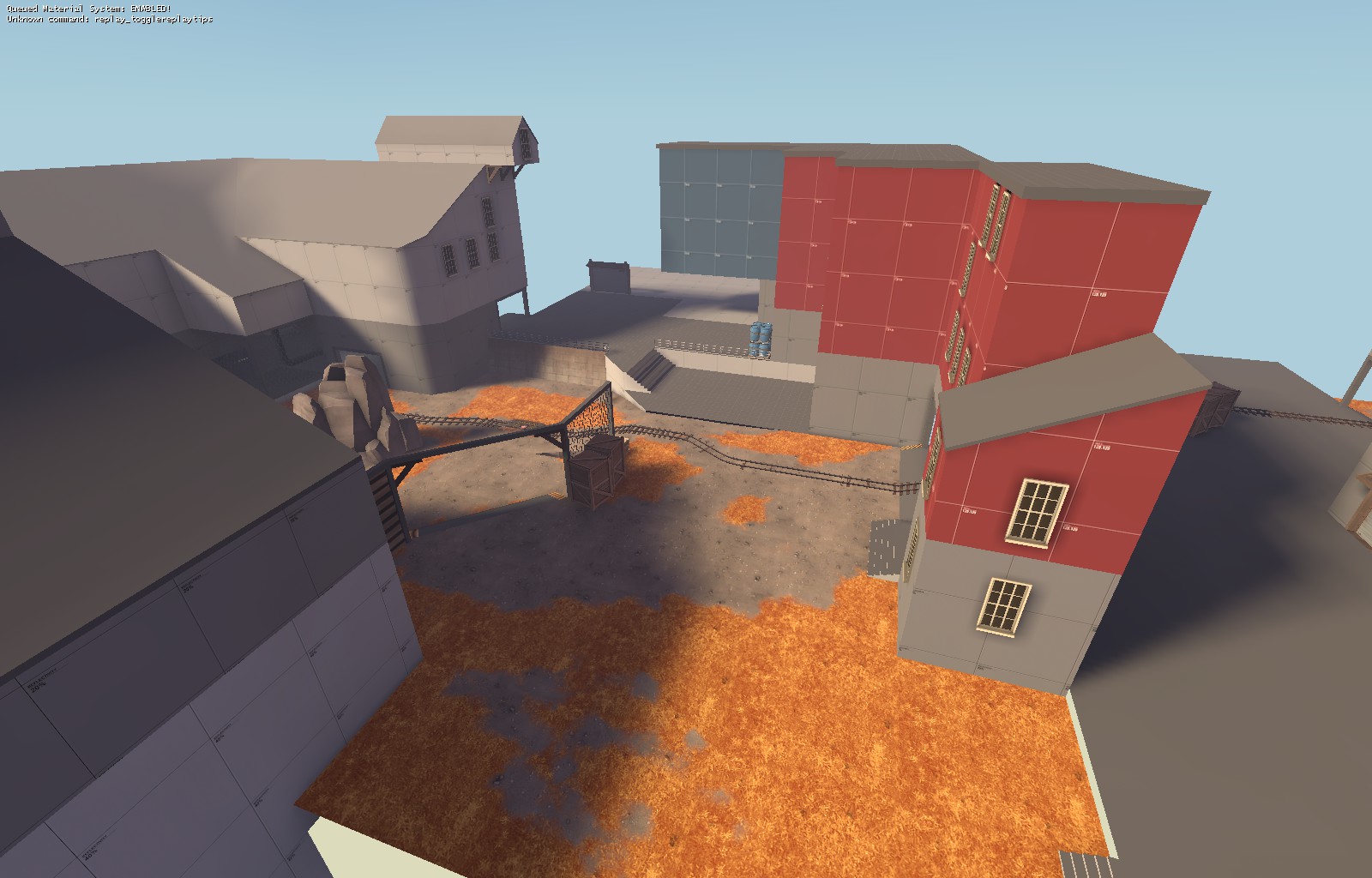
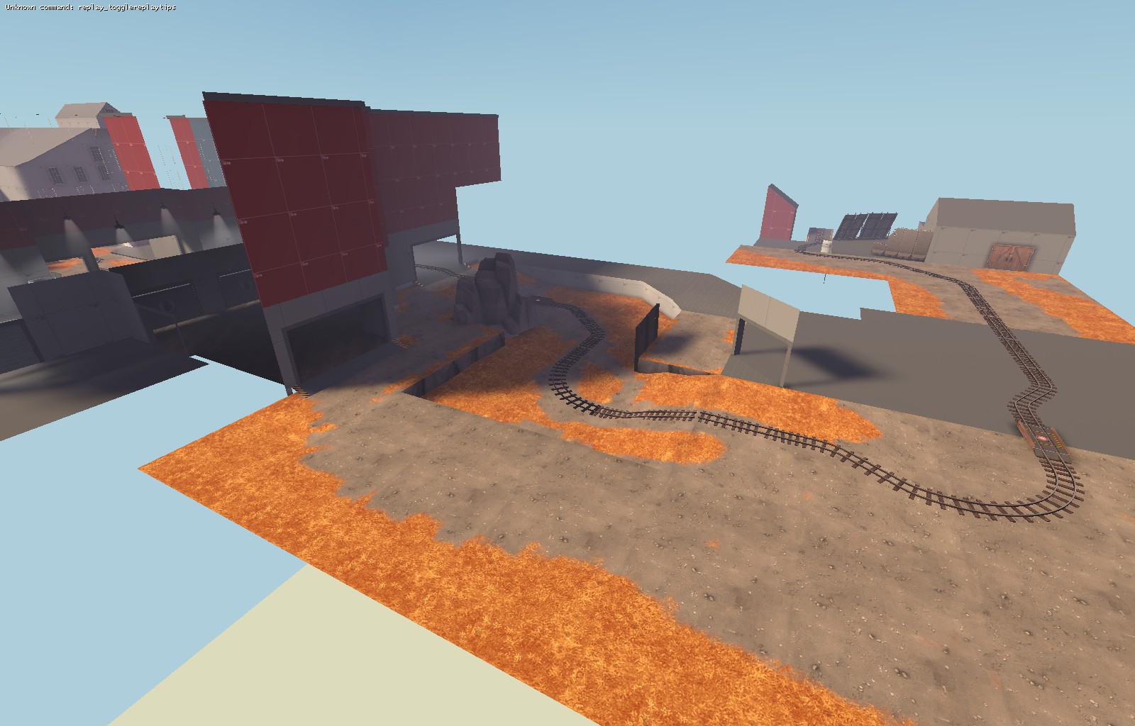
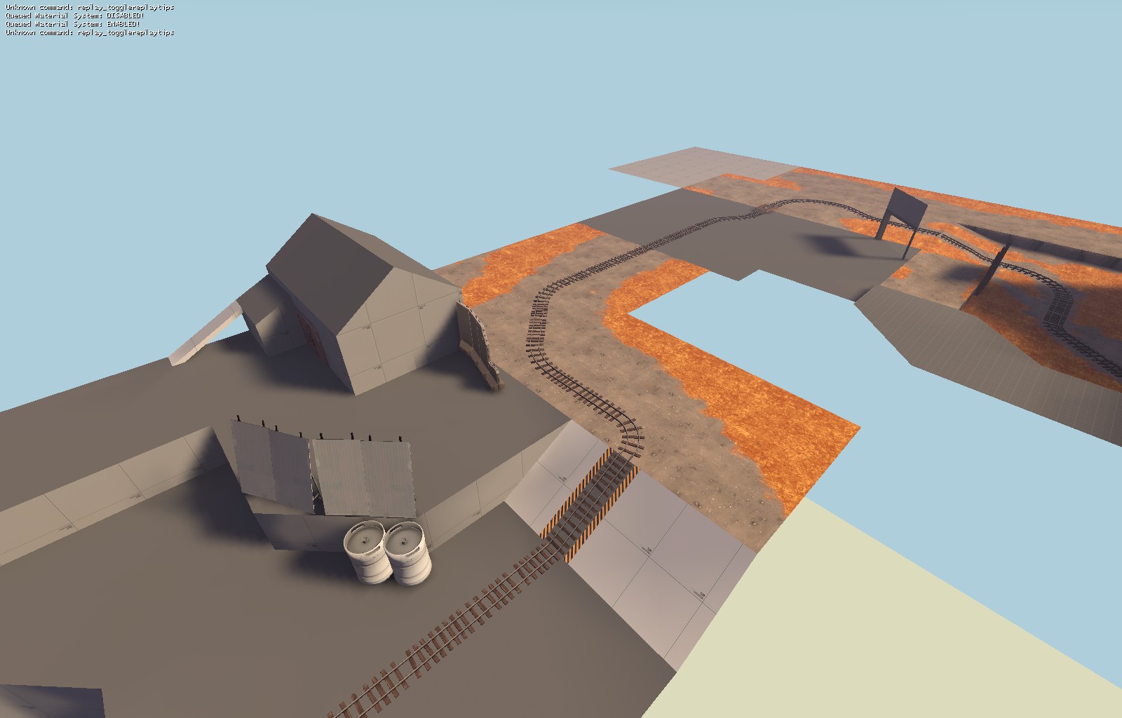
I chose to go with the orange grass because I wanted the grass to look dead and barren, suffering from the chemical waste and pollution the industrial area dumps on the surroundings. Also I read that birch trees are commom in Russia where Kalinka is set.
Yeah I can get that. I wasn't really referring too much to your map as yours is quite older than the more recent ones, so you had some originality to your map.I chose to go with the orange grass because I wanted the grass to look dead and barren, suffering from the chemical waste and pollution the industrial area dumps on the surroundings. Also I read that birch trees are commom in Russia where Kalinka is set.
Bright orange seems like a weird color for dead grass to begin with. Saying it has to do with toxic waste is probably the only good excuse I've seen for it so far.
That's a pretty generous sightline down the left side there. At least one of those doorways should be a solid wall, I think.I made a rough sketch of point A in the map... this shouldn't be the final version, but any thoughts?
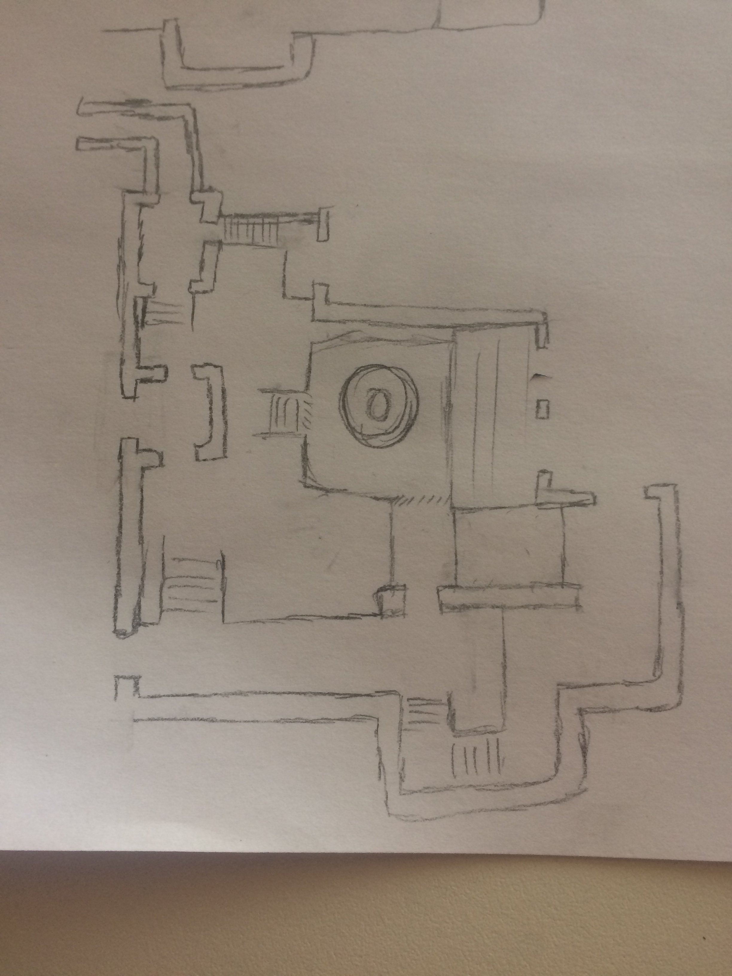
To the left is Blu spawn (somewhere), to the right will eventually be point B...
That's a pretty generous sightline down the left side there. At least one of those doorways should be a solid wall, I think.
Gorge has a very similar sightline in its pre-A connector that I don't think sees much sniper use (though I've never tried to verify this). Taking pause to use that sightline to its fullest potential means turning a blind eye to a major route for the other team.
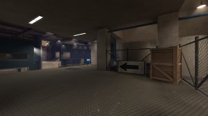
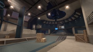
Ive never made a real pass map, and I like the space theme. In turn Im trying to make a space pass map.
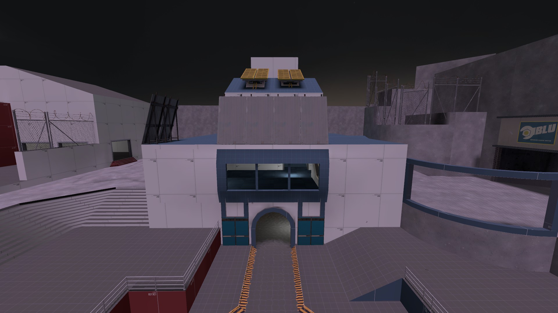
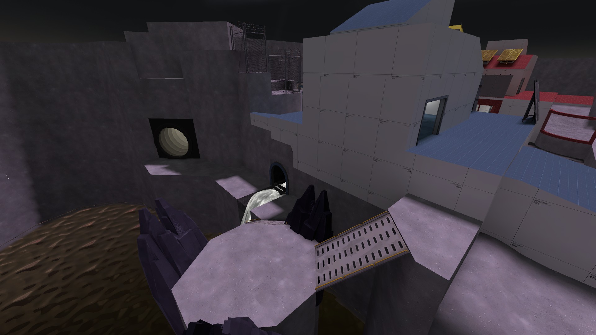
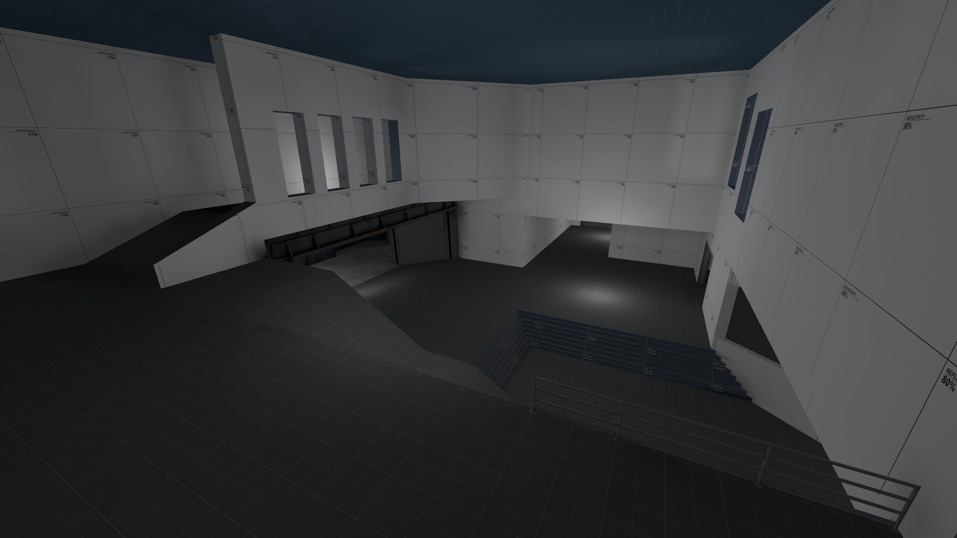
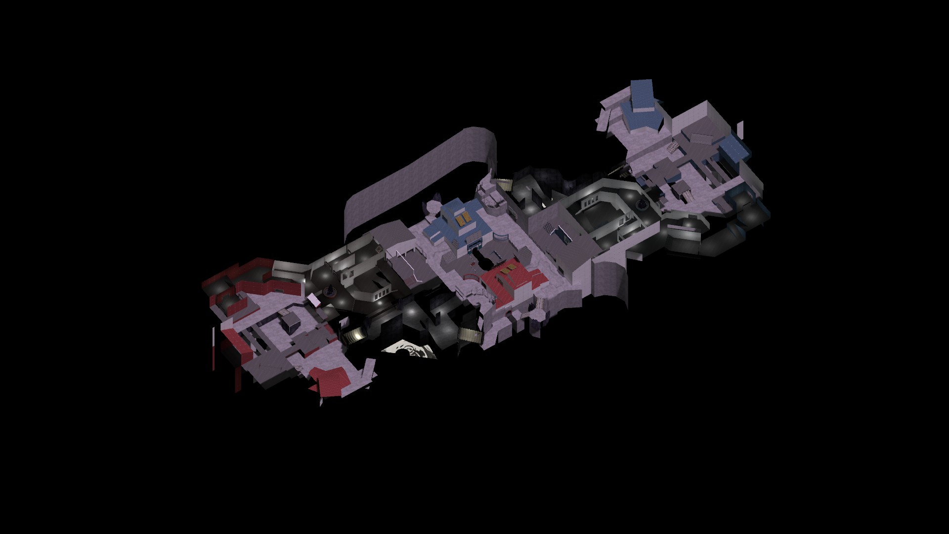
Imgur album so I dont flood with too many images http://imgur.com/a/E9mqH
I threw the lighting together in 5 minutes so I actually had screenshots to show, and I've yet to get the goals all in place yet. But hey, Ive got a layout!


Imgur album so I dont flood with too many images http://imgur.com/a/E9mqH
I threw the lighting together in 5 minutes so I actually had screenshots to show, and I've yet to get the goals all in place yet. But hey, Ive got a layout!
I dont see any jump pads but maybe its fine although jumppads plays quite a lot in pass mode.Ive never made a real pass map, and I like the space theme. In turn Im trying to make a space pass map.


Imgur album so I dont flood with too many images http://imgur.com/a/E9mqH
I threw the lighting together in 5 minutes so I actually had screenshots to show, and I've yet to get the goals all in place yet. But hey, Ive got a layout!
I dont see any jump pads but maybe its fine although jumppads plays quite a lot in pass mode.
I have a couple places in mind for jump pads, but my map isn't as open as many of the others, could be an issue thinking about it. I might remake mid at some point to be a little less complex and more open to use jump pads well, but I cant tell how anything is going to play out until its been tested.
Like I said, it might be fine without jump pads.I have a couple places in mind for jump pads, but my map isn't as open as many of the others, could be an issue thinking about it. I might remake mid at some point to be a little less complex and more open to use jump pads well, but I cant tell how anything is going to play out until its been tested.


